Typefaces of the Month, Matthijs Sluiter’s Picks
Fonts In Use editor and Type Specimens curator Matthijs Sluiter has selected the most notable typeface
Releases
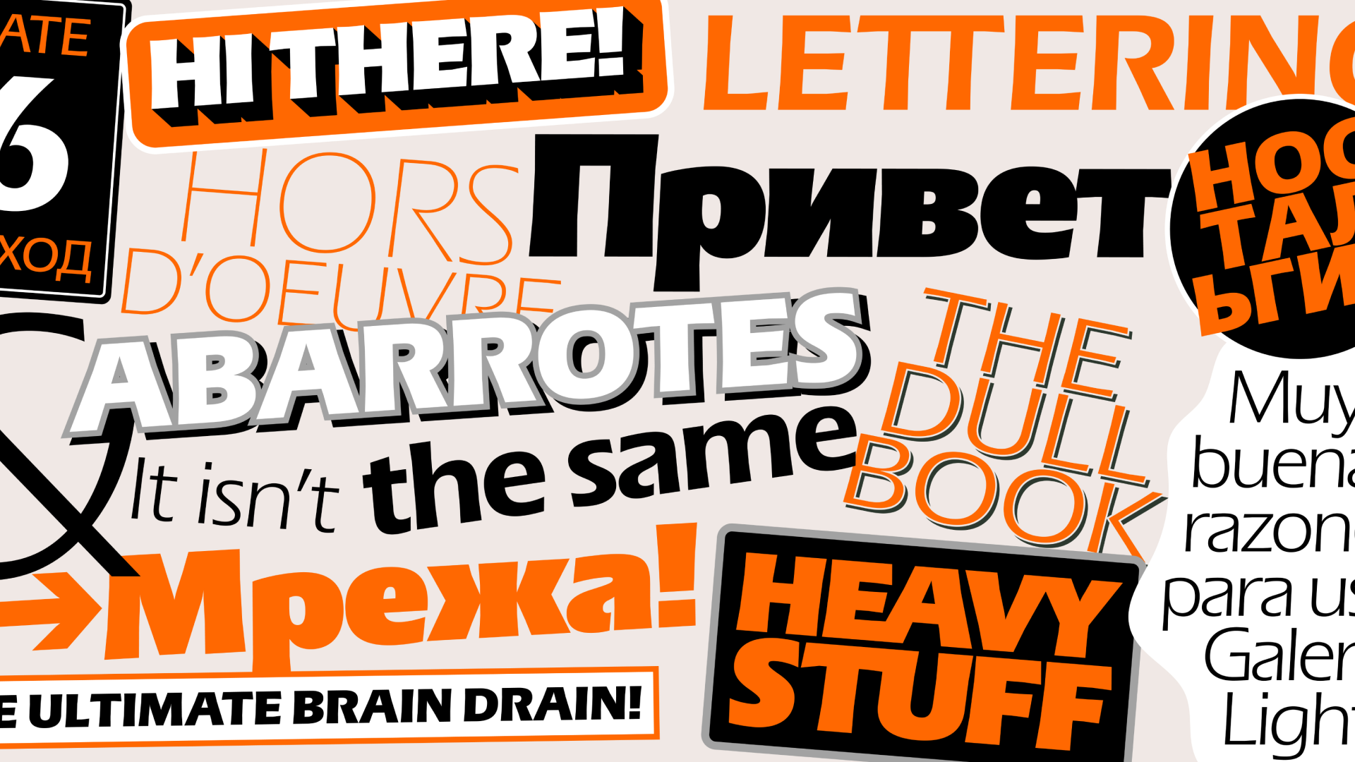
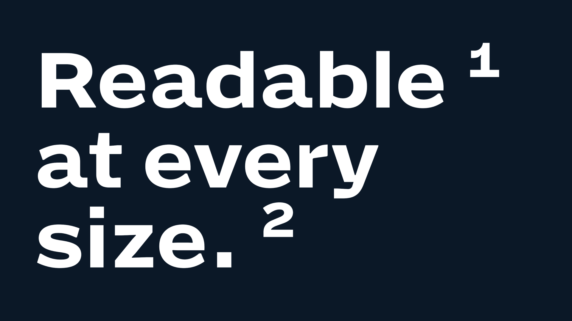 Action Grotesque, Commercial Type
 Asphodel, Alexandre Créquer
 BelleMer, HvD Fonts
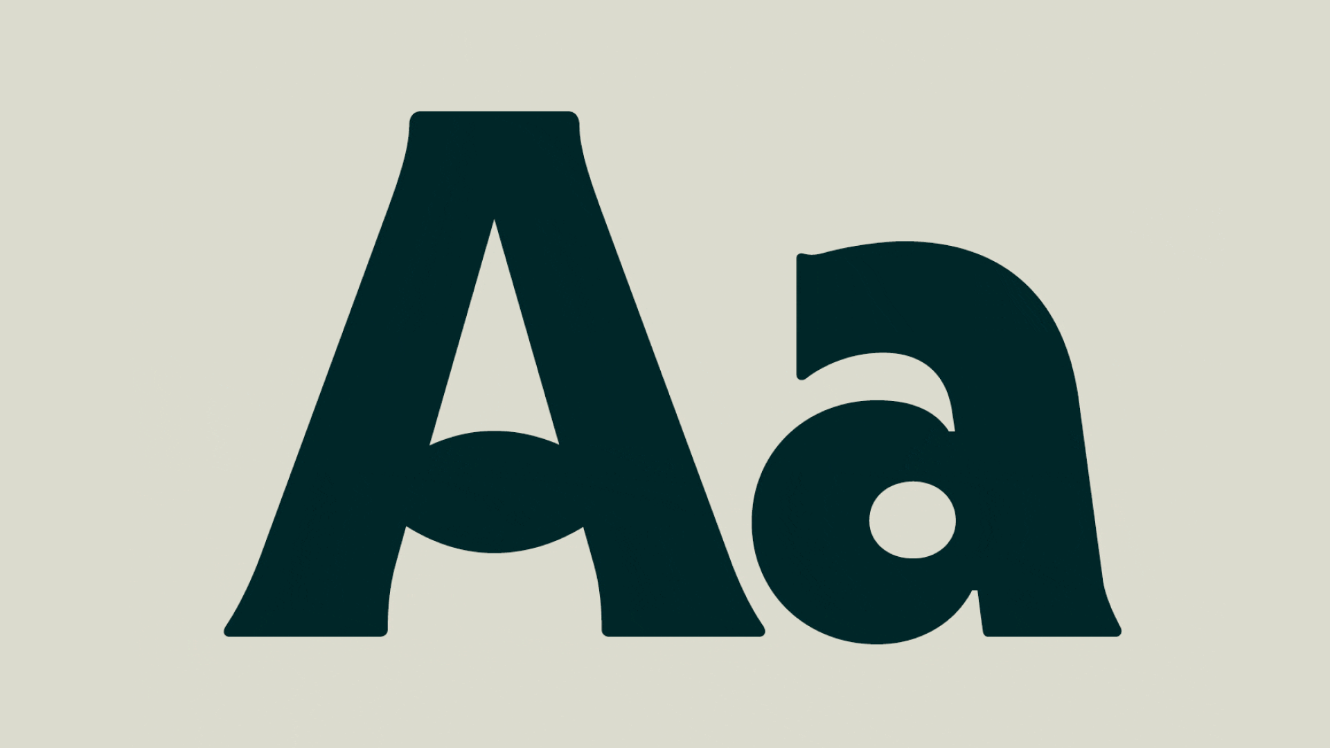
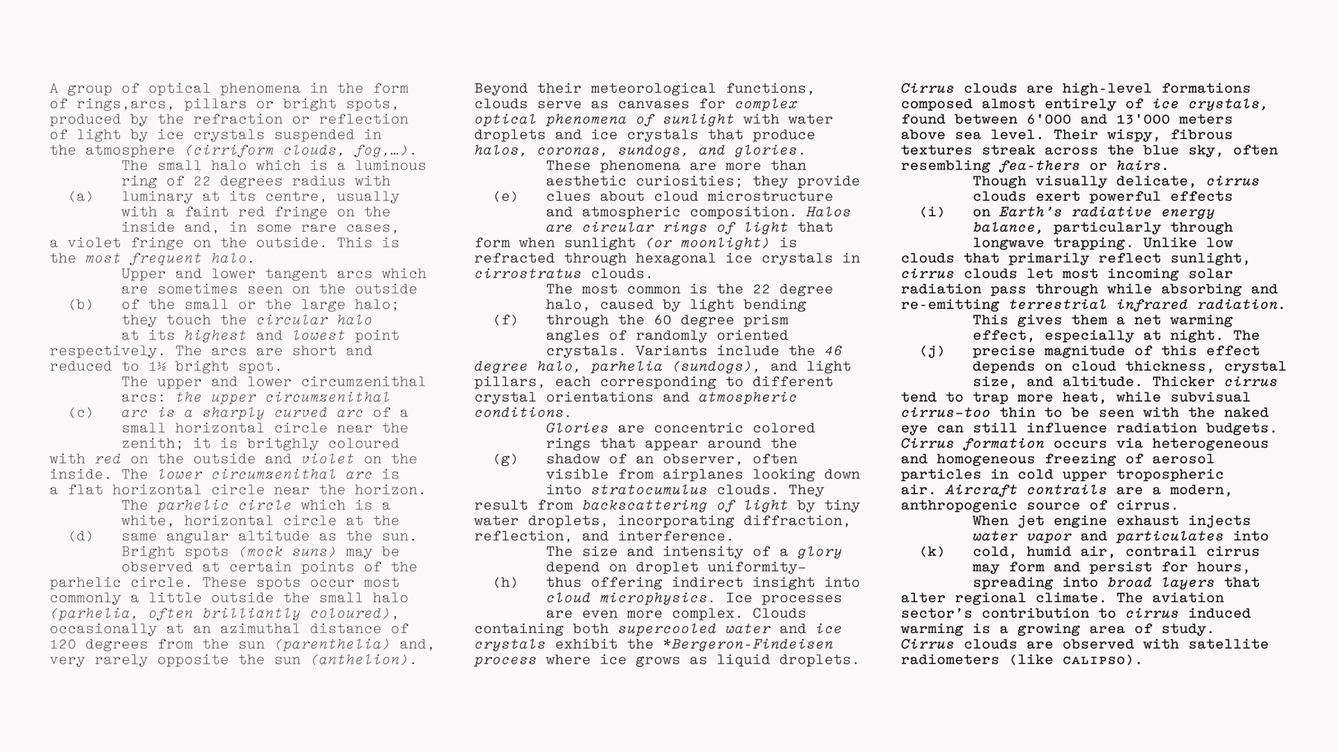
 Canopy, Approximate Type
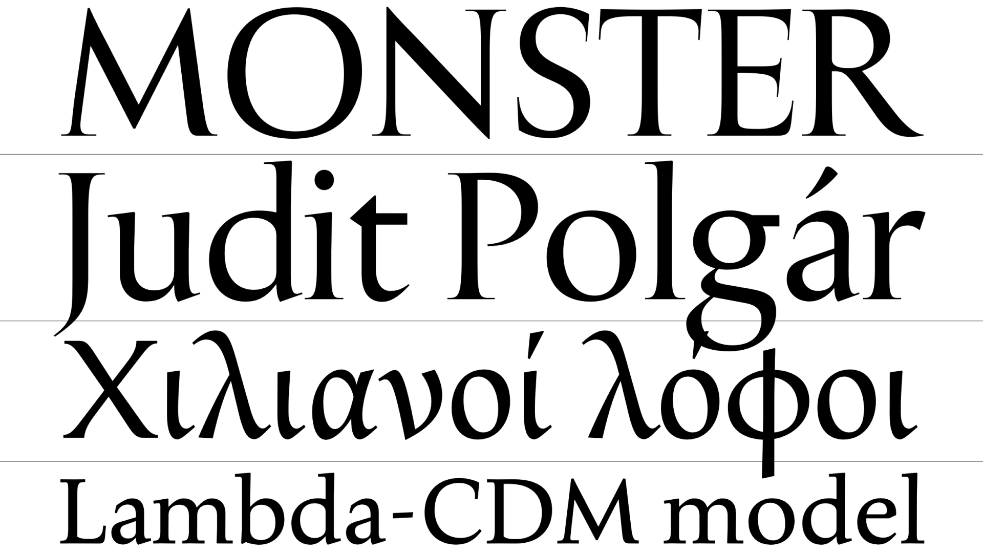
 Electa, Lineto
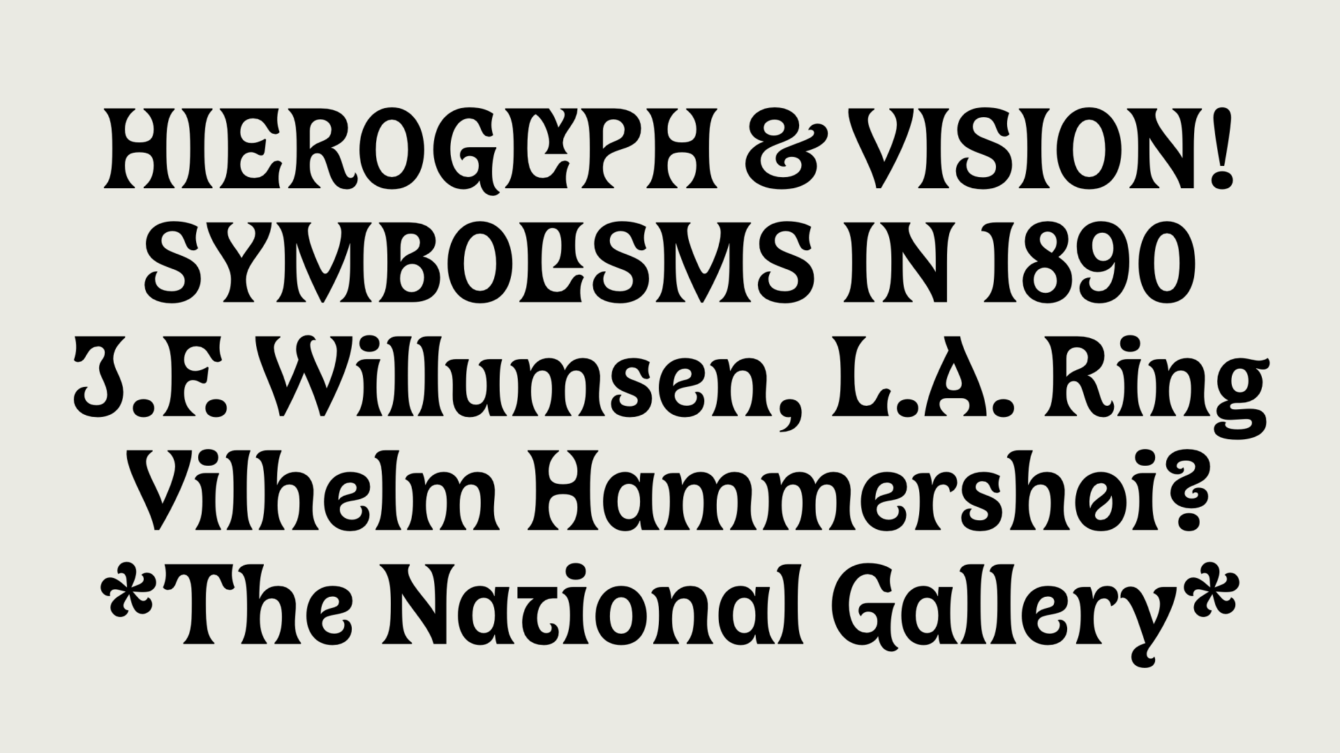
 Galera, Dual Type
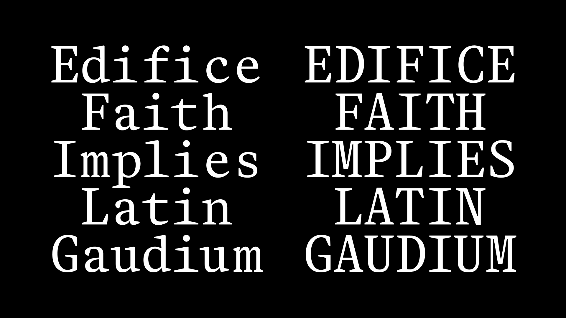
 Marble, East of Rome
 NaN Hawk, NaN
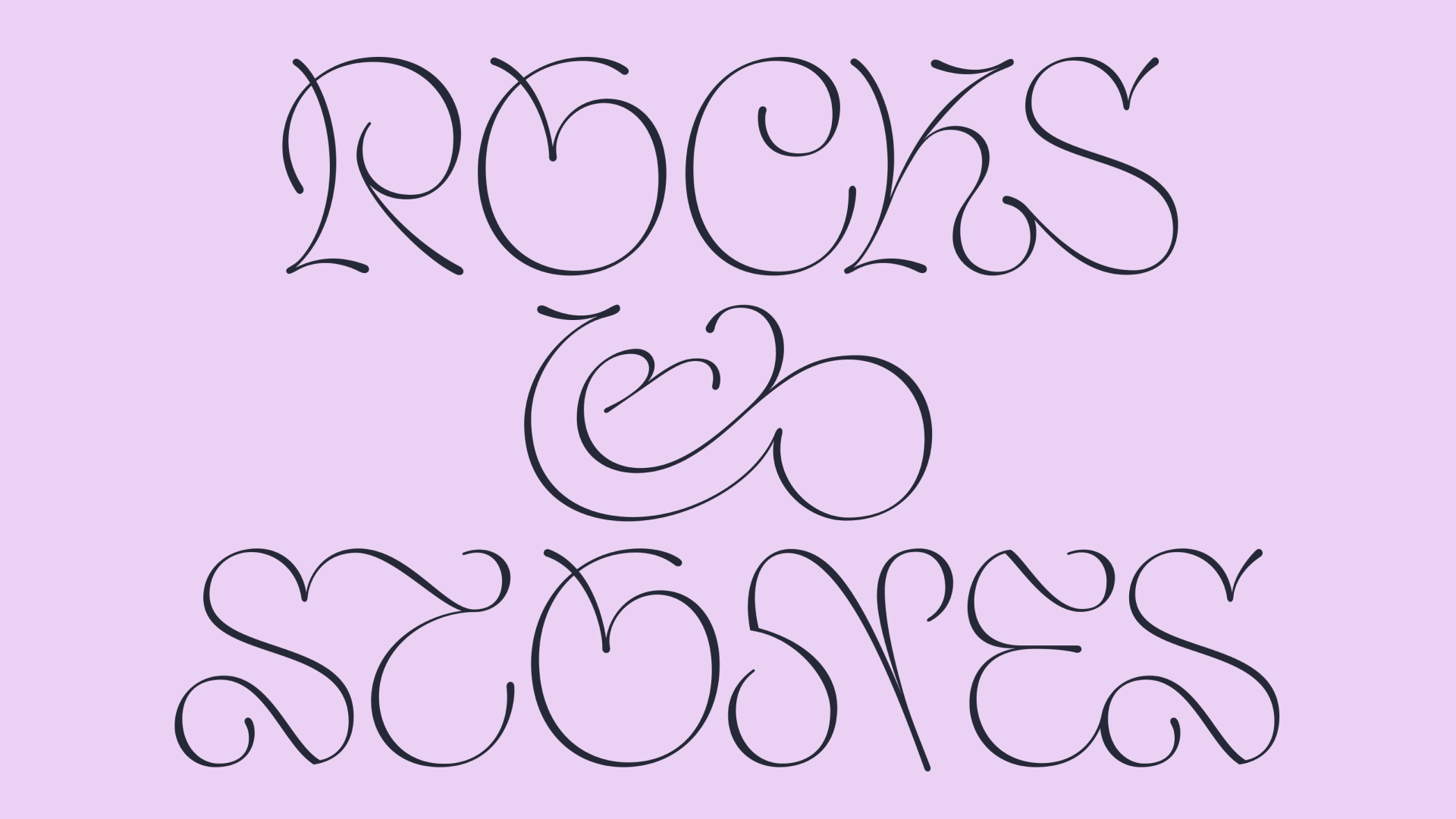
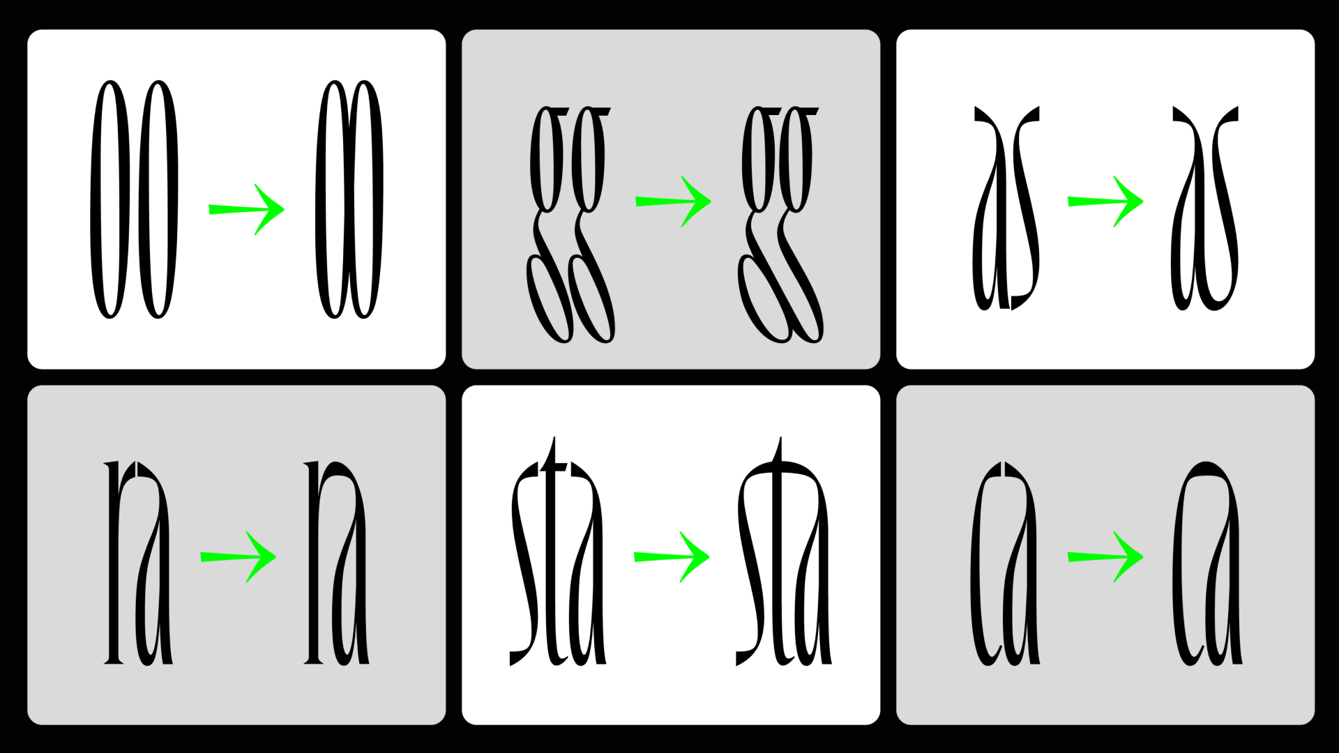
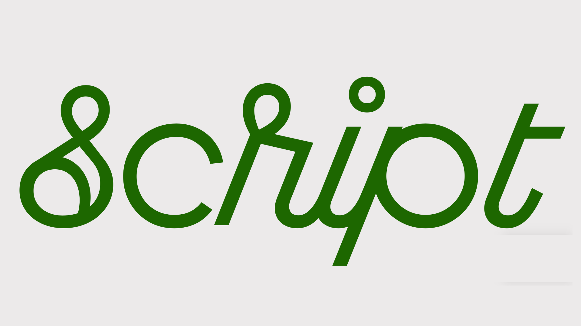 Noggle Script, Léon Hugues
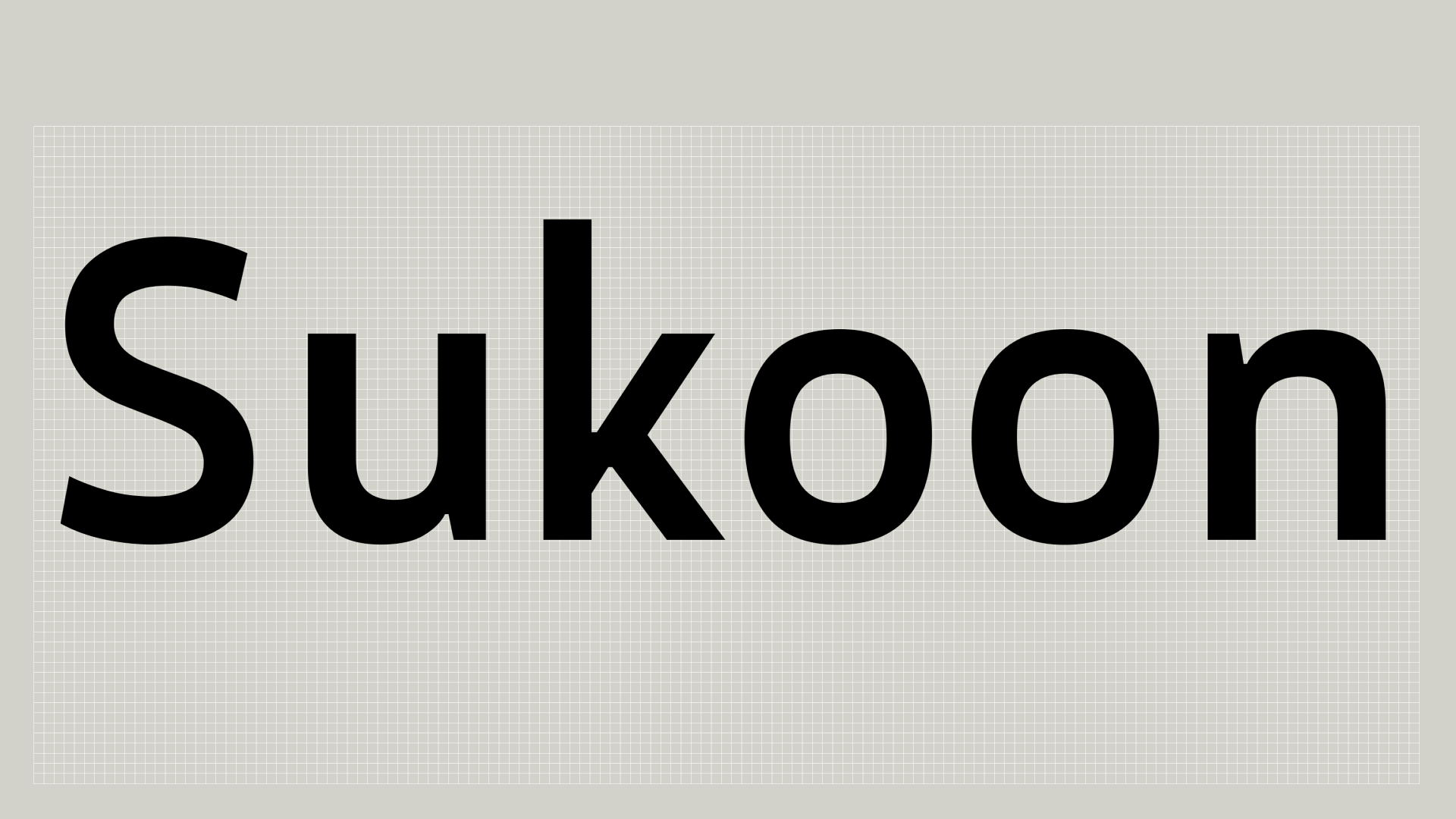 Sukoon, Fontwerk
Updates and family extensions
 205TF released Alcalá Xtra, a version of Alcalá with an enlarged x-height. It comes in five styles including Mono
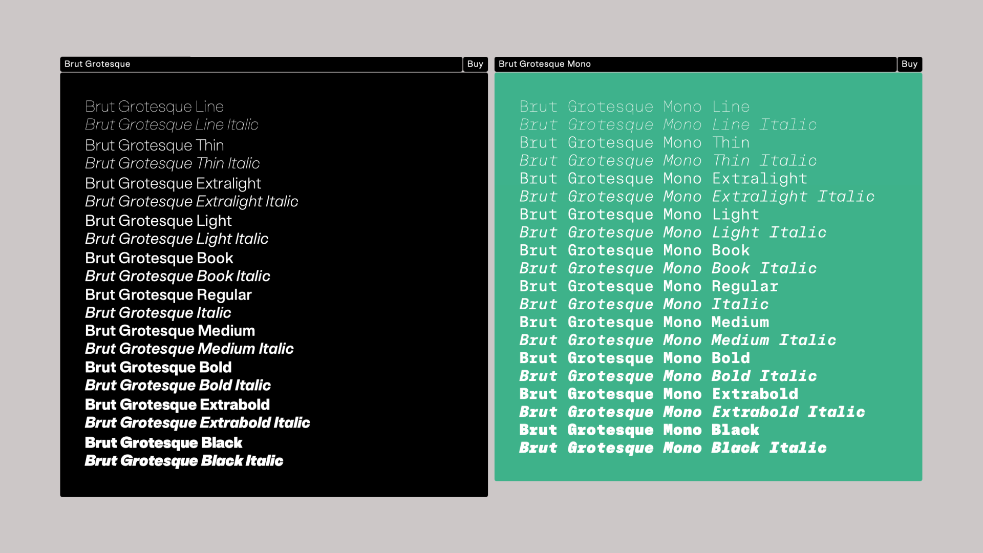 Brut Grotesque Mono was added as a companion to Bureau Brut’s Brut Grotesque
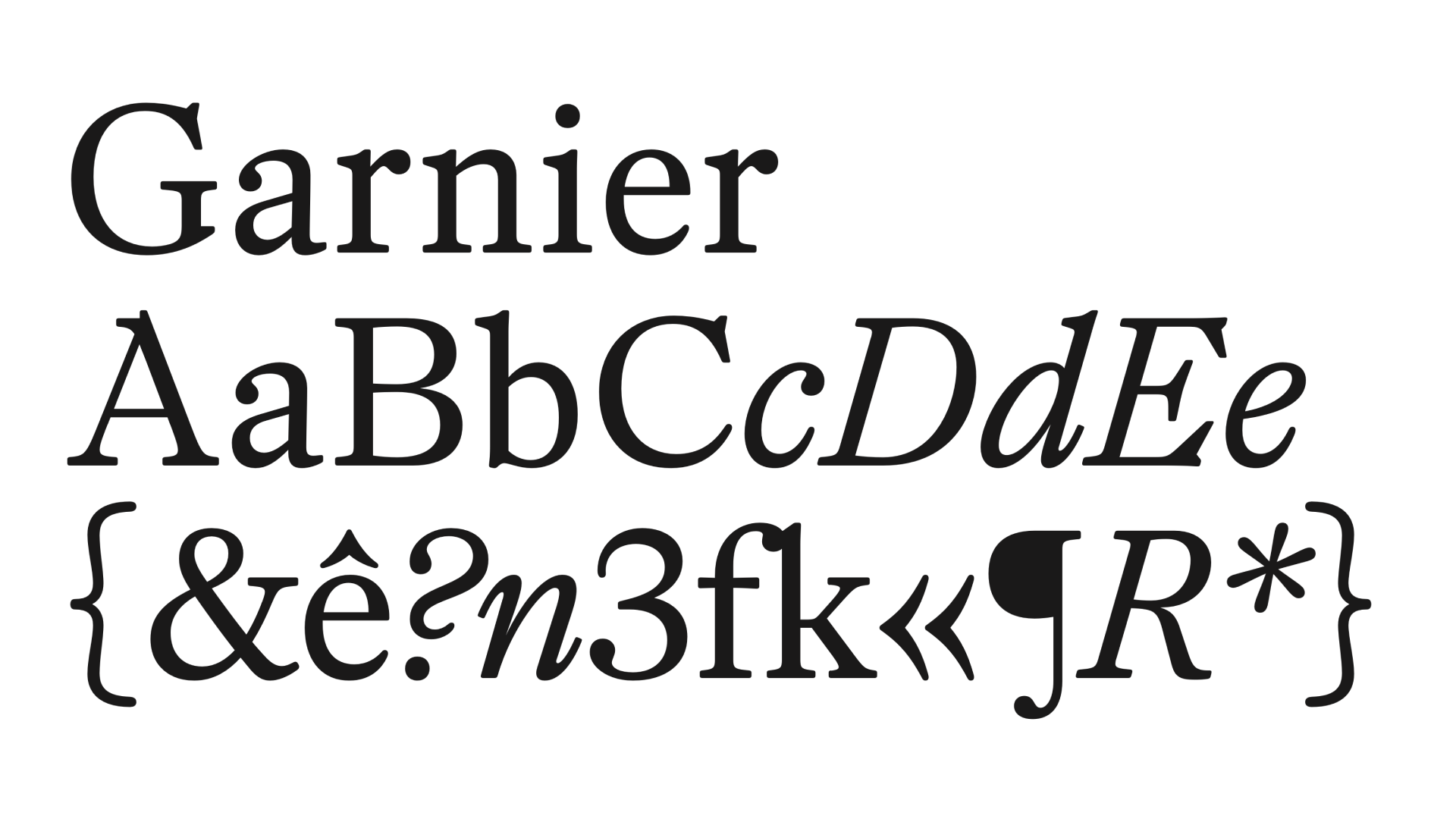 Proof of Words added italics to Garnier
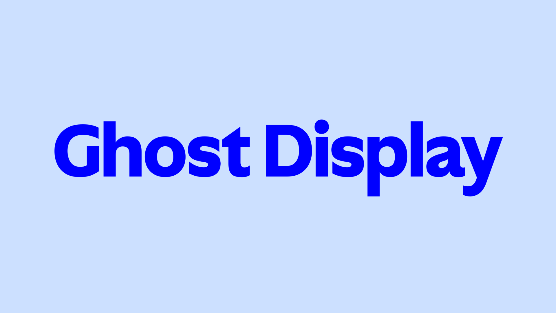 New optical sizes plus monospaced and italic styles for Ghost by Sharp Type
 Greek, Cyrillic and Thai support was added to Neue DIN by
Fontwerk
Greek, Cyrillic and Thai support was added to Neue DIN by
Fontwerk
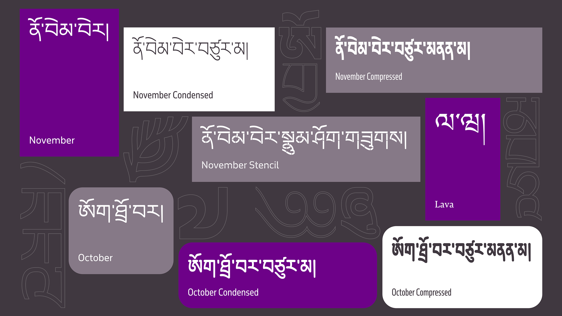 Typotheque released a new collection of Tibetan fonts, adding more language support to Lava, October and November
Unicode Technical Workshop
blog.unicode.org/2026/05/unicode-technology-workshop-2026-call.html
This year, the Unicode Technical Workshop (typically held in the US) will take place at the Atelier National de Recherche Typographique (ANRT) in Nancy, France, on October 20-23. In addition to type and graphic designers, the event will also welcome representatives of Unicode Technical Committee corporate members, as well as programmers, web developers, and linguists. The conference accepted speaker submissions until June 1 and opened Early Bird ticket sales two weeks ago.
 ANRT Nancy
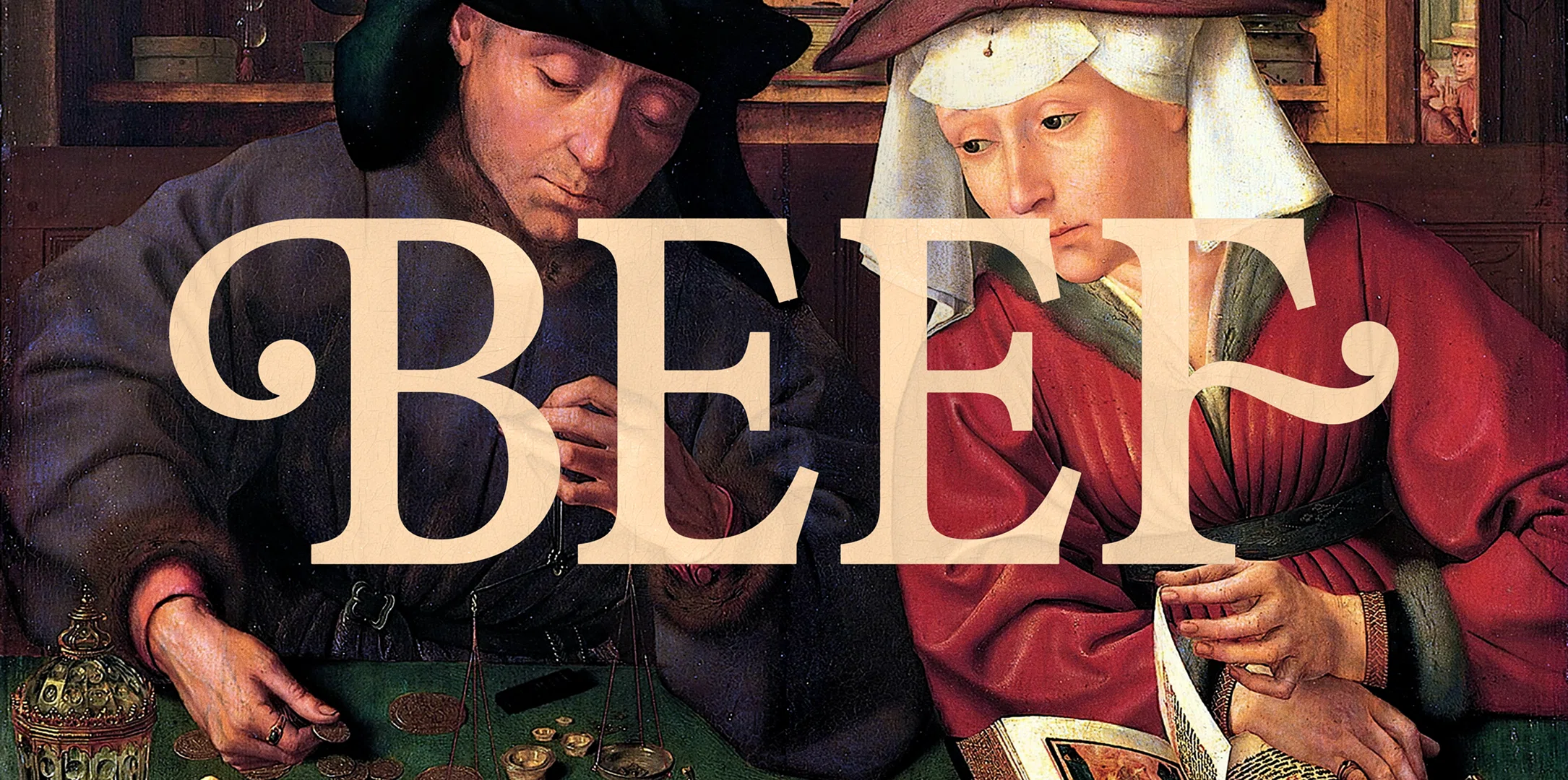
Type of Beef
Type and graphic designer Benjamin Tuttle shared on It’s Nice That how he designed type for Netflix’s
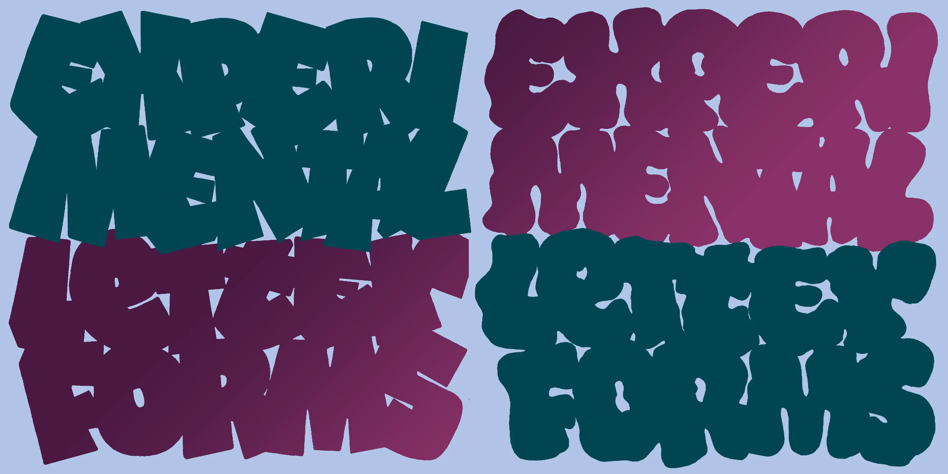
Lessons from Graffiti
typeelectives.com/courses/experimental-letterforms-su-26
Type Electives has opened registration for an online course on how a type designer could enhance their skill through exploring street lettering: signage, tags, graffiti. The course starts on July 9 and runs for five weeks.
Karel Martens × J-LTF
J-LTF has released a typeface in collaboration with Karel Martens. Ticker is both a variable and color font: as in much of Martens’s work, semi-transparent color modules move, shift, intersect, and overlap.
Small Foundry Fund
letterformarchive.org/news/the-small-foundry-fund-for-type-west
Thanks to a donation from David Jonathan Ross, the Type West school has launched a funding initiative to support its students. The fund will be primarily based on recurring donations from small independent foundries. A foundry can commit a three-year donor agreement and contribute $500, $1,000, $2,500, or $5,000, depending on what they can afford. The Fund members can also contribute by providing feedback to student work or reviewing portfolios.
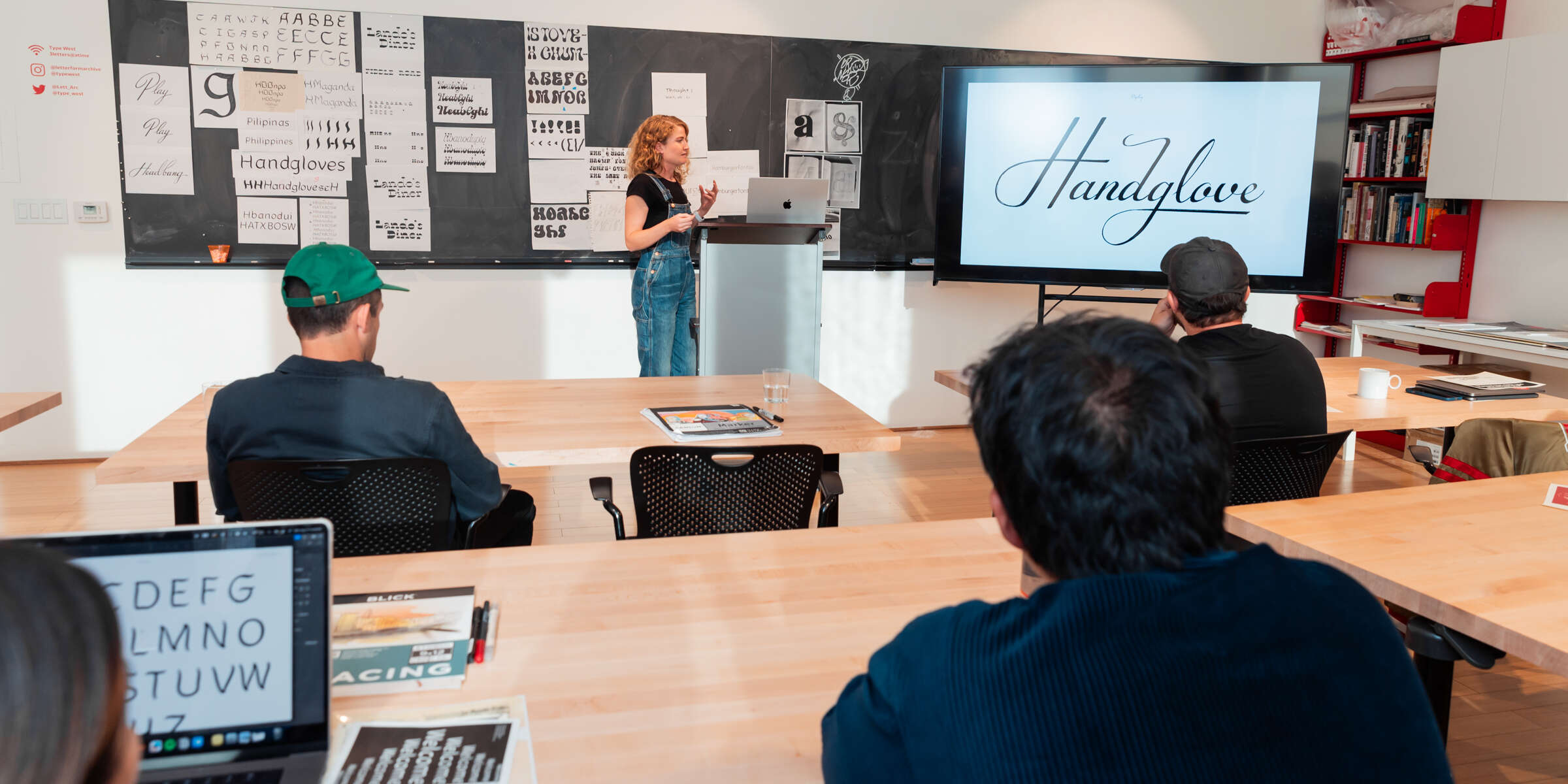 Class at Type West
Faces behind typefaces
ilovetypography.com/2026/05/13/font-faces-nick-shinn
I Love Typography has launched a series of interviews with type designers. In the first piece, Nick Shinn says that if he hadn’t become a type designer he would probably be creating graphic novels instead and explains why drawing images and image generation are different forms of cognition.
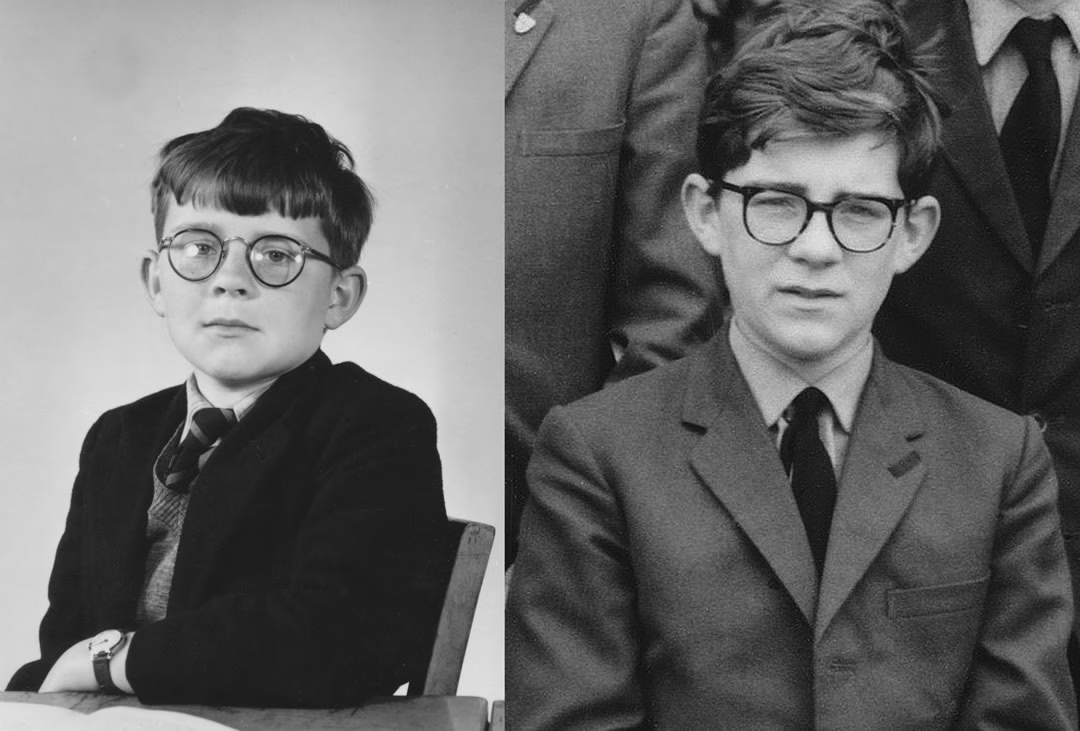 Nick Shinn age 9, and age 13. Image: I Love Typography
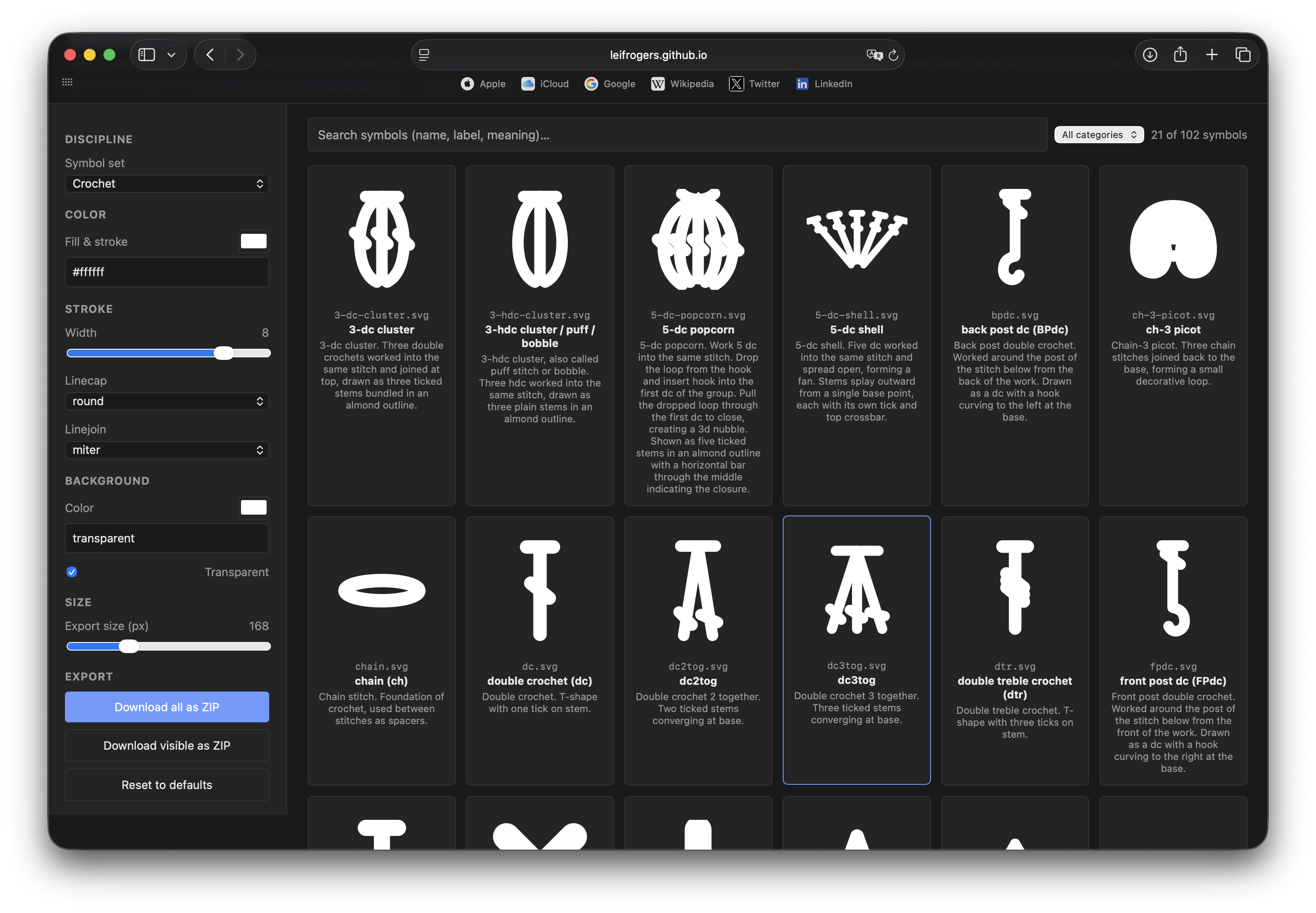
Knitting and Crocheting Typography
Knitting and crochet enthusiasts use a visual system to represent different types of stitches, adopted and constantly developed by a special establishment (yes!), the Craft Yarn Council. This month saw the release of a tool that allows users to export these symbols as SVGs, with customisable settings such as stroke weight or joins. The symbols can be used in patterns and instructions that explain how to knit or crochet a particular item. The Craft Yarn Council has endorsed the tool.
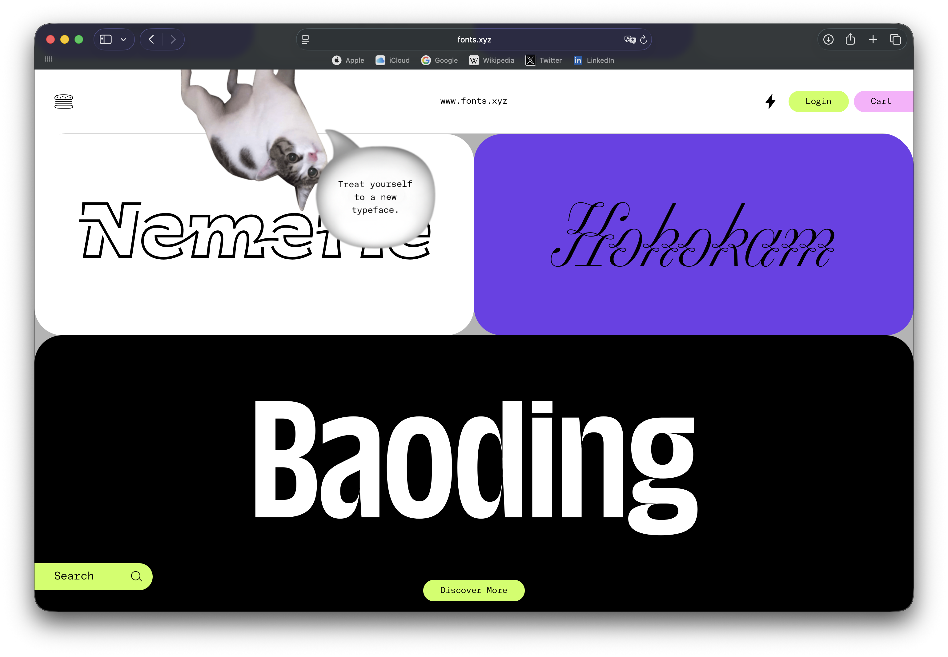
Fonts.xyz by NaN
NaN has launched a new type store. Each foundry that sells on fonts.xyz builds their own
The (yet another) End of Classification
Elisabeth Goodspeed has written a column arguing that we (probably) should stop categorising and classifying design. Goodspeed doesn’t address type in her piece, but designers recalled that the type community has already reflected on the
Hershey Fonts
Artist and developer Devine Lu Linvega posted in his blog about the Hershey font format. Created in 1967 at the US Naval Weapons Laboratory, it was one of the first attempts to systematise how type was displayed on screens. Devine explains in detail how character encoding worked and offers an emulator for viewing Hershey fonts.
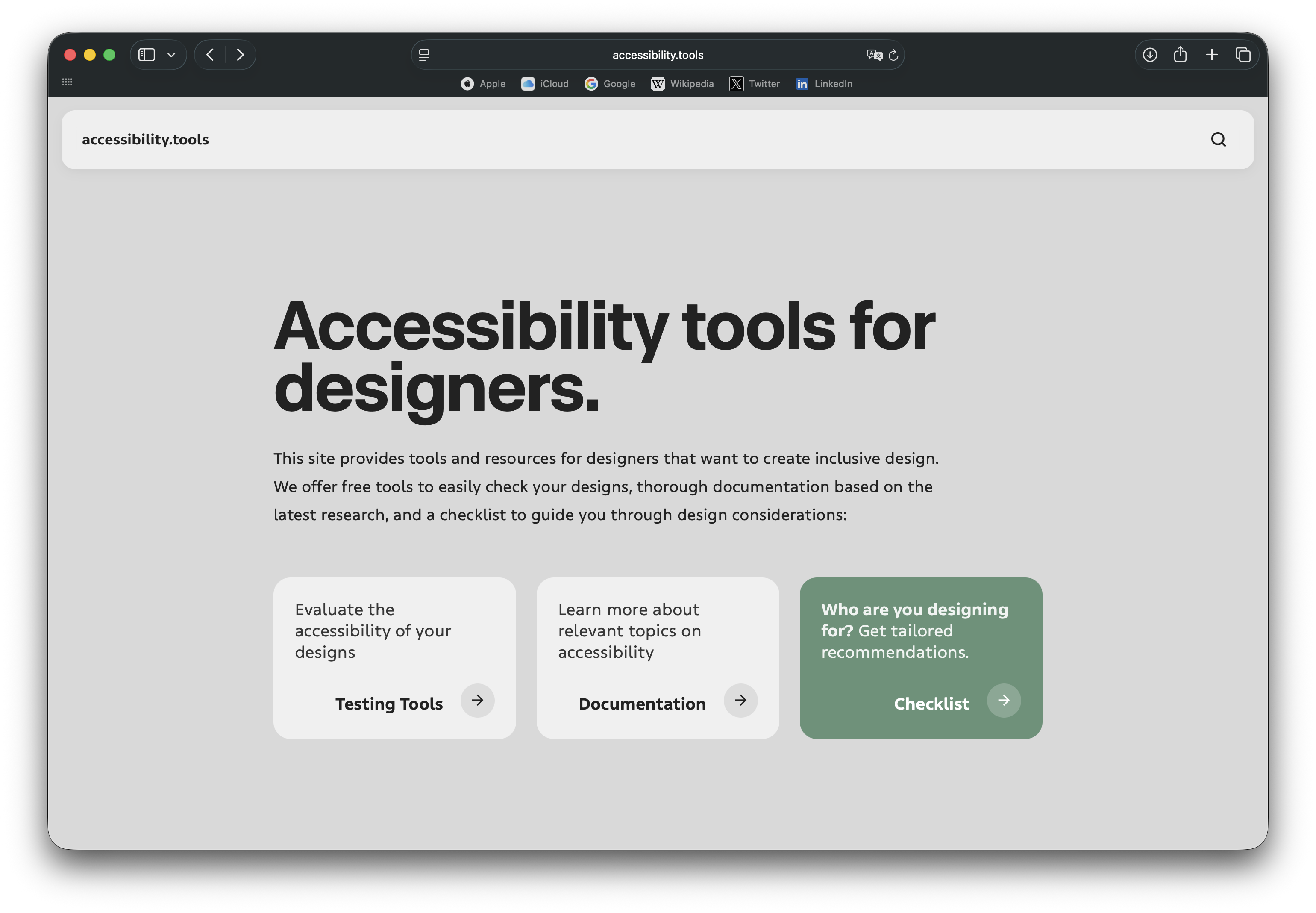
Accessibility Toolkit
Cognitive scientist Héctor Mangas, with the support from Typotheque, has launched a tool to help designers make their projects more accessible. The platform includes documentation on inclusive design, checklists, as well as tools where you can upload your design and find out which groups with specific needs it is accessible
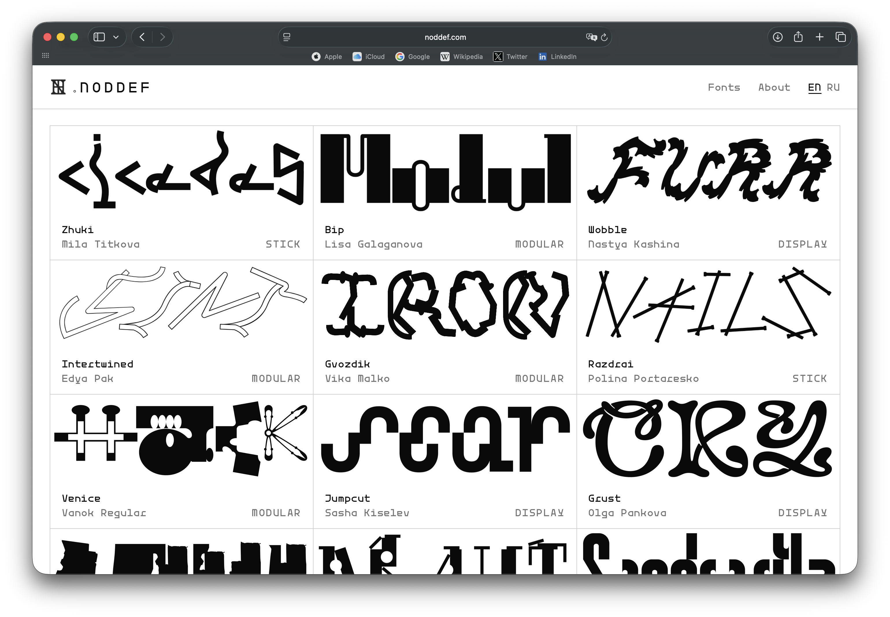
Noddef Fonts
Designers from Oddworks and Partdirector foundries and the Design Spotlight project have teamed up to launch a font marketplace that sells nothing but unfinished typefaces. Much of the collection is
Emigre Files
letterformarchive.org/news/from-the-collection-emigre-font-development-files
The team of the Letterform Archive has completed the digitisation of drafts and sketches of Emigre, donated to them ten years ago. In the piece announcing the fact, digitisation specialist Eve Scarborough reflects on the materiality in type design and argues that designers who were shaped in the digital era should document their creative process.
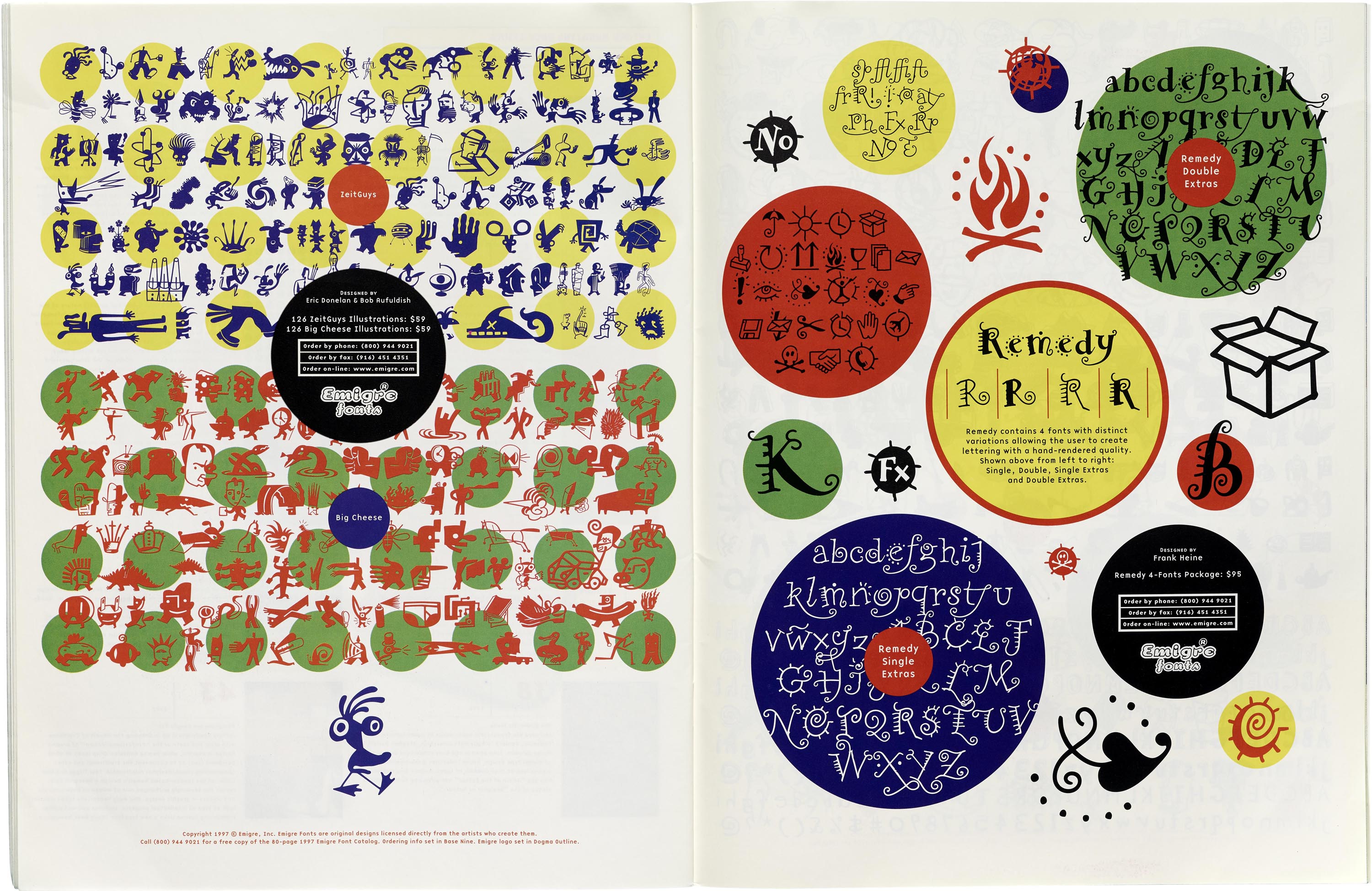 Interior spread from Emigre, no. 44 with glyph designs for ZeitGuys and Big Cheese by Bob Aufuldish and Eric Donelon (left); and Remedy by Franke Heine (right), 1997
M — space
CAST Foundry co-founder Marta Bernstein has launched a newsletter where she promises to share selections of fonts she hasn’t been able to find projects for, recommend interesting books, and review work by her favourites designers. In the first letter, Marta reflects on why we all need
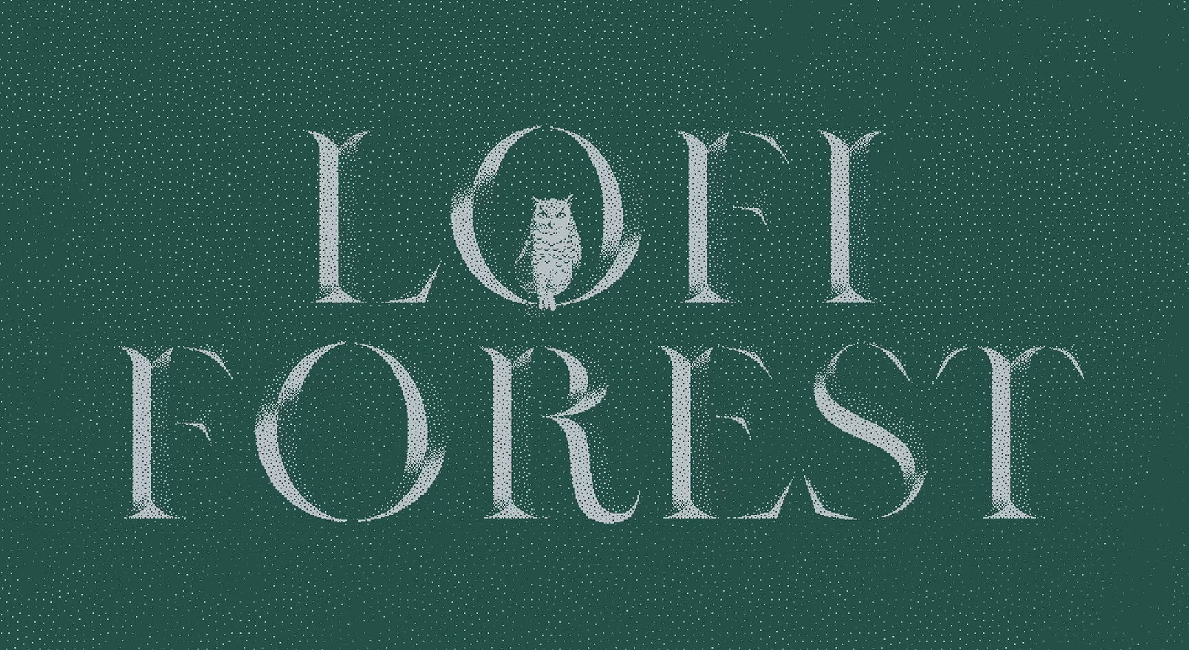 Lofi Forest. Fonts Marta hasn’t been able to find projects for
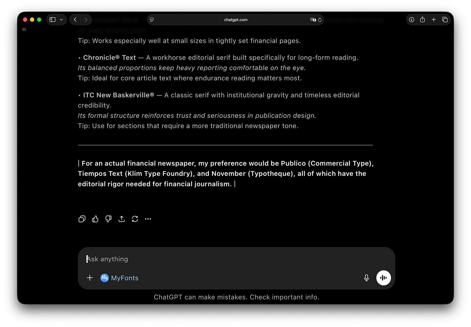
MyFonts × ChatGPT
Monotype has released an app for Chat GPT. If you type @MyFonts in your conversation and describe a task you need a typeface for, the chat will summon the Font Philosopher, who is supposed to suggest font options available on the marketplace and justify the choice. The tool is rather limited and suggests only one category of typeface per
The philosopher occasionally suggests going beyond the MyFonts collection and consider typefaces created by independent foundries (an idea we fully support!) Furthermore, if you ask to find a font pair, the
Independent type designers hope that this idea will share the same fate as attempts to sell fonts as NFT and suspect that the AI will primarily suggest typefaces from the MyFonts catalogue rather than libraries of smaller foundries that distribute through MyFonts.
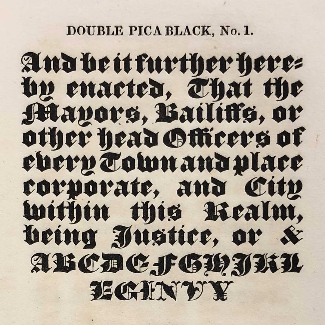
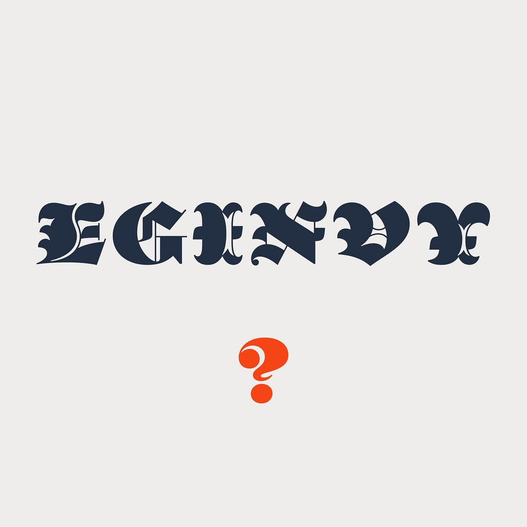
EGINVY Mystery
Jonathan Hoefler has told a story of how Parliament was
May on type.today
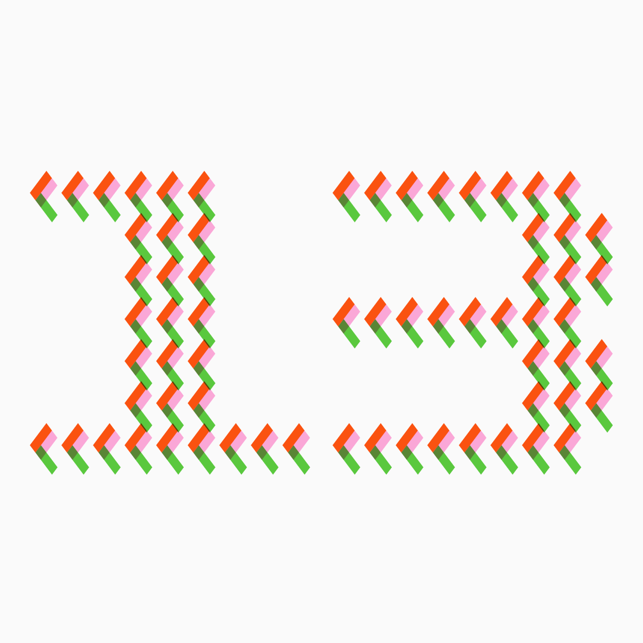
This month, together with Timur Zima and Geo Kotanov’s studio [BUROU3], we released Type Physics, an audio-visual tool for animating variable fonts.
We also held our second open call inviting designers to design posters on the theme ‘OK’ using Maregraphe Mega and then posted the winning entries on our socials.
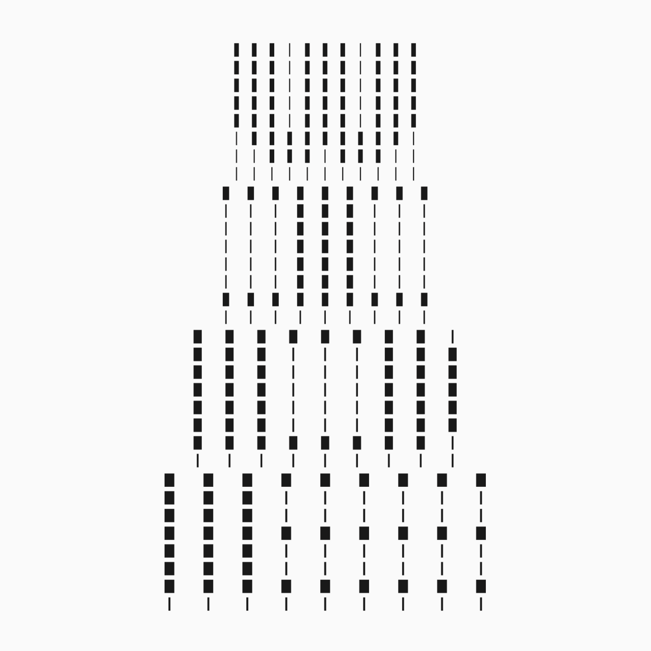
And (last but not the least!) welcome a new member of type.today collection — Fluxetype by Nikita Kanarev, a typeface that exists at the intersection of humanist sans and serifless roman type.
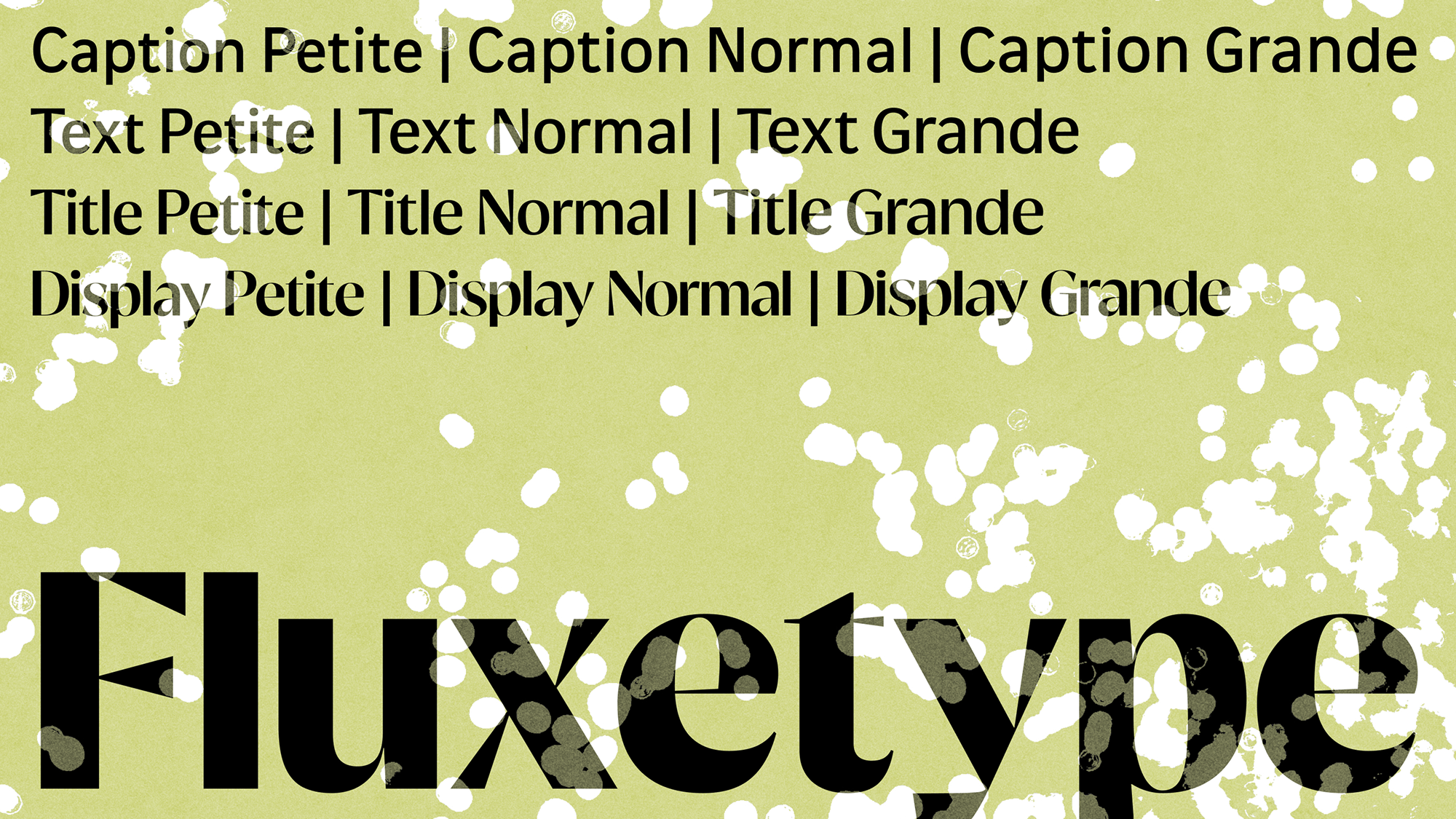 Fluxetype by Nikita Kanarev
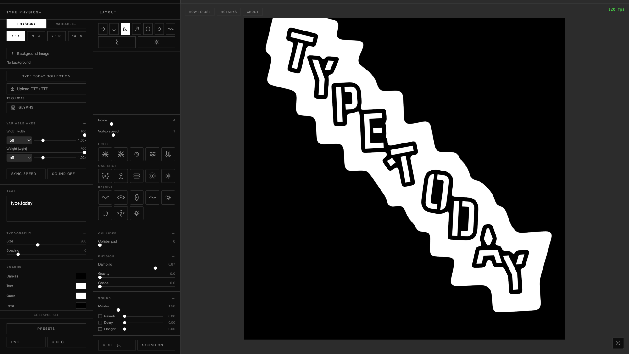 Type Physics by [BUROU3]