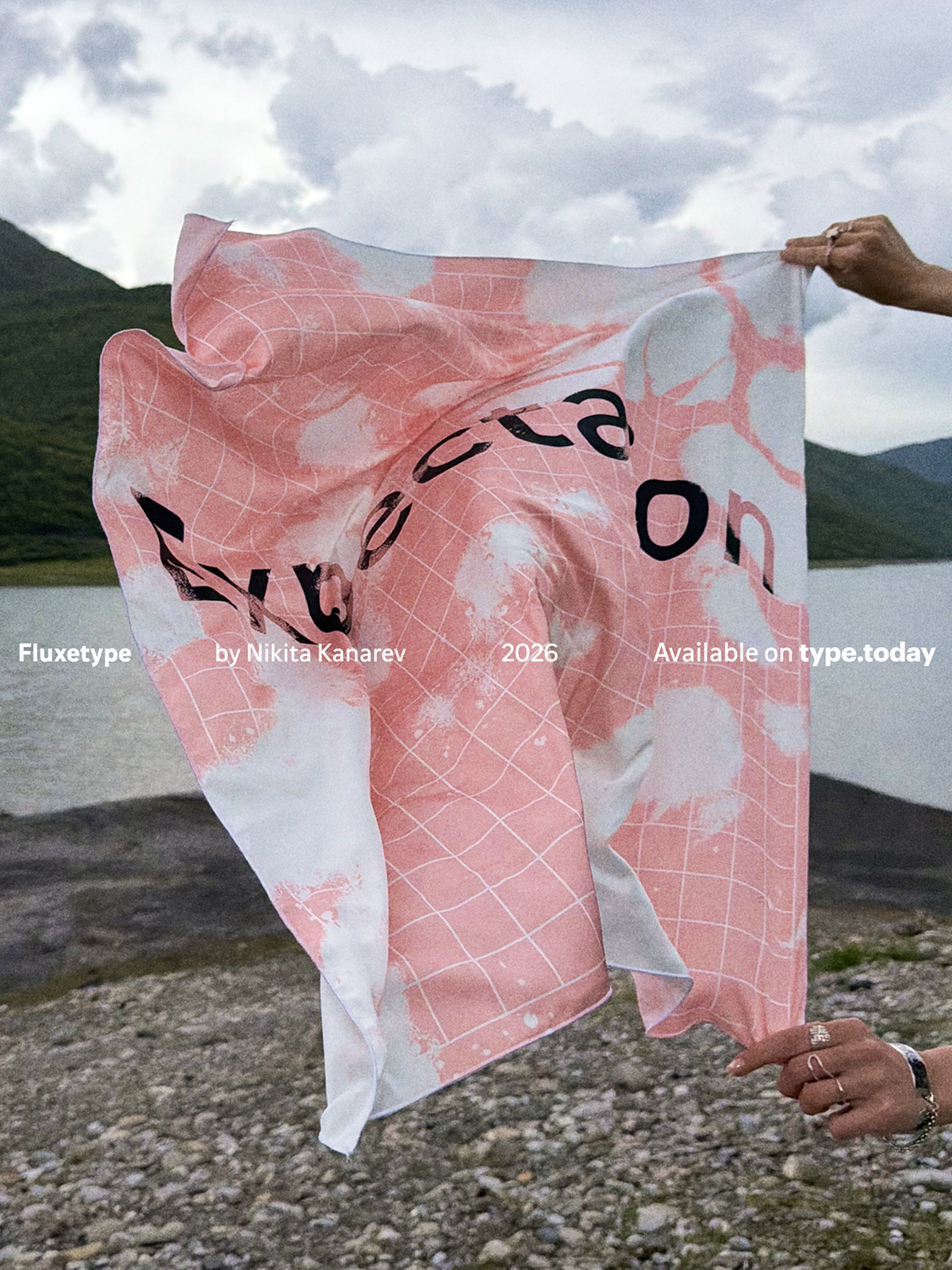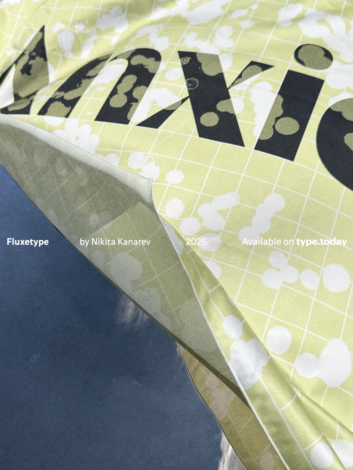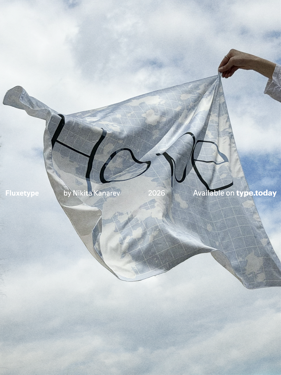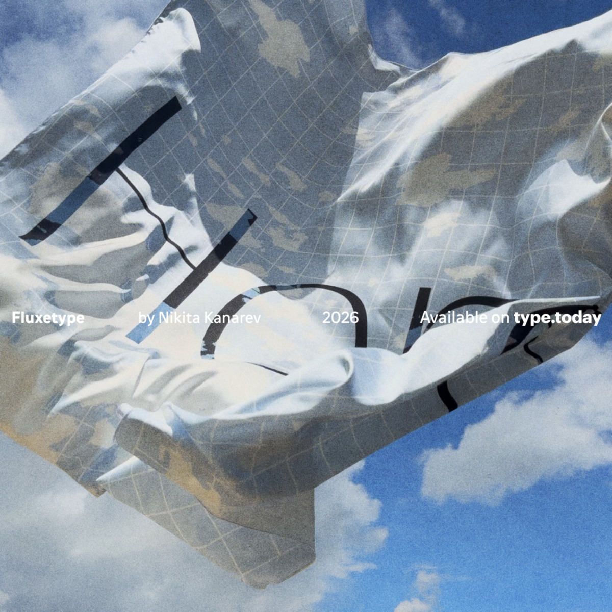
The first Fluxetype letters were cut out of paper, taken into separate pieces, and then reassembled. Moving and shifting pieces, Nikita Kanarev explored the mechanics of variability transferred from the digital world to the analogue one. He asked himself the kinds of questions that are only natural for the process of working on a variable font. What happens to a character when several of its parameters change at the same time? How does stroke contrast interact with the proportions of a character?
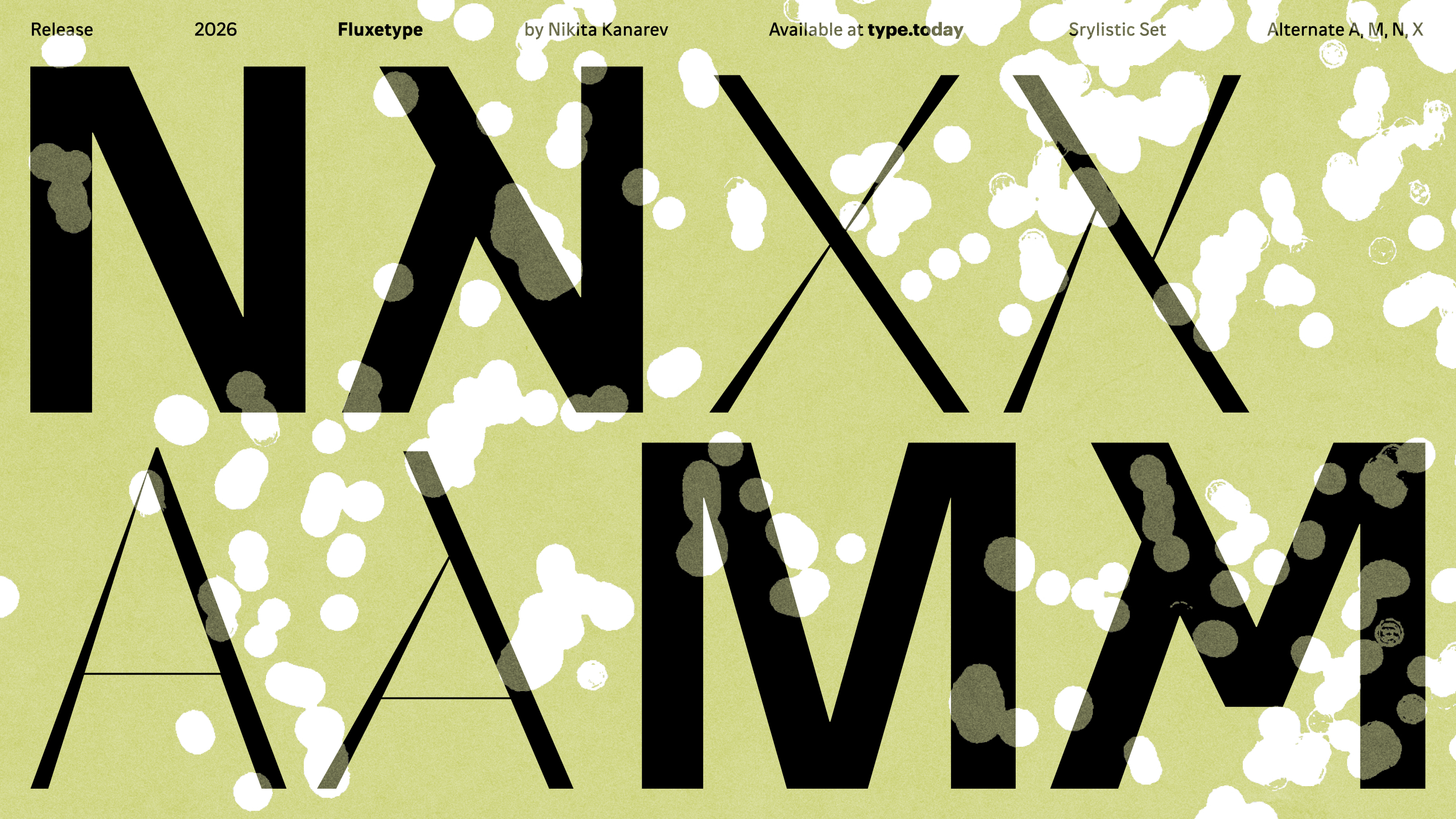
The graphic concept of the typeface was born as a result of this practice. In Fluxetype, form and counterform interlock according to the logic of a so-called dovetail joint used in woodworking. The two parts fit into one another so well that the shape itself keeps the entire structure
The typeface pays respect to Optima, the first representative of the serifless roman genre, while deliberately walking away from its
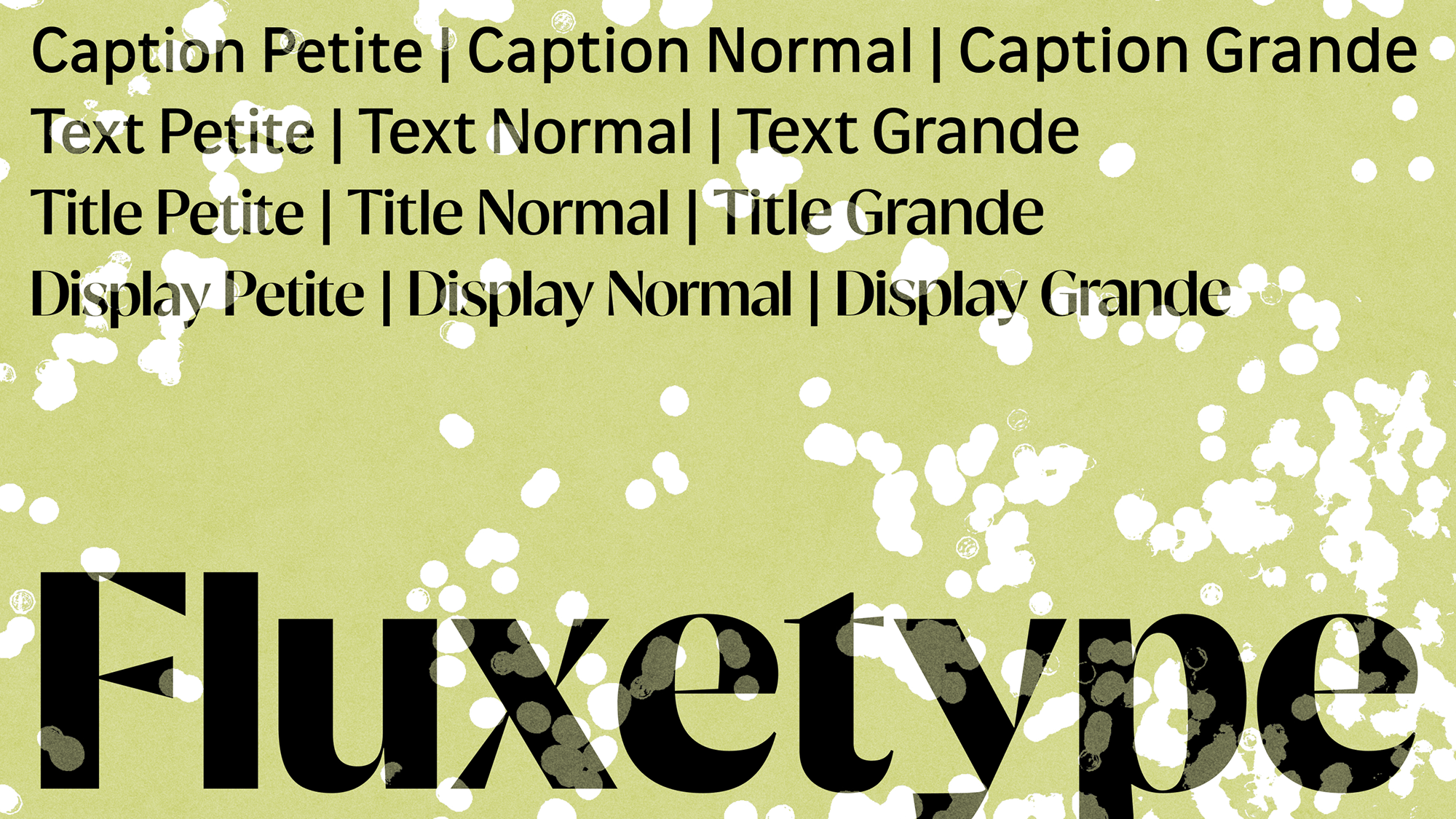
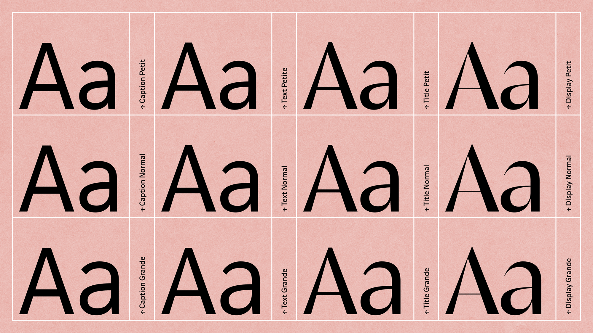
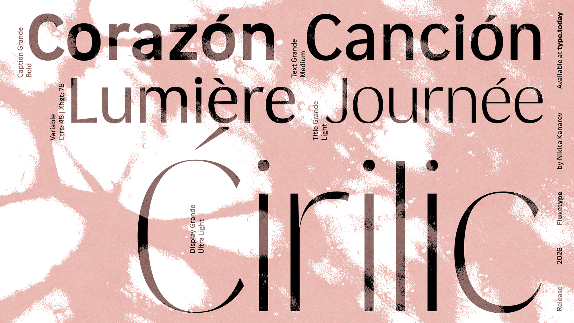
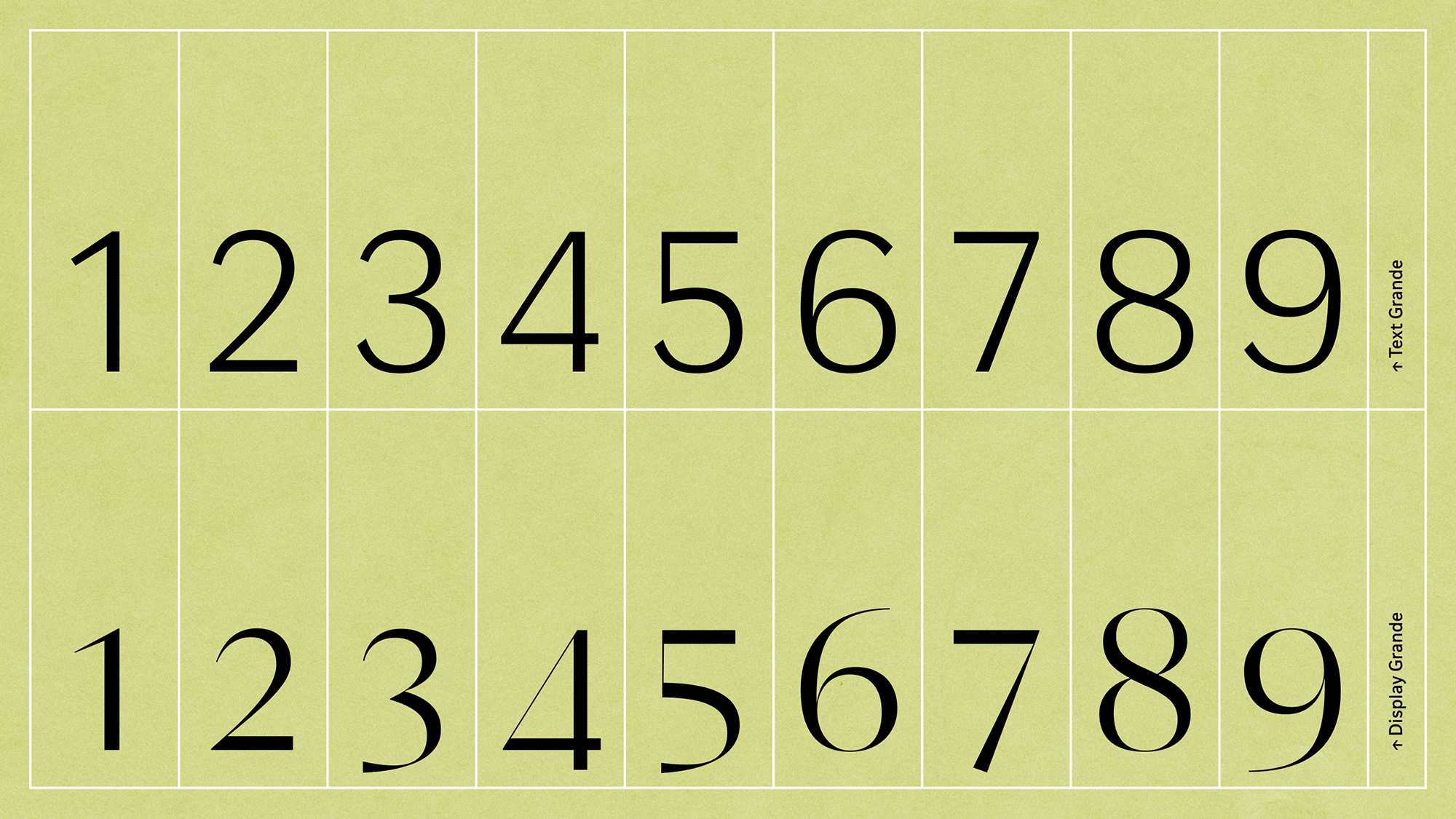
The font features three variable axes. These bring in a range of weights (from Thin to Black), four optical sizes (Caption, Text, Title, and Display), and three x-height options
Fluxetype is a system capable of addressing most of a project’s typographic needs. For instance, the title of an exhibition might be set in the high-contrast Display, while the Caption family could be used for its labelling. Likewise, a startup’s logo could be set in Title Petite, while Text Grande can handle its technical documentation.
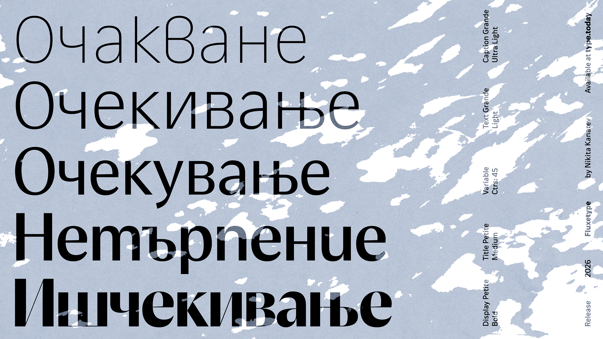
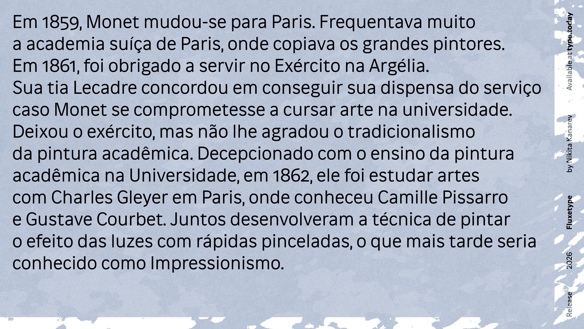
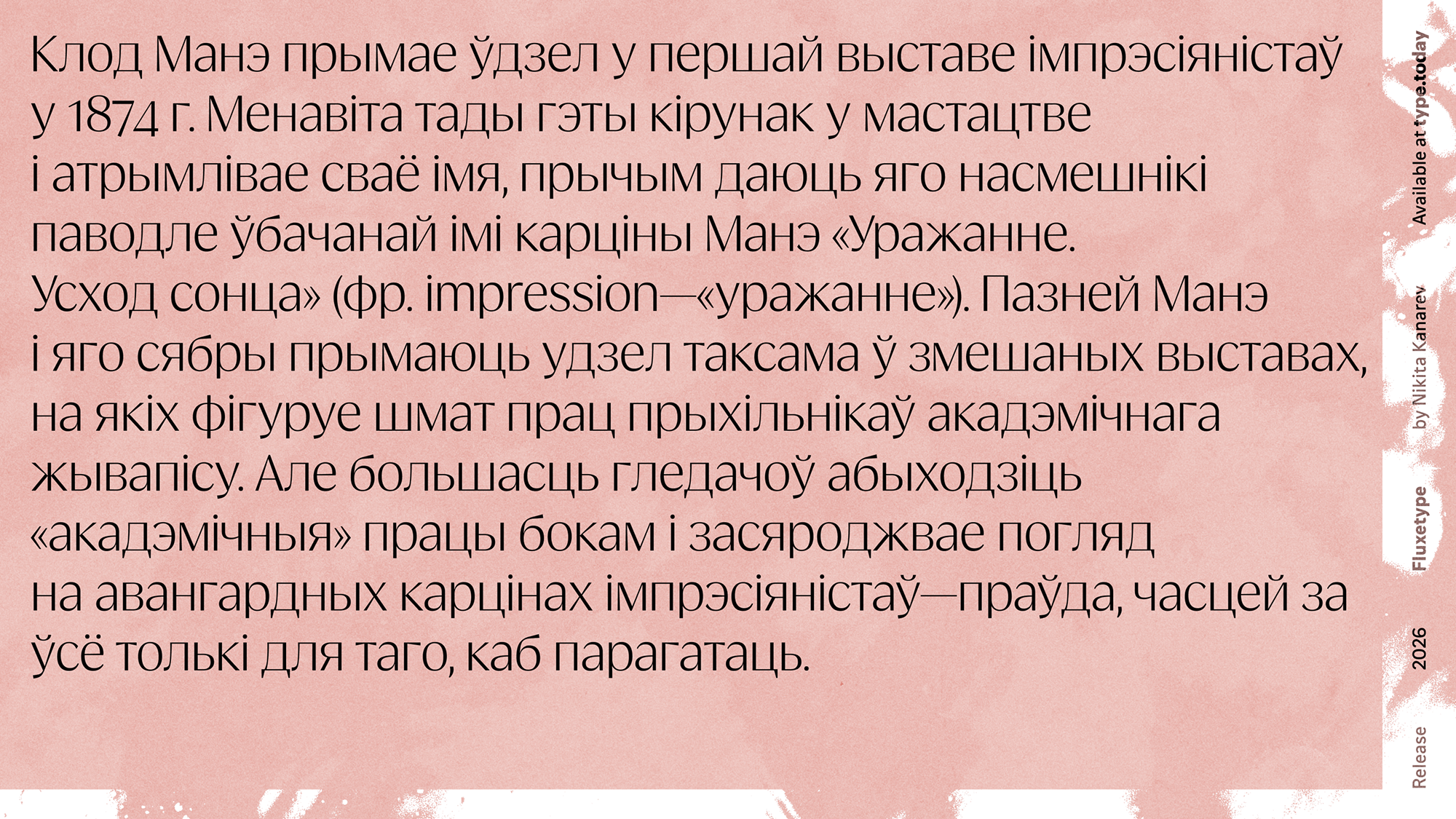
Fluxetype supports extended Cyrillic and
Get Fluxetype
from $50 at type.today