
Typefaces this May, the TypeCache selection
Every day Taro Yumiba, Shohei Itoh, and Akira Yoshino inform the subscribers of TypeCache.com on new type releases. Check the most important novelties of the past month — according to them.
 Arp, published by W Type Foundry. Pick by Taro Yumiba
 Cleft Twinline, Cleft Text, published by Jamie Chang . Pick by Taro Yumiba
 LL Grey Mono, published by Lineto. Pick by Akira Yoshino
 Irregardless, published by OHno Type. Pick by Taro Yumiba
 NaN Jaune, published by NaN. Pick by Akira Yoshino
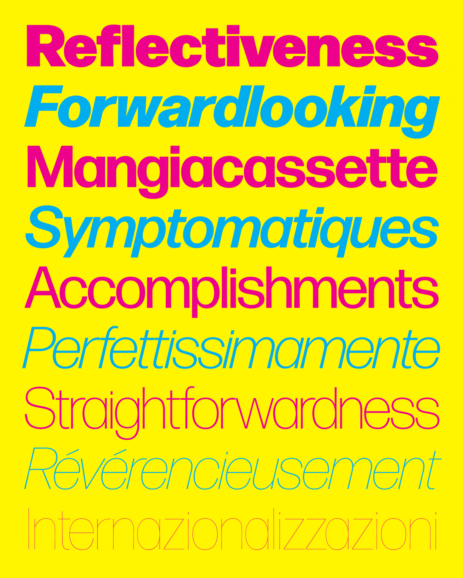
 Mantar, published by Occupant Fonts. Pick by Taro Yumiba
 Marfa, Marfa Mono, published by Dinamo. Pick by Akira Yoshino
 Mestiza, published by Antonio Lechuga Type. Pick by Shohei Itoh
 Numera, published by Monokrom. Pick by Shohei Itoh
 Plethora, published by Sudtipos. Pick by Akira Yoshino

OHno Radio, and so on and so forth
The Clubhouse craze has faded down, to say the least, — although the podcast mania shows no signs of stopping. Recently the podcast was launched by James Edmondson (OHno Type) — in the first episode, he first tells about a nearly-finished book based on the OHno Type School series and then invites his colleagues and shares what he had learnt during six years of running a foundry consisting of just one employee.
- Sergey Rasskazov
- type designer, teacher, blogger
That’s true, we are currently witnessing a boom of audio content about letters. Two more new podcasts arrived literally during last weeks only:
1. Letter Now! An intimate podcast on lettering by Martina Flor, with questions from the audience (submit yours right here). Available on any platform, including as a video version on YouTube.
2. Typochondriac, by Francis Chouquet, a letterer from Basel. Tune in on anchor.fm.
And we cannot fail to mention TypeRadio — an almost 20-years old podcast, 550 (!) issued episodes as of today. It has featured Sagmeister and Carson, Vignelli and Spiekermann — but also Bagdasaryan, Korolkova, Ruderman, and Kulachek. I have been listening to it for a year now, not yet finished.


100 most important books in typography (mostly Western)
grolierclub.omeka.net/exhibits/show/100-books-typography/
The Grolier Club is an organisation of bibliophiles founded in New York in 1884. In 1902 the Club mounted an exhibition called One Hundred Books Famous in English Literature and it was a great success, and since then the Groliers have made up six more lists of 100 important books: American literature, science, medicine, twentieth-century fine printing and children’s literature, and now typography. The initiative results in an annotated list of documents, specimen, sources and research from the age of Gutenberg — incunabulae, evolution of serif types, display type boom of the 19th century, mass printing technologies, Tschichold’s New Typography, phototypesetting, digital typefaces and plenty of other interesting stuff. If you are interested in type, you definitely should get to know this hundred — and even look into and study some of it.

Five styles, one stroke width
Elias Hanzer is an expert on variable fonts — for example, he designed a super-family named Arizona (released by Dinamo) and an experimental generative Phase. However, in his most recent project, Edition, what Elias addresses is not variability, but a non-interpolated relationship: five styles of Edition family are very different, brought together only through the absence of contrast. Contextual reproduces serif forms; Geometrical is a geometric sans; Numerical is a typeface aimed for CRT displays; Scriptural is a script — while Asymmetrical is based on a clumsy, but cute display typeface of the 19th century. All Edition’s styles are also presented as a purely monolineal version with no compensation whatsoever — a perfect fit for plotter, or experimenting with borders.

Ultra-fat, ultra-efficient
An online conference Ultrafett (German for Ultra-fat) deserves attention not only because of its speakers — such as Paula Scher or Mitch Paone, but also because of their website, where all the text is set in a single but variable font (ABC Arizona). Efficient yet diverse, and with a significant salutation to professional type designers — that are their key audience. The conference will be held in June, further detail will be provided to those who leave their email.

Design Regression, a platform for type reflections and research
Rosetta studio now issues Design Regression — which is a small and nearly scientific magazine on type and typography. What they have already: a review of an academic paper about complexity of glyphs in various scripts, a review of an academic paper on the perception of the letter g, first episode of the series about the specifics of multi-script typesetting, and a report on research of differences in perception of type by designers and non-designers.

Ken Garland (1929–2021)
theguardian.com/artanddesign/2021/jun/01/ken-garland-obituary/
kengarland.co.uk
Ken Garland, who died on 20th May, was a graphic design icon, fan of simplicity and elegance both in typography and photography, socialist, nuclear disarmament campaigner, a brilliant speaker and the author of the First Things First manifesto — where he called on designers not to turn themselves into mindless, unreflecting servants of marketing. You can learn about Ken Garland’s legacy on his nicely structured personal website as well as in the monograph by Adrian Shaughnessy which is available to download for free as a PDF on the site of Unit Editions’ publishers.
Italian non-Helvetica, now even better
djr.com/notes/forma-new-weights
DJR Forma is a revival of a neo-grotesque of the same name designed by Aldo Novarese in the 1960s — which is the period of Helvetica being wildly popular. That is an Italian perspective on type modernism: warmer and elegant, with smooth stroke terminals, measly sidebearings and the distinctive, one-piece а. DJR Forma already had as many as five optical sizes, now it is also presented in super-heavy and super-light styles, plus a variable option. More information on Forma, Novarese, and Nebiolo foundry is available here on TypeNetwork.

Typomania 2021
In May, Moscow hosted a Typomania exhibition — and the entire world participated in its online conference. Type and graphic designers from across the globe were delivering Problem of Choice -themed talks and showing their best work (all of those brought together in a big and really beautiful catalogue). This year Typomania used our Signal Mono for text setting: a severe monowidth grotesk played truly well, paired with Literaturnaya, the Soviet knock-off of Berthold Lateinisch.

Typographics 2021, the entire June
Typographics 2021 fest already began and will go on during the whole month. The online conference programme embraces ten days and ten curators from various world regions. For instance, 15 June will see a session on Cyrillic — involving Russian speakers and curated by Ilya Ruderman. An online ticket to the conference is available for free, but it’s better to purchase a paid ticket if you can. Besides, Typographics 2021 will host workshops and 72-hours long TypeLab streaming with an extensive, uninterrupted, unexpected programme. Moire animation in the website’s headlines deserves a special mention — it was designed using Gridlite font by Rosetta foundry.

Post-anti-meta-Helvetica
A Swiss studio named Johnson/Kingston has designed a website for the team of artistic curators PTTH://. Wild, but really balanced custom typeface turns a regular piece of web-Brutalism into a living, detailed canvas — you will definitely want to explore the text, even if you don’t read German. Thanks to Sergey Rasskazov for the link!

Our new release: Lenora
Lenora, designed by Vojtěch Říha, is a contrast serif with references to Didot and Bodoni, but bigger liberties and borrowings from other type styles. A great fit if you need the elegance of a Didone without its intrinsic monotony.

A 6-month strike that had won (and left behind a really lovely lettering)
cartoonbrew.com/artist-rights/day-75-years-ago-disney-animation-changed-forever-140103.html/
28 May celebrated the 80th anniversary of the beginning of the strike of Disney animation studio’s employees — more than a half of them stopped working in protest against arbitrary layoffs, long hours, increasingly lower wages, and ‘arcane’ bonus distribution systems. The protest went on until Disney recognised the union and agreed to consider their demands — which happened only in autumn. Thanks to this event, today Hollywood’s animators can boast higher salaries and social security than their colleagues in the rest of the US. What else — the 1941’s protesters used posters with extremely beautiful lettering. See for yourself.
Psychedelic Scotch
occupantfonts.com/articles/design/scotchadelics/
Mantar is a Scotch Roman typeface with an uncharacteristically free personality, inspired by a Photo-Lettering Inc. catalogue. In light styles, the letters are sharp and soft at the same time because of their blurred forms and non-straight lines — in heavier weights the design also boasts irregular bowl shapes and high contrast, which makes the set text appear a bit ridiculous, but very festive.
In May our Insta has been run by Denis Bashev
Denis, thank you for questions, games, and thinking out loud! In June, type.today’s account will belong to the members of Scholoch design community.