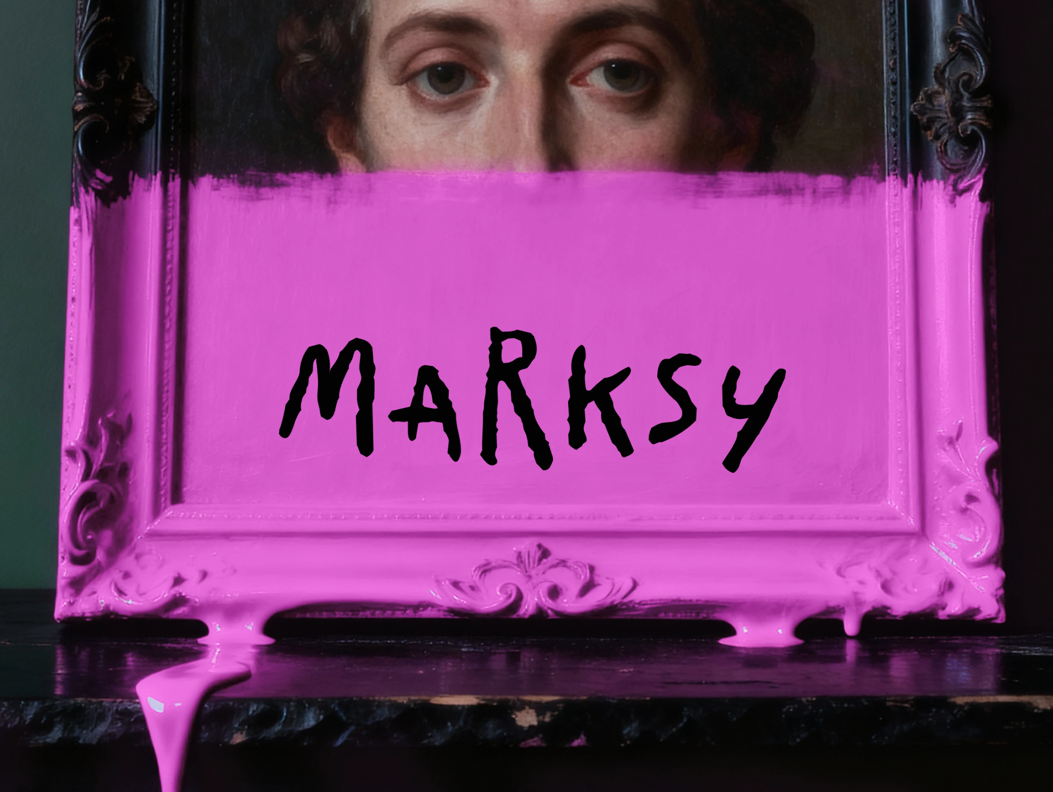
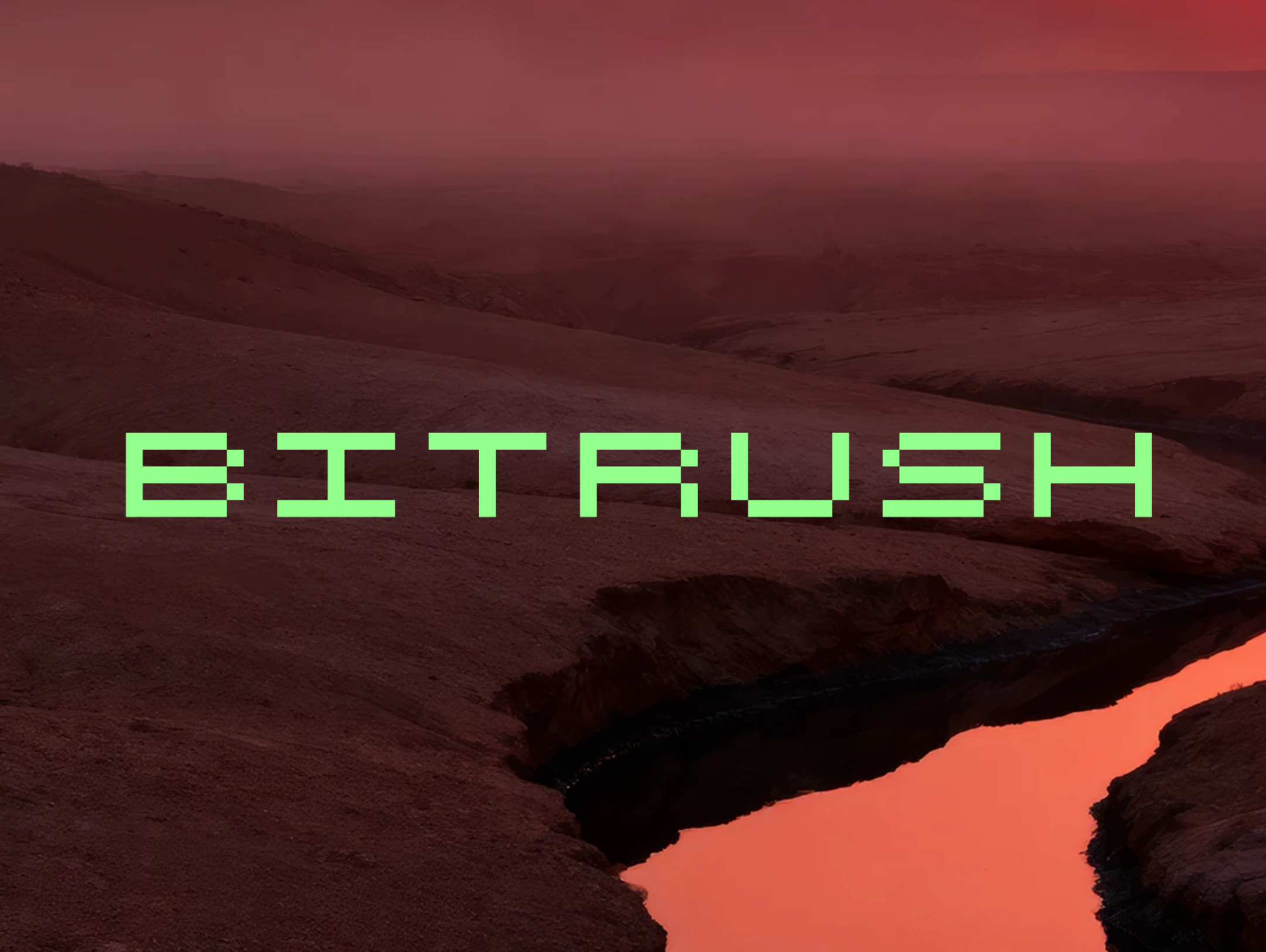
Patio by Atipo
The Spanish Atipo Foundry now has a new storefront, Patio. It will feature experimental display typefaces designed by the team. As of now, the collection includes six fonts: Rubica, an interpretation of the Roman square capitals; the radically rounded Xanky; Sliza, inspired by Saul Bass’ posters; Marksy, the script font; Jift, the block typeface; and the pixelated Bitrush.
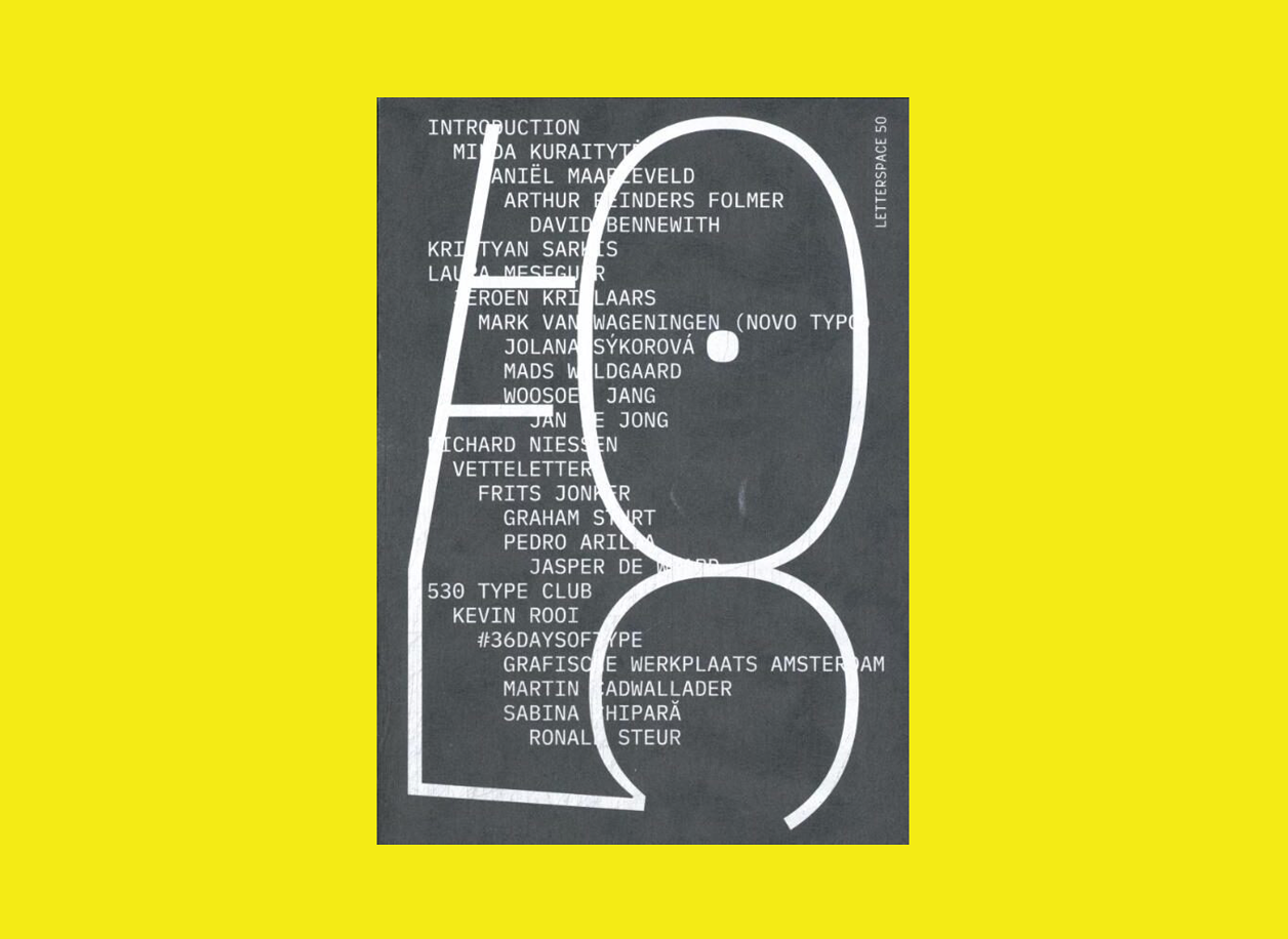
Letterspace 50
Since 2018, the Letterspace Amsterdam platform has been hosting free lectures on type and typography in the modern world. The platform has now brought together the ideas of the first 50 speakers into
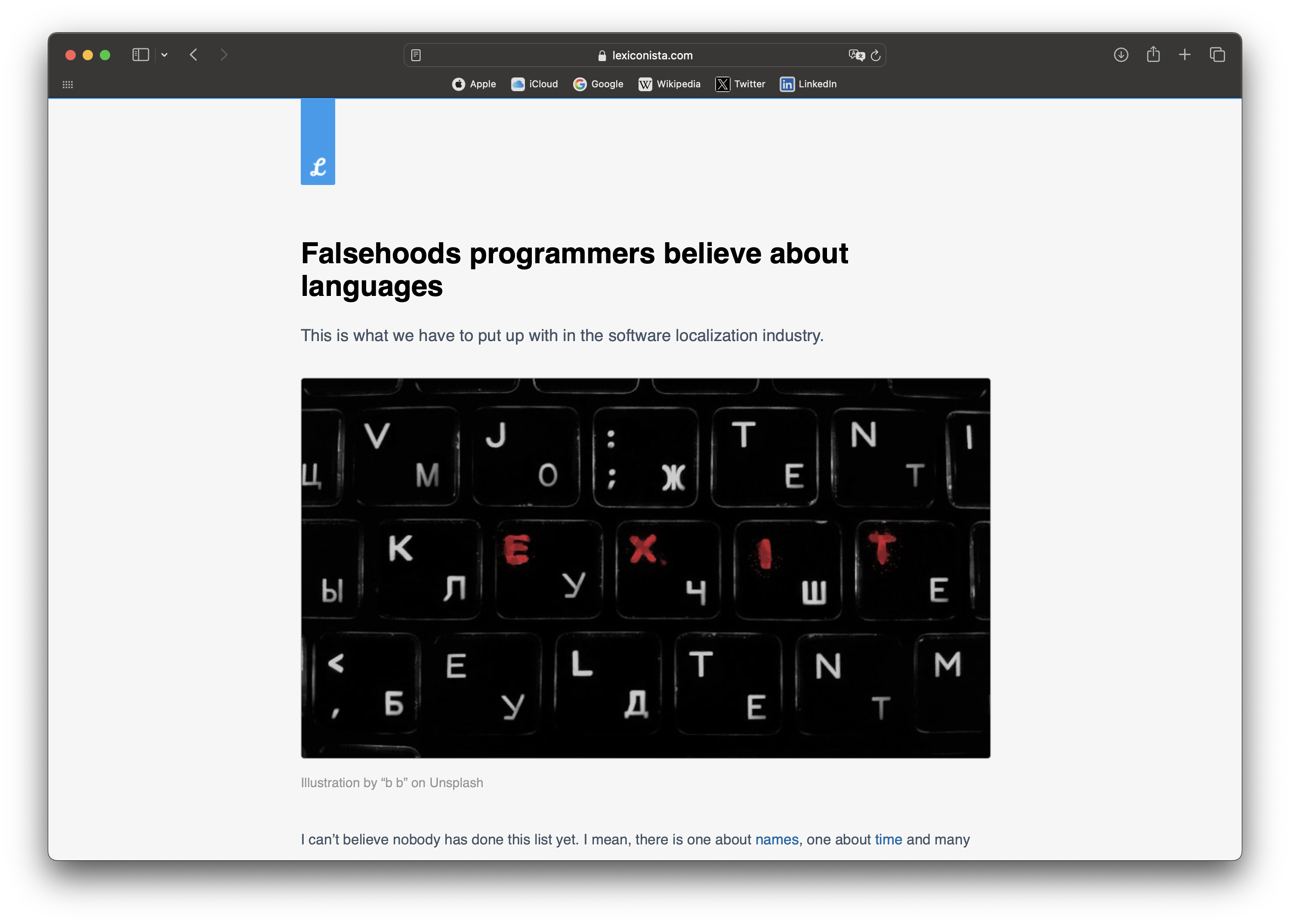
Bad advice from developers
lexiconista.com/falsehoods-about-languages
Michal Měchura, a programmer who works in software localisation and language technology, has drawn up a list of prejudices that, for some reason, many developers and product designers believe, and explained why these misconceptions shouldn’t be held. For instance, Michal suggests stopping to assume that each language is written in exactly one alphabet and that the lowercase/uppercase distinction exists in all languages.
In 2024, our journal published a piece for those who need to handle multiscript projects.
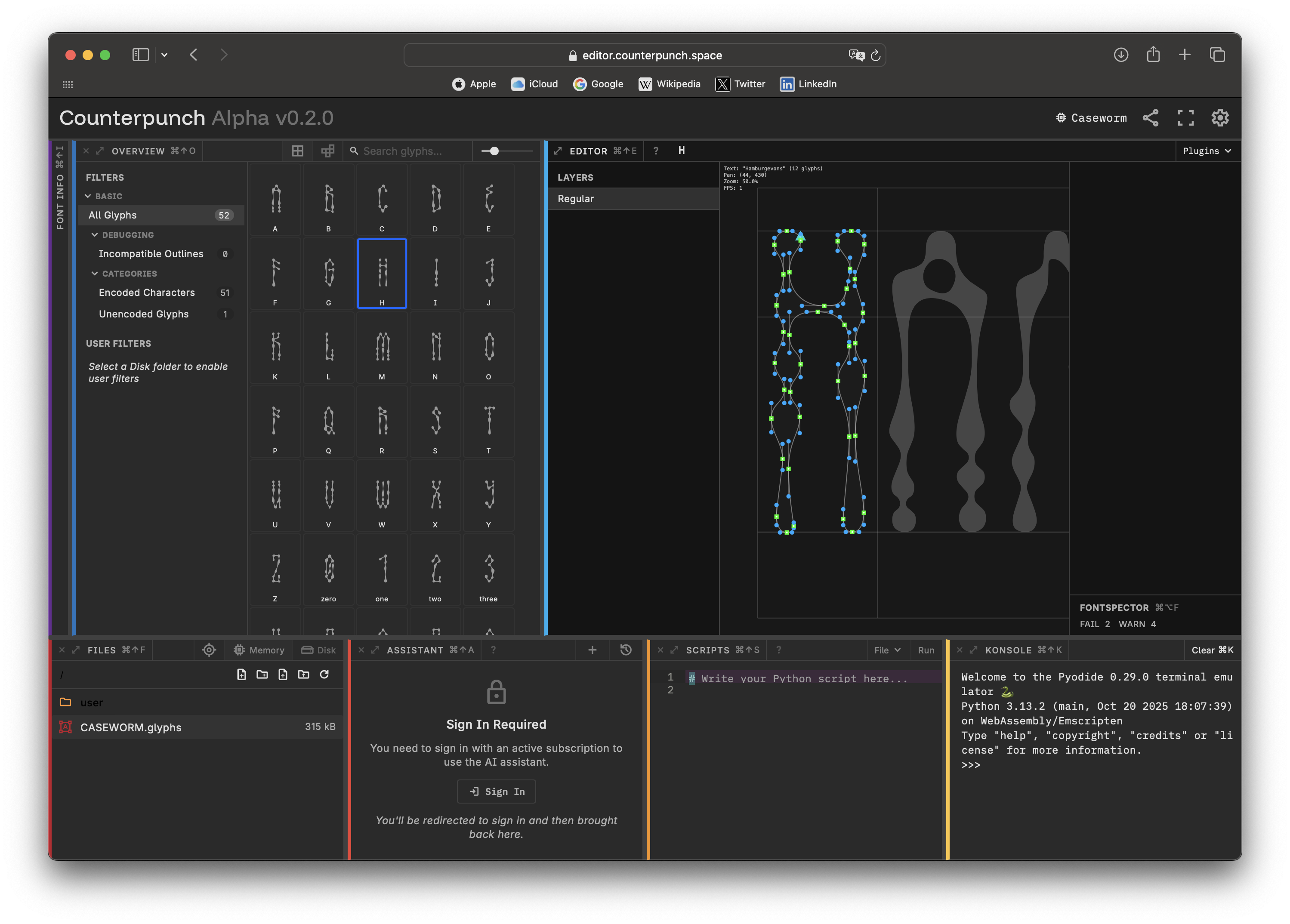
Counterpunch
A new open-source font editor, Counterpunch, has been released. Counterpunch runs in your browser and is available for free without registration. There is also an advanced version of the editor, which costs 46.37 per year and includes a built-in AI assistant.
Among other things, Counterpunch lets you edit components directly within a glyph, rather than in a separate lab.
Monotype, the Great and Terrible
fauxicing.com/reads/monotype_sellfonts
In 2015, Singapore used the Gotham typeface in the logo for the 50th anniversary of its independence, and
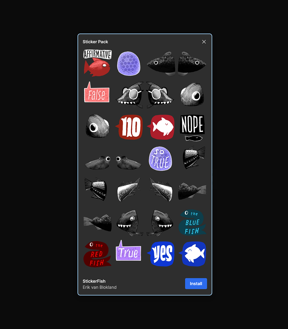
StickerFish
The typographic illustrations featuring talking fish by type designer Erik van Blokland are now available as a sticker pack for Signal.
Last year, we spoke to Erik about how type designers might help each other and whether it’s time to ditch Bézier curves.
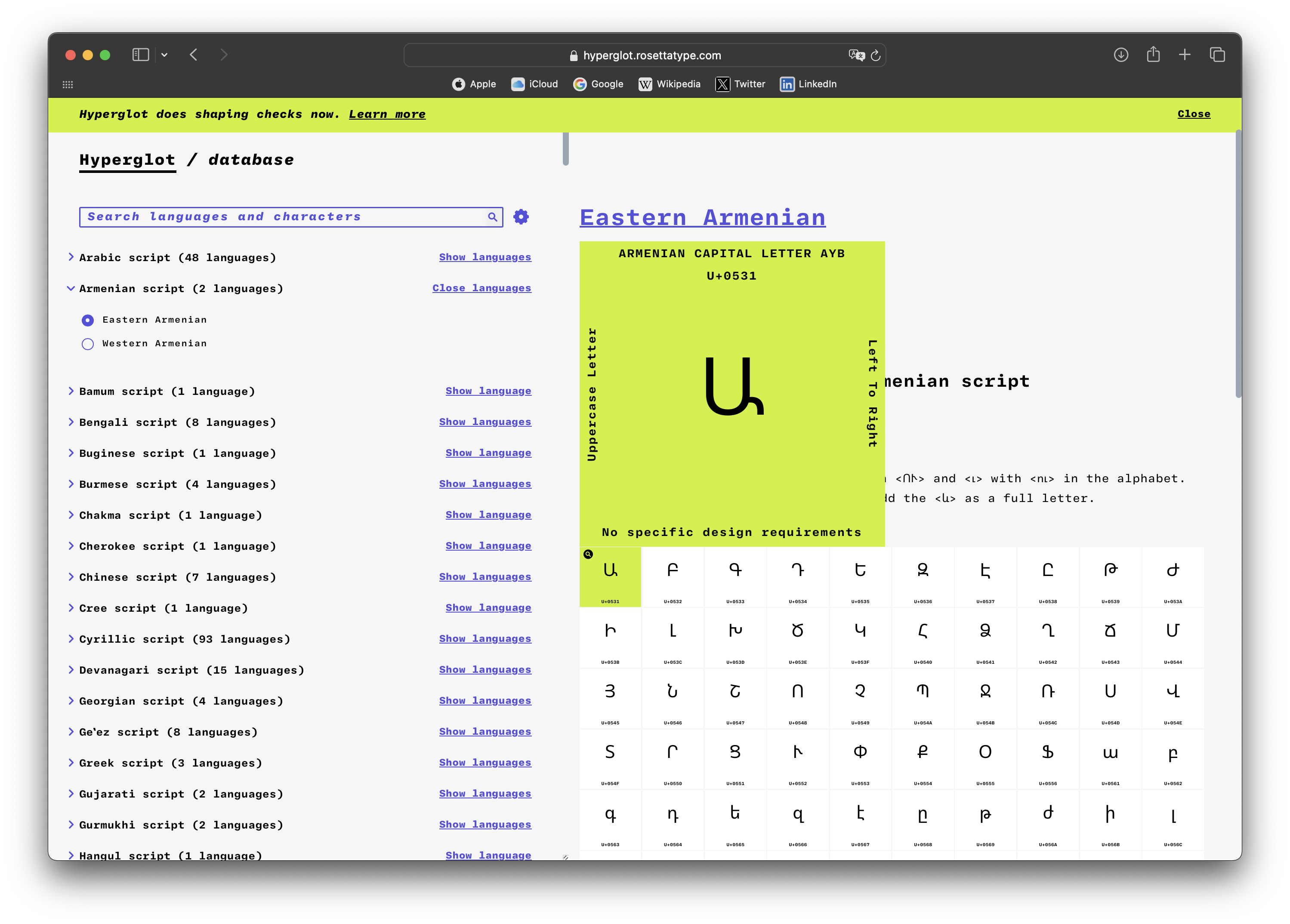
Hyperglot Update
Hyperglot, a project by Rosetta Type, has been reorganised. The single large product has now been split into two separate apps: Checker, a tool that helps type designers figure out how many languages a typeface supports, and Database, which contains glyphs from 783 languages. You can now also support the project financially through a couple of clicks on its website, while navigation through the database has become more user-friendly and detailed.
This is not the only research project run by David Březina, the founder of Rosetta: in February, he published an article on a method that can, for example, be used to find out how stylistically consistent Latin and Cyrillic glyphs in a typeface are.
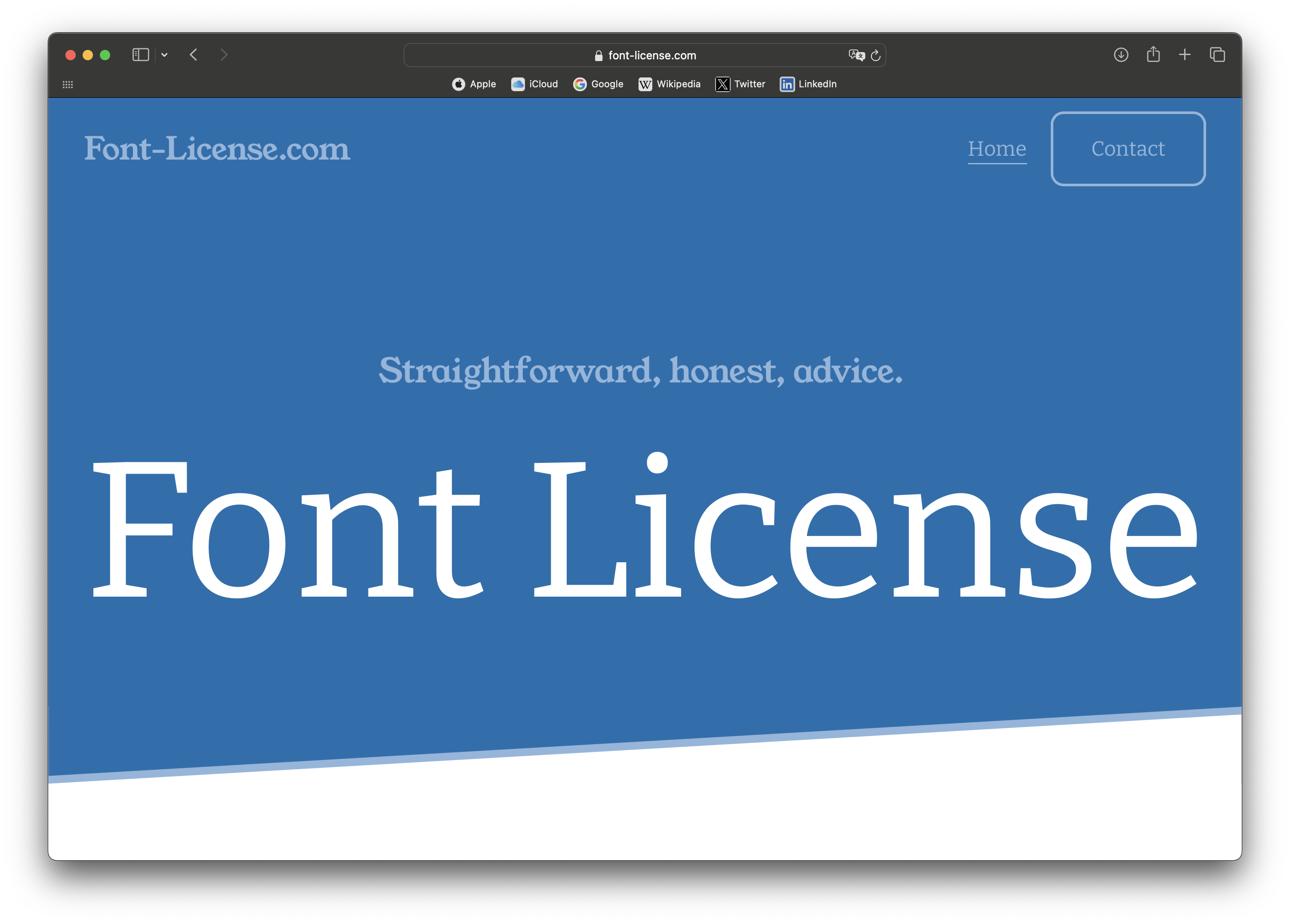
fontlicense.com
Scott Briggs, who has served as Head of Operations of The Northern Block for many years, has launched his own project. His company, Font License, commits to helping type designers and developers shape licensing agreements and navigate intellectual property issues, while also helping designers and agencies figure out which kind of license best fits their needs.
St.Bride Library YouTube update
youtube.com/@stbridelibrary8110/videos
St Bride Library posted recordings of lectures it hosted in 2025. You can now check its YouTube channel to find out how to create drama within a theatre poster or a book cover, or how the kids of Liverpool designed a font for the kids of Liverpool.
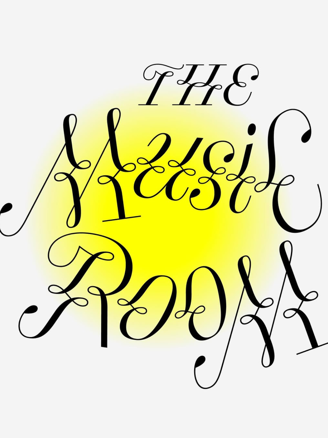
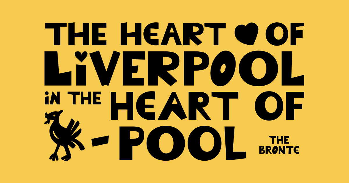 The typeface for the children’s center The Bronte was drawn by its students
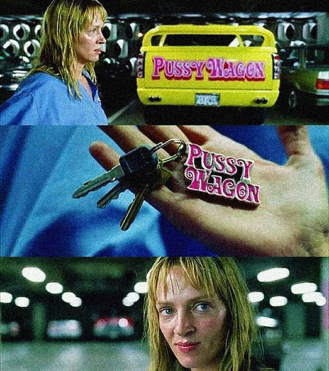
The Pussy Wagon story
fontsinuse.com/uses/26309/pussy-wagon
Fonts In Use editor-in-chief Florian Hardwig wrote an article about the lettering on a pickup truck featured in Quentin Tarantino’s film Kill Bill. Hardwig reveals that the lettering on a vehicle that serves Uma Thurman to take revenge on her enemies is a reference to the typography used in sexist pulp fiction from the 1960s, mentioning that those pink letters lived a long life, appearing in both Lady Gaga’s music video and Tarantino’s Death Proof.
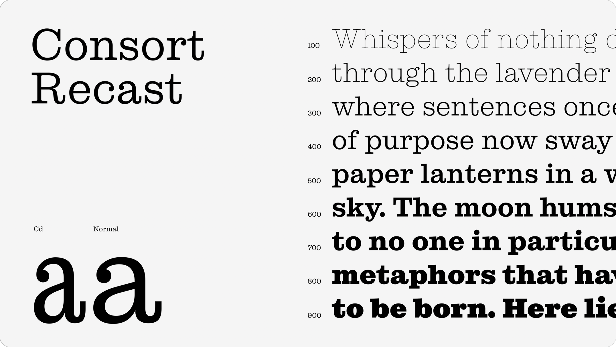
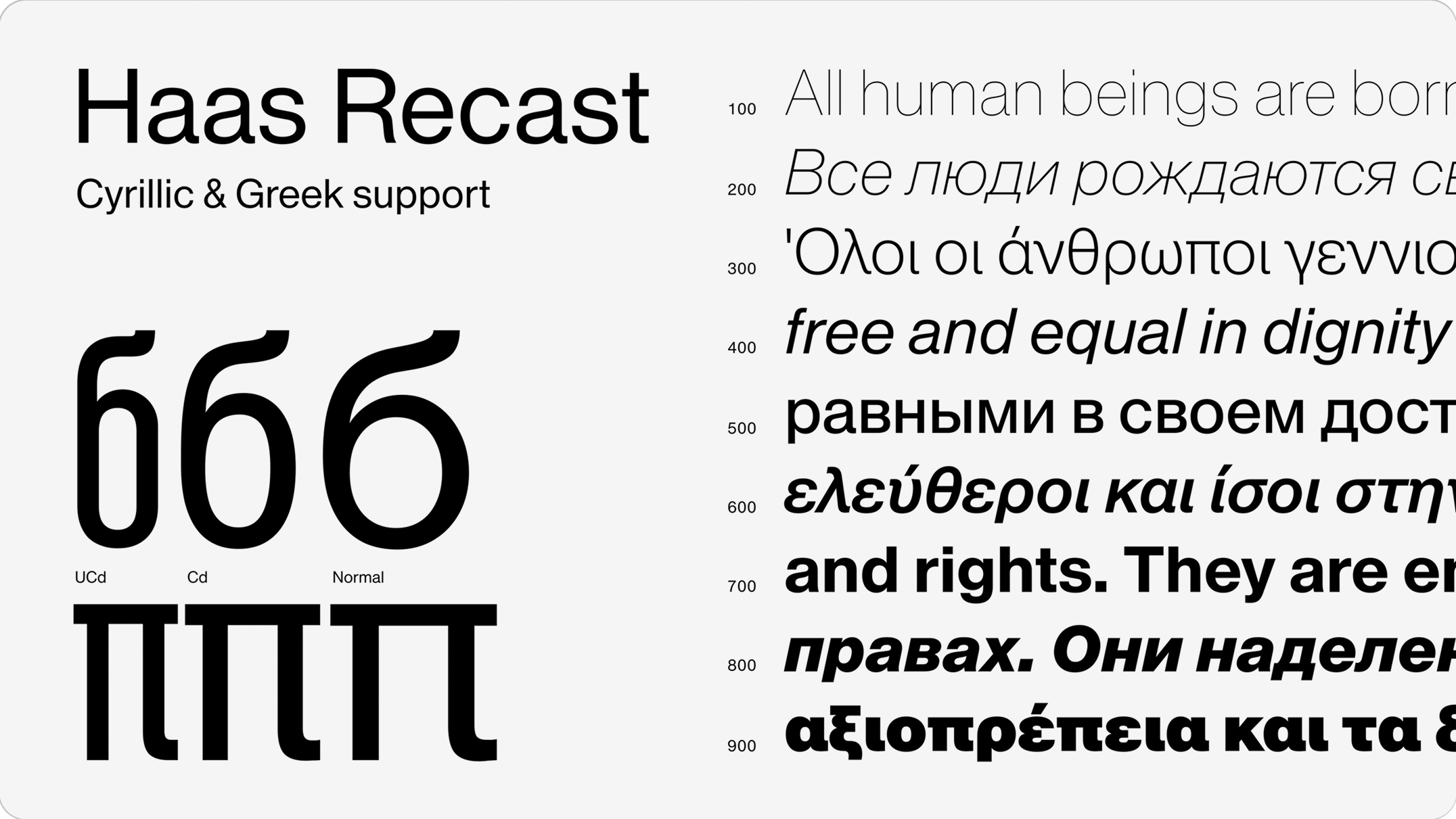
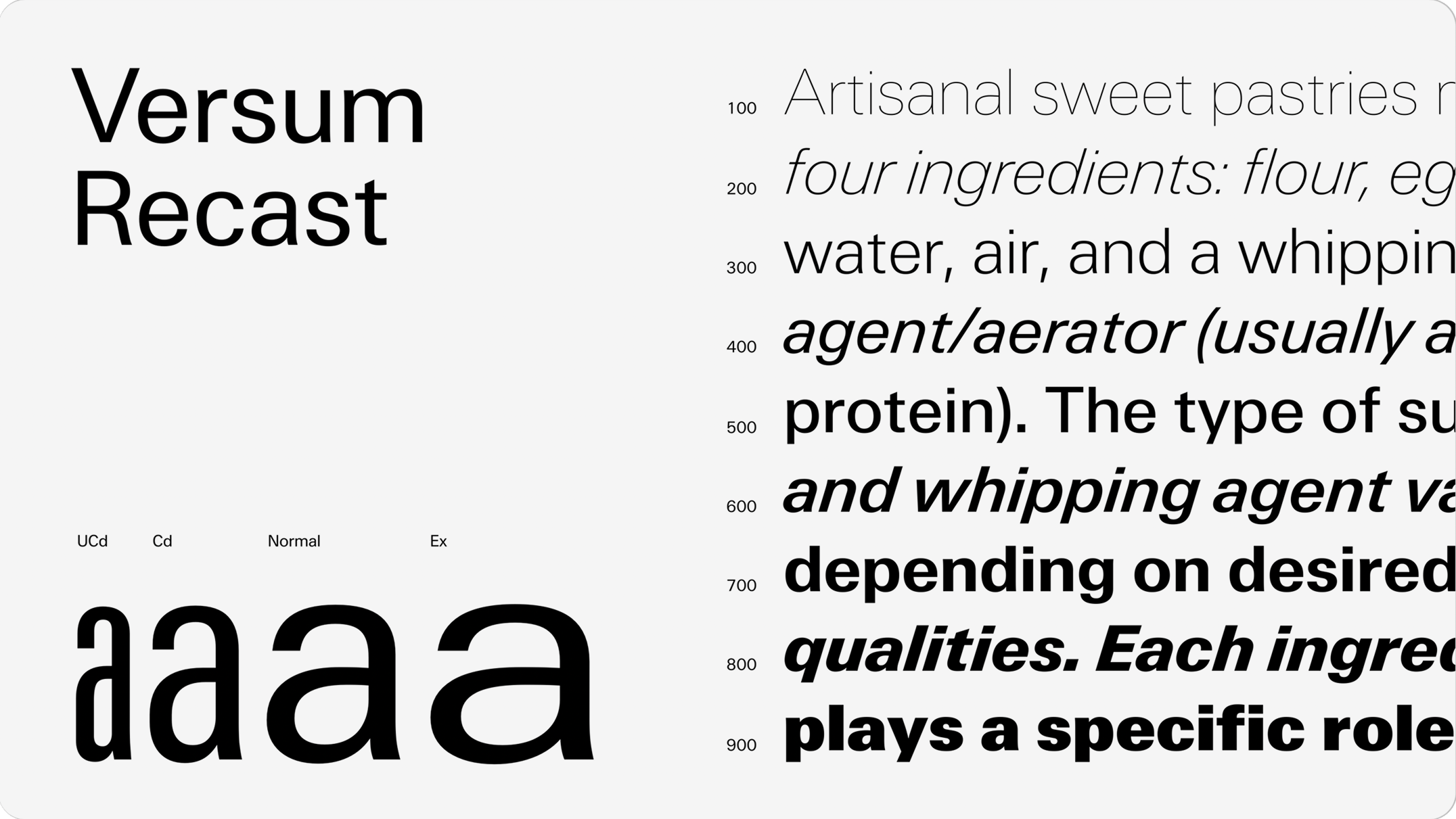
‘I recast; you revive; he is being sued for infringement of intellectual property’
daltonmaag.com/resources/blog/2026-03-23-recasting-the-past
‘I recast; you revive; he is being sued for infringement of intellectual property’ Dalton Maag announced a new series, Recast. It will feature revivals of well-known typefaces, many of which already have digital versions. In a piece presenting the series, the foundry’s creative director, Lucas Paltram, shares that the Recast typefaces are drawn based on the earliest specimens and sketches, rather than original metal type or smoke proofs (prints made from hot metal without any ink involved).
The announcement sparked several debates. at a time. For instance, people argued whether it even makes sense to create such revivals of Frutiger’s
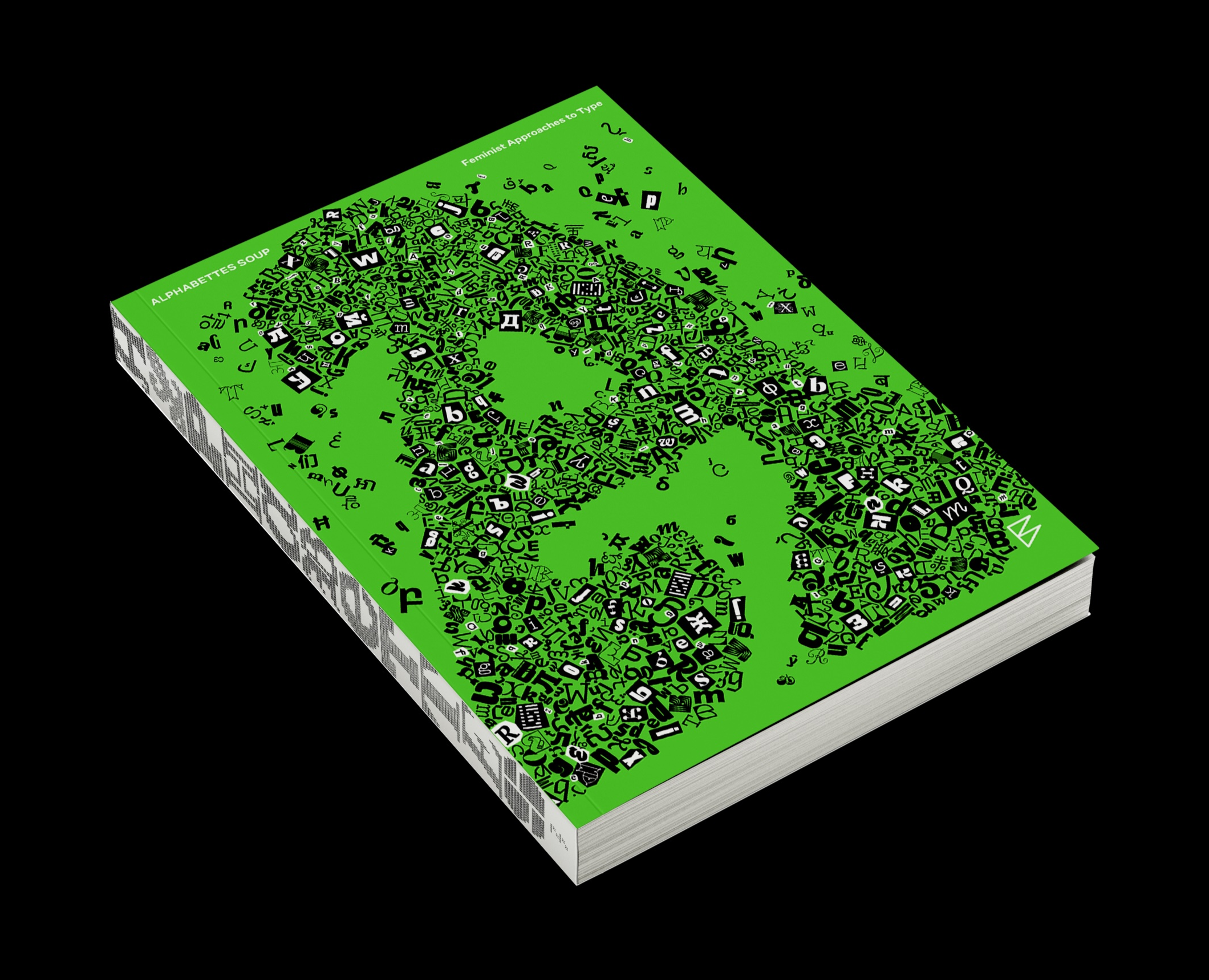
Alphabettes Soup
bikini-books.com/products/alphabettes-soup
Alphabettes is a community helping women and non-binary people figure out and navigate the typography issues. In 2025, the Alphabettes blog turned 10 years, and the team decided to mark the anniversary by releasing a book. Alphabettes Soup: Feminist Approaches to Type includes 55 articles, interviews, and essays, as well as specimens of 100 typefaces designed by friends of the platform, women and non-binary individuals.
The book launch is planned for June, yet it is already available for order.
Our releases
This month, our storefront has been enriched with three new typefaces: Gregory Text, the last member of the Gregory collection; a friendly version of brutal Nekst, and a vigorous sans serif called Nickel Gothic.
 Gregory Text by TypeMates
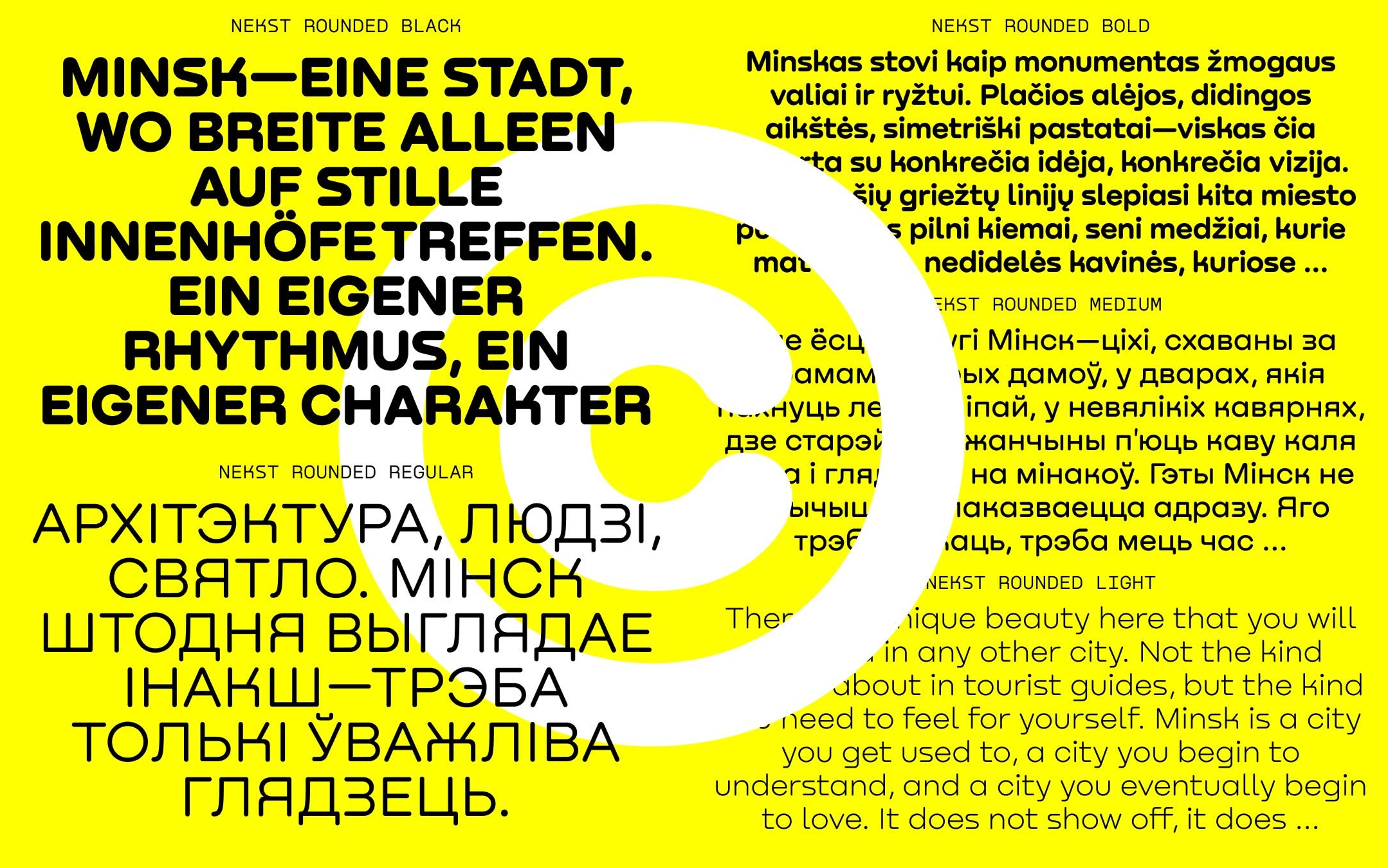 Nekst Rounded by Denis Serebryakov
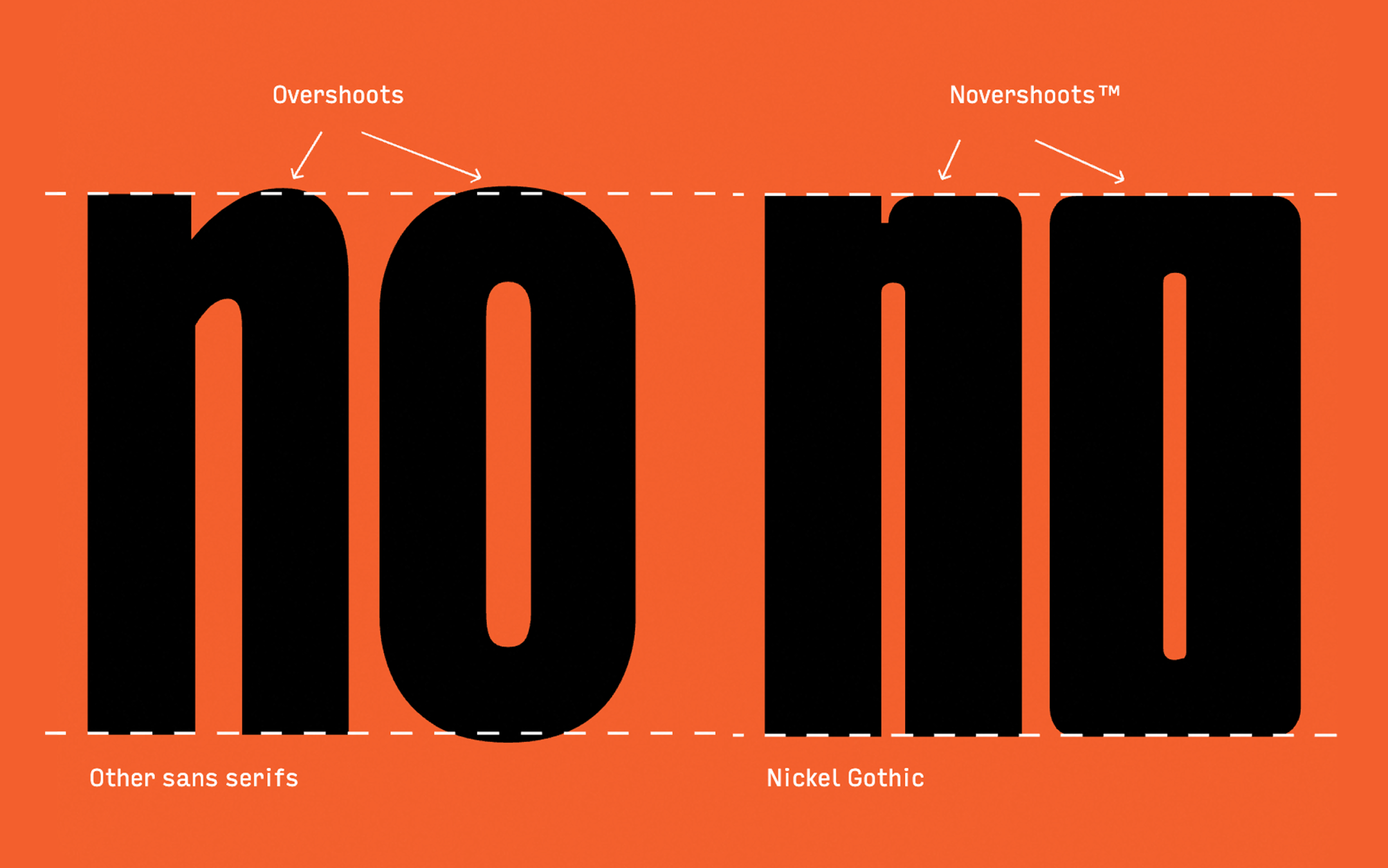 Nickel Gothic by David Jonathan Ross
Released by our authors and partners
In March, our partners Production Type released a narrow serif, Super Castel, while Commercial Type presented Goldscheider, loosely based on the Document Journal logo. Future Fonts published new typefaces designed by Daria Cohen and CSTM Fonts.
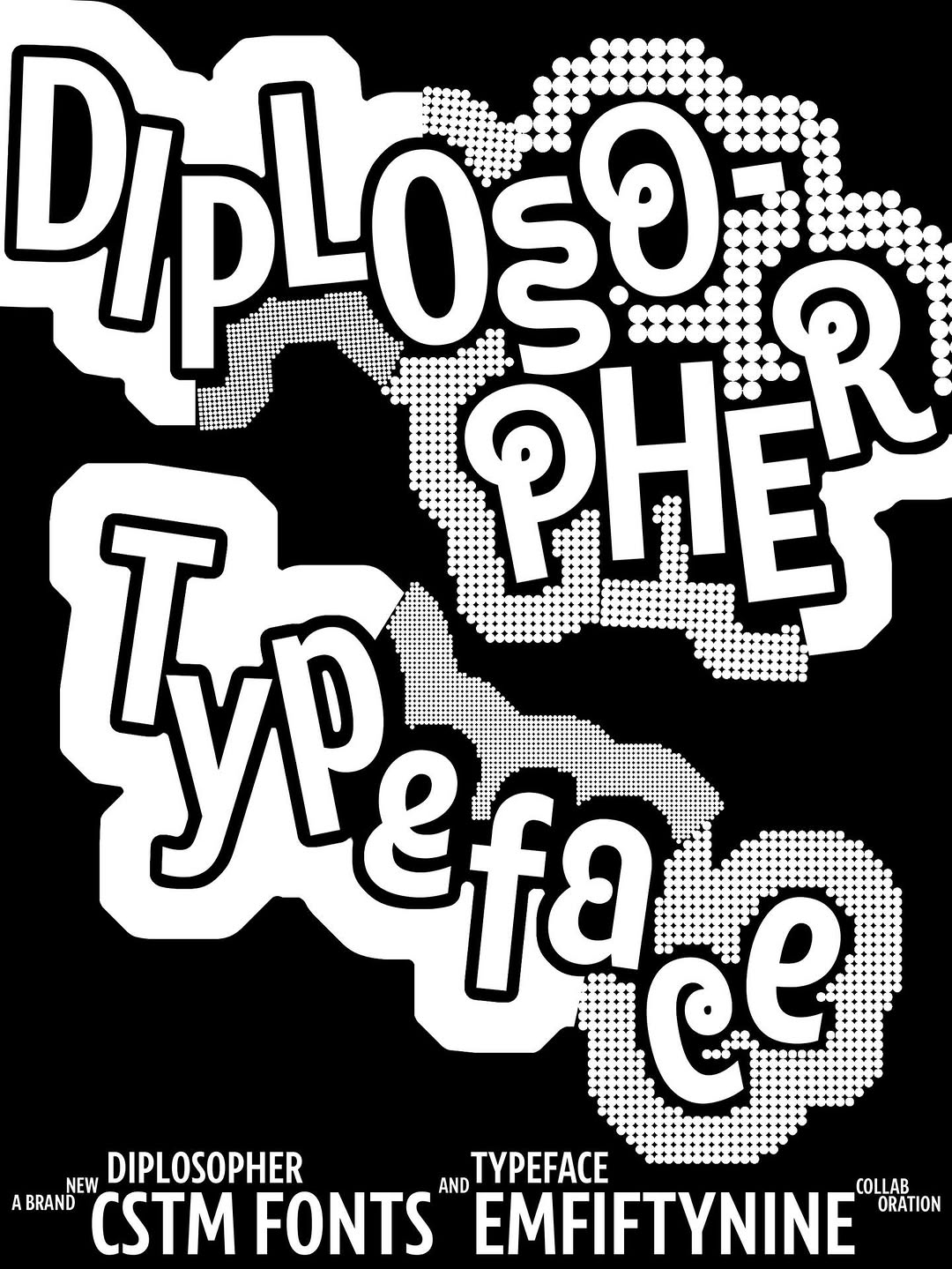 Diplosopher by CSTM Fonts and M59
 Superfluous Daria Cohen
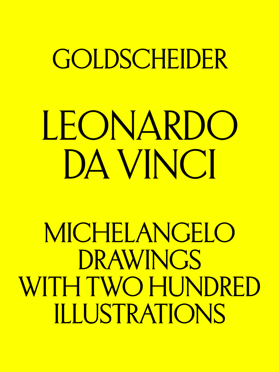 Goldscheider by Commercial Type
 Super Castel by Production Type