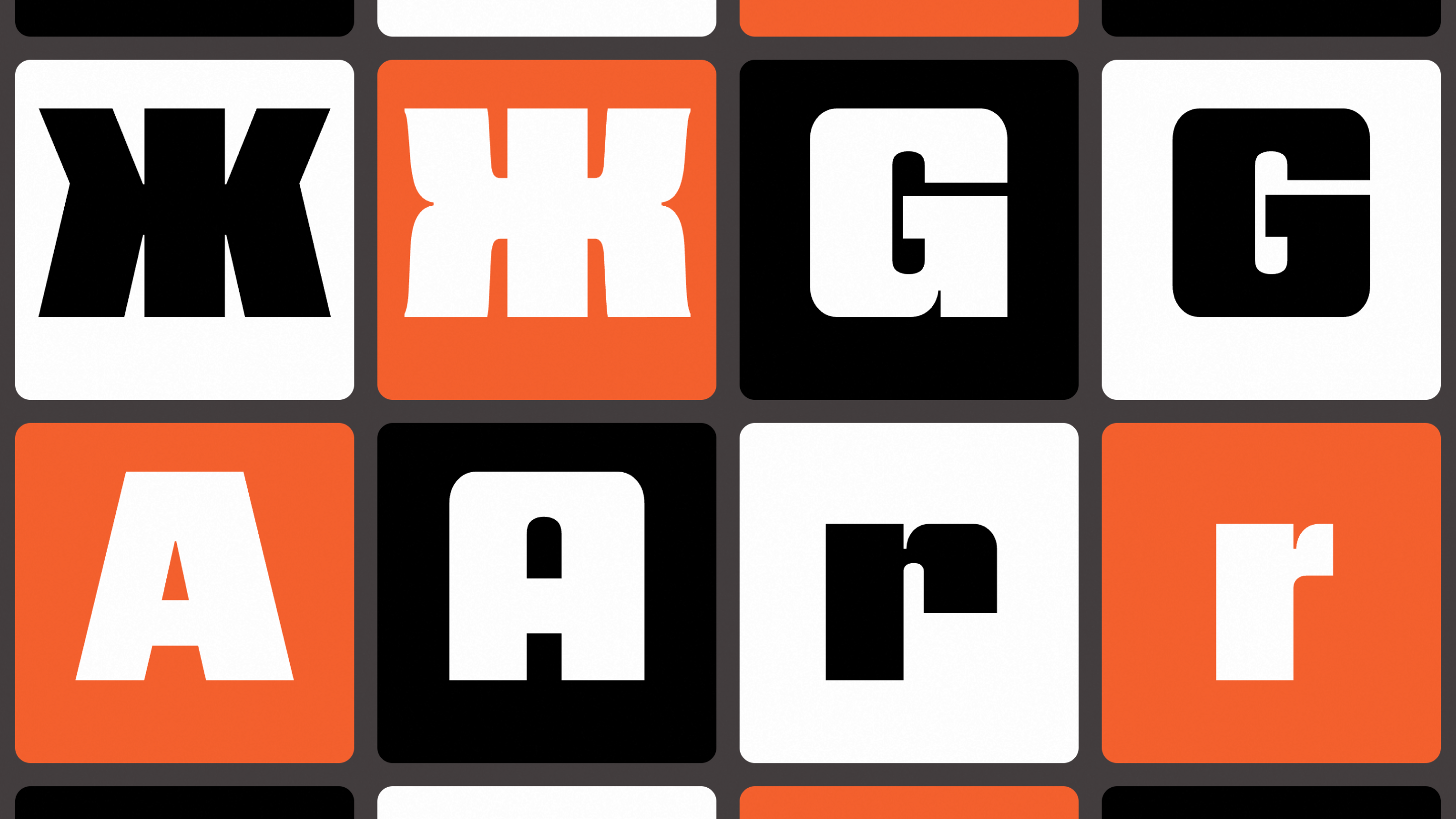
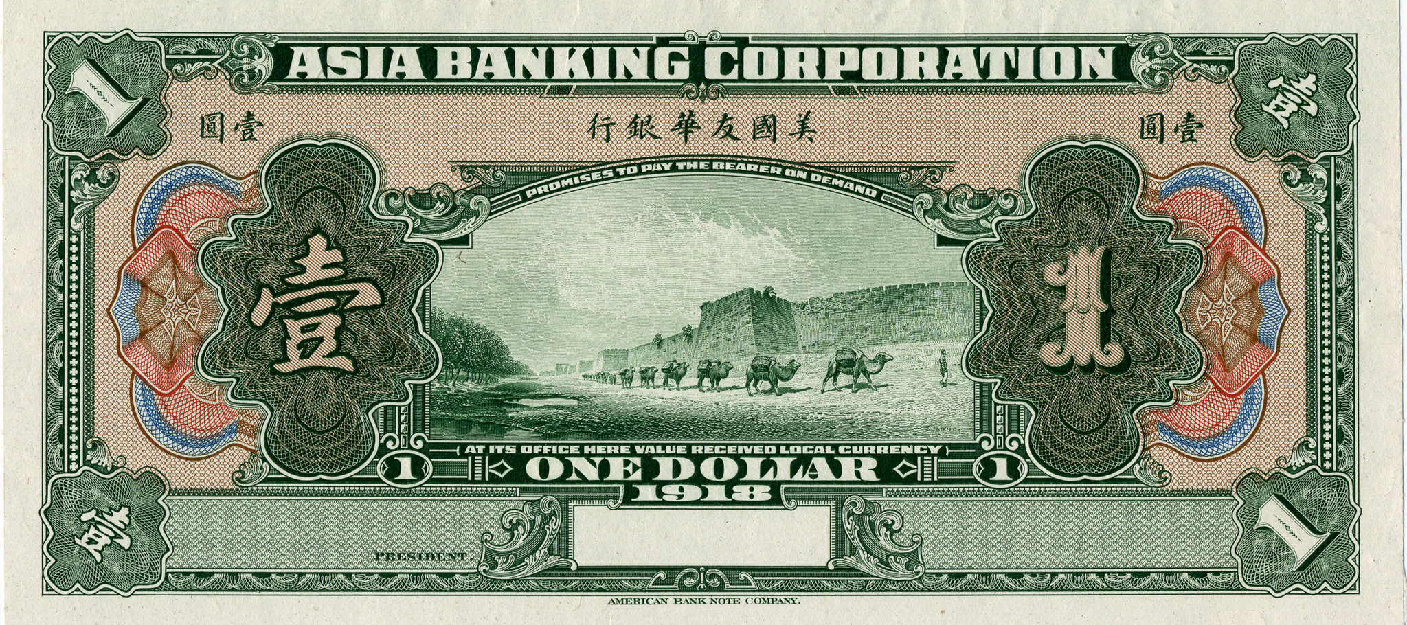
Nickel Gothic was based on lettering found on a 1918 Chinese banknote. But, despite being based on lettering from over a century ago, it carries overtones of the midcentury sans serifs like Microgramma or Eurostile, as well as squared gothics from the 1970s like Neographik and Serpentine.
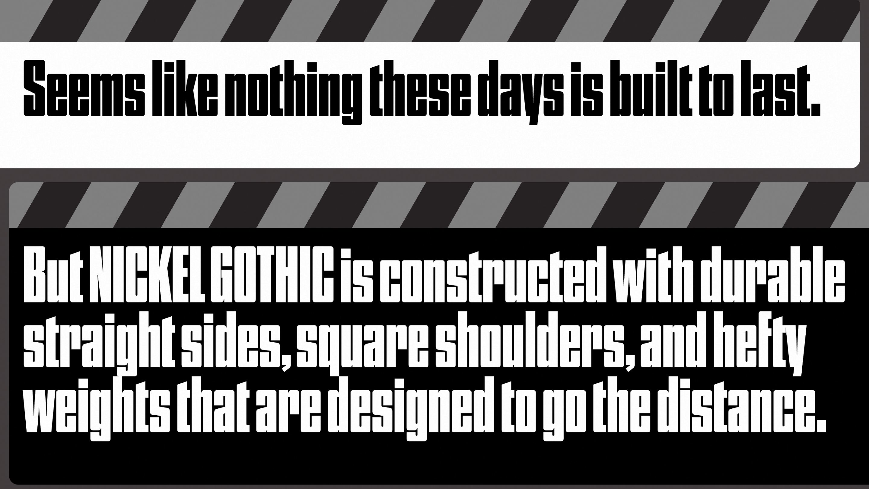
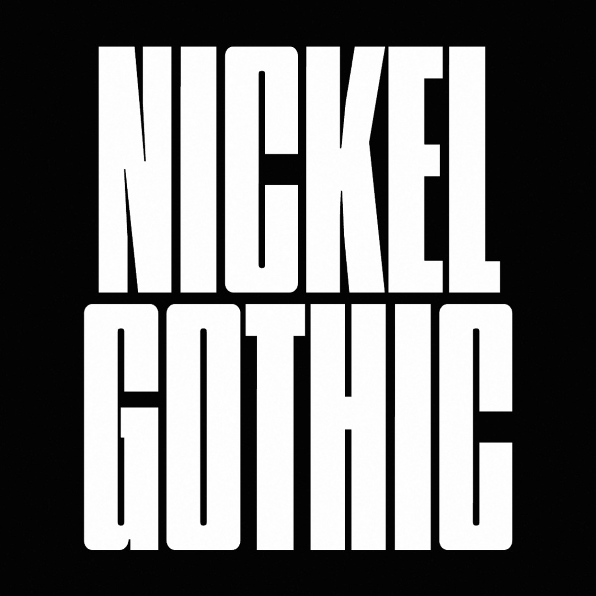
Nickel Gothic’s simple, blocky shapes offer little in the way of sophistication, but they more than make up for it in their raw communicative power. From Compressed to Wide, from Oblique to Backslant, it’s the perfect tool for high-impact, go-big-or-go-home typography.
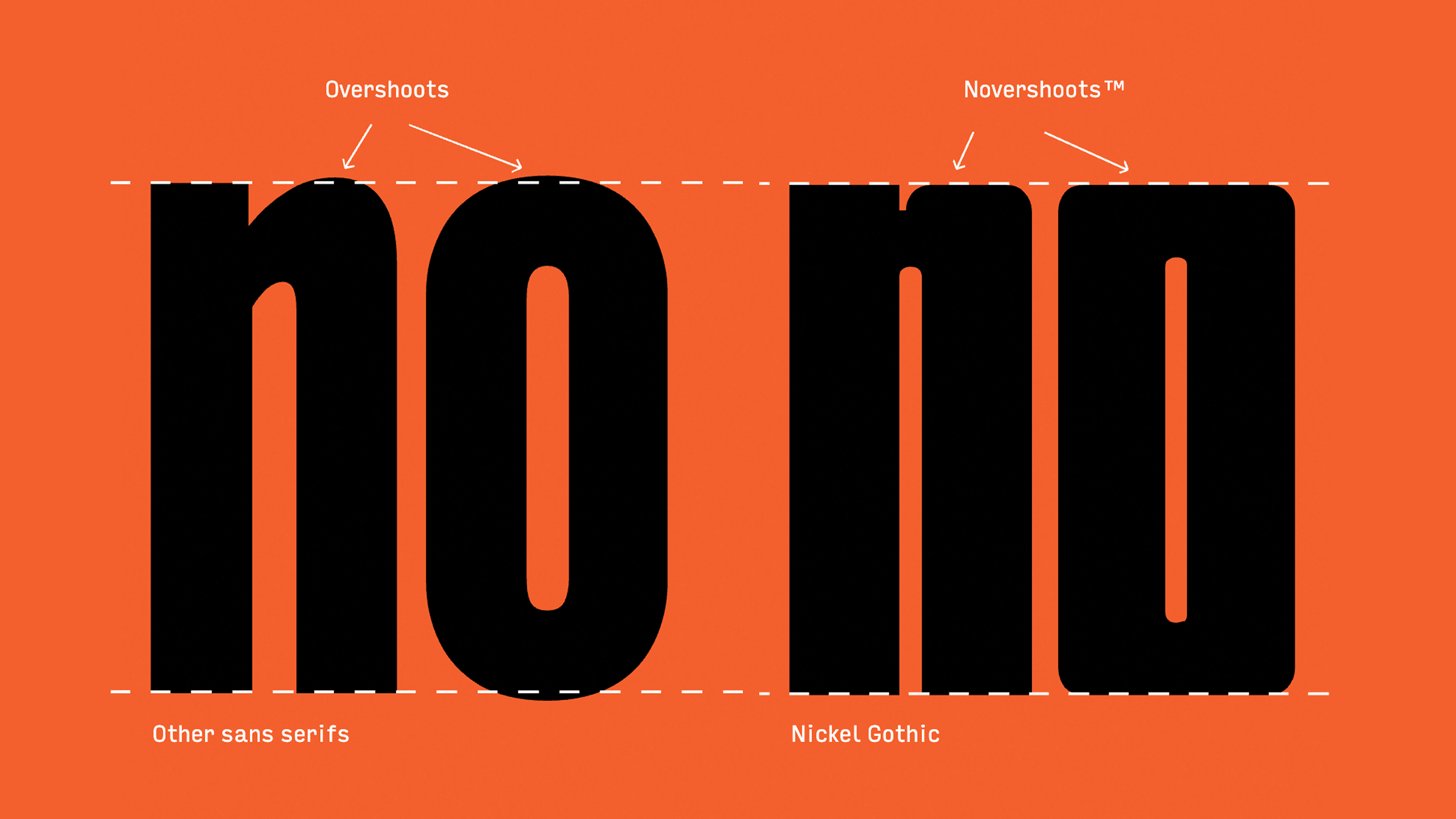
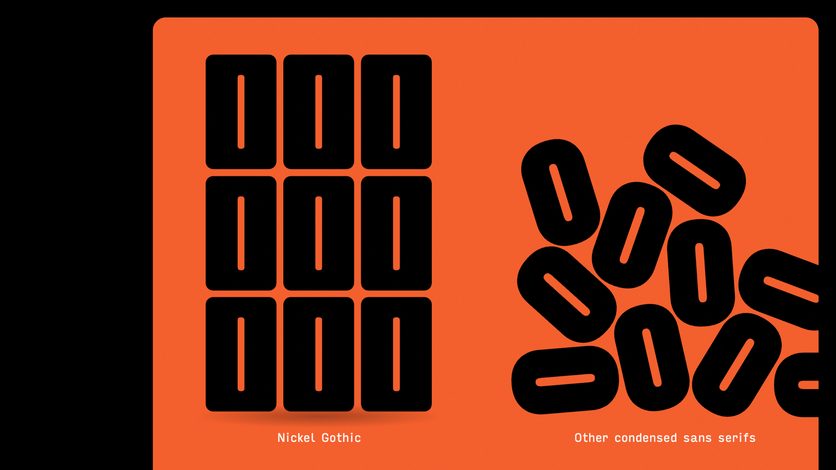
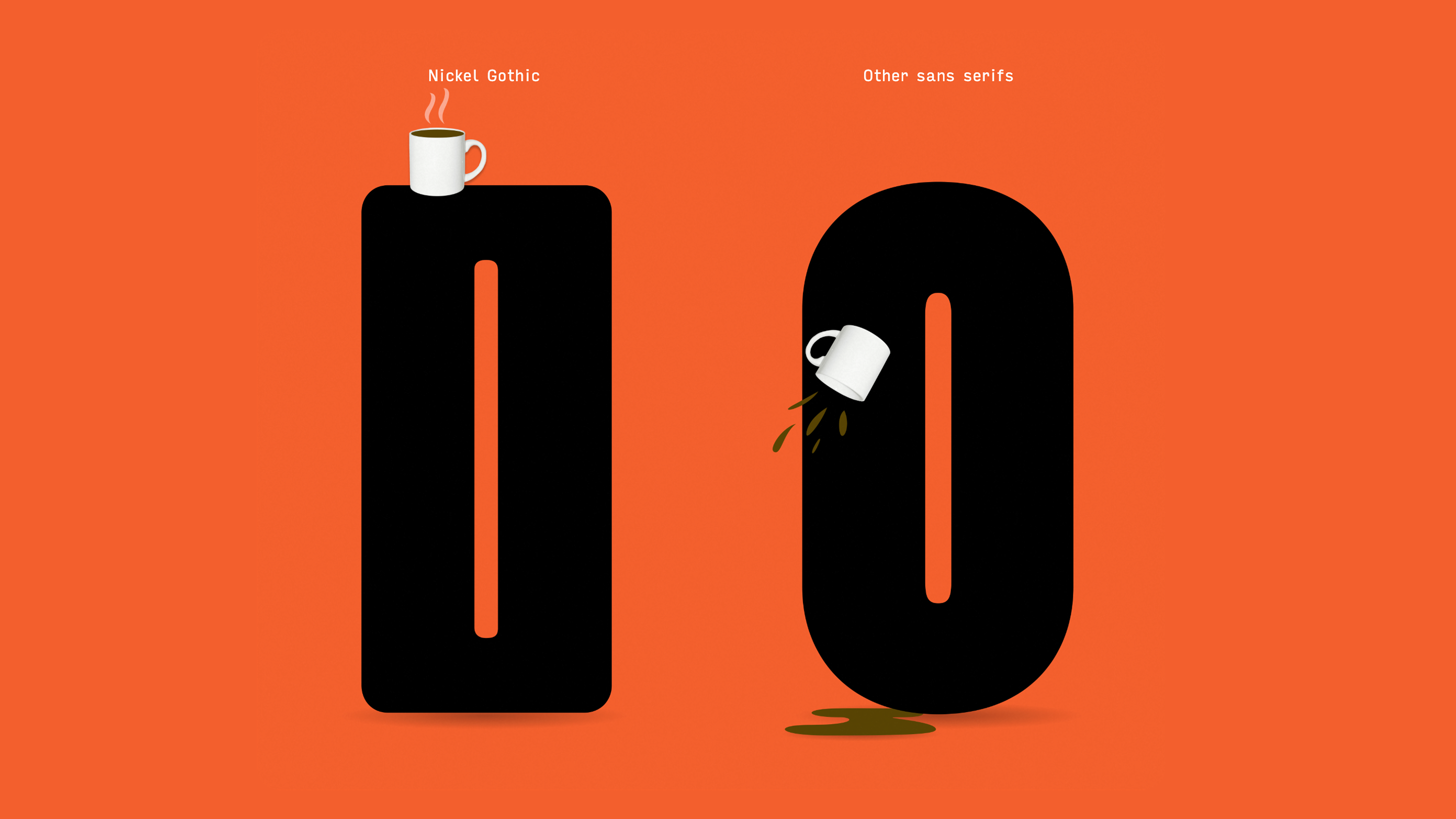
While many condensed sans serifs have flat sides, Nickel Gothic’s defining feature is its flat tops and bottoms. These flat exteriors are contrasted with stadium-like interior shapes, which form pockets of weight in the corners of the letterform… (Or ‘shoulderpads’, as the author himself calls them). These reinforced corners give Nickel Gothic its trademark strength and sturdiness, and make each word land with a thud.
Nickel Gothic was developed by David Jonathan Ross, with additional work by Bea Korsch.
Get Nickel Gothic
from $25 on type.today