We often advise against relying solely on academic literature when making typographic decisions. For example, the type of quotation marks you choose to be primary in your text (as opposed to secondary ones) may depend not only on the rules of the language you deal with but also on the environment for which your design is being made, as well as on the medium you are working with, or the typeface. However, when the typeset document you are dealing with is too big and a typographer is unable to address all problematic spots quickly, it is a good idea to have a textbook at hand that contains all the answers to any (or nearly any) typographic questions. There are several textbooks of this kind intended for various areas. In this piece, we will tell you about the most popular of them.
All the guidelines mentioned in this article work the same
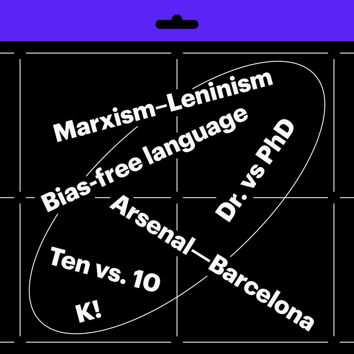
Disclaimer: In the episodes of our Manual, we often refer to the guidelines mentioned here and point out how they contradict each other on numerous topics. For example, according to the Chicago Manual of Style, acronyms AD (Anno Domini) and BC (Before Christ) should be spaced from the date, whereas The Guardian Style Guide states that they shouldn’t. This does not in any way mean that one manual is worse than
APA Guidelines
For whom: for those who deal with publications presenting or covering research in the human sciences
How much: $169 per year
The APA Style Guidelines were developed for members of the American Psychological Association but are now used by anyone involved in the humanities, as well as those who publish popular media. Our editorial team also often resorts to the APA Guidelines.
The manual provides recommendations on when one needs to write out numbers (if the number is less than 10, sits at the beginning of the sentence, or is a part of a proverb or title) and how many styles there can be in a typeset document intended for long screen reading (no more than five).

The free version of the Guidelines includes eight sections: guidelines for paper format, bias-free language Bias-free language is literally unbiased language, a way to convey information without discriminating against people on any basis. An example of bias-free language is the use of the pronoun ‘they’ when referring to a person whose gender you don’t know rules for introducing tables and citations, advice on the publication process, and a section covering grammar. Tips on typographic formatting are practically not available in this version.
There is also a paper edition of the APA Guidelines, the most recent of which was published in 2019. The page dedicated to this publication contains an article stating that the 2019 inclusive language guidelines are now outdated and providing a link to updates.
APA Guidelines, 2019
Associated Press Stylebook
For whom: for those who work in online media
How much: $33 per year
The Associated Press Stylebook covers best practices on abbreviations, punctuation, and capitalisation, as well as a number of tips that might help make your narrative’s language more neutral (some kind of Grammarly-like software, which evaluates your text according to this criterion, is available on the Associated Press platform through subscription).
Most typography-related advice is found in the AP Stylebook Punctuation section. For instance, the handbook recommends spacing a dash with thin spaces on both sides in any text, except for sports scores, and suggests using single guillemets for headlines and double guillemets for body text.

By subscribing to the Stylebook, you get access to the platform where its editors and contributors answer users’ questions on language and typography.
The paper edition of the Stylebook is published annually, with the latest version issued in 2024.
Associated Press Stylebook, 2017
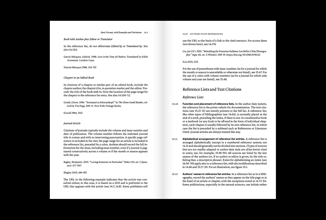
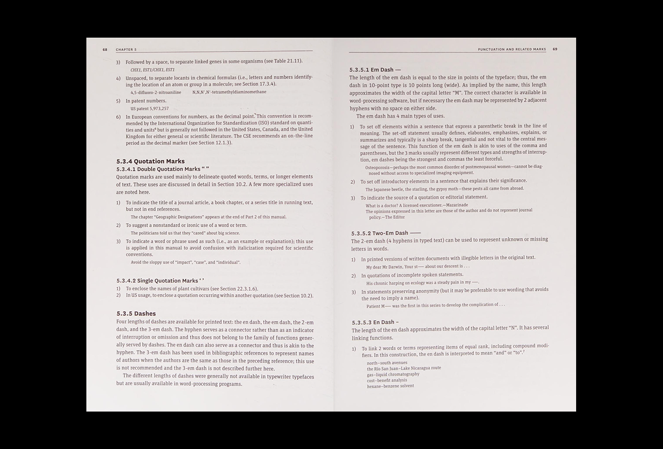
Chicago Manual of Style
For whom: for non-fiction media contributors and editors
How much: $43 per year
The Chicago Manual of Style came about when the University of Chicago established its own publishing house. Today, the manual has evolved into a full-scale institution.
The Manual is divided into three parts: publishing and editing processes, typography and style, source citations and indexes. There is also a forum space where subscribers can ask editors a question.
The Manual explains what kind of text one should italicise (titles of books and magazines, foreign words, terms mentioned for the first time) and how to deal with academic degrees (PhD, MA, BA are spelled without periods, Dr. is only used when referring to a person actually involved in the medical field).

The latest (18th) edition of the printed manual was released in 2024. The previous version, from 2017, was set in Lyon from our collection.
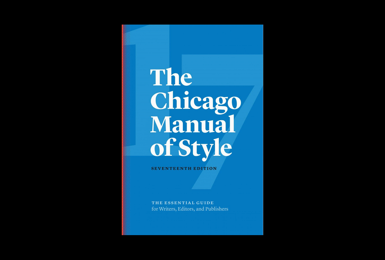
Chicago Manual of Style, 2017
Council of Science Editors (CSE) Manual
For whom: for those who handle publications addressing chemistry, physics, astronomy, and mathematics
How much: $62 per year
It is a project of the founders of the Chicago Manual of Style. The CSE Manual contains numerous materials on the editorial policies of scientific journals and the various formats of such journals.
For example, the manual includes advice on how botanists should label plant specimens in writing (by using a Latin letter followed by an exclamation mark) and a guide on using an em dash (it should be deployed to represent either an inaudible fragment in an audio recording or an illegible part in a written document).

The manual is divided into four sections: Publishing Fundamentals, General Style Conventions, Special Scientific Conventions in specific fields (such as analytical chemistry or genetics), and Technical Elements of Publications. The Citation Quick Guide is the only part of the website available for free.
There is also a printed edition of the CSE Manual, the latest version of which was published in May 2024.
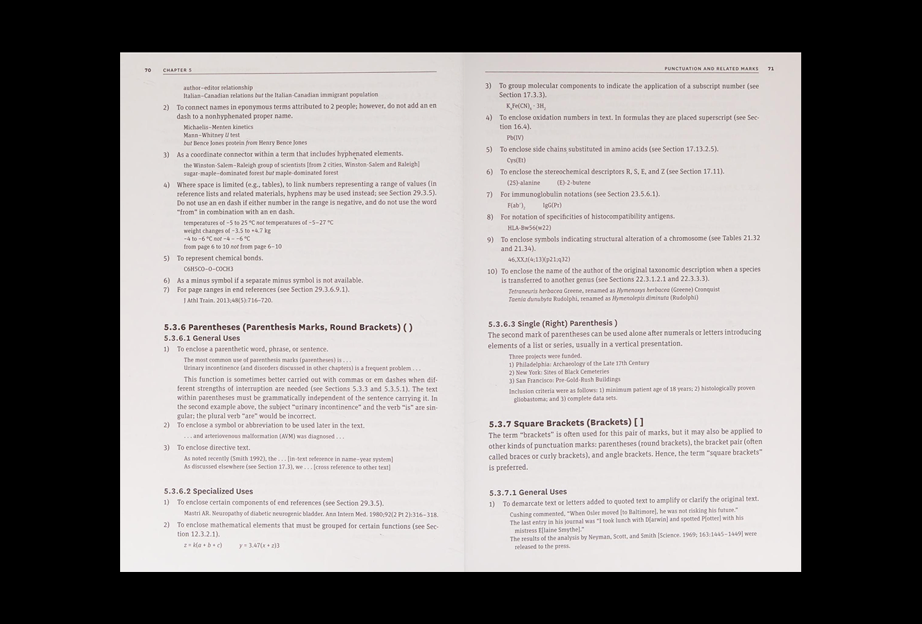
Council of Science Editors (CSE) Manual, 2014
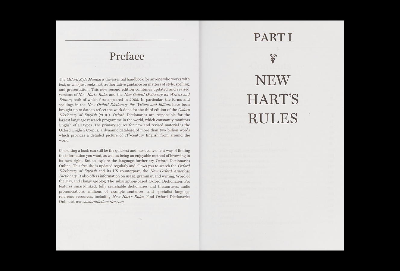
Oxford Reference Online
For whom: for students, editors, and researchers (primarily those involved in the humanities)
How much: the price of a subscription depends on its size. A user not associated with the institution can pick one section and subscribe to it only. A subscription to New Hart’s Rules, which would come in handy for dealing with typography, costs £42 per year
Oxford Reference Online is a resource that brings together all the guides published by Oxford University Press. The list includes, among other things, manuals on how to handle, typographically, police reports or stories on art. The two most popular reference books of Oxford Reference Online are New Hart’s Rules and New Oxford Dictionary for Writers and Editors. They cover best practices for spelling, punctuation, grammar, and inclusive vocabulary.
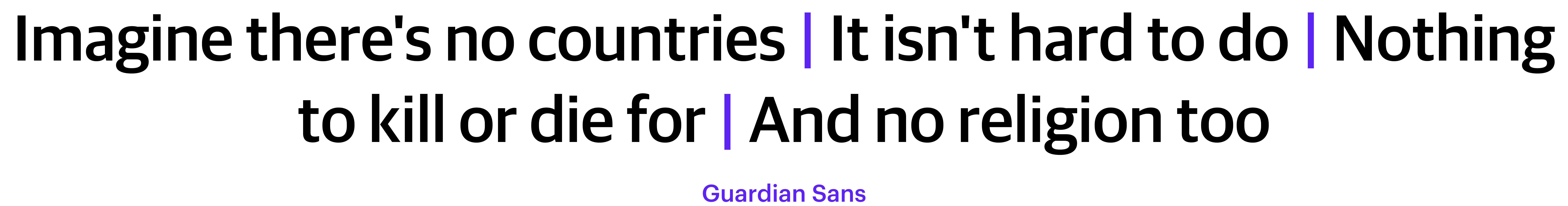
Most of the writing style and typography advice is found in New Hart’s Rules. For instance, the manual mentions a non-obvious example of using an en dash (when a theory or a hypothesis has two authors), or tells how to properly write down a quote from a poem on one line (lines of poetry should be separated by a vertical bar symbol, also known as a pipe, rather than a slash).

The printed version of Oxford Reference Online, the New Oxford Style Manual, was last published in 2016.
New Oxford Style Manual, 2012
The Guardian Style Guide
For whom: for those who work with (primarily news) online publications
How much: free
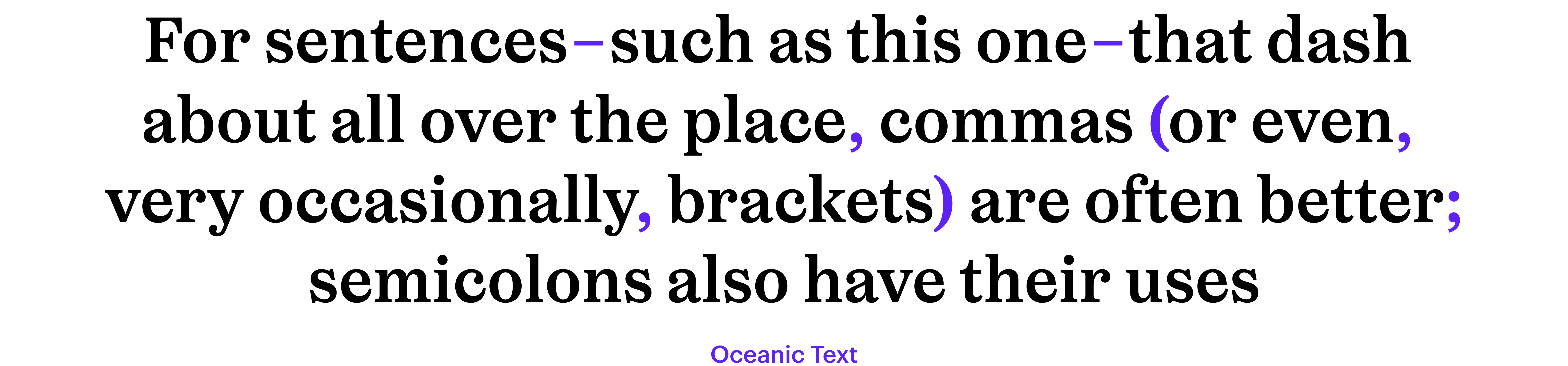
The Guardian Style Guide resembles a dictionary, containing names of businesses, personal names, punctuation marks, abbreviations, and articles. The guide features, for instance, information on when one should refer to a female performer as an actor and when it’s OK to use the term ‘actress’ (only when it comes to an award nomination, e.g. Oscar for Best Actress) and how to properly use dashes (for parenthesis, it is often better to use commas or brackets, and it’s preferable to use en dashes rather than em dashes).
P.S. The reference guides mentioned in this material are useful only for working with texts in English. But such guides also exist for other languages. For example, for Russian texts one can use The Publisher’s and Author’s Handbook by Arkady Milchin and Lyudmila Cheltsova.