
TL; DR
Lisa Huang is a French and Chinese typeface designer specialising in Latin and Hanzi scripts. In 2023, she started the Words of Type project, a platform to expand knowledge in typography and an online multilingual encyclopaedia of typographic terms. One of the reasons Lisa started Words of Type was that she realised many terms related to the Hanzi script are not properly translated into English (or aren’t translated at all). So before talking about the project itself we had to ask Lisa a few (rather naïve) questions about how designing type with Hanzi support works.


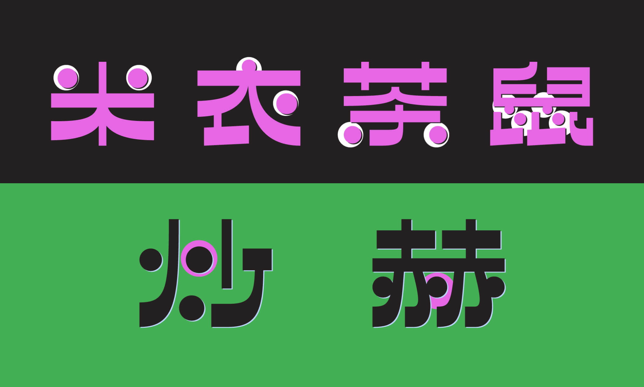
Model, 2018. Lisa’s TypeMedia graduation project
AS: Your mother tongue is a Chinese dialect, you studied Mandarin, and you were raised in France. Did you go through an identity crisis?
LH: Sure, I’m still in there.
AS: Does it help you to work with multi-script projects?
LH: I would say that knowing all these languages helped me to keep my mind open at all times and also made me used to knowing that there are many ways of thinking. That’s the really great aspect of using multiple languages at once when growing up.
AS: I have a lot of friends who envy Americans, because they only have to know English.
LH: Yeah, and they can be sure that everyone else in the world will all communicate with them in their mother tongue, but I also have some American friends who say that they envy people who speak multiple languages too.


Lettering by Lisa Huang
AS: You wrote that the price of a single desktop license for a Chinese font from major type foundries is from 500 to 1,000 dollars, so is there a font piracy problem in China?
LH: Yeah, definitely. The industry is pretty opaque, but I’ve heard from fellow colleagues that a lot of Chinese foundries, the large ones, spend more time filing lawsuits against their clients rather than selling licenses. It’s a completely different way of business management compared to in Europe.
In Europe, more and more people realise that you have to buy a license to use a typeface, and you might have different prices for different licenses. In China, a lot of people still think that if the thing already exists on the internet and you can download it, you don’t have to pay. But things are slowly changing, people are starting to understand that you have to pay for fonts, illustrations, photographs, and music. I hope that it will change fast enough so that not too many type designers will give up their careers, or that not too many students will be afraid of even getting into this industry.
AS: Designing Chinese usually takes a team. When you design, do you work by yourself, or do you also have collaborators?
LH: I’ve only designed tiny sets of characters, because if you want to produce something that can be actually usable, it takes too much time to complete.


Chinese for Calypso by Roger Excoffon. Designed by Thomas Kim and Lisa Huang
AS: How many characters is a tiny set?
LH: A tiny set that I do on my own contains about 300 characters. That’s not enough to actually write a text. Designing Chinese is very complicated on the technical side. Historically speaking, the technology that we use today has not been designed to fit other systems than Latin, so everything else had to just squeeze into that system.
And working with Chinese, which is very different from Latin, is about trying to find a compromise. But the only compromise that we found so far is to have a huge character set. And even if you hire many people (foundries have tried that many times already), things don’t get faster, because the more people you are working with, the more refinements you need to do, so that everything becomes consistent.
AS: You also wrote that major Chinese-type studios create their own secret tools to make it faster. Can you give an example of such a tool?
LH: You can only guess what they’re using. There are many ways to make the process faster, but the thing with Chinese type design is that you could create one tool or even a collection of tools that will work perfectly for one
Some people say that the secret tool that people talk about is just hiring more humans before they invent proper robots, or maybe that’s already the case, we don’t know, it’s very opaque.
AS: Don’t you think AI сould somehow help?
LH: Yeah, there have been some experiments. At the ATypI conference, Yehang Yin talked about how machine learning could make the process faster. But even with the most powerful machine learning technology that we have today, it’s really hard to get high-quality typefaces, because the
I don’t know how it will turn out, I don’t have a crystal ball to read the future, but generating Chinese characters and making them feel natural to humans would be the ultimate challenge for AI.


Presentation by Yehang Yin at AtypI Brisbane, 2024
AS: You also need the machine learning scientists, who are proficient in type design to train the AI properly.
LH: And there are not that many of them. I don’t know if there are any. Yehang Yin has been sharing some of his experimental tools on Twitter, but it’s all experiments only, he has never been able to produce a complete typeface using his tests. Even if you run something using his tools, you’ll always need to do a double, triple check of the results, so in the end, you still need humans to work on the stuff.
AS: Can you name contemporary Chinese type designers that people who are not familiar with the Chinese type scene have to know about?
LH: Well, there are really a few, because there are no type design programs in China, so all the type designers that I know are all self-taught. If you ask them, they wouldn’t really say that they are professional type
There is a Hong Kong type designer, Sammy Or. He’s teaching in a few universities. There’s also a mini foundry called Mallikātype, it was founded by two guys, Zheng Chuyang and Xue Tianmeng, who are creating high-quality Chinese typefaces but at a slower pace than usual because they are a very small team.
There’s also Li Zhiqian from Shanghai, who founded 3Type. He is now mixing type design with graphic design works. He also conducts a lot of workshops… in both Latin and Chinese type design.
In Europe, you would easily find a designer who does only type design, or even specialises in one particular script. In China, everyone does many things at the same time, everyone is teaching ,writing, doing graphic and type design… simply everything. That’s why it’s pretty hard to find a few people who do only type design, and, so far, there are no women among them.
 Beiwei Longmen by Mallikātype
 Zhen by Mallikātype
 Yebai Script by Mallikātype


RVS Basic by 3Type


XinGothic by Sammy Or
AS: Is it problematic to find a high-quality typeface with Chinese support?
LH: There aren’t that many, so you kind of always end up with the same typefaces. It’s because there are really a few large Chinese type design foundries like FounderType, or DynaComware, or Arphic, and there is also Morisawa (who also have typefaces with Chinese support). Their catalogues contain a huge variety of styles of super high-quality. But it’s something around 20 families total for each foundry and that’s it because it takes so much time to design a Chinese typeface.


FZ Qianlongxingshu by FounderType
 AR ShuiGuanGB by Arphic
AS: I live in Georgia, and last year Typotheque released 20 typefaces with Georgian support and made them available for Georgians for free on Fontstand. I am surprised that there are no such initiatives for Chinese typefaces.


Georgian typefaces by Typotheque
LH: This case is really unique. It’s great they did that. There are no such initiatives for Chinese typefaces, but there has been a typeface that has been designed thanks to a crowdfunding campaign. Many people financed this project to make the typeface free for all in the end.
Then there are a few large companies like IBM who commissioned typefaces with Chinese support. They invest a lot of money to give away their typeface as an open source product. Alibaba also did that a few years ago.
 Jinxuan by Justfont, crowdfunded in 2015


Alibaba Sans by Monotype, 2019
AS: Let’s get to the Words of Type project. Why did you decide to start it now? In 2023, to be precise.
LH: I started to have this idea in my mind many years ago. Ever since I started to study typography and type design, I would find more books about it in English. And when you try to learn something in a language that you’re not a native of, you would sooner or later face a word that you need to find a translation for. And when you go on Google Translate you would often find a result that is more confusing than helping. When I started to learn about Chinese typography and type design, that was even worse. I started to write a lot of notes about how one word is being translated into another language and then compare different translations. That happened a lot with Chinese. So I kept writing.
Whenever I talked about this with fellow non-English-native classmates at TypeMedia and Type@Cooper, everyone said that they’ve got the same problem and there are no resources that explain all the translations very clearly and accurately.
So over time the idea grew. After a couple of years working on Google projects, I was able to save some money, and then COVID struck. It was the time when I started to think: there are people saving other people’s lives, helping a lot of other people, and what is it that I’m doing? I’m just drawing ABCs. There was this kind of self-questioning moment, and I tried to think of a way of being a bit more useful. Of course typography is not going to save the world, but still, if there can be something that can make international collaborations easier, give people a chance to understand other cultures, and avoid any kind of prejudice or misconceptions, I think that would be already a lot.
 Poster photographed by Lisa at KABK
When I worked with non-Chinese clients on Chinese-related projects, I’ve always got a lot of clichés about Chinese. Like they say that everything Chinese is cheap and low-quality, and there are so many more things like that. Also, being a young Chinese woman, you’re not taken very seriously. I could explain things many, many times over and over again and see that people are not really paying attention.
We have to fight for these stereotypes and misconceptions to change.


Noto Sans Nüshu, a typeface supporting the script developed by women in a region of China, when it was forbidden for them to read and write Hanzi. First digital Nüshu typeface designed by Lisa Huang
AS: Is this one of the reasons you started the community on Words of Type?
LH: There are many reasons why I started the community, and there are many hopes that I’m putting in it. The community is a way to give the voice to people so that they can say whatever they think about Words of Type, help to improve it or fix mistakes if they find any, because there are always some when the thing is made by humans, right?
I truly believe that when people get to know each other, they can respect each other better. It’s not really about sharing the same opinions, but at least about understanding them. You can understand something but not agree with it, but you have to know a little bit more about the point to disagree with it, and not just be protective of your preconceived ideas and block everything else.
We’ll see where it goes with the community, but that’s something that I’m trying to encourage.
AS: I’ve seen a lot of cool people there.
LH: A lot of my friends, colleagues, and teachers support something that doesn’t exist yet. I’m really grateful for it. There’s such support in the type design industry. I hope that once the website will be online, there will be even more engagement. So more members will join, and we’ll get more finances to continue developing that project.

Words of Type interface
AS: Is it hard for you to separate your personal brand as a designer from the brand of Words of Type?
LH: Well, I think I want to focus more on Words of Type itself. It’s such a big project and it’s really dear to me. So I’m okay at leaving on the side my type designer role. There are already so many type foundries that are amazing, and sometimes I feel like: what am I going to add on top of all those great type foundries? Right now I need a lot of time to manage lectures, workshops, the community, the encyclopaedia, and then if I have time, maybe I will design some more typefaces, but we’ll see.
AS: So you are now mostly working on Words of Type, right?
LH: Yeah, mostly. I knew from the start that it’s going to be a big project, but then you have so many different aspects you did not consider before starting a business.


Scholar Round, a typeface Lisa designed for Words of Type
AS: At the InScript conference last autumn, you said that the Words of Type team only consists of friends. Is it still like that?
LH: That’s something that I’m also super grateful for because I’ve got to ask for help from type design heroes, the people that I’ve always looked up to, and they have agreed to help me.
Technically speaking, Words of Type is not really a company. It’s just me, and I’m hiring other
I know that at some point I will need to hire someone to help me with something, but, being based in France, it’s very hard to hire someone. You need to prove that you’re earning enough money on a regular basis to be able to afford to hire someone.
 Illustrations for Words of Type by Erik van Blokland
 Illustrations for Words of Type by James Graham
AS: Did you get some business advice when you were starting Words of Type?
LH: Well, I reached out to my teachers and some type foundries. I knew the designers there, and I got a lot of (free!) advice from them. But no hardcore business advice, no.
There were a lot of self-taught business moves. I started to envision this project from what I see online. There are some platforms that offer events online or offline. So that’s something that gave me the idea of doing lectures and talks, because there is a great need for these. And the sponsorship system is also something that we see everywhere.
So slowly everything grew together and matured. That’s why it took

Illustrations for Words of Type by Jay Cover
AS: What does it feel like to be a female founder in a world where most founders are still men?
LH: Well, at some point, I ended up working only with the people that I enjoy working with. Between the time I graduated from a design school and before getting into TypeMedia, I worked in a design agency in Paris, where I could really feel the difference between the leadership’s working relations with women and with men. And that was the reason why I didn’t stay long at that company. I wasn’t comfortable with that. I went freelance so that I could pick my clients and my collaborators.
I’d say that even though the type design world is still mostly led by men, a lot of women are trying to do their thing, and we’re all helping each other and pushing each other up. Like the Alphabettes which is a space of support and mutual help.
Of course, there are always going to be things or people to criticise. But I prefer to focus on what I can do best for myself and for the community. I know that there are such problems as toxic masculinity and we have to be aware of them, but as a freelancer, you move away from all that a little bit.

Illustrations for Words of Type by Tezzo Suzuki
AS: Are you planning to add some more information about any other scripts to the encyclopaedia later?
LH: There are so many languages that would be super interesting to add, but adding a language means that you have to hire someone to write texts, to translate, to proofread. I really don’t want to use any AI translator tools to do that.
I’ll have to see financially where I will be once first the website will be out and then if there are more sponsors and if the money from those sponsorship memberships will give me enough funding to add another language.
There are so many languages that I’m thinking of like Russian or Ukrainian with Cyrillic script, I’m sure that there are many terms that are specific to Cyrillic type design that I’ve never thought of. And there are also Greek and Arabic and many more, so I’ll have to make a choice.
I have a few ideas of people whom to contact. Ilya kindly offered help for the translations into Russian, but I cannot ask him to do this for free.
AS: I think he would have asked me to help with it. Actually, a lot of articles in our journal appear after Ilya tells me: I am tired of answering emails on this topic, could you please do a write-up?
LH: That should be helpful, because ever since I posted articles about Chinese typography and Chinese type design process, I’ve started getting way less emails asking how much it costs and how long it takes. So that’s definitely a great solution.

(01) Traditional Chinese, as preferred in Hong Kong. (02) Traditional Chinese, as preferred in Taiwan. (03) Simplified (used in Mainland China). (04) Kanji (part of Japanese scripts). Set in: Noto Serif SC, TC and TC Hong Kong Regular. Source: lisahuang.work
AS: When are you planning to launch the first languages?
LH: Hopefully this September.
AS: Wow.
LH: Translations are almost done, I have to send them for proofreading and then implement all that into the website. Most of the illustrations are also ready. There are a few words that are still left without sponsors If you are a designer or a foundry, you can sponsor a word from the encyclopaedia, your name will be then mentioned on the word’s page., so I have to continue sending emails to foundries, saying: do you want to sponsor Words of Type?
AS: Which languages will be there?
LH: English, French, Spanish, German, Chinese, Japanese, Korean.
AS: That’s a lot.
LH: I could have started with just three, French, English, and Chinese. But having more languages will give a lot of people the idea of how big Words of Type can be, how useful it can become.
AS: So it will feel not only like Words of Type, but a World of Type.

English and Korean in the Words of Type encyclopedia
LH: There’s a website called World of Type. It’s a company based in Prague. They’re selling posters and books related to typography.
AS: You really did the research before choosing the name.
LH: Finding the name took me so long. I was happy with Words of Type because it’s straightforward. It says what it means, it is pretty easy to pronounce no matter which language you are native of.
AS: Which other options did you consider?
LH: Something related to Encyclopaedia, Dictionary or Compendium. But it’s all either too long or too Latin. I’ve asked my friends in China, no one really knows what a Compendium is.I’ve also looked for words related to Collection because it’s a collection of words and languages. But I’m not good at finding names, I don’t know how people come up with them.
AS: WoT is great!
LH: I love that you can take only the first letters, and it sounds like WHAT?
AS: Most of the books that are about designing for CJK languages and are in English are written by European and American authors. Would you like, sometime in the future, open a Words of Type publishing house translating works by CJK designers?
LH: I have no experience in publishing books, but I know that it’s a long process and a complicated one, even more so when multiple countries are involved. It would be nice because everyone loves books. So maybe. Ask me about it in 10 or 20 years.
At first I thought about a printed version for Words of Type instead of a website, but then the disadvantage of books is that you have the constraints of the cost of the physical product. For example, a design book that costs between 30 and 40 euros in Europe is okay. It’s the average price. But for China it would be way too high. It’s almost 10 times higher than the average price of a book in China and that’s something that I wanted to rebalance with
Also producing and publishing books in China is really, really complex, it’s super regulated. The government is really, really serious about censorship, it’s a bit frightening.
AS: I’m sorry if this is stupid, but isn’t there some kind of firewall in China…
LH: China’s, and I highlight Mainland China, the government has a complex relationship with foreign influence which came from a complex history. I won’t talk about that part otherwise it would be a long lecture, but the
AS: Will Words of Type be available in China without a VPN?
LH: I know nothing about the technical aspects to ensure that this will work. It’s going to be the developer’s job. But we do plan to make it as easy as possible for people from anywhere to visit the website, because that’s the point of Words of Type being a website!
AS: For a lot of Russian media it’s also quite a quest to make their websites available in Russia without VPN. Sites get blocked because of just one word that is on the black list.
LH: When they block the site, they don’t even care about the context in which you mentioned the word.
AS: It’s annoying.
LH: It’s crazy.
Lisa Huang
wordsoftype.com
lisahuang.work
@hellolisahuang
@words_of_type