Adelina Shaidullina: How did you research information about readability and children’s perception of typography? Did Microsoft Kermit was commissioned by Microsoft and became part of the Microsoft Fonts collection provide any of that data?
Bas Jacobs: Microsoft has a research department, and they do a lot of scientific research on certain aspects of reading. Sometimes it starts with an assumption, and then they prove it, and if it’s proven, they implement it. I think most of their new typographic products come from this kind of scientific research.
In the case of Kermit, it was slightly different. They had the assumption that if the word appeared progressively on screen, it could help people with reading difficulties get better text comprehension. But Microsoft couldn’t do the research until they had a proper font. So that was a bit of a chicken-and-egg problem.
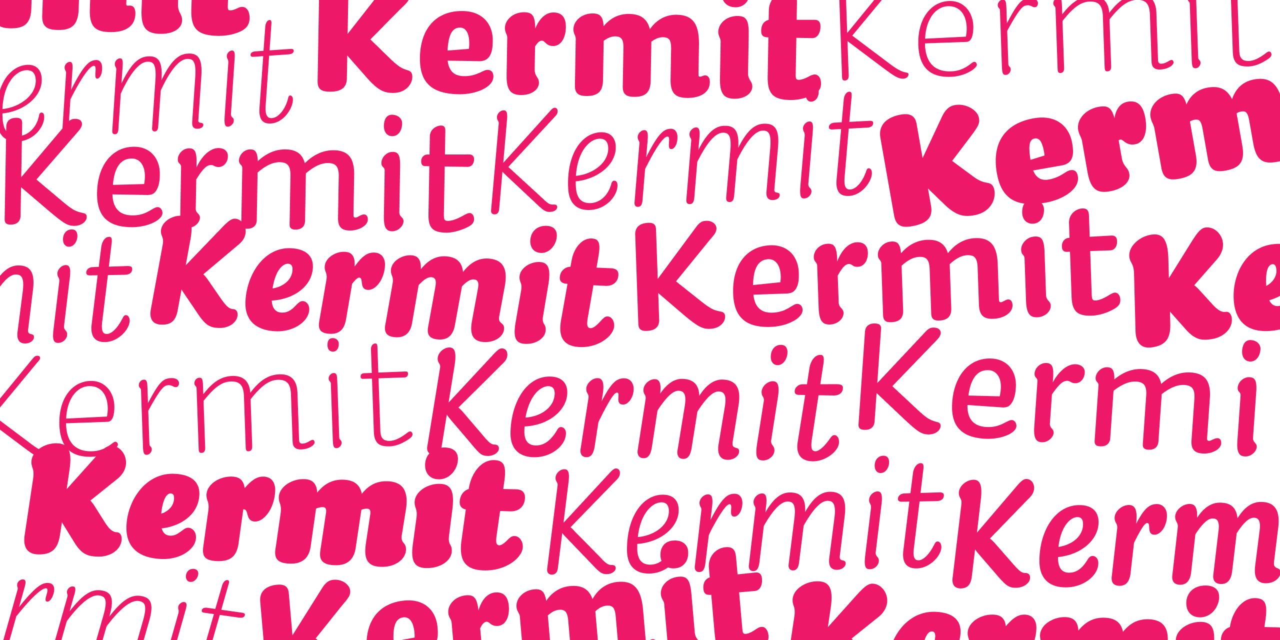
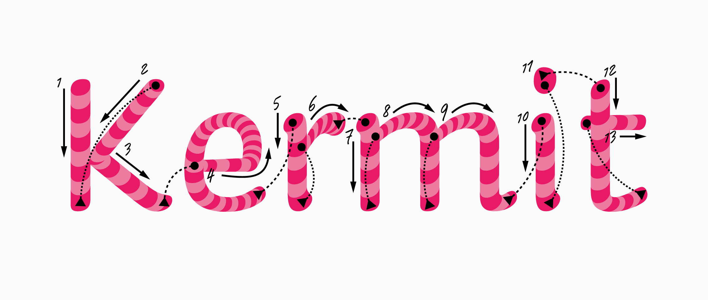 Kermit by Underware. Image: Microsoft Design
Microsoft made a test version in 2017, based on Bahnschrift, I think. It was not good enough for testing.
We did some early exploratory work on motion and attention (not using Kermit) while the font was in development, but honestly, those initial tests didn’t pan out as we’d hoped. That’s part of the research process.
Now that we have a functioning animated version, we have possibilities we never had before. But testing with children, especially children with learning differences, requires methodical caution and proper partnerships with schools and reading researchers. We’re setting up the partnerships and protocols needed to do this properly.
Kevin Larson
Principal Researcher, Microsoft
AS: So Microsoft came to you already knowing you had the technology to create the animated font?
BJ: Yes. We started making writable fonts around 2015; they were not based on variable font technology yet. It was a year before the variable font format was presented. We presented them at a conference. Rob McKaughan from Microsoft saw them, and he thought: oh, that’s exactly what we’ve been trying to test with kids.
 Writable Plakato by Underware. Screen capture from the Scribomat website
Our writable fonts were very primitive in the beginning, and they became more and more advanced over time. One year later, there was OpenType 1.8. Then we came up with HOI, which allowed us to put it all into one font format.
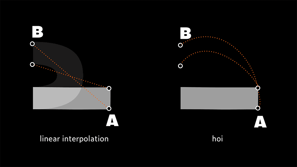 Traditional linear interpolation compared to higher order interpolation with 2 masters. Image: Underware
AS: Do you think that getting a typeface with higher-order interpolation out for a corporation Microsoft does not plan to release the font until research on schoolchildren with dyslexia is completed will make HOI itself more widespread?
BJ: I think the biggest challenge with HOI (as with lots of other technical developments) is that typefaces are strictly bound to software interfaces. You can have very advanced typefaces, but then you’re still limited to very conventional interfaces. So everybody works with a font in an interface that has bold and italic buttons. And everybody makes fonts with bold and italic styles. If you create a font with some new technical possibilities and the application does not support all these new possibilities, then it’s very hard to get the technology widespread.
So you depend on a large software corporation to implement this, and they would have to rework their backend. That’s doable, but then AI struck. For the past few years, most large software corporations have been mostly focused on AI tools, and there is hardly any room to rework the backend to support new technological developments in typography.
 Kermit by Underware
AS: So we are looking at around 10 years after the AI bubble collapses then?
BJ: Can’t wait! Single-mindedness is never a good path.
AS: You mentioned that the idea of the font was to help children with reading difficulties. And you write on the minisite that the animated version is created for kids with dyslexia, how and why does it help?
BJ: I’d like to leave this topic to the scientists.
Many children with dyslexia have measurable deficits in visual motion processing, specifically in the dorsal stream pathway that handles motion, timing, and visual attention. Vidyasagar & Pammer (2010) proposed that this pathway controls a spotlight of attention that should smoothly move from letter to letter when reading. When it’s underperforming, children may struggle to process letter sequences in the correct order.
The hypothesis is that adding motion to letters (having them draw themselves stroke by stroke) might strengthen these neural pathways. Motion-based training has been shown to improve reading outcomes in some dyslexic children (Franceschini et al., 2013), and we know that learning to write enhances letter recognition. Seeing letters construct themselves might provide similar benefits without requiring fine motor skills.
Important caveat: dyslexia is multifaceted, and phonological deficits (difficulty processing speech sounds) remain the primary challenge for most children. Even if animated fonts help, they would supplement phonics and phonemic awareness instruction, not replace it.
Kevin Larson
Principal Researcher, Microsoft
BJ: I personally think that we should address reading difficulties rather than dyslexia. Because the word dyslexia is perceived by some people to be one single problem, with a single solution; reading difficulties are a subject of a much broader, and more open and nuanced discussion.
Microsoft has a plugin that they put on top of existing software, which helps mostly kids who are having trouble reading. It is a collection of tools that do different things. There’s this option that all the verbs get one colour, for example. That’s useful when you’re six or seven and you have problems like understanding the paragraph of text, but not when you just start learning to read. Kevin Larson once showed at ATypI a kind of pictionary library, where if you type the word lion, it will show an image of a lion for better visual understanding.
This plugin can include various things. One of them could be words being written out in real time. Beginner readers could benefit from better text comprehension if they see the word appear
AS: The font description says that Kermit is designed to feel relatable, like handwriting. But did you take into account that not all children, even those who use Latin-based languages, are taught the same style of handwriting?
BJ: Maybe it’s a bit confusing that learning to read and learning to write are two different things, but they overlap. Kermit is not an instrumental tool to learn how
 Cyrillic б in Kermit
But there’s a kind of blended grey area between strongly typographic shapes and handwritten shapes. Kermit is definitely more on the typographic side, because in the end, it can also work as a static font, just like any other static font for texts.

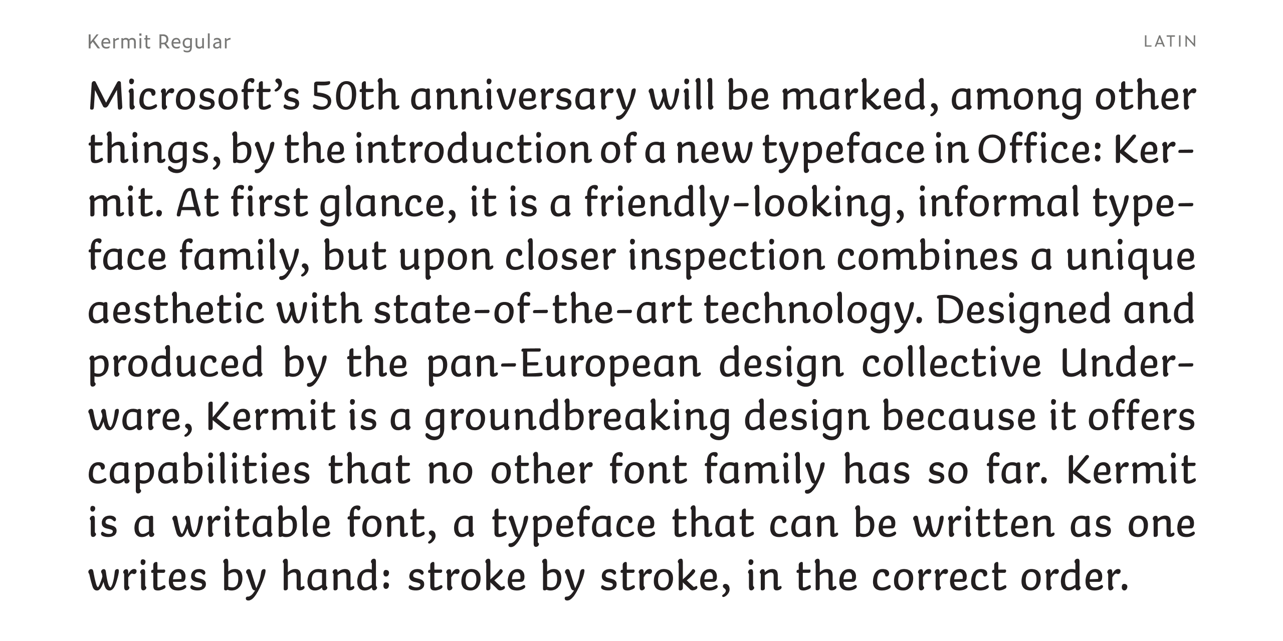
Kermit in texts and headings
AS: Do you think this distinction between the written forms we write and the forms we read needs to disappear?
BJ: I’m not a scientist. I think that, especially with young kids, three to five years old, the brain is extremely flexible. I’m always surprised at how this works. We should not approach the children’s brain with our adult brain. For example, when my daughter was four years old, this, for her, was all capital E. But then F could also be capital E.

And we say: no, no, no, that’s an F. But for her, an E was just a vertical bar with lots of horizontal stripes connected to it.
So I try to shift myself to the position where the brain is as flexible as this. And then I’m not sure how important it is if it’s a single-storey a or a double-storey a.
...children may not necessarily find non-infant characters (in particular double-storey a’s and g’s) problematic. Most children in our study were well aware that there were different forms of a and g, and some even made the point that single-storey a is what we write and double-storey a is what we read. What is likely to be important in terms of confusability or not is that characters are clearly differentiated from each other. [...] Some children, however, perceive double-storey a and double-storey g as ‘harder’ than single-storey a and single-storey g, and while this may not affect their ability to read, it may have some impact on their motivation.
Serifs, sans serifs and infant characters in children’s reading books
Sue Walker, Linda Reynolds
AS: Kermit was primarily designed for screen use. Do you think children today mostly learn to read and write using screens?
BJ: I think this heavily depends on the country you’re located in. In the global South, this might be experienced completely differently than in the global North.
And I think even within Europe, there are many different approaches. Some countries completely skip teaching handwriting at all. They say: we just go to the QWERTY-keyboard, because that will be the future.
So I’m not sure if you can say anything universal or general about this, which also says
AS: Ilya, how did your kids learn to read?
Ilya Ruderman: My kids are three-lingual because we moved to Barcelona, and it’s Catalan, Castellano, and Russian. It was a complete mess, and my son has dyslexia, by the way.
Cyrillic has more differences between typographic and handwritten forms than Latin, and my son was very confused. Sometimes, when I wrote him a note saying “hey, son, do the dishes in the evening,” he would ask: “what is this letter?” Because he had never seen a lowercase т that looks like a Latin m.
Also, bilingual and trilingual kids are always behind the curve when it comes to learning to read.
 Lowercase т in typefaces from our collection
BJ: There is research saying that if you grow up bilingual or trilingual, you live longer.
AS: It’s that you live longer, but your parents die earlier, for sure.
Kermit was designed for beginner readers and writers, while adults still face Aptos. When should default fonts be introduced to people?
BJ: What’s a good age to introduce people to bad music? And what’s the right age to introduce them to very bad television series? What’s the best age to introduce people to bad taste?
AS: I don’t think that default typefaces are bad taste. I associate them with discipline.
BJ: Bad taste is a metaphor for versatility. I don’t have any scientific evidence for this, but I could imagine it makes sense to be introduced to typographic versatility in a similar way at a young age. It’s the same with languages. If you learn three languages when you’re six years old, it’s much better than if you learn one language when you’re six, and only when you’re 20 you’re introduced to a second language, and at 30 to a third one. I could imagine it makes sense to be introduced to typographic versatility at a young age.
Scientifically, there is little evidence to support the idea that being introduced to typographic versatility at a younger age directly improves the reading experience. Even though there is currently no scientific literature that directly tackles this question of typographic versatility, there has been an instance of a study regarding digital text personalization by Sheppard et al. (2023) that could correlate to this. One of its most significant results showed that font variation personalization (letter width, inter-letter spacing, etc.) positively impacted children who had difficulties with reading tasks, both on word and passage levels, which clearly shows that typographic variations do have a positive impact on children’s reading experience on a certain level.
However, regarding the acquisition of these forms, a study by Seyll and Content (2021) suggests that this benefit stems less from the mere variability of fonts and more from the «detailed visual analysis» required to process them. This indicates that typographic versatility is most effective when it triggers an active deconstruction of letter shapes, rather than through passive exposure alone. Yet again, this doesn’t answer the question in relation to children’s reading experiences, but mostly on the letter-decoding level.
But the question can be put completely differently: is it even possible not to confront a child with a diverse range of typefaces? And here the answer would be no.
Ann Bessemans
Readsearch
founder
AS: On the minisite, you note that typographic awareness has grown significantly. Do you believe children today are becoming typographically aware earlier in life?
BJ: 30 years ago, when I was at a birthday party, nobody really knew about typefaces. And then 20 years ago, people started saying: «Oh, yeah, of course, Times New Roman» — everybody knew the classic top 10 from the Word menu. And 10 years ago, typefaces started to become a subject of memes on the internet. Typefaces in general became a part of popular culture.
IR: I agree.
During COVID, my kids even wanted to create their first fonts. It never ended with anything, but it was fun for them to play with the forms. It was boring at some point,
 The font that Ilya’s son started drawing during COVID
AS: You mentioned that people are now typographically aware, meaning they know typefaces exist, but they are not generally typographically aware of whether the typefaces are of high quality or not. Maybe people should become less typographically aware for good…
BJ: But that’s how it was a hundred years ago! If you wanted to set a poster, you had to go to an expert who would do it for you. I’m not sure if that’s better. Because who says the expert is right?
The thing is, if you make a field more democratic, it generates more garbage, but the top segment of good quality is also expanding. So the whole thing by itself is scaling. A hundred years ago, there were quite a lot of shitty books and a few good books. Now there are really a shitload of shitty books, but also many more good books.
And the same probably goes for fonts and typography.
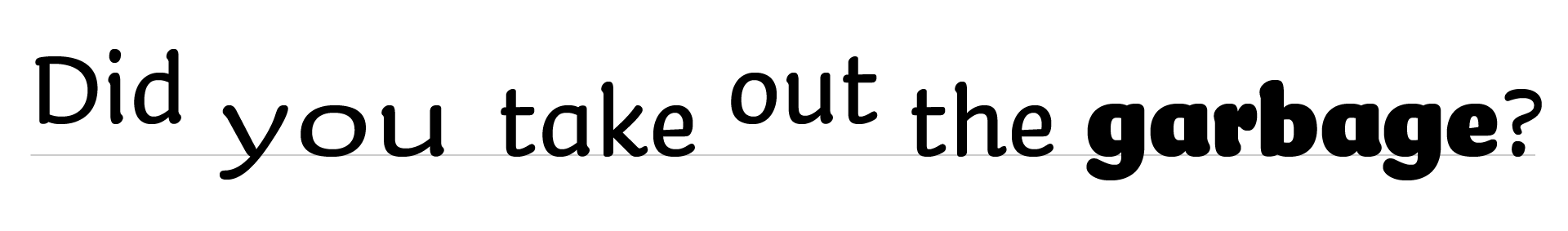
AS: Another feature of Kermit
BJ: The major starting point for Kermit was to make it writable. To have super-condensed and super-expanded styles to test this prosody was more like a secondary goal for the project. And this was based on existing scientific research.
 An example of using Kermit to express the vocal inflections of language. Image: Microsoft Design
We recommend type designers to implement a thickened font when they would like children to guide in their speaking aloud with a louder voice by means of a typeface. Both ‘full bold’ and ‘half bold’ are good references for designers when they would like to implement a volume parameter within their typeface. Type designers involved in visual prosody are advised to widen the font, like our parameter ‘full wide’ when children should be guided to read with a slower voice. [...] When type designers want to implement a design parameter to guide the children in reading aloud with a higher voice, they can raise the x-height, as in ‘full raised’.
Based on this research we can not conclude whether visual prosodic cues are sensed in an intuitive manner. Thus, instruction is needed.
Visual prosody supports reading aloud expressively
Ann Bessemans, Maarten Renckens, Kevin Bormans, Erik Nuyts, Kevin Larson
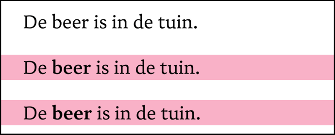 Full bold and half bold versions highlighted in pink
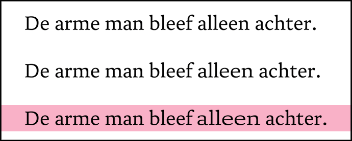 Full wide version highlighted in pink
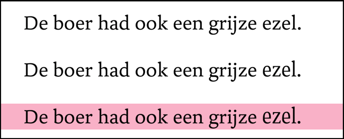 Full raised version highlighted in pink
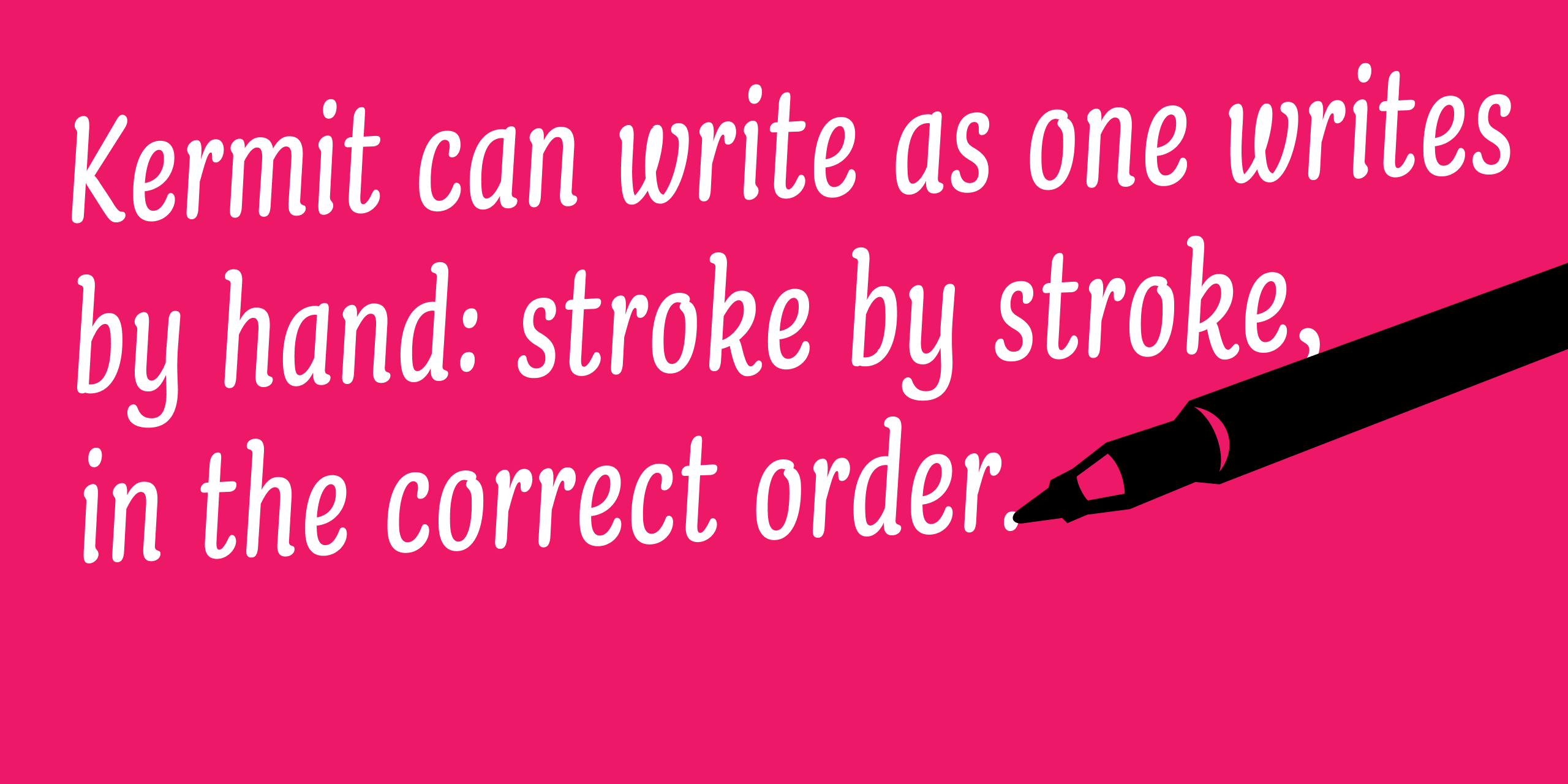
AS: What was the hardest part of working on Kermit, type design-wise? How was it different from working on a traditional variable font?
BJ: Making the movement look natural. Imagine you have a lowercase m. If you draw every part of it at the same speed, the whole appearance looks very mechanical. Because in reality, when the stroke goes down, it goes super fast. And then when you start the next stroke, it starts slow and then, when it goes down, it goes fast again.
We also looked at the amount of time in between two different
 m in Kermit
Normally, as type designers, you only design the two-dimensional part. With variable fonts, you already design all the interpolated parts in between. And with this project, on top of that, we designed how everything appeared in real time, progressively, as well.
This was not the interpolation between two masters, but the kind of interpolation between the non-written and the fully written versions.
 Anatomical illustration showing the information needed to make the font writable
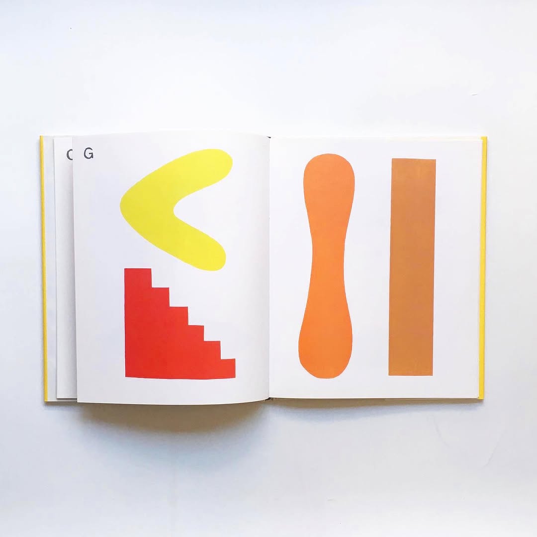
AS: Could you name a children’s book that you think has great typography for beginner readers?
BJ: I have one book: Abstract Alphabet by Paul Cox. It probably won’t help your three-year-old kid learn how to read properly, but it’s exactly the whole concept of learning


![]()
Abstract Alphabet by Paul Cox. Images: Dessin books
And it is so different from what most people think about when they start discussing the subject of books for kids learning to read. They often come up with questions like: should they use a sans-serif font, a rounded font, or whatever? But I think this discussion is much more interesting, because it shows the whole principle. I think that’s exactly the language your kid would understand when drawing multiple bars in E. I would be very curious if you taught this Abstract Alphabet to kids as the only alphabet that exists, and if you had a whole society doing this. I think people could perfectly communicate with this alphabet.