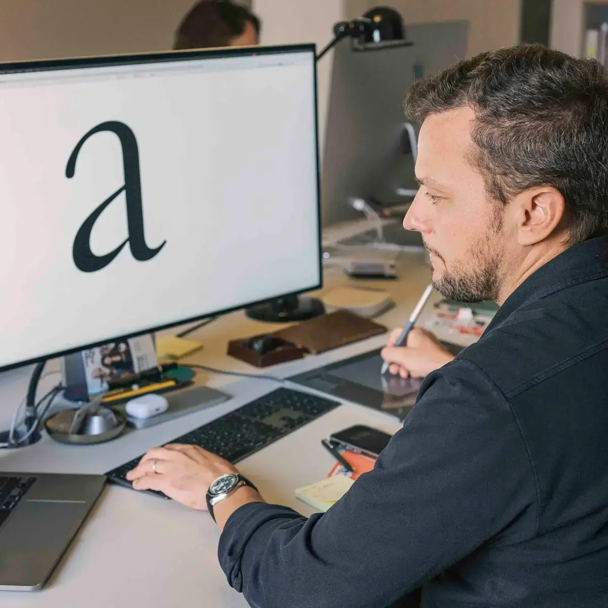
The Production Type website claims it’s an agency, while your LinkedIn profile indicates it’s a foundry. How do I refer to your company?
It’s both. The foundry relates to the business of distributing typeface licenses, whereas the agency is more project-oriented. This reflects the dual stream of business that many foundries do, actually. On the one hand, we operate as an agency. We provide consultations and advisory work. On the other hand, the e-commerce aspect of the business relates more to what a foundry is and does, which is publishing typefaces and selling licenses for them.
But I also feel a discrepancy in the way we introduce ourselves. Honestly speaking, did we really achieve the size of an agency? We are just under 10 people. So it’s rather a studio. But in the economics of typography, it’s already a fairly considerable size. So, all things considered, an agency is a better description of how we operate.
Aside from the Paris office, you have one in China. Why did you decide to open it?
The China business started in 2019. I was exploring ways to enhance our offering. We had international customers based in the Western world with an Asian presence, who were facing font-related problems. Instead of trying to outsource the work, it would be more consistent to provide Western customers with solutions that are Eastern-oriented. It’s not about us capturing market share in Asia; that was never the plan and still isn’t.
We train our Western designers to understand and advise our customers on Chinese, Japanese, and Korean typefaces. Likewise, we train the Chinese designers to improve their skills when it comes to Latin typefaces.
So we started in 2019 with my partner, Tao Chen. And then, as you know, some big news hit the world in 2020. Until 2023, when China’s borders reopened, the growth had been steady, but not as high as we had hoped.
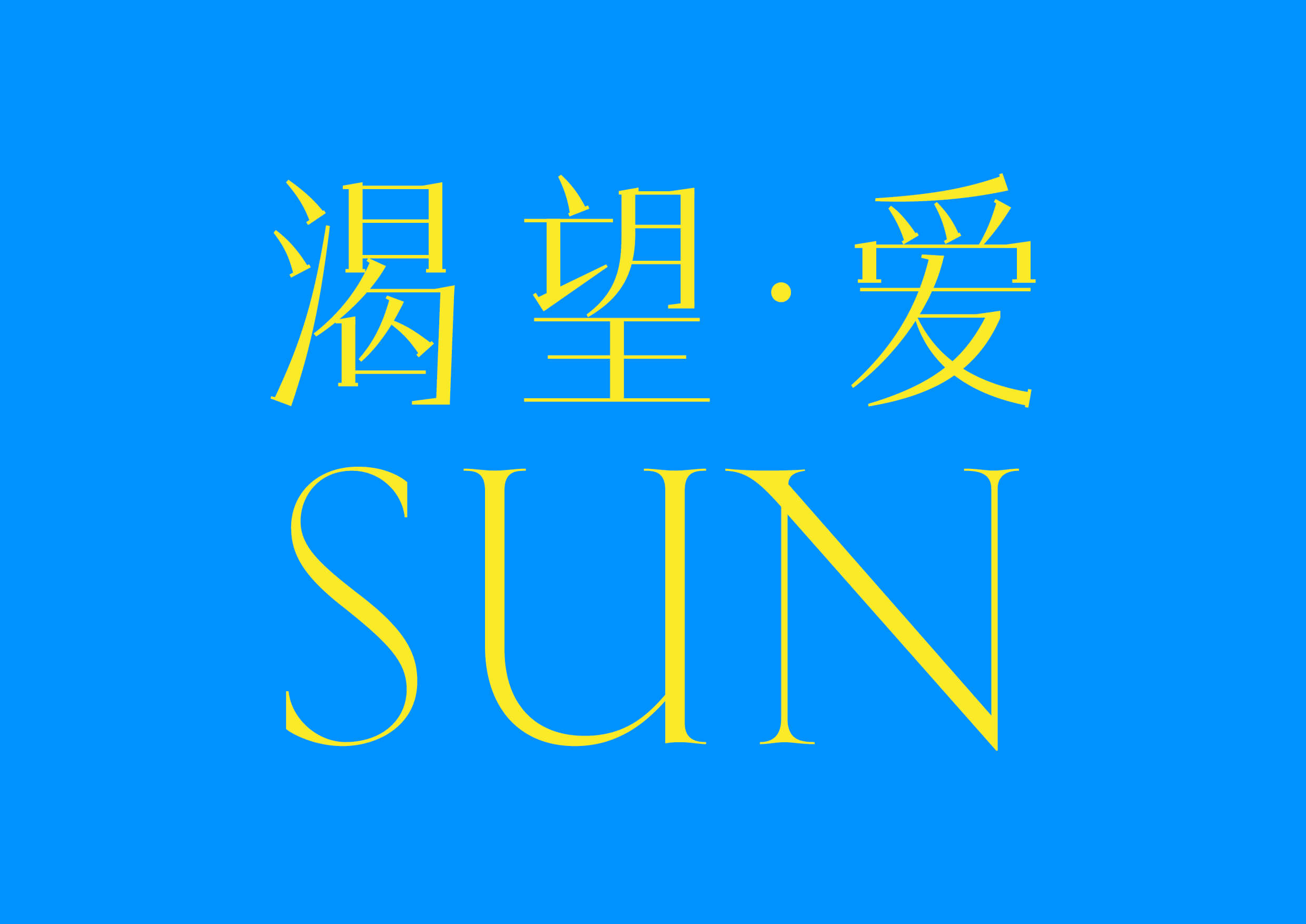 Chinese pairing for Kessler by Production Type
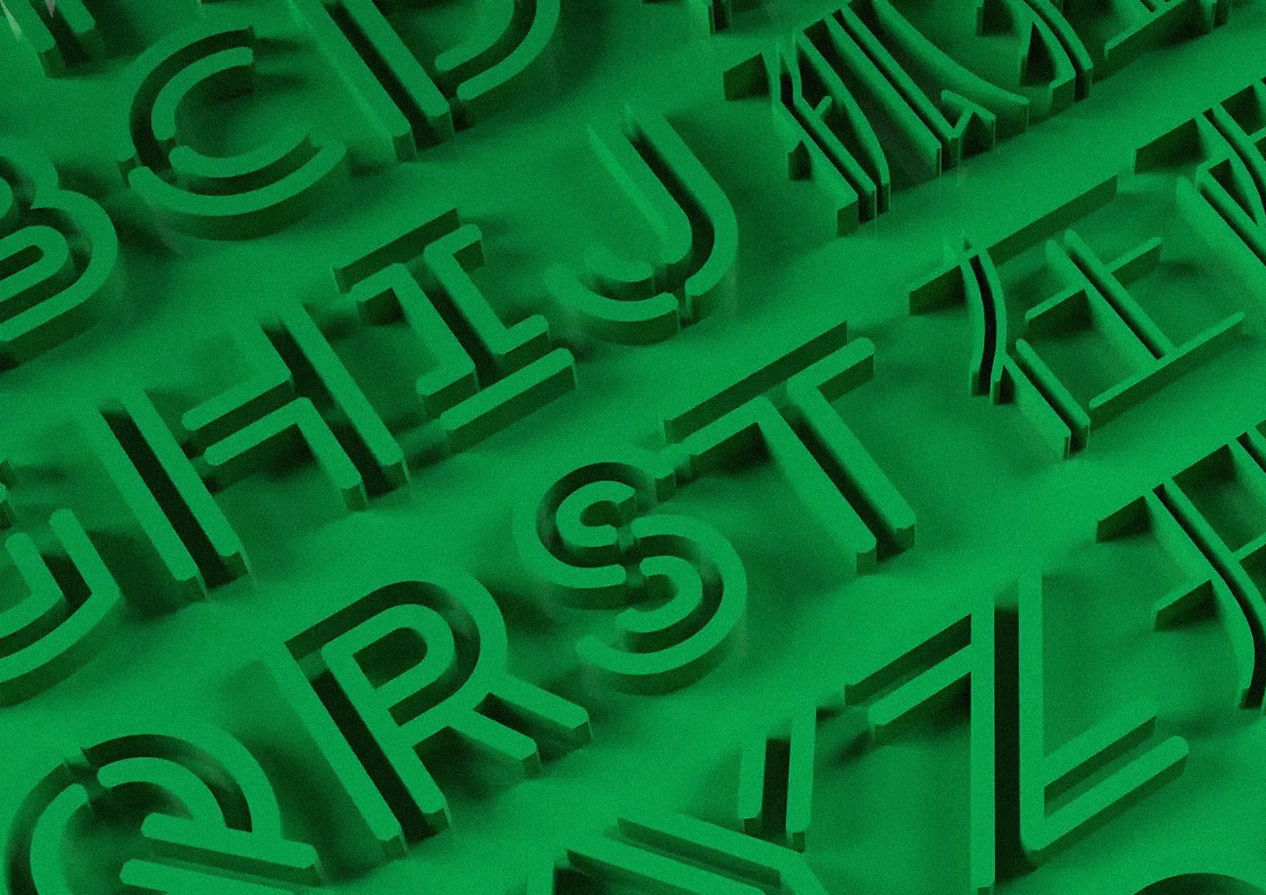
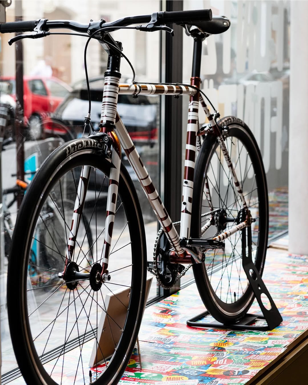
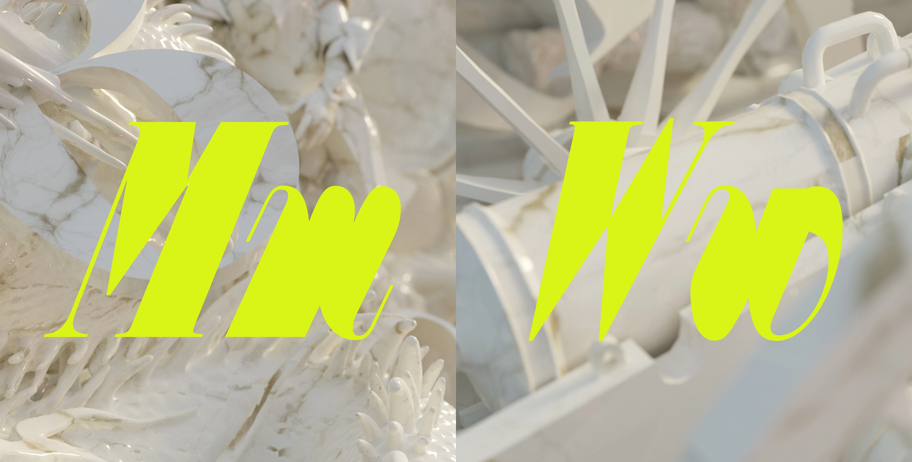
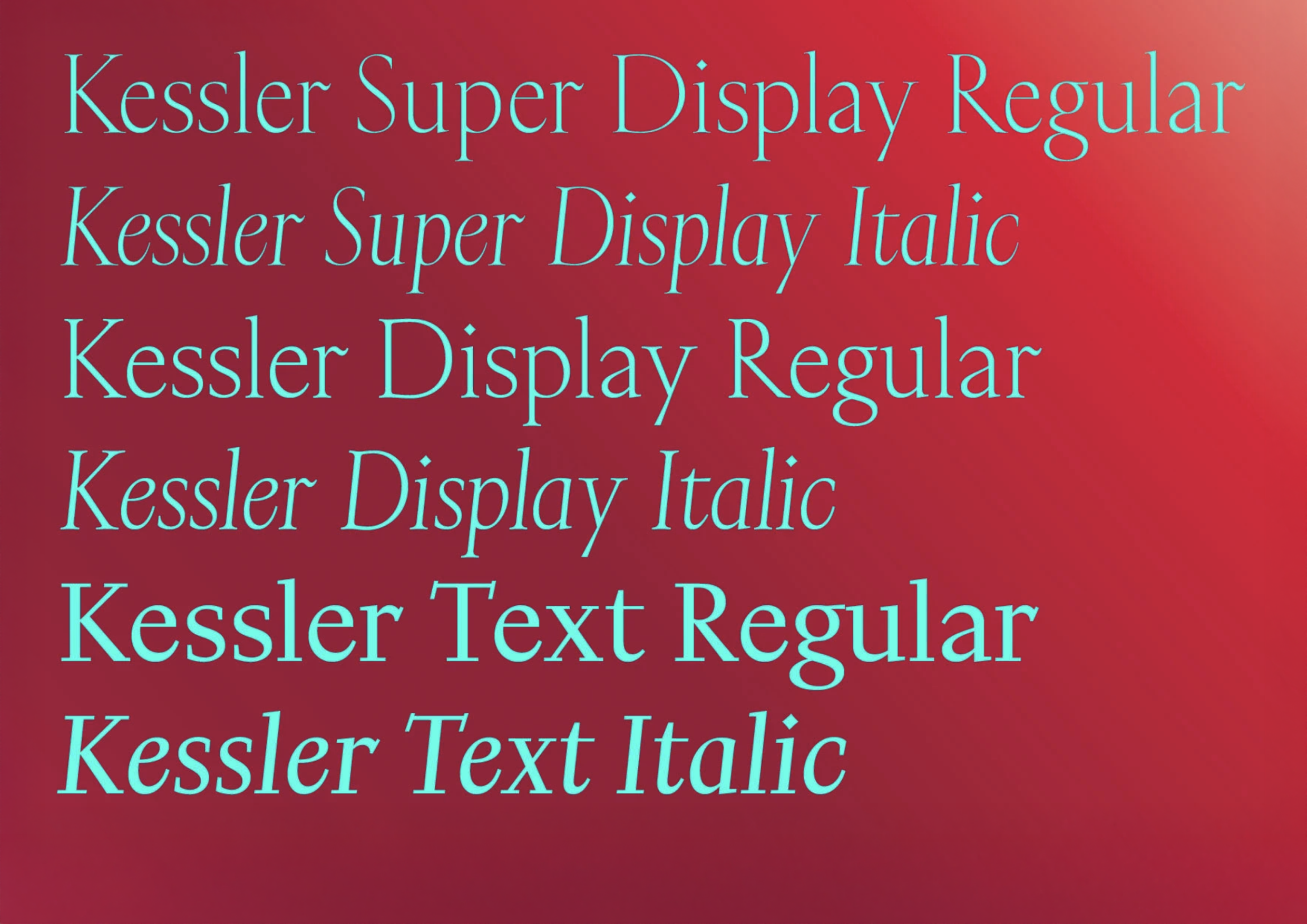 Kessler by Production Type
How do the two offices interact with each other?
We interact on multiple layers. The first are biannual staff exchanges, where staff designers from Paris move to Shanghai for a few months, followed by designers from the Shanghai office moving to Paris for a similar period. During that time, they undergo workshops and operate under the guidance of a senior designer specialised in their own local expertise, and also receive some training and mentoring.
Another layer is cross-cultural exchanges. So, from time to time, either part of the team or the whole team moves to another place. The last time was the complete foundry staying in Shanghai, delivering talks, engaging in some out-of-office activities, and doing some team building. And the last layer is, of course, the business one, where we exchange services and design work. After six years, we now have five fonts with full support for both Chinese and Latin languages. These are expected to hit the market in 2026.
 Chinese pairing for Arc by Production Type
 Chinese pairing for Arc by Production Type
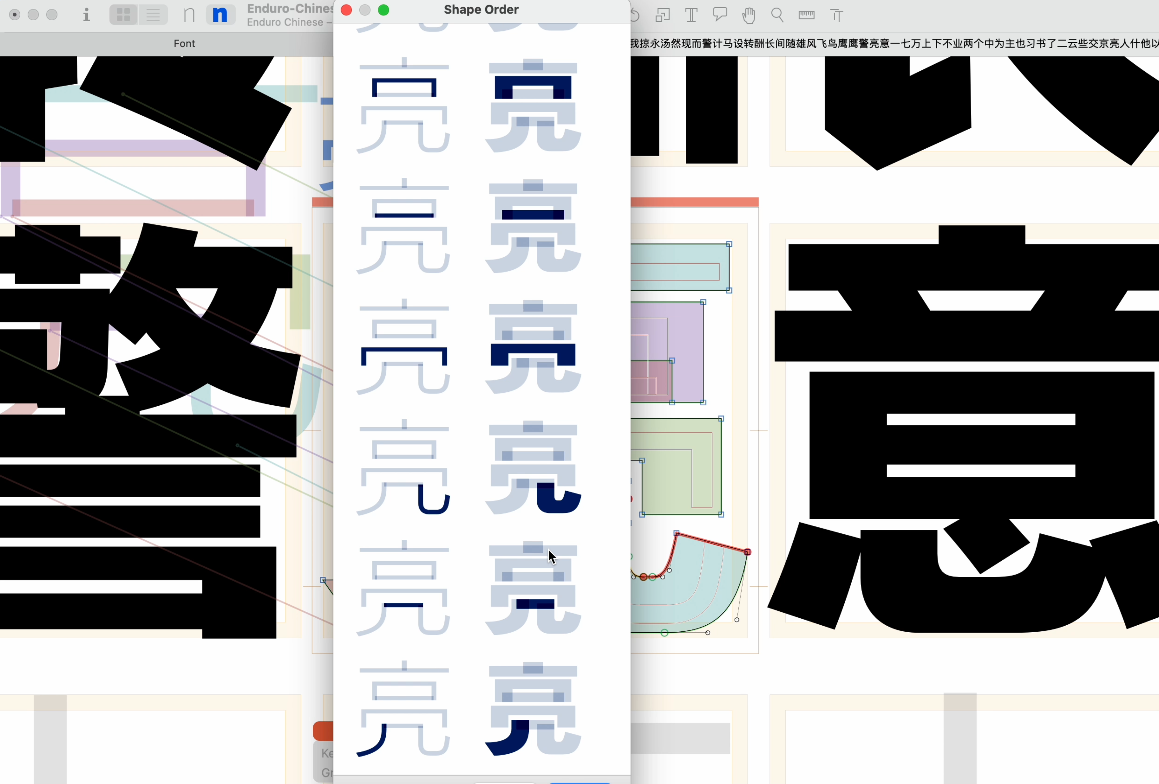 Chinese pairing for Enduro by Production Type
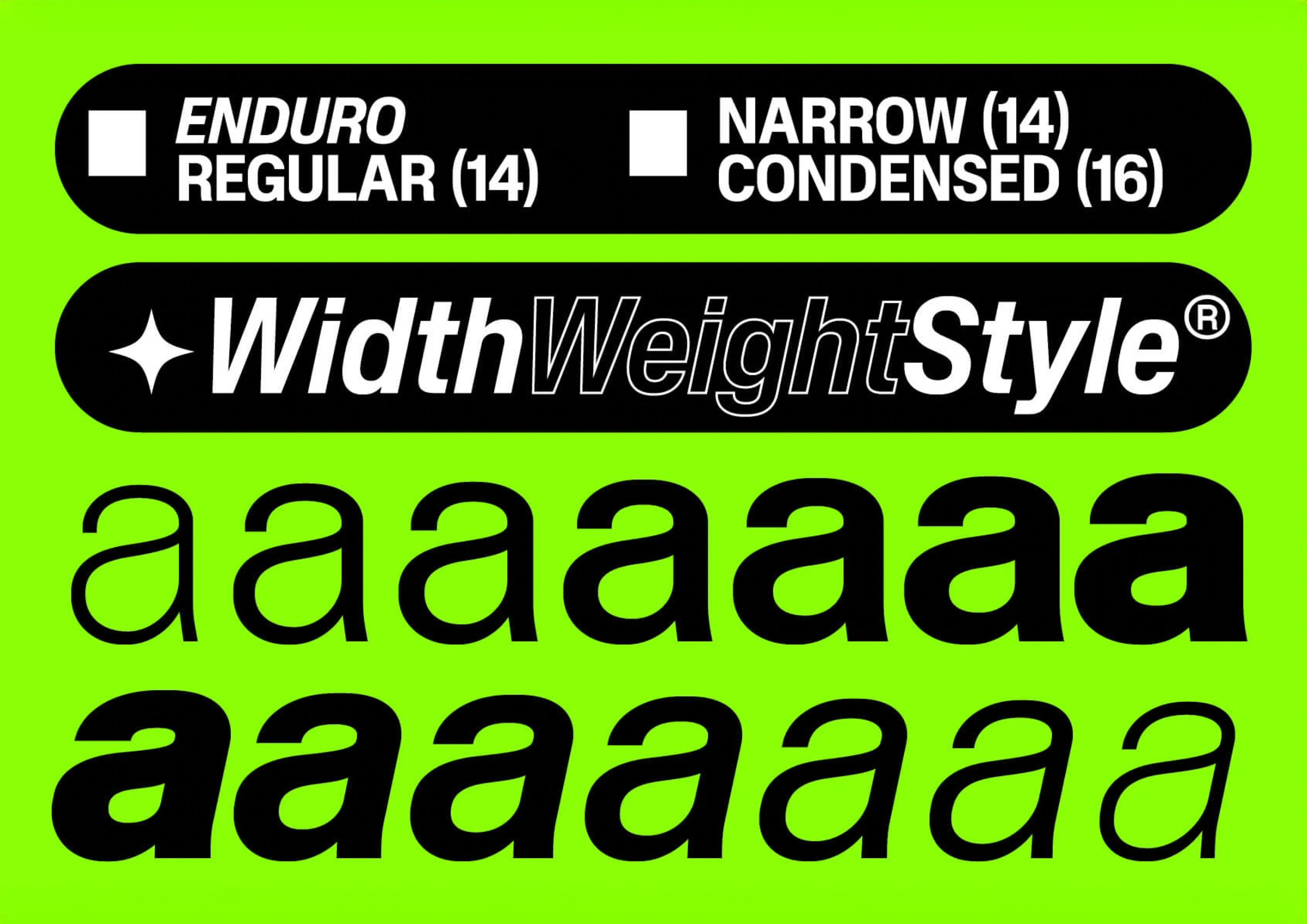 Enduro by Production Type
You talk a lot about business in your interviews — why is that?
When I started my career, there were plenty of lectures about inspiration and creativity, and the discourse around more down-to-earth, underlying aspects of what it is to do typeface design did not exist to the same extent. And I’m trying to answer the questions that I myself couldn’t find answers to 10 or 15 years ago.
Additionally, I developed an interest in this because design is also about it. It’s not fully autonomous in the world; it can be a reaction to the outside world, the society, and the economy. Typography is deeply connected with the economy, in fact. It always has been. Examine the relationship between Fournier and other type founders in the 18th century, the shape of the 20th-century metal type business, and its impact on design. Typography is a field of design that is influenced by societal, economic, and business-related factors.
I still have the impression that I’m talking about design when I’m discussing the business of design.
Do you sometimes think about the future typeface from a business perspective before starting it?
Not in most cases. Strictly business-oriented decisions are also not what typography is about. If you look at our catalogue, you will see that some typefaces exist because they are artistic statements, proofs of concepts. We sell them not just because we have evaluated the revenue potential of a typeface. Otherwise, the catalogue would be very dry, and, in the end, it would be a bad business decision. Therefore, I believe that Production Type’s catalogue should include typefaces that are not designed to sell by themselves, but rather to complement the overall image of a brand.
We receive a large number of submissions, and I have finally found a way to explain why we would not release certain things. Usually, it boils down to the fact that we are looking for typefaces that are compatible with the existing catalogue, offering something that can fit well within the stream of design that Production Type offers, but that are not identical to what we already provide.
It’s easier to decide what not to draw or what not to release, rather than what to release. Our schedule is already set for the next year and a half, if not two years in advance.
Picture from Jean-Baptiste’s interview with Developments Media
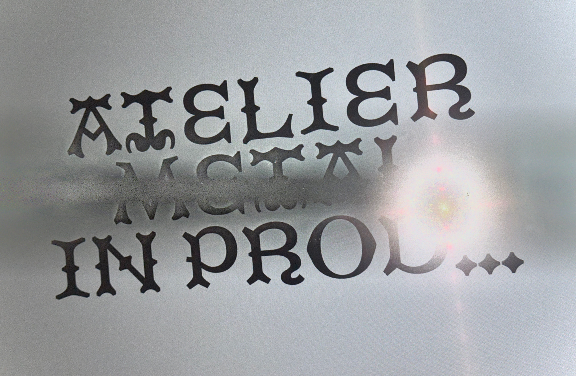
Atelier Metal, a typeface from Production Type’s Beta program, offers designers a way to try pre-release typefaces and test new features
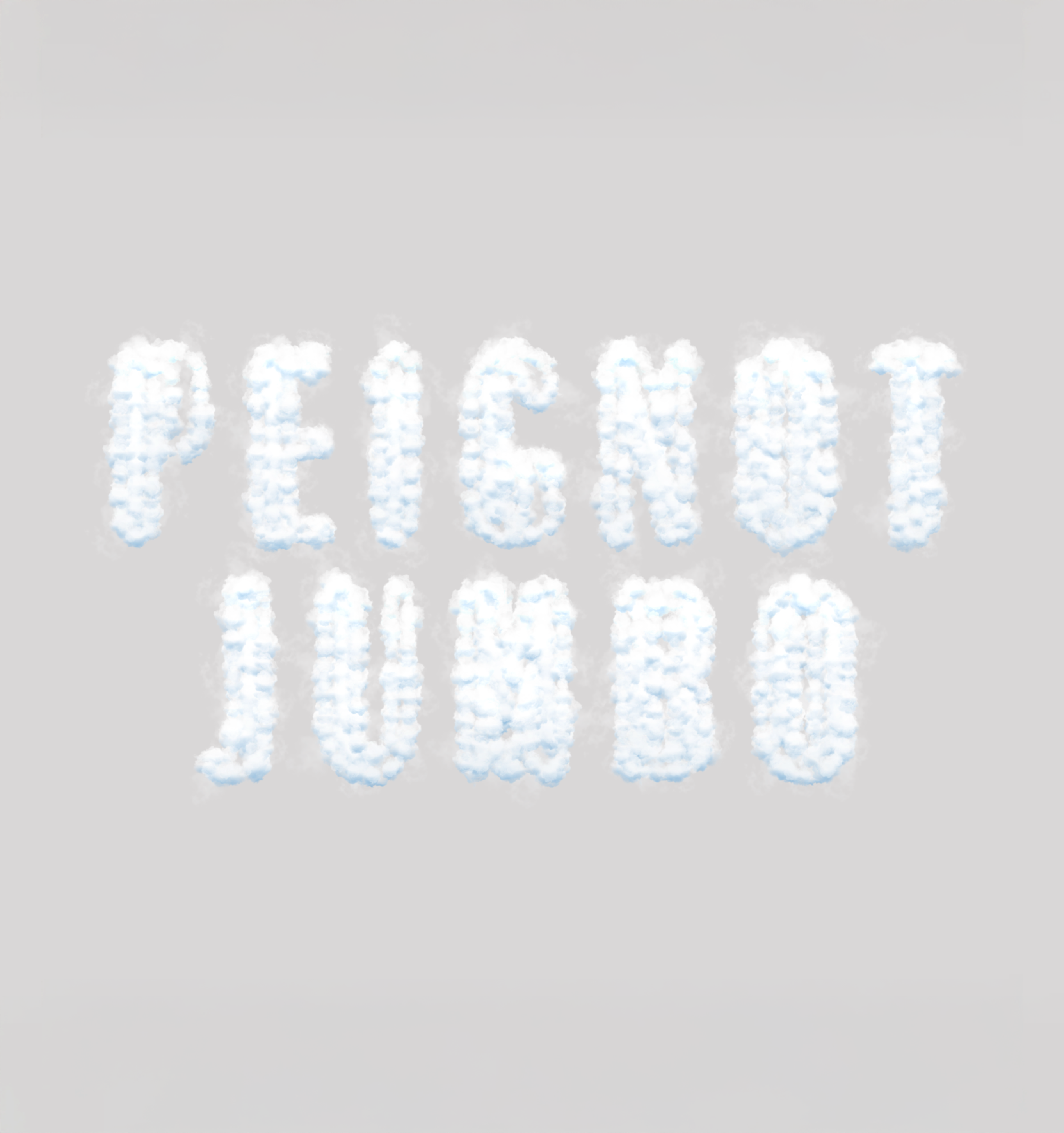
Peignot Jumbo, a typeface from Production Type’s Beta program, offers designers a way to try pre-release typefaces and test new features
You mentioned in a couple of interviews that you care about each team member’s personal growth. How exactly do you contribute to it, except for introducing the designers to CJK-typography?
Well, that’s quite something already.
Constant training is the key to someone’s professional growth. I believe that type drawing is a somewhat easy skill to acquire: knowing how to handle Bezier curves can be taught in a relatively short
Caring about a designer’s personal growth is not about teaching them how to use software; it’s about helping them acquire different perspectives: to broaden their consciousness and knowledge around Cyrillic, Greek, and Arabic scripts, to enable a person to move and get acquainted with another culture, which does not always happen after the studies. Usually, one has the opportunity to travel for study purposes, but not always for work purposes. So we want to offer that.
We also have an allocated budget for internal training. There’s an allowance when it comes to small purchases like plugins or books, or any reference material that’s required to increase your general knowledge of the field.
We want to build a relationship with the people we are working with: Production Type offers its employees full-time contracts. It is philosophically very different from being a foundry that is, in reality, constituted by a galaxy of 30 freelancers.
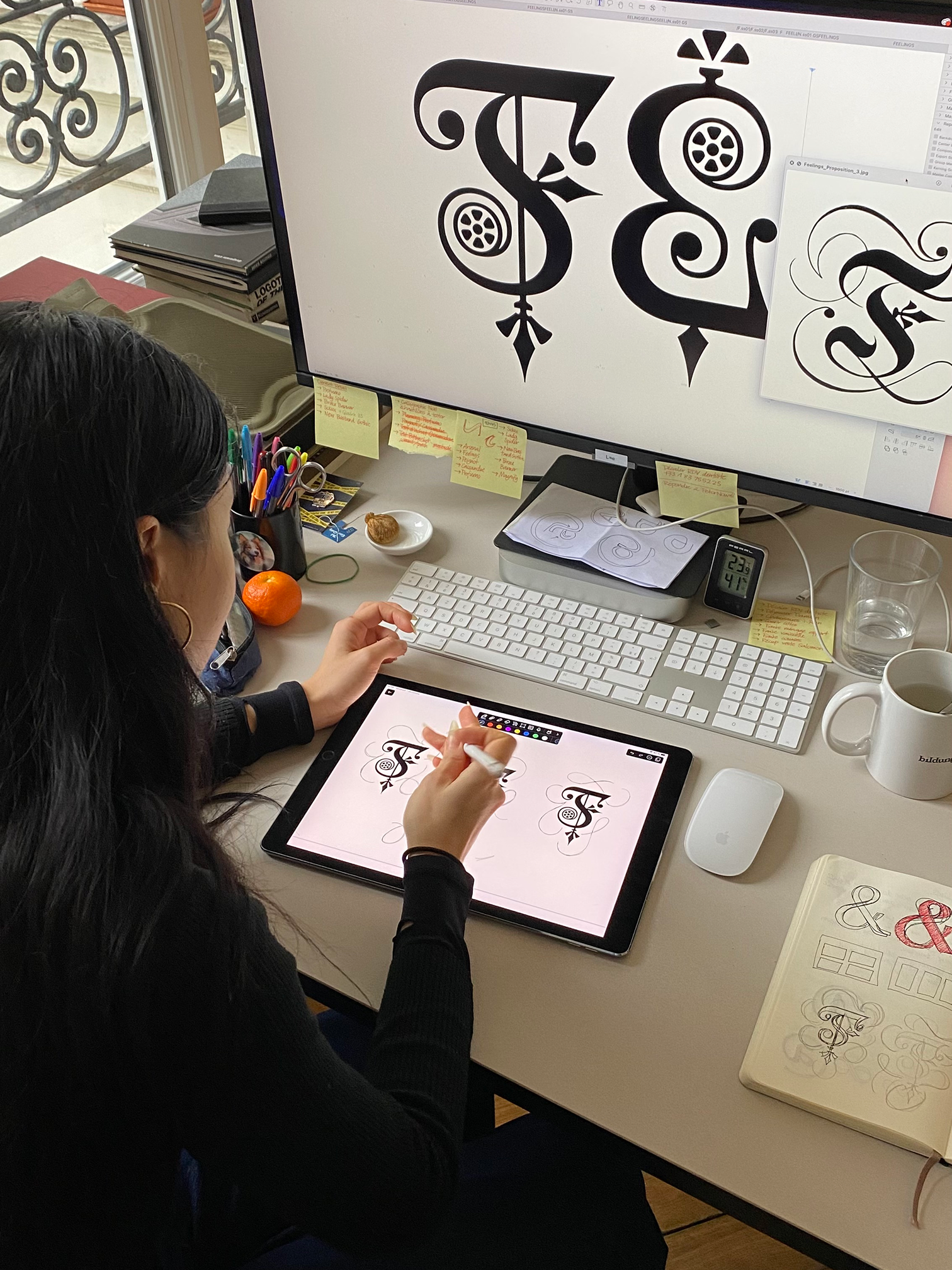
Life at Production Type office
Do you advise non-fiction books to your team? You read a lot of them.
That’s a personal trait. I have other ways to let my mind wander, but reading about history or social studies is really important to me. That’s where I get my kicks from. But I am not the company, and the company is not me. We share influences and references in a dedicated Slack channel. I occasionally gift some of the non-fiction books to my coworkers, but that’s about it.
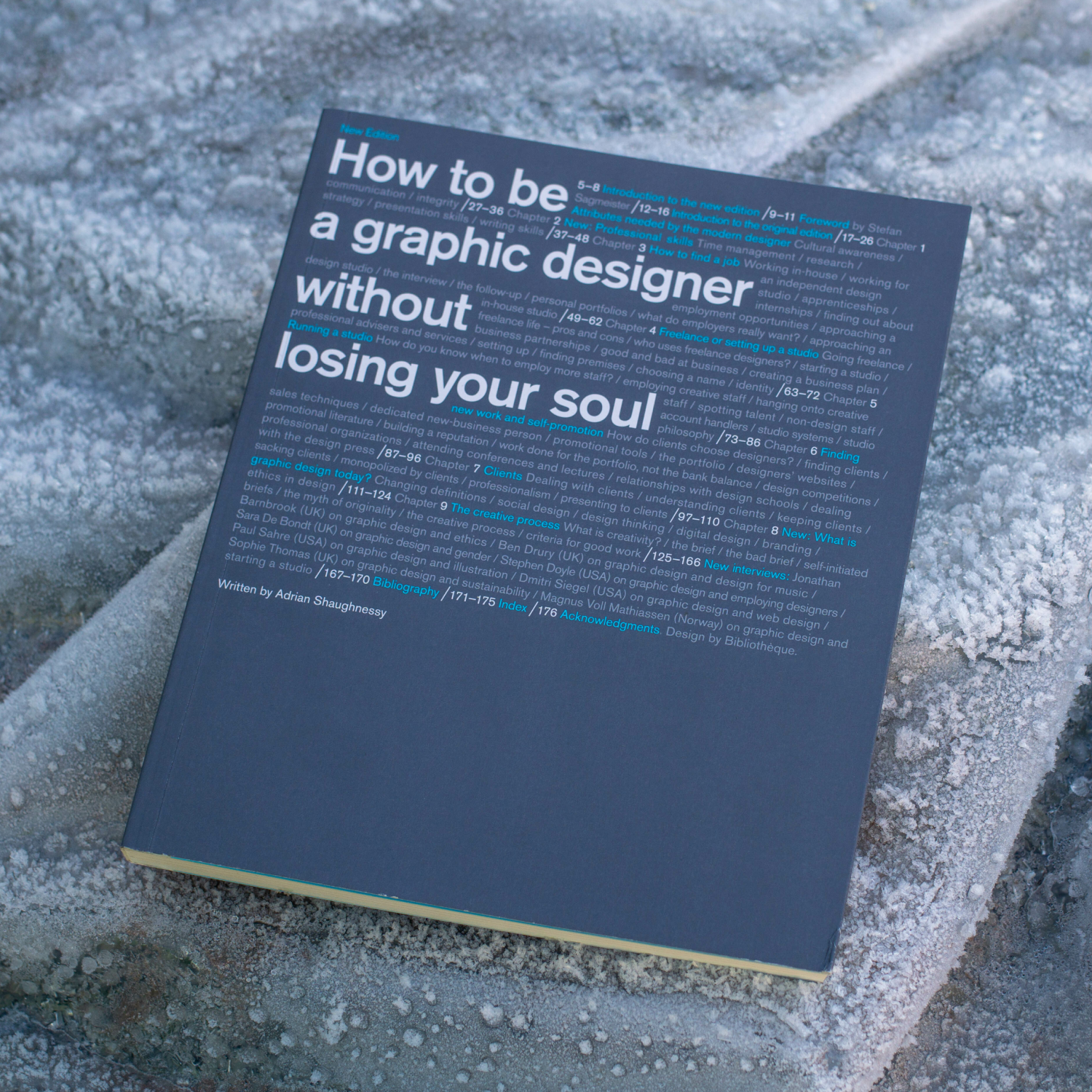 The book Jean-Baptiste Levée mentioned reading in other interviews: How to Be a Graphic Designer Without Losing Your Soul by Adrian Shaughnessy
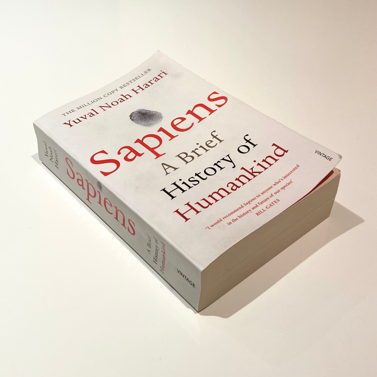 The book Jean-Baptiste Levée mentioned reading in other interviews: Sapiens by Yuval Noah Harari
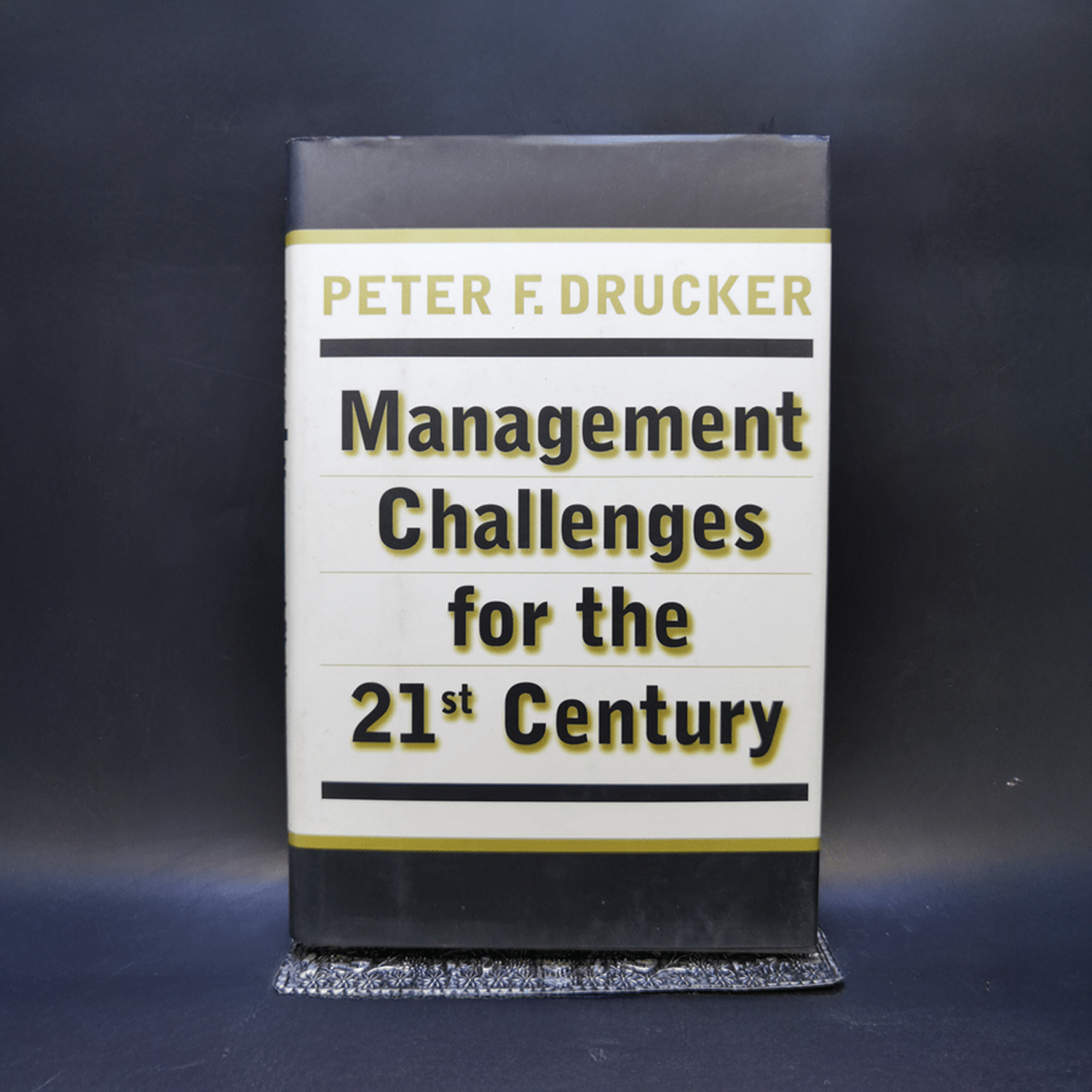 The book Jean-Baptiste Levée mentioned reading in other interviews: Management Challenges for the 21st Century by Peter F. Drucker
You have a research day on Friday, when designers are allowed to work on personal projects. Why did you decide to do so?
This idea comes from Christian Schwartz of Commercial Type. We used to do it, but this has changed as I noticed that the reality of project schedules crushed it. Now people are paid for five whole days a week, but we actually stop work on Friday at noon. After that, people can stay over and spend time on their own typeface, or simply go and leave for the weekend.
Life at Production Type office
You’ve said that it works best if each person is an expert in their own field. Would you consider, for example, a salesperson who has no knowledge of typography?
Of course not. It’s not that we are not primarily looking for typography specialists, because it is such a niche business. However, we need people who understand and appreciate design, as they will interact with designers daily. And if you don’t have a taste for that, the interaction is very poor on both sides.
The bottom line is that to work in a design-oriented business like ours, you need to have a genuine interest in the field, and it should be evident on your resume. The last time we posted a job offer for non-design work, we received 500 applications. We discarded the applications where the resume showed no special interest in design. Everybody likes movies, art, music, and literature, and they put them in the hobby section of their resume. However, we need people who include it in the professional section of their resume.
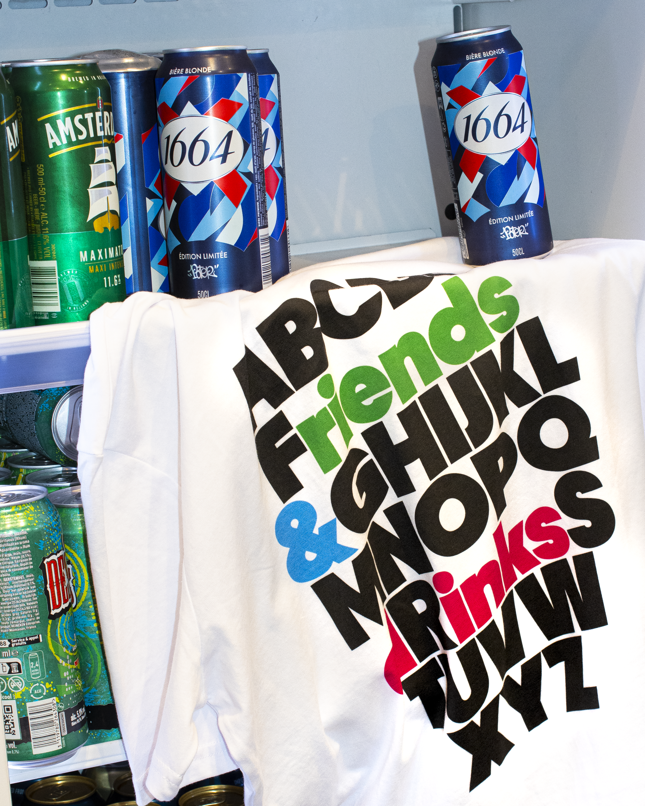
Who in the team is coming up with the merch ideas, like the slippers?
Production Type has always done a bit of merch: it exists because it says something about the company culture. It doesn’t exist because it’s a sellable item by itself, although when it’s “just” a T-shirt, it doesn’t take a lot of effort to figure it out. The summer merch really is a collaborative effort. Some ideas come from me, some come from the communications team, and some come from the designers. My role here is to encourage initiatives that arise within the team.
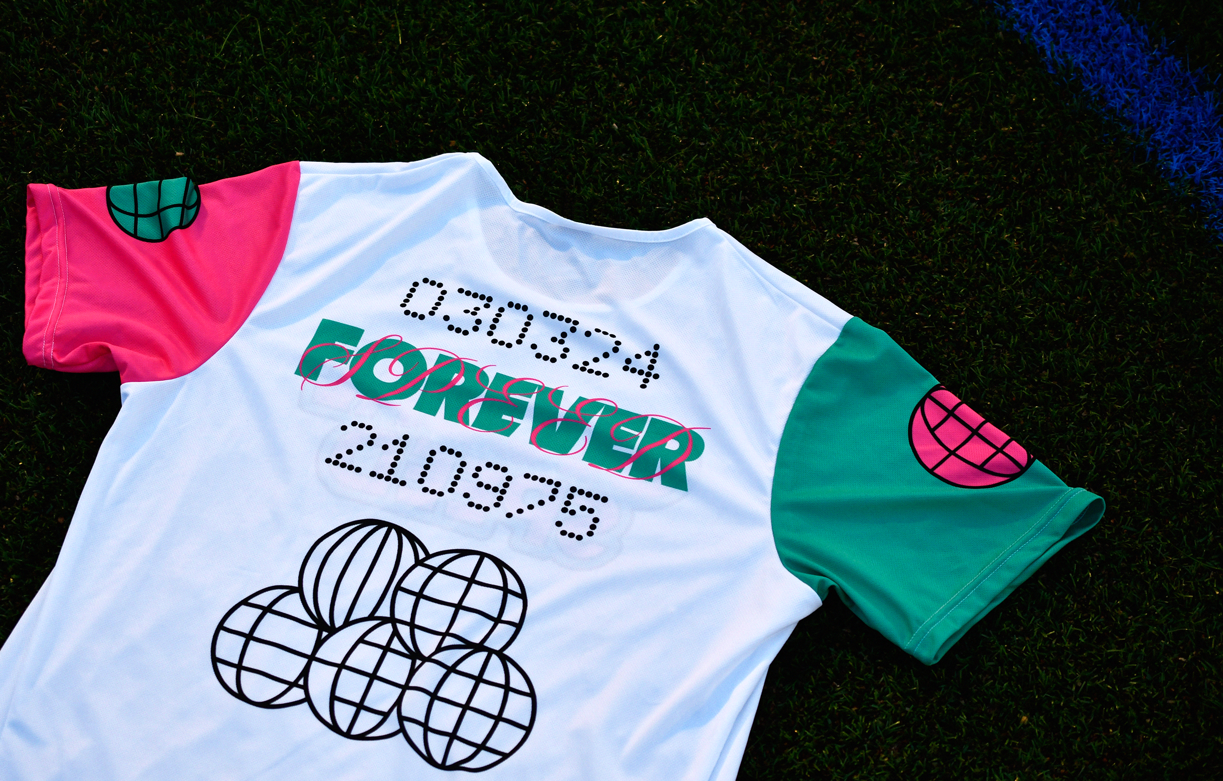
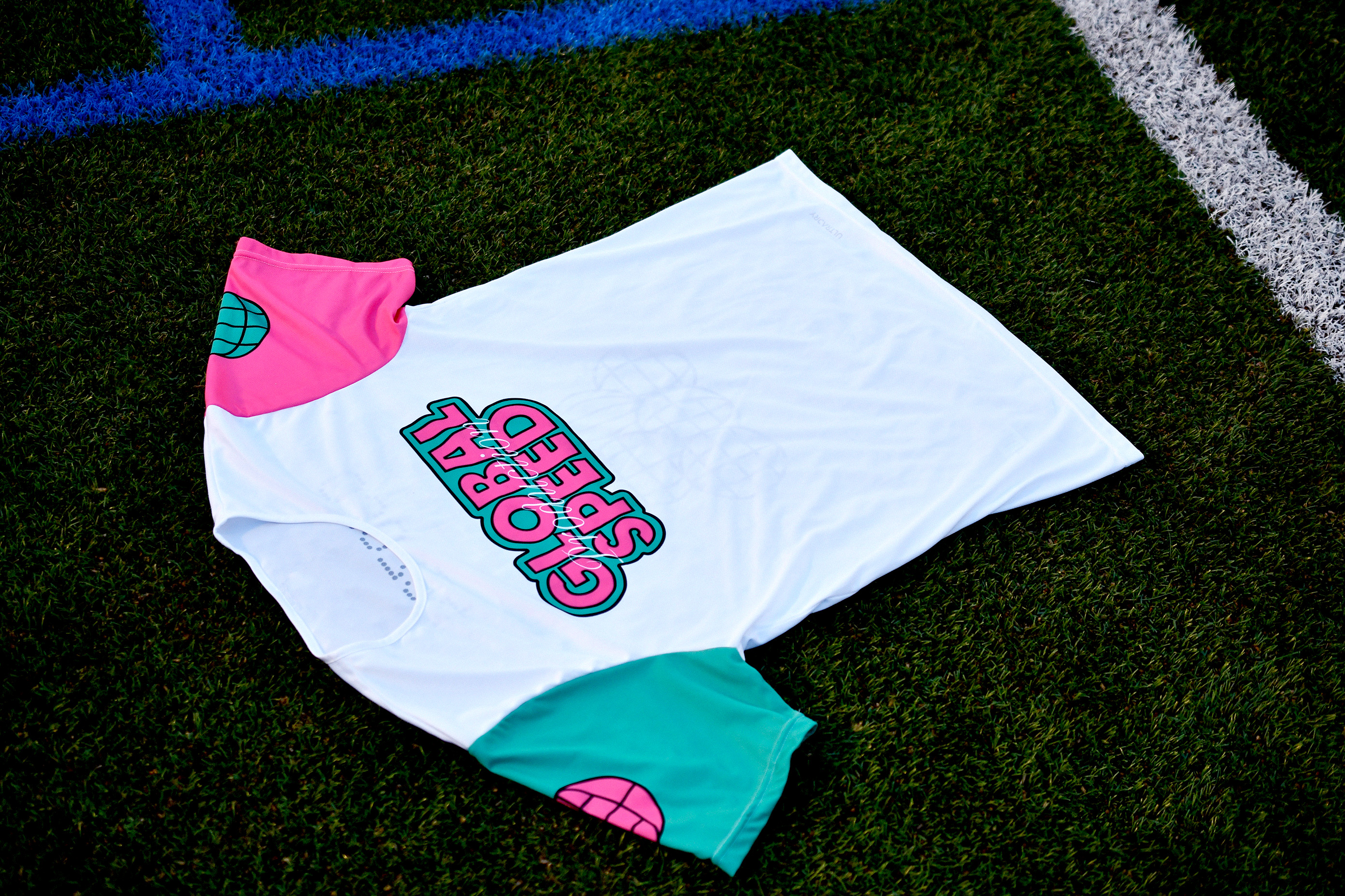
Production Type t-shirt
And how did you come up with the idea of the summer quest, suggesting spotting fonts in the wild?
It is said that summertime is a slow period in terms of marketing, communication, and font release. That’s true for France, where nothing happens around mid-August, but it is not the case in the USA. Each Summer, we seek a long-term communications concept. This year, we built it around signage from French cities, towns, and villages, especially signage that is twofold in nature. One sign is, of course, the name of the city. Another sign is an award label indicating how beautifully decorated the place is. And if you sent us a photo of the signage, you would get stickers.
Both signs relate to typefaces that Production Type published. The city names and town names relate to our typeface Signal, which is also available at type.today. And the one about the award for the most flourished village is typeset in Wigrum, another one of our typefaces, which also supports Cyrillic. There was, therefore, a typographic reason to suggest such a quest.
And beyond that reason, it’s also because people are going on a summertime Tour de France, and it was a way to draw attention, saying, Hey, all the signs you see during your travels are connected to Production Type.
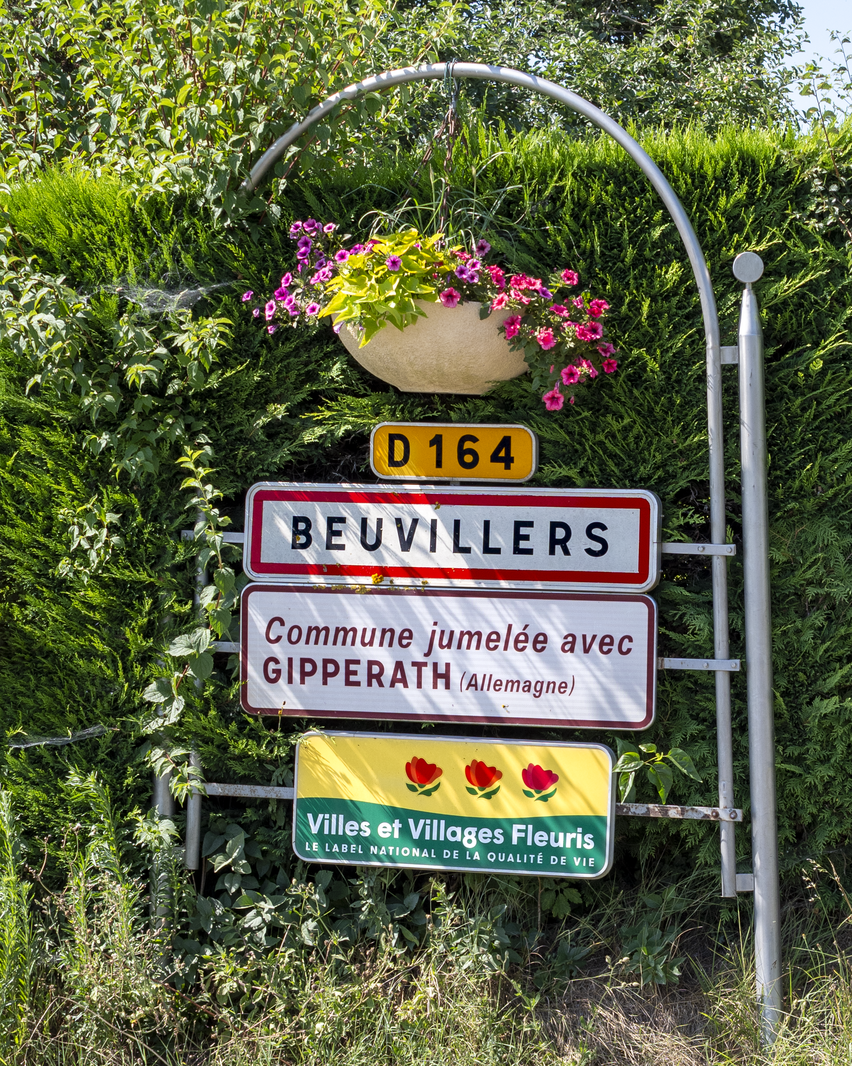
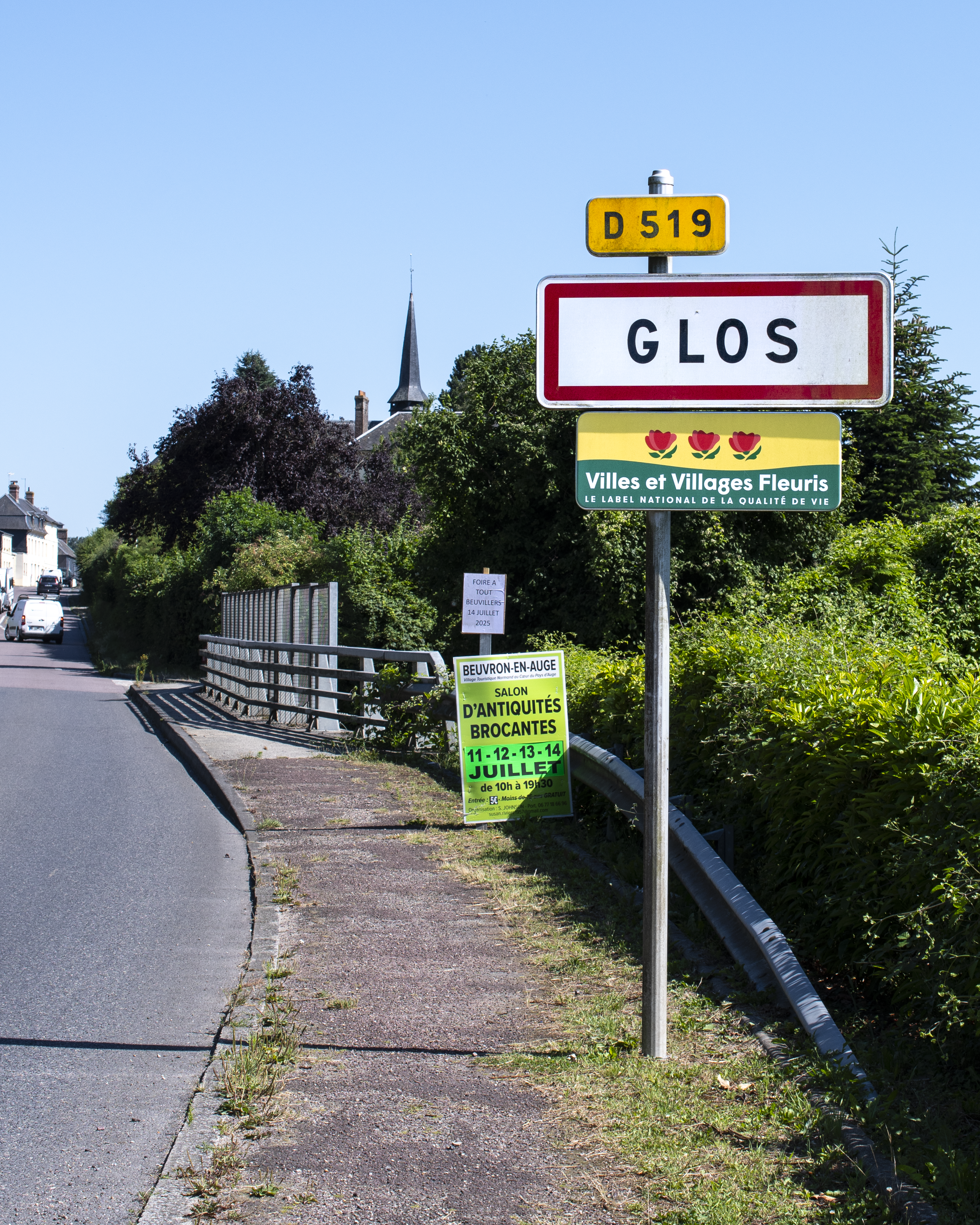
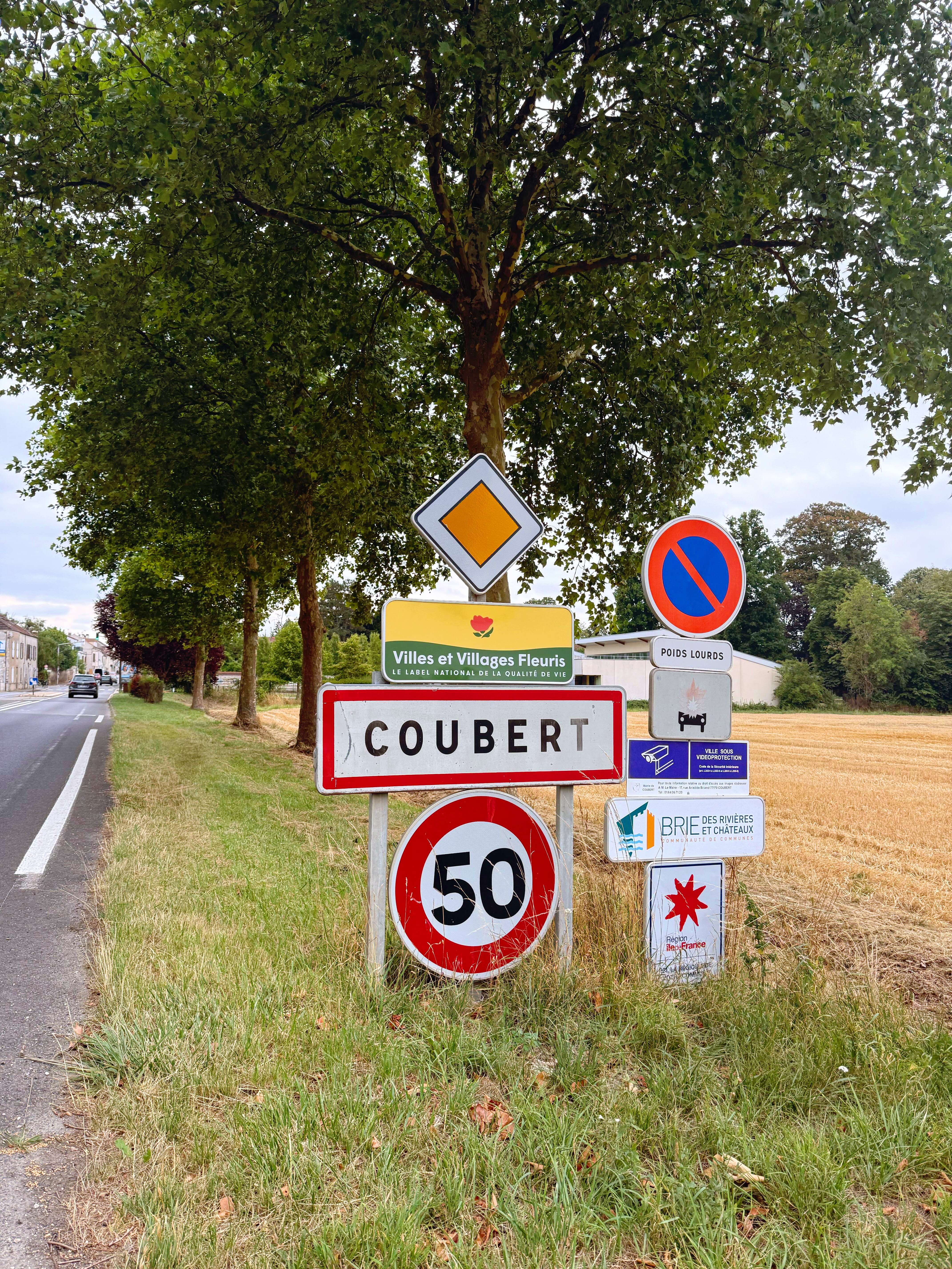
Villes et Villages Fleuris quest by Production Type
Signal Mono available from Production Type and type.today
Why is it so crucial for a digital-first company to go offline?
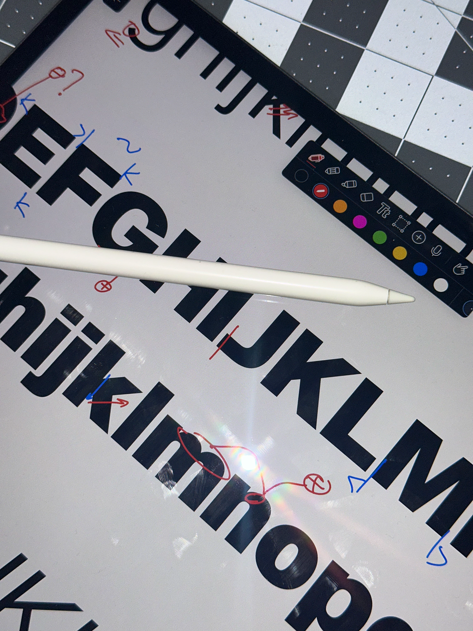
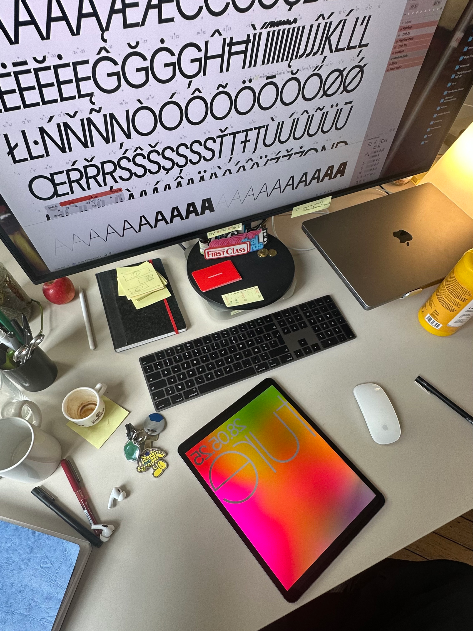
Well, type design on paper can feel a lot like it’s black and white, two-dimensional, and static. But I know that this is not true. Typography and typeface design are actually colourful, moving, and physical. I love seeing typefaces in the physical world, on storefronts, engraved in metal, or enameled.
This is a nice way to connect the reputation of digital type design, which can feel solitary, static, and silent, with the actual lives of typeface designers. They are not a line of solitary, silent people! Here, the office is lively, and it’s actually not always easy to focus and concentrate. If you’re in the middle of super hardcore kerning, it can be difficult.
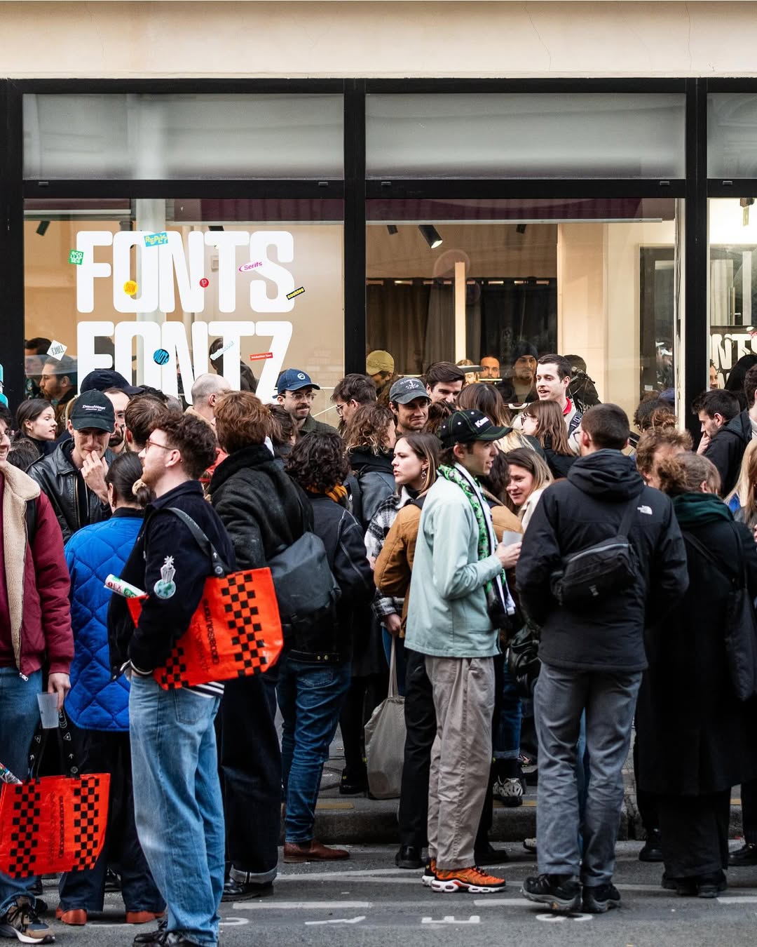
Production Type 10th anniversary
Production Type office
How would you describe the contemporary type design field?
It feels fragmented. I genuinely believe that independents have never been in a stronger position. We have found that more and more foundries are opening and closing at the same time, which demonstrates the sector’s high level of activity. Knowledge around type design, font production, and design business has never been easier to find.
On the other hand, there are fewer and fewer spaces for critical discourse around fonts and design. We have fewer magazines available because the magazine sector is in decline. We have more brands trying to build media. Out of frustration with the lack of critical discourse about typography, some of us had to find a way to express and finance the writing around type.
There are also fewer typography conferences. I might sound like a veteran, but Ilya [Ruderman] and I met during what was perhaps a peak of type design conferences. There was about one type conference per month in any part of the world. And COVID has wiped out all of this.
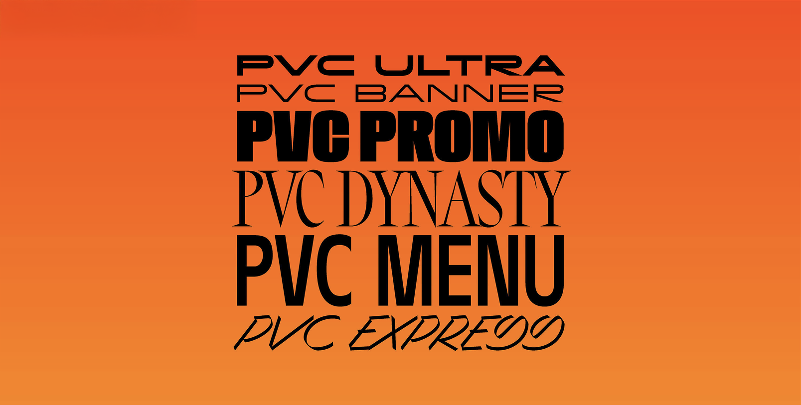
PVC collection by Hélène Marian available from Production Type
Do you think type designers suffer from architect syndrome?
Yes, I still meet that kind of person. It’s not very healthy. It is somewhat related to seeing oneself as the elite of graphic design.
How does this combine with the fact that the median income of an individual entrepreneur (who many type designers are) in France is around 760 euros a month?
This is a terrible drama. This is why being good is not enough, unfortunately. A good friend of mine said that you can be a good designer, but there’s always someone who would be a better spokesperson instead of being a good designer. Therefore, you have to be skilled at promoting what you do.
But this revenue thing is a scandal. It’s a plague. It shows that, on the one hand, designers still have a lot of work to do in advocating for the value of what they do, rather than just the cost of it. On the other hand, it shows that in a capitalistic environment, clients succeed in exploiting the designer’s work in a way that’s cost-efficient for them, but does not generate sustainable revenue or recurring income. And that’s the drama.
In France, we have traces of laws surrounding artists that originated in the 17th century, when King Louis XIV began to care about older artists and how they could make a living. Otherwise, they would simply move from one commission to another, and if they could not work, they would stop making a living. And, unfortunately, to this day, some of us still suffer from this mechanism.
The solutions are easy to mention; they are not easy to actionate, but it really is about designers advocating for the value of typography and the value of design. And it involves professional training, including attending workshops and classes. Even though you are no longer a student, you still need to brush up on your skills and acquire new ones, because otherwise, a design career is one that is often based on youth and freshness.
We’ve recently been sent a request to write an article about older designers who are deciding whether to retire or not, and if so, how they plan to survive. The idea is a backlog, I guess, because I am afraid to see the outcome.
At least before committing to solving that one problem, there could be a stronger design organisation to defend the designers’ rights.
In France, we have a specific institutions that support artists, including typeface designers, and that support goes all the way to retirement. There are some marginal, not structural, gains in privileges, but it would take much more than these to earn more than 700 euros a month.
In 2020, you mentioned that you felt like you lacked soft skills. Have you improved them since then? Do you have any advice on how to do it?
Yes, go into training. If possible, set aside some money to finance training in areas you have identified as lacking in your skill set. I’m not speaking about knowing how to code in Python. It’s more about being convincing, using rhetorical techniques, speaking in public, and building a presentation.
Most type designers know how to put together a good layout, but being a good storyteller and learning how to structure a presentation in a way that makes what you are saying convincing and compelling, so that people follow your path of thought, is not that easy.
Have you ever attended classes on public speaking or improving your soft skills?
Paradoxically no. However, I have read about it extensively. I also took consultations, a bit of personal training, but not a group class on how to build a presentation.
I also learned from my experience, from failures and successes. For instance, my secret recipe for presentations is that you don’t have to have secrets. Just say: “I started there and now this is where I am. In the meantime, I got lost, I tried this, it didn’t work out for this reason, I hesitated, I failed.” Building vulnerability will earn you trust from a client.
Which fonts do you wish to release at Production Type but are unable to?
I’m happy with what we’ve been able to release. I’m super proud of that. If you ask me about past fonts that I wish I had released, I’m fortunate enough so far to have not turned down something that was immensely successful afterwards. I would hate that feeling. I don’t see the point in fantasizing about past successes. I don’t see the point in being envious or jealous.
Recently, we reviewed a couple of submissions, but we didn’t simply reject them. I said: “I think this would be better placed in this catalogue and I’m happy to offer an introduction. I think this would be the right place for your typeface.”, followed by a connection email.
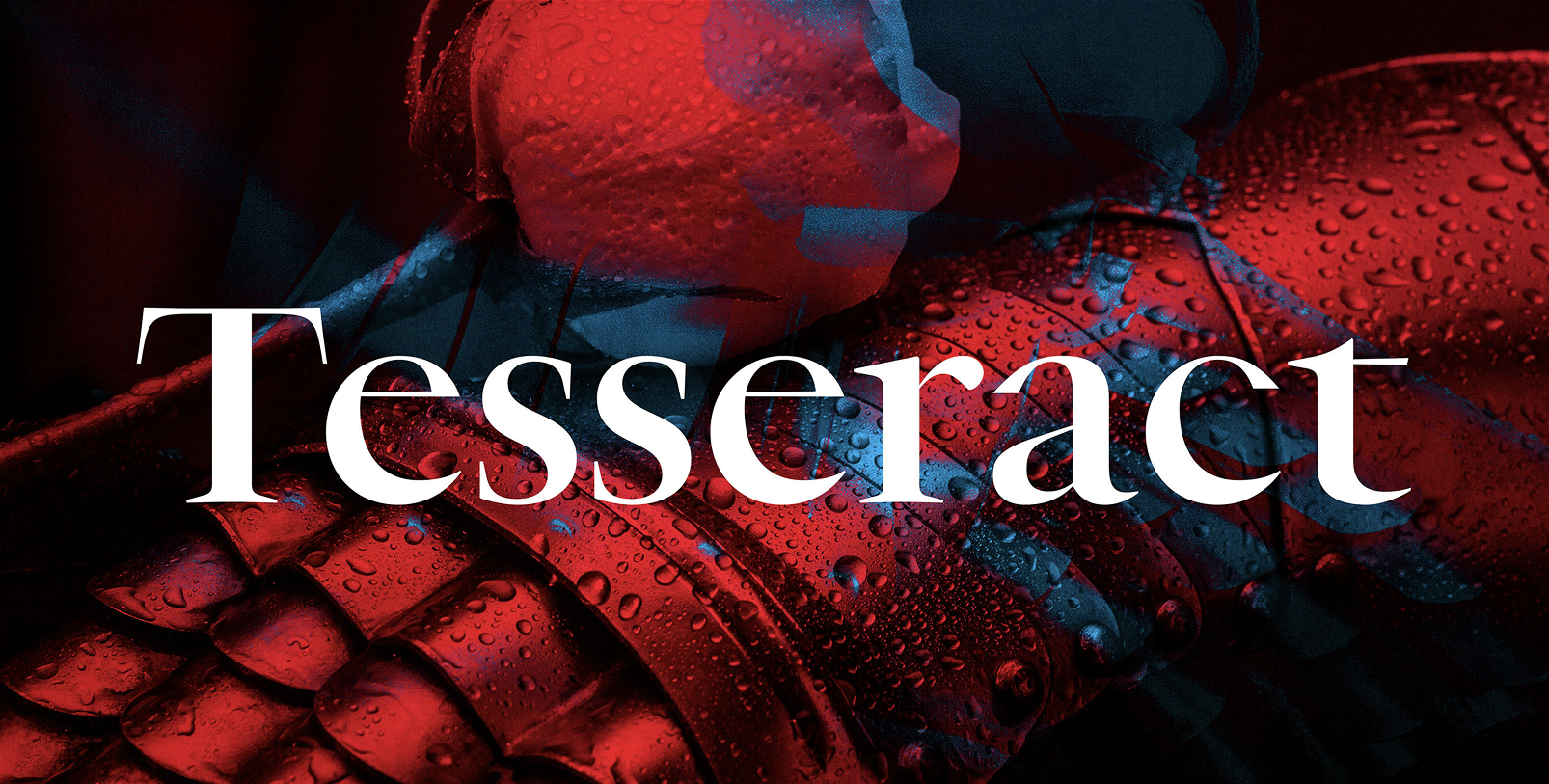
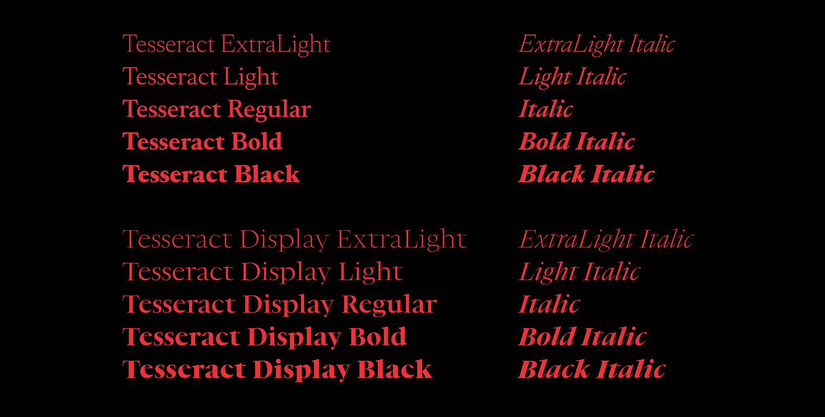
Tesseract collection by Jean-Baptiste Levée and Marion Sendral available from Production Type and type.today
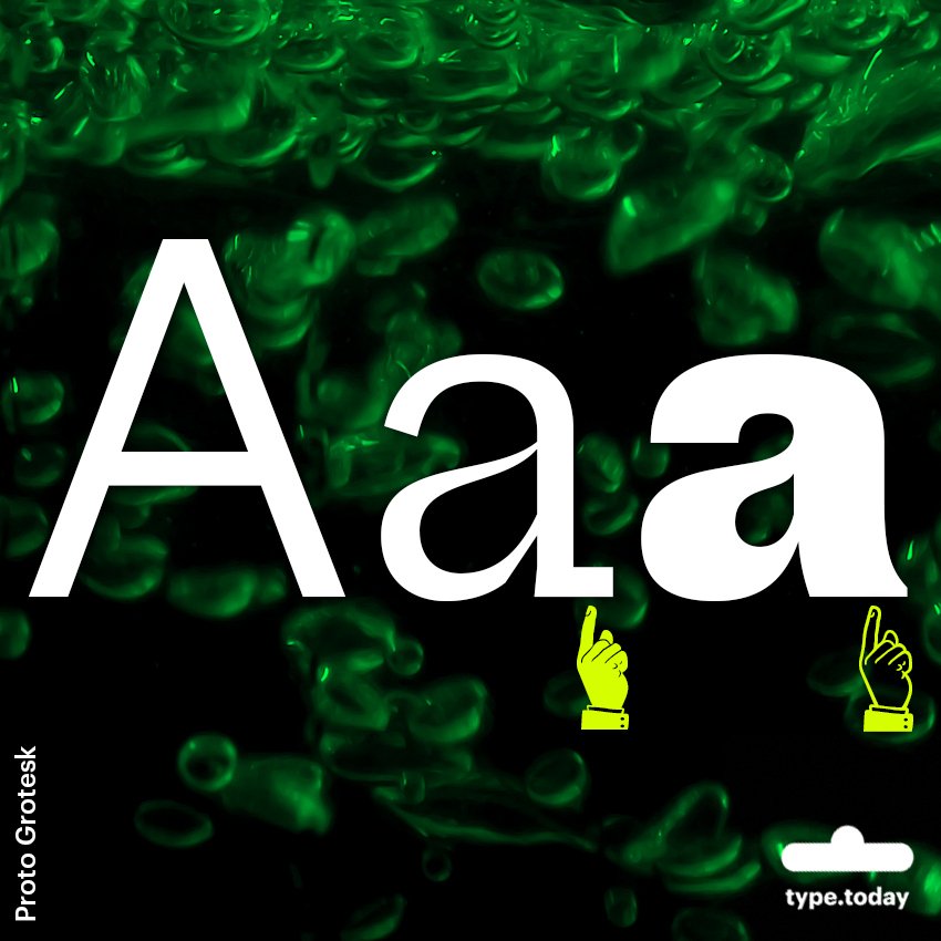
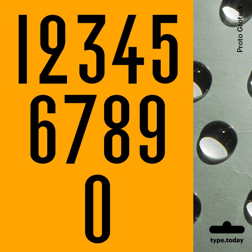
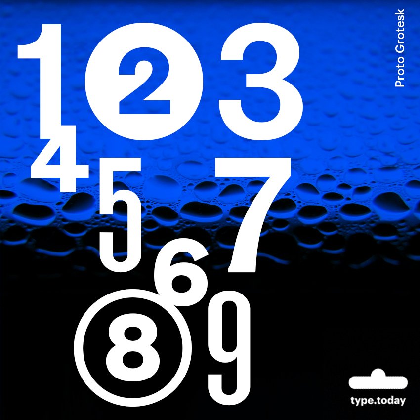
Proto Grotesk by Jean-Baptiste Levée available from Production Type
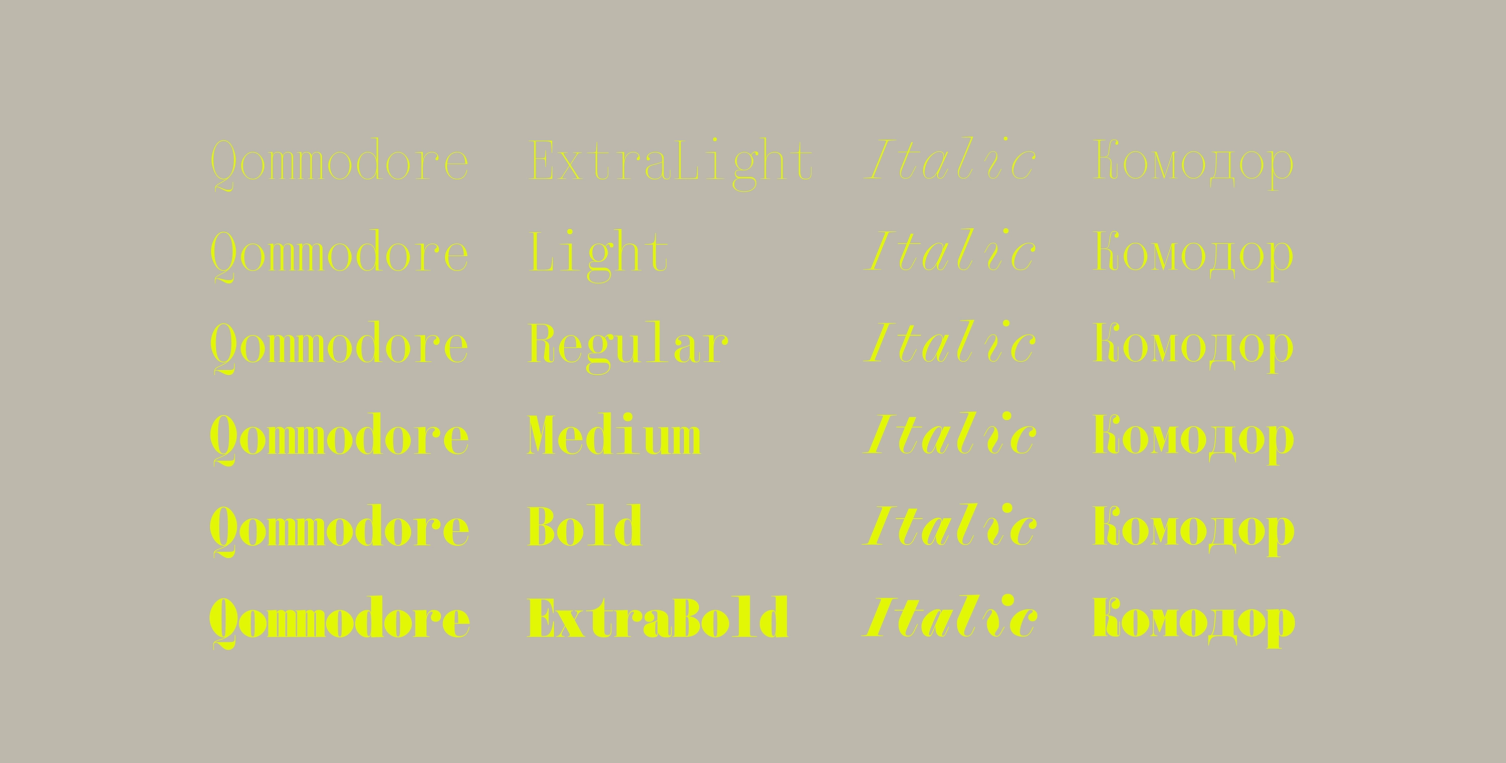
Qommodore by Hugues Gentile available from Production Type and type.today
How will you describe running a foundry as an experience?
Entrepreneurship is not for everyone, just as being a freelancer is not for everyone. I may be toxic to myself, but I don’t really disconnect. Earlier, I said that I am not my company; however, I do sleep with the company in mind. I go on holiday with my business in mind. If I were on a payroll, that would be very toxic. However, as a business owner, that is part
I have to deliver bad news. I have to make difficult decisions. I have to live in peace with the fact that I cannot please everybody. But it’s definitely worth it. I’m really thankful for where I am. There’s a bit of luck involved, but not a great deal.
I have over 20 years of experience, with more than 10 years in the foundry. And right now, I’m reflecting a lot on the sociological aspects of what I did: in my life, not so much evolved around talent or luck. My greatest skill is identifying opportunities and seizing them.
I do not come from a wealthy background, and I did not have access to financial capital or social capital. In a very “Pierre Bourdieu-esque” fashion, my capital was instead a cultural one, and I evolved in a culture-friendly environment. I also have to acknowledge the fact that I’m a white male, which grants me a set of privileges. I arrived in the job market with that particular set.
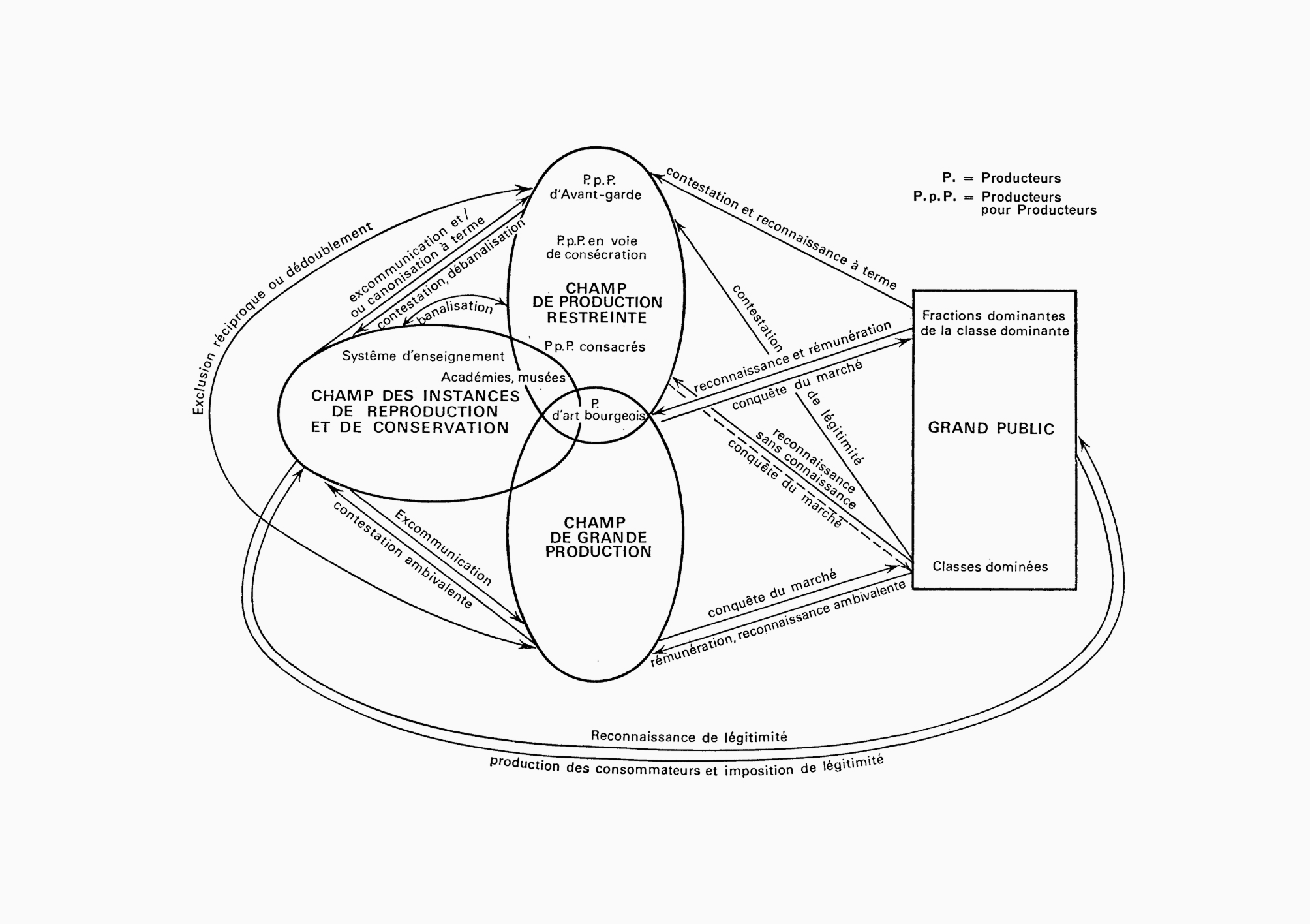 Graph from “Le marché des biens symboliques” by Pierre Bourdieu
Life has provided me with more opportunities than others. I was able to seize the opportunity, and for that, I’m thankful; I’m also extremely happy with where I am today.