
IR: I’ll start with the usual question. One more time, Andy, what do you think about type today, what is type today for you?
AC: I knew you were going to start with something like that. I don’t really know. I think you see so many people today trying to learn to design type. It’s like type is becoming something that…I don’t know how to word it the right way: it’s become more accessible, there’s more opportunity today to study type design. A graphic designer, a user of type, can really learn how to make type for themselves.
This is also how I like to think about it when I teach at the Cooper Union – this is the sixth year now that I’ve been teaching workshops and I’ve always liked teaching the kind of student who’s a graphic designer who just wants to make their own type. Maybe not necessarily someone who wants to start a type foundry or actually work in the industry, but someone who really could just make something for their own needs because what they really wanted didn’t exist yet. Lettering and typesetting skills have always been taught along with a graphic design education but I think it’s all taken a step further now that type design is easier to get into. What do you think about that though?
IR: I like your point about education because, despite being such a vital instrument for everything which is visual, as important as the understanding of colours and composition, type was so badly taught in academia. This is why we have a generation of graphic designers for whom one of the most painful questions is choosing the type. Finding a nice pair of typefaces.
AC: Yeah. I’m sure the basics still have to be taught first or at least alongside, maybe a student shouldn’t learn to design type before they even know how to look at the qualities of a typeface and at least what makes one different from another. And you probably shouldn’t design a typeface just for the heck of it. There should be a real reason, maybe you can’t find something quite like what you had in mind.
 Drawbot is a powerful, free application for MacOSX that invites you to write simple Python scripts to generate two-dimensional graphics. Drawbot logo designed by Andy Clymer in 2005.
IR: I actually had several students over the years who came directly from school without any education. When they applied for the course I would ask them: “Isn’t it strange, you don’t know anything about graphic design. You don’t know how type actually works. You don’t have any experience.” Most of them just honestly said “Yes, I don’t. I don’t know anything about usage but I really believe that it is one of the most important tools. I will find my way later. Maybe I will make a super strange typeface first? A super strange project? But at least I will get an understanding of how it works. What the rules are. I’ll learn how to control that, and then I won’t freak out when I need to choose something, make a decision, correct something or play with it.” And this is super smart, in my opinion. I was super proud to hear such responses from young people. Perhaps they’d read it somewhere? Maybe. But it is still a very good point.
AC: That’s true, too. For me, when I was in college, there was only one typography class available to us at first. They added a couple more classes as the program went on, but it’s tough to condense it all into one class. You learned how type worked, by, I don’t know, Bringhurst’s Elements of Typographic Style. So it wasn’t very experimental, you’re learning to use type from the traditional perspective of a book designer, following their rules.
IR: Super classical, conservative typography
AC: Right, yeah. Maybe, if you follow Bringhurst word for word, there’s just a system to it where here’s how to choose a page size and here’s how much leading to use or how many words you should fit in a line. But I think experiencing the act of making a typeface would of course give you such a different perspective on using type. Because the designer of a typeface has to think critically in a different way as they use it and proof their work, and I think they learn to not just trust the default layout settings. But I’m thinking back to that point a moment ago, in most major cities right now you can find a workshop on type design.
IR: More or less, yes.
AC: Not just lettering, but yeah, you find type design workshops happening all over the place. Maybe I’m thinking more North American-centric, but there is a lot of stuff happening in San Francisco but even in places that I’m kind of surprised to hear about. You hear of workshops happening or more new cities that host Type Thursday meetups. A lot of people want to learn.
IR: So actually that means that this is just the beginning of changes.
AC: Right. I mean, I have no idea. You could speculate that sure if everyone learned to design typefaces then what does that mean as a change in the industry for those who sell type? But I think most of the students that take these classes to learn type design, some might think at first that this is a career change and they want to move into working for a type foundry, or they are going to open their own shop. But I think what most students aim to get out of it is to just supplement their own design work, I see students doing very interesting work by making typefaces just for their own use.
IR: For just one particular thing.
AC: Yeah. And maybe it’s only because that next step is a very big step. To be comfortable with selling the product and being confident with how it will work for everyone else. I don’t know if that’s what keeps them from going further, but there’s really something special about making your own type and not being concerned if someone else can use it the same way you can.
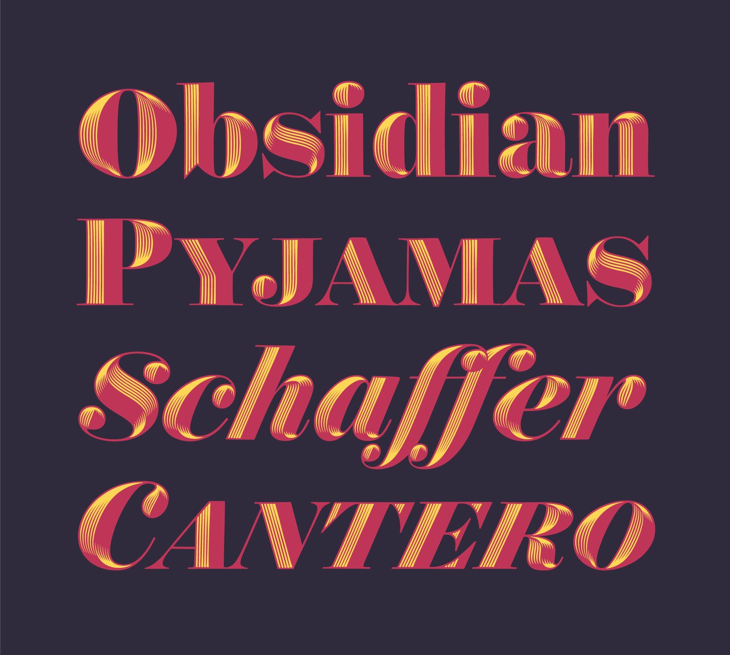
 Obsidian — dimensional typeface by Hoefler&Co
IR: Okay. Let’s move from teaching to work. In our class you were the Python God. Lately, I know that you’ve been working a lot with scripting and you’re still producing tools and improving your workflow. At the same time, as a type designer, you have incorporated several projects over the last few years that have been super innovative from the graphical point of view. How does this work balance out? And, of course, there’s Obsidian. Obsidian is something based on scripting and you gave a wonderful lecture about that. I remember how you explained how it was kind of interesting and super complicated while still involving a certain amount of manual work, something that script cannot do. But looking back on that, could you make some observations on that experience?
AC: I have to call you out on saying scripting “God”. I know at Typographics 2017 you were talking about how type designers need to be rock stars and I think it kind of tries to imply that maybe someone was born with a skill that the others don’t have. I only call you out because I used to be more jealous of other’s skills, and still am, but I’ve only recently become comfortable with the fact that I can just be really happy to be getting better at the things that I really enjoy doing.
For me though, when we were in The Hague, something about the programming classes felt right. The Drawbot exercises and Python lessons just felt like they fit. I used to dream of being a better calligrapher but I couldn’t stand the monotony of the practice, I know a lot of people feel the same way about programming.
What do you think about that though? I know that I kind of deflected the entire question just to talk about that point.
 Obsidian — dimensional typeface by Hoefler&Co
 Obsidian — dimensional typeface by Hoefler&Co
 Obsidian — dimensional typeface by Hoefler&Co
 Obsidian — dimensional typeface by Hoefler&Co
 Obsidian — dimensional typeface by Hoefler&Co
IR: For me, who is not scripting that much, just an idea that I kind of have a possibility, and I agree with you that there are things which I haven’t spent time on, and probably could have done something by myself as well. But the idea of controlling a tool, making a new tool, maybe some super small one, but just for my own particular reason or project. Unfortunately, it is still a miracle. So I wish I’d spent more time over those ten years or so on scripting and had that possibility and the knowledge to make something of it.
AC: But that is really it, with Obsidian as well, it’s just time. And I feel so fortunate that I was given the time at the office to explore something new, that Jonathan [Hoefler] saw that this exploration was something I was interested in and thought it would be a worthwhile endeavor to let me actually spend time to explore. Of course, if I’m given the time there’d have to be some result that comes out of it, I’m not just exploring something that’s completely tangential to the work we do at the office. But something that’s been so important to me in my job is that I love that I’m given the opportunity to just learn something new. It would be so boring to just do the same thing with the same process in every project, but it would be an absolute dream to be able to learn something new each time.
And that is how Obsidian came about, it really started as an exploration within some boundaries, where I just wanted to try something new and become a better programmer. But that’s another thing; I think a lot of people just don’t want to sit down and try to write code, if they don’t feel like it’s a fun thing.
IR: Or just thinking “Oh no, it is not possible!” So basically, most of the time, we’re just thinking that this can’t be automated. This can’t be done by the script.
AC: Right. But maybe people get bored or they bite off too big of a problem early on. I wish so badly that I could pick up a brush and knock out the most amazing little lettering lockup, you see so many people who could do that and you think it’s like “Are they born with it, born with a hand that can do that?” But no, they’re literally going home and practicing until late at night, because maybe that’s how they clear their mind or at least because they enjoy doing it. They love the process. They have the interest and the time.
 Obsidian — dimensional typeface by Hoefler&Co
 Obsidian — dimensional typeface by Hoefler&Co
IR: I see how the industry is partly becoming a programming industry as well. So the amount of people who are producing those small tools, extensions, scripts and everything, basically it is beginning to be part of the profession, and type designers are more and more often people who not only draw but also write with code. More or less, another side of that trend, is that at some point there will be so many extensions and everything that you actually don’t need to do that. It’s already there. That is my hope.
AC: This is a notion that I got from Erik [van Blokland] and Just [van Rossum], when we were studying with them, but particularly from Erik. It’s such a small industry, and even though the industry is getting bigger, sometimes you still have to kind of take care of the tools yourself. And you can’t wait for some large company to make the new thing that you need and solve your problem because they’re not going to sell enough copies of it to make it worthwhile. We look to people like Erik van Blokland who made Superpolator as an excellent self contained application but the kinds of tools that a designer makes for themselves on a daily basis are much more simple, I’ll make something because I just have one little task that I could use some help with. It would just save time to quickly make a little helper script. I think these kinds of tasks can’t be filled in with a new extension written by someone else, there’s a certain point where the process is really personal to an individual designer’s way of working.
IR: My question was maybe that it’s not necessary to, but you answered that.
AC: I should finish that point, because I liked how you brought all that up about tools and the industry, another example is that Frederik Berlaen built RoboFont with the idea that it has no built-in knowledge and nothing is automated for you that you don’t know about. No knowledge of the design process. But the extensions that Frederik writes and shares sometimes do things in ways that I would absolutely not want to do! But that’s just the design goal of RoboFont, that all of the add-ons should be completely personal to how you want to work. His extensions just fit his exact workflow.
 Creating Obsidian with several custom tools
IR: And after Obsidian, then came Operator? Which is a completely different story and this is the question, several questions; not about fashion in type but this kind of freshness, I don’t know, the feeling of today-ness. I was really impressed by the italics. Those italics are incredible. Where did they come from? I read the story and understood how, but even coming up with this idea, it can be one of those ideas where you think, “I can do that, but no, it’s stupid. Nobody does that.”
 Operator typeface by Andy Clymer and Hoefler & Co
AC: Yeah. I’ll say first, you can definitely thank Jonathan Hoefler for keeping them looking fresh and new, he’s great as an artistic director and keeps you on the right path by pointing out the things that you didn’t see, if it looked a little too ‘50s or too much like what you would expect on a neon sign or this or that. So he really has a great way of pulling it out of you. It could have been completely different, of course. I mean, there were even these swashy script caps in there that really, truly, now when I look back on them, they did look like they belonged on a 1950s diner menu. It could have looked pretty retro. So, we can definitely thank Jonathan for that.
But I had so much fun with the process of making the Italics, we had been working in the Roman for quite some time before they started. There had been a few months of really figuring out how the Roman was going to work and then I brought two Italic options to a meeting with Jonathan, one was really more like what you would expect, maybe it even looked too much like Lucida or just a really anonymous humanist italic.
 Behind the scenes look at the development of Operator, and the “g” that didn’t make the cut, from AIGA Eye on Design
 Behind the scenes look at the development of Operator, and the “g” that didn’t make the cut, from AIGA Eye on Design
 Behind the scenes look at the development of Operator, and the “g” that didn’t make the cut, from AIGA Eye on Design
 Behind the scenes look at the development of Operator, and the “g” that didn’t make the cut, from AIGA Eye on Design
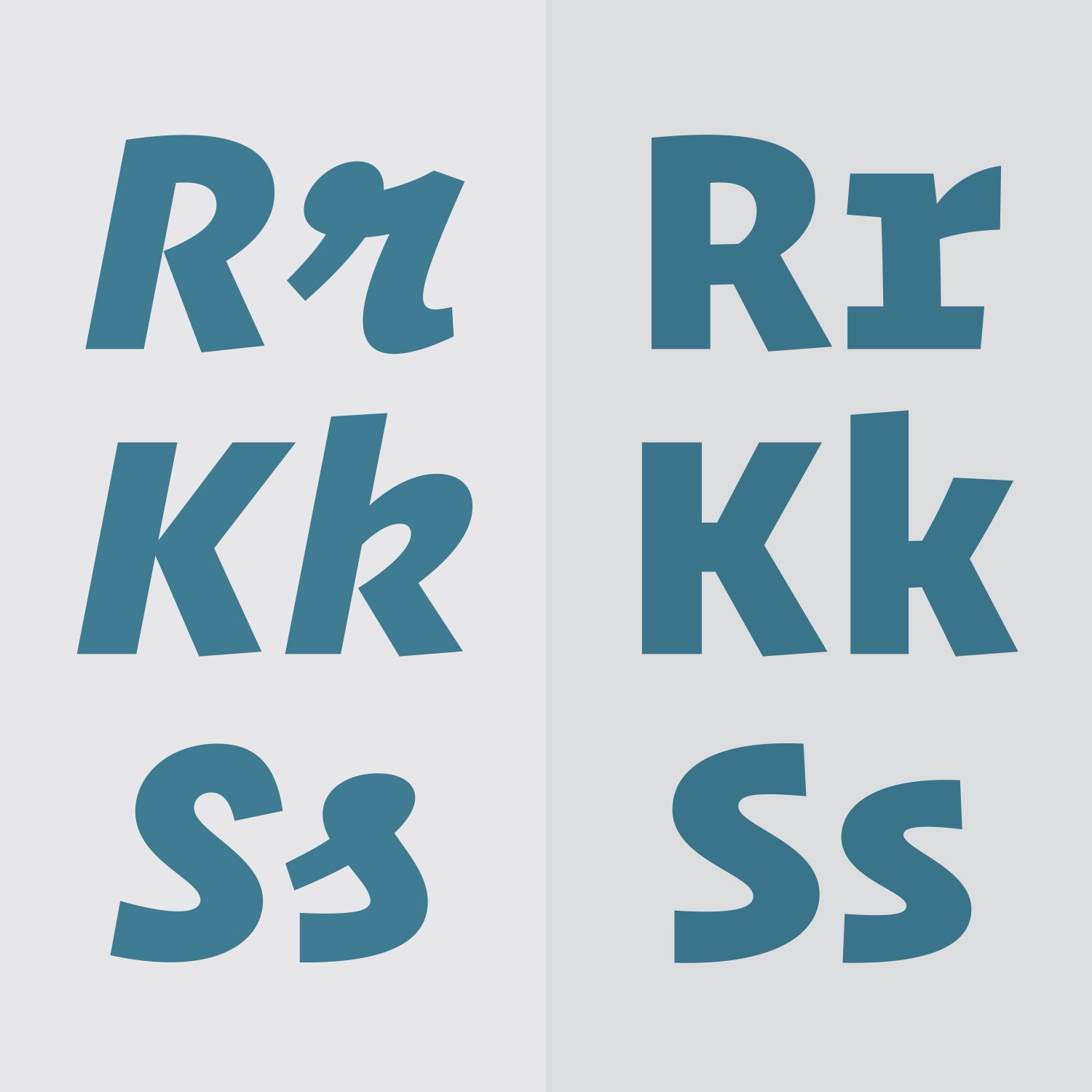
But then I had a couple characters of this really out-there script italic, I think just the lowercase “s” and “r” and, still with the idea that the letters would be disconnected as if they were drawn for the typewriter. And we can definitely thank Jonathan for having the courage to see that this more unexpected option was the way to go. And I’m glad he did too because I think the other option was only on the table because I wasn’t super confident at the time about going to such an extreme in the Italics.
IR: It was a nice call.
AC: Yeah, right, because we were really also thinking about how people would use Italics in a monospaced typeface. I didn’t want to make the world’s best programming typeface. That was never the goal because there are so many options out there. Every programmer has their own idea for what they really want.
But I thought that having a really contrasting style choice was missing in other monospaced typefaces. You know, when you’re looking at code on screen, it is usually very colourful. The editor that you’re working in is going to use a certain colour for a keyword or string or different parts of the code. Around the same time I was trying to advise a friend who was working on a programming book project which was going to be printed in black and white. You can’t really use shades of grey in the code examples in this same way, if you really want to call out different elements. You can pick a typeface that is a range of weights, of course, but what I really wanted was an italic that looked so clearly different but still fit the family. Like it had to be another completely distinct style choice.
IR: I still see quite a lot of you in that italic.
AC: I don’t know, I hope so.
IR: That reminded me quite a lot of a project you did at Type & Media. I don’t know why, but maybe some decisions or something. When I saw the italic, I really saw you in it.
 Operator typeface by Andy Clymer and Hoefler & Co
 Operator typeface by Andy Clymer and Hoefler & Co
 Operator typeface by Andy Clymer and Hoefler & Co
 Operator typeface by Andy Clymer and Hoefler & Co
AC: I did try to put a lot of myself into it. We were looking at other related typewriter typefaces to get a certain feel for things but it was never going to be a revival. Everything was drawn more from a memory or some kind of feeling, in a way. Of course, with Jonathan editing out the really crazy stuff that came out. Yeah, I definitely tried to…
IR: I really think that it’s not just because you’re my friend, but I think that Operator really is a brilliant thing. Super unique and it will stay like that forever. It’s perfect.
AC: I hope that it’s a little bit ahead of its time, because I haven’t seen any really big project where it’s been used yet. I absolutely love searching on Twitter for “Operator Mono” because one place it really caught on right away were with the programmers. A lot of people share code with screen shots or teach courses on YouTube, and so of course they’re going to try to design it a little and make a choice about how their code looks. I love reading the comments, “Oh but what’s the font?”
I think there is a certain kind of designer out there who might be a developer/designer who may not have a say in the choice of typeface for the project they’re working on, maybe too often the front end developer comes into the project after the branding is pretty far along. So I think these designers maybe don’t have as much opportunity to choose type for the projects that they work on, but they still have an eye for design. And it’s nice to have a choice in the typeface that you’re using to work with all day long. It’s the same for me, I wanted another choice for the typeface I would use for programming.
IR: Nice description, because it has some custom feeling.
AC: Yeah I don’t think it really follows the expectation. There was freedom though in not trying to make the world’s best programming typeface, but it’s trying to be another choice that just works differently and it works for me.
IR: Also in a certain way it is a little bit more human? It’s a little bit more personal…
AC: Right, yeah. You know, because for a long time I’ve been thinking of the monospaced typefaces that you would use for programming, they may have started from being drawn from the restriction of the pixel and moved up from there.
IR: Or being just too technical.
 Operator Mono comes full circle back to its typewritter roots, recreated as an IBM Selectric type ball
 Operator Mono comes full circle back to its typewritter roots, recreated as an IBM Selectric type ball
 Operator Mono comes full circle back to its typewritter roots, recreated as an IBM Selectric type ball
 Operator Mono comes full circle back to its typewritter roots, recreated as an IBM Selectric type ball
 Operator Mono comes full circle back to its typewritter roots, recreated as an IBM Selectric type ball
 Operator Mono comes full circle back to its typewritter roots, recreated as an IBM Selectric type ball
 Operator Mono comes full circle back to its typewritter roots, recreated as an IBM Selectric type ball
AC: Yeah, too technical. Engineered to be pixel perfect then it’s only meant to look good at small sizes. Operator’s ScreenSmart version is hinted for the screen, but it was drawn in a way to still make sure that it looked good at a higher resolution and off the screen when it’s free from that restriction. I guess maybe that is the way to put it.
IR: There’s actually quite a strong trend to use monospaced typefaces for art museums’ posters. That’s how they keep that, because they kind of are natural and from a completely different area. Quite a lot of museums and art galleries are using mono spaced typefaces.
AC: Yeah, you do see that. And to be perfectly honest, that’s more where the entire project started. When Jonathan and I started talking about the idea of making a monospaced typeface I was really hesitant to make one that was only designed for the screen, like “I’ll never make one that is better than the one I already use. My eyes are so used to what I’m already looking at.” So the idea was to really make something that has the feel of the typewriter, has a feel of monospaced design, more as a choice of style and not the function of the fixed width.
What is the reason why the museum or a magazine goes for a monospaced typeface? Is there something that we could in that area, that gives them something that they could use? And the design started with the proportional width Operator which is really the larger part of the family, the non-monospaced version, that still had the feel and some of the details from a fixed width typeface but it would still be spaced and kerned with more natural proportions. Even early on it wasn’t certain if we would create the separate fixed-width Operator Mono.
 The real code set in Operator Mono typefamily by Andy Clymer and Hoefler & Co
 Operator Mono typefamily by Andy Clymer and Hoefler & Co
IR: Do you use it yourself?
AC: Oh absolutely, yeah. And I love it because I have my terminal window in all Italics and then I write code in all Roman. I like how that kind of divides the tasks up on screen, having them look very clearly different. I use them absolutely every single day, always. I think some of it may have been drawn for what I wanted to use but you do your best work when you really use the typeface you’re making. I’m sure other people would look at it and think that “Oh, I wish he didn’t do this. I wish they didn’t do that. I wish I had an alternate for that S or something.” But for me it’s perfect. So that is all that really matters. Troy Leinster is responsible for a huge amount of how it looks and works too, and definitely he and all the designers at the office use Operator Mono. And all but I think one or two of our developers made the switch.
IR: A few questions from a slightly different perspective: Your hobby of programming with hardware, and the project which Erik reminded me about two days ago, about masks and everything. Another thing you’ve been quite ahead of the popular trend for some applications with, actually. So, a few comments about that. But also this kerning joystick or whatever it’s called? As I understand it, you’re the first to have introduced this idea, no?
 Electronics projects by Andy Clymer, for music synthesis and experiments in interfaces
 Electronics projects by Andy Clymer, for music synthesis and experiments in interfaces
 Electronics projects by Andy Clymer, for music synthesis and experiments in interfaces
 Electronics projects by Andy Clymer, for music synthesis and experiments in interfaces
 Electronics projects by Andy Clymer, for music synthesis and experiments in interfaces
 Electronics projects by Andy Clymer, for music synthesis and experiments in interfaces
 Electronics projects by Andy Clymer, for music synthesis and experiments in interfaces
AC: That one always keeps coming back to me because I gave the Robothon presentation in The Hague, but it actually came from C.J. Dunn. I don’t know if he came up with it or if he heard of it from someone else. But when I gave that presentation at Robothon, I was making my own control board. I was playing around with this little piece of hardware I made that had knobs and buttons on it. I wanted other people to test it and I was telling C.J. about it. He was interested, so I got him set up with one of those boards and some knobs and buttons and things. So out of the conversation with him, he’s like “Hey have you ever tried using a USB game controller?” It’s just genius. It makes so much sense. After going through that process of experimenting with the hardware I really haven’t changed the way that I work but I still always have new ideas for things I want to try.
Andy Clymer’s talk “Things that go click” at Robothon 2015 conference
IR: I expected you had an additional game board.
AC: I have a lot of ideas that I’d like to still keep going with it. I think it’s more about at least thinking about your process and not taking it for granted, like even how the command keys in a program are set up. Think about what you do all day long. You’re clicking on the same thing every single day, is there a better way to do it? Maybe you could actually make a change if you’re always going through the same steps? That’s kind of like the evolution of the computer user: You start out just clicking and dragging, and you realize, “Oh, I can hold down command and press f to get to the ‘Find’ instead of going to the menu”, and it’s faster. You just slowly make it faster and more enjoyable to fix the annoying things you have to do all day long.
IR: Using gaming devices also can be fun, yeah?
AC: Yeah, and there are so many things out there. And it’s thanks to the game industry that the stuff is relatively cheap. You can just buy them and you don’t have to be an engineer to make something custom. But if you look at other industries it’s really amazing how many devices are made for them, for people in music production there’s an endless variety of controllers you can get that have faders and knobs and things that you actually really need because you need to interact with the software differently or whatever you’re trying to control.
So what I’ve kept in my mind since exploring this stuff is trying to be really aware of my process. What’s the ideal way to control the work I’m doing?
IR: Especially for type designers…
AC: For kerning and Metrics Machine, it’s so obvious that Tal Leming must have had this in mind when he was making it. It’s clear that it’s designed so you shouldn’t have to use the mouse while kerning, you don’t have to lift your hands up from the keyboard for half an hour or whatever until you’ve gone through the entire list of pairs. And everything you’re doing on the keyboard is with the same five keys or so, just like when you’re playing a game.
IR: Did you actually try to kern like that?
 Special custom-made game controller produced by Andy this year for Robothon 2018
 Special custom-made game controller produced by Andy this year for Robothon 2018
 Special custom-made game controller produced by Andy this year for Robothon 2018
AC: I’ve done it, yeah. I have a really cheap Super Nintendo controller with a USB connection that I set up, it’s a little bit too cheap though, it doesn’t feel as good as the real controller though. I know a lot of people use PlayStation controllers. Those are supposed to be pretty good.
IR: Alright.
AC: Yeah, but I love that. But C.J., let’s point that one back to C.J.
IR: We will mention C.J. as well, of course. I can check with him actually.
AC: Check with him, yes.
IR: Maybe he got that idea from someone else? Otherwise you two just brought that up.
AC: I was the mouthpiece for it, just because it fit with the theme of the rest of the talk.

Editor’s note: We were able to obtain the following comments on this matter from C.J. Dunn: “As far as I know, I was the first to try kerning using a USB game controller. But the idea came directly out of talking with Andy a few months before Robothon 2015. I had seen the keyboard extension he posted on Twitter leading up to Robothon so I asked him about how I could make something similar. He encouraged me to explore different kinds of buttons, switches, and sensors that could be used as inputs for an Arduino board. In the catalogues of Arduino parts I saw some large arcade buttons and I had the realization that, since I only use a couple of button while kerning, most of the work could be done by mashing these arcade buttons, which sounded fun. My first thought was to try to take apart an old USB game controller and connect those buttons to an Arduino to test out this concept before buying the arcade buttons. But then I realized I could just leave the controller as is and map the controller buttons to be the same as the keyboard shortcuts in metrics machine. I gave it a try and realized that I quite enjoyed kerning using a controller. It’s nicer on my wrists ergonomically and it reminds me of playing a game, so somehow kerning feels more enjoyable with a controller. I still use a controller for kerning whenever I can. These days, if I want to kern at a coffee shop I’ll bring my USB controller. On multiple occasions people have asked me if I’m testing game controllers because they see a technical interface and nonsensical letters on my screen, which probably makes more sense to most people than the idea of kerning a font. For anyone interested in trying it out, I use an application called USB Overdrive to map the controller to different keyboard commands. Here’s a photo of the controller with settings I use (I don’t know why I made this upside down) and I’m attaching the overdriveSetting file I use, though it’s pretty easy to set up yourself.”
IR: I also want to mention here the collection of photos of the stencils on cars.
AC: I’m still collecting those obsessively. I don’t know if my Instagram followers like them as much so I don’t post as often, but I love it so much. I think it has turned into a funny obsession because there is a very particular kind of van door or lettering on a vehicle that I’m looking for. So it’s not just any old thing. It shouldn’t be something that it is poorly done by someone who knew better, like someone who could actually have done a better job and they did poorly. It shouldn’t be done really nicely and perfectly either, by someone who just happens to be a bad designer. But when it’s almost put together really quickly by someone who doesn’t think twice about it, you can get very interesting compositions, I think. It’s not just about it looking bad or ugly or distressed, but like if someone goes down to Home Depot and they pick a bunch of numbers and letters stickers off the wall, and then they get to the door and they put them on and move on to get to the job site and work. Like they really didn’t think about it. I love cars and I could never think of considering defacing my car by sticking these…
You see doors out there where people had to drill holes and put house numbers on it. I’ve seen these kinds of things. I would never want to damage my vehicle by putting a sticker on the door like that. I wouldn’t even put a bumper sticker on it. So I think I’m fascinated by that as well. You can see a brand new truck where somebody has used house paint on the door to put their business name and address on it. I love it, because I walk around, I always go on a big walk at lunchtime, and I love that I see my vans go around. So I see the same ones come around or I’ll be in another part of town and one goes by. It catches my eye, but I already have a photo of that one. I don’t know, why is it that I’m obsessed with this kind of thing? Is it being a type designer?
 From Andy’s personal Instagram account
 From Andy’s personal Instagram account
 From Andy’s personal Instagram account
 From Andy’s personal Instagram account
 From Andy’s personal Instagram account
 From Andy’s personal Instagram account
 From Andy’s personal Instagram account
 From Andy’s personal Instagram account
It was something that I wouldn’t see in California, it’s some kind of vehicle regulation that we didn’t have there, I don’t know how the law reads but it’s something that commercial vehicles have to have their company name and address on the side. Along with all of the layers of painted over names for the past owners of the truck.
 From Andy’s personal Instagram account
 From Andy’s personal Instagram account
 From Andy’s personal Instagram account
 From Andy’s personal Instagram account
IR: Another thing I wanted to mention is that quite a lot of type designers I know are also musicians in one way or another. Or maybe it is the same percentage as with normal people. But I know that in the last few years you started experimenting with that.
AC: It also goes back to my interest in programming. I just really enjoy programming, I like making something. So I’d come home from work and find new ways to apply what I was learning but to more of a hobby and I got started writing code to make sound and make some music. I think I listen to the kind of music that might not be so traditional, even if it’s not really music it was fun to hunt around and find a certain kind of sound that I like hearing.
IR: So you were writing code to create music?
AC: Right, yeah. But also with the hobby of working with electronics and making noise and sound there too. That’s the kind of stuff I make now with Caroline. She plays guitar and I have some synthesizer equipment that I built up. It’s mostly on the noise and drone and feedback end of things.
IR: Do you have it recorded?
AC: We make a simple recording every time we practise and we used to always post them online but no real formal recordings. Every time, it’s improvised and we both just start doing something and it kind of develops. So there is the first minute or so of the recording where it is kind of uncertain and then it actually, for both of us, it feels really good, and it’s going somewhere. That’s the kind of stuff we like to make but it hasn’t ever been a real traditional musical composition.
IR: I know you recently saw Just van Rossum’s lecture about sound and letter shape.
AC: That was amazing, yeah.
IR: Actually it was so obvious, but at the same time, I don’t know what the outcome can be from this, and basically Just also questioned that. But it is a very interesting experiment.
AC: I think that it’s an amazing experiment. That could even turn into a tool. Okay, the shape of a letter that has an interesting sound, but I don’t think that it relates back to the letter. If you listen to the way the R sounds, you would have to really train yourself to know that it’s an R, without seeing it. But as a tool for a sound maker or someone who is a musician, to draw the shape of the sound. Maybe not drawing a letter, but drawing some abstract shape and getting it to where it sounds the way you wanted and then interpolate that shape into another one and make a transition. That could be an incredible tool for a sound designer or musician. I hope he keeps going with that.
IR: And now we need some kind of conclusion or at least finale: Maybe about tomorrow, maybe the future and everything? Maybe your own future or maybe a dream project? Maybe a dream client or a dream collaboration? Maybe something you have been looking forward to? Maybe some technology?
AC: I’ll tell you, I’m glad you asked that especially with the kinds of questions that you’re asking about those more experimental projects, something I really only learned recently has been on my mind is that, at least in art but I think also in design, documentation is as important or sometimes even more important than the actual work that you’ve done. I had been part of a ten-week program at an amazing place called the School for Poetic Computation, and in such a short amount of time you learn how important it is to have an idea, make it happen, document it, and move on to the next thing. You make the book, you have the exhibition or whatever and then you move on. It’s done. Your hands are washed of it. A lot of the questions that you brought up about code and hardware or a photography project with those vans I think I should take the time to document so that they’re out of my mind and I can put a pin in it and move on to the next. I need to get better at this.
I just always want to keep learning. I’m looking for that next new challenge. Sure, of course, there’s Obsidian, Operator, the weird keyboard controller things, I can sit around thinking about them forever and think “Oh I need to go back to that and keep working and working on that.” But maybe now I need to think of what the next thing is.
IR: I still have a question about dreams. Do you have anything that you dream about in the profession? I mean it’s New York City, man. It’s a lot of businesses, it’s a lot of projects, a lot of huge companies. Some of them we really like, some of them are here forever, I don’t know. There’s also quite a lot of professionals too, art directors, studios and so on.
AC: I’m sure I’d say this only from the perspective of someone who lives here: I think when you’re in New York, you always have this feeling that there is so much going on. Everyone is here. Everyone is doing incredible stuff that I sometimes wish I was doing. But I’ll get to it later. I didn’t go to the Statue of Liberty until after having been in New York for ten years because you think “It’ll be there forever, I’ll go when someone who is visiting wants to go.” It’s the same with “I’ll work with that person later. There is plenty of time. I’m here in New York and in no rush.”
But I guess because of that I do have dreams of the kinds of things you can’t get in New York which is mostly just physical space. Like the fantasy of having a little house with a basement where I can tinker on little projects or have my own space to work on something a little bit more experimental. But in New York you don’t have that space. What you do have though, the thing that is plentiful here, are collaborations with everybody or lots of other kinds of work to do. But the question you asked, “Who do you want to work with? What do you want to do? What do you want to be doing?” That is always on the mind of someone living in New York, that if I’m not doing it, someone else is going to work on a better project than me.
IR: Paranoia?
AC: It is that paranoia, yeah. I’ve kept that at bay because I’m lucky to have had a job that I’ve really enjoyed for 12 years now. But I have friends that I’ve seen kind of hop around from one place to the next and have either been very successful at it, or not, but that’s definitely something you could do in New York. I don’t know, I’m still kind of deflecting the question in a way, but I guess I don’t have a name for you of the person or the place or the project that I’d want to work on. I’ll continue to hope that I’ll put myself in the right place at the right time because it’s worked out so far, I’m very lucky to have been given the opportunities that I have in my job.
IR: I know you’re happy with the company otherwise you would have left already, ages ago, but over the conferences during these years you’ve met quite a lot of different designers, have you ever been thinking “I like how this guy is thinking. I like what kind of skill he has. I would probably learn a lot from him”? If it wasn’t Hoefler, who would you work for with interest, do you think?
AC: I’ll say again that I’m so fortunate to have had this experience that you describe, from Jonathan and Tobias. I can’t even begin to describe how much I’ve learned, I’m sure you can imagine though.
I’d love to work more for clients who want something a little bit more risky and experimental, or even better to work for friends who don’t feel like clients. I can imagine an ideal studio where it’s two or three people that work in related but completely different areas whose projects you collaborate on, maybe that’s one thing that I miss from having a job in a type foundry that we’re all working on the same projects toward the same goal. But I would love to work with industrial designers, architects, engineers…
IR: With different fields.
AC: Different fields, yeah. Different fields where they need my work, I need their work, or whatever.
IR: Yeah, because nowadays design is happening between disciplines. Always like the mixing of something.
AC: Actually, it’s funny because it goes back to what we were talking about at dinner, where for one day a week you work on someone else’s project, with the people in your studio space. I like that idea, in a certain way your coworkers are your clients, the same people you’re already hanging around and kicking around crazy ideas with. That would have to be part of my dream, to not have to hunt around for clients…as I’m saying this I understand this might not really be possible.
IR: I believe that it is actually possible.
AC: There still has to be a product you make or a way to get money in, someone has to find the client or at least there still has to be someone out there paying for what you’re doing. Yeah, that is the dream though. On that note…
IR: Yeah, on that note, thank you. It was a very nice interview.
AC: Thank you, Ilya