
Larik, why do you like serifs so much?
Let’s just say: I like all the typefaces, but when it comes to serifs, I’m their advocate, because they have been unjustly neglected. Here’s the problem: if you believe that the bicycle is an inefficient form of transport, since the car has already been invented, people will stop using it before you’ll remember that it’s actually eco friendly, green, and quite comfortable. We are this close for people to forget how to properly use serifs.
But today we often hear that ‘serifs are back’ and even in service design there has been a certain renaissance. Don’t you agree with that?
Not entirely, not. Today I’ve looked through the websites of the ten top startups of 2021 and haven’t found any serifs there, even though there were no reasons not to utilise them. This renaissance comes like a flower out of pavement: suddenly, you see a serif typeface jumping out of nowhere. And that relates mainly to IT projects. I see that in services such as Whereby or Fibery. Which is interesting, because normally the IT guys are the most closed-minded. It’s just that in graphic design serifs never left, what is happening is simply recurrent fluctuation of its types: yesterday super bold was in trend, today it’s super round, tomorrow will see blackletter with little serifs, or this, or that. But serifs are actively trying to enter IT, and I really want that to happen.


Whereby website. Set in Roslindale Condensed
Why do you think that serifs could settle down in the new world of services?
I have given it a great deal of thought. And I believe that serif brings everything to a higher level. What is happening today is the democratisation of everything, and most of all people appreciate technological effectiveness and performance, which is why sans serifs have taken over everything, they seem simpler, more open, more inclusive. Yet, on the other side, there is nothing wrong with sometimes being inclusive-academic, trying to explain something from a scientific perspective, where serifs are better fit. Or use it to show that things can also be a bit more elegant. I am not sure that people would like to see serifs on their
Part of the problem is that people who come working in UX/UI development rarely have a design or arts educational background: it is technical if we’re lucky, or there is none at all if we’re not. They mastered Figma and immediately started
Do you believe that IT companies should invite typography professionals?
It will at least introduce some nice diversity. When you go to Behance, you see more artsy-fartsy dudes who are trying to make their product more
There also has been a rather illustrative experience with Apple…
Yes, when they released their San Francisco and that serif New York at the same time. It is quite an interesting
 Apple advertising campaign 1997. Set in (Apple) Garamond
Do they use New York themselves?
I wasn’t able to find anything. It is allowed for use and available within Apple, as well as San Francisco: it is available within UI kit, and you can apply it as a part of brand block, if you are a software developer for MacOS and iOS. Meaning, it has the same potential. But right now no one sees it yet, because, frankly, nobody bothers themselves. In fact, less and less people bother themselves, judging from what they use.
Can you tell us more about some successful project using a serif font, and why does it work well there?
Well, I think, Fibery case is quite successful. I worked with them, but not as their typesetter. They actually have a very cool combination: they took the sans serif Graphik, while the rest, headlines in particular, are set in Libre Baskerville which is pretty free, but comes with no Russian version. It is slightly more round and nicer than all the Russian-speaking Baskervilles in various realisations. And it fits there like a glove, accompanies well, and doesn’t make the product look older, just brings in a certain intellectual vibe to it.


Fibery website. Set in Libre Baskerville


Libre Baskerville in use. Typozon website
Fibery exists in the competent market: the guys are making a task tracker with node

Interface by Douglas Engelbard
Do you agree that a text set in a serif typeface is easier to read?
It’s hard for me to give a definite answer: I read in sans serifs, too, but I prefer serifs. I almost gave up reading paper books, I read everything from my iPad, and there everything’s set in serif. So, the actual answer is yes.
The Russian version of which serif font do you feel the need of?
I need a hell lot of things in Russian. I make quite a lot of Cyrillic stuff, therefore many fonts that I have, such as the very same Libre Baskerville, are half-faced. That is a good, beautiful typeface, but I can’t use it to its full extent, because at some point I remind myself ‘Oh, not for this market, no’.
Sometimes I lack the entire clusters of fonts, for example gothic
 The Eternals film titles
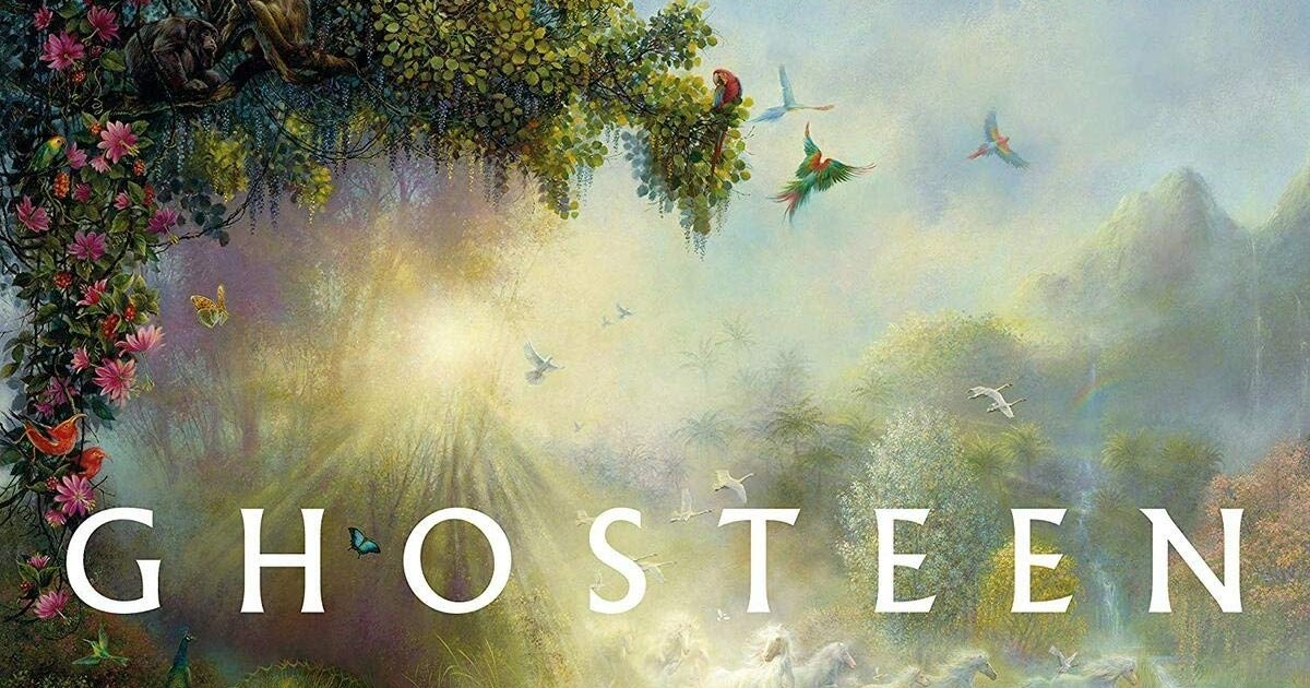 Ghosteen by Nick Cave, album cover
In Russia people don’t even think about the fact that there’s such a type class, because de-facto there isn’t. All there is is Copperplate Gothic, translated in 1994 or something like that as a kitchen-table effort by I don’t even know whom. I don’t remember any other bright examples of gothic fonts, while Copperplate is not the best example, to be honest.
There’s also not enough Russian glyphic, incise serif typefaces. There is Optima, also known as Opium which was once translated by Paratype, but it is not capable of covering this extensive hole in the market alone. What are you supposed to use for setting cosmetics, after all? Not to mention that that is a rather elegant class of fonts, and in London, for example, it is even applied in street navigation.

Street navigation in London. Set in Johnston
I need an experimental type as well. For instance, there is Cooper Black — a certain rounded font from the 1960s, seemingly, but it was actually designed in 1922 (I discovered this fact while doing research and was quite amazed). It was first remembered by The Beach Boys, and it made it to the top together with their Pet Sounds album, and then people started using it left


Bogart

Recoleta
Just like seven years ago people discovered for themselves the existence of the very same sans serifs, but in their rounded version: ‘Can we really give a message set in Arial that would not sound like it was given by a lawyer, or a policeman? Yes, we can!’ The fonts imitating Cooper are the same thing, but even softer and rounder. While it’s not childish. A very good solution for any product market.
 Cooper black, 1922
 Pet Sounds album cover, 1966. Set in Cooper Black
 Easy Jet identity. Set in Black
What do you think about the boom of fonts that Timur Zima has called ‘wicked serifs’?
All kinds of variations on when there are long swashes coming out of a serif typeface, sticking out in all directions? This is normal, that’s fashion. A couple of years ago we witnessed a boom of fonts that were seemingly written by a person who happened to have his face paralised during working in Illustrator, and all his moves can be only very weird, kind of intentionally naïve (here, ‘naïve’ is not a life sentence, but rather an outside perspective on the approach: as if I draw in a quad-ruled notebook and came up myself with the rules where I can’t swerve or turn aside anywhere, which is why all the letters will be little legible). That is also fine. Type in general is very much exposed to fashion trends. And it even can come through the whole fashion cycle while the rest of the market won’t notice what is going on. Unlike the clothes market that can use and absorb billions of dollars during each cycle, type designers are only able to make a couple of hundreds of posters and move forward to new achievements, while the rest of designers are striving to understand exactly what they did. Type is a quite marginal profession, in a good sense. That is a frontier of experiments with letters from which people later will get their inspiration. A whole lot of ideas are born here, that you’ll later suddenly see on some weird sneakers two or three years after they were conceived by some type designer. Fashion industry is a much more closed and cautious community, which is surprising.
I cannot help but ask you about the serifs presented on type.today platform. Which of those have you used? What did you like?
Obviously, I bought Kazimir ages ago and used it a lot the way it was supposed
 Totti identity, design by Airborne Ape. Set in Kazimir
Are you familiar with Vesterbro?
Oh yes, it is very nice looking. Although with it you can feel, no offence, the same vibe that Doreuli’s Willam has: when it was released, everyone got
 Vesterbro in use. “How to live” book
Here, one must realise that, apart from obvious
Take Trola. This typeface has been highly appreciated in competitions, but is still not very popular for some reason…
I think I know what this is about. That is a very well and neatly made
 Trola in use. The General Election Day 2015 Newspaper
Are serifs about state, government stuff?
Yes, serifs are associated with state things, government-related. Laws coming down from above are rather set in serif. Whenever the document is written in sans serif, it looks either as if you were force-fed with something, or as if it was all as figured out that you are given a stepwise guide on how to act. But once we’re talking about
Now could you please assess the serif in the RIA family whose destiny is very much similar to the one of Trola.
Here you have a simpler explanation, I think. Certain things disappear at some point and never come back, while sometimes they return years later. This happened to many typefaces. There was Officina, and then this trend left on a very long distance train. However, obviously, this doesn’t make Erik Spiekermann a bad designer, absolutely not. It’s just that at a certain point Officina was used to jumping on so much that it stopped being a launching pad. The very same happened to DIN. In 2012, it was all over Moscow.
 RIA Text Serif in use. “In Memory of Memory” book
Naturally, everyone got tired of it, and DIN disappeared. The same thing, I hope, is eventually happening to Circe: it is already making our eyes bleed, just because it has exceeded the limit of consumption. The same level of boom was experienced by Formular, but I’m glad it was not overdriven to death. Meaning, all these fonts are well made, but we have questions as to how much they were used. RIA falls into the category of Charter and other Swifts, and Gusev in Kommersant applied those everywhere until everybody started crying with bloody tears. And, just like the time of Kommersant is over, the era of Charter and Swift is over as well.
 Kommersant Newspaper, 1999
 Kommersant Newspaper, 2000
Let’s also check the typefaces under our tomorrow tab…
I just adore tomorrow’s tab. I enjoy everything there. Look, there’s Lenora. I like Lenora. I am a big fan of Yura’s stuff, so I buy different Xprmntls from you with great regularity. They are not that easy to classify. Or, yet again, Base&Bloom — what is it? I would say that it’s sans that has grown legs. But it also has certain serif features, in some places. I would not deal with regular Apoc, while I would play with its Revelation style. By the way, the Transgender Grotesk that ended up with
 Base&Bloom in use. “Radio Dolin”
Curbe drops out of the topic of our conversation as well, but I like such things: pseudo-Soviet style with continuing reflection on that matter. These are very beautiful exercises which are there to jump-start the script that we have, but that is not figured out and dies in agony on posters of small towns’ cinemas. Lately I visited the design weekend in Suzdal. And there, on the cinema poster, it was written in that good old classic blue and green and by brush: ‘Godzilla vs. Kong’. The ideal script! Totally awesome. I literally passed out. Because, damn, now we’re
I like Epos, I love fonts like that. Recently I made this kind of thing myself, not as complicated, but of similar type, a thing you could have called a glyphic, or incise, typeface, but it has no narrowing in the middle of its lines. On the other hand, I spent a very long time trying to apply Brownfox’s Nolde which I also like. It belongs to the class of typefaces that you always want to put somewhere, but they rarely let you do so, because they have a certain gravitas and steal your design, dragging it away into their own funnel. I like Halunke as well, and I like it from afar, too. I don’t understand where it can be utilised, but I just like how it’s made. With tomorrow’s typefaces, you often, as they say, celebrate the master. You look and think: ‘That is a hell of an idea. I am very glad it exists. I probably won’t be able to use it, but I will try at least’.
 Epos
Epos
 Nolde in use. Moscow Contemporary Music Ensemble at Kaliningrad Music Week, program
Whom would you approach first when you need a great new serif font?
If we’re talking about Cyrillic one, I only see two candidates. I would go not even to Letterhead, literally to my father, and I would go to you. As for Masha Doreuli, I don’t understand what kind of new things she produces, while


Typefaces by Yuri Gordon: Elsenskok and Fleursdumal
And what if it’s not Cyrillic serif that you need? What foundries and typefaces are your favourite?
I liked a font by Klim Type Foundry called Signifier. I don’t know yet how well it will fit within a design, though I believe that everything will be fine. It has a good contrast in proportions, but still is sharp in all possible places you can think of. Yet with all its sharpness, it doesn’t lose its powerful personality.
 Signifier in use. Hasso Plattner Institute of Design yearbook
There was another font that also seemed great to me, Nocturne Serif. But when you make it a bit smaller, all its sharp parts become too thin, and it can’t be normally used, it works only at decent sizes. I fairly regularly buy Colophon’s Basis in small amounts from them, and that’s largely fine with me.
 Smart Coffee identity, design by Airborne Ape. Set in Basis
They also have the Value Serif that I find


Simula in use. Сollaborative Change
 Ogg in use. The Landscape the Tropics Never Had album cover
VJ Type is what I love and nobody else does. Those are French guys called Violaine and Jérémy who are just graphic designers, but they do have a type section that has practically turned into a separate store already, and, actually, there are more serifs than sans serifs presented, while normally it’s the other way around. Initially they were making designs for restaurants, museums, and theatres, and occasionally drew super detailed pencil pictures, completely wild ones. Then they gradually began to introduce their own typefaces which I have been loving for years now, and that I am ready to literally hoover up, even though they all are slightly weird and bizarre, and you can hardly just take and use those, unless you do the same wild French design. These guys in many respects were in advance of their time and anticipated current
 Love by VJ Type
 Voyage by VJ Type
 Traviata by VJ Type
Is that why you’re advoсating serifs?
Yes, because we need to keep diversity alive. Serifs have a significant potential in lots of various kinds of uses, and we should never forget about that.
But what should we do to that end?
Graphic and product designers should try serifs. It seems to me that now they are simply not trying it and not thinking about it. While type designers, since their concern is to show specimens, they should make specimens which would interest those guys. Not only develop beautiful marginal stories, but also try to strike this very balance where an unexpected serif would look attractive in absolutely routine, casual things. I am certain that this balance exists and it is possible. And that is something that I actually could ask you, too, guys. For example, imagine on type.today’s Instagram what will happen if all popular services suddenly become