This April, type.today turns 10. So we decided to talk to those who have been using our typefaces all this time. In this piece, we spoke with the founders of Holystick about how they choose typefaces for their projects.
How do you choose typefaces?
Mila: We think of a particular emotion that a project evokes in us and attempt to figure out which of the typefaces we’re already familiar with most accurately matches this emotion. Then we try it out to see whether this little buddy fits the project’s voice. Once we’ve identified a category of typefaces that suits, we gradually narrow down our search.
It is especially satisfying when you manage to find a functional, modern font with a charming, quirky feel that perfectly matches the mood.
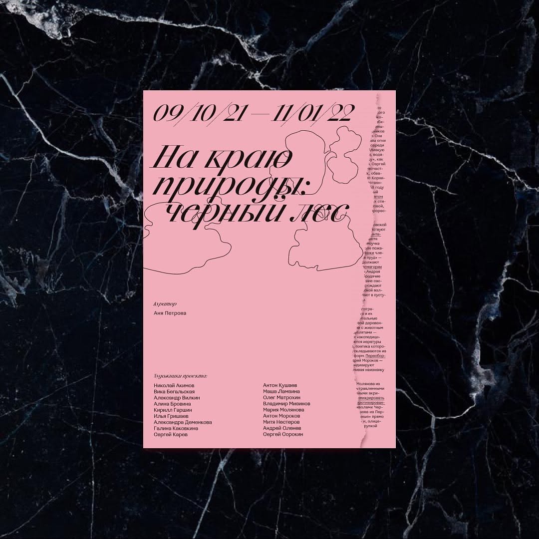
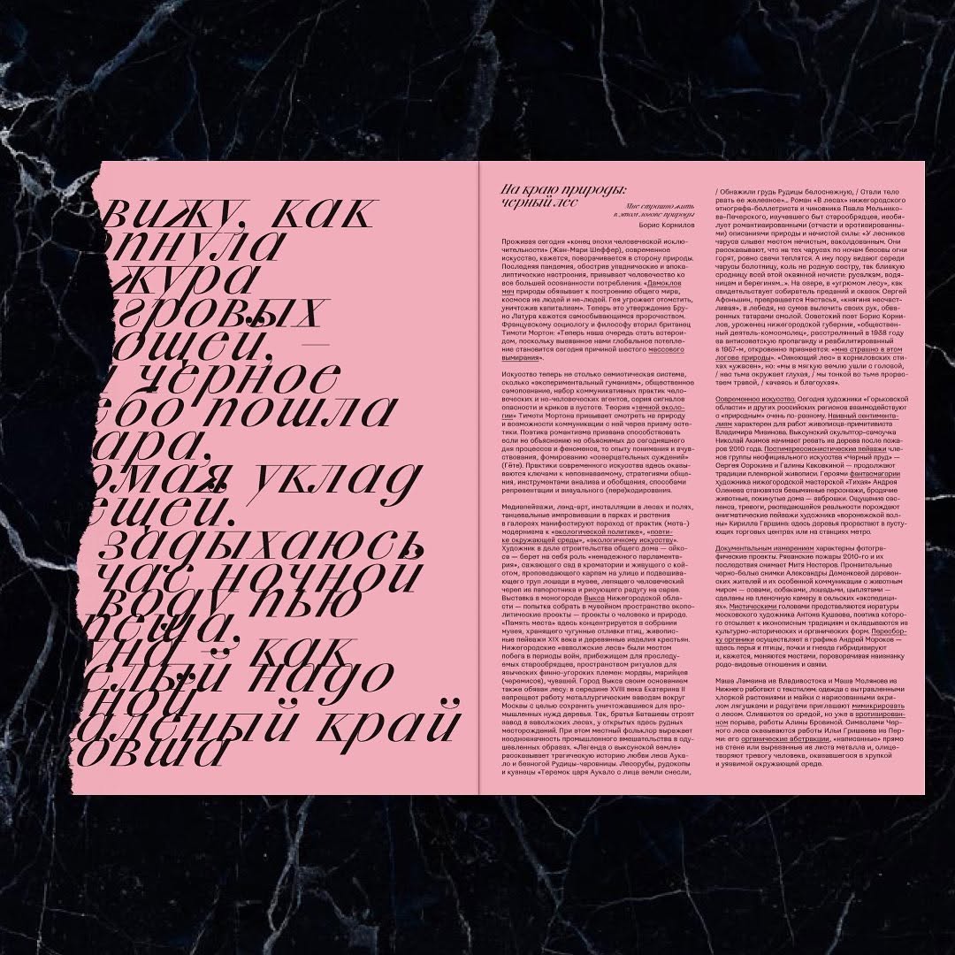

At the Edge of Nature: Black Forest, exhibition catalog . Set in CSTM Xprmntl 02. Design: Holystick
How do you follow new type releases?
Mila: We have our favourites among
Yana: I also sometimes check Fonts In Use, but clearly it’s not just about new
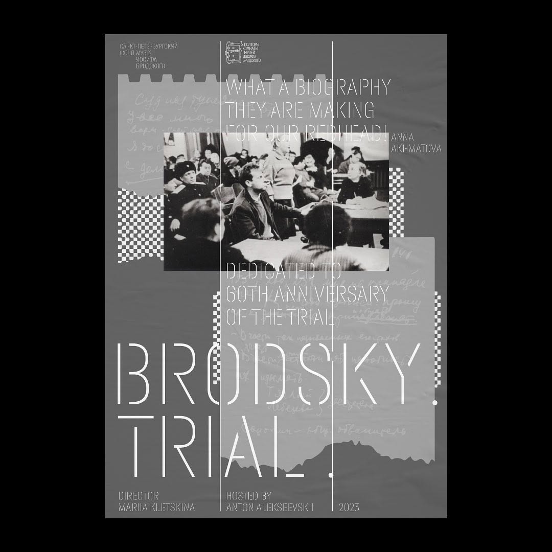
Brodsky. Trial, film poster. Set in Halvar. Design: Holystick
Is there a typeface that you really like but haven’t been able to find a project for?
Yana: There is. I am in love with Archaism. I am trying to use it wherever I can, but designs with it aren’t being approved. The clients are probably just afraid. We created an identity featuring this typeface for the Kom pizza place, but that’s it. Since then, we haven’t been able to slip it into anywhere else.
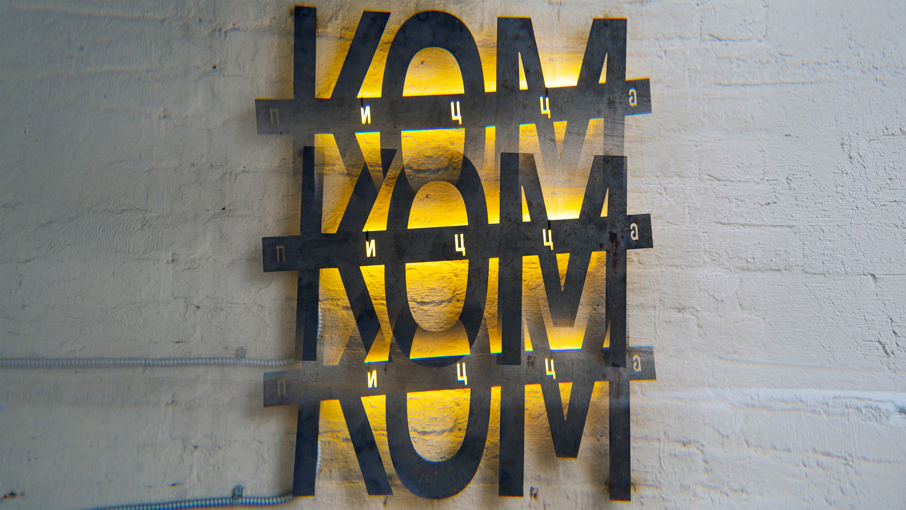
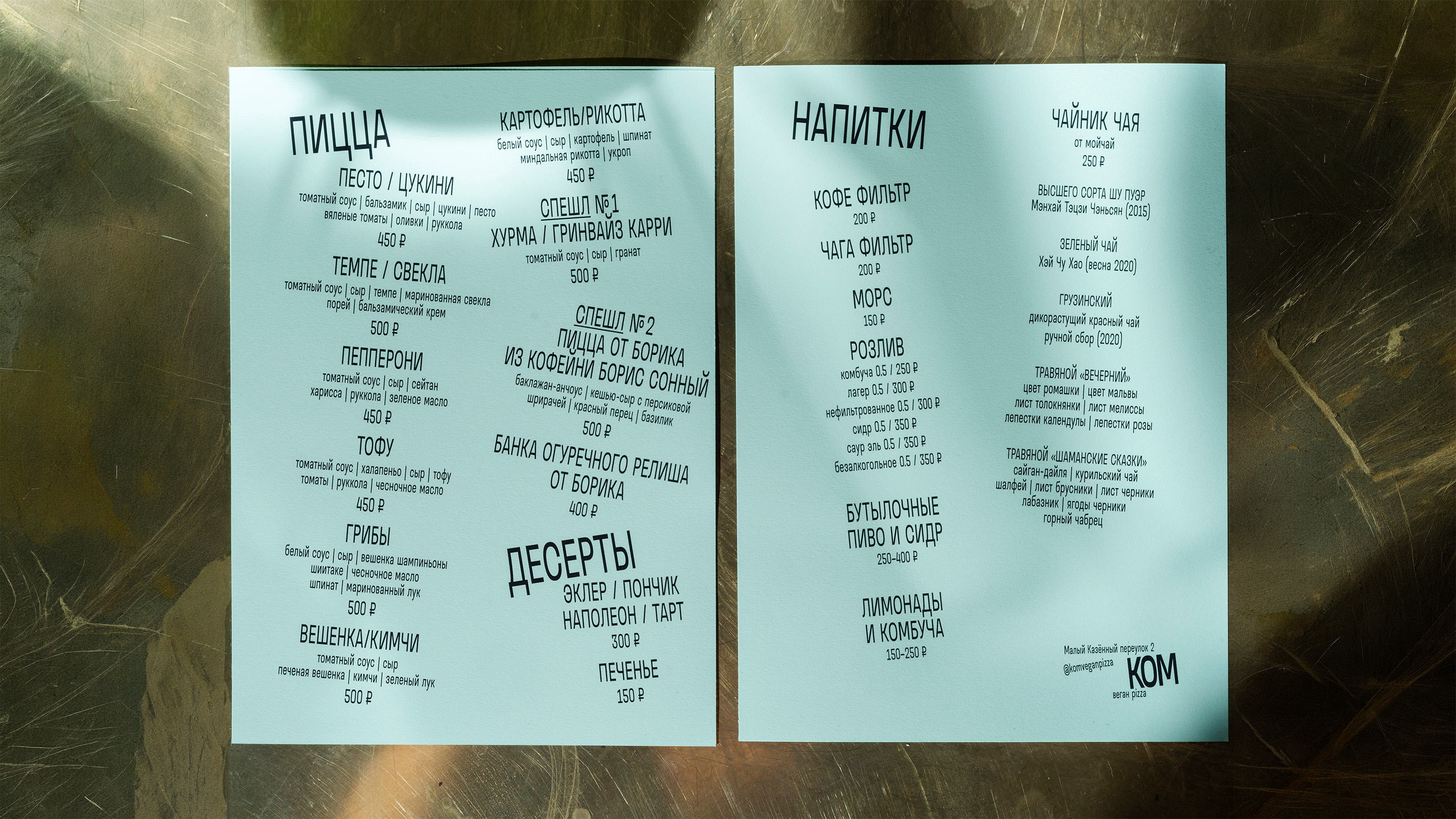
KOM pizzeria, visual identity. Set in Archaism. Design: Holystick
Has it ever happened that you worked with a font for quite a while and at some point realised that it was no longer time-relevant?
Yana: It has. I worked with Gerbera for a long time, and at some point realised that if you want to feel modern and up-to-date, it probably shouldn’t be used anymore.
We have noticed a trend towards a large amount of space within characters and very little space between them. So when you apply negative tracking, this immediately makes the typeface feel more modern.
Mila: I believe that the name of Roma Gornitsky just has to come up when answering this question. He seems to be constantly releasing typefaces that are highly relevant to today’s needs, yet they are so distinctive and authentic that everyone immediately wants to use them
What typographic trend frustrated you the most?
Mila: A little while ago, it was a common trend to create and use typefaces with a pronounced contrast between the x-height and the cap height. I wouldn’t say it pissed me off, but fonts like that were rather difficult to work with.
Yana: Especially in the setting, when building the page. We prefer a really dense texture, so it was hard for us.
Mila: A trendy move is probably like a vivid item of clothing. You get a certain item that’s currently really trending; you wear it once or several times, and then return to something more functional, quiet, neutral, deep, and delicate.
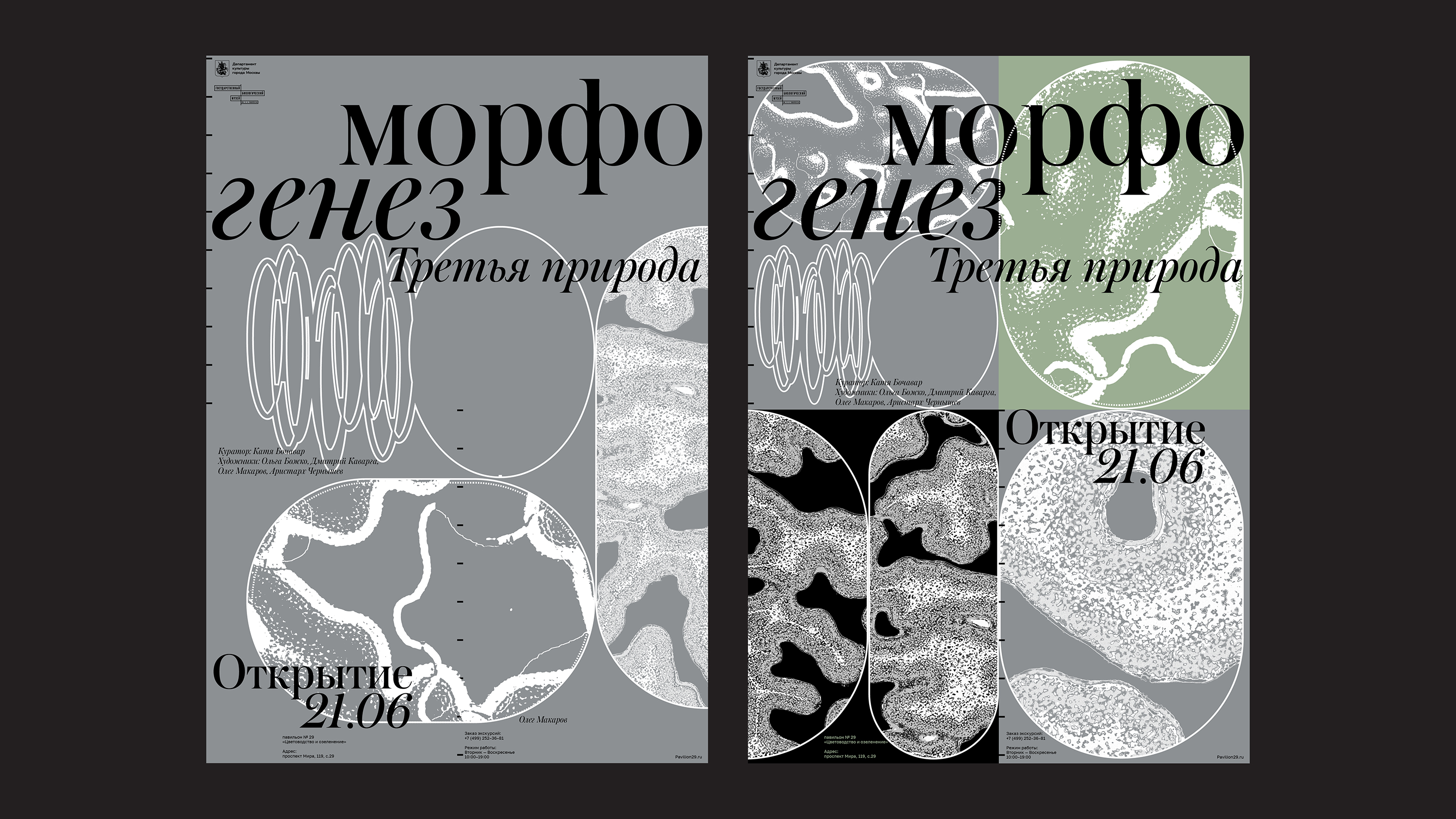
Morphogenesis exhibition Morphogenesis at the Biological Museum. Set in Austin, CoFo Sans. Design: Holystick
Is there a typeface in our library that you particularly like?
Mila: There is one. I feel like this might be a surprising answer, but that’s Signal. Whenever I fail to find the right voice right away, I always check how the layout looks with
Yana: We used Factor A and Stratos a lot for quite a while, and we’ve also done numerous projects with Atlas.
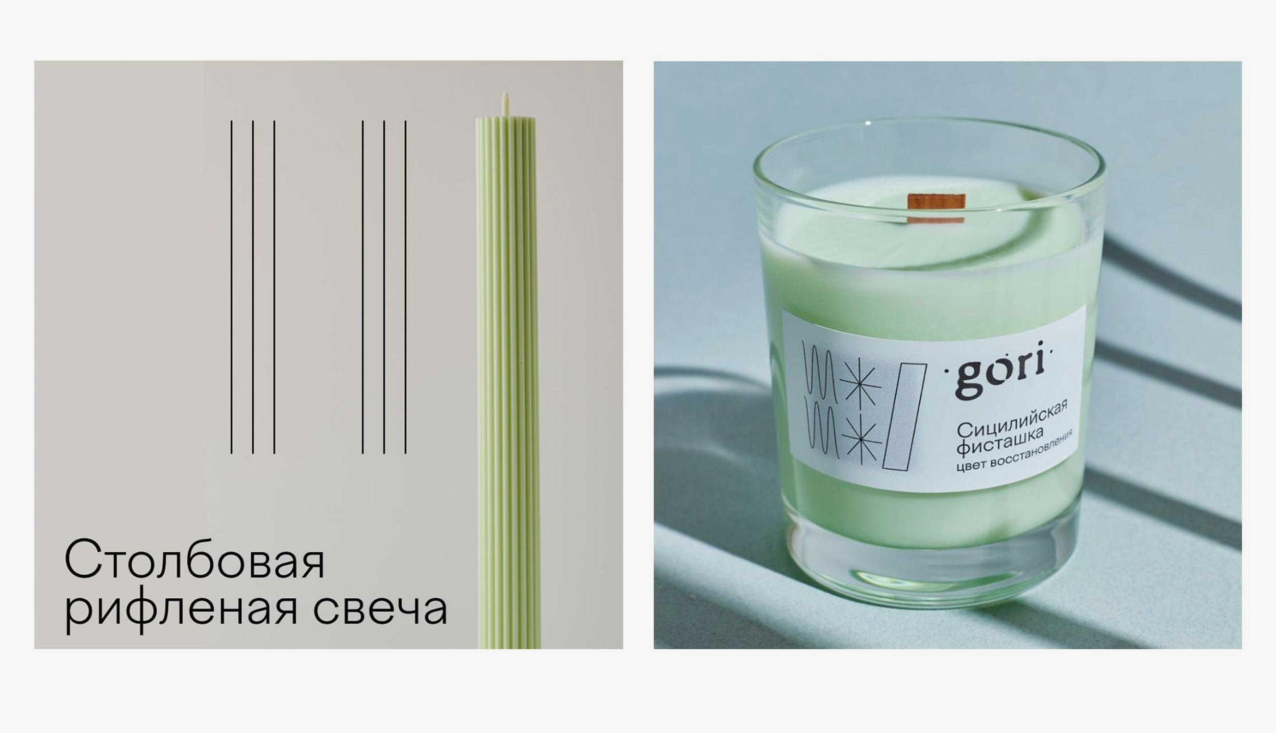
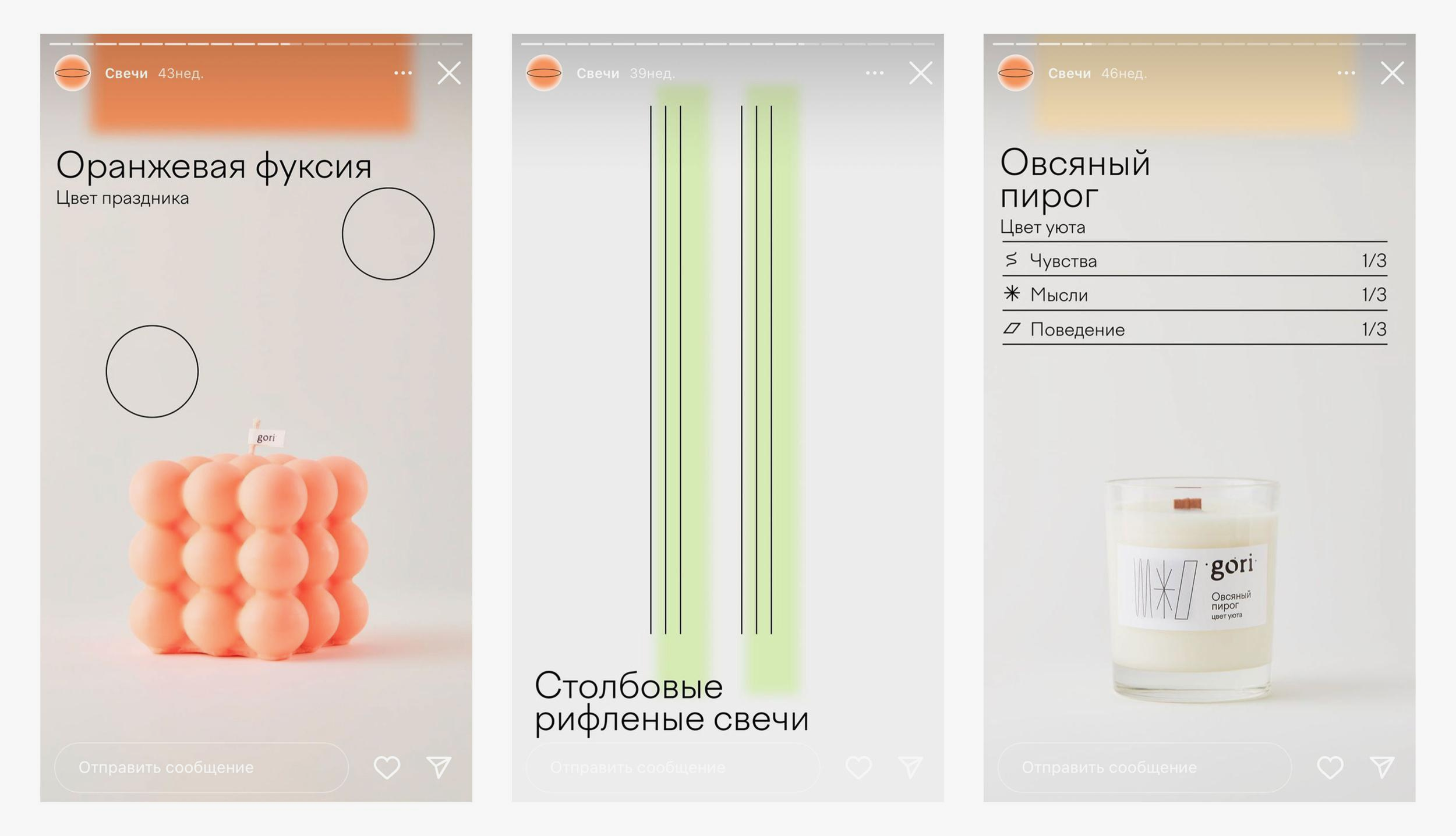
Gori, candle brand visual identity. Set in Factor A. Design: Holystick
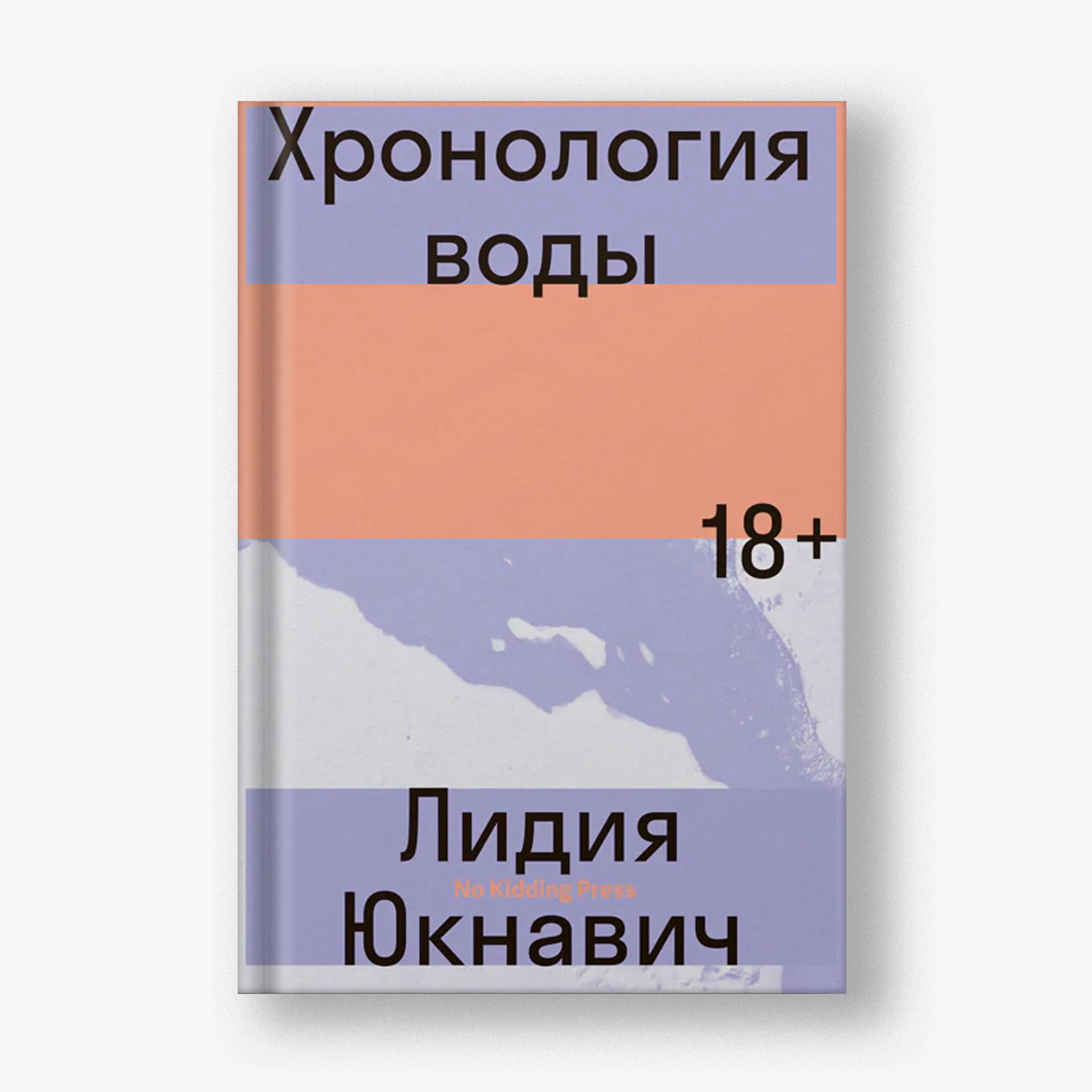
The Chronology of Water, book cover. Set in Stratos. Design: Holystick

Numen, logo. Set in Stratos. Design: Holystick
What kind of typography do people like today?
Yana: People or designers? Those two have completely different needs. I believe people tend to choose something understandable and easy to read, while designers tend to choose something that can surprise them.
Just recently, we proposed Favorit to architects, and they said, ‘The typeface is really good, but this у is a bit silly’. It is so great that the font included a quieter alternate; we applied it, and the architects were happy. It both slightly improved the typeface’s readability and preserved its personality. It’s nice when you’re able to strike a balance between the taste of designers and that of people.
Mila: I think this may be compared to high fashion. Anything you see on the runway is about the hyperbole. But if you like the idea, you find a more subtle version of it, or it’s only certain individual elements of it that you bring to your life.
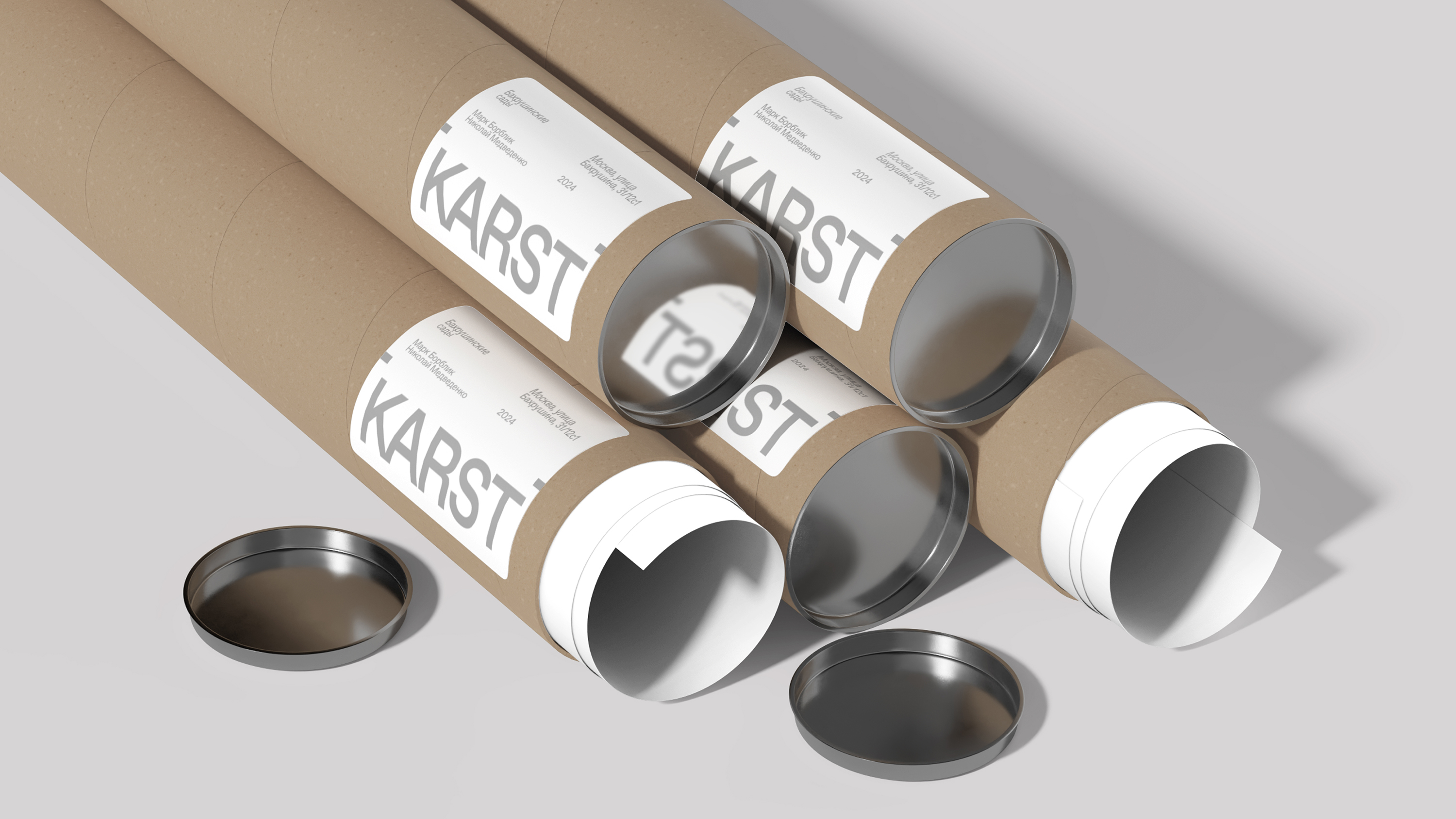
Karst environmental design studio, visual identity. Set in Favorit. Design: Holystick
Is it possible to tell what message the author was trying to plant just by looking at their typeface?
Мила: t is easy to place simple
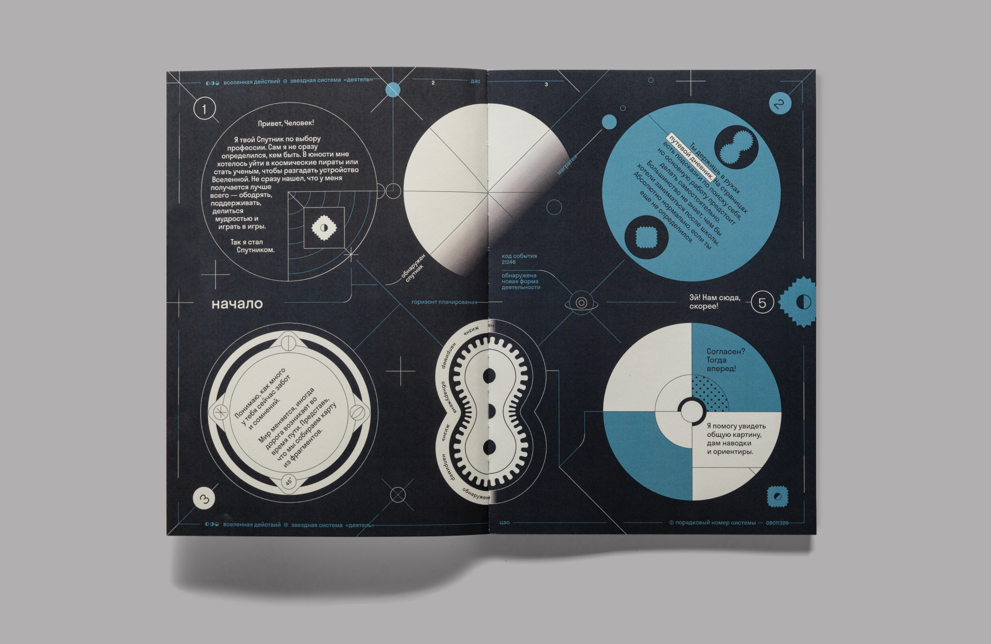
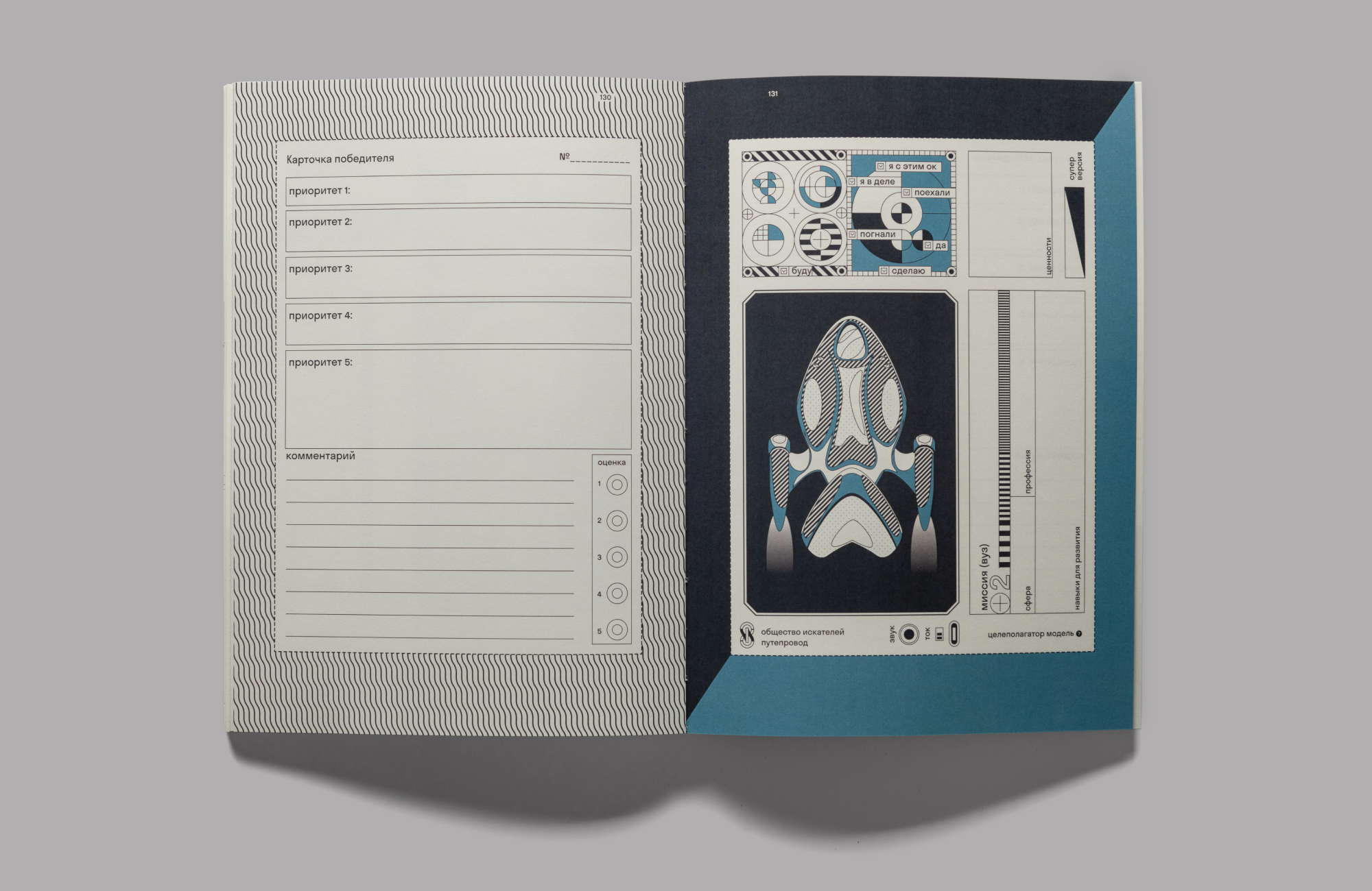
Sputnik, planner. Set in Stratos. Design: Holystick
Is there anything you wanted to say but we didn’t ask?
Mila: It is most important that designers take on an educational role. It is particularly valuable when the customer is a small
Yana: And also by the fact that it’s not always possible to use for your project whatever was ‘already installed’ on your computer for free, and that even what was installed on your computer might and should be, in fact, paid for. We believe that our mission is not just to educate our customers, but also to teach them to appreciate the diversity of typefaces.