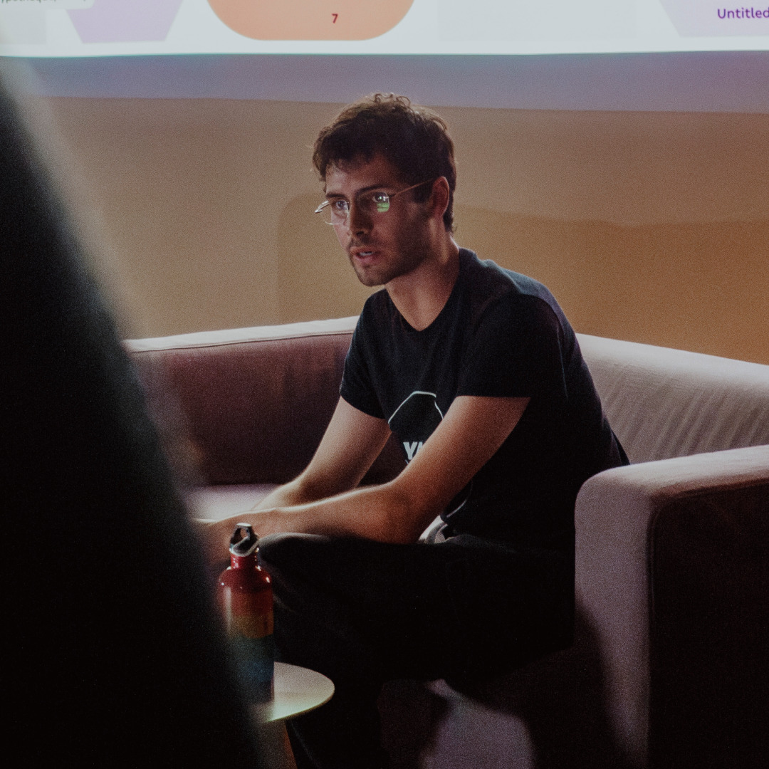
AS: How did you get into working with type designers?
HM: Serendipity, really. I studied cognitive psychology for my undergraduate. I had Photoshop on my computer from a very early age, and have always loved drawing, so I guess I always had an interest in design. I wanted to do something related to that, but the cognition of language also really called me. Those interests more or less led me in two directions.
One was developmental psychology with a linguistic angle, looking at how children acquire language. The other was reading research, which really was the perfect overlap with my interest for design. So I did an internship with Dr Bo Yao at the University of Manchester on the literate brain, trying to map personality traits to typeface parameters.
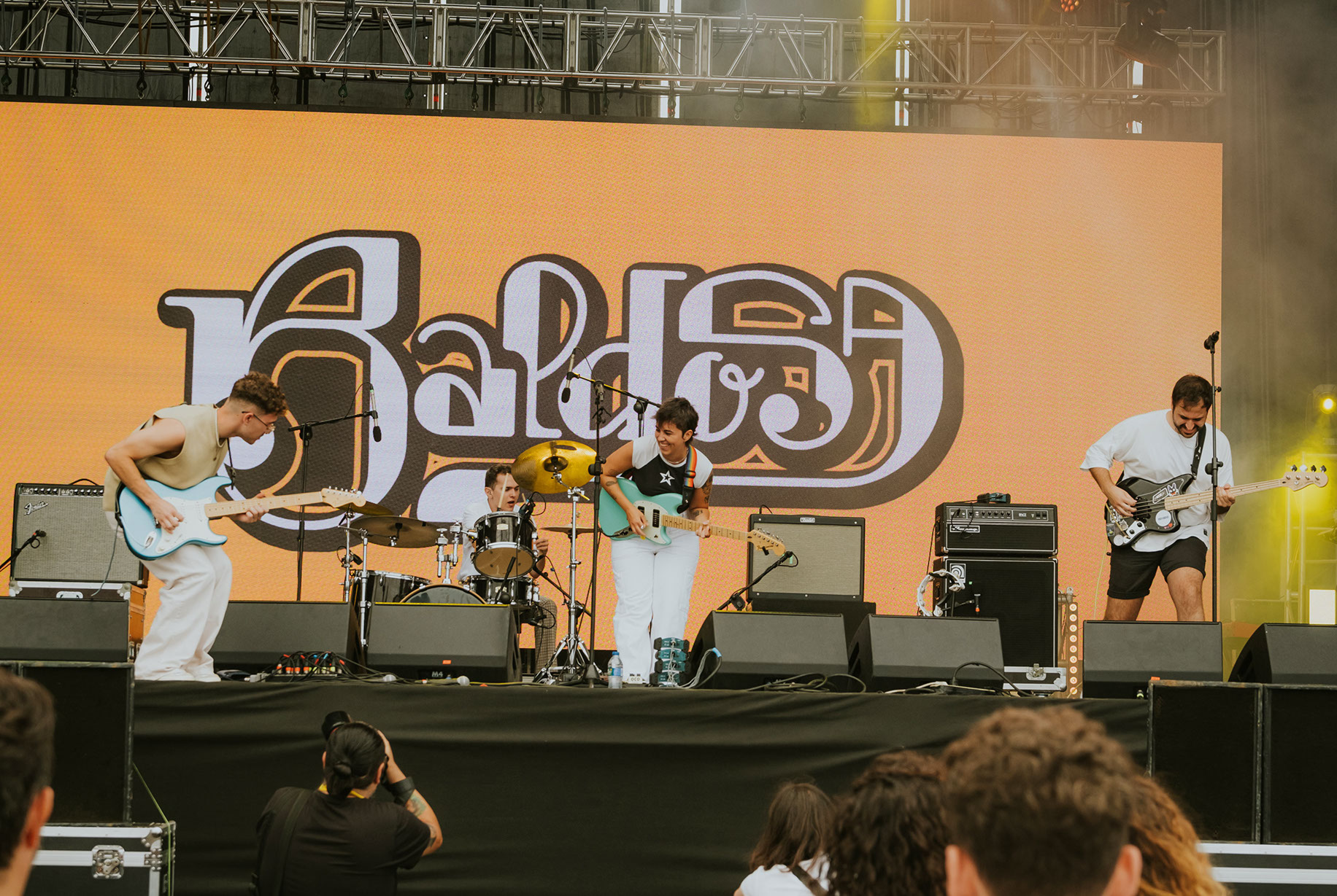
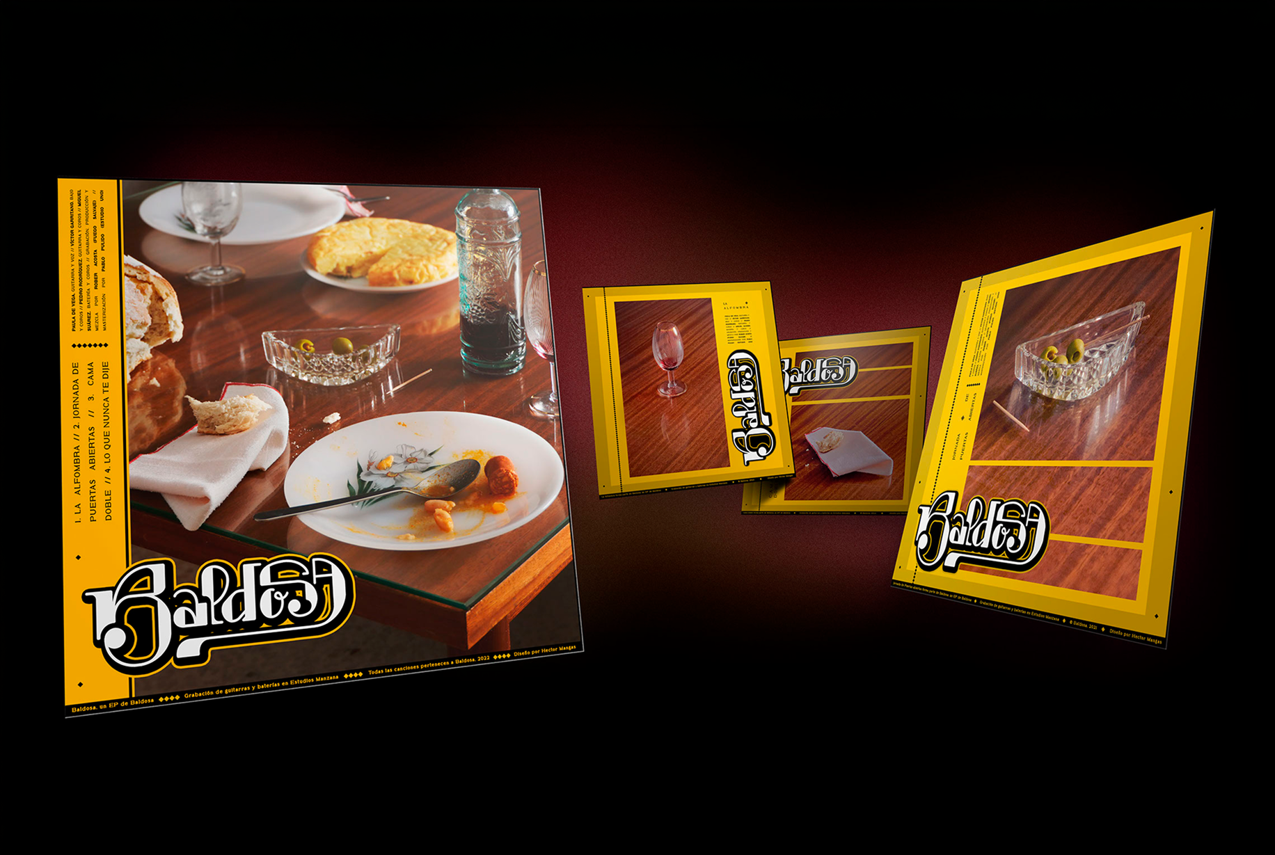
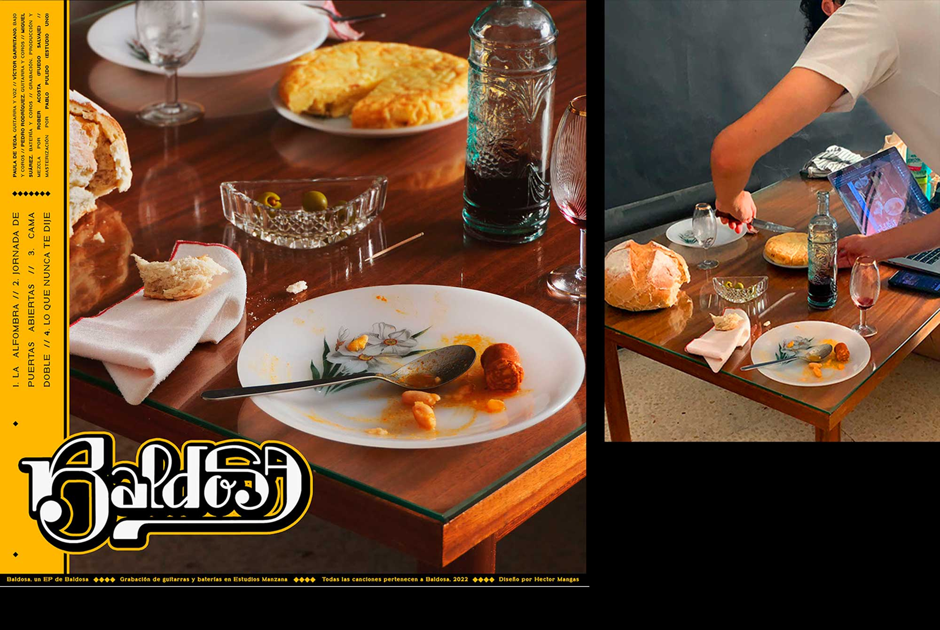
Visual identity for Baldosa music band and their debut EP. Design: Héctor Mangas
AS: Can you give any examples of such mappings?
HM: It’s quite an old paper. We mapped type features to a personality model called OCEAN, which tries to describe personality using just five traits: Openness, Conscientiousness, Extraversion, Agreeableness, and Neuroticism. Some people argue that it’s a bit simplistic, but it’s also one of the most extensively researched personality models.
What we found was, for example, that greater stroke contrast lowers perceived openness. So if a typeface has higher contrast, it feels less open. We also found that typefaces with higher contrast are perceived as less agreeable. But that was just my bachelor’s thesis, and it was quite a while ago. Now we’ve done a follow-up study at the Centre for Visibility Design, with Dr Sofie Beier, which we’re preparing to publish.
One of the drawbacks of the first study was that the fonts we used weren’t of very high quality. This time, Elias Stenalt Werner, a great type designer from Copenhagen, designed a typeface family that lets us manipulate one parameter at a time, and we used his typefaces as the stimulus. That way, we ran a much more controlled experiment that draws more precise conclusions.
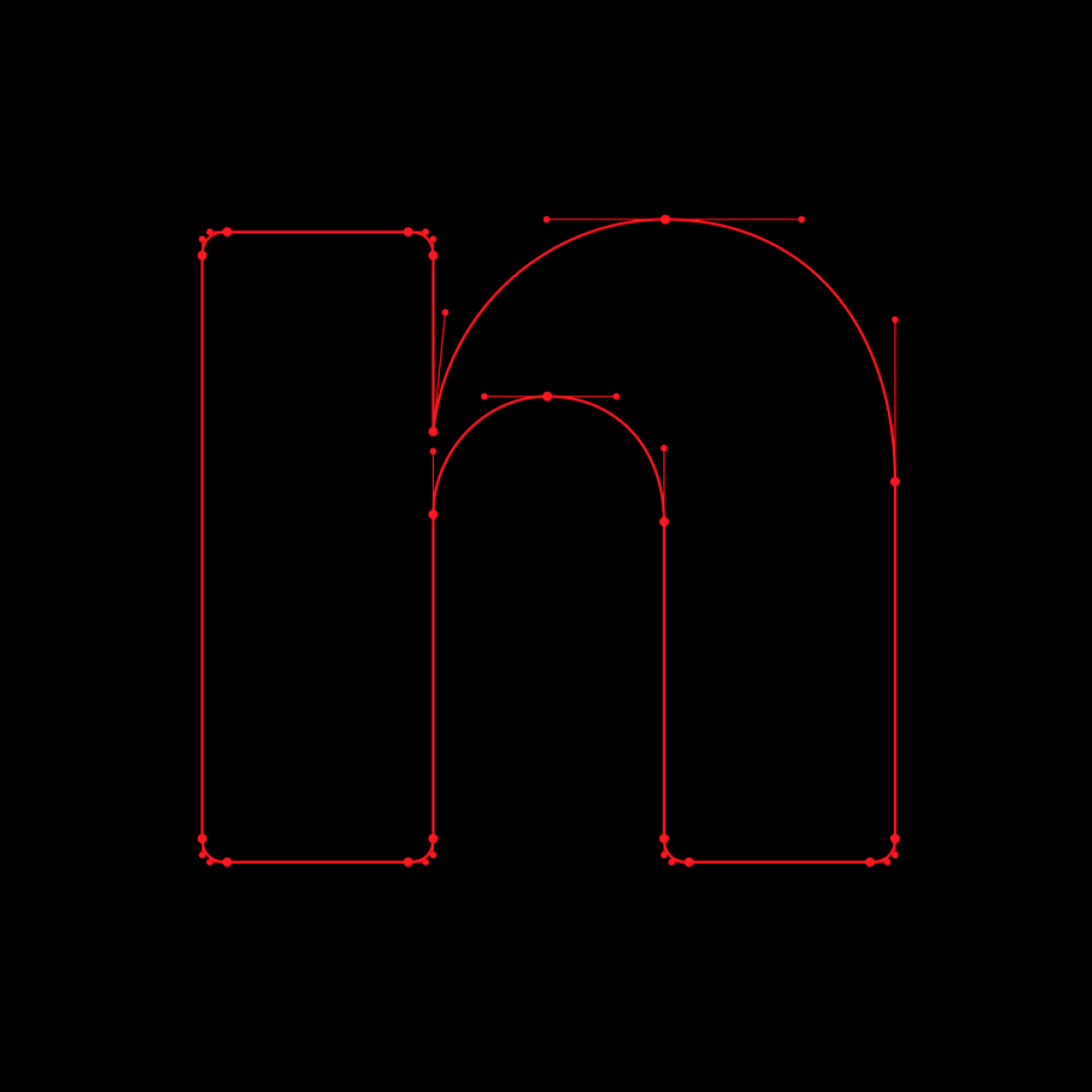
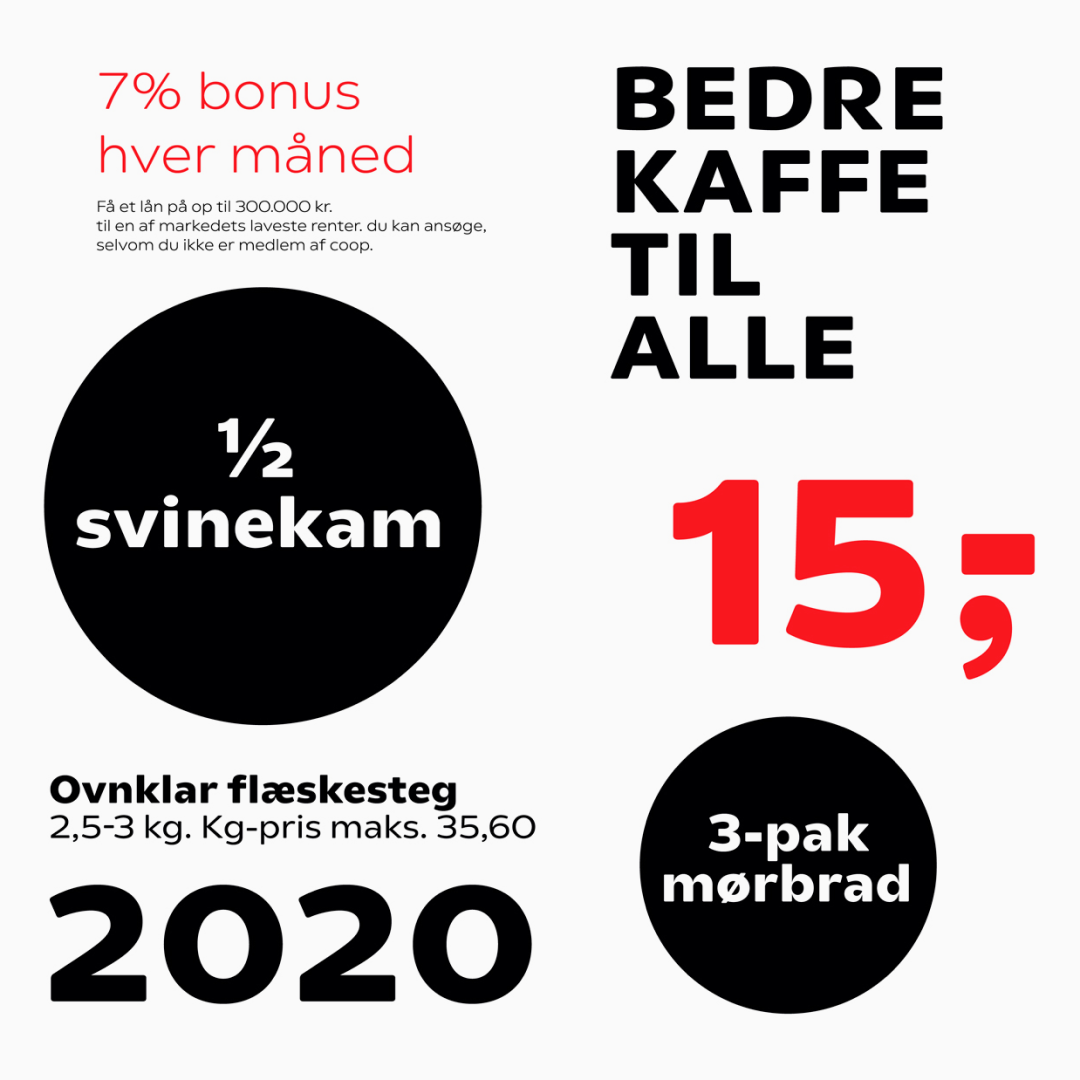

Bespoke typeface designed by Elias Stenalt Werner for Coop
But we’re not saying that the outcome is universal. These personality mappings are true for Latin only and are culture-specific.
AS: That’s an important detail! That’s good that you pointed that out! Well, how did you get to work with Typotheque then?
HM: For my master’s, again, I wanted to do something that would also bridge my background in psychology with the other things that I was interested in. So I went for Applied Cognitive Psychology, in the Netherlands. I studied in Utrecht, and I sent an email to Typotheque saying, ‘Hey, do you guys have any internship positions? I would love to do my internship with you!’
Marlis Marlis Zimmermann — client relationships specialist at Typotheque, who replies to all of the emails, got back instantly. She said, ‘No, we don’t have internships, sorry. Thank you for your interest.’ And I replied being like, ‘Okay, I’m still new to the field, so I would just love to meet you guys because you are research-oriented and we’re both in the Netherlands.’
Then Peter Peter Biľak — the founder of Typotheque got involved, and it turned out he had an interest in doing research with a psychologist. Curiosity more than interest, I would say. We shared lunch, which was lovely. Because it’s hard to tell what sort of stuff is going on at the foundry if you just look at their work online, hearing it firsthand was super nice.
He had mentioned a project he was planning, and as soon as I got home, I started writing and sent him a six-page research proposal by the end of the day to show that I was really interested, and five years later, here we are.
AS: Do the research questions come from you, from the designers, or from Peter?
HM: The research questions normally come from the designers, may that be Peter, or some other colleague. It usually happens when we’re developing a font that supports a specific script, and there’s not enough documentation for the native designer to rely on. That means they don’t really know how users will react to them drawing a letter in a specific way.
And from there, we talk to develop a research plan. I go back and forth with the designers, asking, ‘What exactly do you need to get answered?’ I say, ‘You are asking: Will people like this letter? What do we mean by “like”? Is it about the associations that will come with it? Or is it about how comfortable people will be reading it?’
Based on these conversations, I draft a design for an experiment or a survey. We normally pilot it before we launch it fully. We have a few people, normally people in the network of the designer, who can help us and answer the survey or guide us a bit more. From there, we start the proper study.
And after we run an experiment, we try to use the data to answer our questions. There are times when this is an open-ended question, where there are two options that are equally valid. But there were also times when we ran a confirmatory study, and we realised that something that was going to get shipped wouldn’t be accepted by the users, so the designer had to rework the font completely. And then this new font had to be tested again.
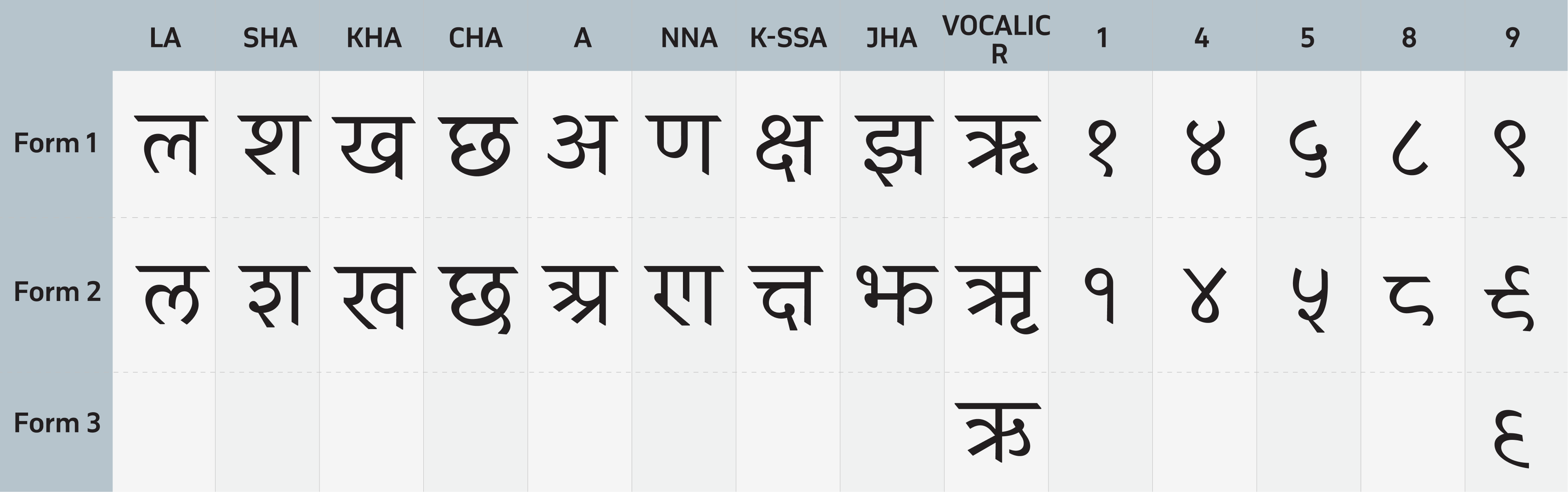 Letterforms analysed in the study of Regional Devanagari forms. Image: Typotheque
AS: Is it difficult for you to conduct research on a script you can’t read?
HM: My work doesn’t happen at the script level. That’s usually the typographer’s
But of course, it’s useful to know a bit about how the script works, how it’s read, and how its shapes are built. This is also one of the most fun parts of the job.
AS: The things you write are user-friendly. I can read them without needing a break every five sentences. But with most scientific papers, it’s the
HM: How can I answer this question without offending either side… The problem is that the research community tends to talk to itself. They’re talking to their own people in their technical terms, and although it makes sense to speak in expert terms about complex, specific things, it is problematic especially when we’re referring to design research, which needs to be understood by designers. If you’re leaving out designers, you’re essentially failing as a design researcher, I feel.
A lot of work goes into trying to keep the rigour, because we also don’t want to write something that’s flashy or inaccurate, or that just simplifies what we’re trying to explain way too much. A big training exercise for this has been Accessibility Tools. The world of accessibility is very complex, with so many stakeholders who have different ways of speaking, and each of them uses their own terminology.
And then you have the designer, trying to understand all of these parties on top of their work, struggling to navigate what accessibility actually means and how to build for it. So the focus of Accessibility Tools was: how do we adapt the scientific literature accurately and precisely without making the reader need to take a break every three lines?
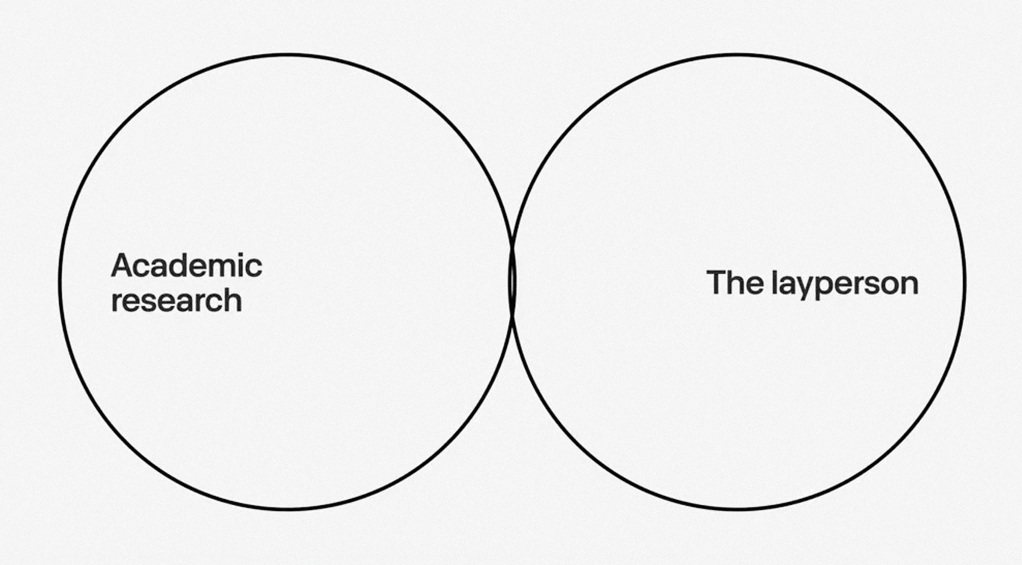 The Venn Diagram of the intersection between academic researchers and ordinary designers. From Héctor’s presentation on TypeLab
AS: Also, you have the checklist, which is super useful. I recommended it to my friends who are now making a web platform.
HM: That’s very sweet!
AS: Now my friends are following the recommendations and getting really nervous. They’ll say, ‘We wanted to make this paragraph text 100% black. Is that okay? Do you think we’re allowed to do that?’ I just tell them, ‘Guys, it’s just a checklist, not a police order.’
HM: It’s supposed to be a set of recommendations. I’m happy to hear that people are using it, but people should not stress if they can’t meet everything. Also, it’s still a work in progress.
We want to link each recommendation to supporting documentation. For example, if you see the recommendation not to make text fully black, we can explain why and invite you to read more, with a short breakdown of the reasoning behind it. I believe transparency is very important for this kind of work. Understanding the shortcomings of making certain decisions can be more important than compliance.
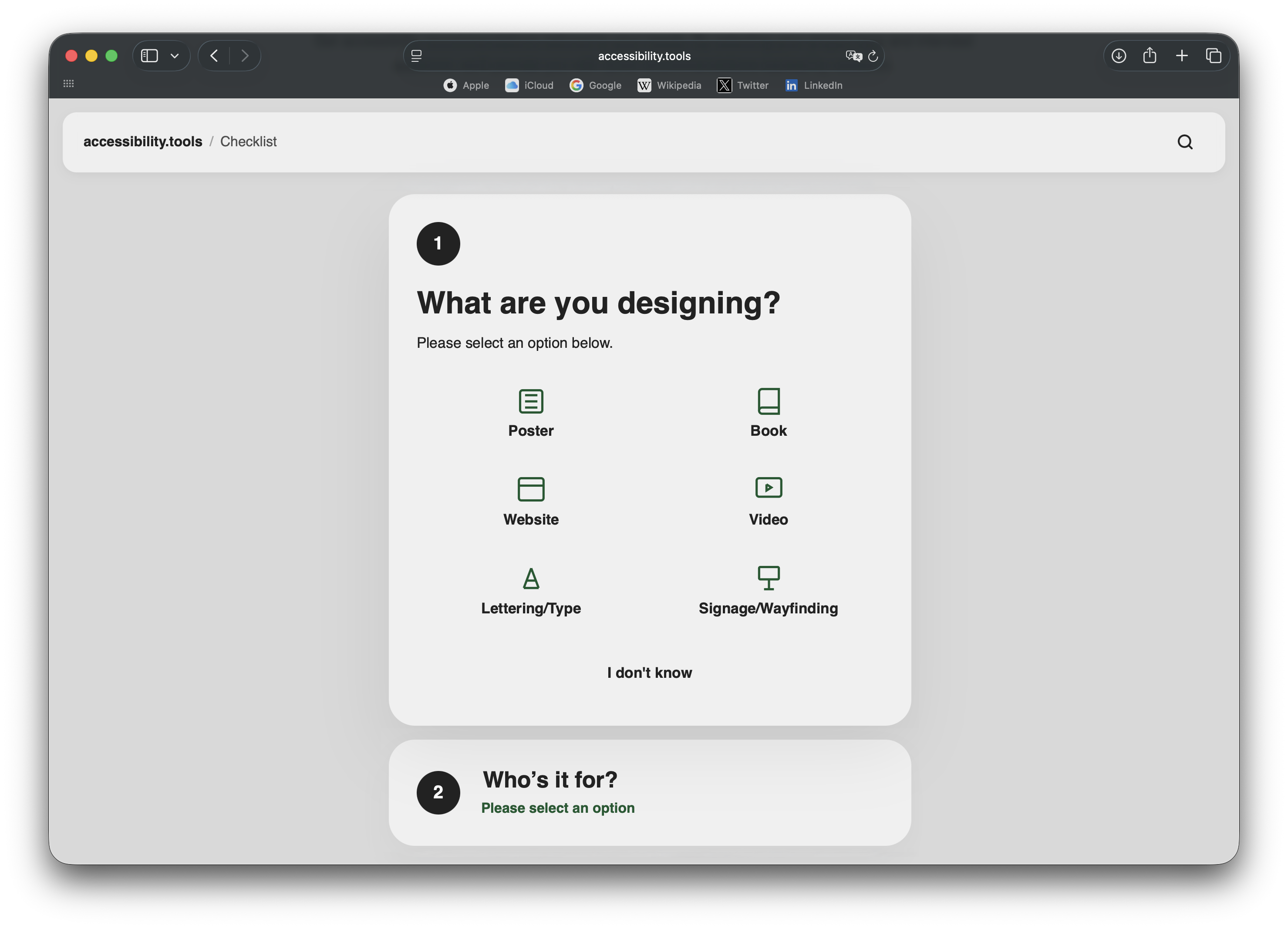 The checklist on Accessibility Tools
AS: Don’t you have the feeling that accessibility is kind of a buzzword among designers?
HM: I feel there’s a lot of misconceptions or misuses of the word accessible. And, of course, the term is a bit overused. In the survey we did before starting Accessibility Tools, we asked over a hundred designers about their notions of accessibility. We wanted to get a glimpse into what they consider to be the trade-offs when thinking about accessibility. And aesthetics turned out to be the first one.
AS: And what was the second one?
HM: Time was the second one, and cost was the third. For us, these can be bridged, as they both come from the client side. These two trade-offs are normally there because designers do not have enough argumentative power to tell their clients that accessibility is important.
But designers thinking that accessible things are ugly is a problem that sits on the designer side. So a big part of Accessibility Tools is making sure that designers don’t feel like making their design more accessible, or understanding accessibility better, is going to make their design boring or less pretty. You should still be able to do something interesting, but if you want to be accessible to specific groups, you should know the constraints.
Another big thing is fixing things in communication with
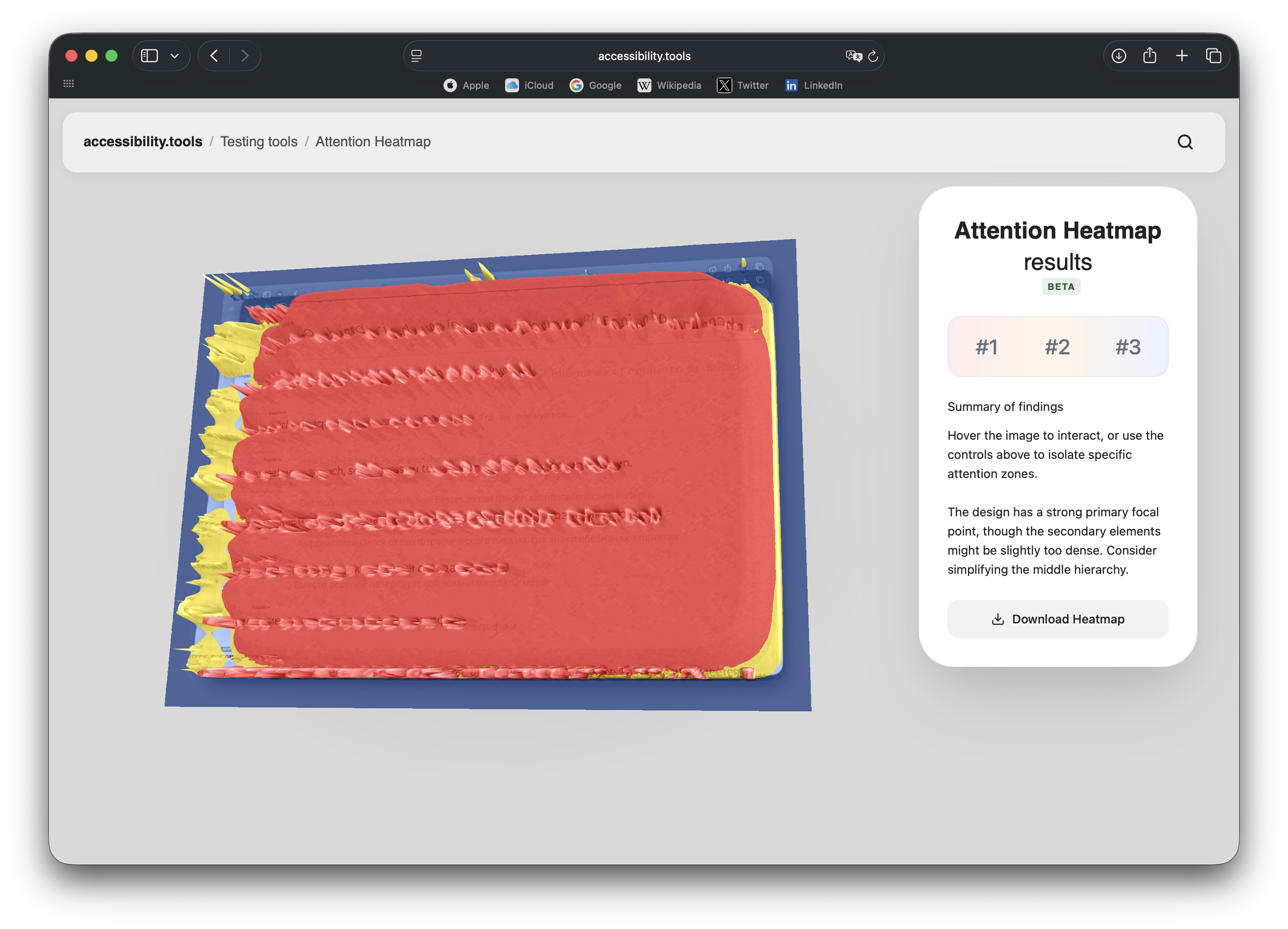 Attention Heatmap on Accessibility Tools
AS: What’s the most annoying misconception about accessible design?
HM: There are very annoying misconceptions about very specific things. For example, about dyslexia. There are a lot of misconceptions around how to create a design that is dyslexia-friendly. In recent years, they have become less prevalent, but you’ve definitely heard of dyslexia-friendly fonts.
AS: And there is also dyslexia-friendly typesetting!
HM: Totally. To me, some dyslexia-friendly products are really annoying because, if we look at the literature, there’s no evidence proving they work. And I feel that that’s partly because the research papers are inaccessible and people don’t read them. Then designers use these dyslexia-friendly fonts, with a very noble intention. That’s why we started the documentation section of Accessibility Tools with
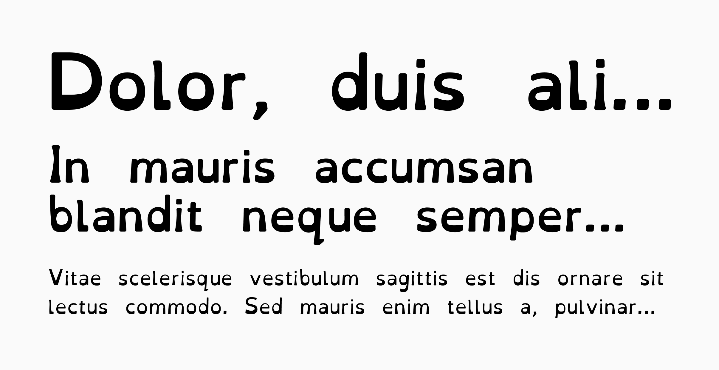
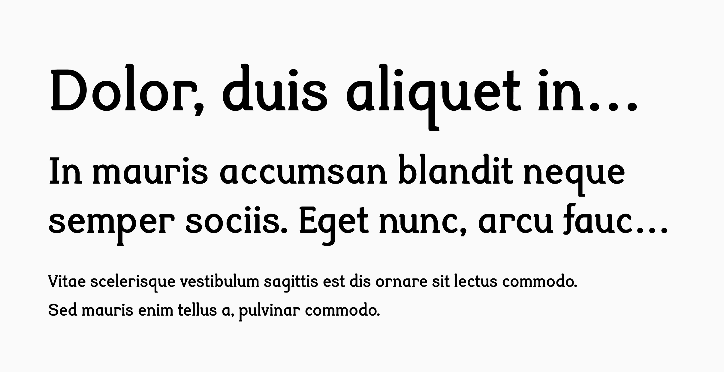
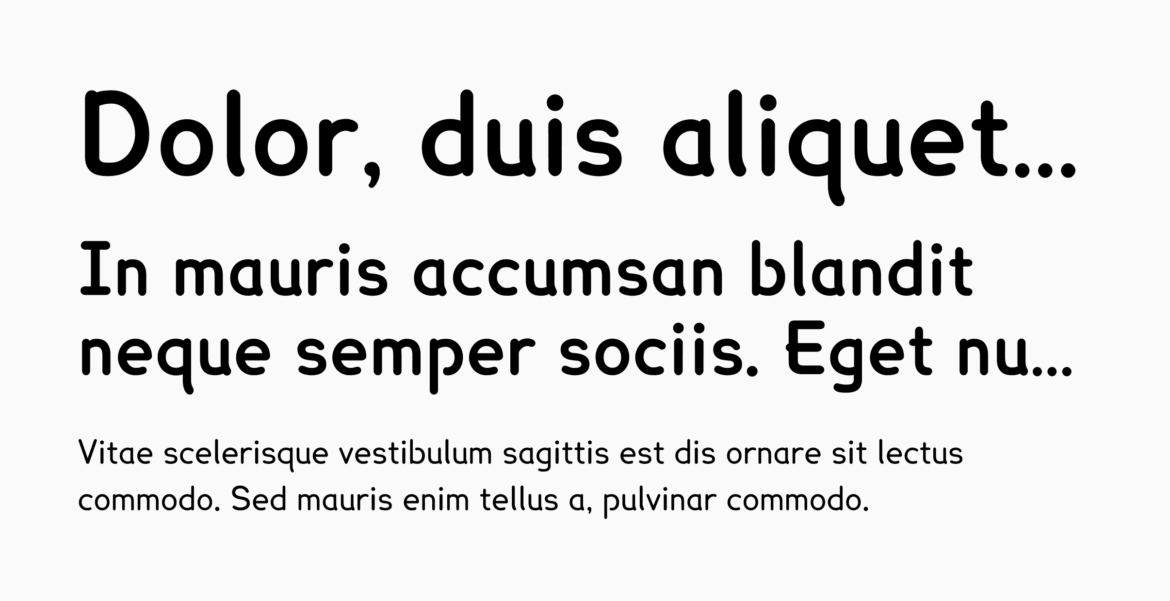
Fonts designed for people with dyslexia
AS: I saw a discussion on Mastodon a while ago about whether font specimen images should include alt text. Some people said, ‘Visually impaired people are not our clients, so we don’t think it’s a must.’ And then there was Rutherford Craze, who argued, ‘I’m travelling by train, and the internet connection is so bad that it helps to know what’s in the image so I can decide whether I want to wait for it to load.’
So what are your recommendations? Do I have to write alt-text for all the images on my website and in my Instagram posts?
HM: I agree with Rutherford. Alt text is not only for people with vision problems. It makes the content much richer. If the picture just happens not to load on your phone, having an informative low-data alternative is useful. Also, saying ‘They’re not our clients’ is a bit rude, isn’t it?
I think you definitely have to write alt text for images on your website, and Instagram even has an automated alt text generator.
AS: But is the generator reliable? It’s just that I tried asking ChatGPT to write alt text for me multiple times, and it failed. Let alone type-related images, it couldn’t even properly describe my portrait. There was only my head; I was obviously scared, and it described my clothes but didn’t describe my facial expression, so it was easier and faster for me to write the text myself than to guide the AI.
HM: That’s surprising, especially the portrait bit. For the type images, I can imagine that it just doesn’t have enough data for describing type-specific things. Well, it definitely doesn’t have enough data about reading research. If you don’t have an answer for a readability question, never rely on a public LLM, ask an expert.
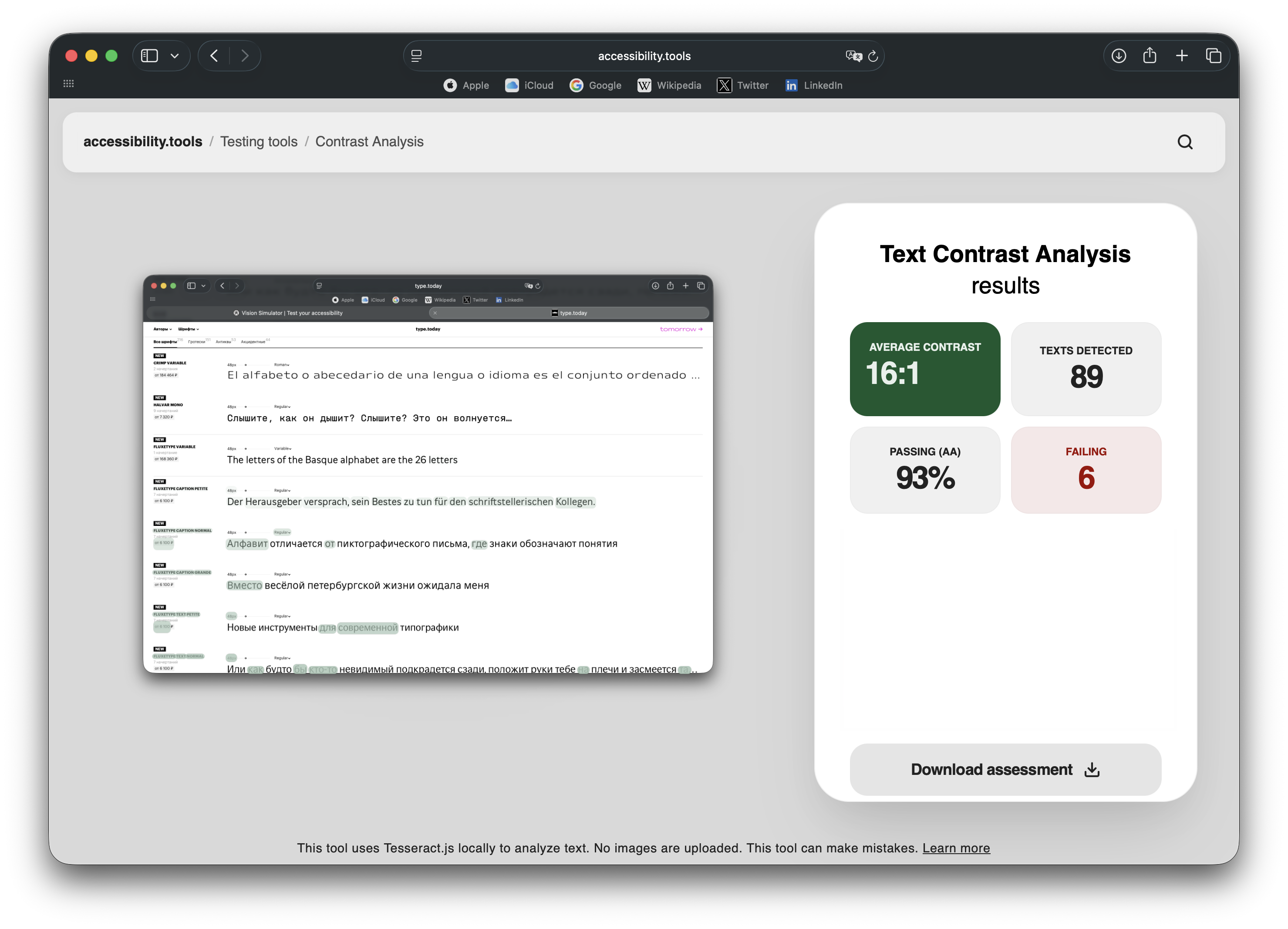 Text Contrast Analysis on Accessibility Tools
AS: Isn’t there generally a very small amount of readability research in the world?
HM: There is quite a bit, but not enough. Also, for LLMs, the existing amount of information hasn’t been scraped well enough, perhaps. And there’s also the problem with LLMs giving you too many confirmatory responses. So I would advise against using them if you’re trying to do research.
AS: Do you use machine learning in your work?
HM: For editing text, yes. But just for me, internally, to put things in place. We have an editor who reviews the text after that. AI is also really useful for coding, for writing Python to analyze data.
AS: Did you use it while making Accessibility Tools?
HM: Yes, part of the code has its input. But again, it has been reviewed by humans.
AS: So we still need humans!
ГМ: We still need a lot of humans! We’ve worked with two designers, Pauline Fourest and Katie Fridman, who have created infographics and illustrations for the site. Cognitive psychologists Sofia Ferrer, Jeanne Gäßler, and myself have been working on the docs, together with reviewers that take a look at the writing before it comes out. Additionally, interaction design researcher Matt Baxter has helped improve the usability of the site, and prepared the survey I mentioned earlier.
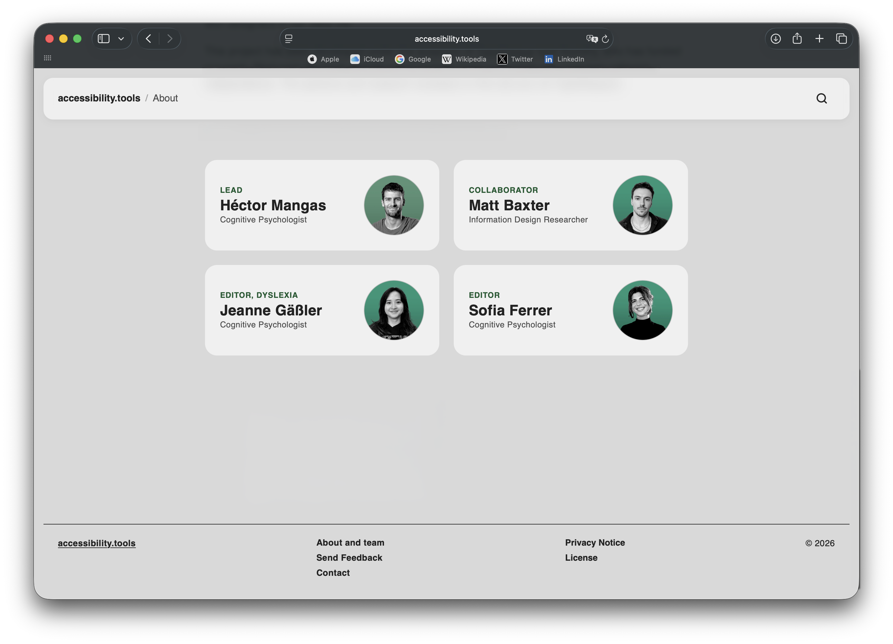 Accessibility Tools team
AS: What hard skills does it take to become a researcher working with type designers?
HM: Oh wow, I’ve never had to write a job opening for that! It’s a rather unusual type of job. But if I think of my colleagues, like Sofie Beier or Mary Dyson, I’d say that to do readability research, you have to have an understanding of methods.
And, of course, you need to have knowledge of how type works. There’s a lot of reading research that compares completely different things because the researchers were great vision scientists, but they didn’t know anything about typography. So they were comparing Times New Roman to Comic Sans, meaning they were not isolating variables. You need to have a bit of knowledge from both sides to do good research.
There are also very good researchers in the vision science field who have contributed to reading research. But I feel that within this niche, type research, or cognitive type research, if we are to call it that, is an even smaller subset where letters are also important.
AS: Doesn’t one need to know how to write code?
HM: It is good, but I don’t think it’s a must. The team at the Centre for Visibility Design, which is one of the few labs focusing on this type of cognitive type research, for example, has people with a very varied set of backgrounds, and although multiple colleagues can code, it’s not a common denominator.
I would say that some understanding of statistics is probably more important than coding. You can get away with coding if you have a colleague who knows how to code, or if you use libraries that are already there. But a good foundation in statistics is quite
AS: That’s a skill needed for daily life! So, which aspects of readability that you mentioned remain underresearched?
I actually do have an opinion. I have a kid, and he needs to learn how to read in three scripts. He’s confusing numerals and letters so badly, and he has every
HM: See? The literature is not accessible. I would say exposing one script at a time would be the best way to go. I feel that having one symbol meaning both things at any given time is very confusing. And in terms of speaking, how are you teaching him?
AS: I’m not
HM: It’s probably super interesting to observe. Maybe for these three specific scripts, there’s nothing in particular, but I feel there’s quite a bit of research on how to teach multiscript. Don’t you think so?
AS: I don’t really know. But still, is there a field that you feel is underresearched?
HM: For reading research, everything beyond Latin, really. There are many things that have only been tested on Latin, and people are just making the stretch of saying, ‘This is how reading works globally,’ which is a crazy assumption. I’m doing my doctorate at the moment, and it’s about trying to challenge it.
For instance, at Typotheque, we did a paper about Thai loops. Latin-script readability research would tell you that simpler is better for running text. It’s the consensus. But for looped and loopless Thai, we observed that looped typefaces outperformed loopless ones. More complex shapes were more recognisable at small sizes. And this is just one assumption we were able to refute. But the idea of my research is that familiarity with a certain set of shapes is what makes them legible, meaning you read best what you read most.
It might be a given for type designers, but still, we need to bring it to people’s attention, to remind them that reading research is conducted mainly on European or American users, and there’s a huge under-representation of how people in other places read. There is, of course, research in other parts of the world, but the majority of reading researchers are European or American, and they focus on their native scripts.
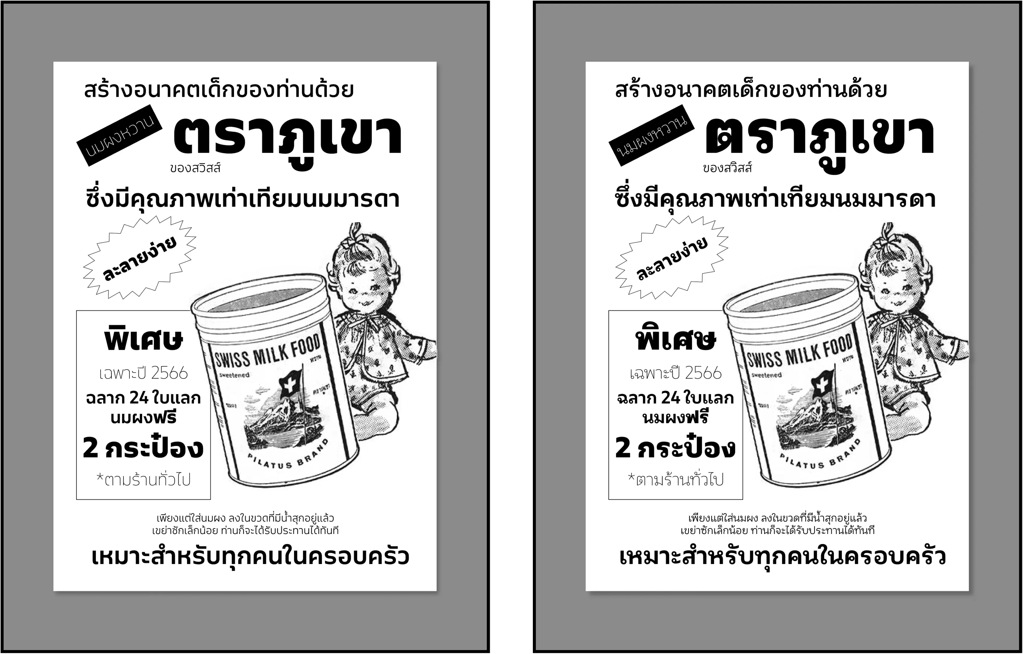
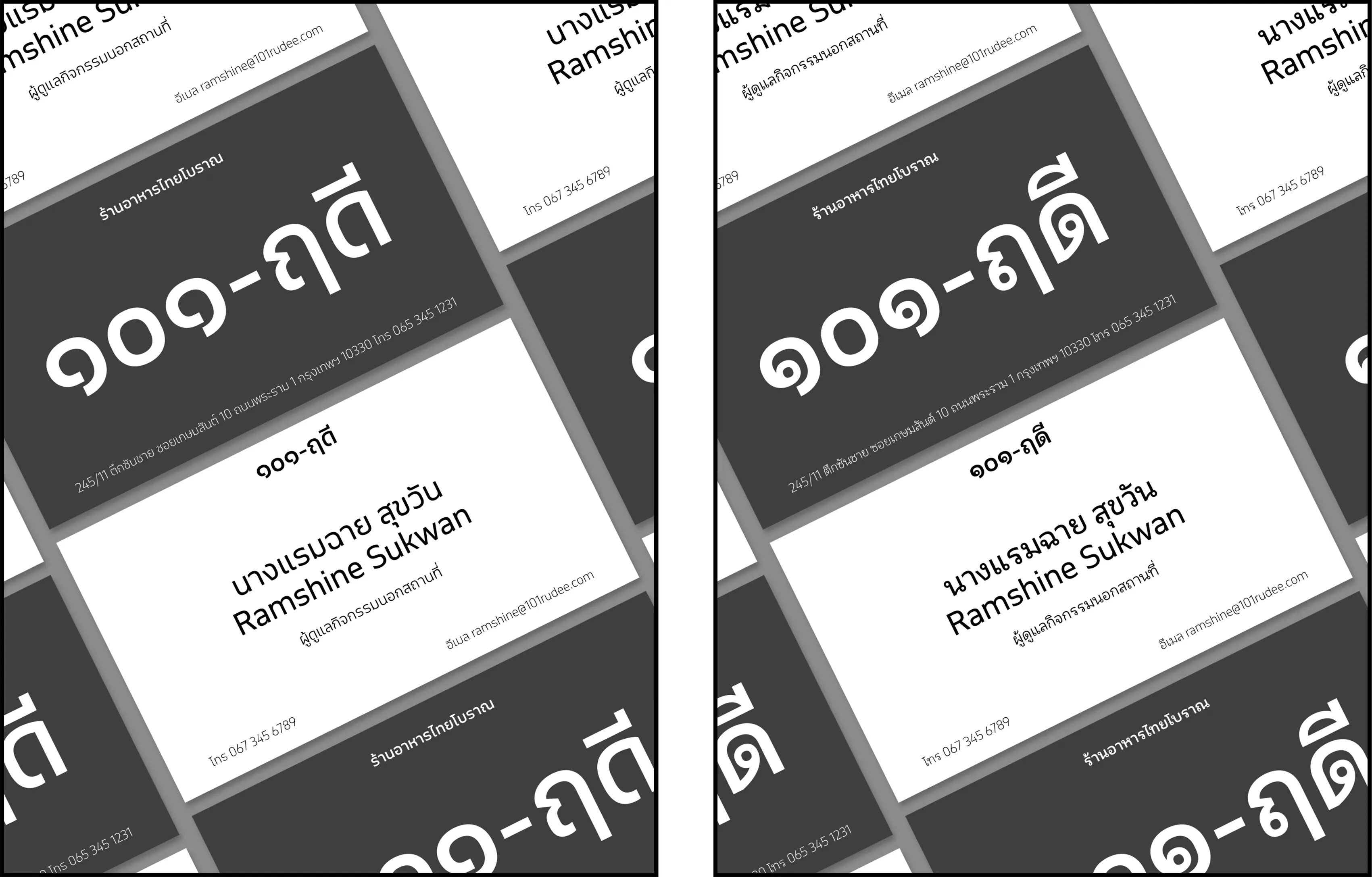
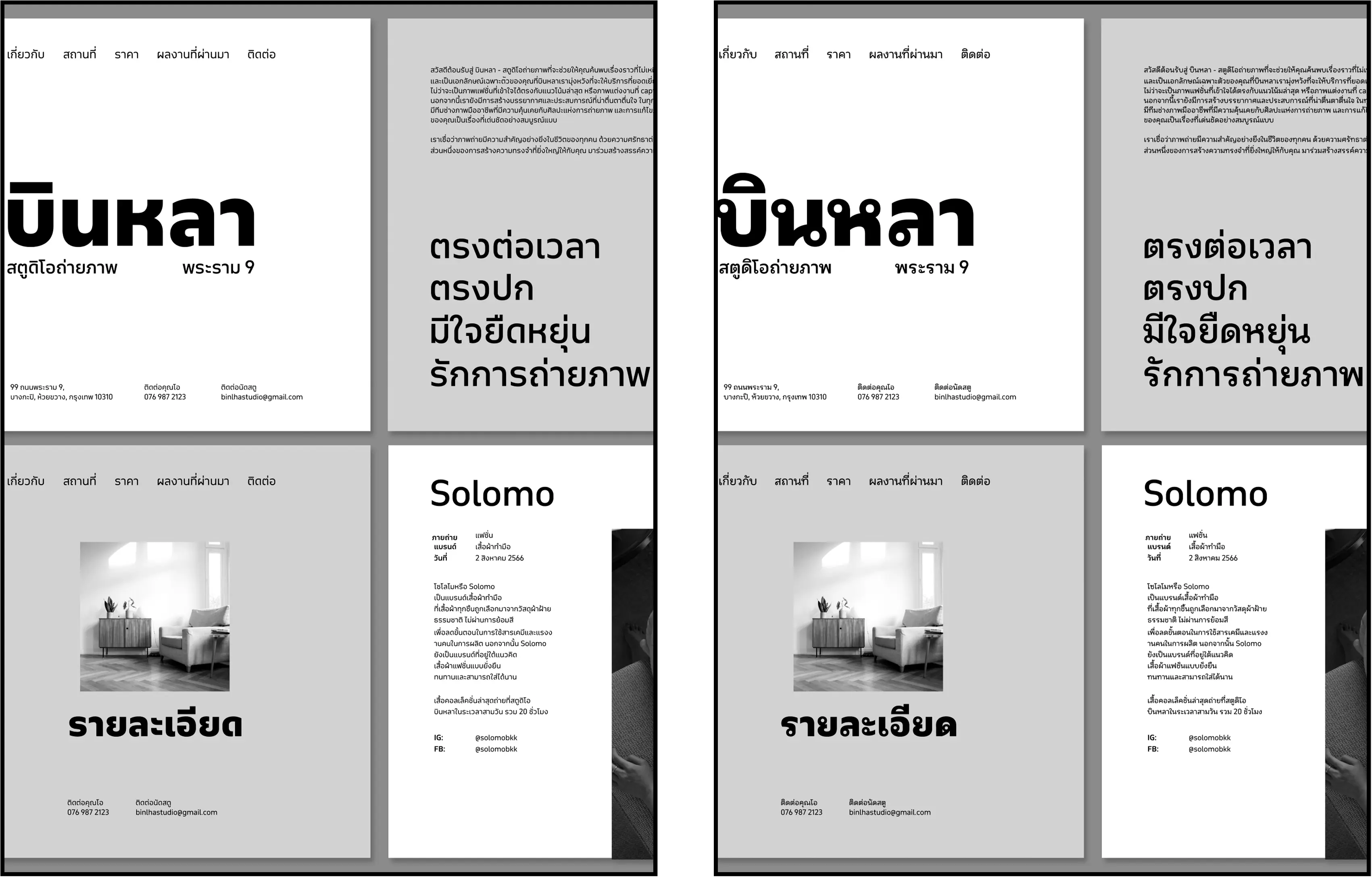
Materials set in looped and loopeless Thai used in Typotheque’s survey. Images: Typotheque
AS: Do you see the fact that
HM: I get where they are coming from, but I also think that Anya does it with a lot of respect. If you do it with respect and rigour, I don’t think it is a must to be a native to research a script. Of course, you can’t just go somewhere without engaging with the locals and just say, ‘This is how we’re going to design it from now.’
But what I won’t say is that it’s not a problem that the majority of researchers are European and American. I do think that that is a problem. I do think that it is a massive problem, and that we are not representing people in an appropriate and fair way. We need more and more native researchers doing legibility research in other parts of the world.
But I think that focusing on the non-natives who are doing work is not really helpful. What we really need is to make people interested, and maybe in ten years it’s all different.
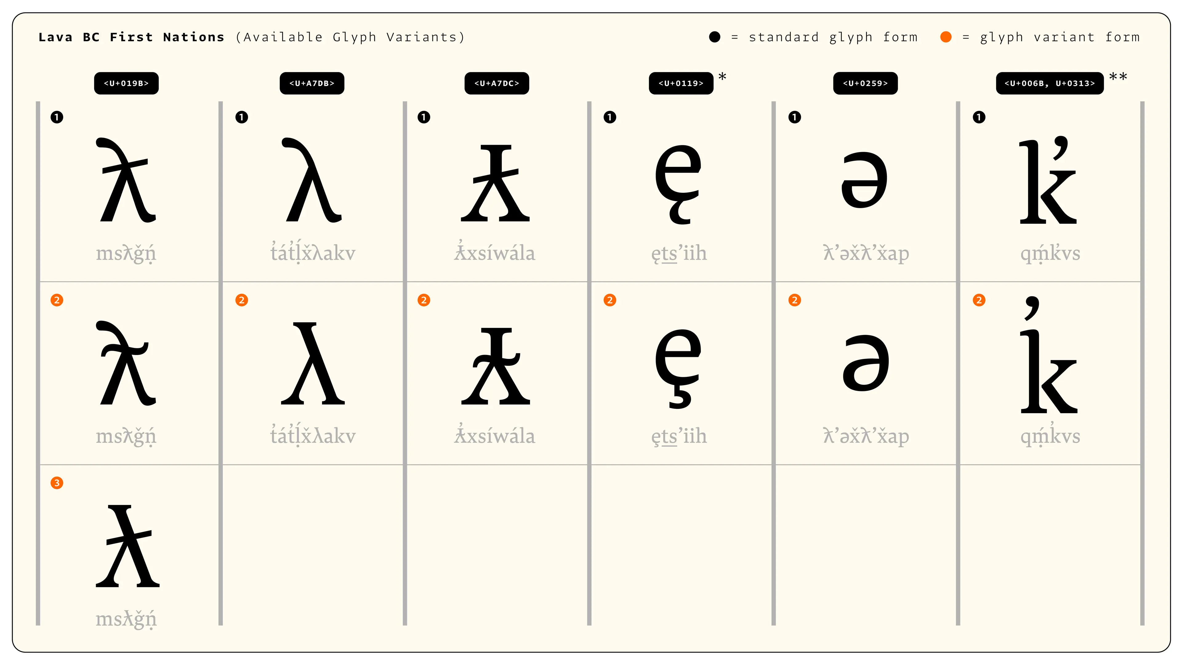
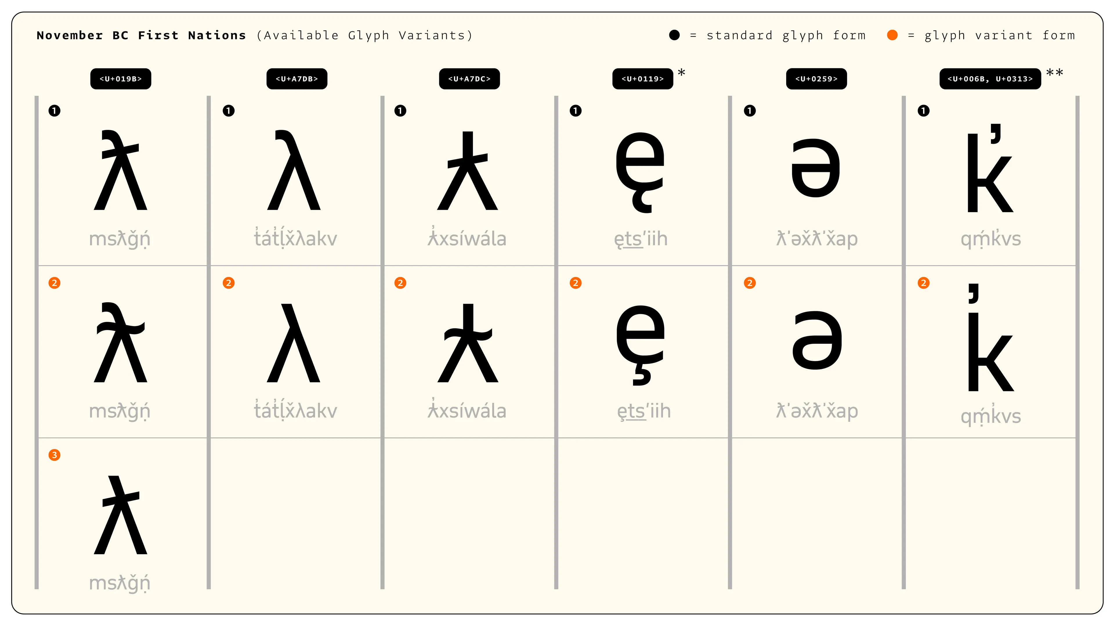
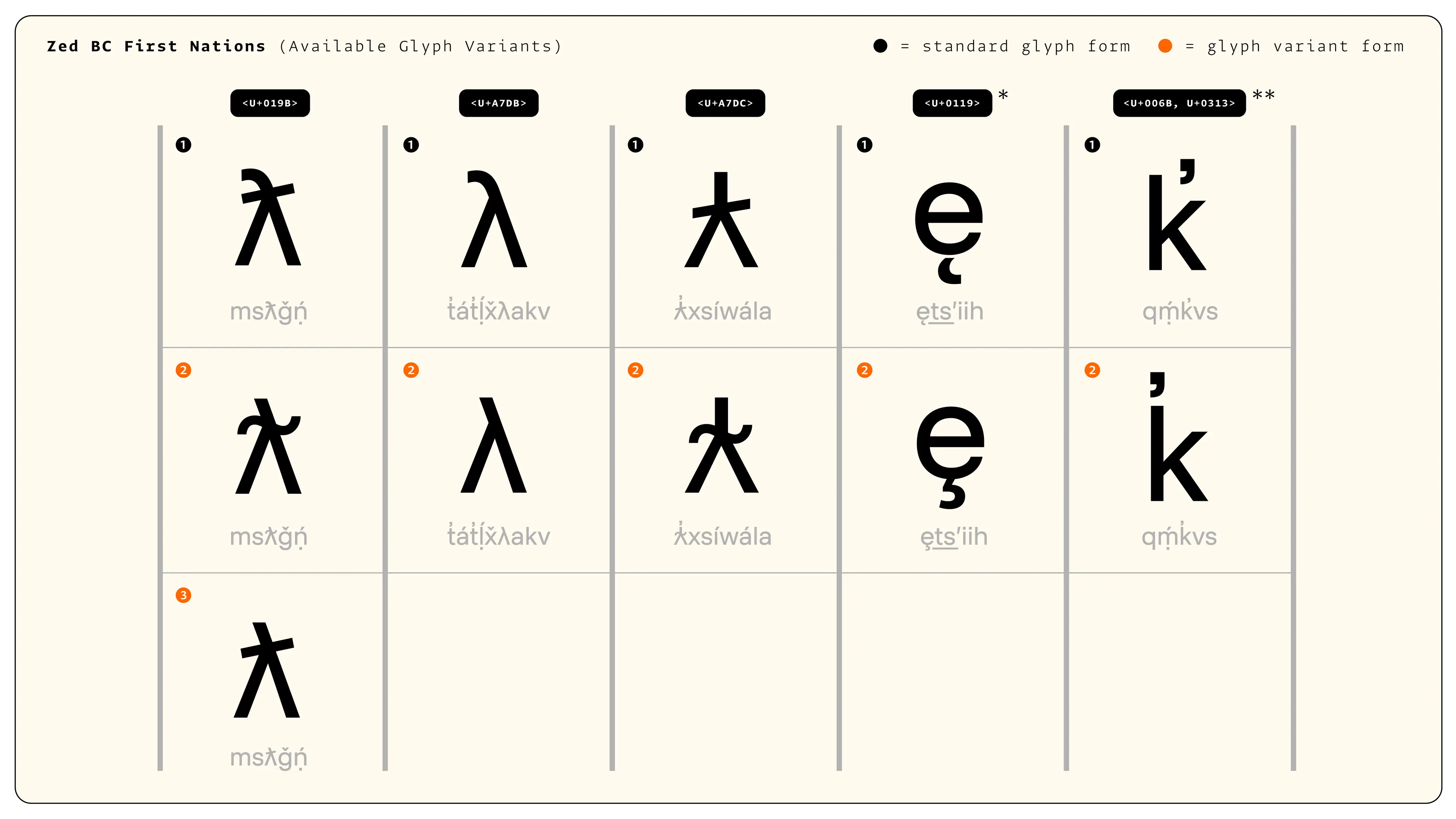
Characters specific to Indigenous North American languages, designed by Typotheque in collaboraton with Heiltsuk Revitalization and FirstVoices
AS: I have a feeling that today the term research is becoming a bit vague, a bit shallow. Now everything can be research. Taking a walk is research, planting a rose bush is research. How do you feel about that?
HM: I have the feeling that, in a similar way to accessibility, research can mean so much. I don’t get mad if you call a walk research. Maybe I should be more precise about how I use the word ‘research’, because what we do is empirical user research. Maybe we should all use more specific terms for the kinds of research we are conducting.
I’ve also heard the term desk research, which some use as a synonym for googling. And I think that’s a valid way to do things, as long as one is open about the format.
AS: Don’t you sometimes feel lonely in the type design community?
HM: I think the type community is so welcoming, it’s very hard to feel like an outsider. I’ve had a very good experience meeting people from the industry. And I think there are a lot of people doing very rigorous, very cool research.
Maybe the user research part is a bit new, but I found people who are using the same methods in Denmark. And there are other people doing very cool readability research and empirical user research. All of them are open to sharing information.
AS: Did you watch The Rehearsal? I think it’s a show about research. It’s about a comedian who solves the problem of plane crashes by using his experience and knowledge as a comedian. He solves the communication problem in the cabin, to be precise. Do you believe designers who don’t have research experience can conduct user research themselves?
HM: I would say that empirical readability research needs a standalone job. I have the feeling that there are questions to answer that require a very specific set of knowledge. For example, how many people do you survey? How do you design a method that is actually measuring what you want to measure and not measuring something else? How do you analyse the data?
But if there are designers who need help, I am always happy to hear from them!
AS: Is there a script you personally would like to work with?
HM: I think ideographic scripts are very interesting. There’s a lot of research on Chinese, but still, I think I would love to learn more and read more about readability in ideographic systems in general, since I’ve done very few projects that involve any on them.
AS: What research project would you pursue if funding, logistics, and every other opportunity were unlimited?
HM: Wow. If we had unlimited resources, I would love to fund more readability research in different places around the world. I can dream of having research groups looking at the readability away from Latin, challenging the assumptions we were discussing before. That would be so cool. But who
Héctor Mangas
typotheque.com/authors/hector-mangas
hectormangas.com
accessibility.tools