Reimagining wood type printing, Gregory Grotesk brings a handmade patina to sterile digital environments. With no ink traps, strokes thin at joints to compensate in a tapering reminiscent of 19th-century Grotesques: eye-catching moments of contrast and character, they celebrate small type displayed big. Matching the smooth texture of familiar system fonts, but showing a real, offbeat personality up close, Gregory’s a joyful take on your usual go-to sans serifs.
 German sans serifs: Moderne Steinschrift and Neuste schmale Grotesk. Both released in 1865. Image: Dan Reynolds, Flickr
Ranging from Compressed to Normal widths in the typical thin-to-black spectrum of weight, Gregory Grotesk is an individual alternative to conventional Grotesques. Instead, it’s a quirky system of 24 individual styles united in one agile variable font with weight and width axes.
Get Gregory Grotesk
from $50 on type.today


Get Gregory Grotesk
from $50 on type.today
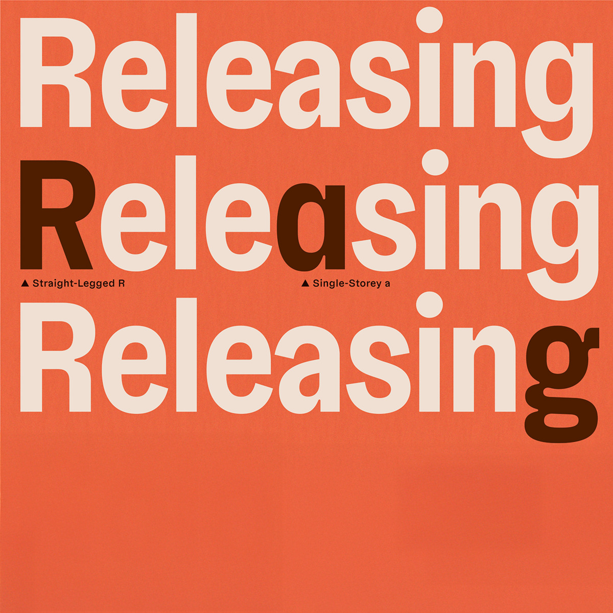
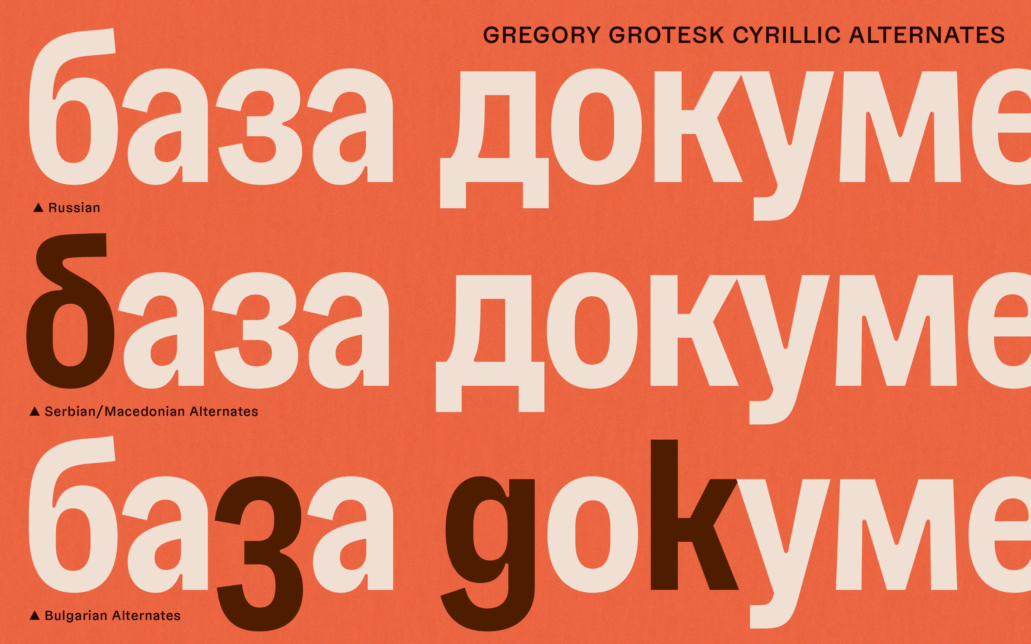
Designed by Jakob Runge, with Greek and Cyrillics by Antonia Cornelius approved by native designers (Irene Vlachou and Maria Doreuli), Gregory Grotesk is good company in more than 270 languages, including Vietnamese. The typeface is carefully engineered with a range of OpenType Features for ambitious typography, including a set of relaxed oldstyle figures, legibility alternates, and delightful symbols and emoji.