Hi there, that’s Adelina. You’ve probably already read the articles I wrote for type.today, but this one is different. There will be no updates on our work, no tips on how to handle your project’s typography, and no new typefaces of ours. This piece is my little personal Christmas story.
I have a pretty large and mainly Catholic family, and this year it’s my younger brother who happened to be put in charge of sending homemade Christmas cards to all our relatives living in different countries. On December 6th, he sent me a MyFonts link and asked, “Is this font okay?” My brother is a 19-year-old Business Economics student, so he simply googled “Christmas Fonts” and was quite pleased with himself for being so smart. Instead of giving him a lecture on how to choose fonts (I don’t think it would be a good one anyway), I decided to find out who determines what typefaces on MyFonts and Adobe Fonts are Christmas, Halloween, or Wedding and which are not. As it turned out, it’s not stated anywhere. But in 2019, Adobe Research and MyFonts published a paper in which they proposed a tagging model based on two AI mechanisms. So it’s safe to assume that their tagging process is probably (at least partly) managed through this algorithm.
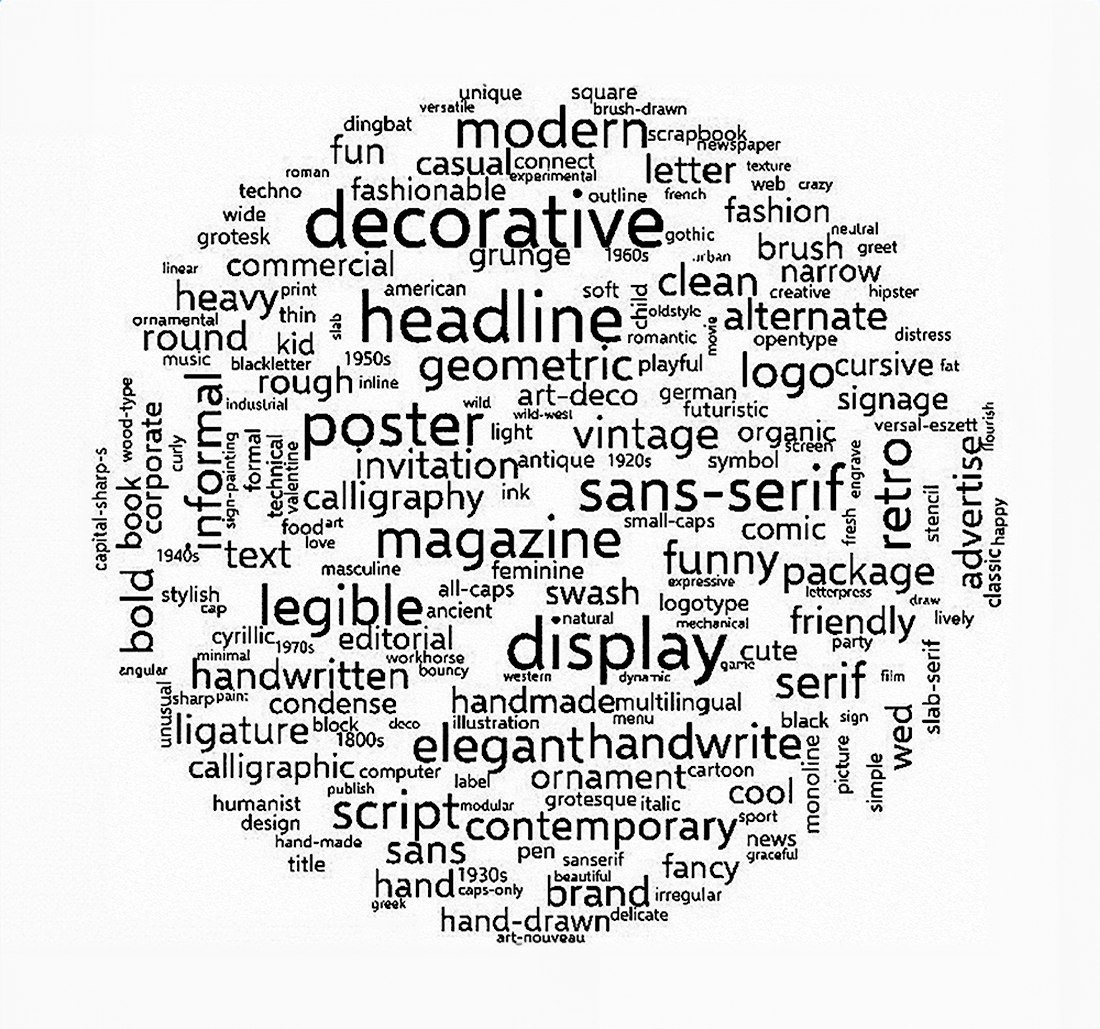
The team of researchers needed a dataset to train their learning algorithm and had to create

300 most popular tags on MyFonts
Describing their work, Adobe Research and MyFonts say that their algorithm was specifically created to make the font selection process easier for non-designers (like my brother). We can argue forever on why non-designers need to design things as quickly as possible all while giving to it as little thought as possible at all, or why the words masculine and feminine made it to the 2019 top list of tags, but this is a Christmas story so we won’t do that. Let’s rather talk about who decided that tags somehow make it easier to deal with text typefaces.
These were psychologists, Poffenberger of Columbia University and Franken of New York University, and they did that a hundred years ago, in 1924. Just like the researchers from Adobe and My Fonts, they brought together a group of respondents and asked them to rank the appropriateness of 29 fonts for each of five abstract qualities (cheapness, dignity, economy, luxury, strength) and five commodities (cars, building materials, coffee, jewelry, perfume). By the way, Poffenberger and Franken assessed the answers of male and female respondents separately, but it turned out that there were no substantial discrepancies. The scientists believed this proved that their tagging system works (and we agreed not to judge people for that a couple of paragraphs ago!)


Typefaces shown to respondents by Poffenberger and Franken
According to the respondents, the only script font in the list was not at all dignified and was not a good fit for selling perfume, a light fraktur looked cheap and a swashed Caslon Old Style No 471 appeared as a strong typeface.

Swashes in Caslon Old Style No. 471, 1912. Image: Luc Devroye
I decided to benefit from the Poffenberger and Franken system to help my brother choose a Christmas font, so I asked him to choose a feeling and a product he associates with Christmas. As my brother picked dignity and jewelry, his Christmas font, according to the Poffenberger and Franken tagging system, happened to be Globe Gothic Bold. I couldn’t find any jewelry-related content typeset in Globe Gothic on Flickr and decided to compare a century-old tagging system with a system introduced 90 years ago.

Globe Gothic, 1912. Image: University of California Libraries
In 1934 in the US state of Indiana, psychologists Ronald Clark Davis and Hansel Smith conducted a study quite similar to the one by Poffenberger and Franken. They asked 90 students to match 13 typefaces first with products in the advertisement of which they could be used, then with the emotional responses the typefaces in question triggered in them (there were 24 items in each list).

Typefaces shown to respondents by Davis and Smith
After much calculation, the researchers concluded that, for instance, italic, non-bold, and expanded typefaces are suitable for advertising mirrors, perfume, and formal dresses. The only difference between a typeface that is considered dangerous and a typeface that is deemed safe is that the dangerous one is wider.
 Characteristics of fonts correlated with impressions of them
 Characteristics of fonts correlated with the products they are suited to advertise
Century Oldstyle turned out to be a Christmas font according to the system proposed by Davis and

Eggnog advertisement, 1969. Image: Bart Solenthaler, Flickr

Century Oldstyle, 1883. Image: Smithsonian Libraries
Does it make the typeface a Christmas one? Of course not. Does anything or anyone, other than the designer’s decisions, make it a Christmas one? I don’t think so either.
It just feels really funny that everything seems to have changed over a hundred
P.S. If you’re still worried about our family postcard layouts, don’t be. My brother ended up ordering reprints of Paul Rand


Paul Rand’s New Year cards from the Letterform Archive collection
