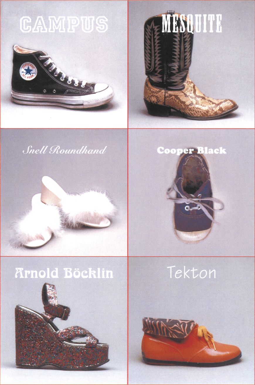
In Erik Spiekermann’s book Stop Stealing Sheep, there’s a typography exercise where you match six typefaces with six pairs of shoes. According to Spiekermann, the typeface Campus suits Converse sneakers, Mesquite goes with cowboy boots, Snell Roundhand with fur-trimmed shoes, Cooper Black with children’s sneakers, Arnold Böcklin with platform sandals, and Tekton with rubber boots.
 From «Stop Stealing Sheep & Find Out How Type Works» by Erik Spiekermann
We wondered how people outside the world
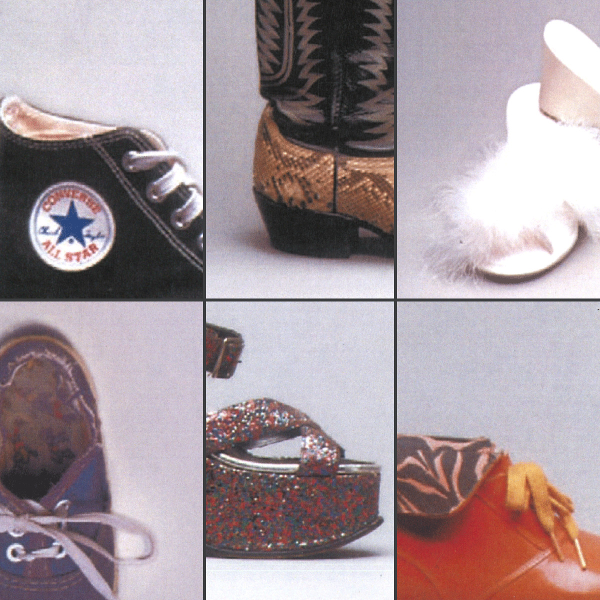
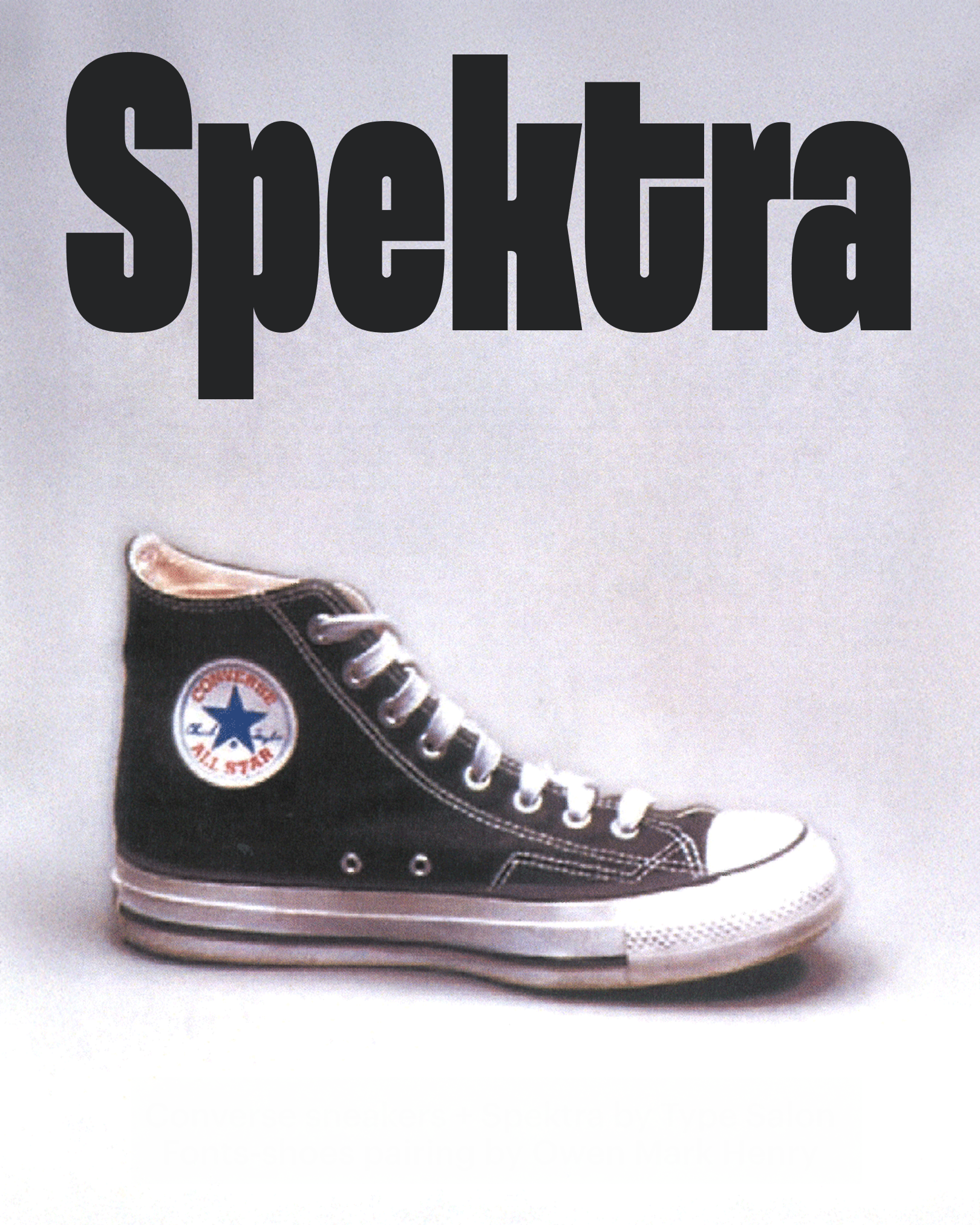
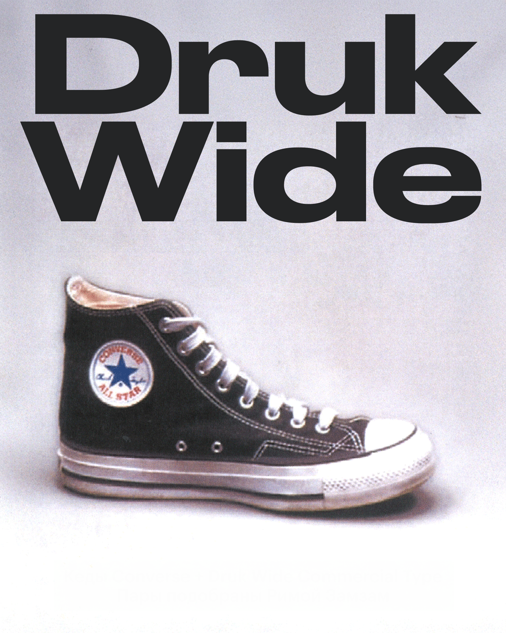
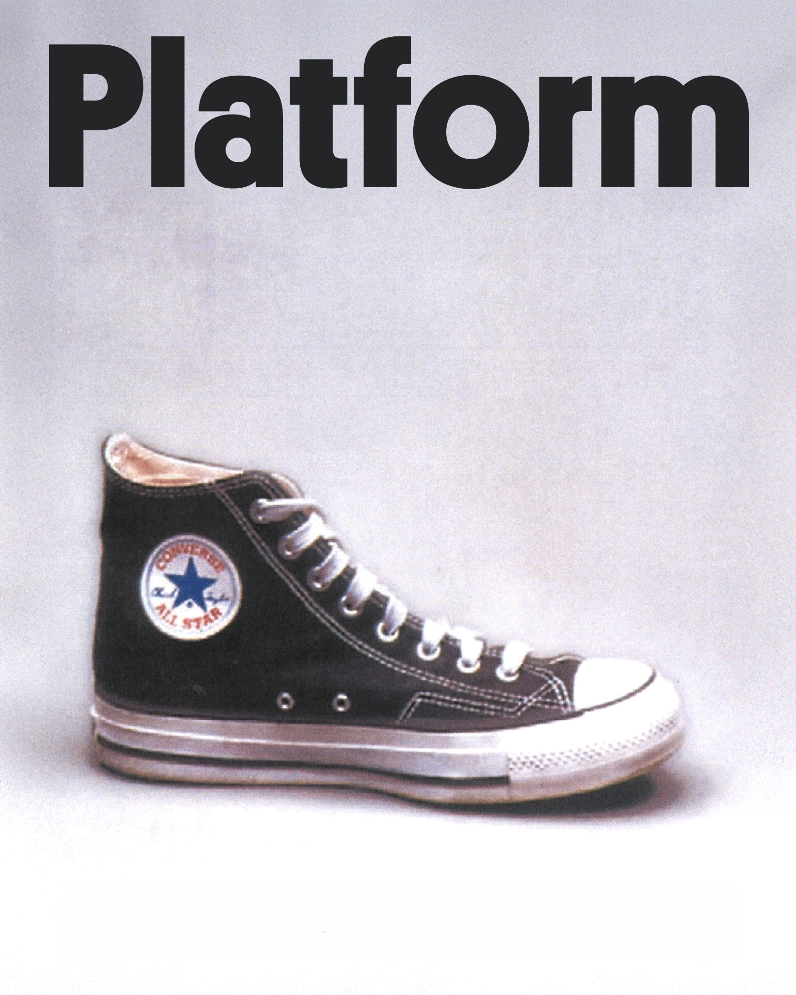
Converse sneakers
- Owen Mark Henry @owenmarkhenry
- Stylist, H&M

It feels as if you’re thrown back a decade or two. A typeface that looks washed out should be cracked, like it’s been through countless spins in the dryer on an old band tee.
The Converse sneakers sticking stubbornly to the soaked floor of a dimly lit venue. The air is thick with heat, sweat, and the low hum of amps warming up. A hot summer’s night carved into memory, where every riff and chorus felt like it could last forever.
- Rima Zamzam @rima.zamzam
- Creative director and consultant, Vintage Marketplace

A typeface and sneakers with the energy of street protests.
- Ruslan Nasir ruslanasir.com
- Independent menswear designer

Converse All Stars have an over-a-century history, and it is the kind of a shoe I truly hate. When I was interning for a fashion brand in New York and designing a denim patch for them, I went through stacks of American product and retail magazines of the 1920’s, collecting vintage labels, designs, and fonts.
The shoe is still popular today, so Platform seems like a good match, as it both reminisces old lines of lettering you could see a century ago, as well as today. Simple, readable, yet shaped refined features.
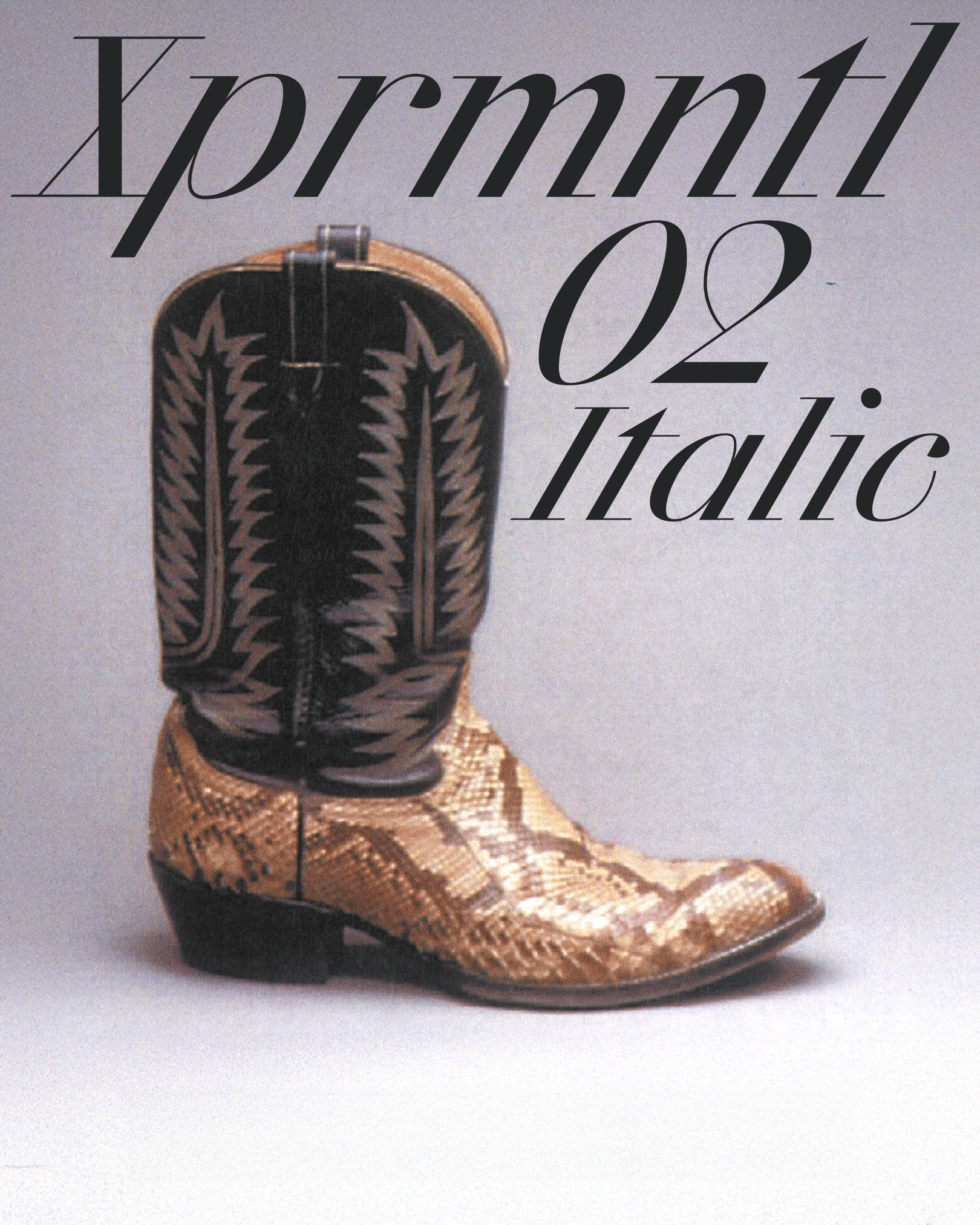
Сowboy boots
- Owen Mark Henry @owenmarkhenry
- Stylist, H&M
He’s bold and has a hard shell, where tradition and sharpness collide, but don’t

- Rima Zamzam @rima.zamzam
- Creative director and consultant, Vintage Marketplace
You should be able to hear the heels of this typeface click. Feel rhe sharp edges. This pairing
- Ruslan Nasir ruslanasir.com
- Independent menswear designer
Epos incorporates this juicy, leathery feeling as well as the beveled little heel and a pointy, prolonged toe of a cowboy shoe.
The pictured boot is too much: fluorescent beige python and sharp flowery ensemble. Yet, combined and transformed into a font with its beaks and foots, sharp brackets and steep arcs, that is gonna look exactly like this option. All caps.

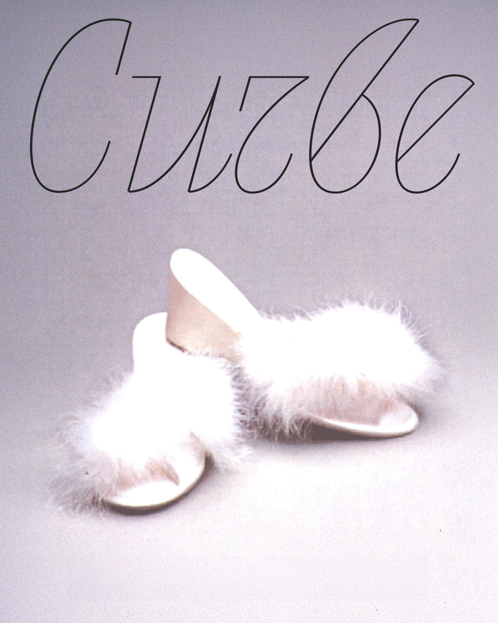
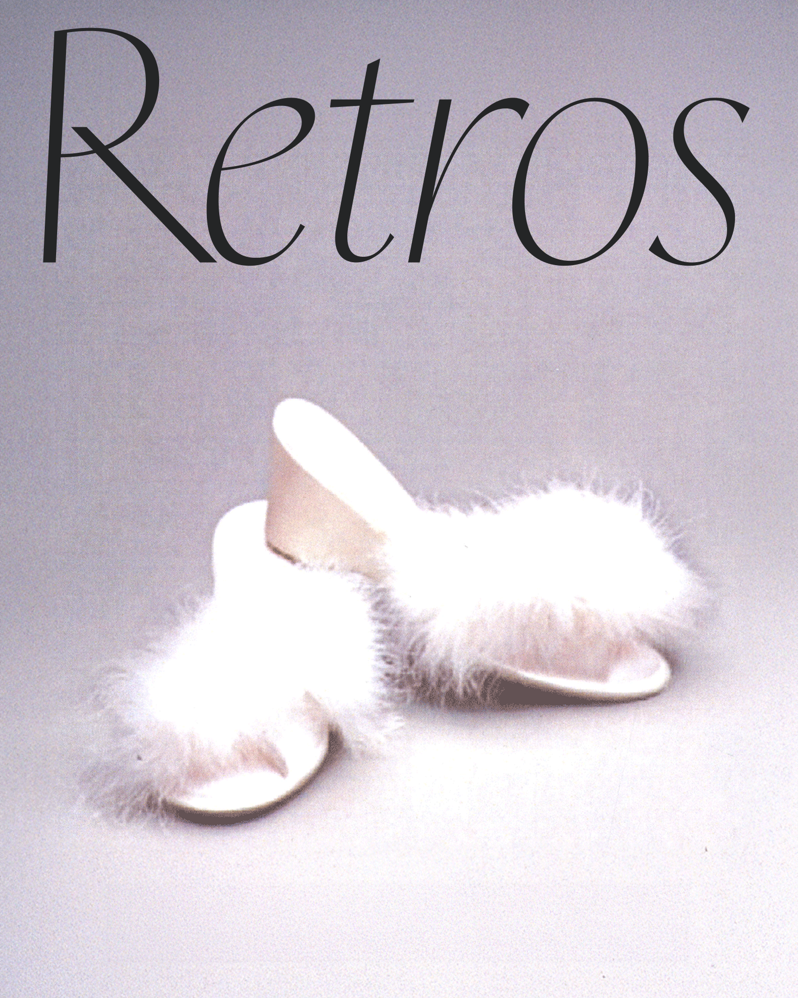
Fur-trimmed shoes
- Owen Mark Henry @owenmarkhenry
- Stylist, H&M
The white fluffy kitten tells the story of arriving at an Art Deco hotel but not to check in, just to lounge in the lobby. Only to turn heads while you can already taste the saltiness of the olive floating in the martini on your tongue.
- Rima Zamzam @rima.zamzam
- Creative director and consultant, Vintage Marketplace
A swashed italic is begging to be used, but we’re resisting

- Ruslan Nasir ruslanasir.com
- Independent menswear designer
I am not sure the word ‘retro’ is mentioned when we speak about the 90s, but I would call these slutty yet angelic boudoir heeled slippers exactly like the name of the font, in plural.
White color, a kitten platform heel, and plush feathers: the font is all that, with its slightly cursive, thin-shaped lines and yet dynamic bowls and counters.
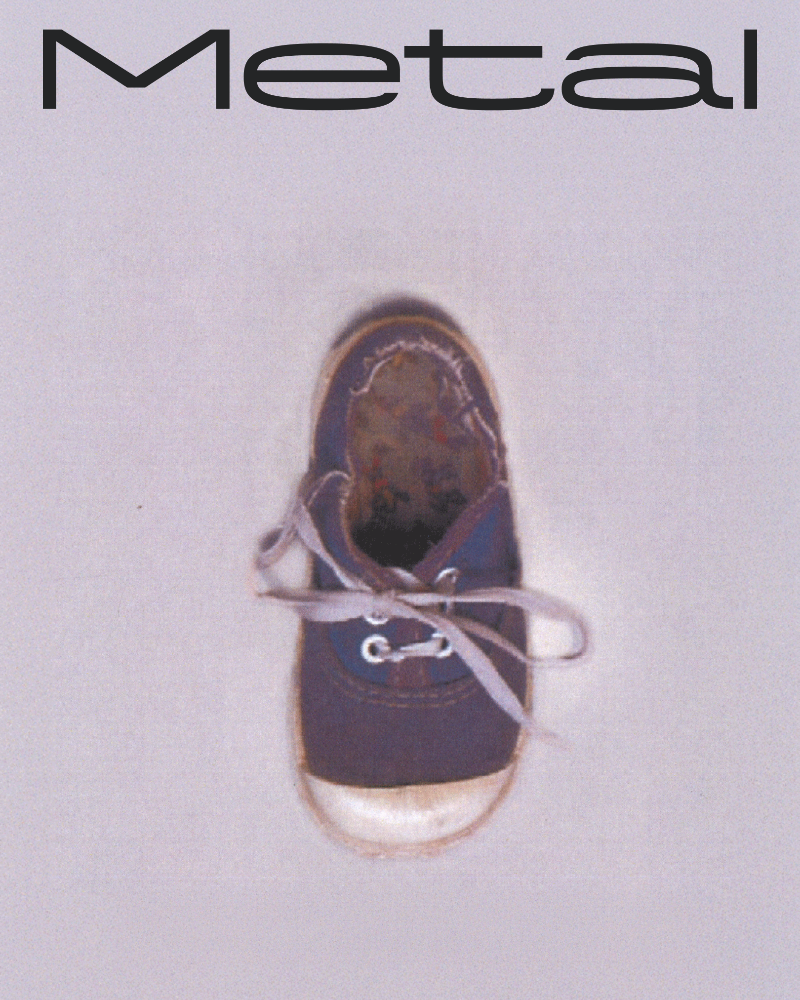
Children’s sneakers
- Owen Mark Henry @owenmarkhenry
- Stylist, H&M
Ah, the importance of innocence and safety! A place to relive memories and be raised by family and loved ones. Small, handheld, and blushing with red chubby cheeks. Everything is hushed and genuinely guided with a warm, oozing heart.
- Rima Zamzam @rima.zamzam
- Creative director and consultant, Vintage Marketplace
Like something from an old book with yellowed pages…
- Ruslan Nasir ruslanasir.com
- Independent menswear designer
This shoe looks weird as hell. I never understood this choice of camouflage being put into a toddler’s dress code. Yet, I’m obsessed with this kind of rounded toe. There are also punk unfinished endings and a disproportionately long lace.
So to put a cherry on top of this chaotic yet harmonic design, my choice of a font is Metal: readable for kids, yet potentially used by some kind of rebellious, forgotten genius of a shoe designer.
Minimal, extended, no serifs, no extra stuff. Sometimes I wish I could stay a child forever.
Platform sandals
- Owen Mark Henry @owenmarkhenry
- Stylist, H&M
Ignorantly loud and stifling the room, curiosity has unquestionably killed this cat many times over. Metal has a little more to offer than most if you’re feeling frisky but risky. Just a heads up before committing or taking these platforms for a spin her ankles are probably swollen from the disco.

- Rima Zamzam @rima.zamzam
- Creative director and consultant, Vintage Marketplace
These shoes feel so loud that they don’t need a typeface at all. But let
- Ruslan Nasir ruslanasir.com
- Independent menswear designe
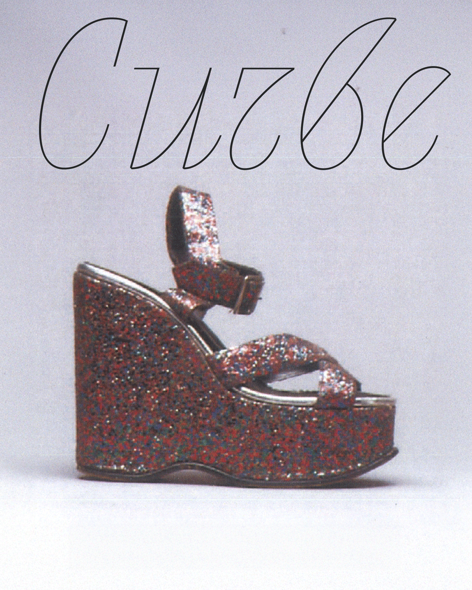
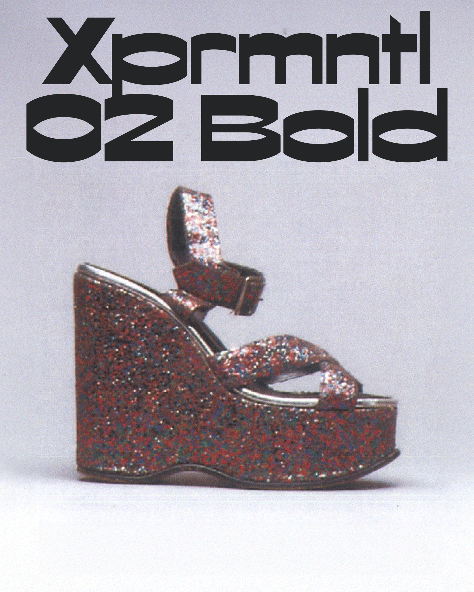
This f***ing shoe. My favourite Spice Girls song is ‘Holler’, if you care. Even though that one was released in the year of my birth, 2000.
This glitter platform shoe is yet again a relic from the 90s. I can feel the cheap glitter scraping a finger and falling onto the floor, leaving a sparkly trail as my older sister leaves to a party.
CSTM Xprmntl 02 Bold is my personification of this. Bold, experimental: it’s all in the naming. I love the contrast dynamic of arms and stems, a bit of expanded shape, both sharp and bubbly geometry. This and images of roses or fairy’s wings on the soil? Absolutely.
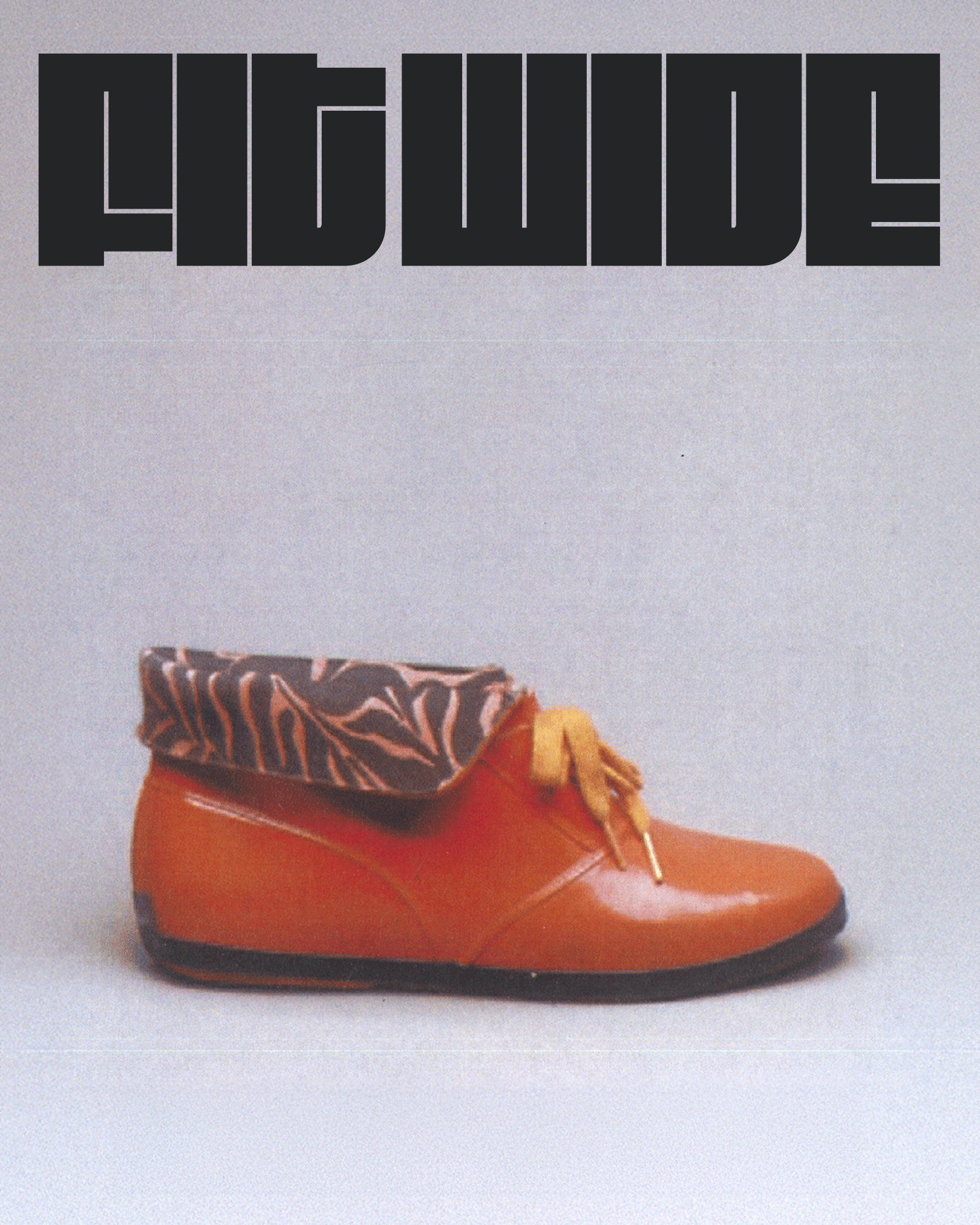
Rubber boots
- Owen Mark Henry @owenmarkhenry
- Stylist, H&M
Merging the wonky rhythm of the typeface and the powerful orange results in geometric clarity. Its glitch kissed textures and unexpected character turns the shoe into a redefined design. The orange colour expelling enthusiasm goes hand in hand with this bureaucratic drama.
- Rima Zamzam @rima.zamzam
- Creative director and consultant, Vintage Marketplace
Lovely patent rubber boots for stomping through
- Ruslan Nasir ruslanasir.com
- Independent menswear designer
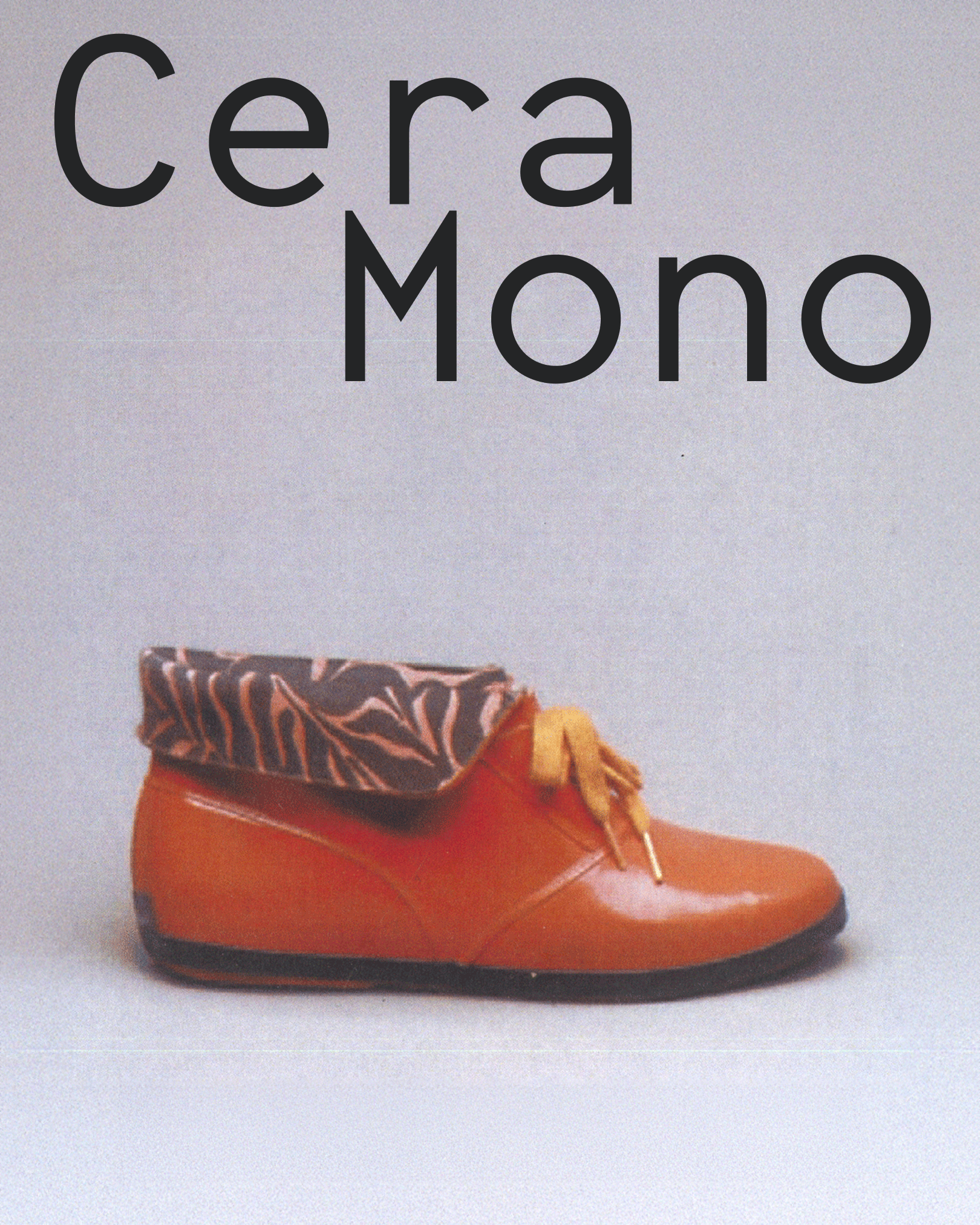
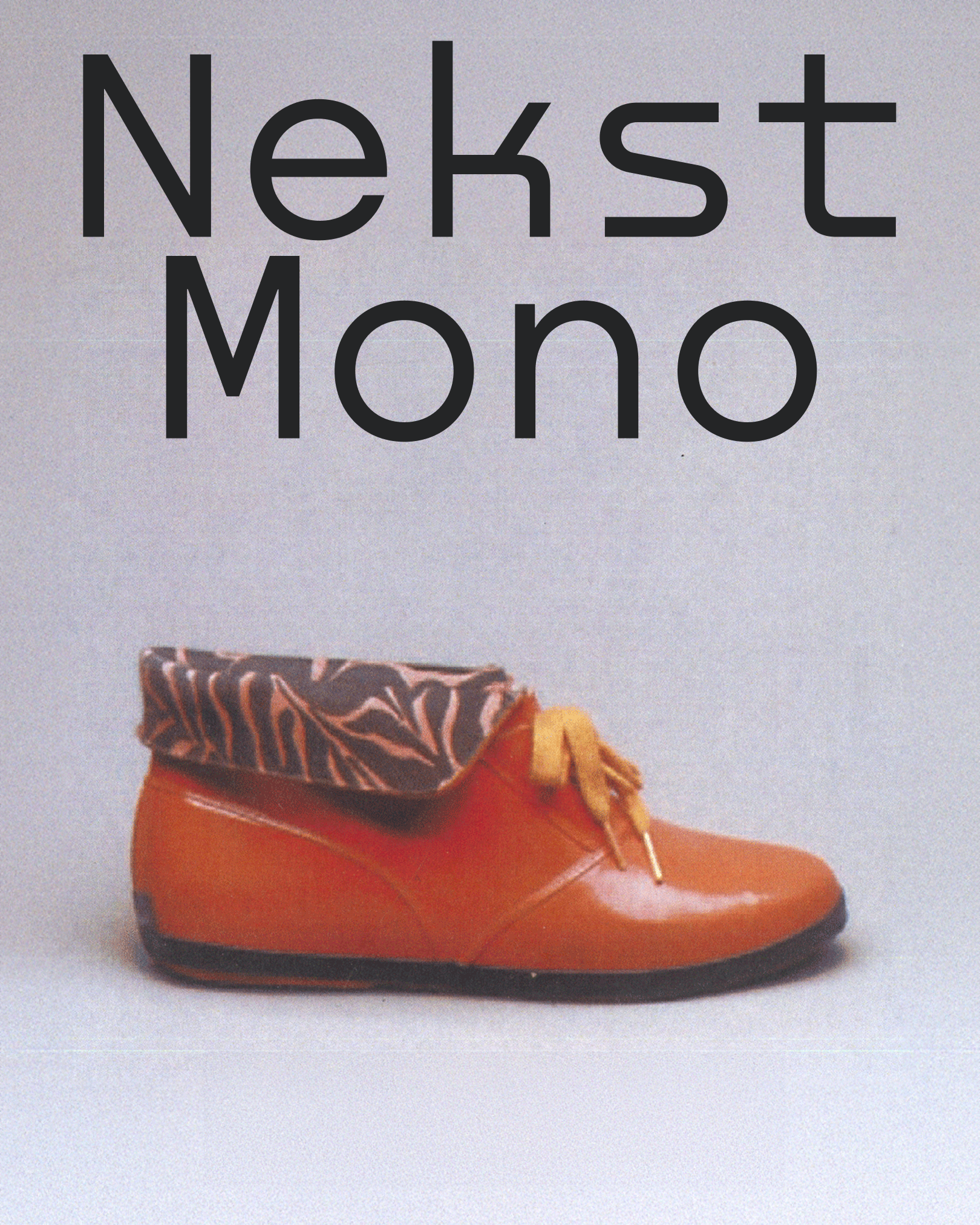
Your granny would kill for these contraband standouts. Orange-coloured rubber, mustard lace, some kind of tropical lining sticking out: now this is real retro.
The font’s name, ironically, could be a perfect branding of this shoe, and I clearly see it embossed on the soil. Fit Wide gives this fat (literally) vintage flair: tiny counters and huge weight of the letters exemplify these rubbers.