Em Dash ≠ ChatGPT
99percentinvisible.org/episode/658-the-em-dash
Last summer, one Reddit user concluded that journalist Bryan Vance uses AI to write texts for him, as they contain too many extra-long em dashes. Bryan wrote his texts himself and was very offended. This is the story told at the beginning of a new episode of the 99% Invisible podcast, which reveals the history of the em dash from the moment it first appeared in an 11th-century manuscript until November 2025, when OpenAI CEO Sam Altman promised that ChatGPT would minimise the use of this symbol in its answers.
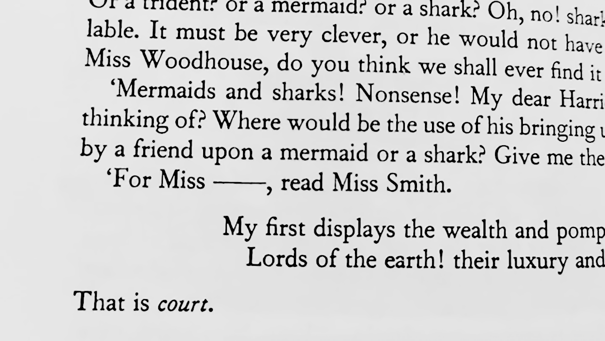
A very long dash in Jane Austen’s novel Emma
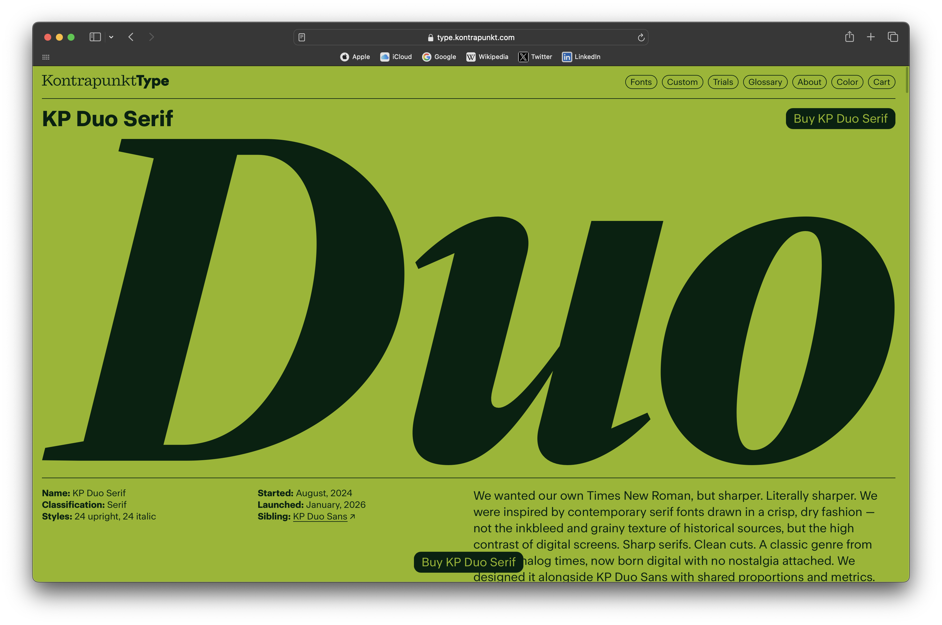
Shop by Kontrapunkt
Kontrapunkt, the foundry that designed custom fonts for Mitsubishi и Asics, launched their own type store offering retail fonts. As of now, the collection boasts three families: two versatile text faces, Duo Sans and Duo Serif, and a warm geometric sans, Spatial.
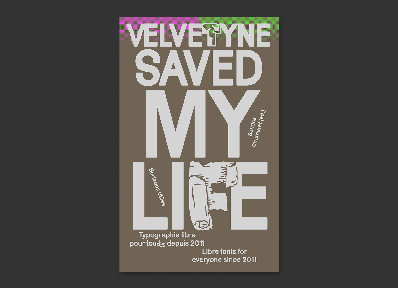
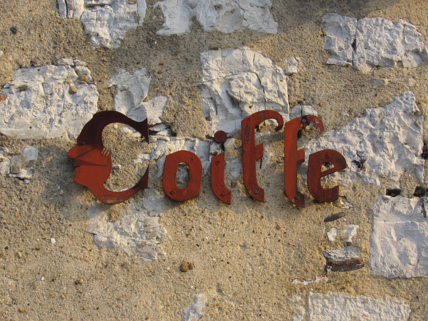
Velvetyne saved my life
surfaces-utiles.org/velvetyne-saved-my-life.html
The first book by Velvetyne — a collective that has been promoting the open-source font culture for
History of Bulgarian Cyrillic
delyo.be/blog/rants/2026-01-31-cyrillique-histoire
Designer Delyo Dobrev explores the digital archive of the Saints Cyril and Methodius National Library in Sofia and tells the story of Cyrillic from the perspective of a contemporary Bulgarian designer. He explores why Bulgaria never had metal serif yuses and how 19th-century ideas of unifying the Romanian languages influenced Bulgarian Cyrillic. Delyo also speaks about the opponents of the removal of the letters Ѫ and Ѣ from the alphabet and modern Bulgarian neo-nazis who add the letter Ъ to the end of their surnames, as well as reminds us that Cyrillic does not equal Russian.
The piece is written in French, though it is easily translated and ends with a list of English-language literature on the history of Cyrillic.
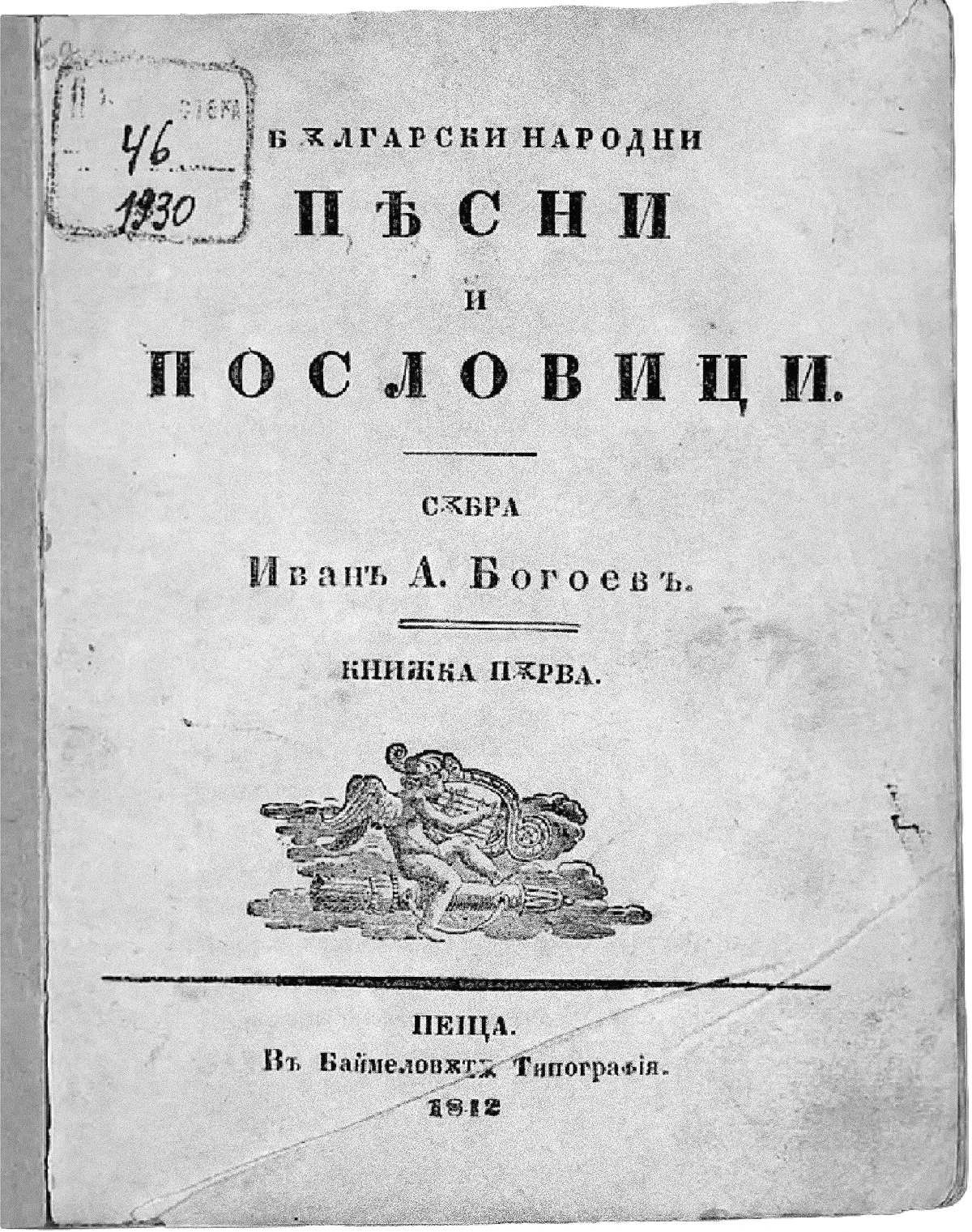 Bulgarian Folk Songs and Proverbs: Book One, 1842
Script Keepers Network
endangeredalphabets.com/launching-the-script-keepers-network/
The project Endangered Alphabets, which aims to help preserve endangered scripts, launched Script Keepers Network, an online community seeking to bring together those who use newly developed or minority scripts and need typographic support and designers willing to provide this kind of support. The first meeting of Script Keepers Network took place on March 1st.
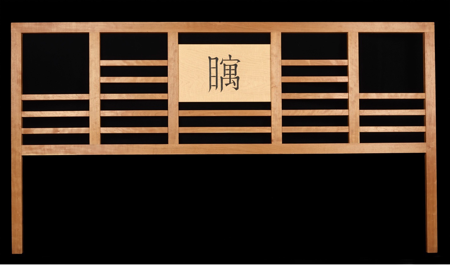
Bed headboard in the Chu-nom script of Vietnam, carved in terms of Endangered Alphabets project
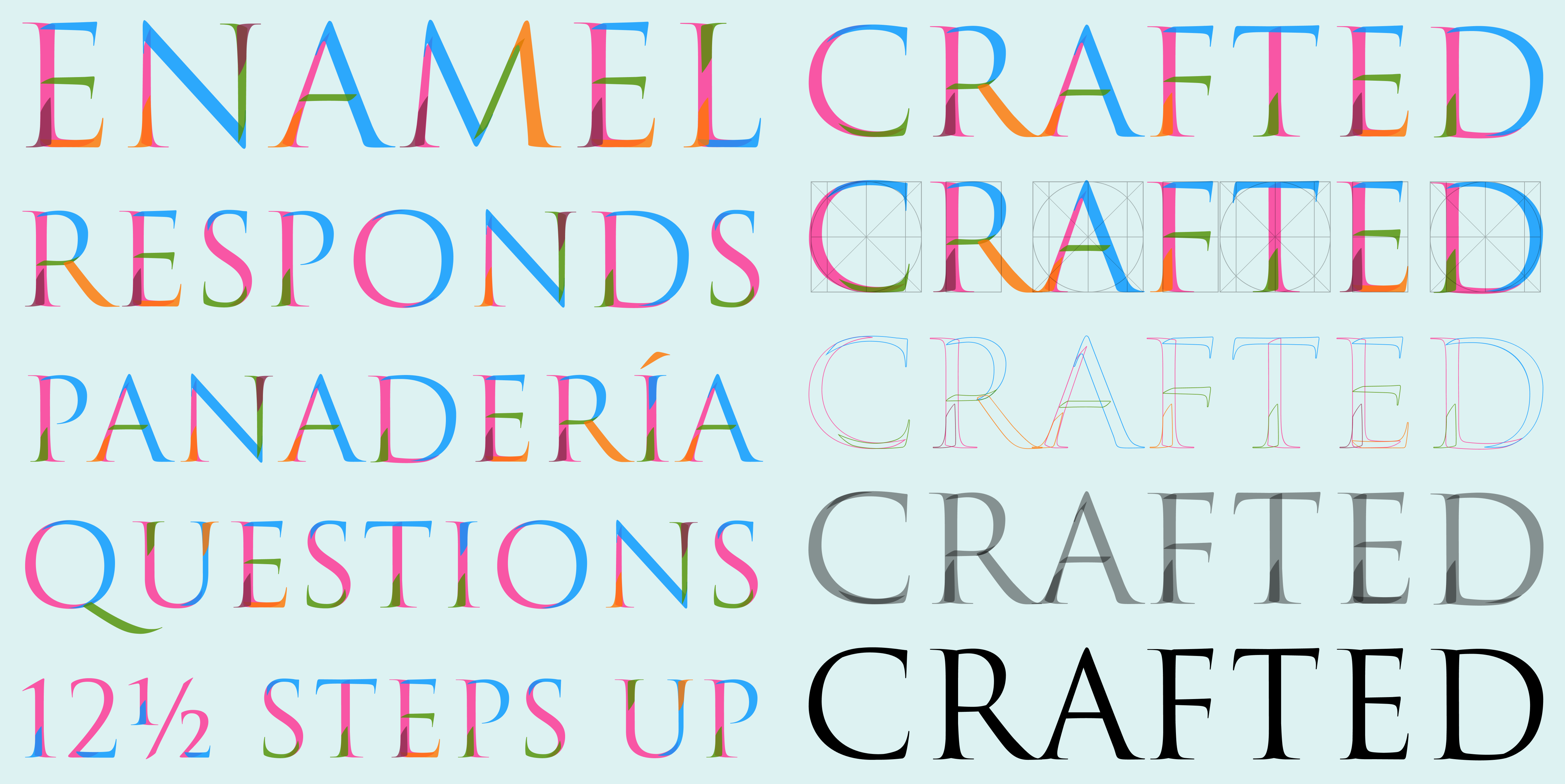
How-to: Roman capitals
dualtype.design/fonts/catich-color
For years, type designer and calligrapher Gen Ramírez has been telling Type@Cooper students how Edward M. Catich revealed that the letterforms on Trajan’s Column inscription were defined by the nature of a brush rather than a chisel. Gen has now turned his lecture into a typeface. Catich Colour’s glyphs are made up of multicoloured strokes that help us understand the specific brush movements that shaped Roman Capitals.
To accompany the font’s release, Gen has also released a game in which you need to arrange the strokes within the letter in the correct order.
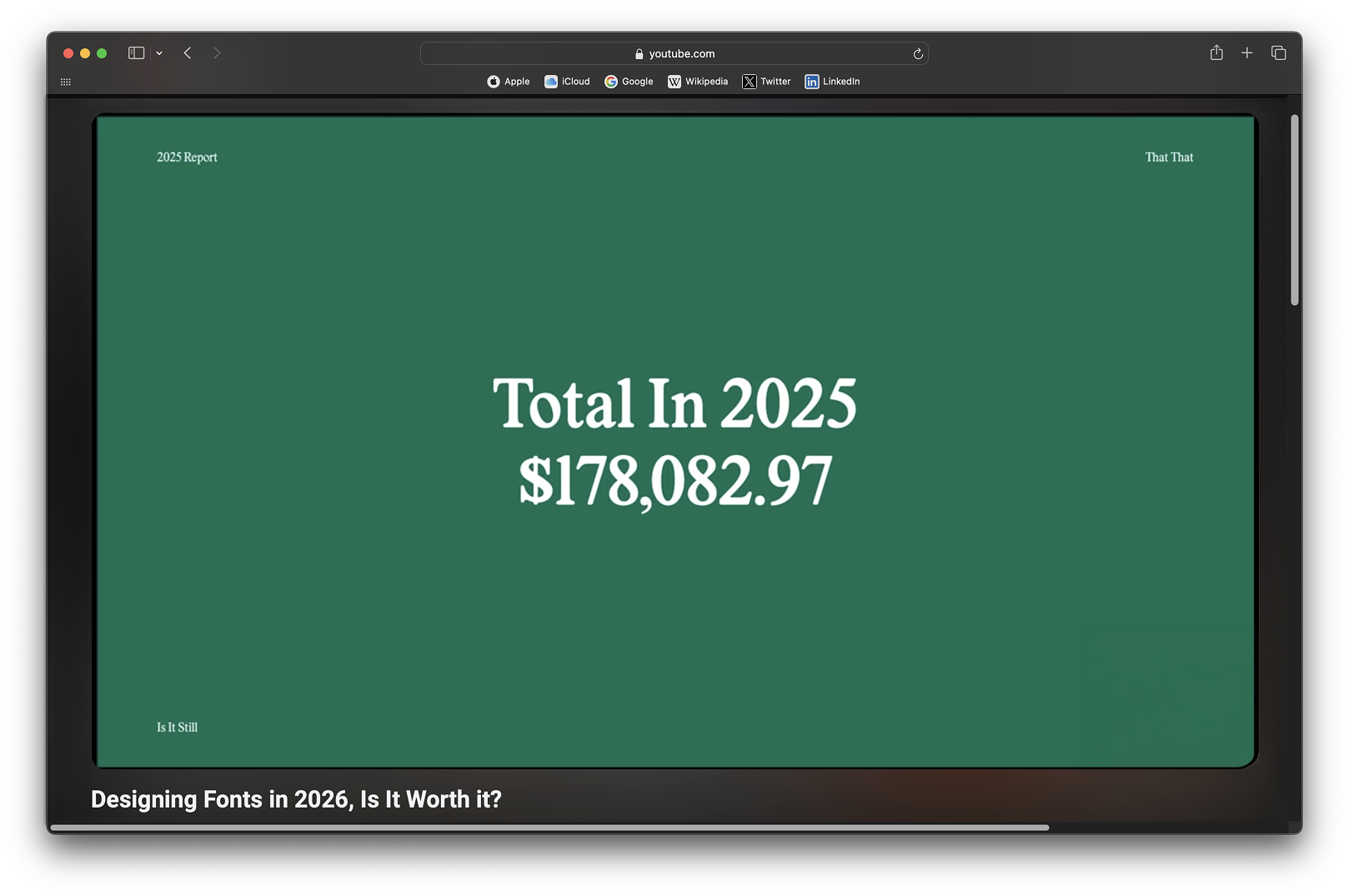
How much money does a type designer make?
youtube.com/watch?v=MsPlT9KQEKU
Utah-based type designer Harbor Bickmore compares his income in 2023 and 2025, trying to figure out whether starting a career in type design in 2026 is worth it. Long story short: it is indeed worth it, as, following Monotype’s decision to introduce subscriptions for retail fonts, businesses have increasingly started commissioning custom typefaces. Harbor himself made $178 082.97 last year, but still uses a spare room at his wife’s parents’ house as an office.
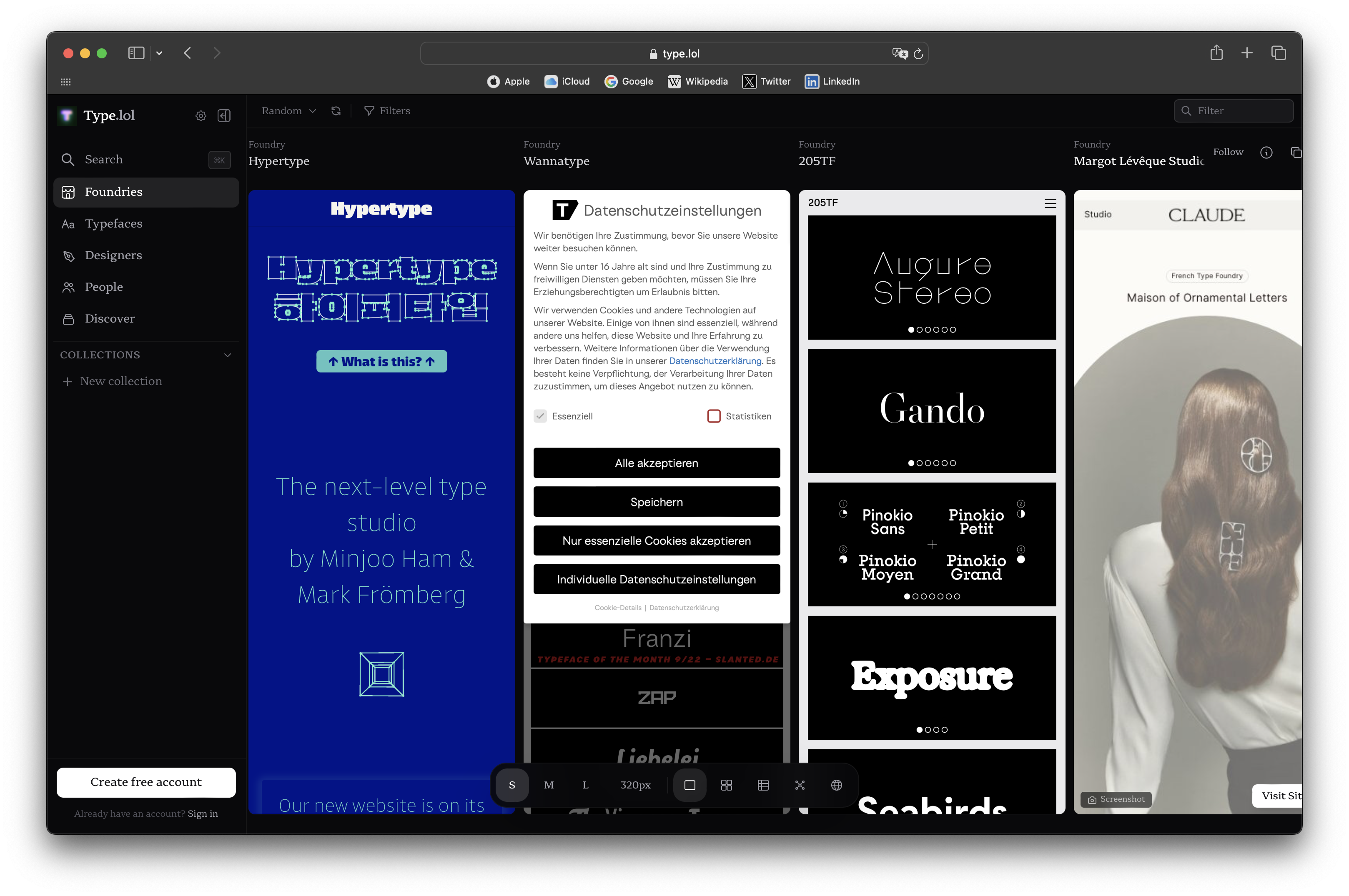
Type, lol
Mark Johnson, a type and graphic designer, published a directory in which he plans to list all existing independent foundries. Since Mark is working on his project alone, he used AI to gather some of the information, so he is now encouraging designers to contact him at yourfriends@type.lol — if they spot any errors in their foundry description.
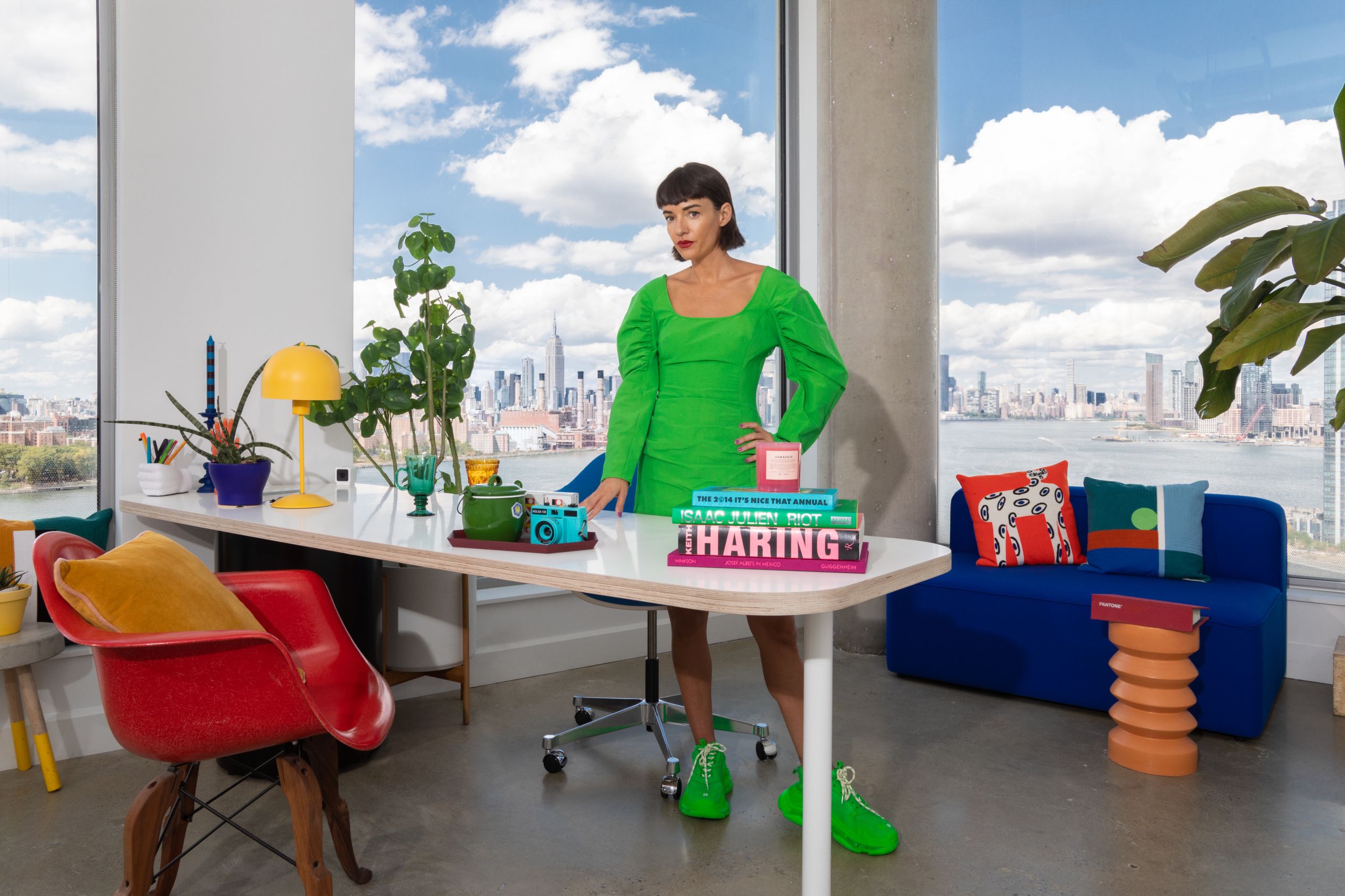
Jessica Walsh on Creative Boom
creativeboom.com/insight/typography-might-be-the-last-thing-ai-cant-fake
Jessica Walsh has become a columnist for Creative Bloom. In her first piece, she states that foundries mostly design two types of fonts: huge, workhorse text families and distinctive custom
Herbier typographique 2.0
Since 2006, Jules Vernacular, Herbier typographique blog has been publishing typographic finds
From the Jules Vernacular blog
Affinity vs Illustrator
type.today/en/journal/affinity-vs-illustrator
In February, our editorial team compared working with typography in Affinity and Illustrator, while today and tomorrow’s designers experimented with using the tool to create our social media posts and shared how it felt for them working with the software.
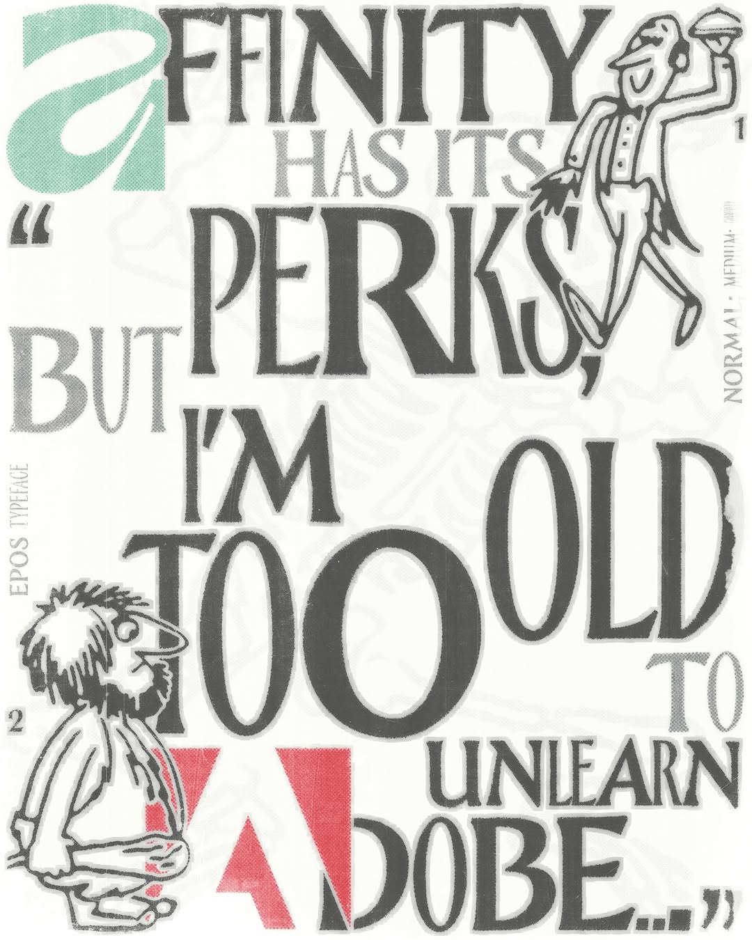
From the review of working in Affinity by designer and Tomorrow curator Nikita Nelikhov
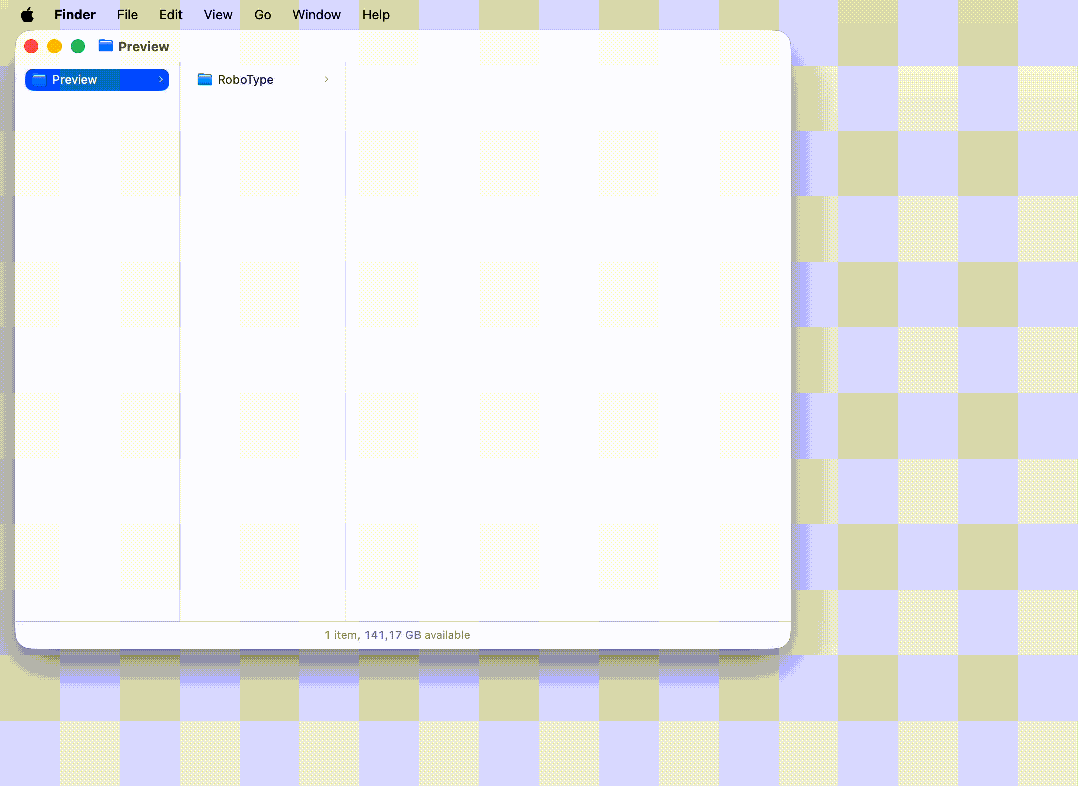
Robofont 4.6
robofont.com/announcements/RoboFont-4.6
A new version of one of the most popular font editors has been released. RoboFont now lets you disable extensions that you don’t plan to use any time soon; each type of point has its own design; and the tool allows you to preview the entire character set in a UFO file window.
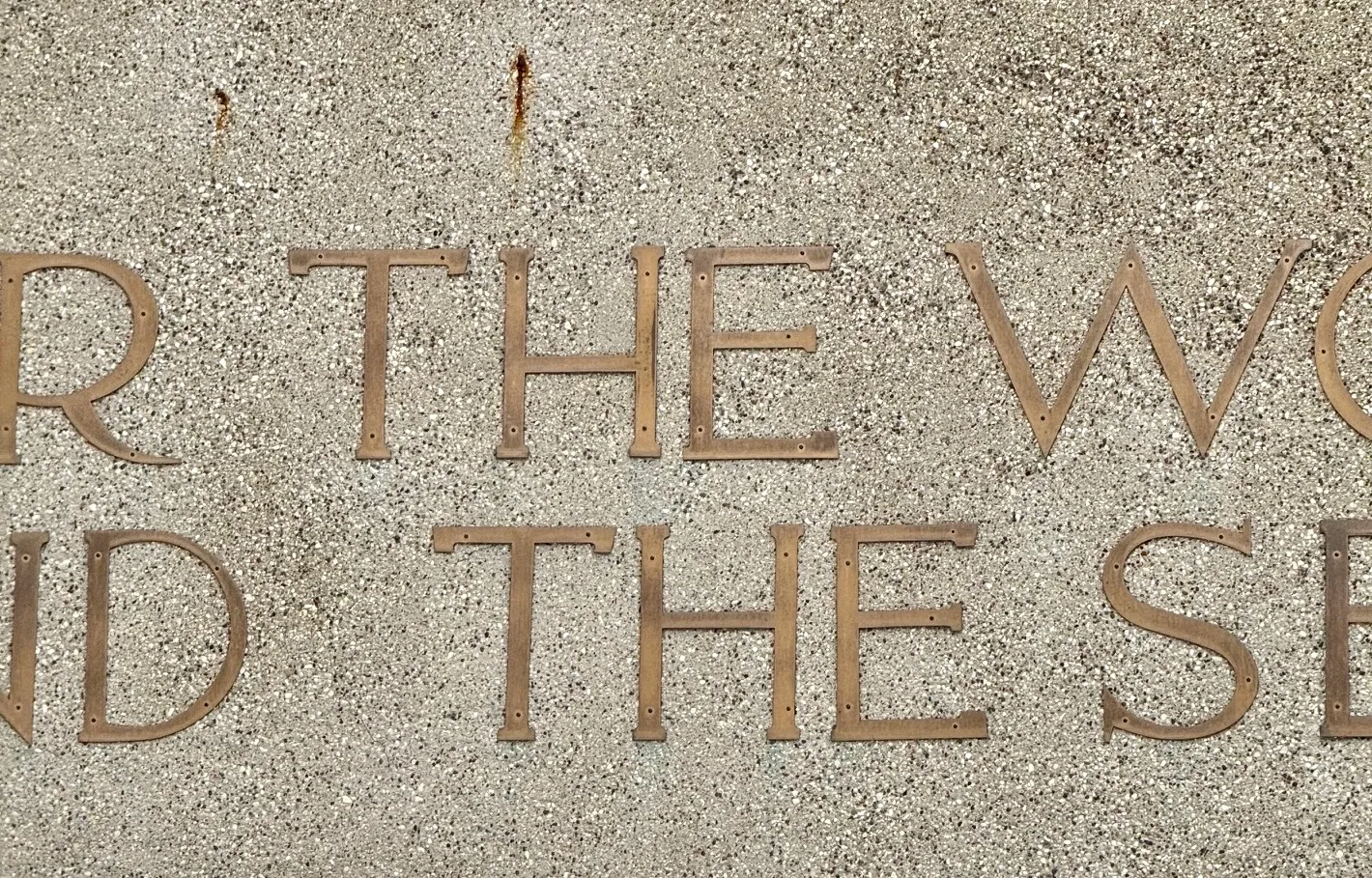
Frank Lloyd Wright and the upside-down letters
inconspicuous.info/p/h-bomb-a-frank-lloyd-wright-typographic
One day, journalist Paul Lukas saw a photo of the façade of a church in one of Chicago’s suburbs. The photograph was taken by Jonathan Hoefler, who noticed that one of the letters H in the phrase For the worship of God above the entrance was upside-down. Paul decided to do some research seeking to find out whether this typographic decision was made by the architect behind the church, Frank Lloyd Wright, and, if not, who and when installed the letter in the wrong way. Spoiler: this turned out to be harder than he thought, but the journalist has been able to discover that back in 1956, all the Hs in the inscription were upside-down, and from 2005 to 2010, the S in Worship was also upside-down.
Why is cuneiform covered by Unicode?
Type Radio released a podcast featuring Johannes Bergerhausen, a professor at the University of Applied Sciences in Mainz and co-founder of the Decodeunicode initiative. He spoke about the function of the generic currency character (¤), as well as why emojis, cuneiform, and hieroglyphs are included in Unicode, and whether it will ever come to a point where we can say that the work on encoding all the characters in the world is complete (it won’t).
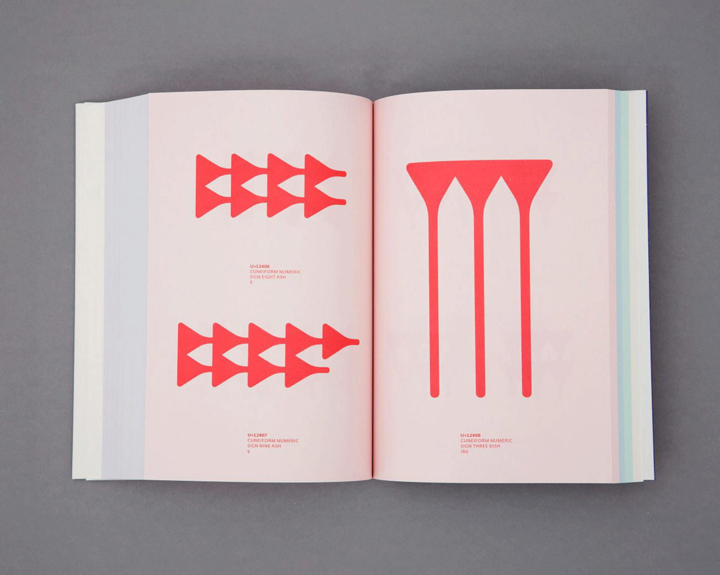
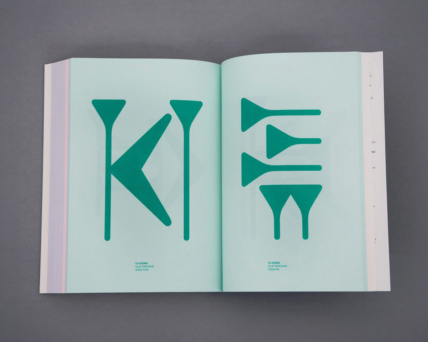
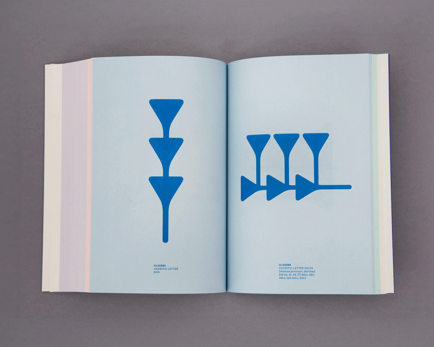
Digital cuneiform book by Johannes Bergerhausen, 2014
Typographic Bulletin 2, preview
The team behind the Typographic Bulletin hosted a discussion on why archives are meaningful for contemporary typographers and what qualities a typography researcher should possess. Professor Thomas Huot-Marchand told how ANRT students work with the archive of Adrian Frutiger; Rustam Gabbasov, co-founder of Type Journal, shared what he learned from engaging with the archive of Solomon Telingater; and book historian Rémi Jimenes addressed how posthumous inventories of printers, typographers, and engravers help him research 16th-century typography. A recording of the meeting is available in French and Russian (with minor cuts).
A written piece based on the talk will be published in the second issue of the bulletin.
From the Frutiger archive, currently being researched at ANRT
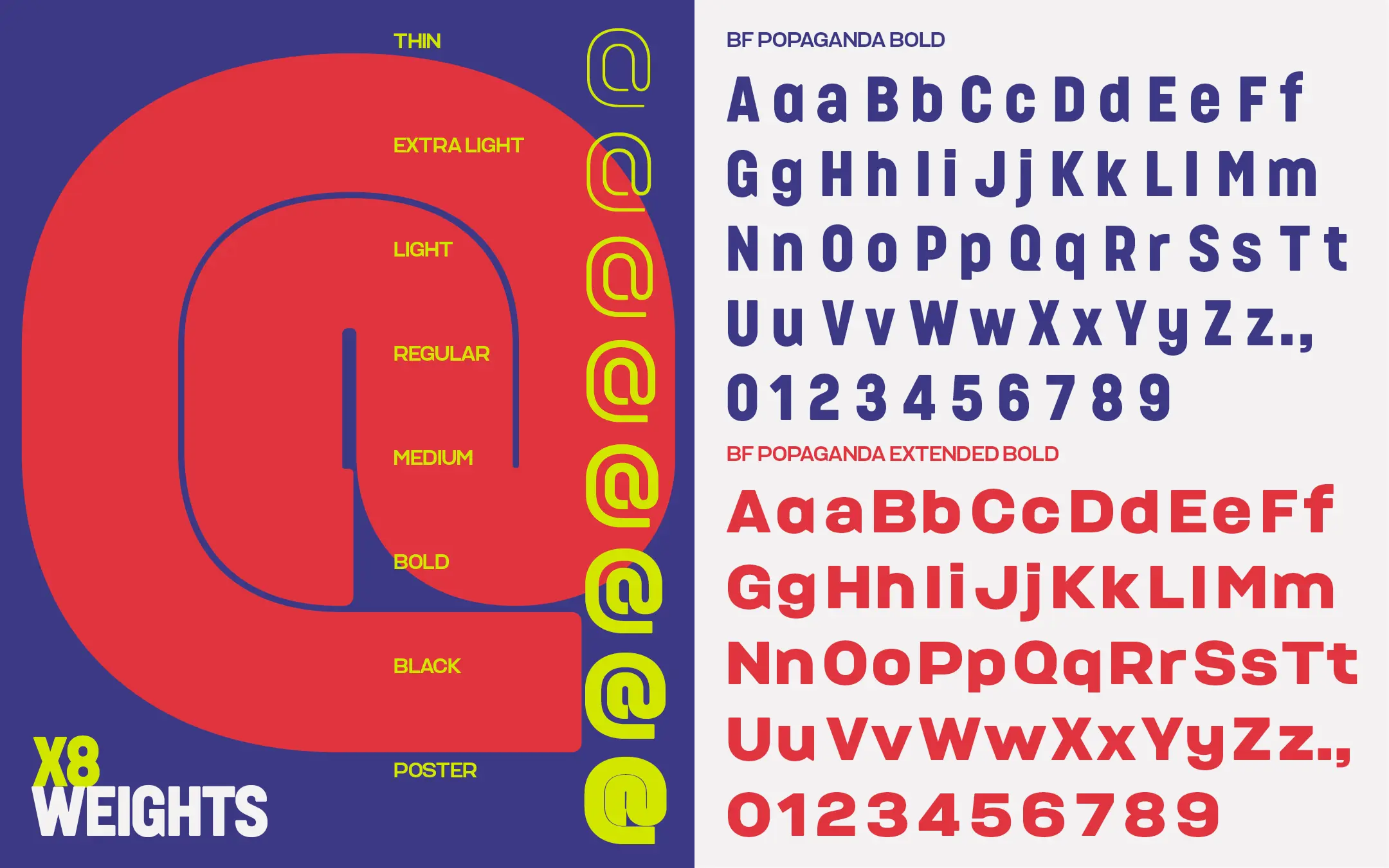
Propaganda by Neville Brody
typenetwork.com/articles/popaganda-interview-giveaway
Neville Brody has released a new typeface, Propaganda, and spoke with the Type Network Type Network sells typefaces by our partners, including CSTM Fonts and Schrift Foundry. magazine about how it felt working on this project and, more broadly, about today’s typography. Nevill believes that the process of selecting a font should be more like curatorial practice than sorting through options, and that powerful display typography is almost always about resistance.