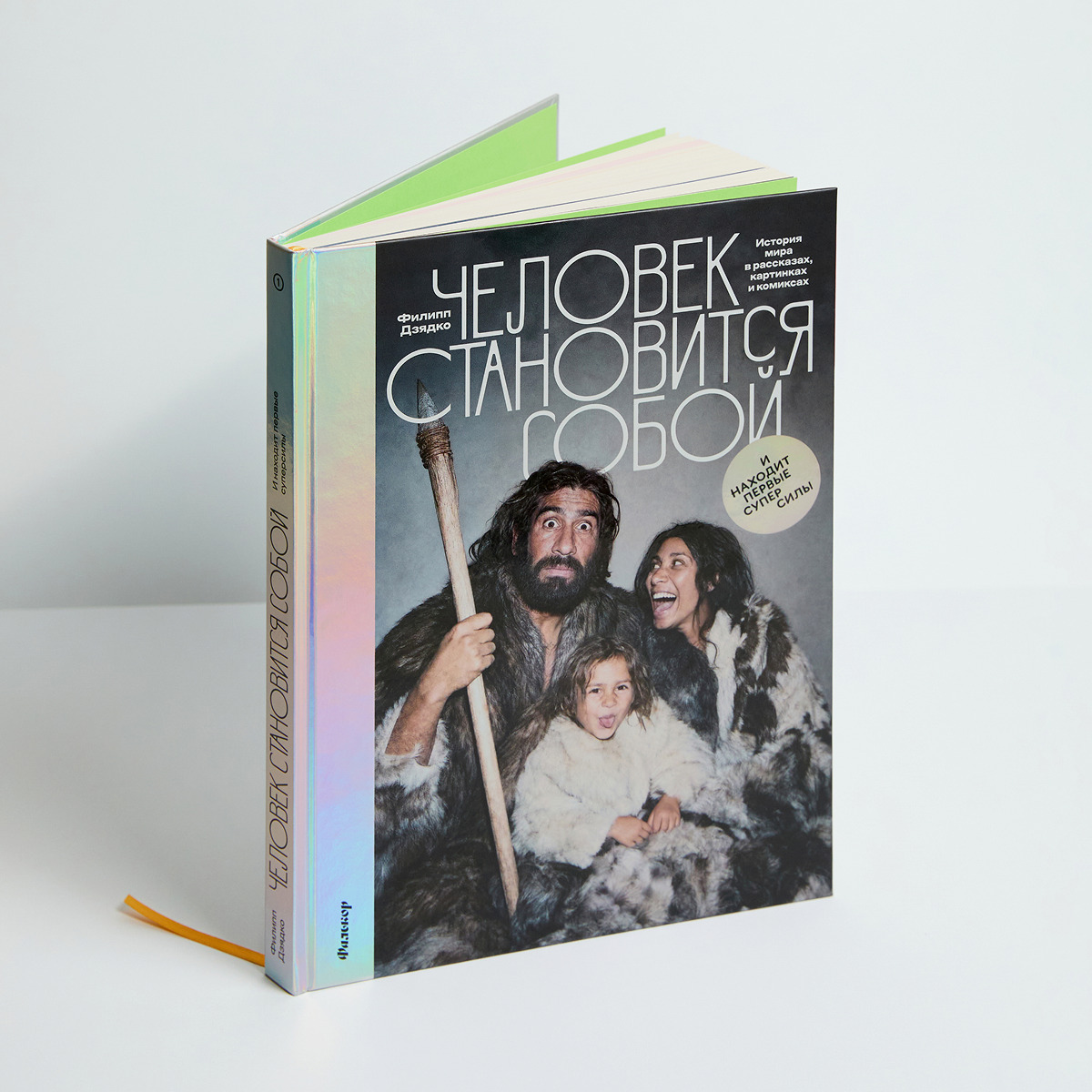
- Filipp Dzyadko
- author of the book

It was crucial for me that the book be both engaging and easy to read and interesting to look at. In most cases, it’s either one thing or the other. But we needed
Before getting started, I drew up a list of 19 things I wanted to achieve. Some of the items in the list contradicted each other. On the one hand, the book needed to be a space
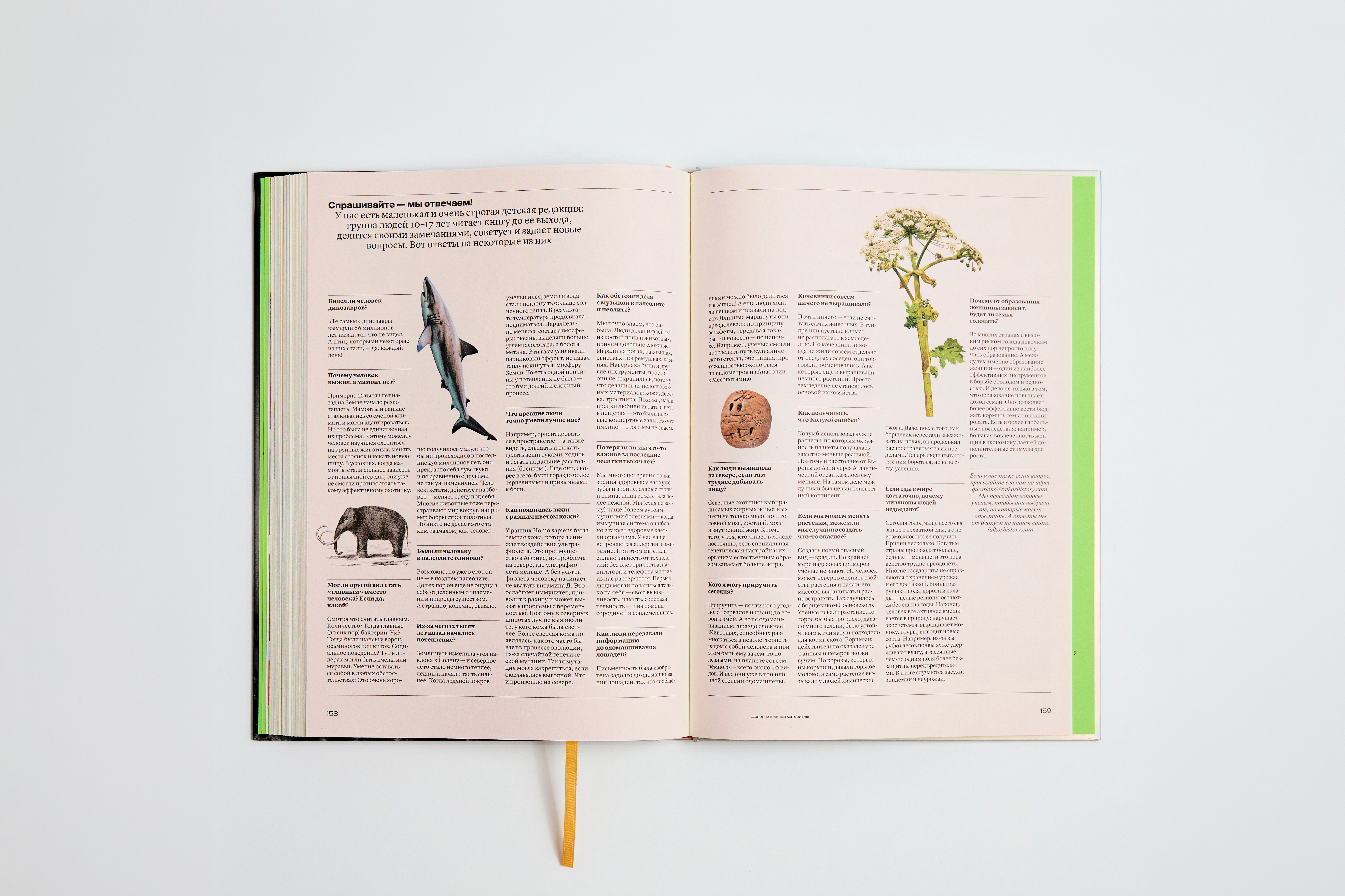
A regular textbook is the last thing you would think of when looking at our project. We intended to create a book that could be useful for schools, but at the same time wanted to avoid this ‘public service institution’ tone of voice. We have neither numbered sections nor framed rules. However, it was really important to ensure a clear hierarchy on the page. In terms of structure, we are closer to a magazine than a book.
The key word for the entire
And there’s something else: the whole thing had to be read as one long
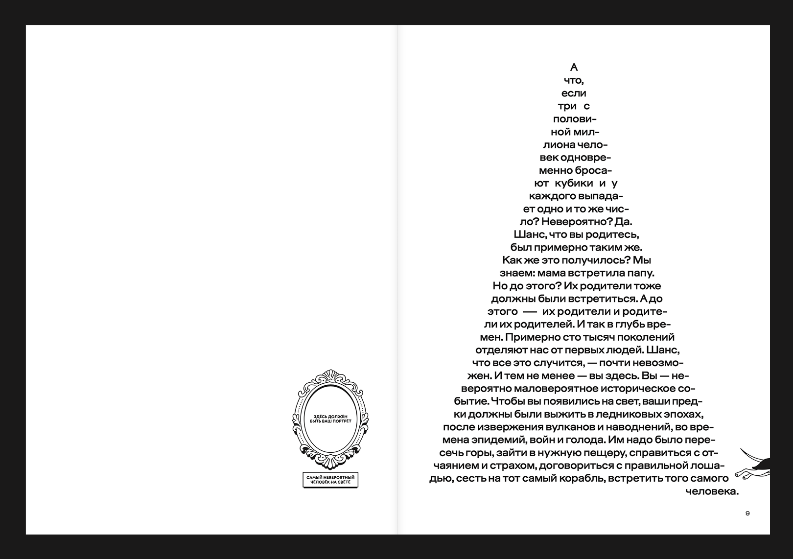
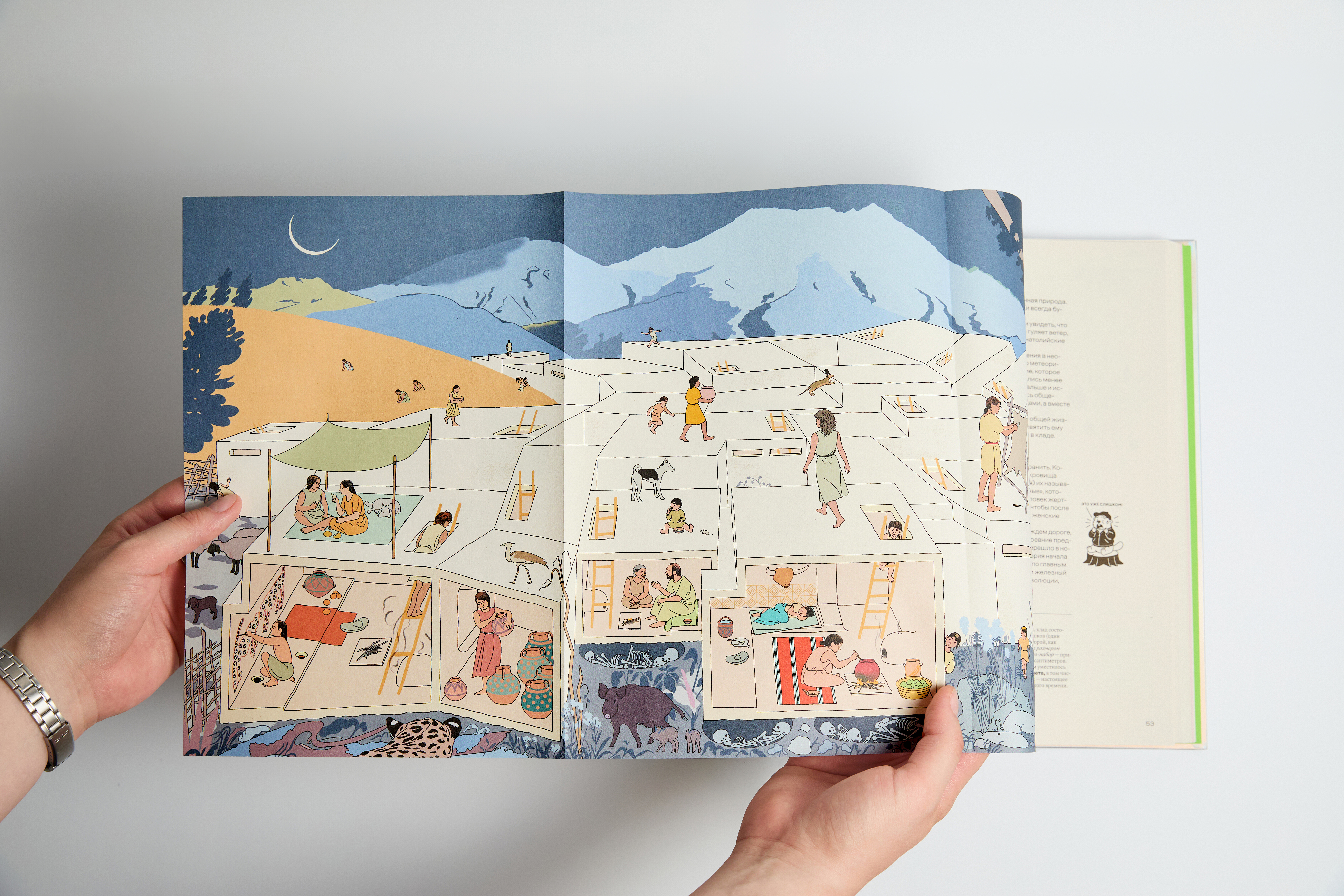
My favourite spread is the one with a triangle. It has everything. It is both a wonder and a thing which is easy to read, and a world of its own.
- Daria Yarzhambek
- art director of the project
Well, of course, those 19 items contained no mention of typefaces. But Filipp and I looked through a number of children’s encyclopaedias and got the feeling that, with a densely packed encyclopaedia, it seems extremely interesting at first, with a surprise at every page, and yet halfway through the book, it kind makes you feel kind of motion-seek.
We focused precisely on doing things so that an increased level of density wouldn’t make one feel tired, and turned to the dominant ways people consume information
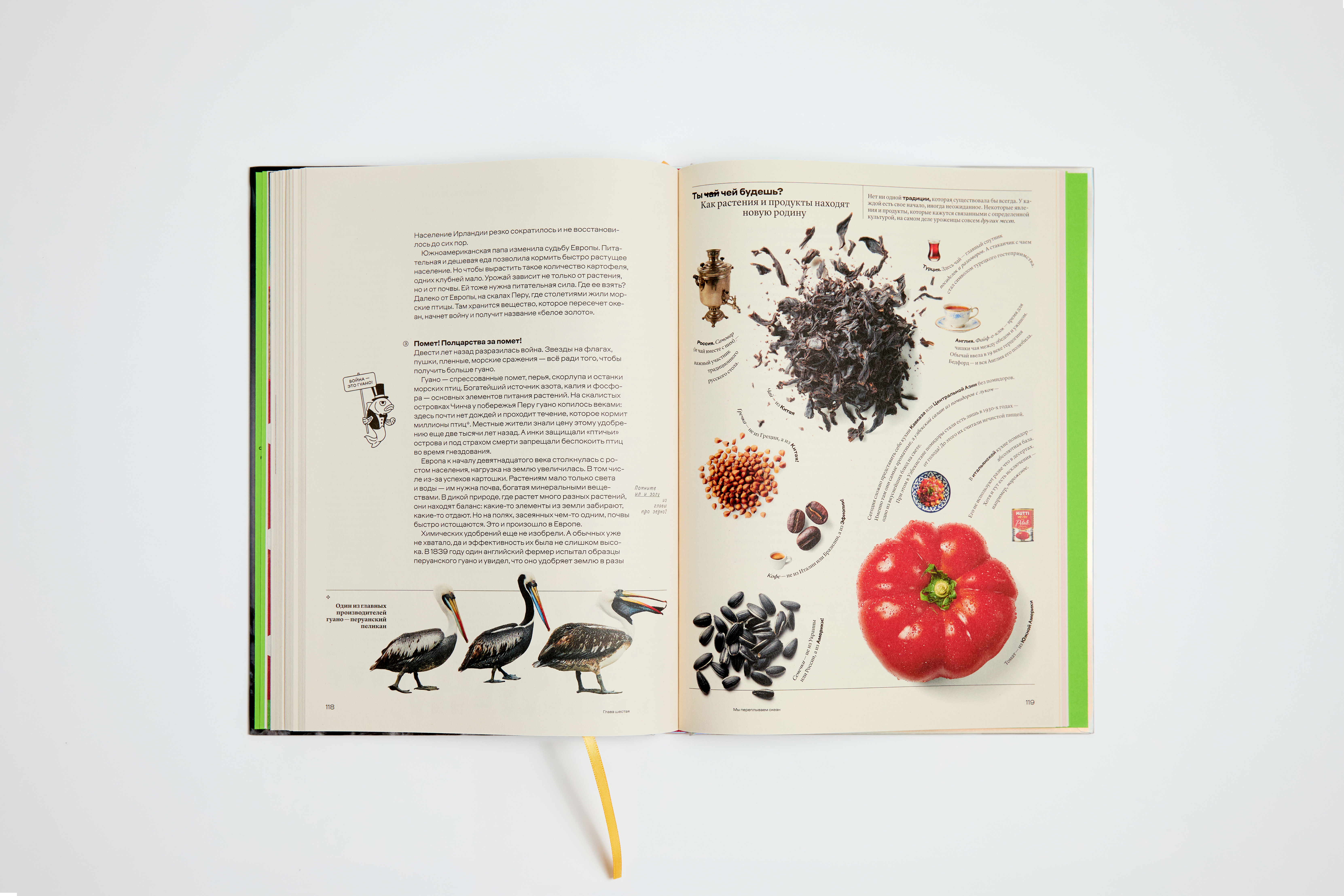
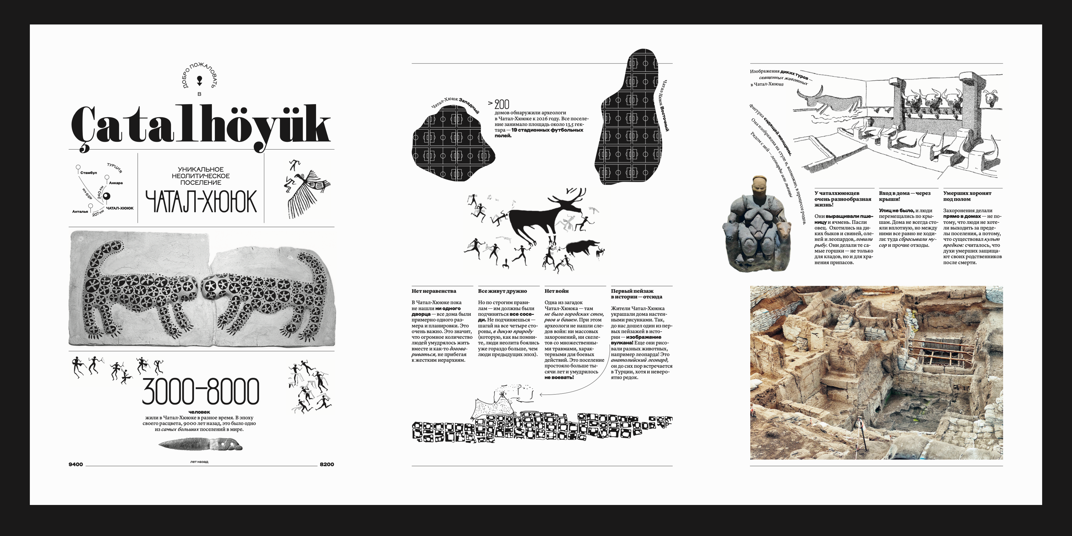
Applying the TikTok/Instagram approach, we tried to split the messages into the smallest possible segments so it doesn’t feel monotonous, or feel like dealing with bricks of text. We believe our strategy
The author’s text in the book is this dense, captivating, artfully crafted narrative. We help the reader navigate it through various inserted
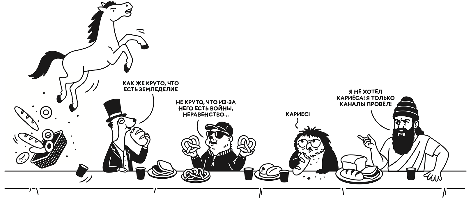 Speech bubbles, left to right: ‘How great it is that agriculture exists!’, ‘It’s not cool that because of it there are wars, inequality…’, ‘Cavity!’, ‘I didn’t want cavity! All I did was dig canals!’
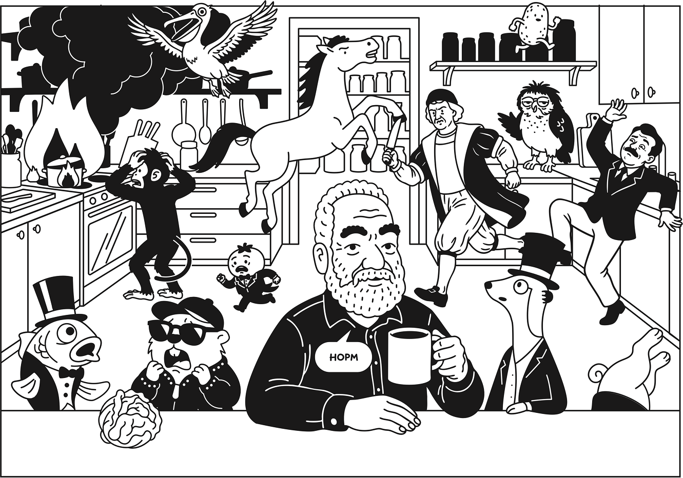 Caption: ’This is fine’
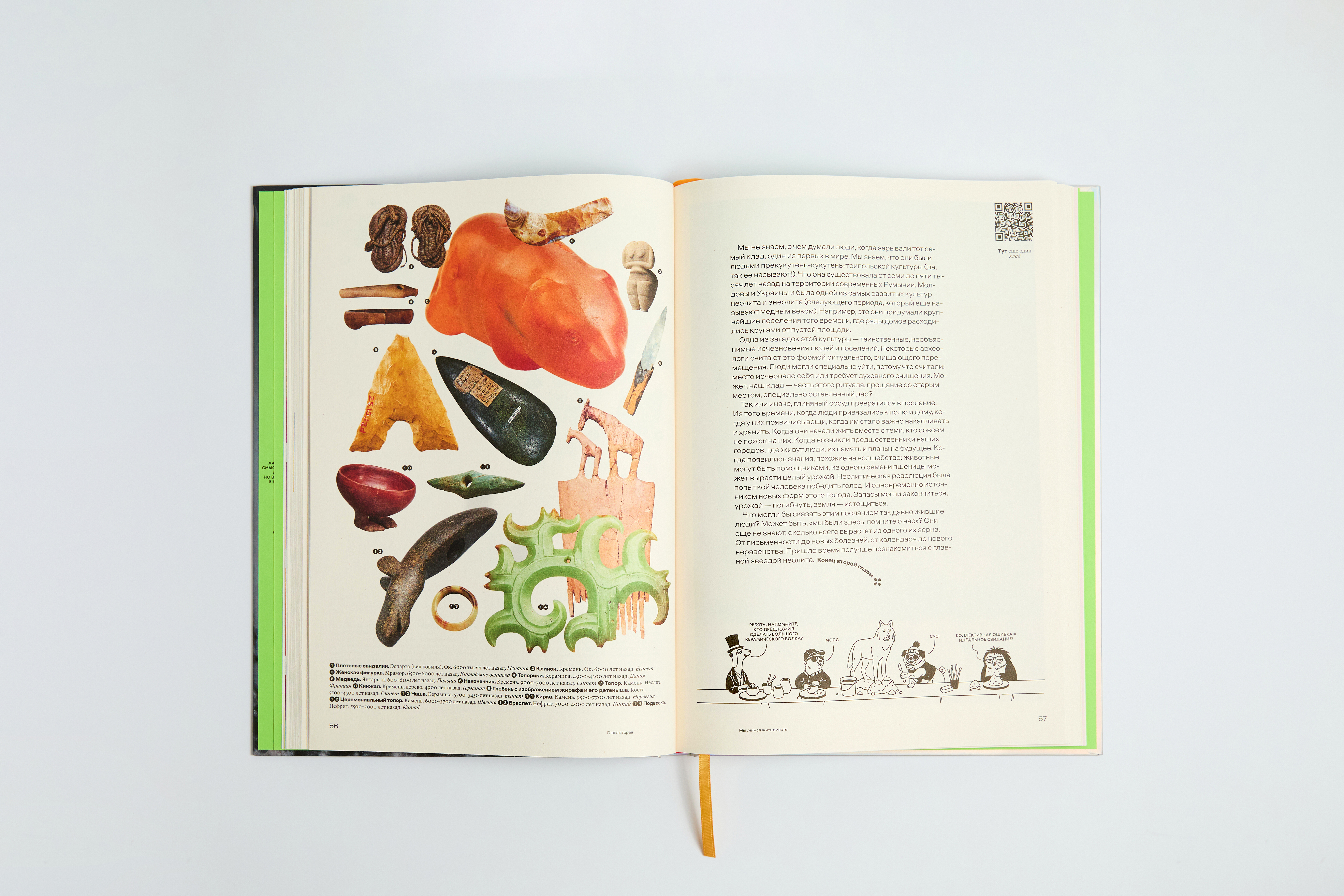
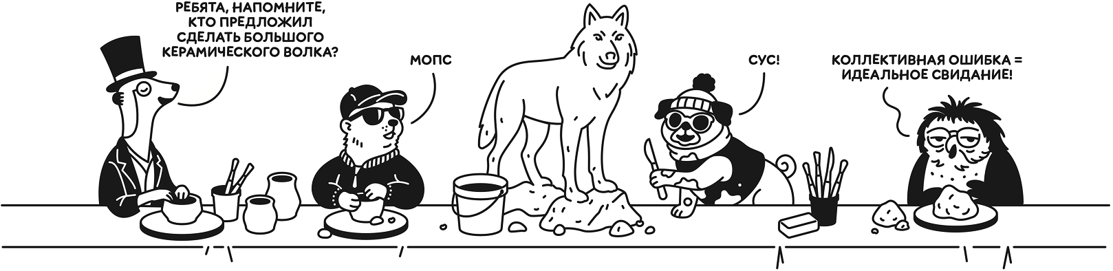 Speech bubbles, left to right: ‘Guys, remind me: who suggested making a big ceramic wolf?’, ‘Pug’, ‘Soos!’, ‘A collective mistake = a perfect date!’
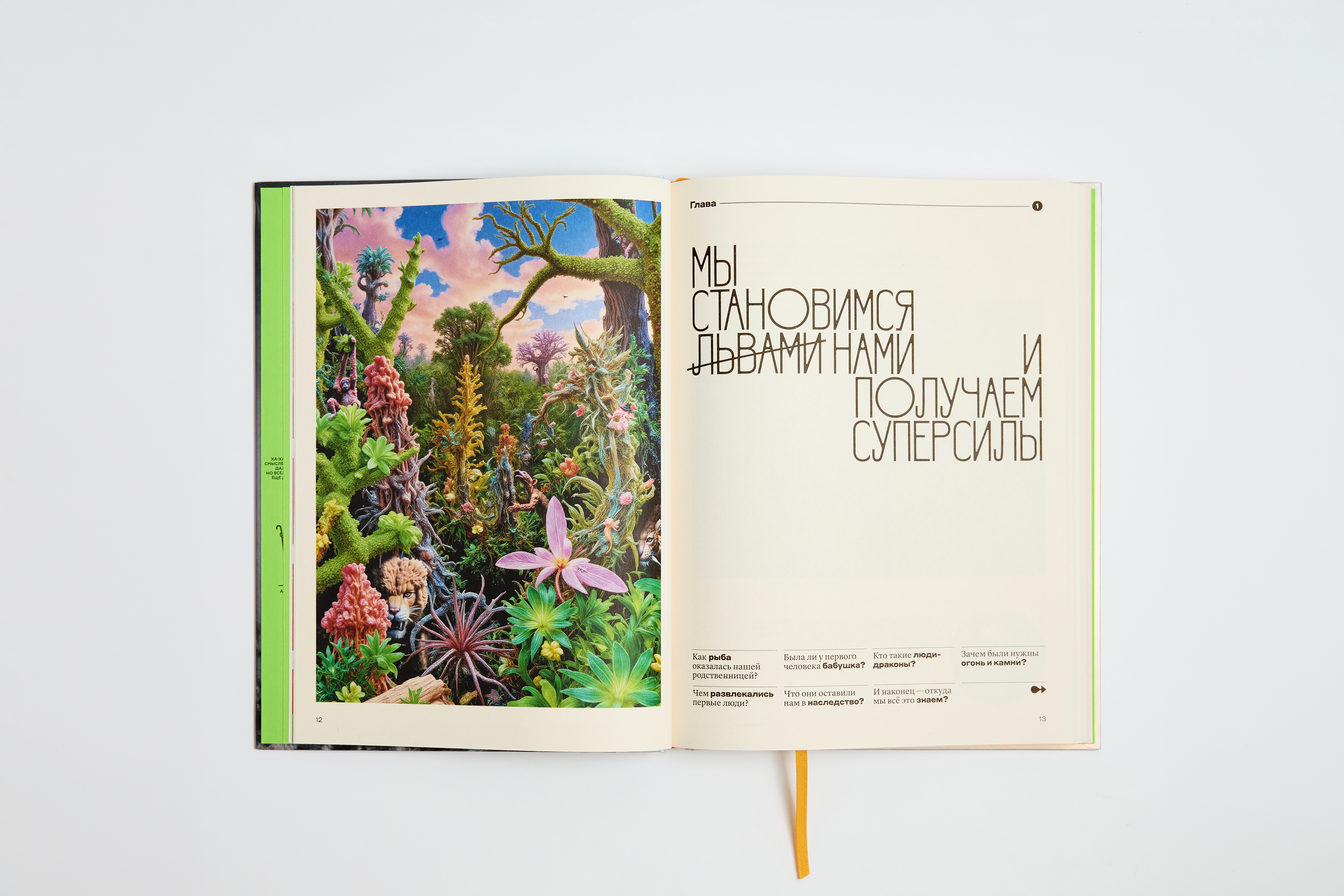
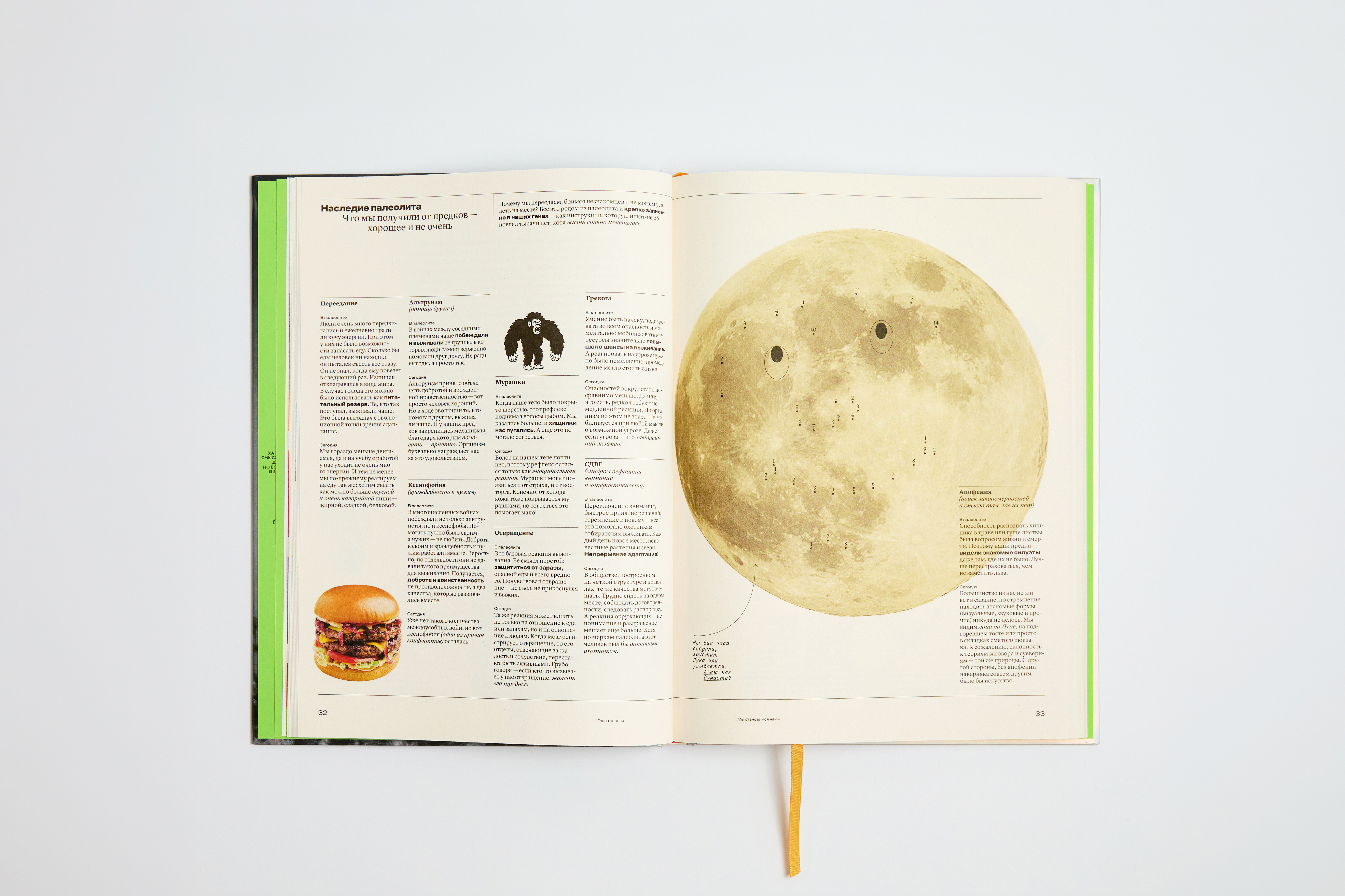
The book features a number of different voices that communicate with the reader as they progress through the text. We came up with the idea of introducing two more characters, two voices in addition to the author. The first is Paperclip Person (that’s our in-house term for the character).
Paperclip Person is kind of like your older sibling, a bit of a teasing know-it-all. They can argue with the text or add to the author’s narrative. We assigned the typeface Elma Trio to this voice.
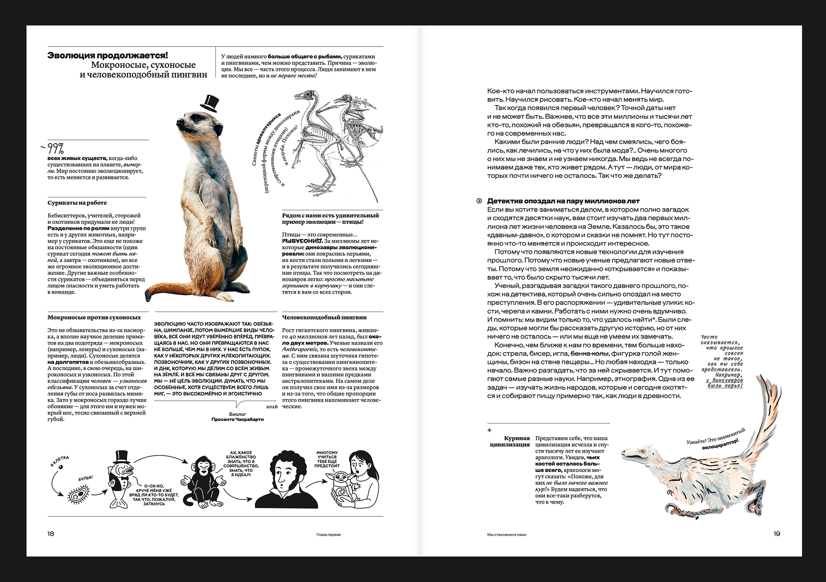
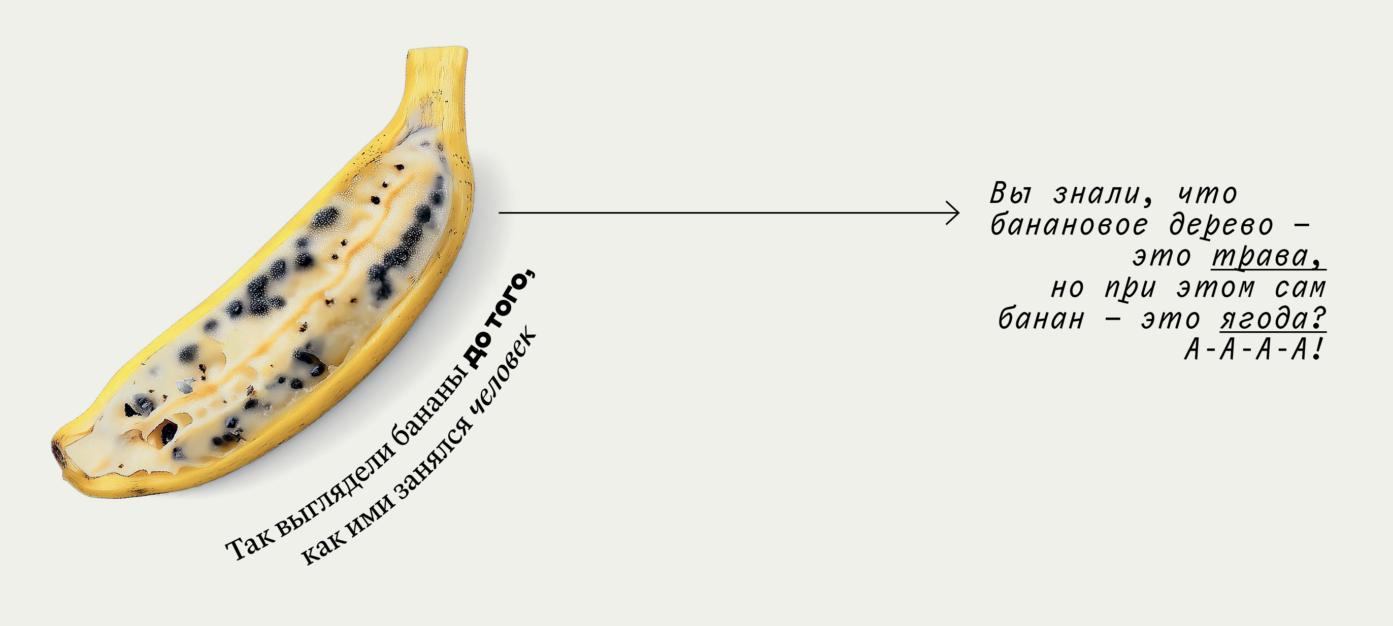
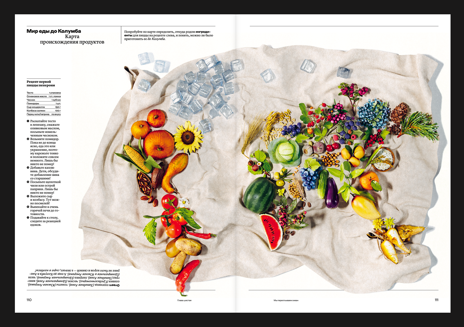
Another character we came up with is Monocle Person; they are here to convey academic knowledge. He is like an older relative or an older friend, whose entire room is packed with old encyclopaedias. And, naturally, they’re a subscriber to Monocle and The New Yorker. That is why the typography of what they’re saying heavily plays with the visual style of the Monocle
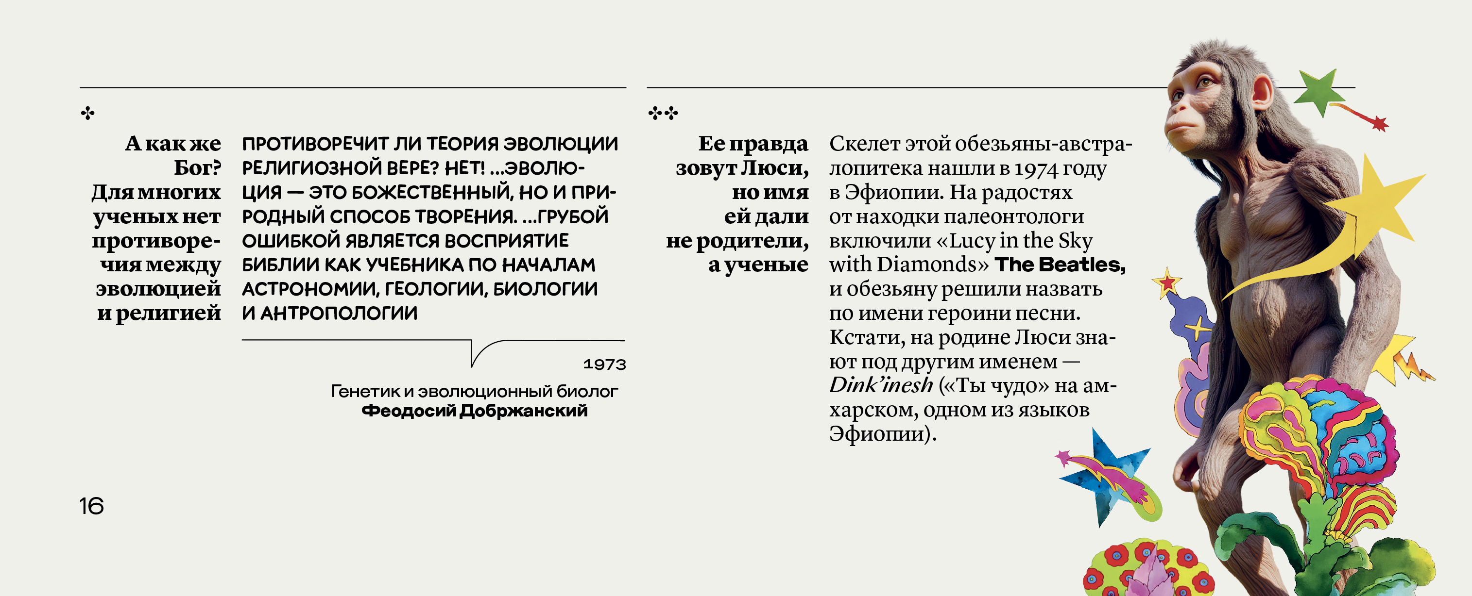
We went through quite a journey while designing and formatting the main
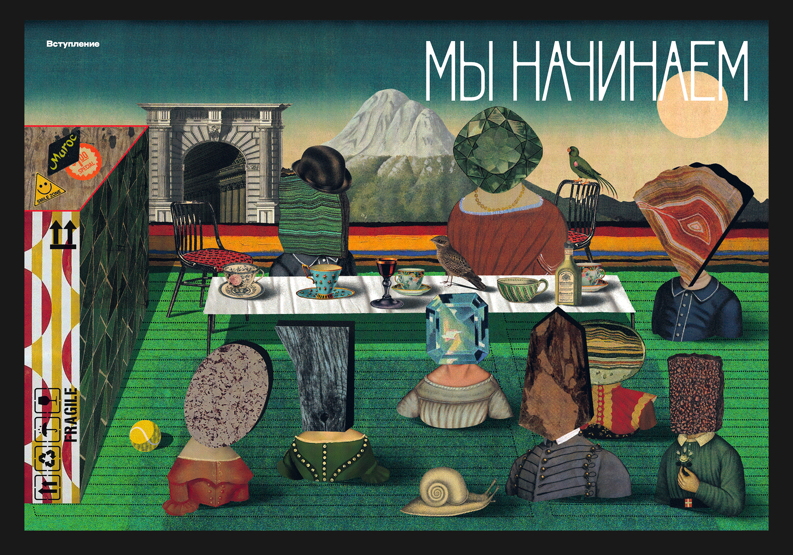
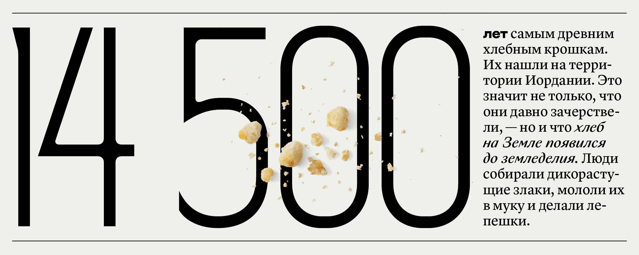

We also really wanted to use Qommodore for many
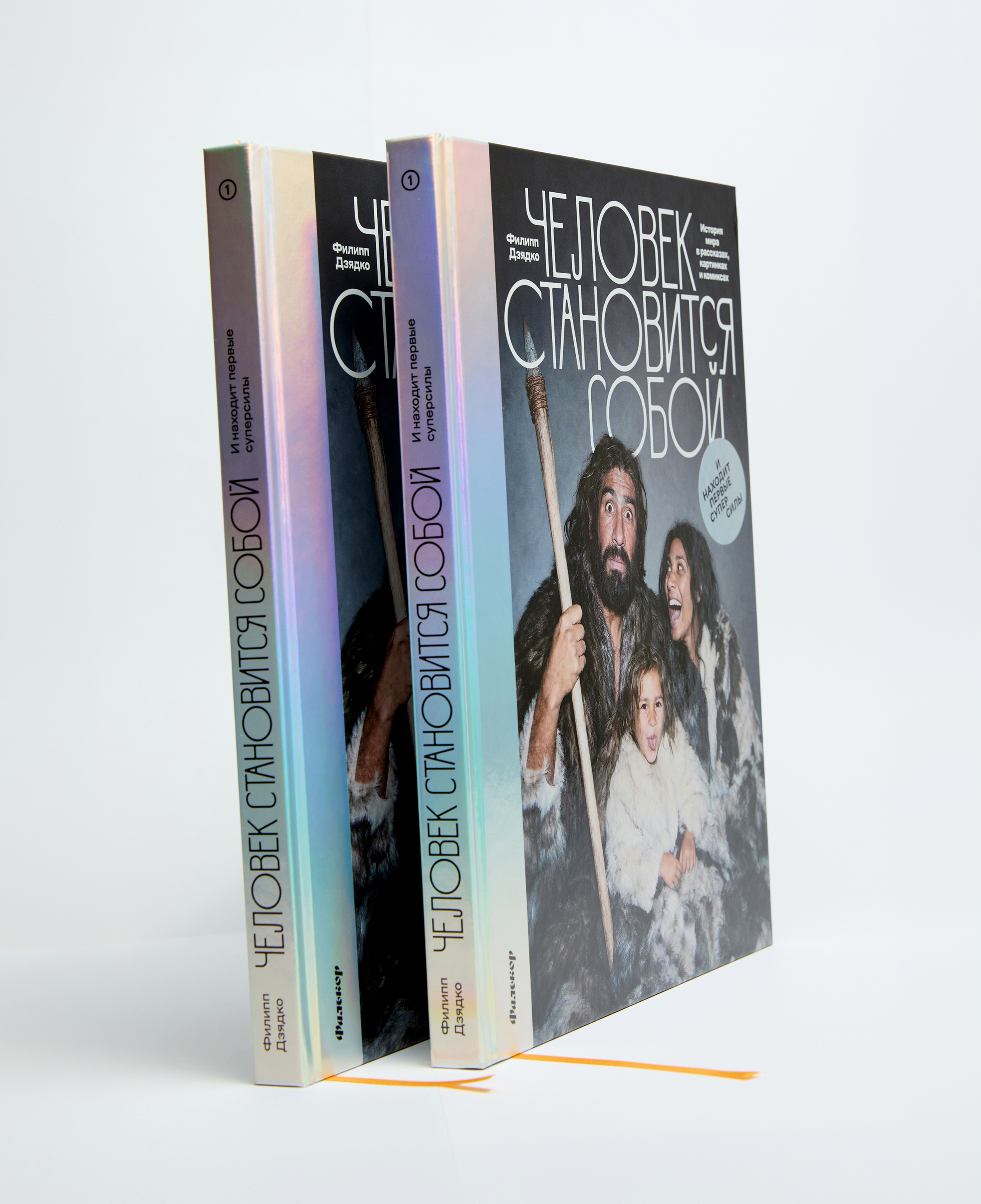
Volume 1. Artists
Nikita Vasilevskiy, Igor Gurovich, Misha Gurovich, Masha Krasnova-Shabaeva, Daria Rychkova, Facultative Works, mina milk.

Project team
Project Lead and Author: Filipp Dzyadko. Academic Supervisor: Andrey Zorin. Authors of the Historical Concept: Anastasia Papushina, Anna Sokolova. Producer: Sonya Goryacheva. Managing Editor: Marina Nafikova. Editor: Daria Timchenko, Academic Reviewer and History Teacher: Denis Lanshchikov. History Teacher: Nadezhda Kalashnikova. Art direction: Daria Yarzhambek, Yury Ostromentsky. Fact-checker: Alexey Boronenko. Author of Infographics: Vyacheslav Rogozhnikov. Author of Comics and Recipe Texts: Yuri Saprykin Jr. Photo Editor: Natalia Shlyakhovaya.