Adelina Shaydullina: Do you usually watch the movie before designing the titles?
Eric Demeusy: Most of the time you are brought in way before the movie is finished. A lot of times we are approached with scripts and concept art,
AS: Has it ever happened that you watched the movie in the theatre and realised: with this plot twist, my titles do not work?
ED: I don’t think so. I’ve been involved in some projects where the production ended up going to a different studio to do the titles. Then, after seeing the titles, I thought: ‘Oh, that’s an interesting choice!’ But usually the filmmakers have a pretty specific idea of what they want.
Honestly, designing the titles feels like you’re making something separate from the film. Obviously, you’re trying to make it connected to the film and guide the audience into or out of it. But for some reason, it just feels like you’re making this thing on your own. And then seeing the two things combined at the end is pretty interesting. I think the audience probably sees it more as one continuous flow than I do, though.
AS: So what does the typical brief for a film logo or title sequence look like? What does it include except for the script or the props?
ED: The brief is explaining what the film is about, and then it’s also trying to give you an idea of what the titles are expected to be. It explains what the director wants the audience to feel during the title sequence. It may include things the director feels they want to reference design-wise.
Most of the time, the production is trying to give you everything that they have available for the
AS: How often do you feel the brief is insufficient and you have to ask for additional details?
ED: It depends on how much they give you upfront, but it’s not too common that you’re asking for additional materials.
Normally, you’ll come up with three to five totally different directions for what the title sequence can be based on what you received. Then you’re trying to pitch them, and hopefully one will be picked.
But there’s times when none of the directions were chosen, and it turns out to be a collaborative process with the filmmakers. Just a lot of experimenting and developing that just slowly turned into the final title sequence. So it’s always different.
AS: Who decides what information will be included in the title sequence?
ED: There’s actually a pretty strict legal process governing how the titles have to appear: how long the names stay on screen, the order in which they appear, which names are included, which titles can appear on screen at the same time, which ones need their own title card, and even the size of the names. So it always depends.
Production always gives you a list of the titles that need to be included. Usually, there’s a rough estimate of how many titles there will be and what those titles are. So you’re just blocking it out, literally using ‘First Name, Last Name’ as a placeholder.
Title sequence for Game of Thrones
AS: Are there certain categories of fonts that are harder to animate?
ED: I’ve never really thought about it like that. I don’t think I’ve ever run into it as a problem. Whatever the font is, it dictates what the animation can be. I’d look at a very thin font and automatically think, ‘Oh, this is going to be tricky. I don’t really know what I can do with this.’ But then you’re forced to figure it out. If it’s, like, a really thick one, you think, ‘Oh, I could texture this. I could give it a 3D treatment.’ There’s a lot of space, so I can fly in through the letters. So it depends on the typeface, and usually the animation ideas come from the font itself.
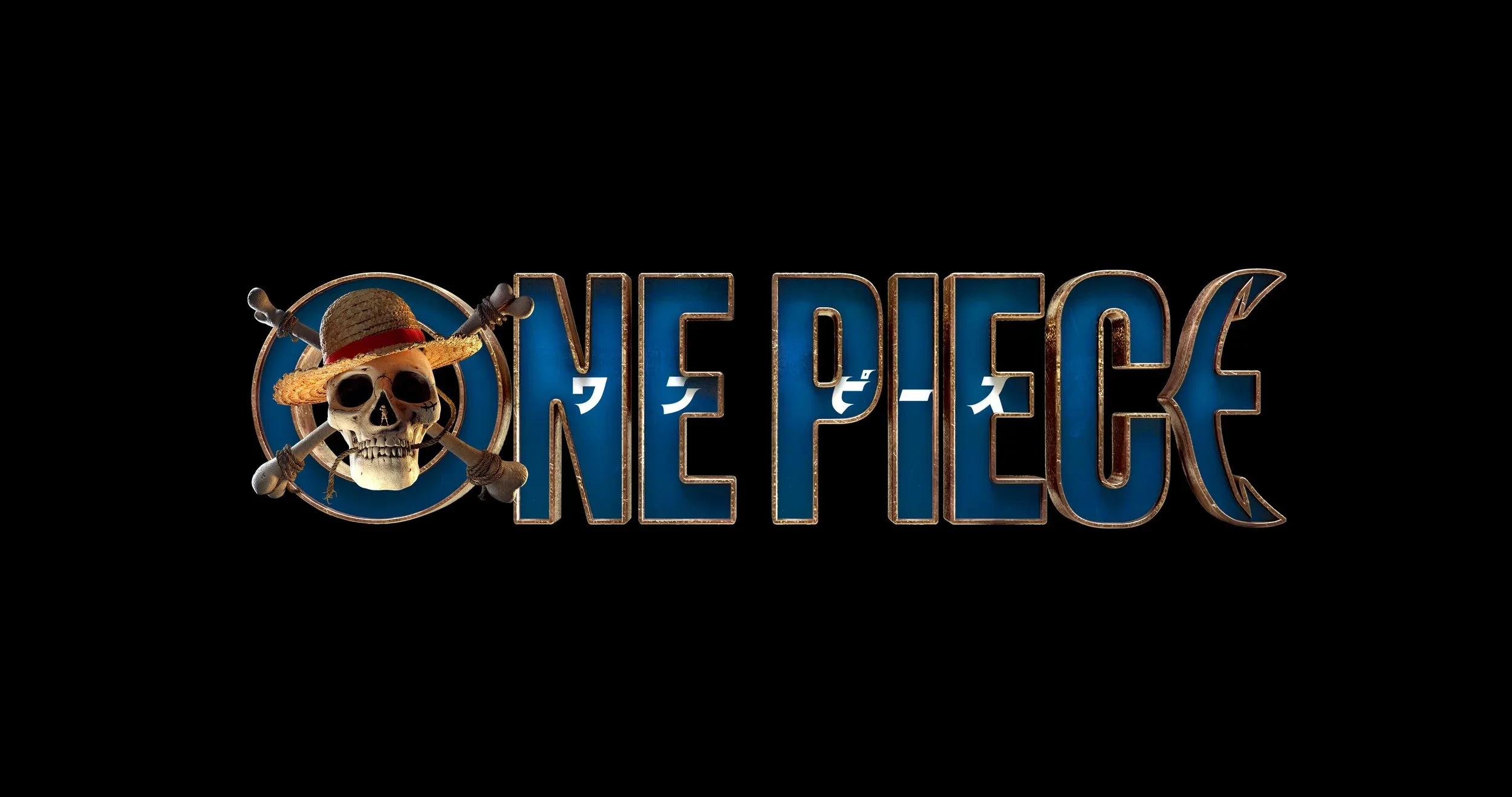 Logo for One Piece series. Design: Eric Demeusy
AS: But what do you usually do with very thin fonts? Some of them are barely readable even when they’re static.
ED: I tend to stay away from thin fonts! In animation, thin fonts tend to look very aliased, and you’re always adding a slight blur or something like that to soften the edges a little, so it doesn’t feel like a mosaic.
Then you can draw something over a very thin type. But these days, you’re not actually animating the type that much in title sequences; the font just tends to fade in and out.
It’s disappointing in a way because you usually think of the opening titles as a
Title sequence for Se7en. Design: Kyle Cooper
AS: Do you think about the screens the movie will be shown on when designing the title sequence?
ED: The only thing I really think about is font size, because if it’s smaller, it will look a little bit better. But if somebody’s going to watch it on their phone, they’re not even going to be able to read it. So I don’t really think about that too much, as you never know what it’s really going to be viewed on. Well, sometimes you do. I mean, if it’s a TV show, people are going to watch it on their TV. If it’s going to be a theatrical release, it might be IMAX.
But at the end of the day, after that whole theatrical run, people are going to be watching it on their TV or their phone. So you always want to make sure that it works at every size and pay attention to its scale relative to the size of the frame.
AS: Was it easier to design titles when people didn’t try to do everything on their phones?
ED: I don’t know. I just remember that old televisions used to cut off certain parts of the picture or certain parts of the titles, and you always had to make sure that, like, titles fell within certain guidelines. Now that’s not really a thing anymore. Sometimes, you still have to do that because it would be shown on television. But, generally, nowadays, we have more freedom to put the titles wherever and however we want. I feel like that’s really the only difference I can think of.
AS: Do title animators often work with variable fonts?
ED: There are situations where you would want the first name to be in a slimmer font and then the last name in a bolder font. Or the description to be italicised and the name to be regular. But if we did something like that, we would probably custom-animate it.
So it’s not common practice to use variable fonts, because a lot of the
And if we’re using fonts, we just tend to think in terms of a static font family with different styles.
AS: Do you use AI to animate typography?
ED: No, I haven’t yet. Recently I was working on a course on title design that’s available at Action VFX, and I did utilise AI to demonstrate some of the processes. But the typography shown on the course is designed in Illustrator, and animated in After Effects or Cinema 4D.
AS: Do you research, or perhaps understand from experience, what the typographic preferences of different audiences are?
ED: I don’t normally think about the demographics. I would think about it more in terms of genre. To go back to what I said, the main title sequence is trying to get you prepared for what you’re about to watch, and typography is one of the tools that help you set the stage for the main stuff.
So if it’s a horror film, you might have sharp edges on your type or cracked lettering and things like that. If it’s sci-fi, it’s usually very clean and smooth. And those usually have quite thin typefaces.
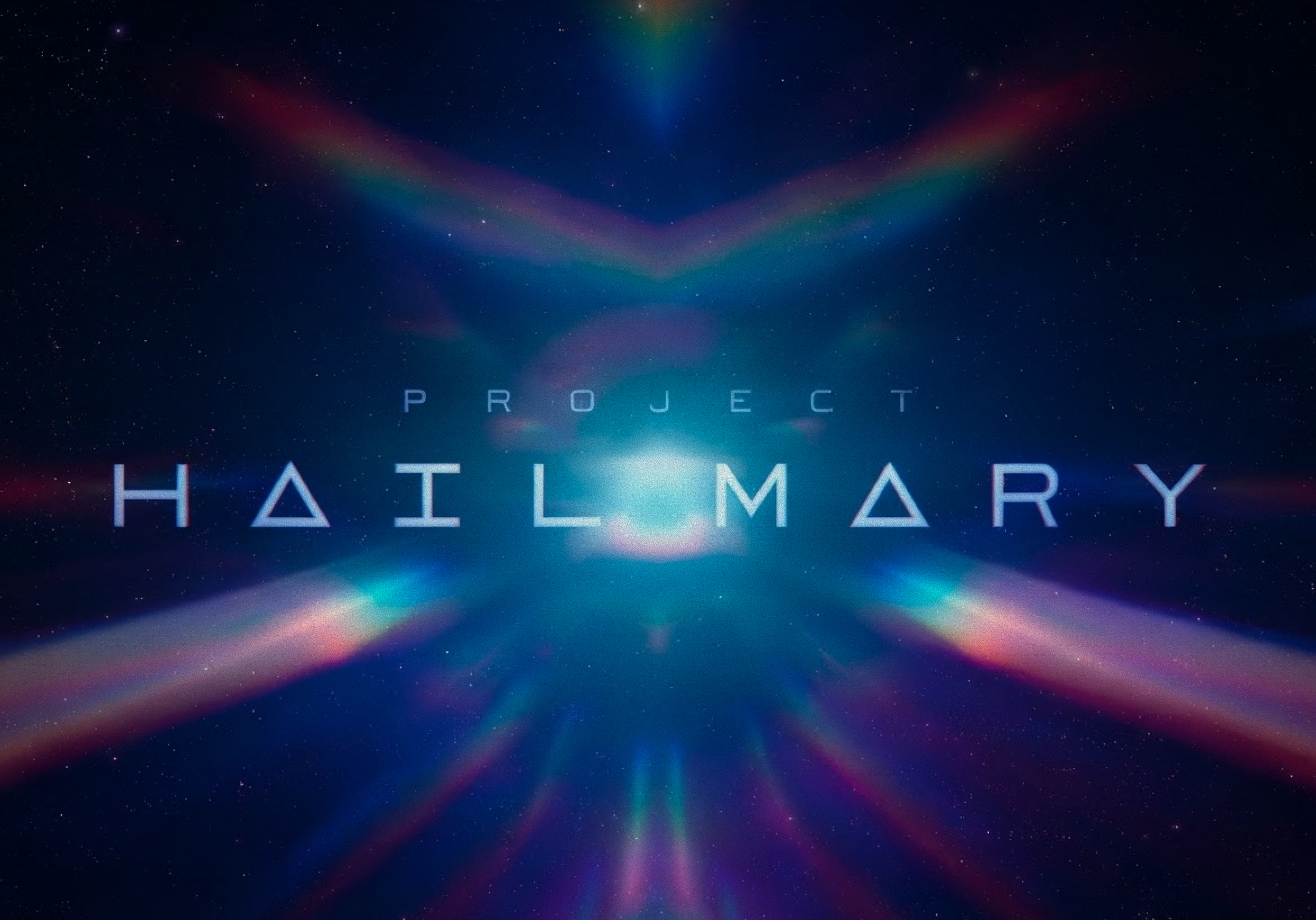
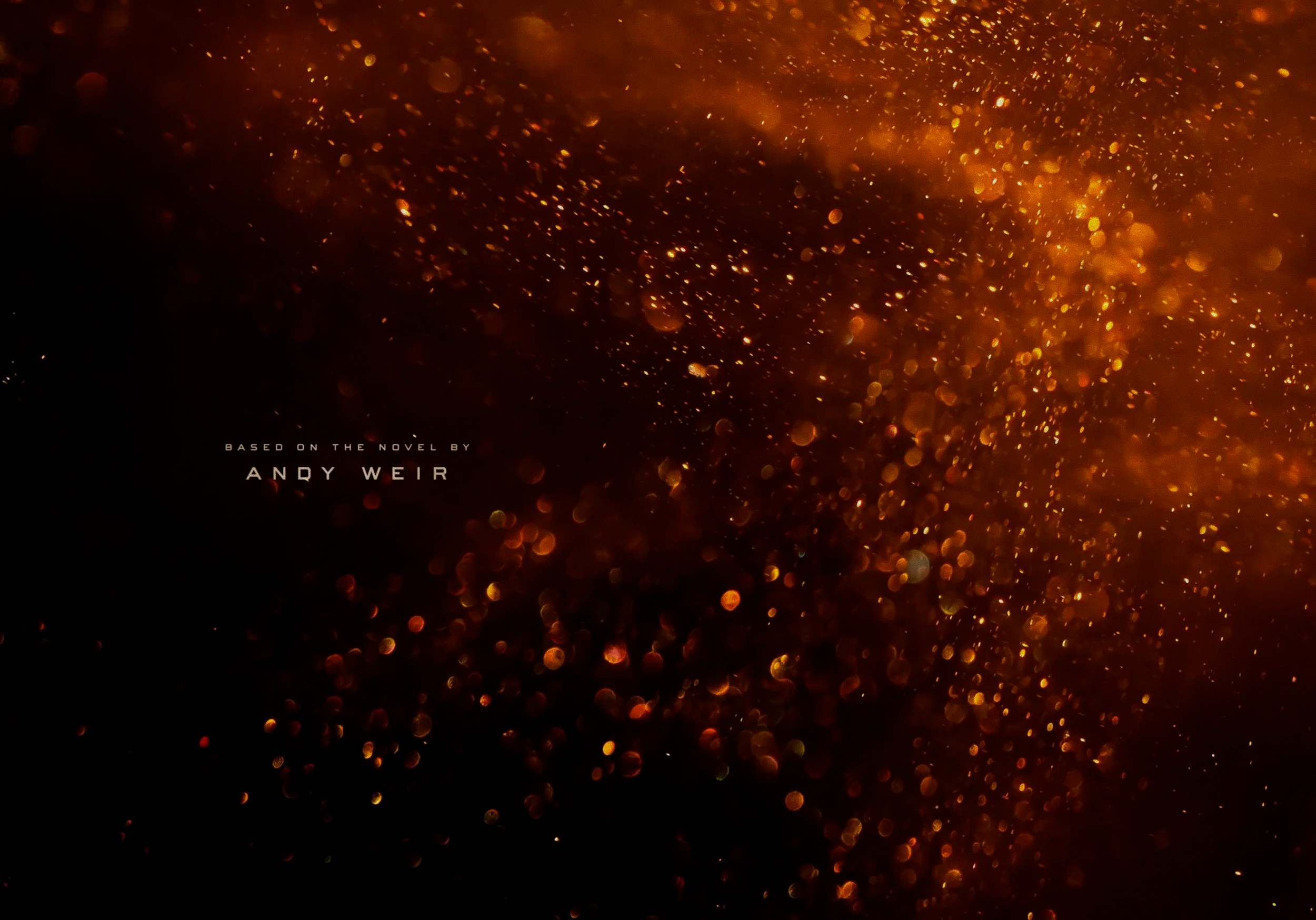
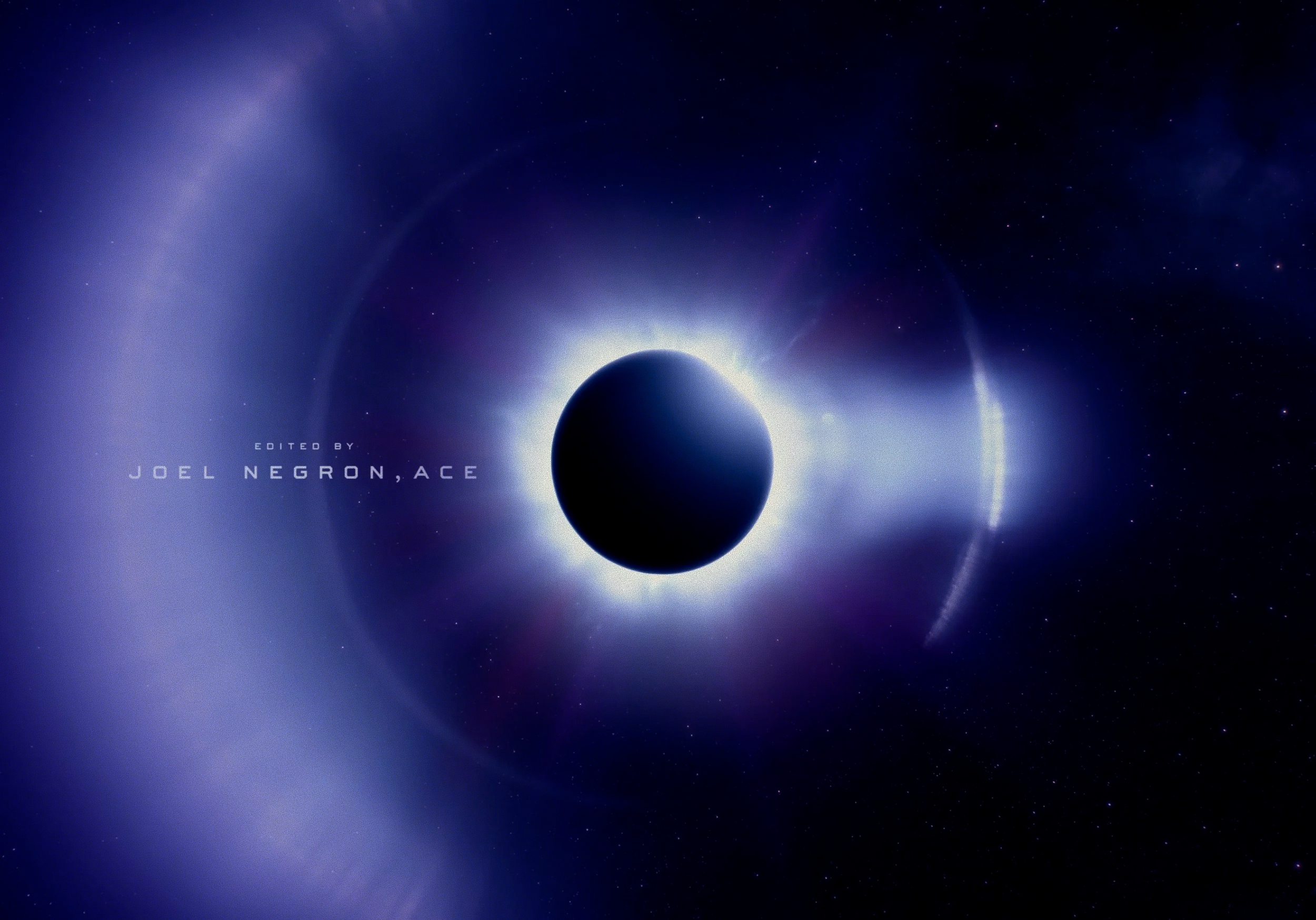
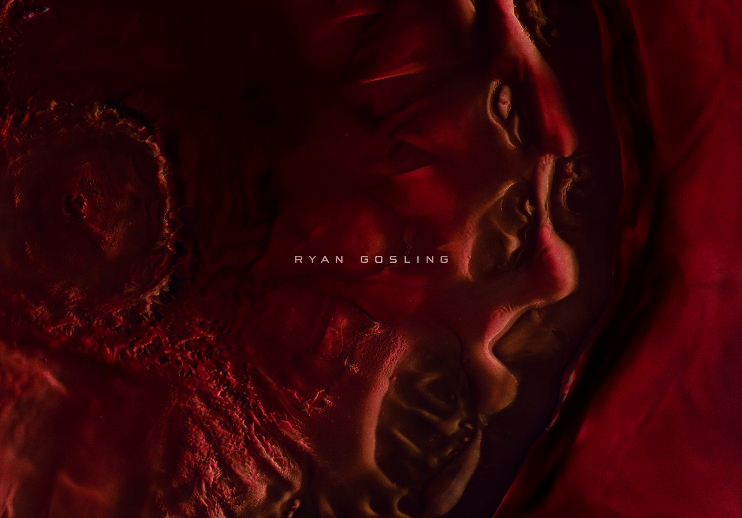
Title sequence for Project Hail Mary
AS: Isn’t it tiring trying to fit into genre-specific stereotypes?
ED: I think you’re always trying to find something new. You always want to push the tradition a little bit, which is difficult to do because at the same time you want it to feel familiar to the audience. You don’t want to make them ask themselves, ‘Does it feel like horror? Or does it feel like sci-fi?’
Sometimes there’s a reason to push people to think of something different. So it all depends. But experimenting and trying to find something new is part of the fun.
AS: There is a joke among type designers that the best answer to any typographic question is: ‘It depends.’
ED: That’s true. I keep coming back to that. That’s why it’s hard to generalise.
AS: You were also responsible for the title sequence of your directorial project. How’s the process different when you’re also directing?
ED: Well, that’s interesting. I guess the difference is that there’s just nobody to bounce ideas off of. You’re creating it and approving it at the same time. Of course, you try to get some ideas and opinions from other people, but you have the ultimate say.
It’s hard because when you’re designing something for a certain project, there are guidelines and limitations. So you can’t just do anything that you want. If you’re doing it for your own project, you could literally do whatever you think of and whatever you think is cool.
So on the one hand, it’s nice to have guidelines and boundaries. But on the other hand, it’s nice to have total creative freedom, and I really enjoyed it.
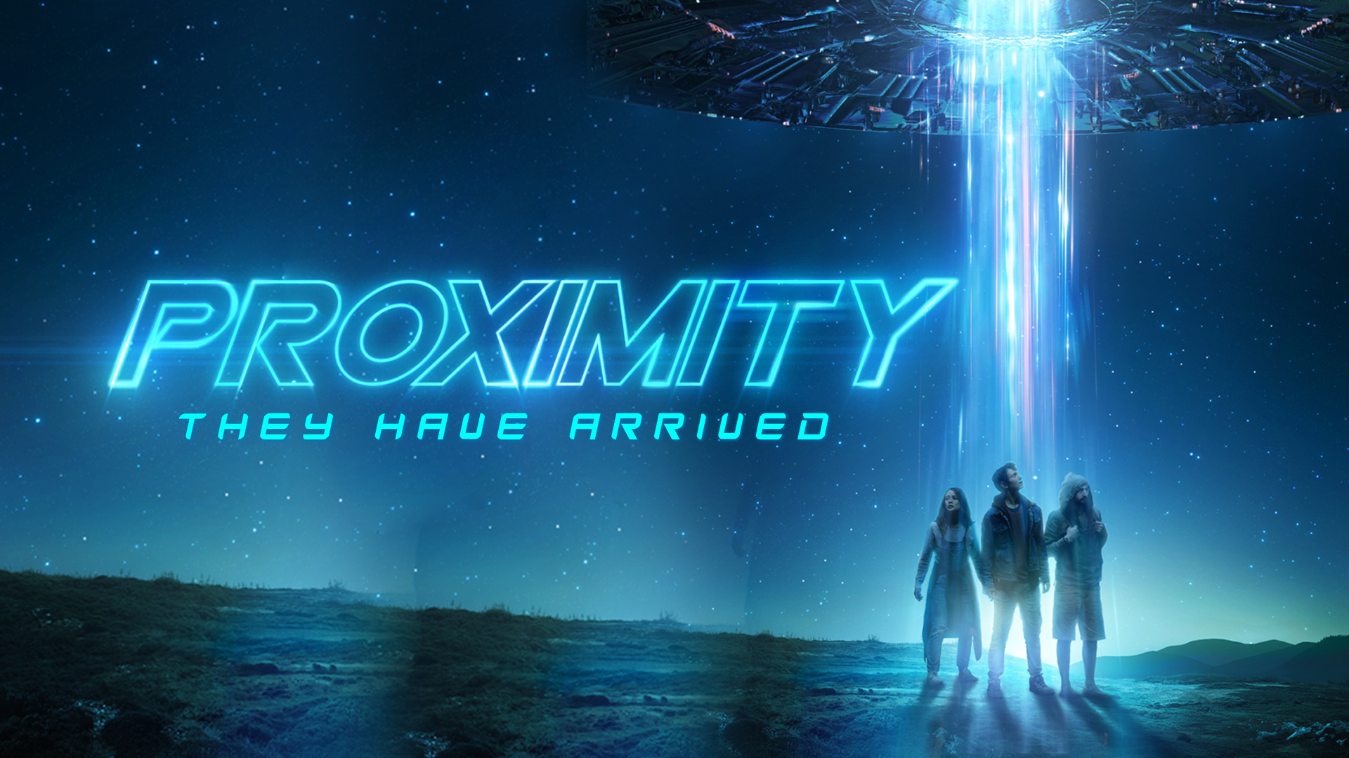 Proximity cover on Prime Video. Logo designer and director: Eric Demeusy
AS: How common is it for designers who work on movies not to be able to discuss their work, like in terms of an NDA?
ED: You always sign an NDA, and it depends on what company it is. Some of them are very strict, to the point where, while you’re working on the titles, you have to be inside of a locked room working off of a different server. There are cameras, and they also give you special hard drives for things. So it can be very locked down.
You generally can’t talk about the project until it’s released digitally. So even after the premiere in the theatre, you’re not able to say too much.
AS: Are there any particular trends you see currently in title and logo designs for films?
ED: A while ago, something that you would call ‘3D beauty shots’ was popular. Everything was static, and it was just the camera moving around a rendered space.
Now, I think because TV shows have become so much more prominent and there are a lot of title sequences for TV shows, title sequences are getting shorter, becoming almost like one-shot short title sequences.
AS: Isn’t that just because our attention spans have become shorter?
ED: That could be. In Breaking Bad, for example, there was no title sequence. It was just the logo of the show coming together. It was very quick.
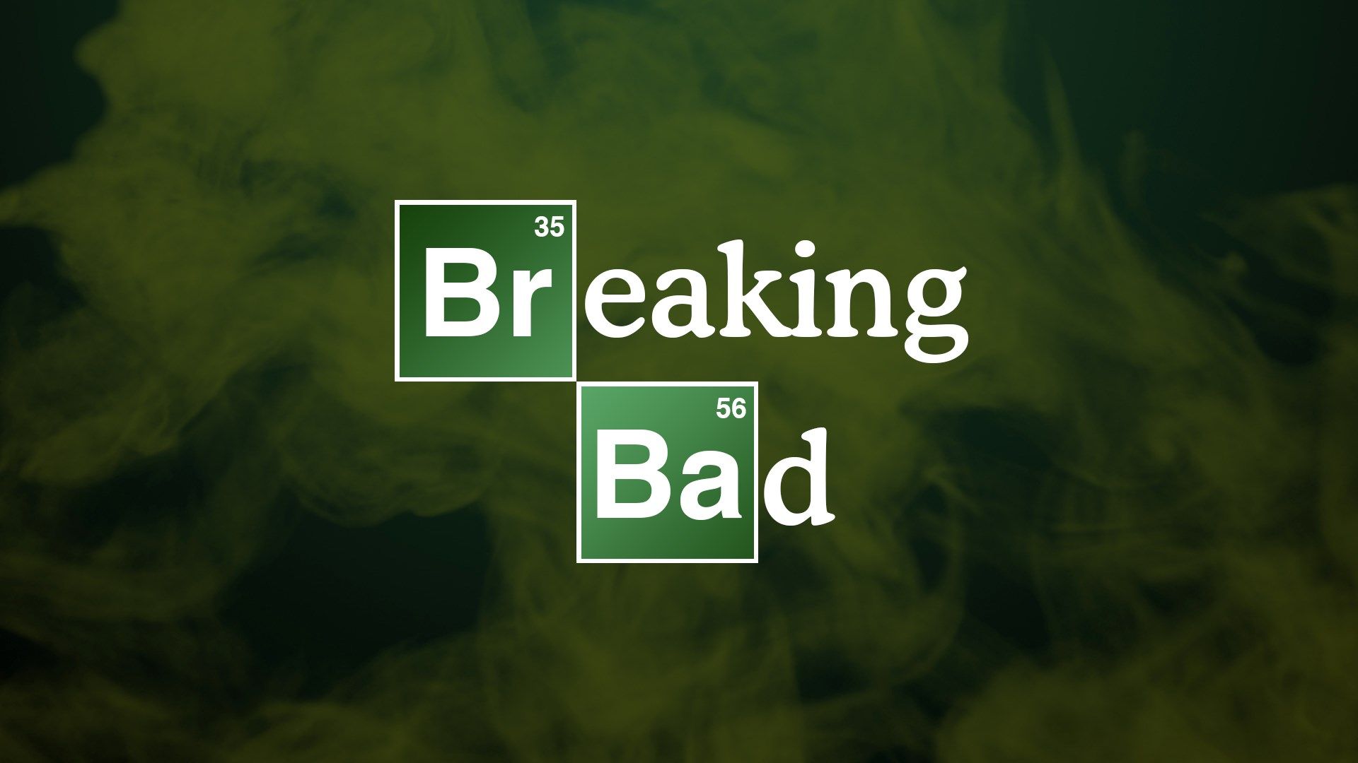 Breaking Bad logo. Design: Electric Sandbox
AS: I wonder why they would do that. Streaming platforms have the ‘skip intro’ feature, and people are used to it. The other day a friend of my kid asked me whether I could skip the intro for them at the cinema.
ED: Yes, people are used to that. But you don’t want people to feel like they’re just waiting to get past a commercial or something to get to the film. You want the titles to feel like a piece of information that a viewer needs to see.
AS: Coming back to the previous question, can you think of any typography-specific or design-specific trends?
ED: I start thinking in terms of genre again. For action movies, the colours are often blue and green or teal, and for comedy films, they’re white and red. You also see that a lot in the poster design.
AS: I’d never thought about that, but now I can’t stop checking all the different posters that come to mind!
There has been a growing number of films commissioning custom typefaces — The Substance and The Girl with the Dragon Tattoo, for instance. Do you have any experience commissioning fonts, or have you ever seen any of your colleagues do it?
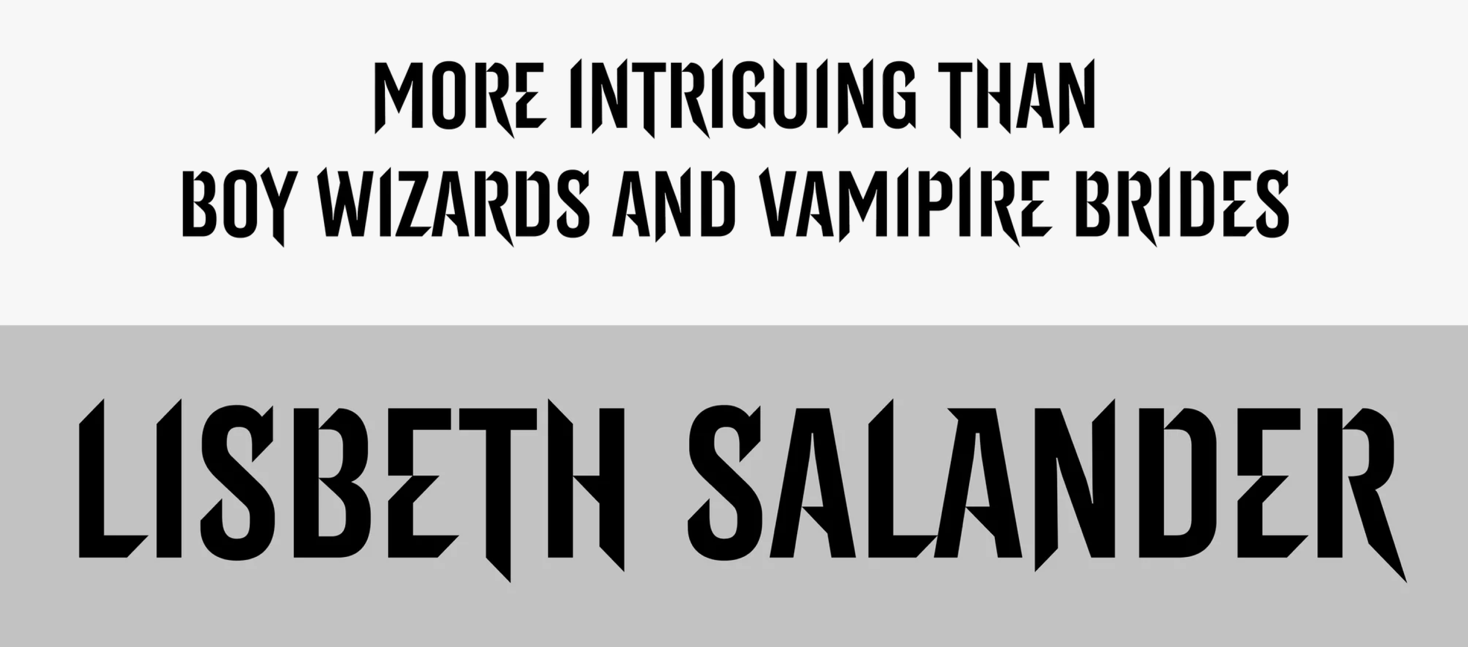
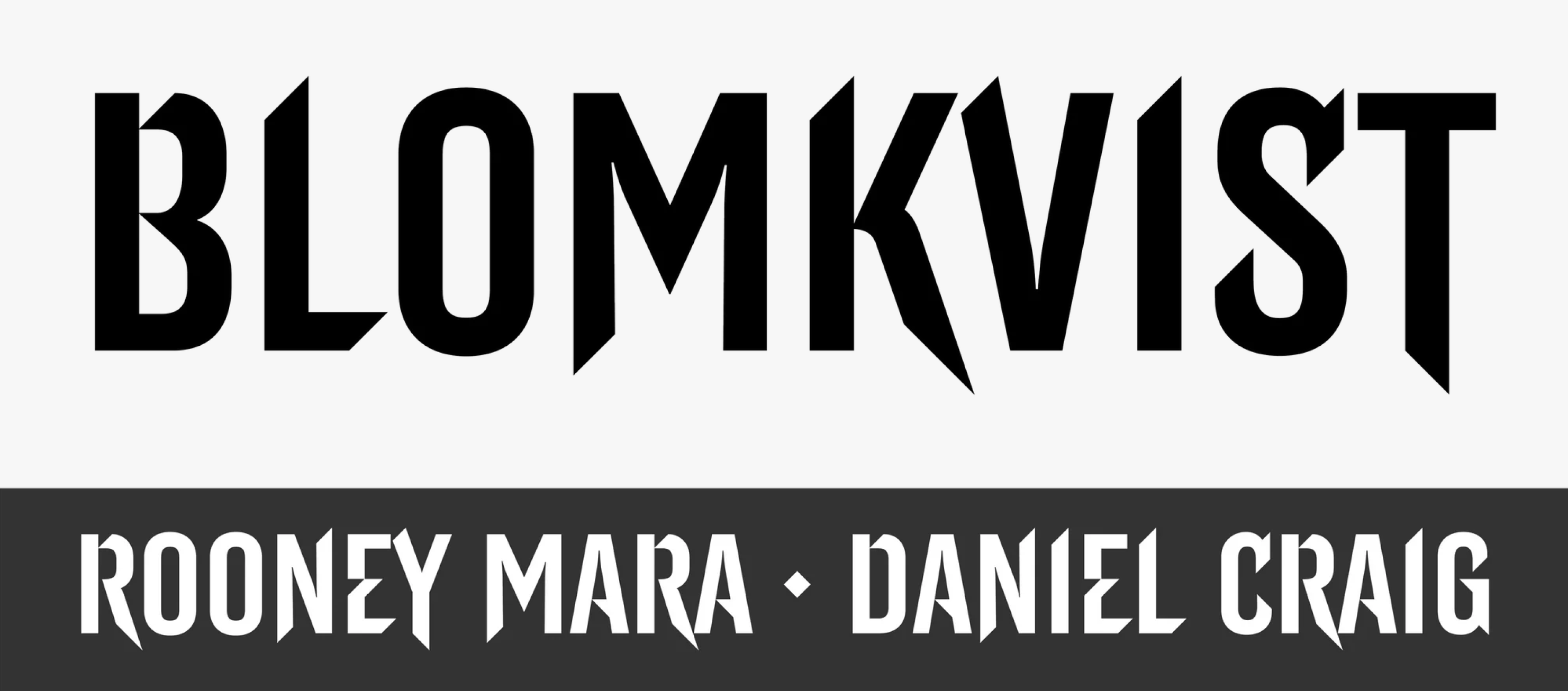
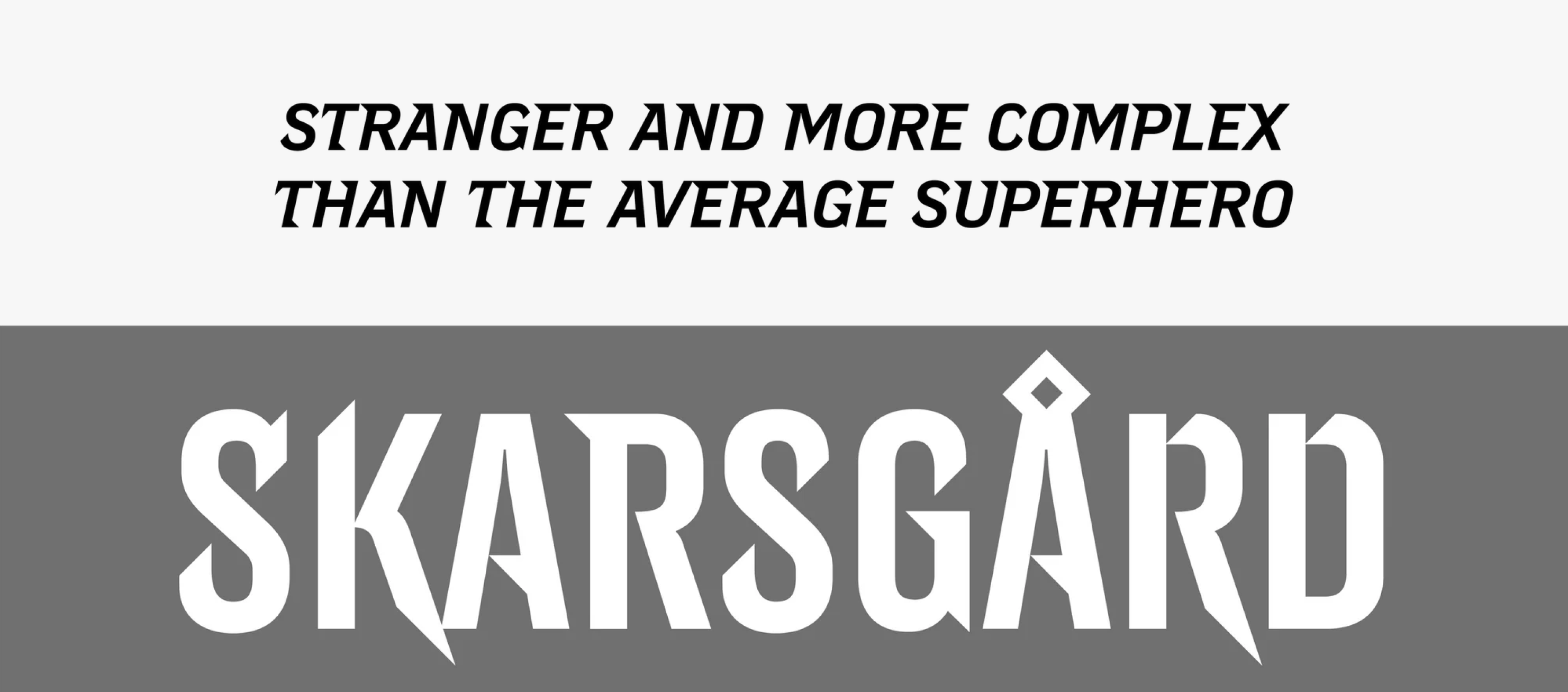
Typeface for The Girl with the Dragon Tattoo. By LuxTypo

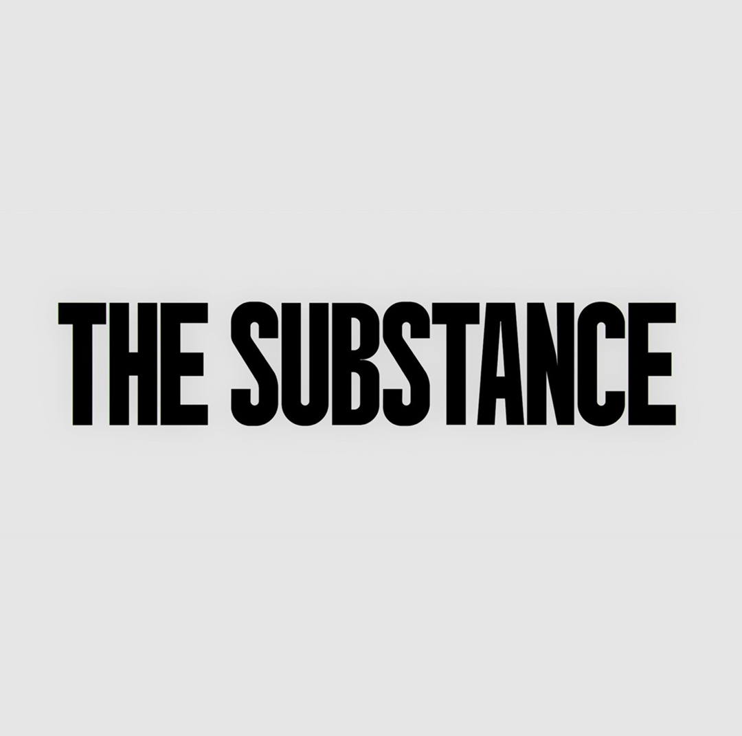
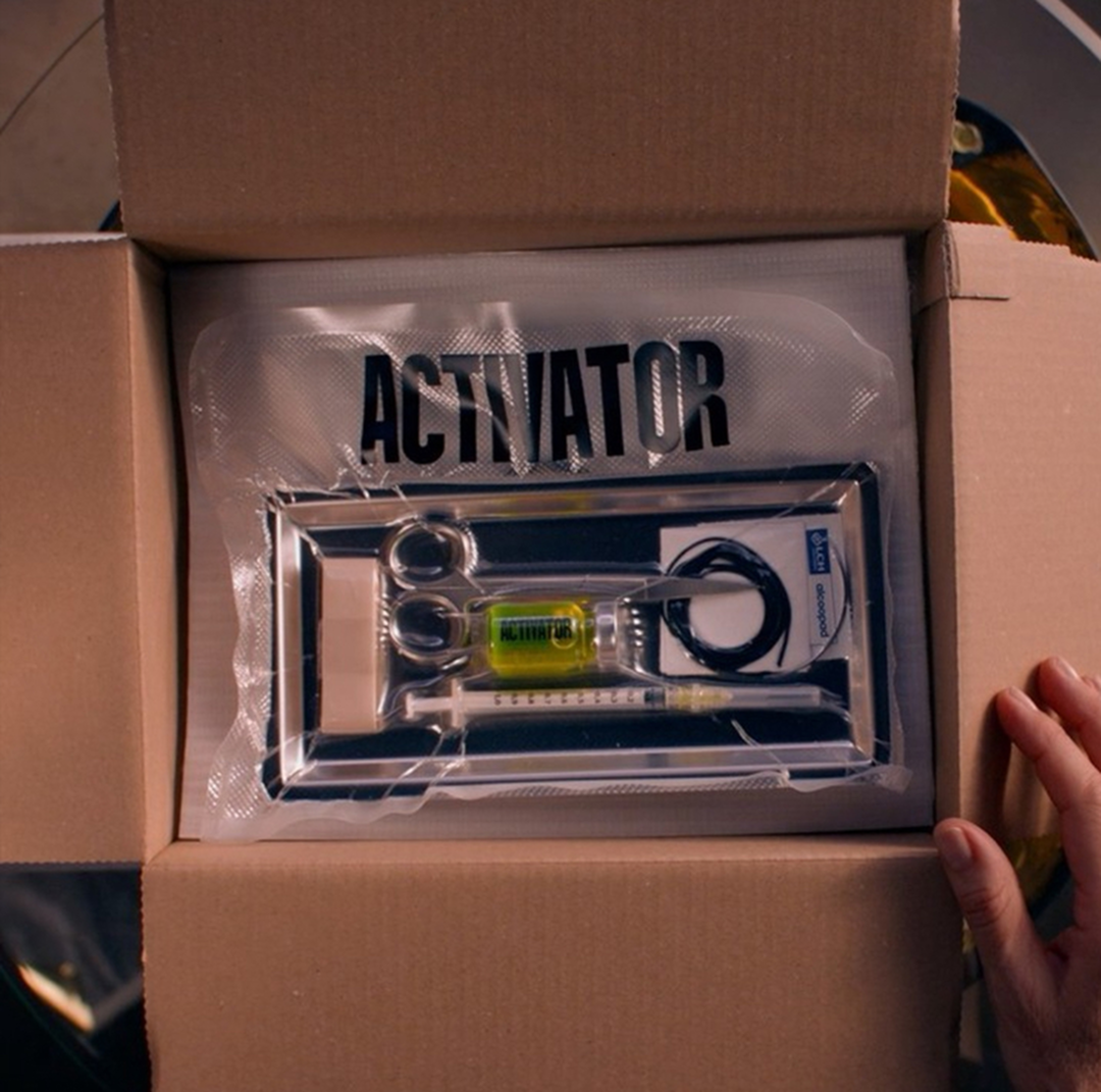
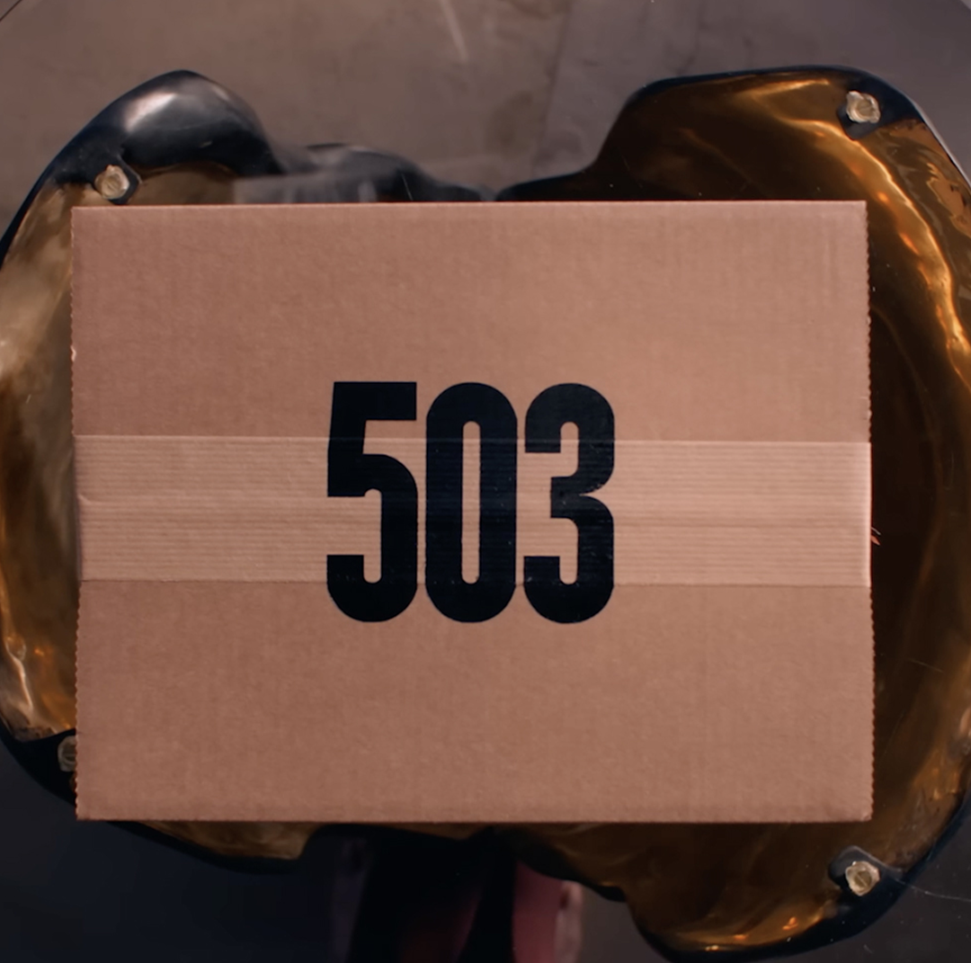
Typeface for The Substance. By Fugu Productions
ED: For logos, we usually customise the letters ourselves. Like the Stranger Things logo. It was based on ITC Benguiat, but it was heavily customised; some letterforms were adjusted. However, I’ve never commissioned anyone to design a custom font.
AS: Did you see that Adobe Fonts now promotes ITC Benguiat with an image copying the design of the Stranger Things main titles?
ED: No, it’s funny. But I guess it makes sense to take the best-known thing that the font has recently been used for and show that. But it’s so weird because that font was so common. Michelle, the creative director that I worked with, saw a picture of me that I posted. I was two or three years old in the picture, and she pointed out that my shirt had ITC Benguiat on it. I never noticed that. But that font’s been around for so long, and it’s been on so many book covers.
Title sequence for Stranger Things
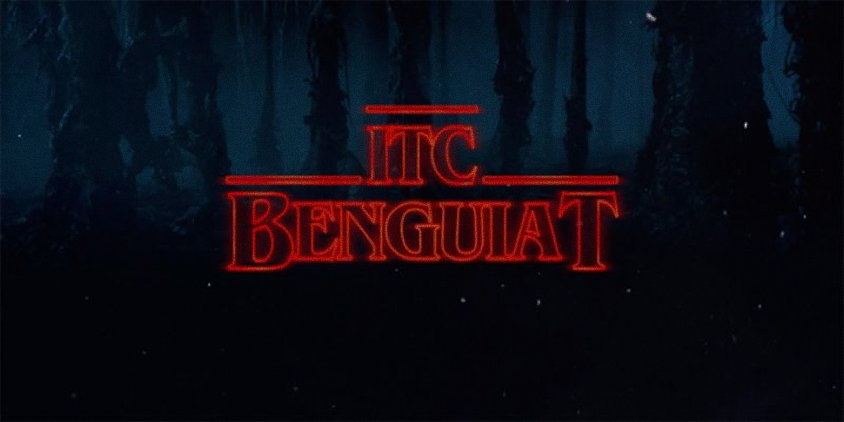 ITC Benguiat on Adobe Fonts
AS: So why did you choose it?
ED: It was actually the Duffer Brothers. We went through like a couple of different font choices. The original one was Serpentine, I guess. And we were animating with that for a while. But then we decided to go with ITC Benguiat because they were referencing so many Stephen King books, and the show itself was like a mix between Stephen King and Steven Spielberg, and a lot of Stephen King books had that font on the covers.
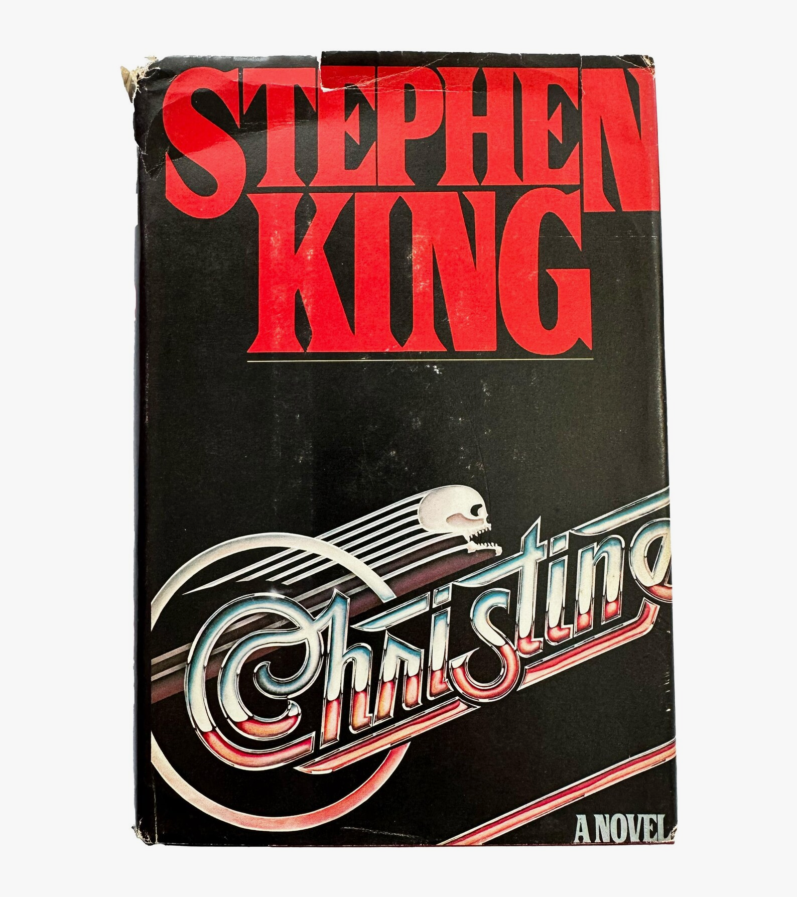 Christine by Stephen King, 1983
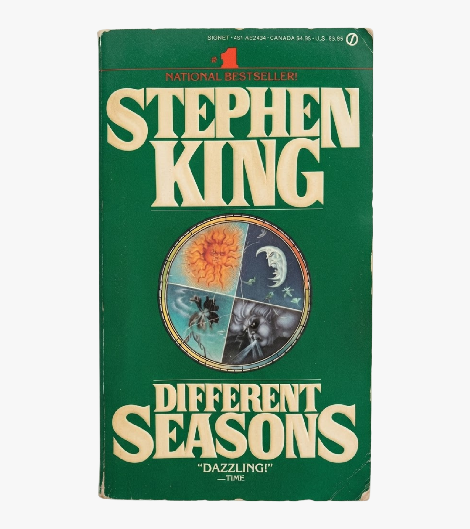 Different Seasons by Stephen King, 1982
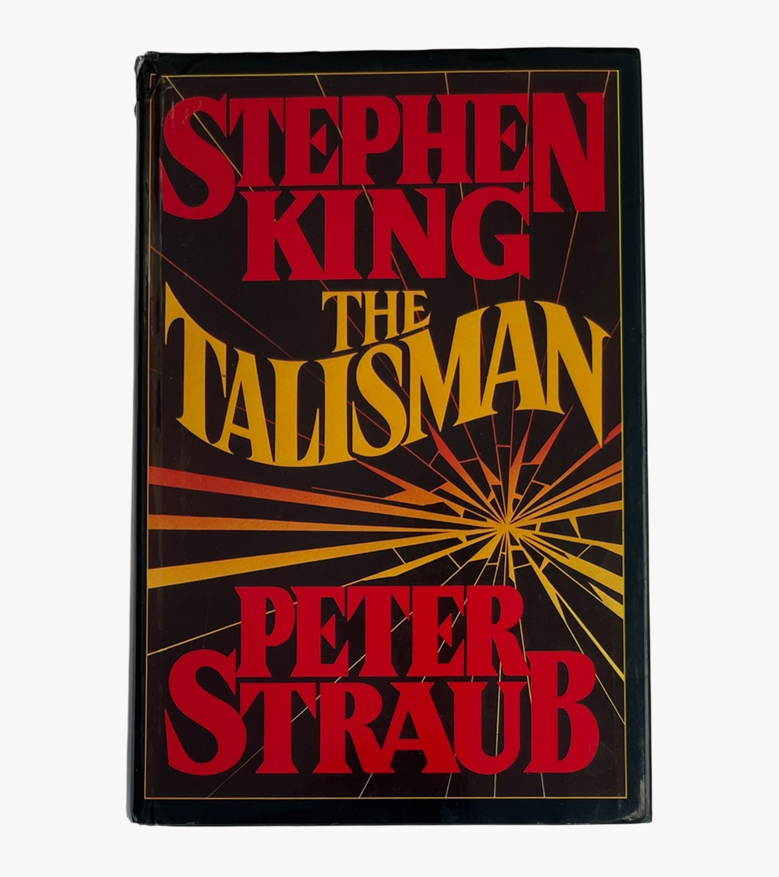 The Talisman by Stephen King, 1984
AS: Sometimes, shows that are released digitally localise the titles. Do you have any control over how people do it?
ED: It depends on what title it is. If it’s the main logo of the film, sometimes the production would want you to do, like, versions for different territories, but it depends mostly on if the producers care about the design integrity, which most don’t. A lot of times that stuff just ends up getting done by agencies local to whatever territory it’s in.
They just try to mimic it the best that they can. And that’s how it goes in 99% of the cases.
AS: Have you ever come across localisation examples that made you furious?
ED: Not for titles, but for my feature film, one of the territories designed their own poster. I was very upset with it. It looked nothing like the movie, but I had no control over it. Once it goes to marketing, it’s very hard to maintain control because then it’s design integrity versus what’s going to make the most money, sales-wise.
Sometimes they even change the title of the movie, which I can understand because of the differences between languages. So they’re just trying to make the best call. But sometimes it’s upsetting and frustrating.
AS: Most of the title sequences in this world are designed by a couple of studios.
How realistic is it for a young independent studio to break into the Hollywood design world?
ED: It’s tricky because it is such a specific niche. Like you said, there are a few studios; some of them have been around since the ’90s. And if you’re on a major Hollywood production, you tend to just get recommended vendors for things. If you’re going to do visual effects and you have the budget, you’re going to want to go to ILM, Weta or Double Negative — you’re going to go to the biggest, best visual effects house. The same thing goes for titles.
So if somebody wanted to break into that, I would recommend first getting into a company that works on title sequences to build up a portfolio of really credible projects. There will be people who break off from the biggest studios and start their own practice; they would probably be able to hire someone new.
I think that the tough part is, like, getting your portfolio, as having great work is different from having work that is reputable and that producers find likeable. If they see that you have worked on a really established film, then they’re more likely to hire you, and it’s hard to get to work on such a film, so it’s almost like a catch-22.
AS: If it’s a small, rather closed niche, do you feel like you are a community?
ED: Not really. We don’t have an online community or anything like that. But through working at different studios, a lot of us know each other. It’s kind of like living in a large neighbourhood — people know each other, but there’s not, like, a union.
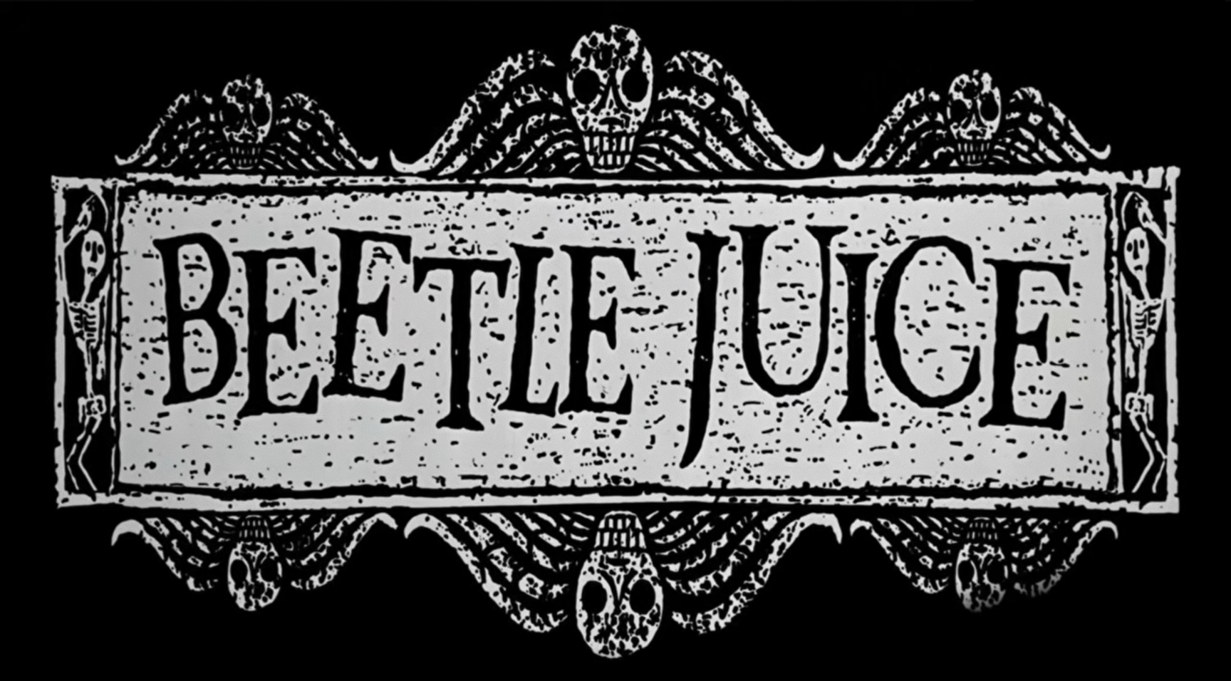
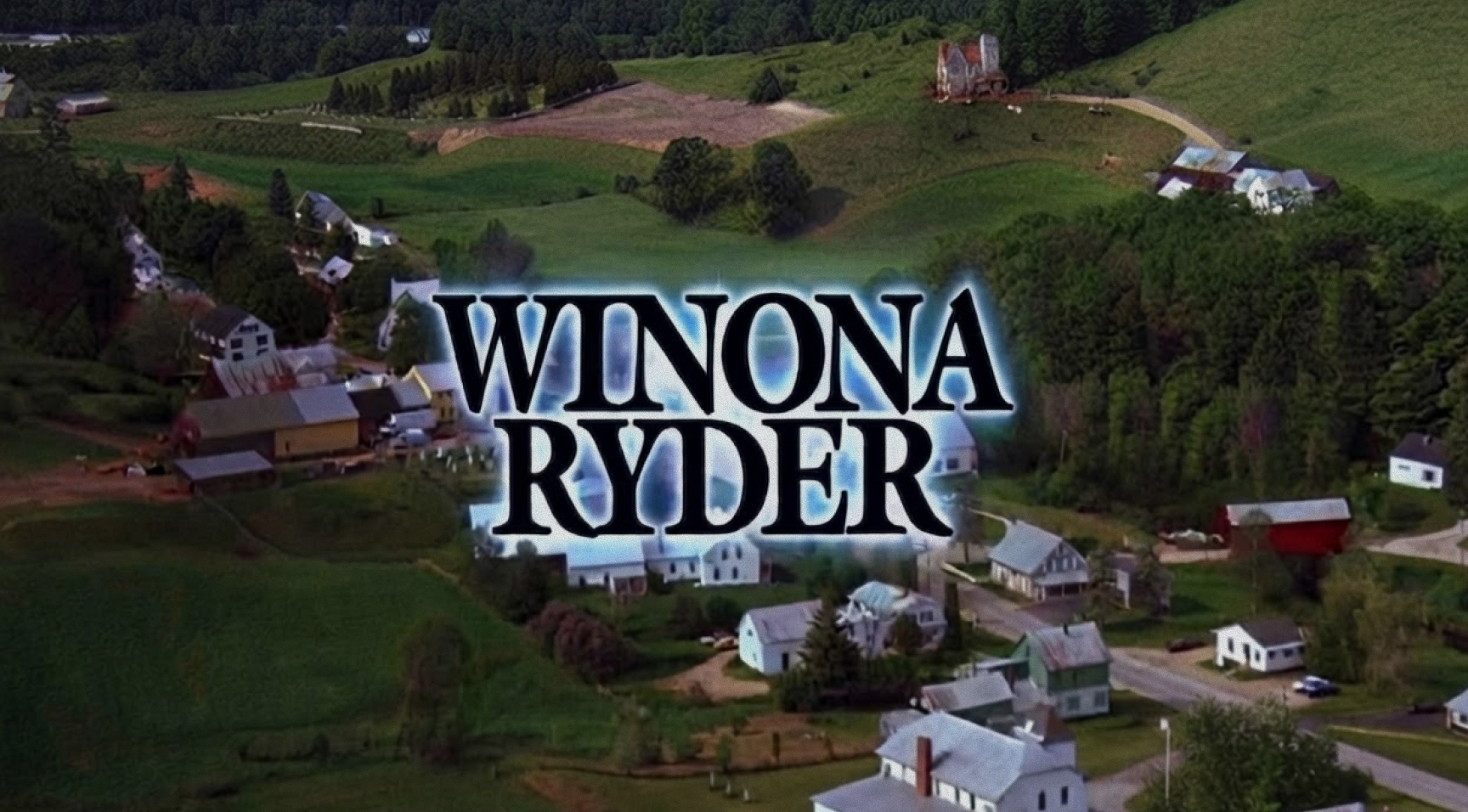
Title sequence for Tim Burton’s Beetlejuice. Design: Pablo Ferro, Robert Dawson
AS: What title sequences do I have to watch to build up my, like, visual experience?
ED: I feel like if you watch enough Tim Burton films, you’ll get a good sense of it. For me, that was what got me interested in titles. He’s always got very interesting sequences or prologues. Obviously, James Bond is known for its title sequences, which have been consistent throughout the years. And if you want to get a sense of the variety, just watch television, see what other people are doing, and check out the studios that are making titles.
Art of the Title is also a really good resource. It’s a website that has, like, every title sequence, and they usually do interviews with the title designers and stuff.
Just seek out title sequences wherever you can, but I’d definitely recommend starting with Tim Burton’s films!
Eric Demeusy
ericdemeusy.com
@ericdemeusy
actionvfx.co/course-titledesign-2026