
Meme-inspired type by David Rudnick, neural network producing type, type designers on strike, custom type for Russian state and Ukrainian capital city, and 12 more type news of last December.
Curated by Misha Berezin

Braille, Visible
typeroom.eu/content/his-latest-project-kosuke-takahashi-upgraded-braille-all
Braille Neue, the new project by Kosuke Takahashi, combines tactile Braille code with visible glyphs, resulting in a universal typeface for sighted and visually impaired. The new writing system does not require additional space and could be easily integrated into existing wayfinding infrastructure. Takahashi suggests Braille Neue be used for Tokyo Olympics and Paralympics 2020 “to create a truly universal space where anyone can access information.”

French Type Designers Join Nationwide Strike
Workers all over France continue their month-long strike against the new pension plan: Emmanuel Macron’s government proposes raising the full retirement age and cutting pensions for several categories of citizens. Graphic and type designers have also joined the stuggle: Velvetyne Type Foundry, known the world over for their free-to-use fonts, have suspended their website, redirecting all viewers to Formes des luttes, the thematic resource of protest posters (many of them employ relevant and powerful typography).
Ilya Ruderman, type.today: Designers all over the world voice their opinion more and more often. The majority of speakers at any design event mention the global warming problem and no American designer skips on a chance to oppose Donald Trump. Designers (well, most of them) feel responsible to the community, and they tend to get more and more political.

Print Magazine (1940–2017), Set To Relaunch
printmag.com/uncategorized/print-is-not-dead-printmag-com-is-back
Print, the industry magazine of graphic design was founded in 1940 and existed through 2017. Last December the brand was acquired by a team of “industry veterans”: Debbie Millman (Design Matters), Steven Heller (The Daily Heller), Andrew Gibbs (Dieline), Jessica Deseo (Dieline), Deb Aldrich (D’NA Company) and Laura Des Enfants (D’NA Company). The publication is soon to be relaunched online.

War Is Over At 50: Who Was The Designer?
fontsinuse.com/uses/1159/war-is-over-if-you-want-it
War Is Over (If You Want It), the iconic poster paid for by John Lennon and Yoko Ono turns 50, it was hung at Times Square on Christmas Eve’69. Nick Sherman, the founder of HEX Projects and Fonts In Use, pulled together the few things we know about the poster’s history into a short article. Sadly, the author of the typographic composition still remains unknown.
Yury Ostromentsky, type.today: My favourite poster. Someday, I’d love to know the person and the story behind the image are discovered. Things like this should be taught in schools and colleges, so that the kids knew how to make the common truths heard.


Commercial Classics Release Multi-Layered Display Type
commercialclassics.com/catalogue/caslon_rounded/
commercialclassics.com/catalogue/thorowgood_grotesque/
Commercial Type released several updates to the Commercial Classics collection. Unlike their historical prototypes, Thorowgood Grotesque Dimensional and Caslon Rounded Ornamented consist of several visual layers and each of them can have a separate color. Type designers seem to be more and more keen on multi-layer and multi-color, and that might become of the type trends of 2020.

Didone, But Witty And Charming
Paris-based Alex Chavot released Kellar, a classicist serif named after McKellar, Smiths & Jordan type foundry and the illusionist Harry Kellar. Just like the name suggests, the font is very 19th Century, but in a peculiar way, with certain clumsiness of proportions and boxy letterforms making the Didone typeset unexpectedly vivid.
Alex Slobzheninov, tomorrow.type.today: A truely relevant, contemporary Didone is such a rare sight — after all, the genre is so pretentions — but that is exactly the case, thanks to the fine work with the details.
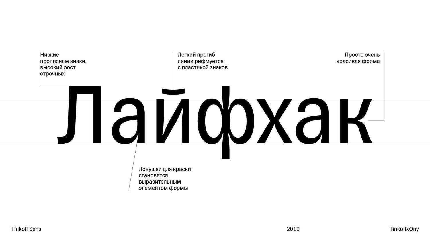
Custom Type For Russia’s Leading Digital Bank
Moscow-based ONY Agency designed a custom font, along with graphic guidelines for Tinkoff, a large Russian bank set to turn into digital ecosystem. Oleg Sans, a slender and narrow neogrotesque with visible inktraps designed by Konstantin Lukyanov, will be used in all external communication of Tinkoff Bank, Tinkoff Insurance, Tinkoff Mobile, and every other sub-brand.
The release of Oleg Sans triggered some discussion in the Russian type design community, with some commentators focusing on the questionably mild character of the typeface and pointing out its graphic flaws, others reflecting on the state of local custom type industry. If you can read Russian, check out the discussions on Facebook: Type&Typography group, Lukyanov’s personal page, comment by Maria Doreuli (Contrast Foundry), comment by Yuri Gordon (Letterhead Studio.)

Custom Face For Russian Government Web Design System
Paratype released Golos, a five-style-strong type family for Russian Digital State Standard, a web design system for Russian government developed by Smena Agency.

Paratype’s Take On Modular Display Type
Paratype also released Grrr, a contemporary display family with reverse contrast, modular structure, and Bezier-inspired forms.
Yury Ostromentsky, type.today: It’s nice to see large type producers experiment. The result raises lots of questions, but I’d only like to pose one: why the font with explicit graphic influence from SwissTypefaces’ catalogue, namely, Brrr, is named the way it is? Similarity, coincidence is natural with producers looking in the same direction. But when it’s even the name that’s similar, I can’t help but feel the thing is a derivative. UPD: Paratype answered my question, assuring me that this was a pure coincidence. This story is yet another reason to acknowledge how important it is to thourougly explore and monitor the enviroment you exist in, for exluding any chance of such unpleasant coincidences.

Gudrun Zapf von Hesse, 1918–2019
fontshop.com/designers/gudrun-zapf-von-hesse
vimeo.com/321295456
Late Gudrun Zapf von Hesse was a female pioneer of type design and the spouse of Hermann Zapf (1918–2015). She took on studying calligraphy in the 1930s, her first metal face, Hesse-Antiqua, was cut in the 1940s, in 1976 she took part in designing the first retail digital font, Marconi. In 1991 von Hesse received the Frederic W. Goudy Award for outstanding practice in the field of typography. For Hesse’s centennial, in 2018, Monotype published a new digital version of Hesse-Antiqua.

Graphic Design Is David Rudnick’s Passion And Now, A Font
twitter.com/David_Rudnick/status/1212047076256813057
David Rudnick is, arguably, the graphic design personality of the 2010s: he made retrofuturism cool, he invented the chrome type, and also designed dozens of fonts for his own projects. December 30, 2019 Rudnick announced a “stupid” free-to-use font to be released before the year ends, a promise followed by posting the design process on Twitter. Passio Graphis is a thin glyphic face, inspired by Graphic design is my passion, the famouse ironic meme set in Papyrus. The font file also includes the frog glyph.

Type Trends At Typographica.org
typographica.org/features/our-favorite-typefaces-of-2018
Typographica.org have published their annual, the collection of reviews for typefaces released in 2018. Great chance to learn what is the thing: reverse contrast, inktraps, display serifs, slant play, variability and contextual alternates.

How To Knit Type
Typographic Knitting, a book by the Zurich-based designer Rüdiger Schlömer was published last October and has already received the TDC Certificate of Typographic Excellennce and a nomination for Design Prize Switzerland. Which technique is best for knitting letters, how to turn a digital font into an analogue pattern, and 32 manuals for knitting fonts by Bold Monday, Emigre, Lineto, Nouvelle Noire, and Typotheque. The book is a must for graphic and type designers aspiring to make something palpable and wearable.

Neural network has created a typeface using Google Fonts
“Type is a beautiful group of letters, not a group of beautiful letters.” Machine Learning Font, realised by Luke Prowse, is declared to be neither. The free font was designed by a neural network, fed with the 2674 pieces of Google Fonts catalogue (including Spectral, which can be downloaded at type.today free of charge). Each glyph took an average of five hours machine learning: some were a no-brainer, while others (b) presented unexpected difficulty for the algorithm. The font has two versions (one is untouched by human hand), both include contextual alternates.
Alex Slobzheninov, tomorrow.type.today: Will the computer ever be able not only to find the average letterform, but to follow the trends, create something new with scrupulous attention to every detail? And when that happens, will we still perceive text with our eyes?


Photos: TypeJournal.Ru
Yuri Gordon’s New Book
yurigordon.com/ru/shop/books/kniga-pro-moi-bukvy-kniga-s-podpisju
Yuri Gordon, co-founder of Letterhead Studios, released The Book Of My Letters, in which he tells the stories of custom and retail faces he has designed since 1994.
Yury Ostromentsky, type.today: “What did the author mean?”
Designers cannot talk or write. That is simply not our business. Some of us can edit text, some produce emotive graphic outcries, others can sort or shorten things. Thankfully, most of us can read.
No special training or crash course would change the situation. The designer doesn’t have to compose letters into words or sentences, there are plenty of other people to do that.
As usual, there are exceptions. As usual, an exception is Yuri Gordon. Say all you want about his subject or his writing style, or even his design style. The main question of type historians, tour guides, and future design students is answered by the author himself. The author is among us.

Is Serif Type The 2020s Type?
theoutline.com/post/8385/didones-font-of-the-decade
Issues of typography are now covered by The Outline, a progressive American online magazine. The main idea: geometric sans is going out of fashion. In the 2020s we would be surrounded by something very different, quite possibly, that would be serif type.
Mind the headline though, it’s a conceptual faux-pas: today’s heroes are not only Didones, but also the transitional and the contemporary serifs. Apart from that, the article is a valuable take on contemporary typographic austerity.
Alex Slobzheninov, tomorrow.type.today: Forget it! The new decade will see type designers have fun any way they want to — not limiting to just serif fonts. The industry evolves in too exciting a way, graphic designers are soon to have much more tools than ever before.


Kyiv Type, Unofficial Face For Ukrainian Capital
telegraf.design/news/dmytro-rastvortsev-stvoryv-variatyvnyj-shryft-dlya-kyyeva
Dmytro Rastvortsev (who designed a custom face for NAMU Museum, covered in the Issue One of our digest) is developing a font family for the unofficial tourist brand of Kyiv, capital of Ukraine. Kyiv Type has three sub-families, Sans, Serif и Titling, each of them is quite display. The project is paid for by Kyiv residents: Banda Agency, Projector Design School, Dmytro Bulanov Creative Büro. Kyiv Type is set for release in early 2020.
Alex Slobzheninov, tomorrow.type.today: I’ll take the liberty to say it is still quite raw and somewhat awkward, the curves are unsteady, the styles are quite questionable. It might turn out great though, they just have to take their time to develop and polish the design.
Last December our Instagram was in the hands of Asya Cherepanova. Cheers, Asya!
This January we welcome Oleg Turbaba, who covers his everyday design process in his Telegram channel (in Russian).