Disclaimer: the answers we provide apply only to children with good vision (or those wearing prescription eyeglasses), without any special learning needs.
Is it easier for children to read text typeset in larger sizes?
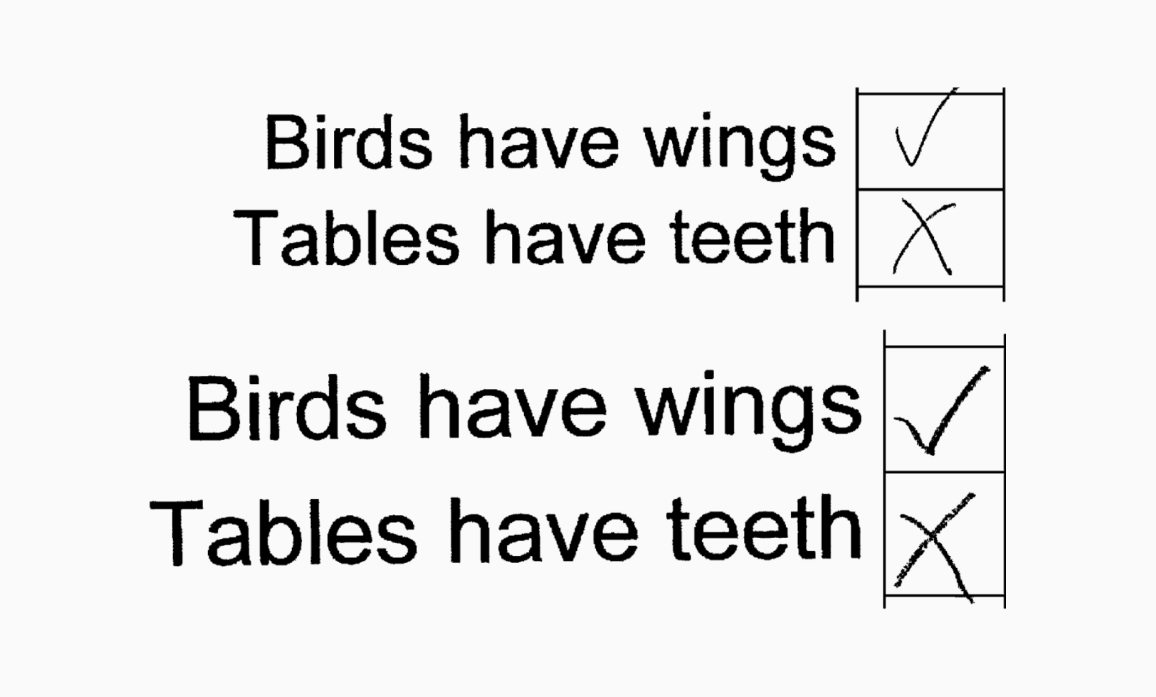
Most likely, yes. In 2009, a team of researchers from the University of Essex conducted an experiment involving 43 children aged from 7 to 8. Kids were asked to tick true statements (such as ‘birds have wings’) and cross out false statements (e.g., ‘tables have teeth’). The first half of the statements shown was set in 22 pt, while the second half was set in 26 pt. The point size didn’t affect the number of right answers, yet the children completed the tasks set in a larger size faster.
Is it true that children make fewer mistakes if they read text set in a sans serif typeface?
Most likely not. In 1965, Swedish scientist Bror Zachrisson carried out an experiment in which he divided 74 boys into two groups. The first group was taught to read using only serif type, while the second one, only sans serif faces. Then the researcher gave the participants texts set in four typefaces, two serifs (Bembo and Nordisk Antikva) and two sans serifs (Consul and Gill). The children performed equally well when reading in all four font options.
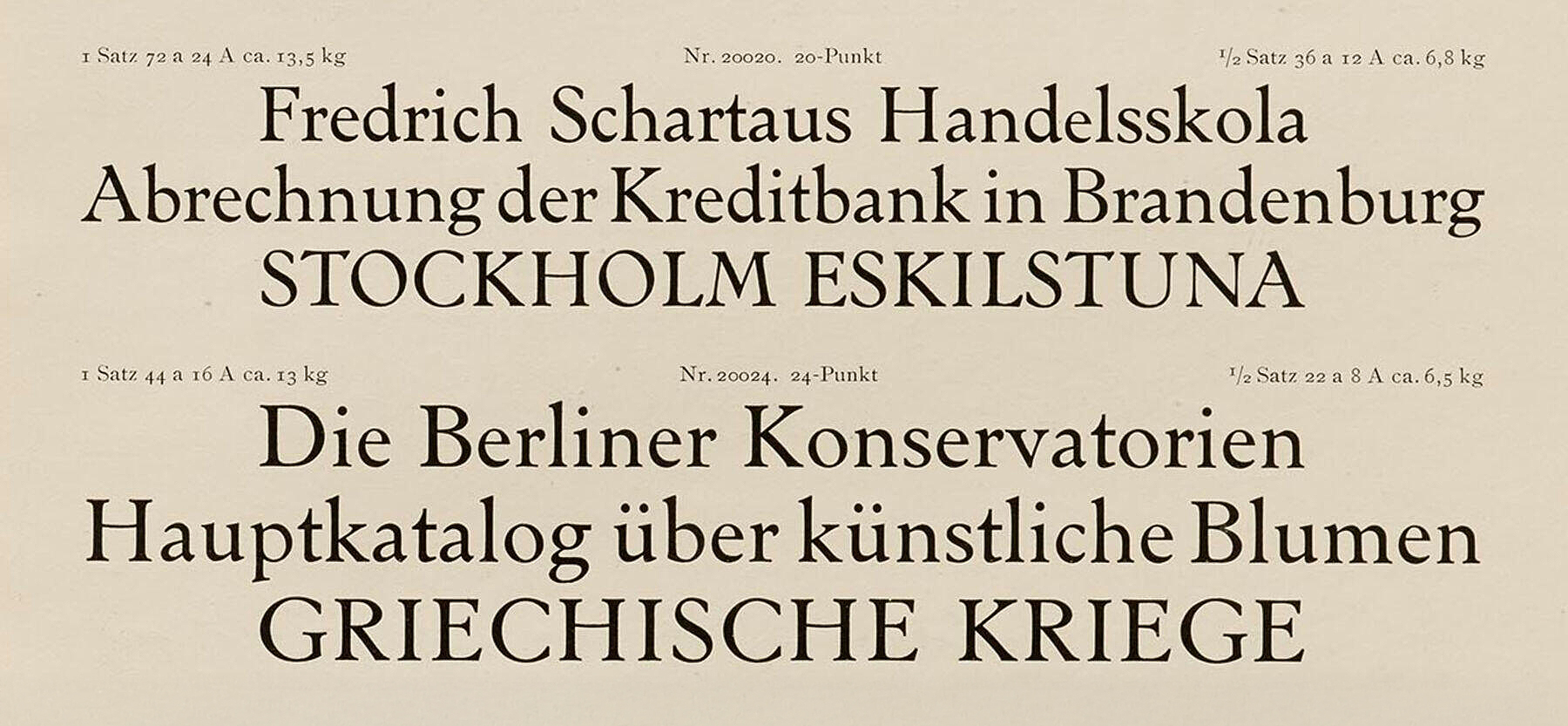 Nordisk Antikva, 1910s. Image: Letterform Archive
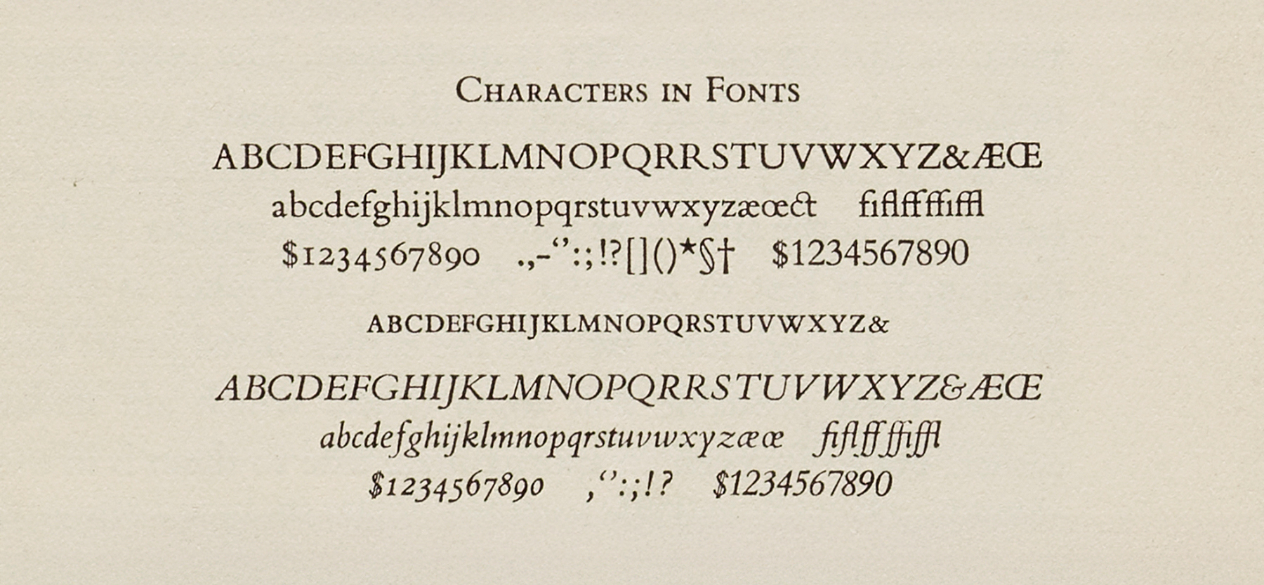 Bembo, 1929. Изображение: Letterform Archive
 Consul, 1926. Image: Bibliothèque spécialisée Paris
 Gill, 1935. Image: British Letterpress
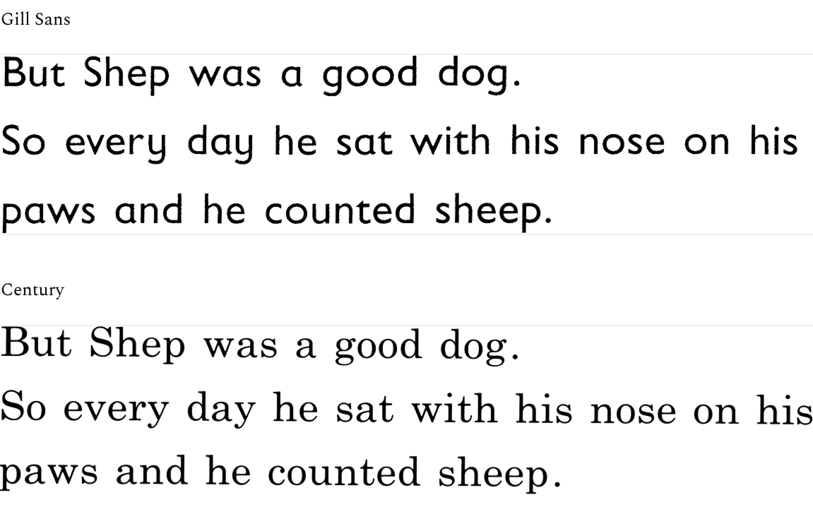
Zachrisson’s findings were confirmed by a study published by Sue Walker and Linda Reynolds of the University of Reading in 2013. The researchers showed 24 children text set in Century and Gill Sans, and the kids managed equally well dealing with text typeset in two different fonts.
 Materials Sue Walker and Linda Reynolds handed out to kids
So where does this stereotype come from, then?
In 1980, Bridie Raban surveyed 271 teachers, two-thirds of whom stated that they preferred textbooks set in sans serifs, as the sans serif graphics are more similar to how kids tend to depict their first letters themselves.
A study conducted in 2005 by a team of researchers from Stephen Austin University showed that children tend to confuse certain letters with one another in a serif typeface more often than they do when dealing with a sans serif. However, the amount of such errors is statistically insignificant.
Does it mean that it doesn’t matter what font a children’s book is set in?
Not quite. In 2011, Blondina Elms Pastel defended a dissertation on how children are sensitive to type design. In the conclusive section of her work, she writes that a child’s attitude towards the typeface used in educational materials is important for their motivation to learn to read. That is, those who design typefaces for textbooks should primarily keep in mind the audience aged from 4 to 7 years (the average age at which people learn to read).
However, a font one likes doesn’t necessarily mean a font that’s easy to read. For example, in her article in Books for Keeps, Sue Walker recounts how, when she did research for her book The Songs the Letters Sing, a 7-year-old participant shared that she really liked French Script, even though she struggled with reading it.
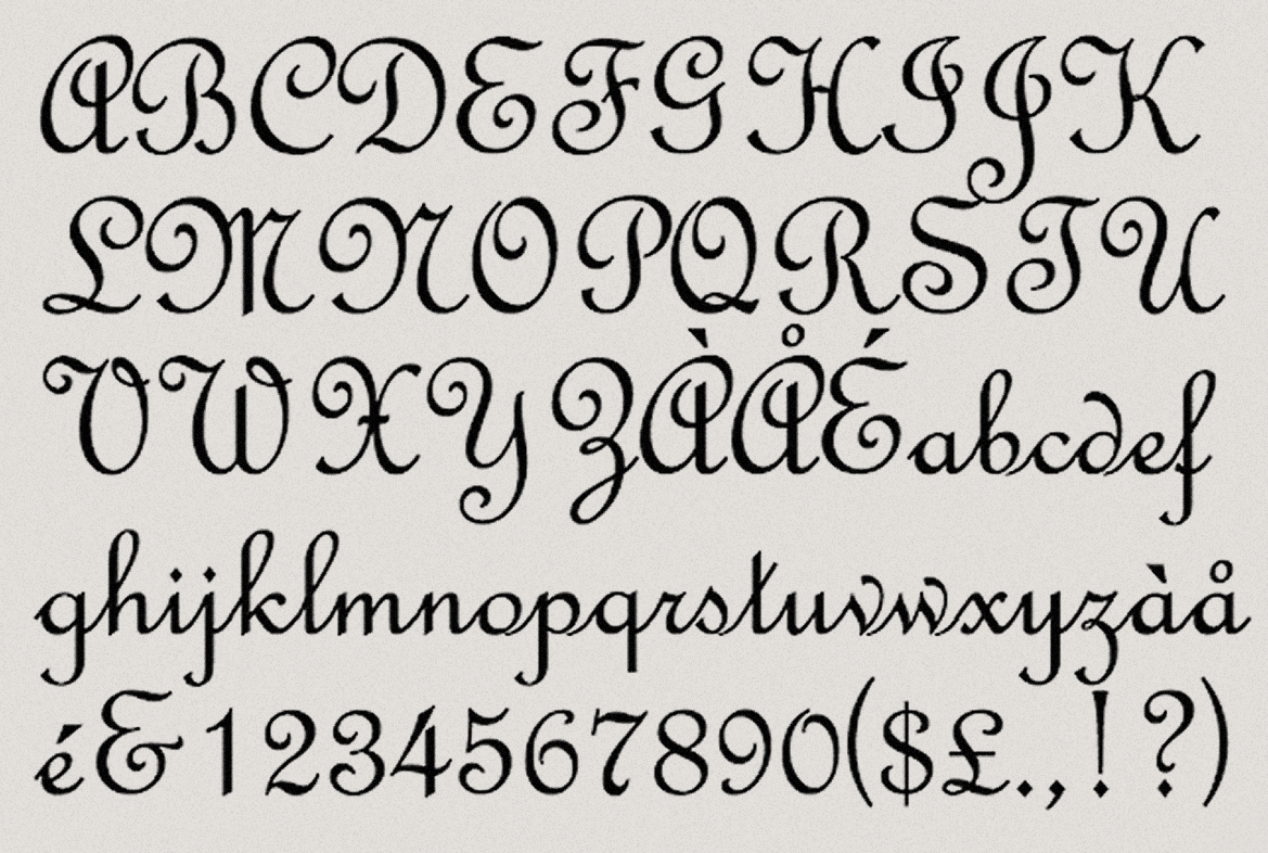 French Script, 2001. Image: MyFonts
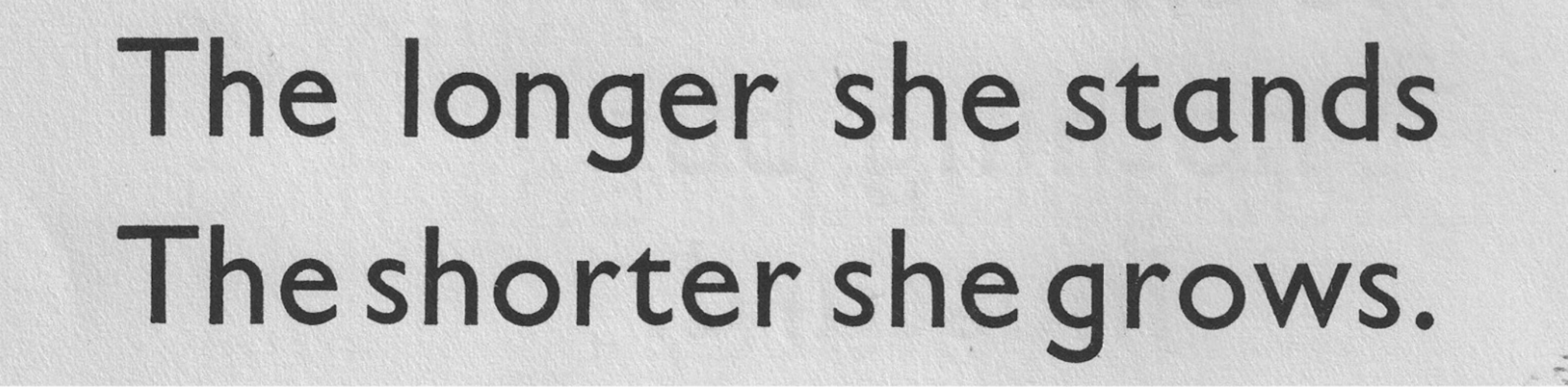
Single-storey a and g are known as infant characters. Is it true that they are easier for children to read?
Most likely not. Yet this stereotype was actively supported by teachers in the early 20th century, for the same reason as the one about sans serif type being better legible. In 1931, Eric Gill (at the request of a teacher, Augusta Monteith) even had to design an additional, single-storey g for Gill Sans so that the typeface could be used to set a children’s poem collection, The Pink Book of Verse.
 Eric Gill’s single-storey g. Image: About the Letter G
 Little Ones’ Own Picture Reader textbook, 1924. Image: About the Letter G. Image: About the Letter G
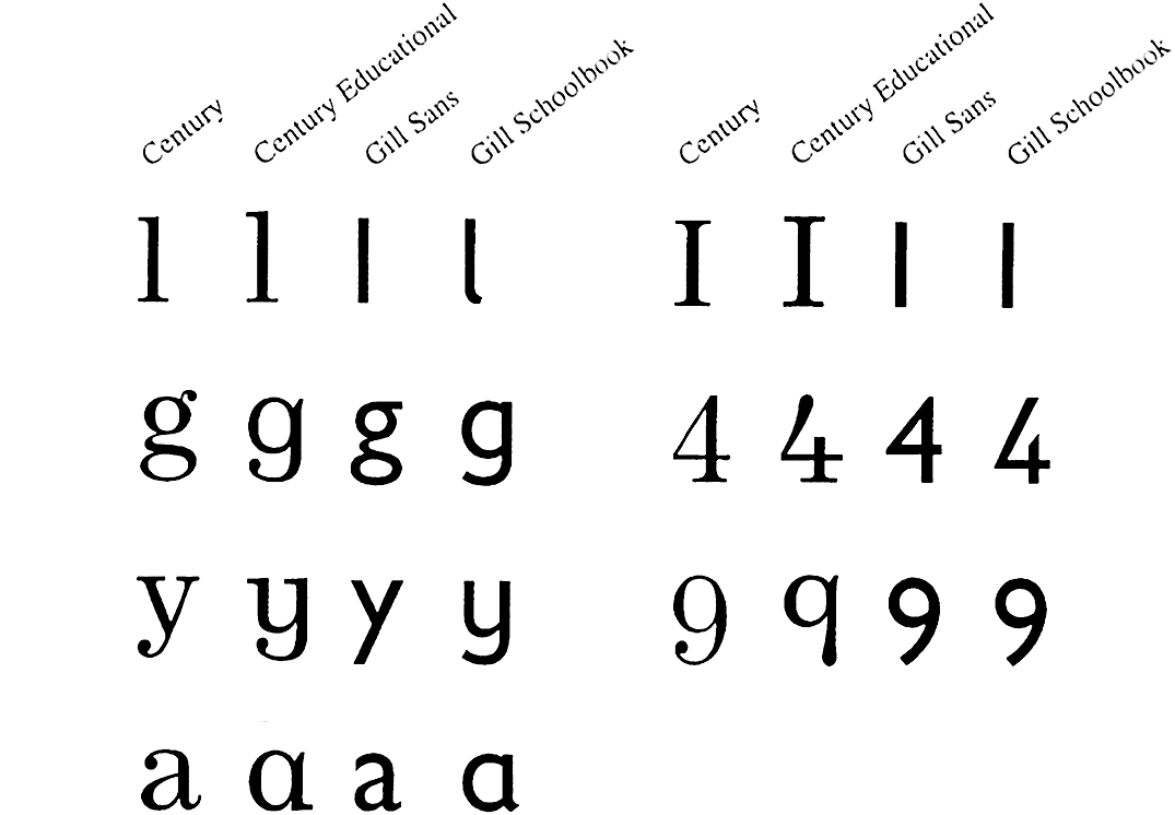
Already mentioned researchers Sue Walker and Linda Reynolds of the University of Reading (along with many other scientists) conducted several experiments to confirm or disprove this stereotype. They showed children texts set in Century and Gill Sans and their adapted, children-friendly versions (besides single-storeyd a and g, these fonts had different glyphs for 1, 4, 9, I, l, y). Kids read all versions of the text equally well and quickly.
Education expert and expert in handwriting Rosemary Sassoon also spoke our against this stereotype. That said, the Sassoon Primary typeface, which she designed with designer Adrian Williams, features single-storeyed a and g. These fonts are now distributed on MyFonts under the name Sassoon-Williams.
 Sassoon-Williams Start Bee Infant. Image: MyFonts
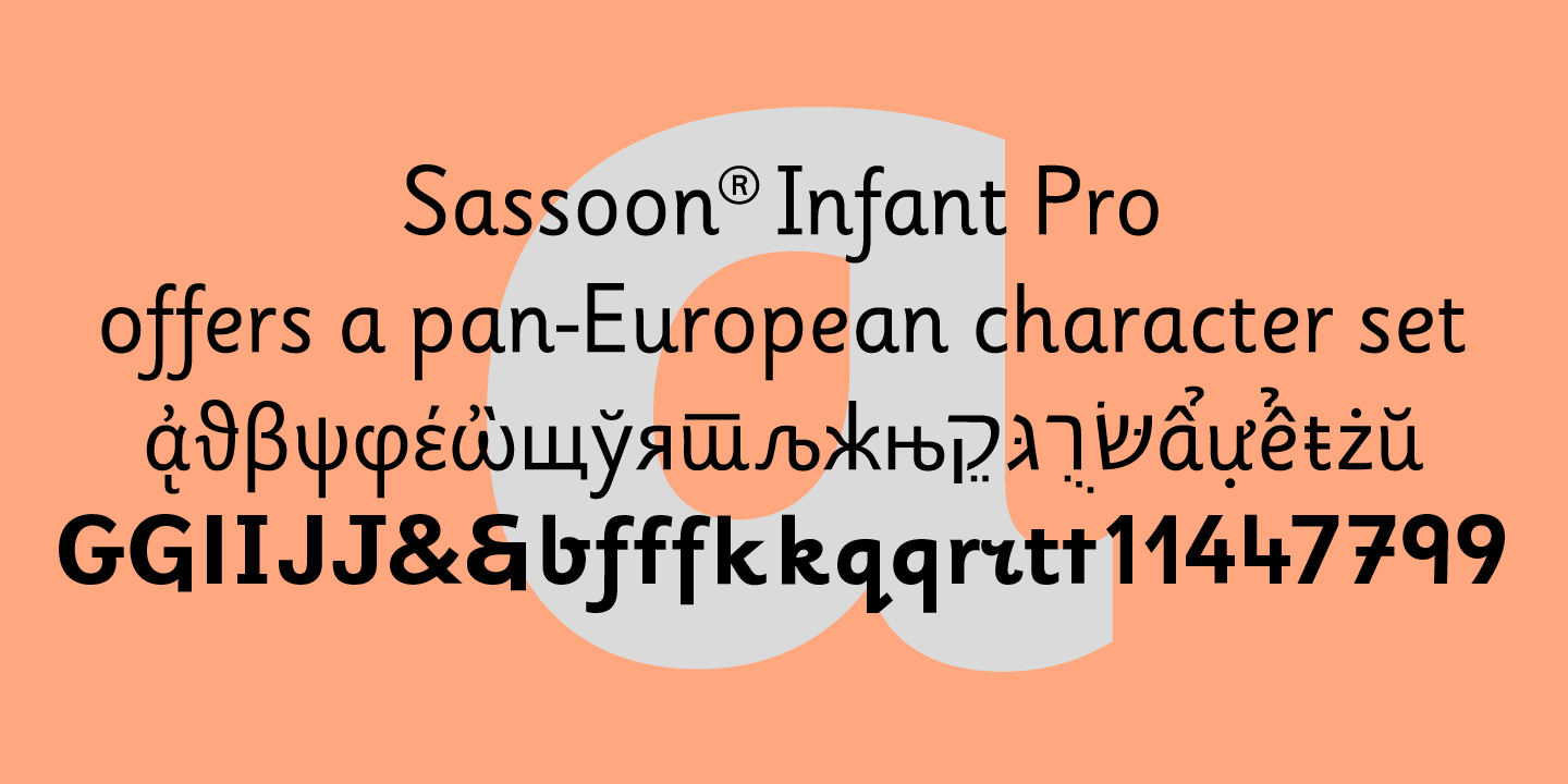 Sassoon-Williams Infant. Image: MyFonts
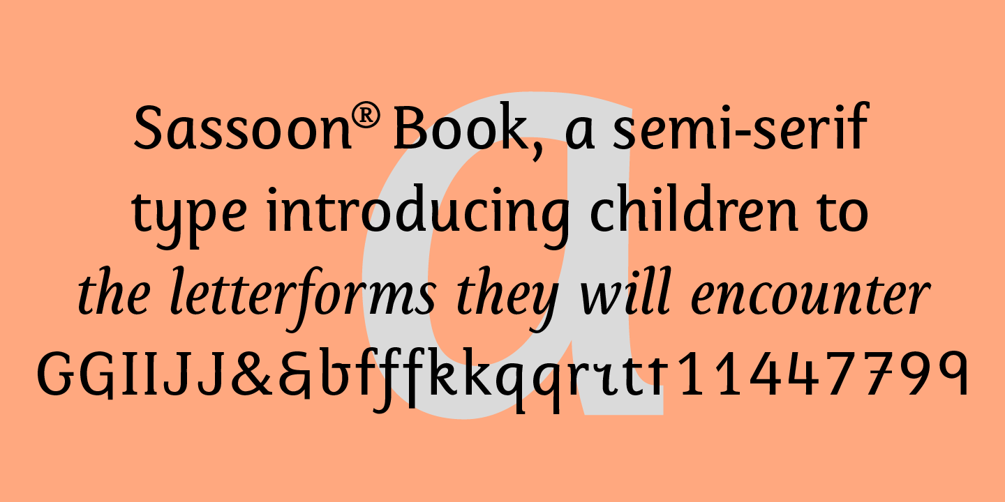 Sassoon-Williams Book. Image: MyFonts
Who does research in children’s typography?
Researchers in many different fields could be doing that. This aspect was mentioned in an article by legibility researcher Ann Bessemans. This kind of research is often done by psychologists or educational experts, and in the process of work on their advice or materials they do not normally tend to consult type designers who work with publications intended for children or design typefaces for this kind of literature. In her research, Sue Walker often mentions designers with whom she collaborated to develop materials for testing children, and Ann Bessemans herself graduated from the Plantin Institute for Typography before obtaining her PhD at Hasselt University.
Can the studies mentioned be trusted?
We don’t know. In each of the materials we referred to in this piece, authors state that the body of research on reading and legibility when it comes to children is small (as of 2011, there were only 52 such studies), and therefore it is hard to consider the available data absolutely reliable.