Typefaces of the Month, Matthijs Sluiter’s Picks
Fonts In Use editor and Type Specimens curator Matthijs Sluiter has selected the most notable typeface
Releases
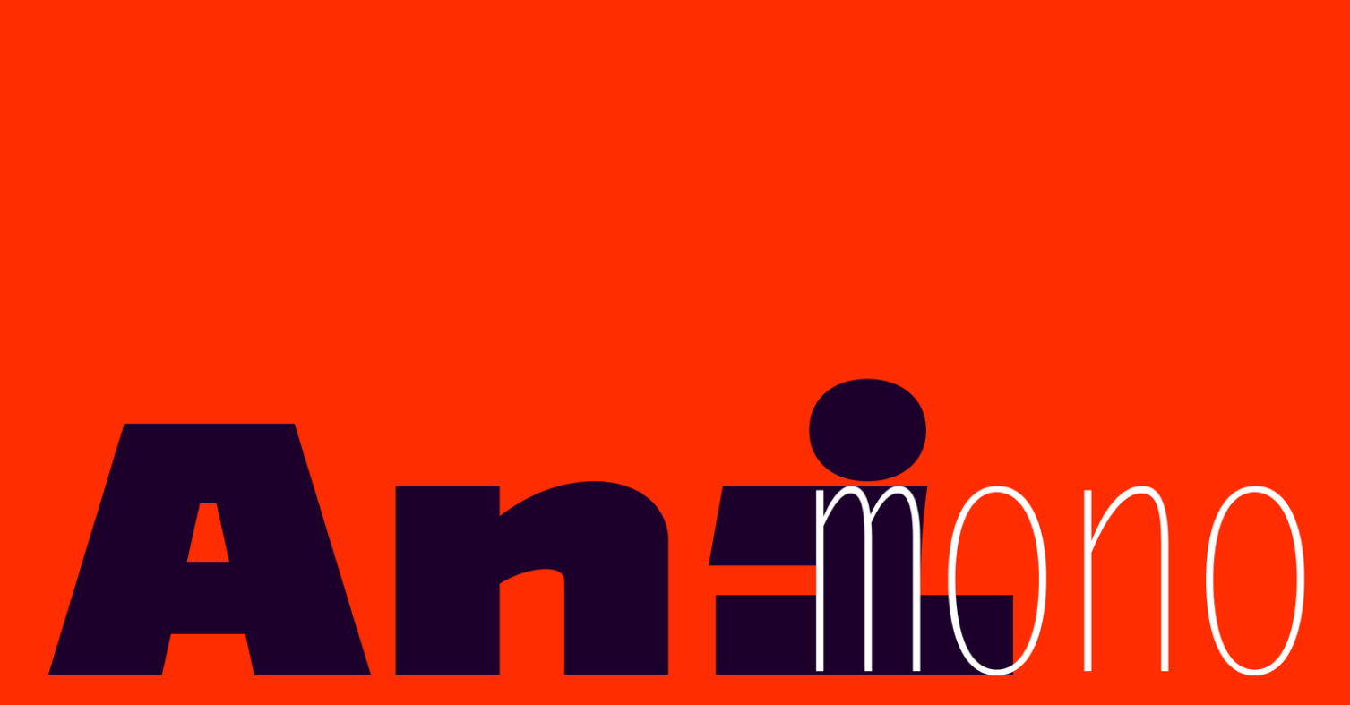 Animono, Storm Type
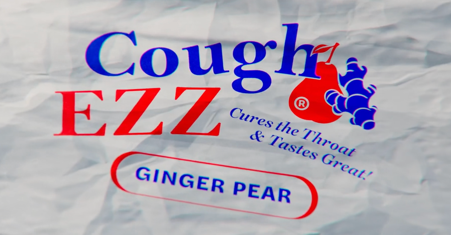 Daith, Darden Studio
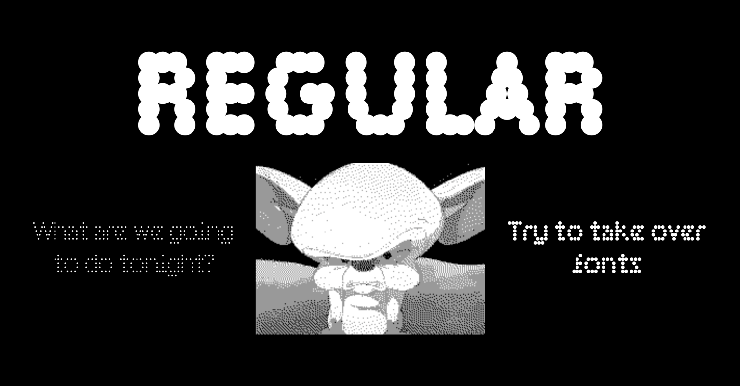 Parma Sans, Metis Foundry
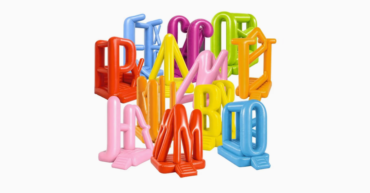 Peignot Jumbo, Production Type
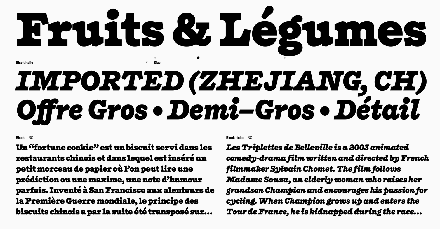 Redward, Sharp Type
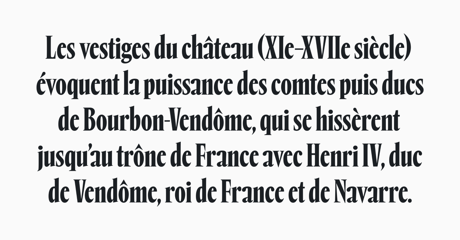 Rempart, Douglas Hayes
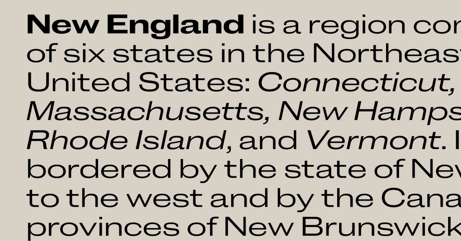 New Doric, Commercial Type
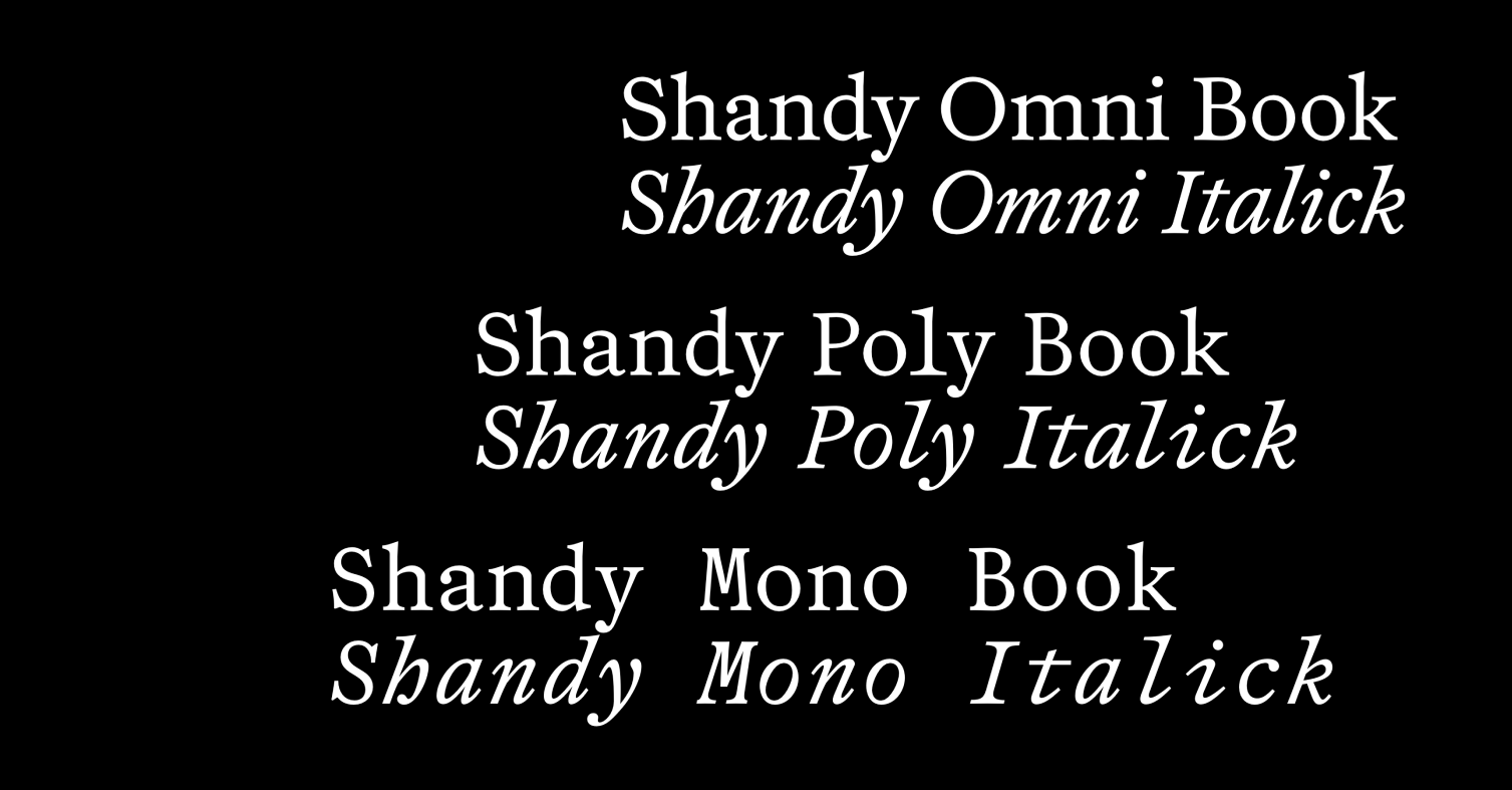 Shandy, The Pyte Foundry
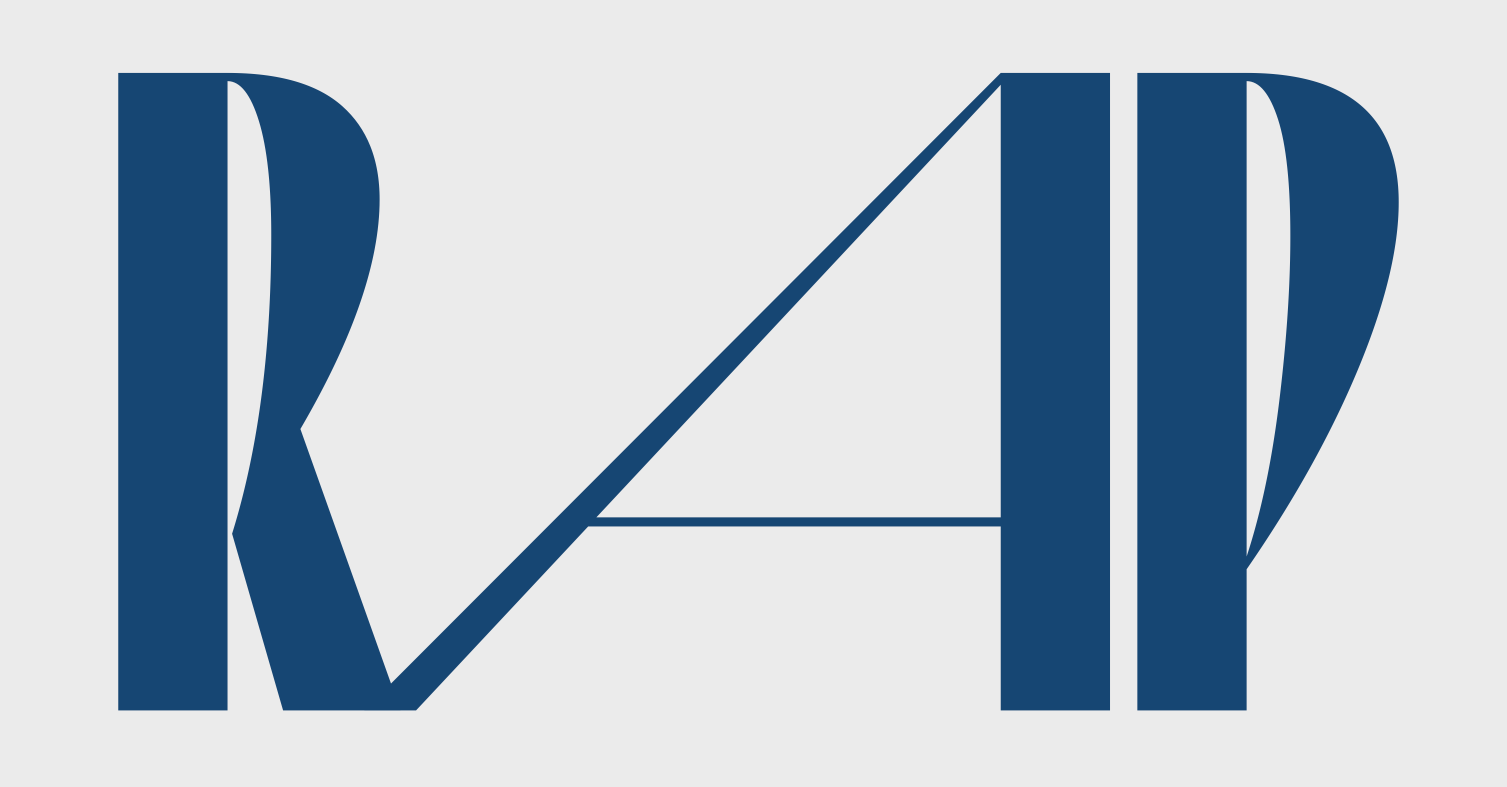 Thaw, Superior Type
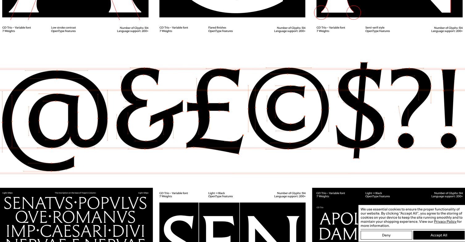 GD Trio, Gärde Design Studio
Updates and family extensions
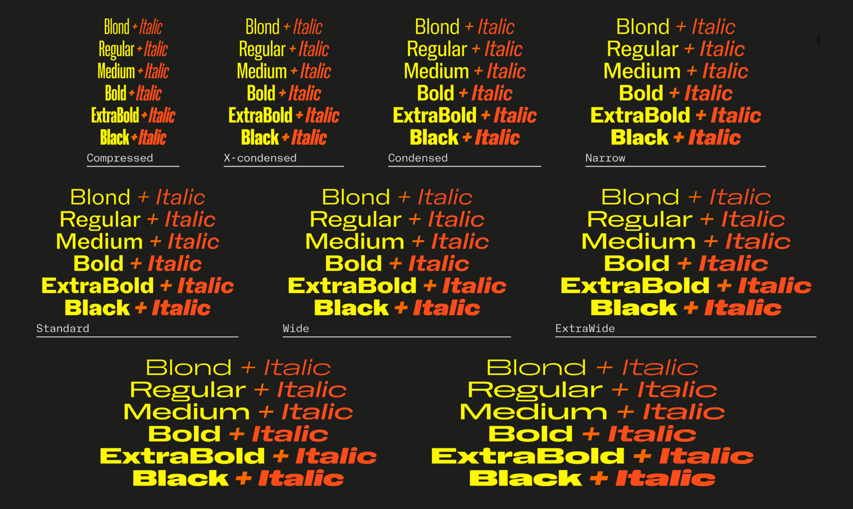 Nan Holo has grown with four new widths, plus italics and Panafrican Latin support for all styles.
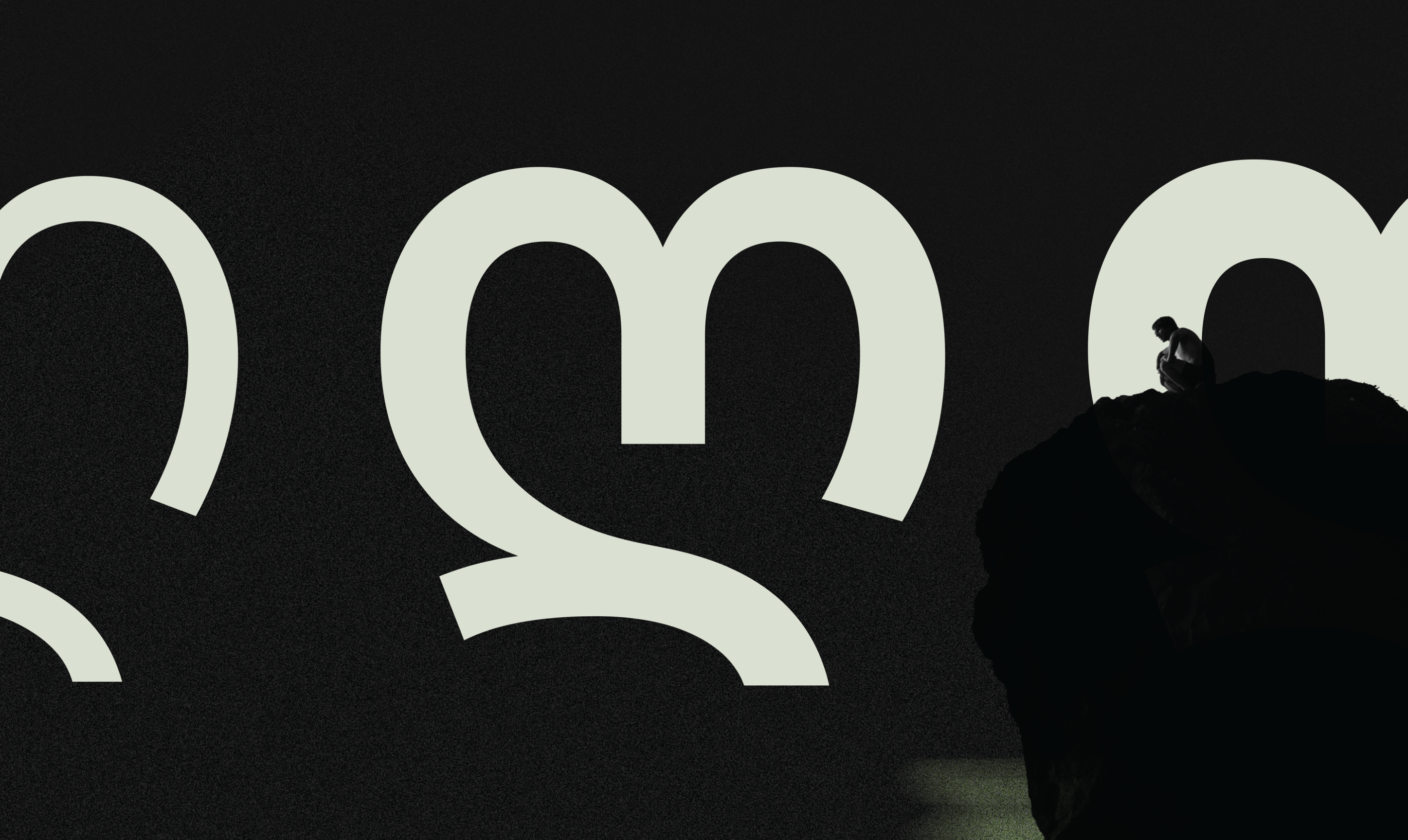 The extensive script support of Pangea from Fontwerk was extended once again, this time with Georgian by Akaki Razmadze
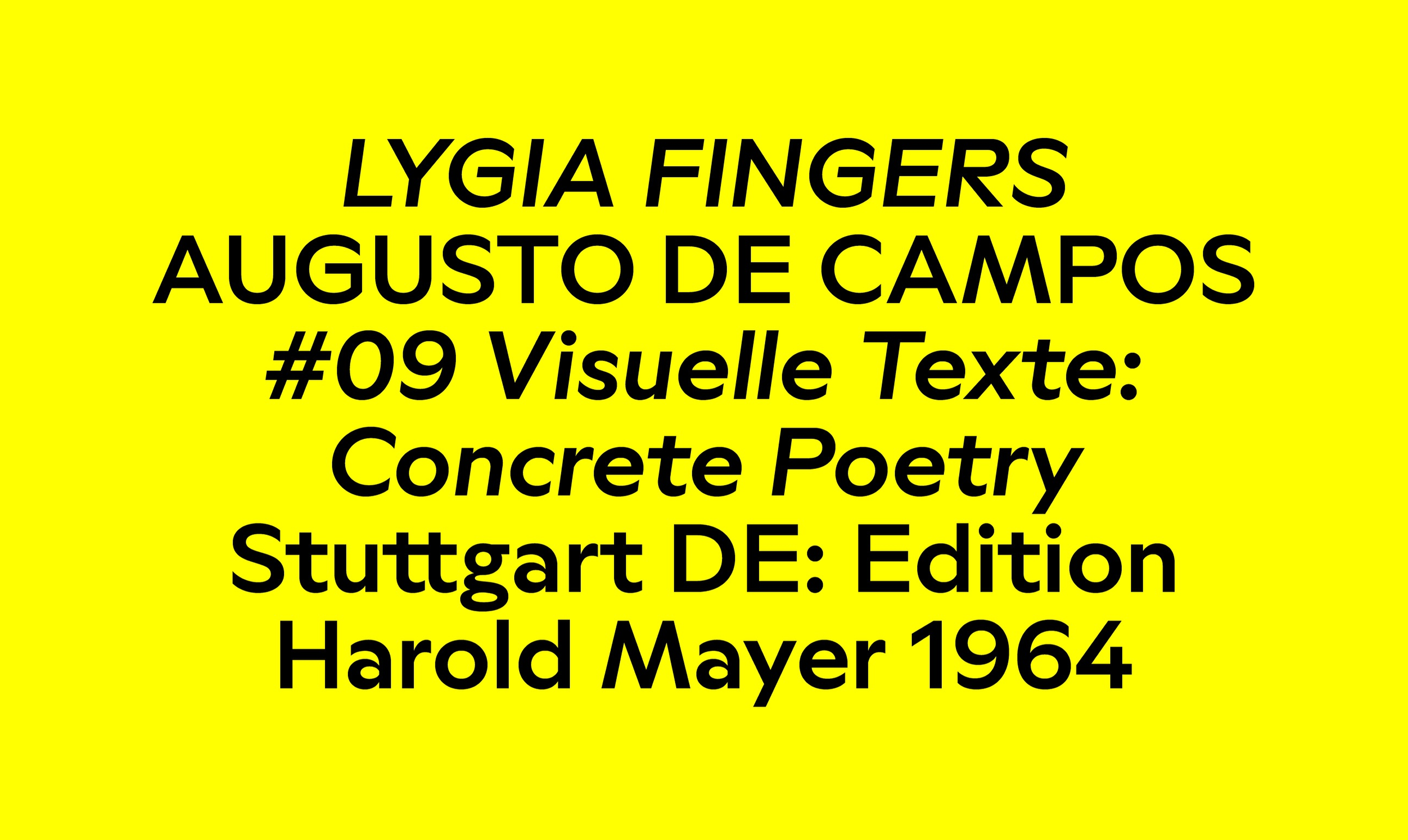 British Standard Type added italics to Ritma
Google Font Filter
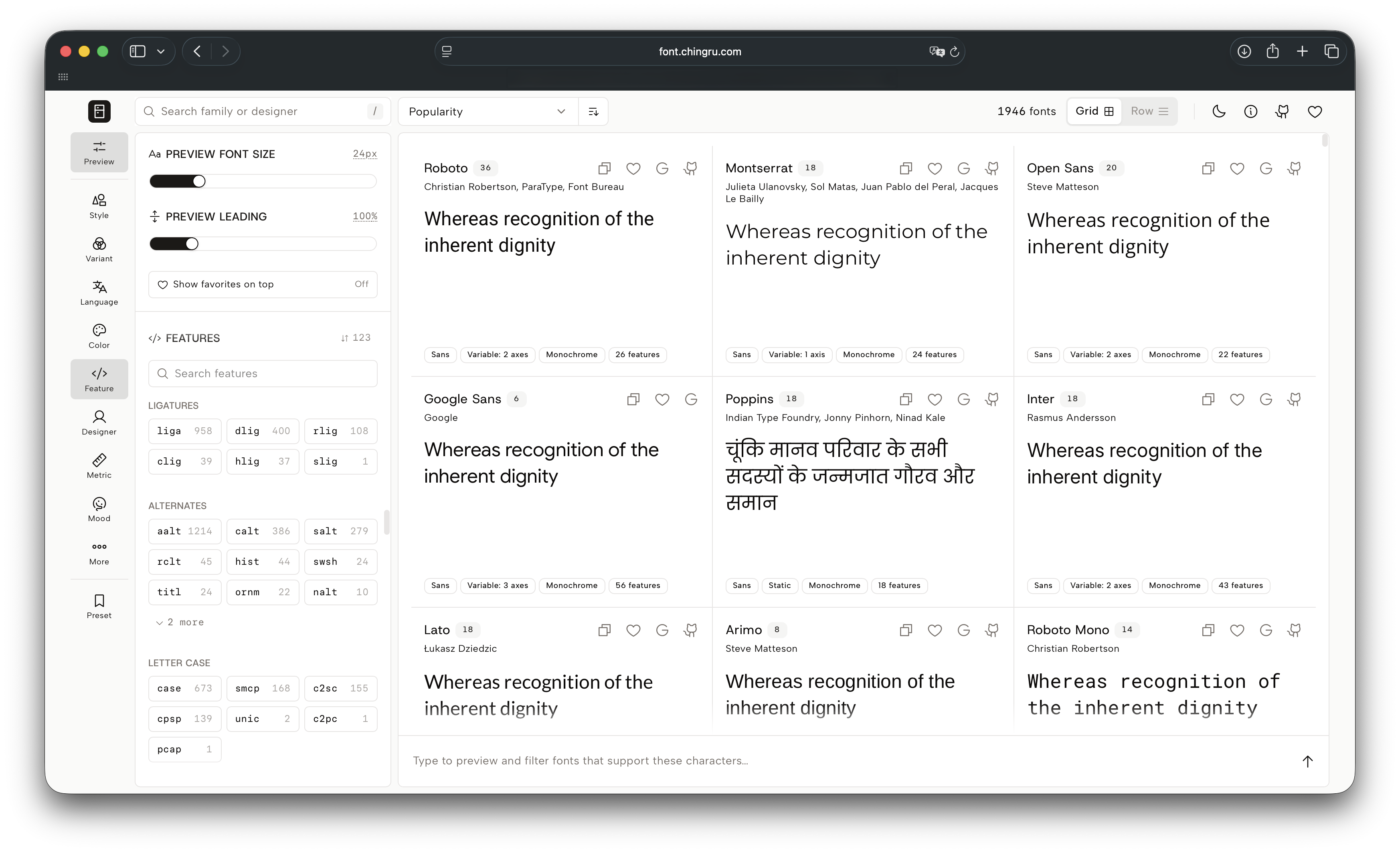
We now have a tool that makes it easier to search for fonts in the Google Fonts collection. FontFridge displays the same fonts as the Google Fonts platform, but offers a wider choice of filtering
Fonts-and-AI 2.0
trust.ilovetypography.com/font-tech-ai
In October this year, I Love Typography will host another Fonts & AI conference. Among others, the programme is curated by type designers Alice Savoie, Petr van Blokland, and John Hudson.
How to do ‘civic branding’ (and should we even?)
The NYC administration plans to launch a network of city-funded stores aiming to lower grocery prices and has announced a Request for Proposals for its branding and design consultant. Considering how Mayor Zohran Mamdani is incredibly good at turning the designers he works with into stars, any studio would dream of landing this project.
In her new piece, Elisabeth Goodspeed explains why all this is not that simple (the budget is rather modest, the 83-page Q&A document is vague) and argues that the term ‘civic branding’
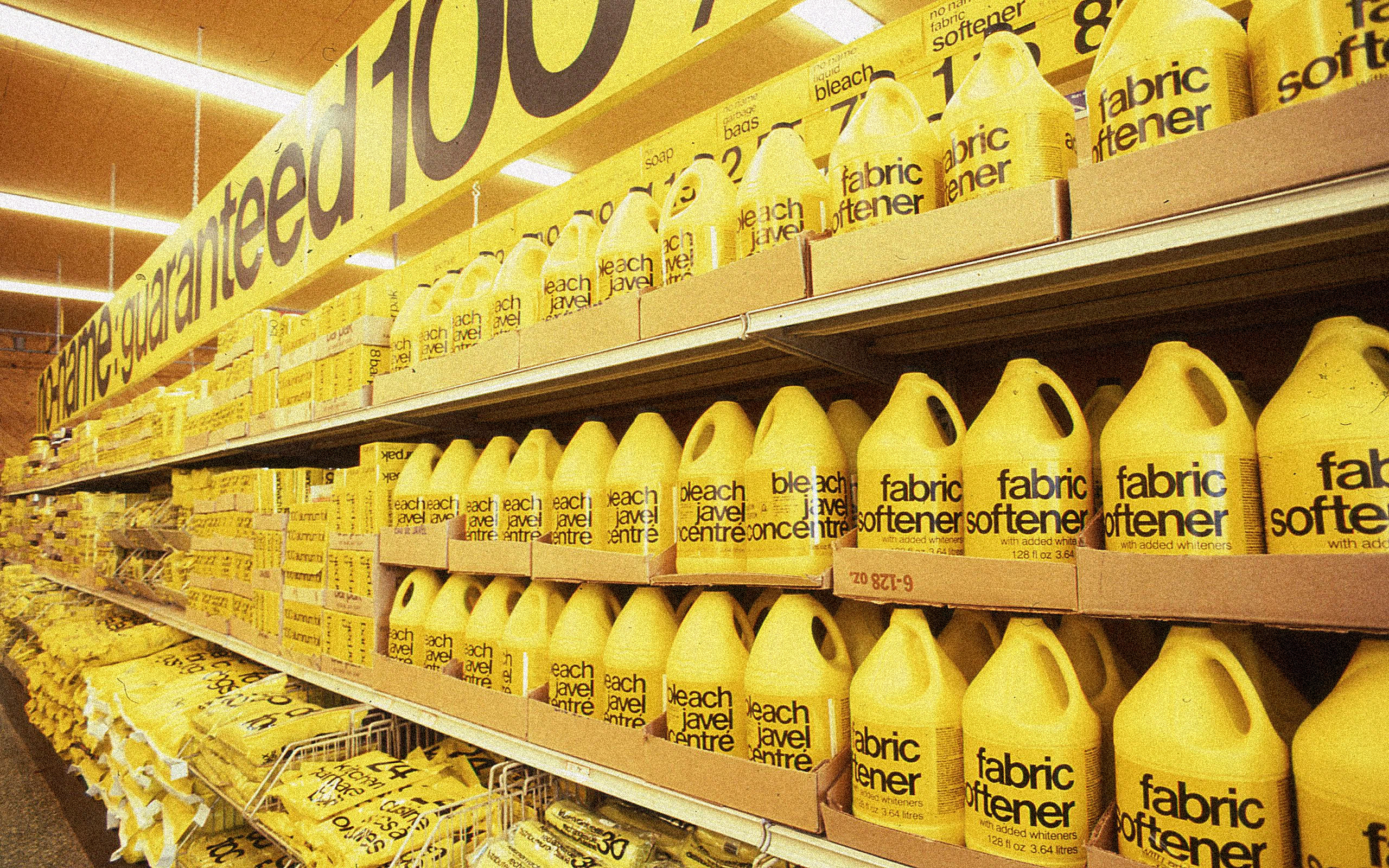 Don Watt: No Name branding. From Elizabeth article on It’s Nice That
A regular Tuesday at Monotype
In April, František Štorm terminated his contract with Monotype. He had been promised that all Storm Type fonts would be removed from the company’s servers. Instead, however, Monotype is still selling, for instance, modified and renamed versions of Serapion and John Sans (with the abbreviation MT added to the font names). Nadine Chahine — co-founder of I Love Typography and former Monotype
Apparently, Monotype responded to the frustration of the type
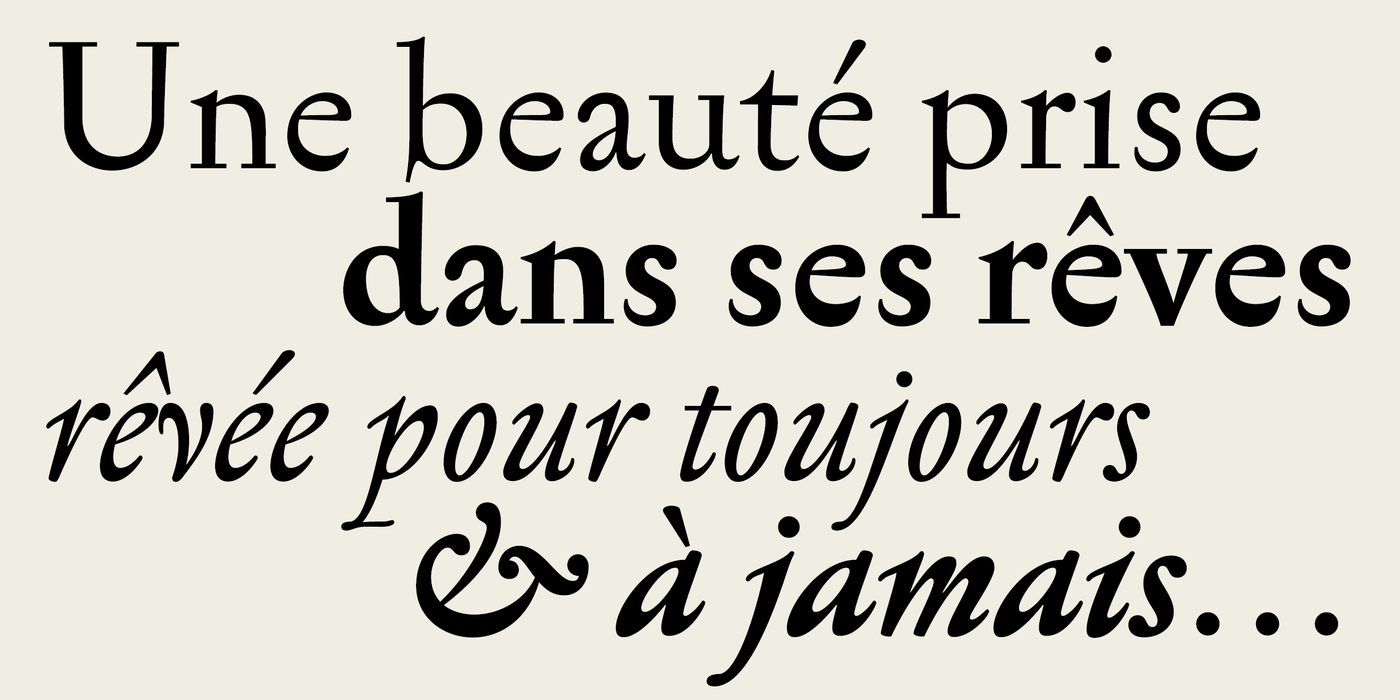 Serapion by Storm Type
Hyperézier curves
https://linebender.org/blog/hyperbezier/
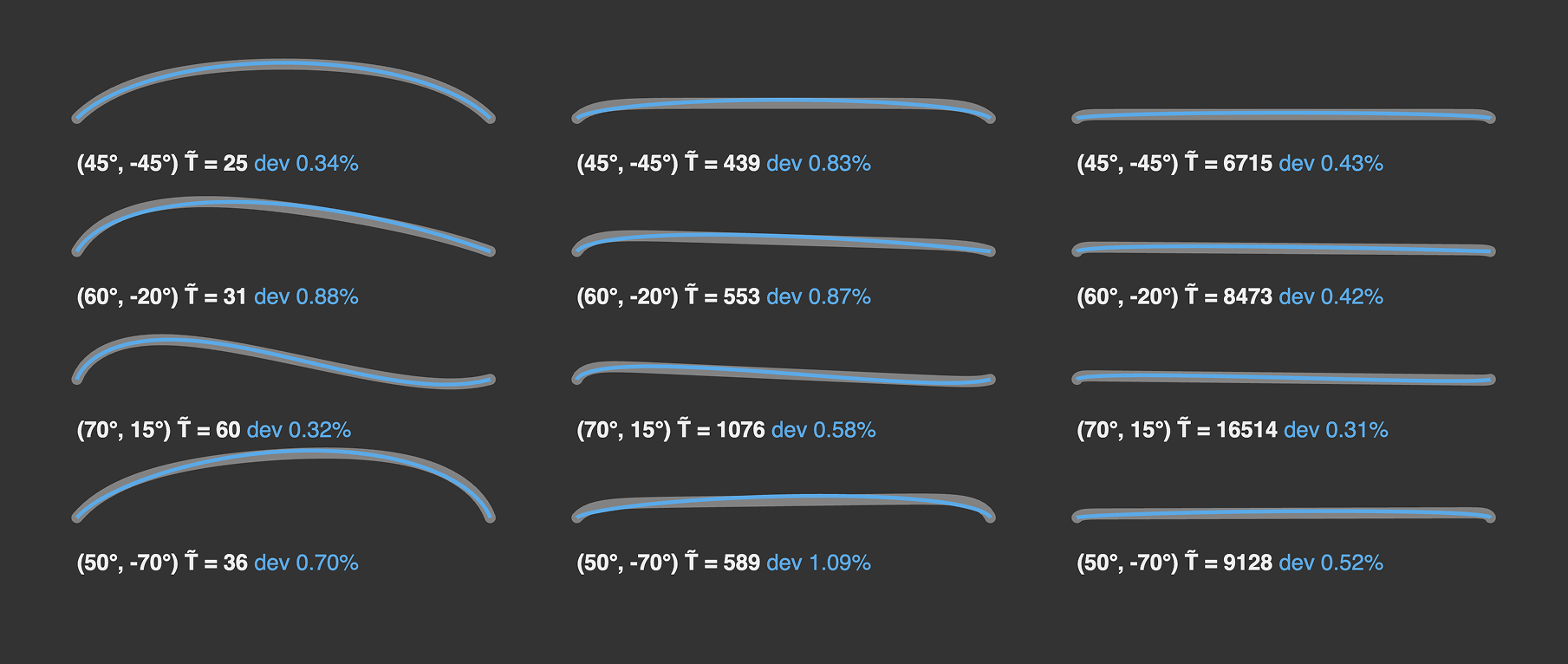
Web developer Raph Levien spent a long time looking for an alternative to Bézier curves and wrote a PhD thesis on Spiro curves in the process. This month, he posted a comprehensive article on the mathematical nature of hyperbézier
Nicer Tuesday every day
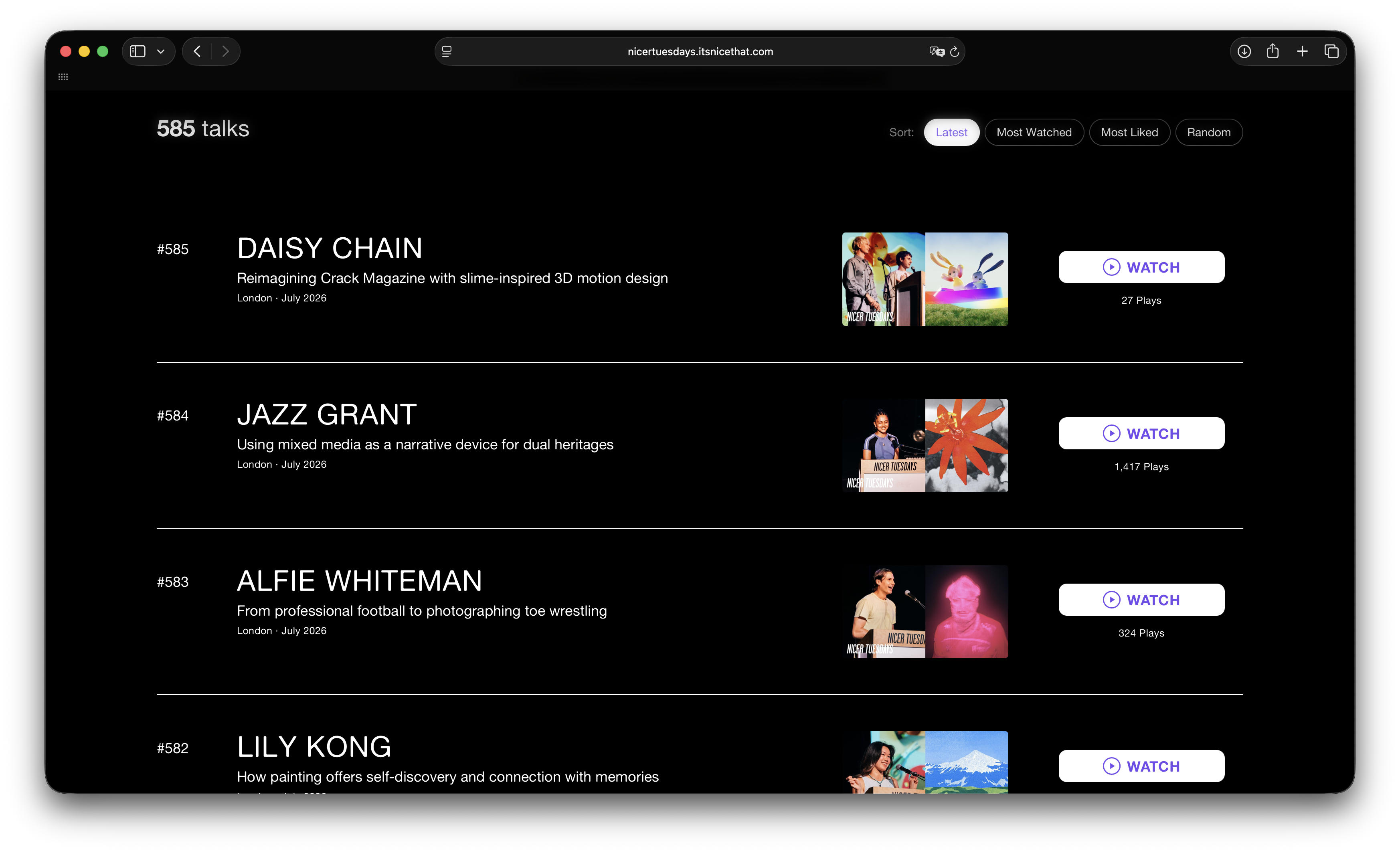
It’s Nice That has launched a website featuring all the talks delivered by designers, artists, and photographers as part of Nicer Tuesdays, monthly events held in London, New York, and Los Angeles.
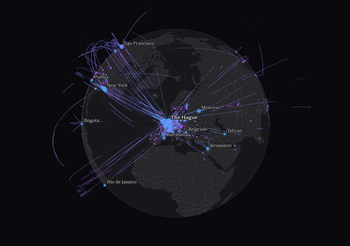
Who produces the most typefaces?
type.lol/studies/where-type-comes-from
The Type.lol
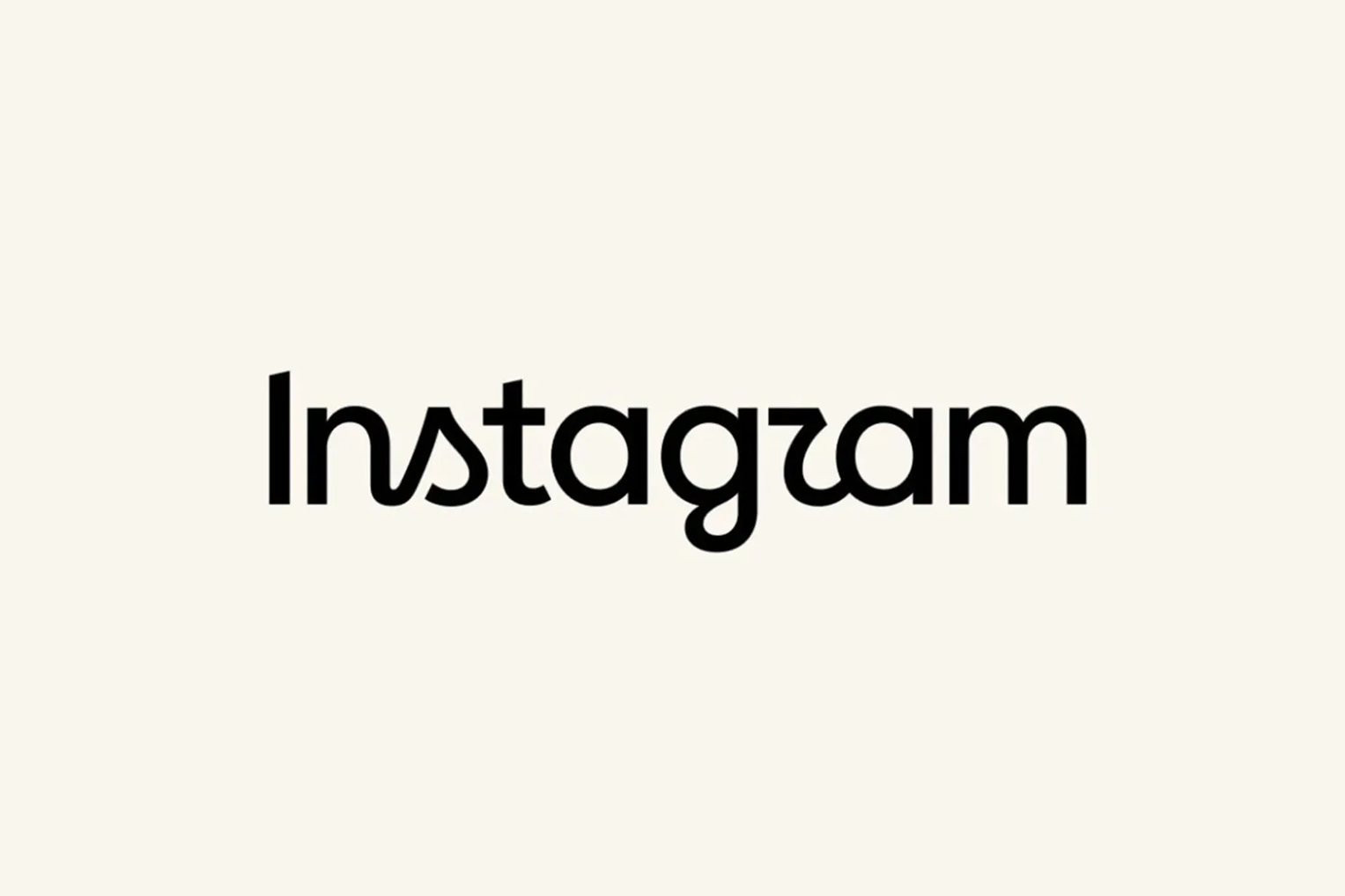
New Instagram logo
meta.com/design-at-meta/blog/the-new-instagram-brand-identity
Instagram has updated its brand identity for the first time in ten years. The Koto studio was in charge of the brand system
 New wordmark
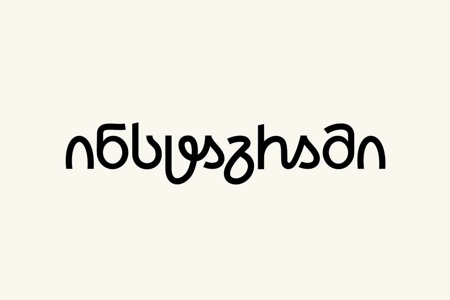 Georgian localisation by Abo Akhvlediani
Shield against AI
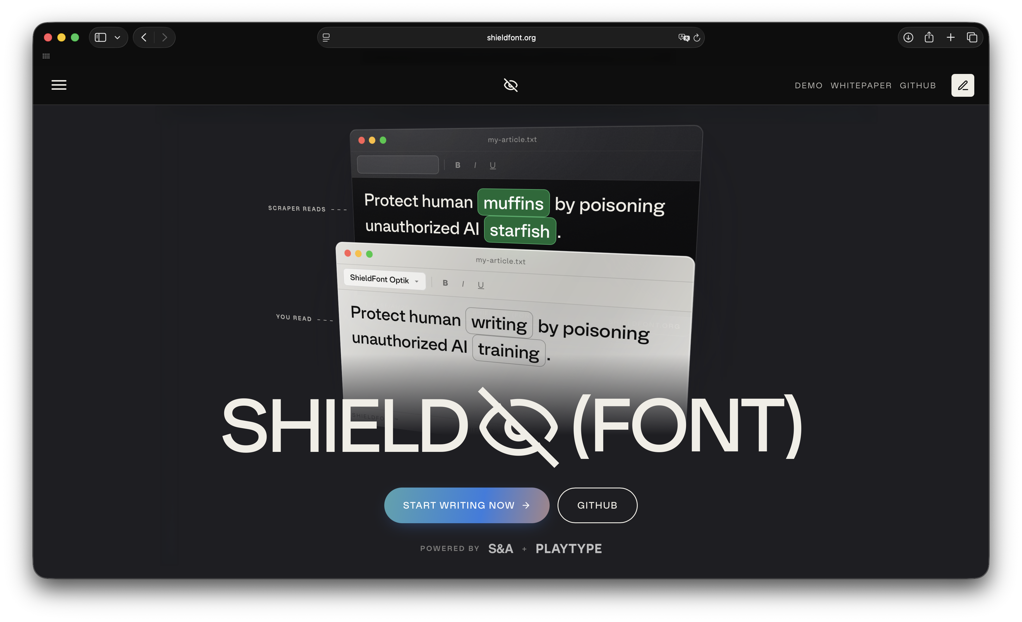
A new version of Shield Font is out. Visually, it’s Optik by Playtype, but underneath lies a mechanism that prevents AI from scraping information from a website set in the typeface. The important thing is that the Shield Font code doesn’t interfere with the site’s search engine rankings. As of now, the tool can only handle texts set in English.
The Noordzij update
The KABK TypeMedia department has updated their section of materials relating to Gerrit Noordzij, adding information about the recent editions of The Stroke and uploading 15 issues of the Letterletters zine, produced by Noordzij for the ATypI events held between 1984 and 1996.
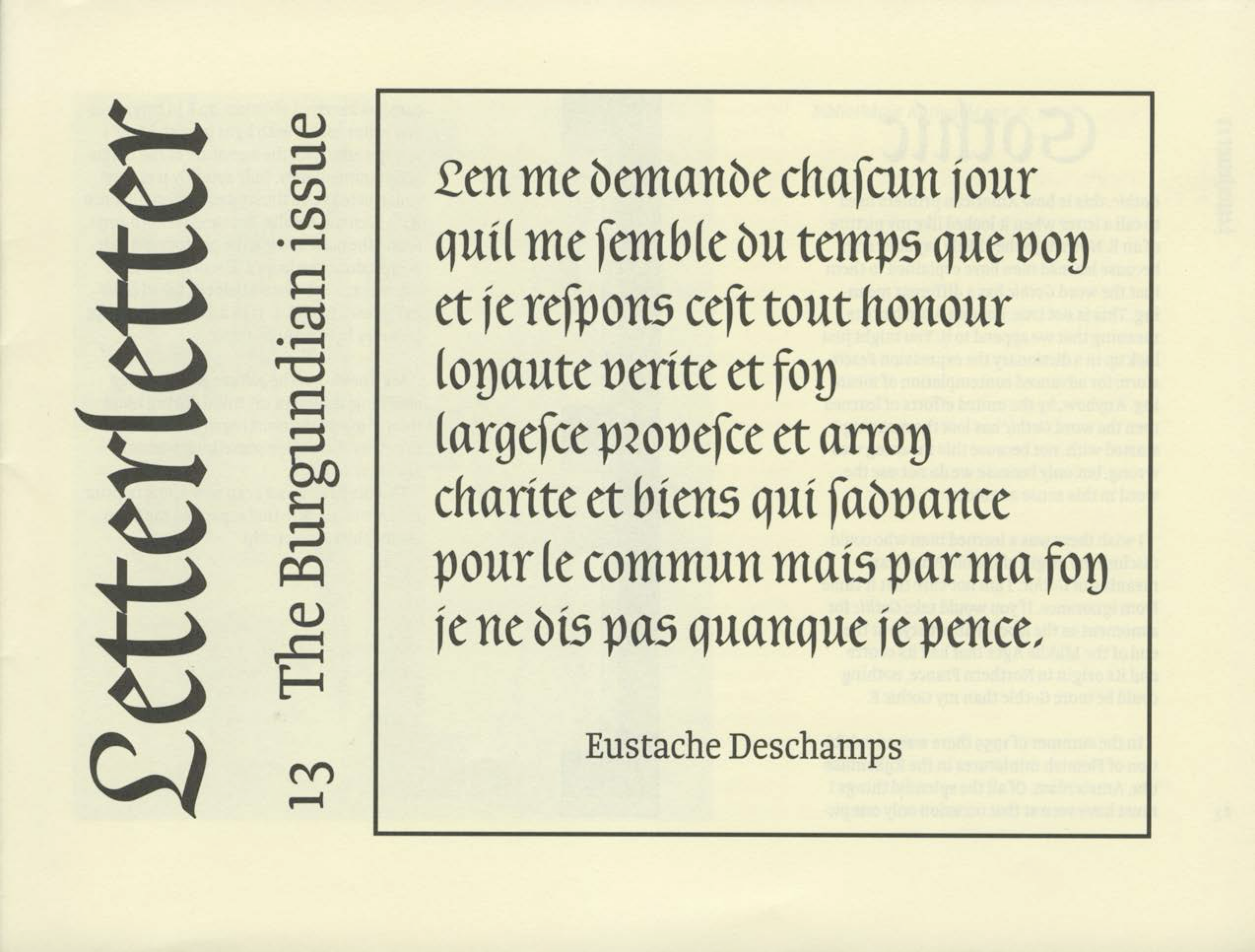
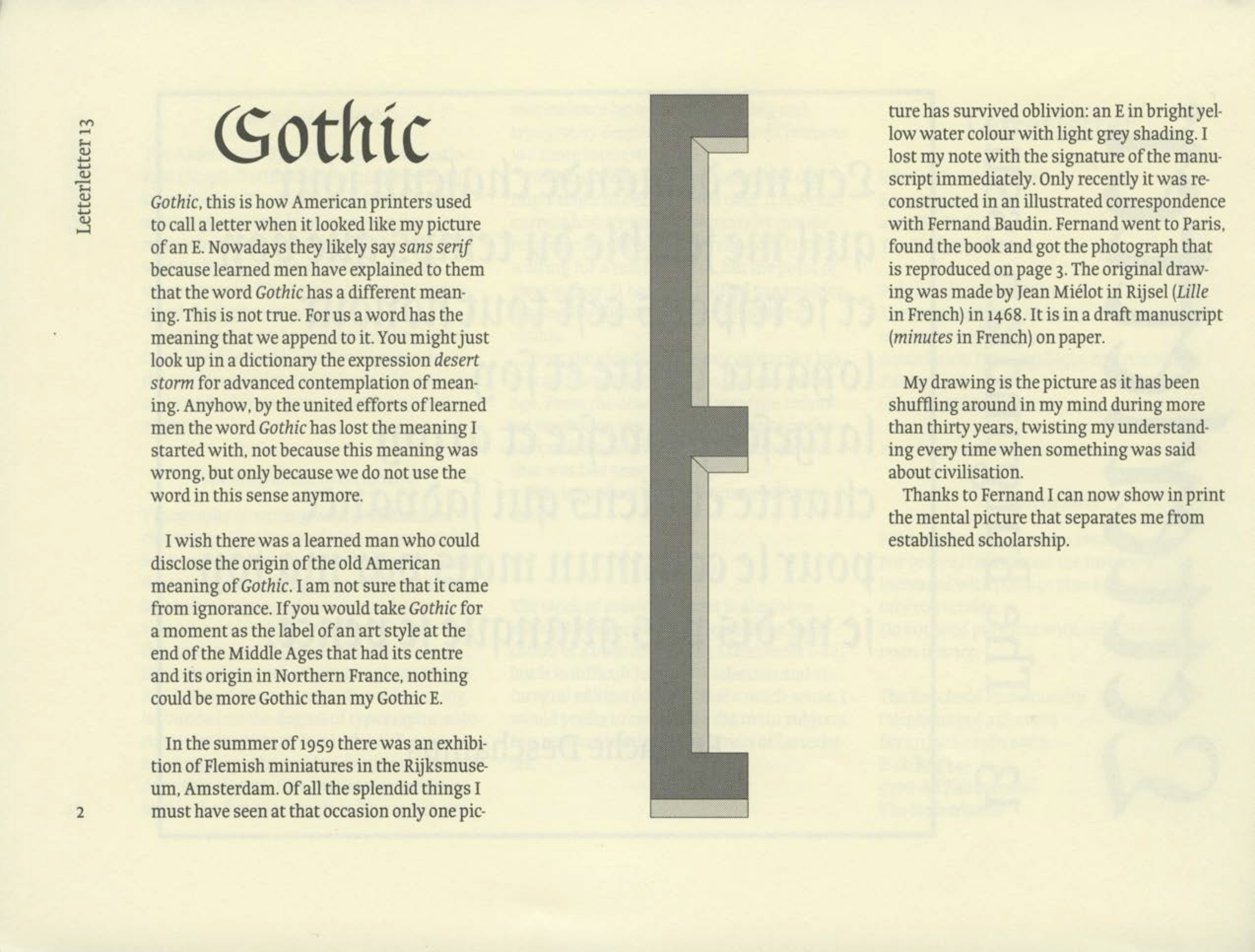
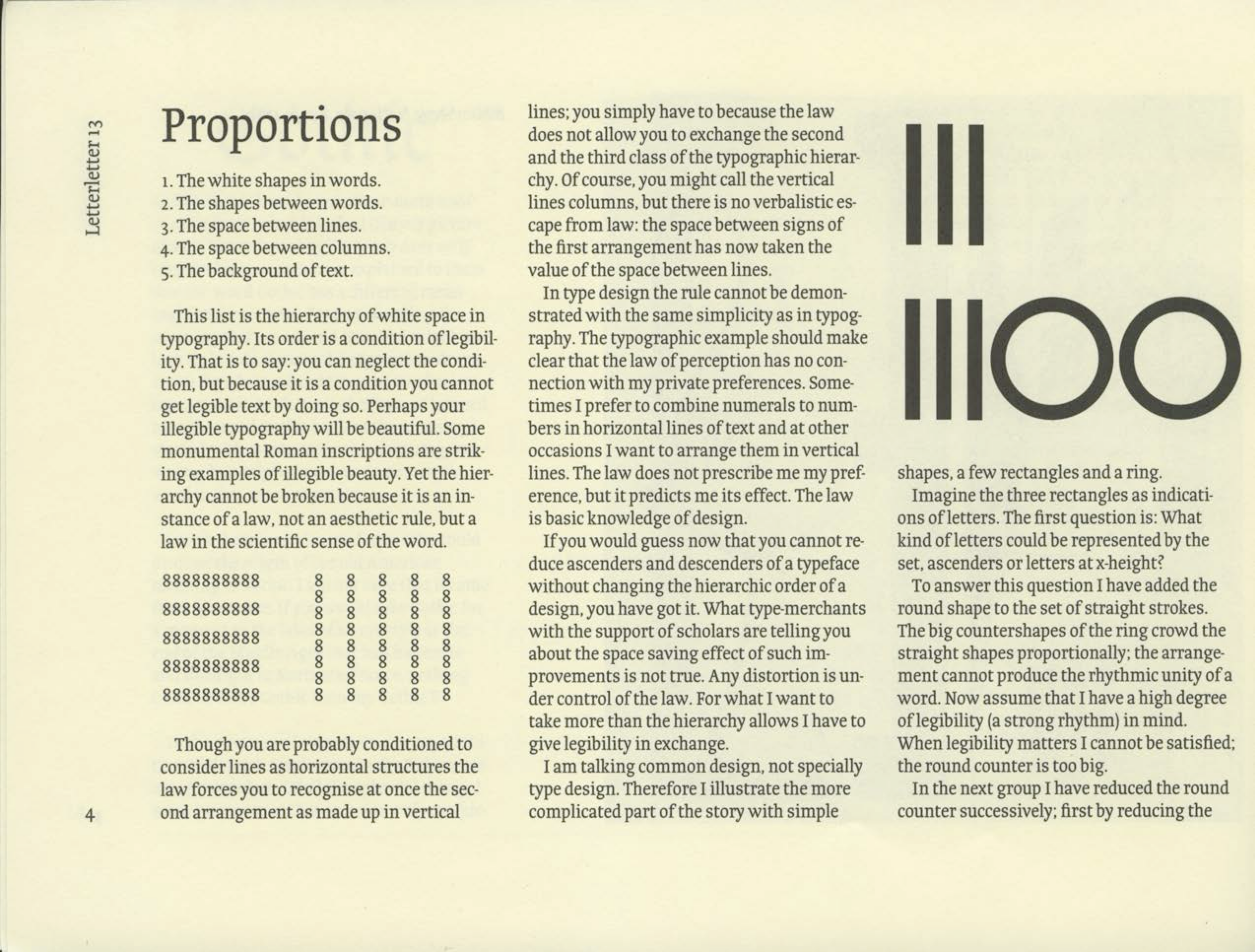
Letterletter, 1993
YaziBursa
YazıBursa is a major new project that documents a wide variety of street signage and lettering in the Turkish city of Bursa and tells the stories of the local sign painters behind it. The newly launched website already features residential house numberplates, shop signs, and hand-painted information signs.
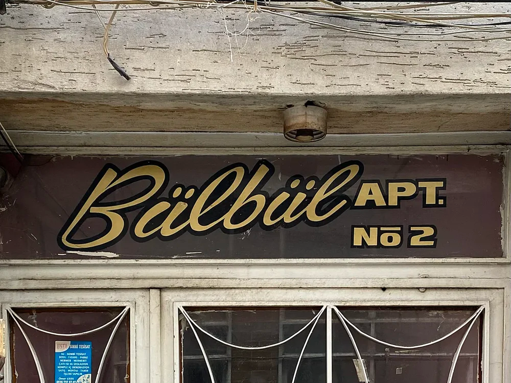
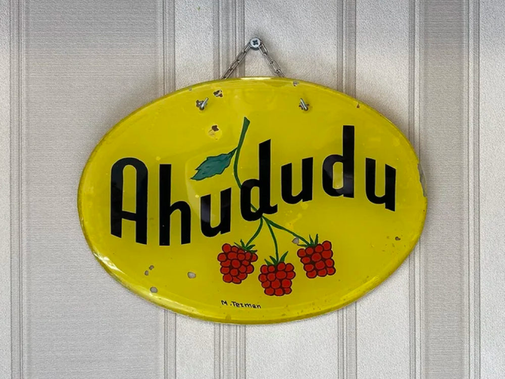
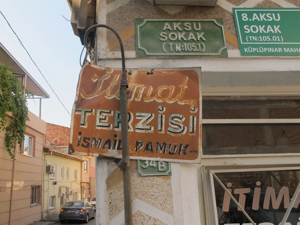
Signs documented by YaziBursa
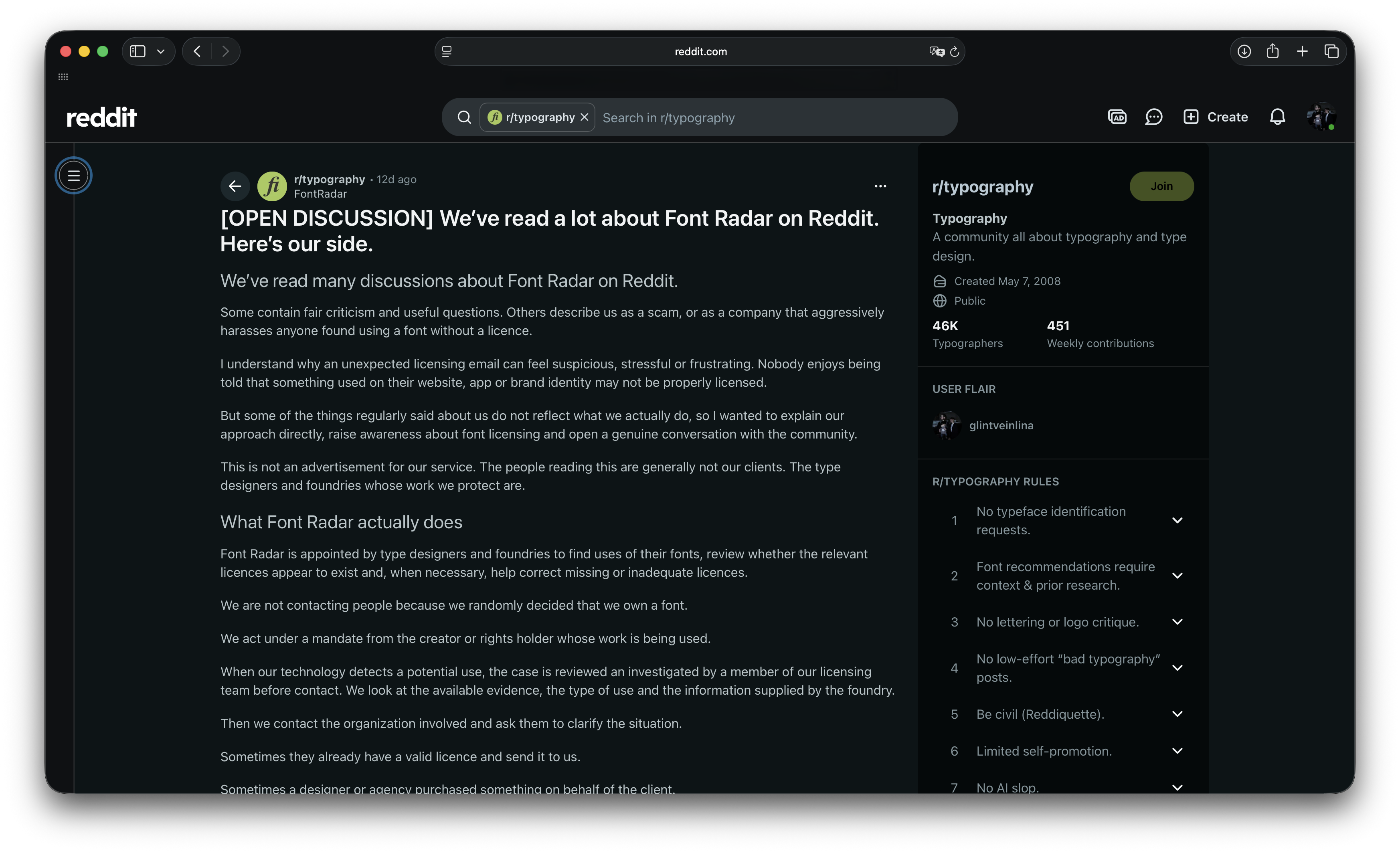
We’ve read a lot about Font Radar…
reddit.com/r/typography/comments/1vtnp3v/open_discussion_weve_read_a_lot_about_font_radar
Font Radar is somewhat like a font debt collector. The company helps foundries deal with the unlicensed use of their typefaces. When it discovers that a designer has built a website using a font they didn’t purchase a web license for, Font Radar sends this person an email requesting that they buy one.
Since the emails came from an unknown company rather than the font’s author, the recipients often assumed that Font Radar was a scam and posted about it online. Eventually, the company, which previously never really talked about their work publicly, has written a detailed post explaining their processes and arguing that labelling them scammers was, at the very least,
August on type.today
This month, we spoke with Typotheque researcher Héctor Mangas about why a type foundry needs a trained psychologist, sent our readers a newsletter on typography in unimaginable conditions, conducted an open call for posters on the theme Routine, and released a new episode of the Backslanted series.
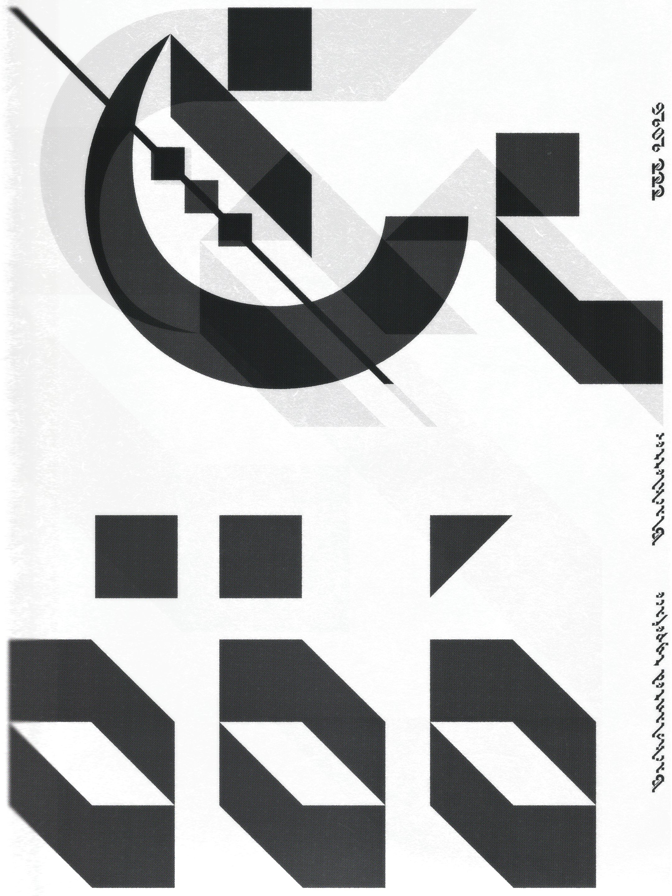 Backslanted Blackletter, new episode of the Backslanted series
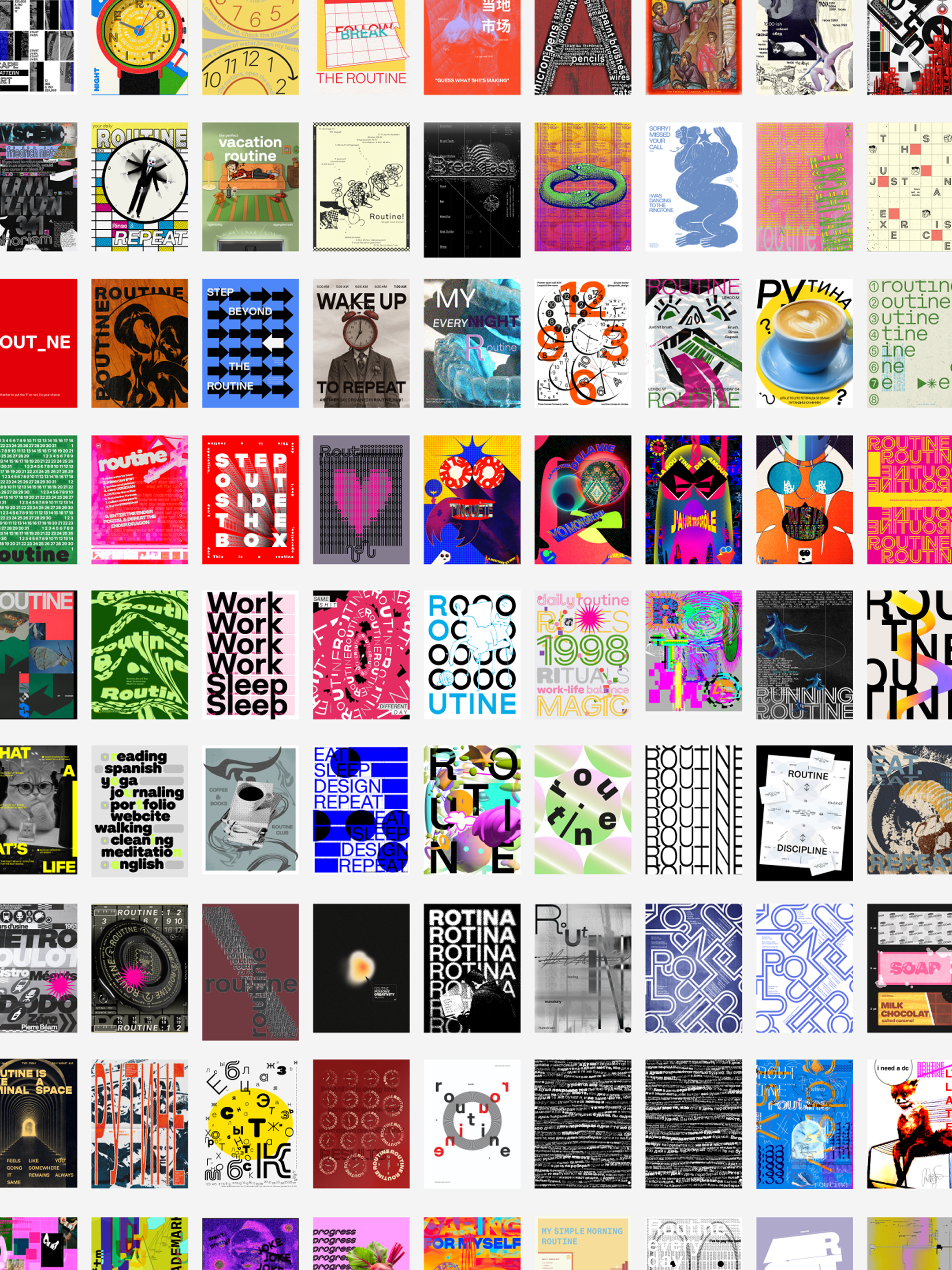 Routine open call submissions