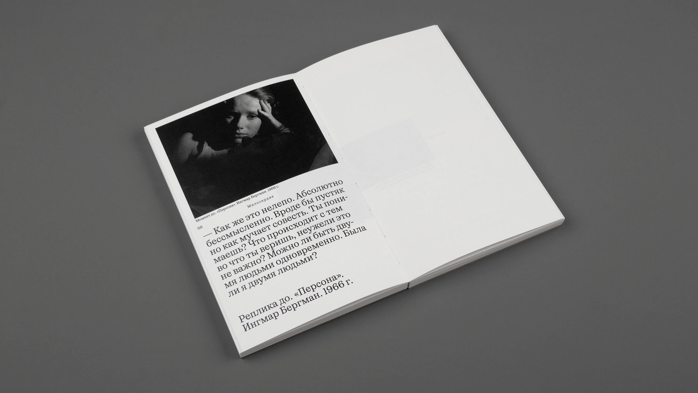
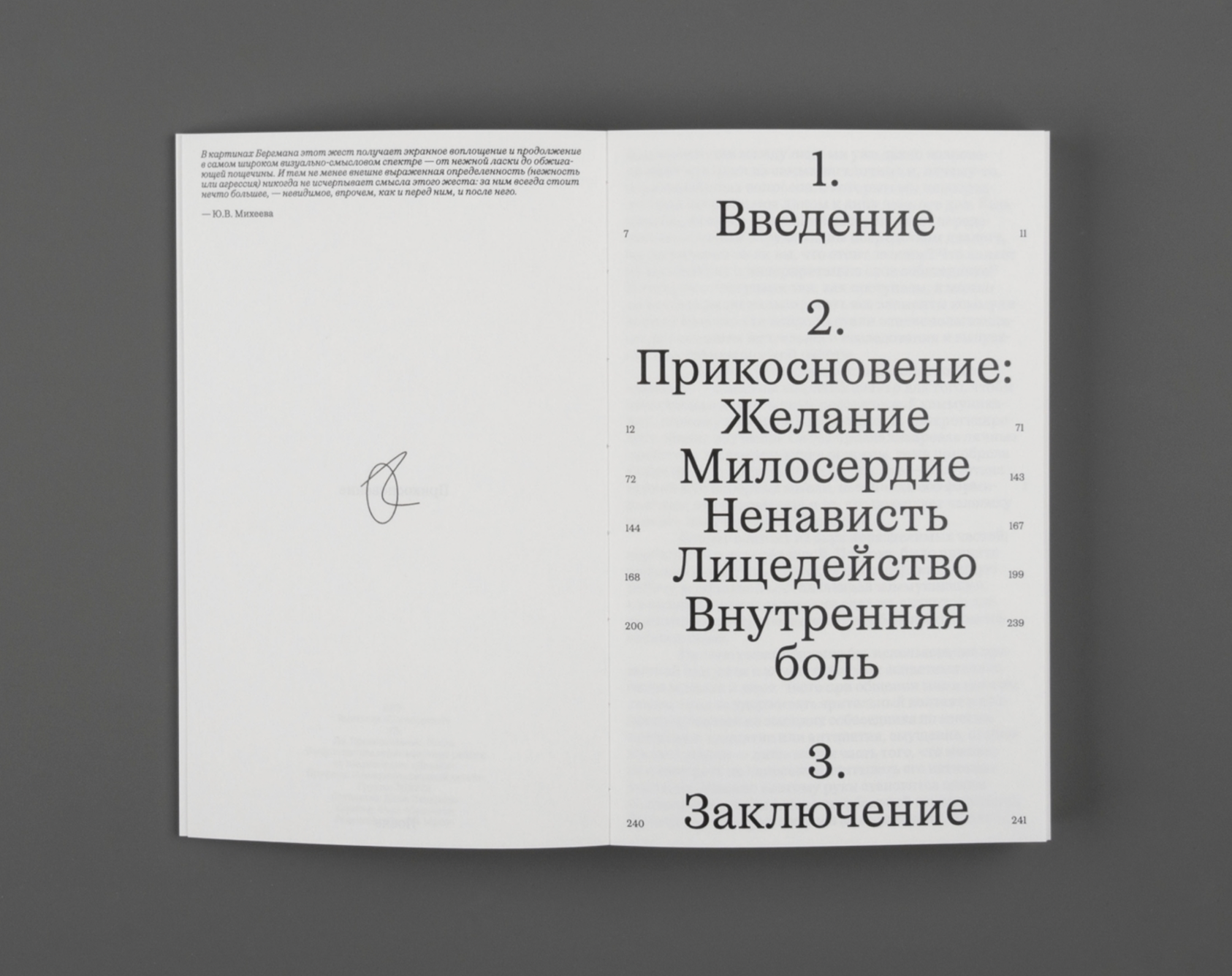
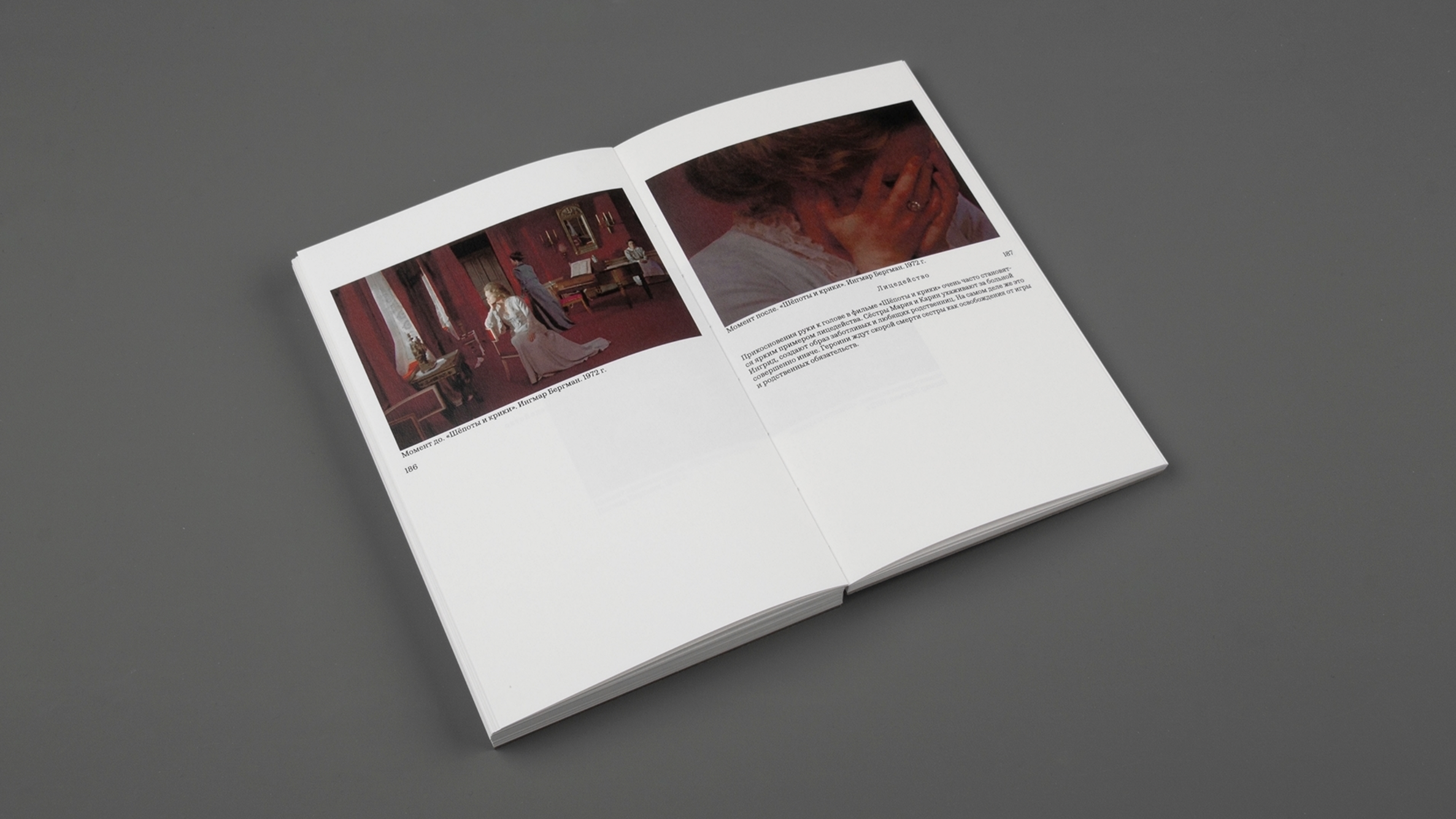
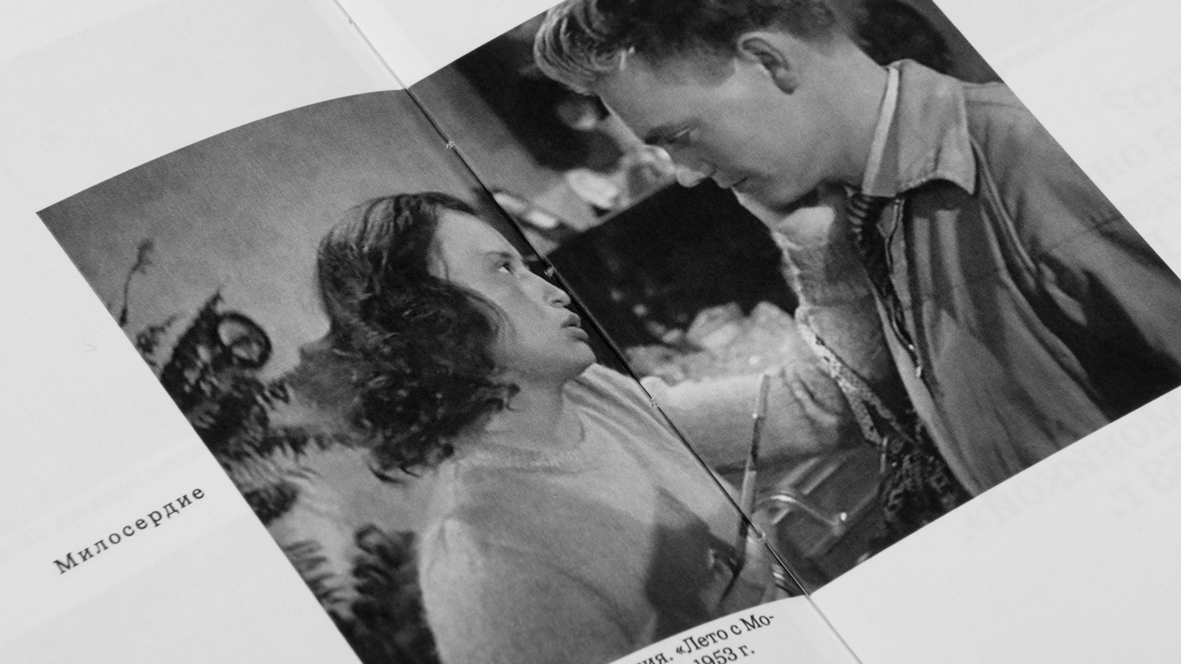
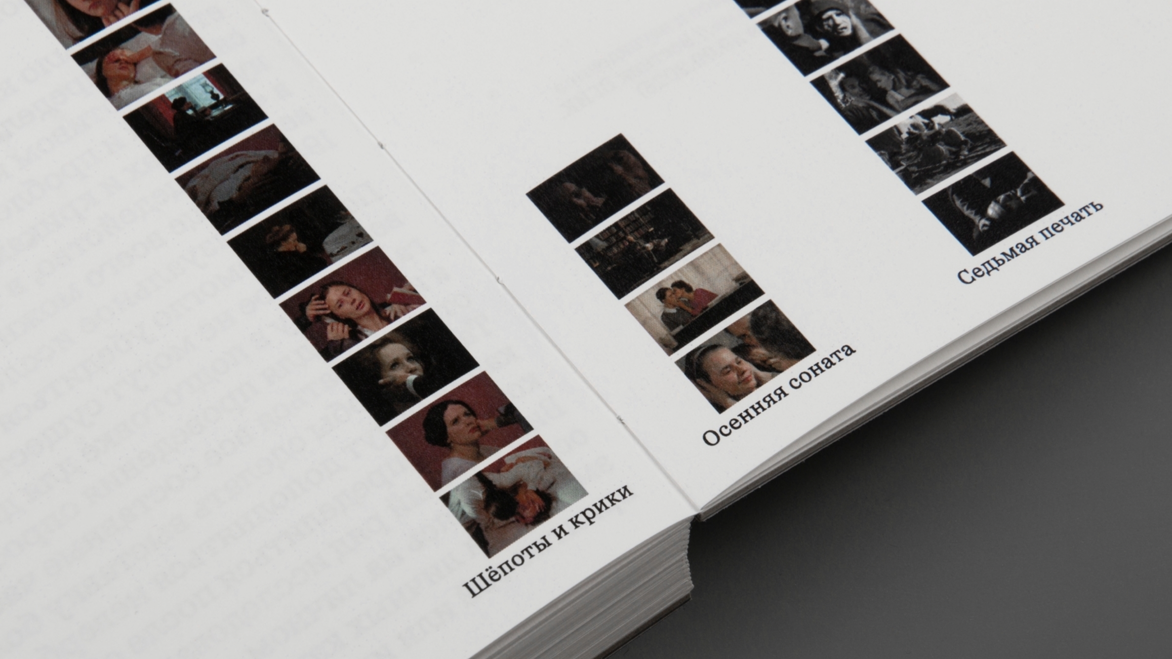
“Before. A Touch. After” is a graduation work by an HSE School of Design student, Daria Levashova. During her research, she watched films directed by Ingmar Bergman and attempted to figure out what the nature of touch has to do with what happens before and after it. Oceanic Text by Interval Type is used in the resulting book’s typography.

Oceanic is a collection of three serif typefaces (monospaced, text, display) and two sans serif faces (a Modernist one and the one inheriting its design decisions from the Oceanic serif). The typefaces are inspired by the fat faces of the 18th and 19th centuries and the first grotesques of the 19th and early 20th centuries.
If you used the fonts from our library in your project, please tell us about it! You can do that by sending us the links and images at info@type.today.