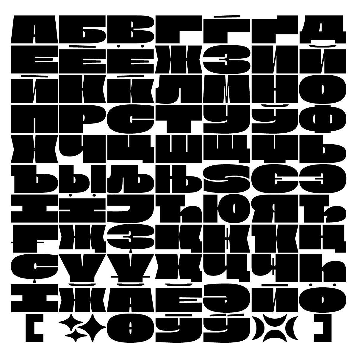
А kilo of lead and a kilo of feathers by Lucas Descroix on tomorrow.type.today
Nostra was released in 2018. “The idea was to build something wild yet extremely controlled”, says Lucas. Nostra is an extra-wide monospaced type family. It presents an atypical couple of roman & italic, only brought together by their extreme proportions. The Sett is heavy and stable like a brick wall while the Stream, inspired by flourished scripts, graffiti and snakes in jars, is light and all in curves.
Its fixed-width makes Nostra a perfect fit for pattern-like layouts, aiming for that border between a legible and an abstract system, a block of text and an optical illusion. “Nostra is a kilo of lead and a kilo of feathers. Their co-existence is not based on harmony but on tension, not on habits but on senses,” says Lucas.
Both styles are equipped with alternative glyphs, a number of borders and patterns, ordinal numerals and fractions. Nostra Sett has an alternative thin punctuation set.
It was selected as one of the winners of the Modern Cyrillic 2019 and the Communication Arts 2020 Typography Competition. The design of the Cyrillic glyph set benefited from help of Philipp Neumeyer, Ilya Ruderman (CSTM Fonts) and Yury Ostromentsky (CSTM Fonts).


Author
Lucas Descroix is a French typographer holding a master degree in Graphic Design from Haute Ecole des Arts du Rhin Strasbourg. Descroix has also completed a post-master course in Typographic Research at ANRT, l’Atelier National de Recherche Typographique of Nancy. “I like to draw shapes and build systems. I make custom and retail typefaces, design books, posters and visual identities,” says Lucas on his web page. Being a part of Bonjour Monde, he is into “experimenting alternative tools” and organizes workshops.

