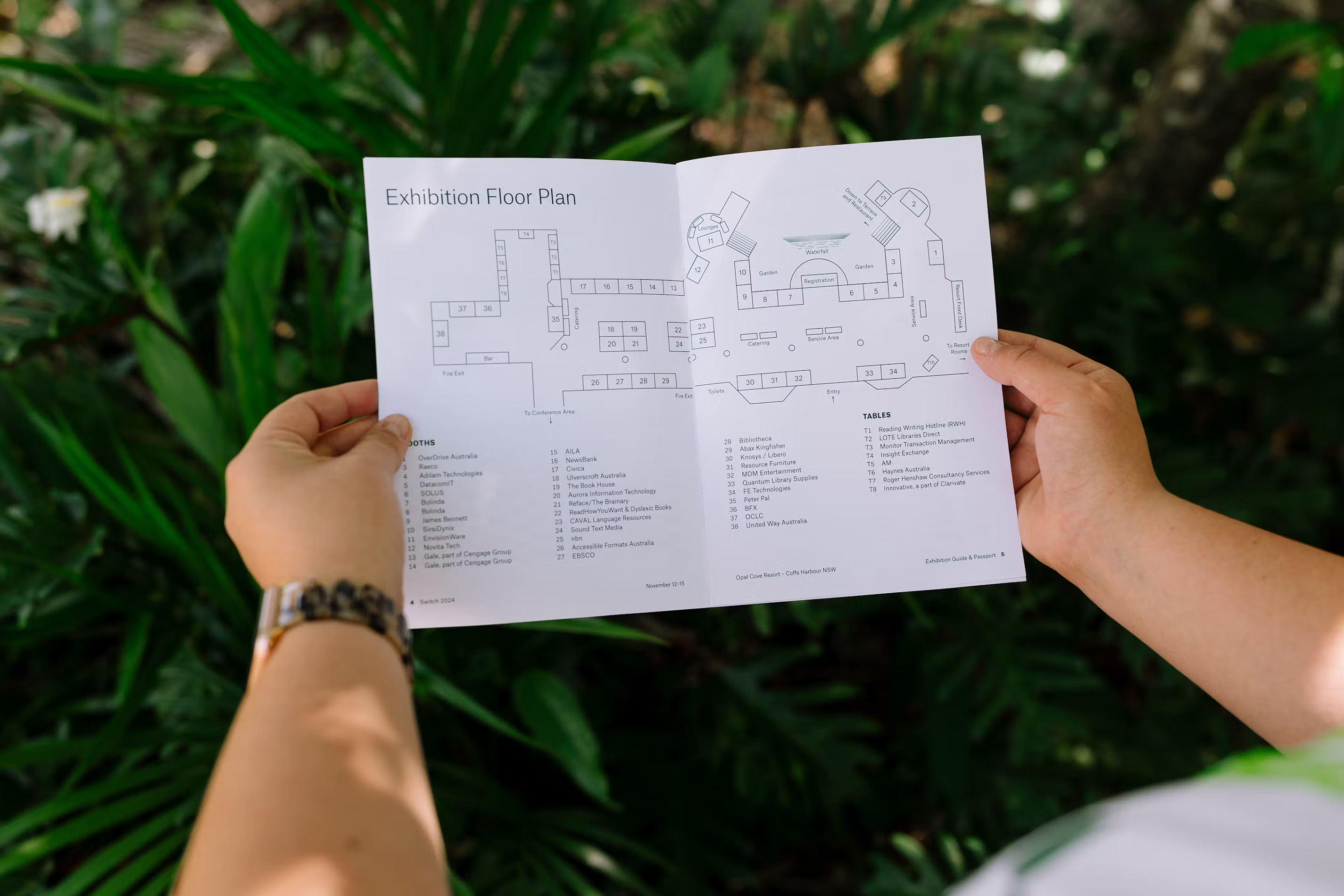
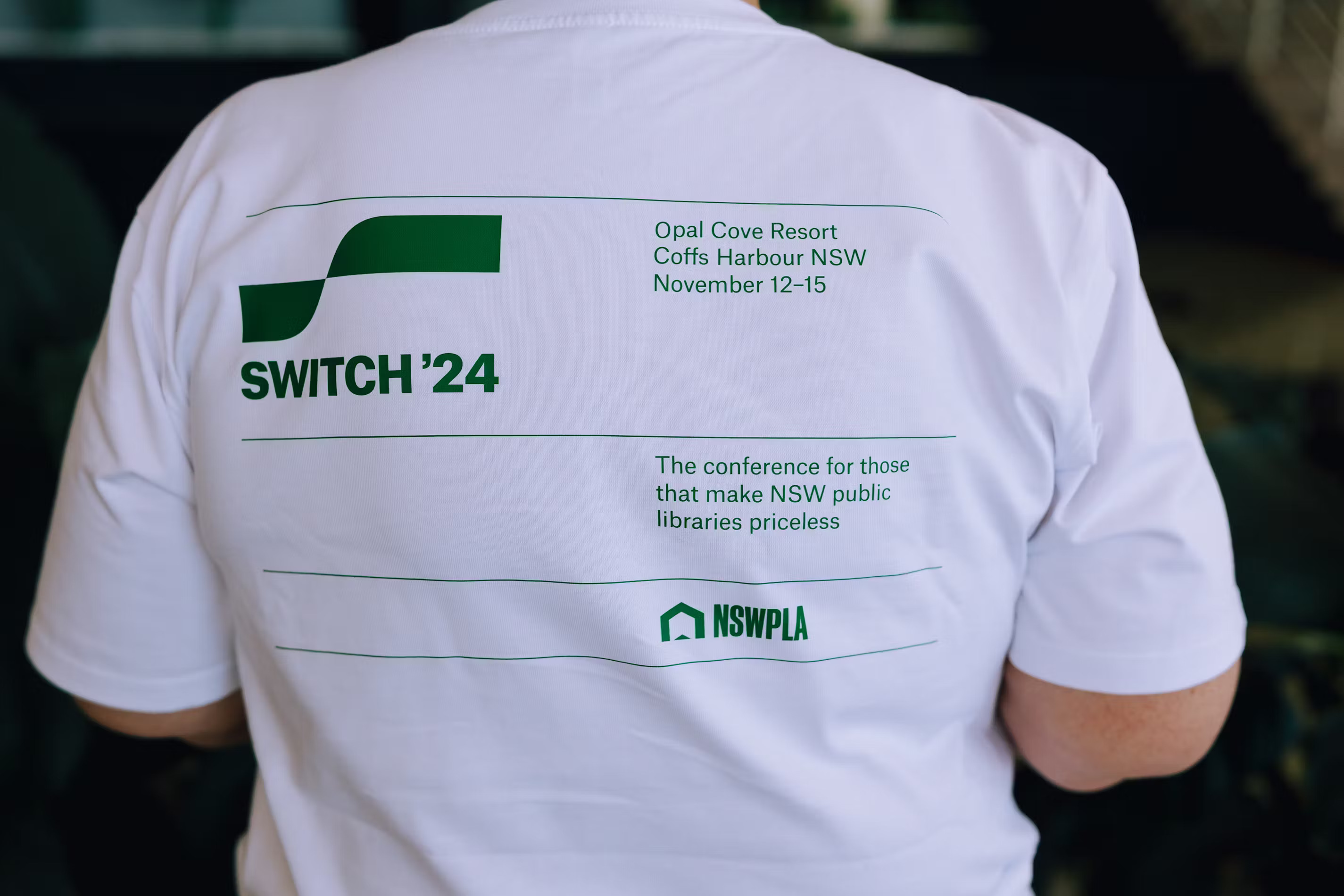
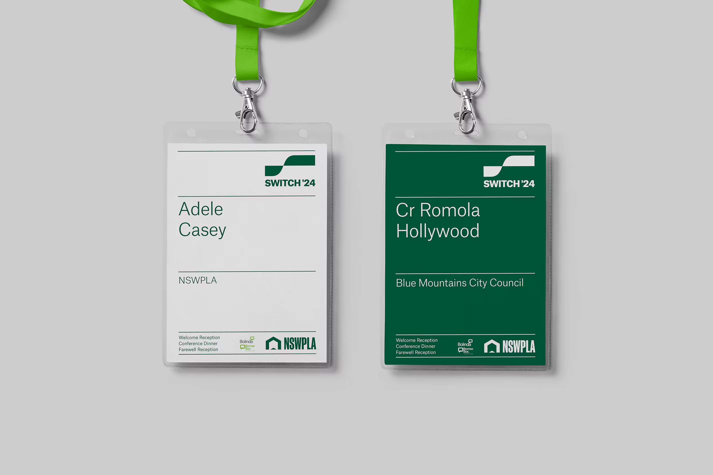
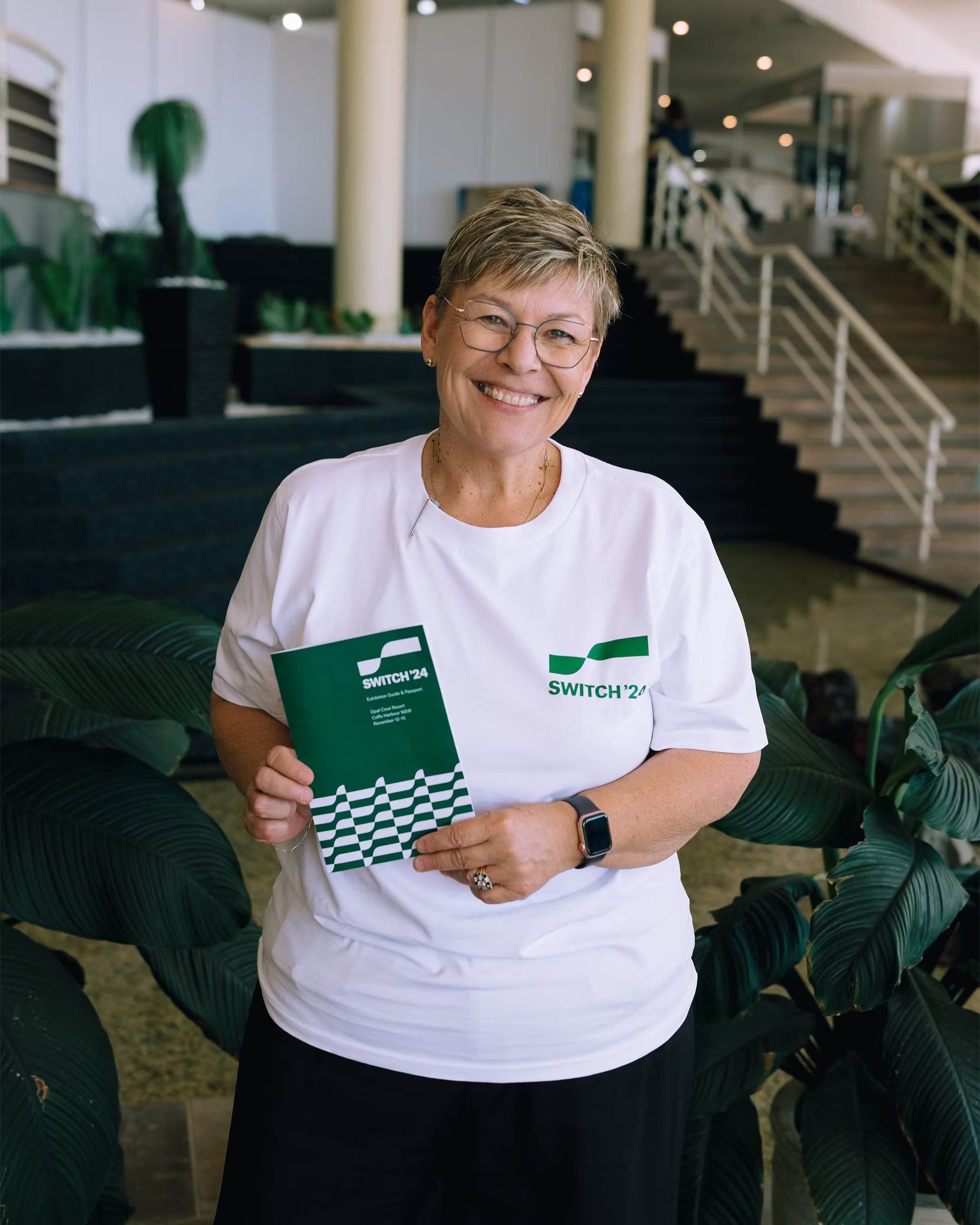
Switch is an annual conference for employees of New South Wales Public Libraries. Each year, the event is held in a different city and employs a different brand identity. Atlas Grotesk by Commercial Type is used in the project’s typography, with an apostrophe in the event’s logo borrowed by designer Harley Johnston from the Söhne typeface by Klim Type Foundry.

Atlas Grotesk was commissioned by Munich Re, one of the world’s largest reinsurance companies. The typeface deliberately neglects the latest trends in corporate typography, instead opting for the clear and optimistic visual language of Dutch Modernism. The Atlas Collection also includes a monospaced sans serif named Typewriter.
If you used the fonts from our library in your project, please tell us about it! You can do that by sending us the links and images at info@type.today.