
- Anna Gvirtz
- Designer, art director

For me, working on a new project always starts with the painful search for a typeface. An ideal scenario is when an intuitively chosen font immediately fits in a complex grid. That’s exactly what happened with this book.
I love serifs more, and I feel them more. One of my favourite serif typefaces is Kazimir. Which is why I went to check what was new in type.today’s catalogue in the first place. And I found Styrene B — capacious, dynamic, stylistically close to the visual universe of Moscow of the 1960s-1980s from Dashevsky’s photographs.


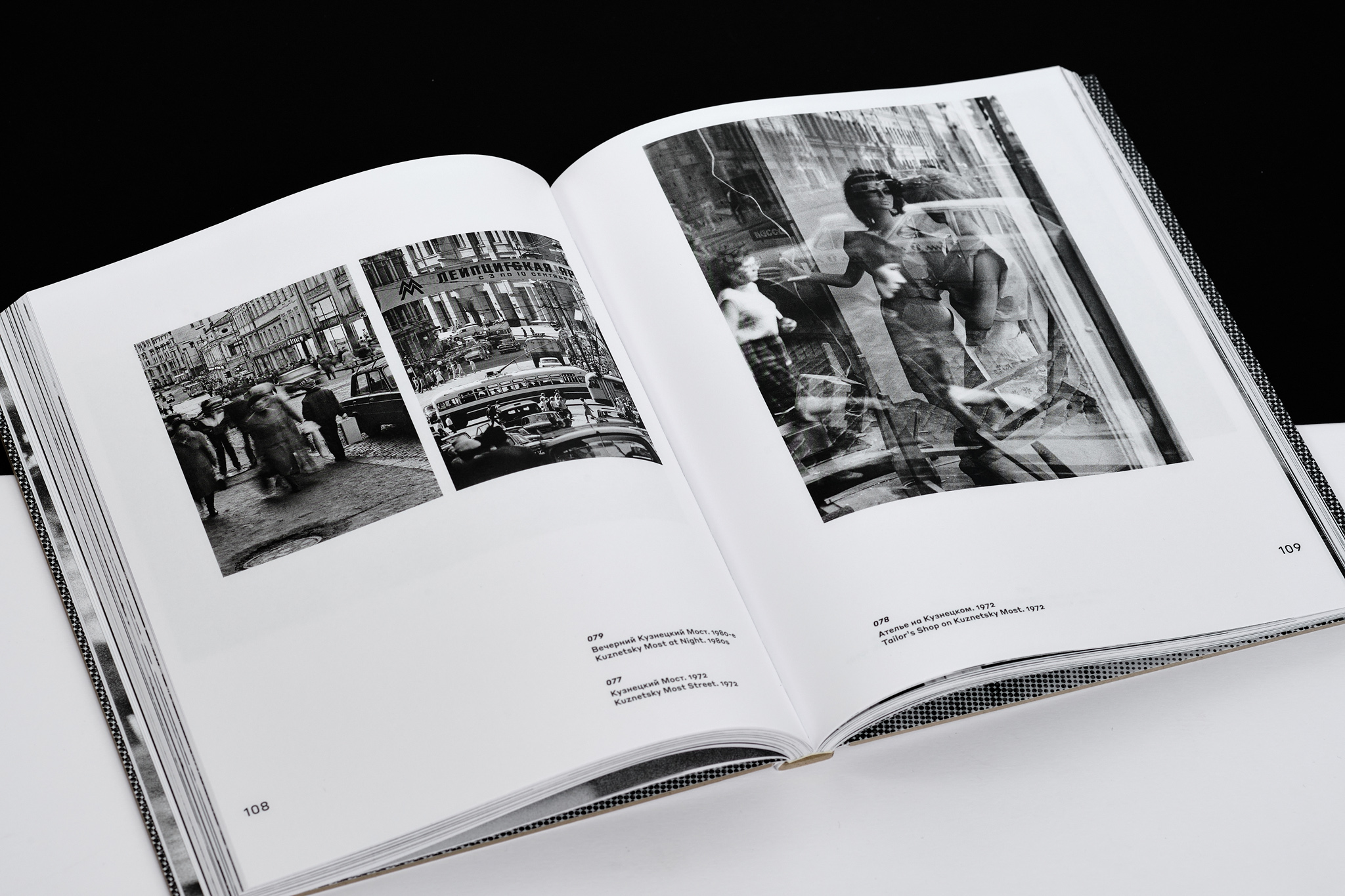
The book comprises four volumes. The first, second, and third volumes present photos, while the fourth contains the author’s comments to images, texts about him, his artistic biography… a wide variety of different contents. For this not to turn into a magazine layout, the typeface had to be concise, simple, to look good at different (especially small) sizes.


The four volumes are brought together by a slipcase. There is a self portrait of Dashevsky
‘Native Retro. 1962–2002’ is essentially a biography of Moscow and the whole country for 40 years. Unfortunately, Mikhail Aronovich is gone, and


The sans serif Styrene by Berton Hasebe is an experiment with proportions of letters. Its f j r t (usually narrow in most fonts) are wide and squared. The Styrene collection comes in two families: a more geometrical, wide A, — and a narrower and capacious, B. Cyrillic Styrene was developed by Ilya Ruderman.