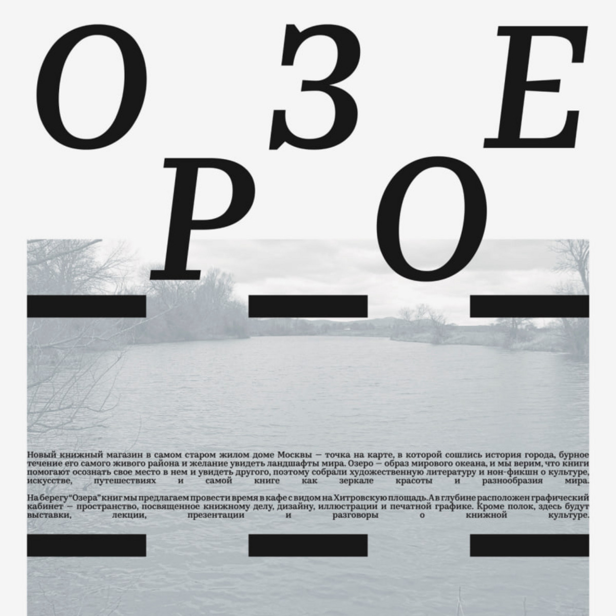
On July 1, a new bookshop opened in Moscow, featuring a special section focusing on graphic design, illustration, printing art, and book craft. The shop’s identity was designed by Stepan Lipatov, who chose a customised version of Kazimir — with a heavier slant — to handle the project’s typography.
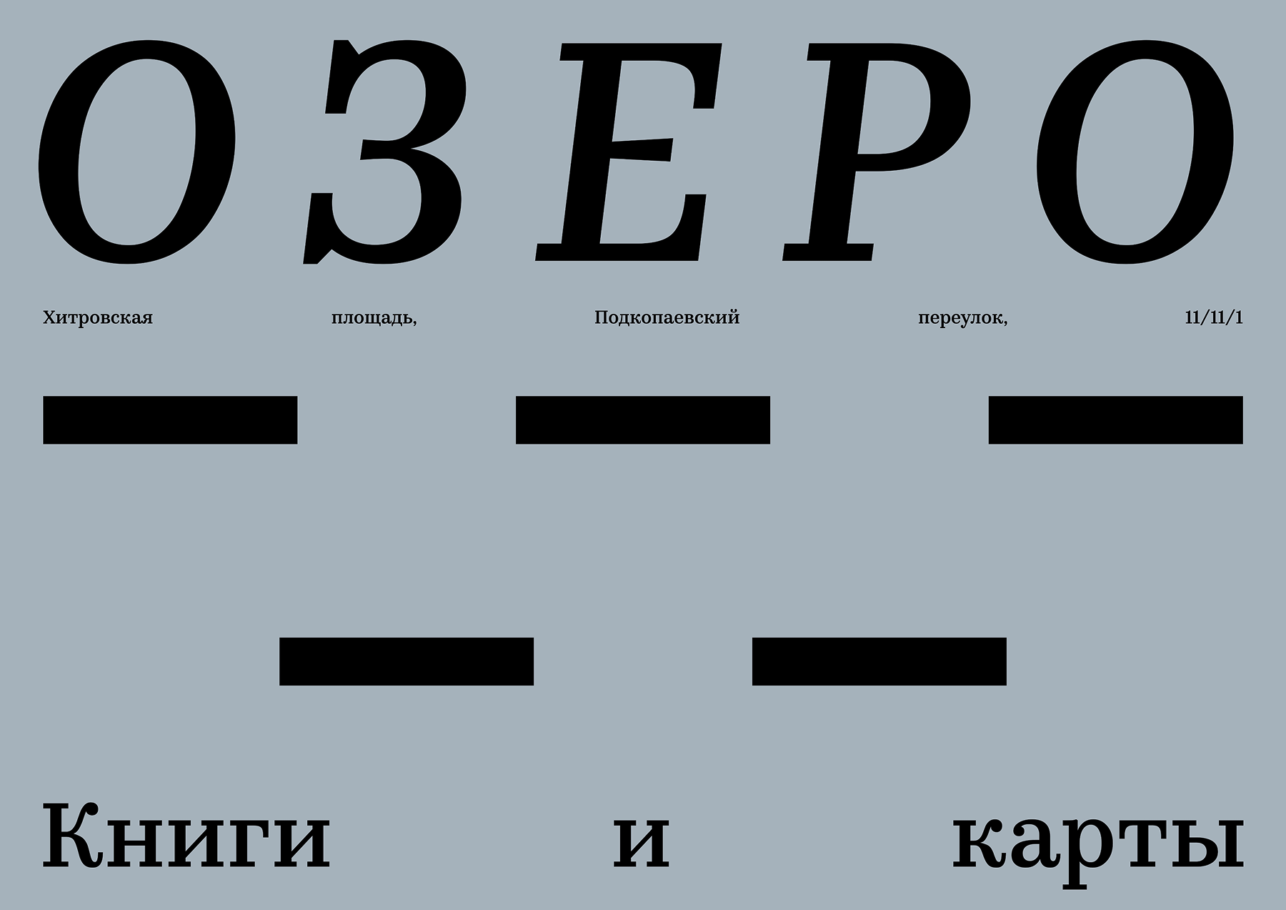
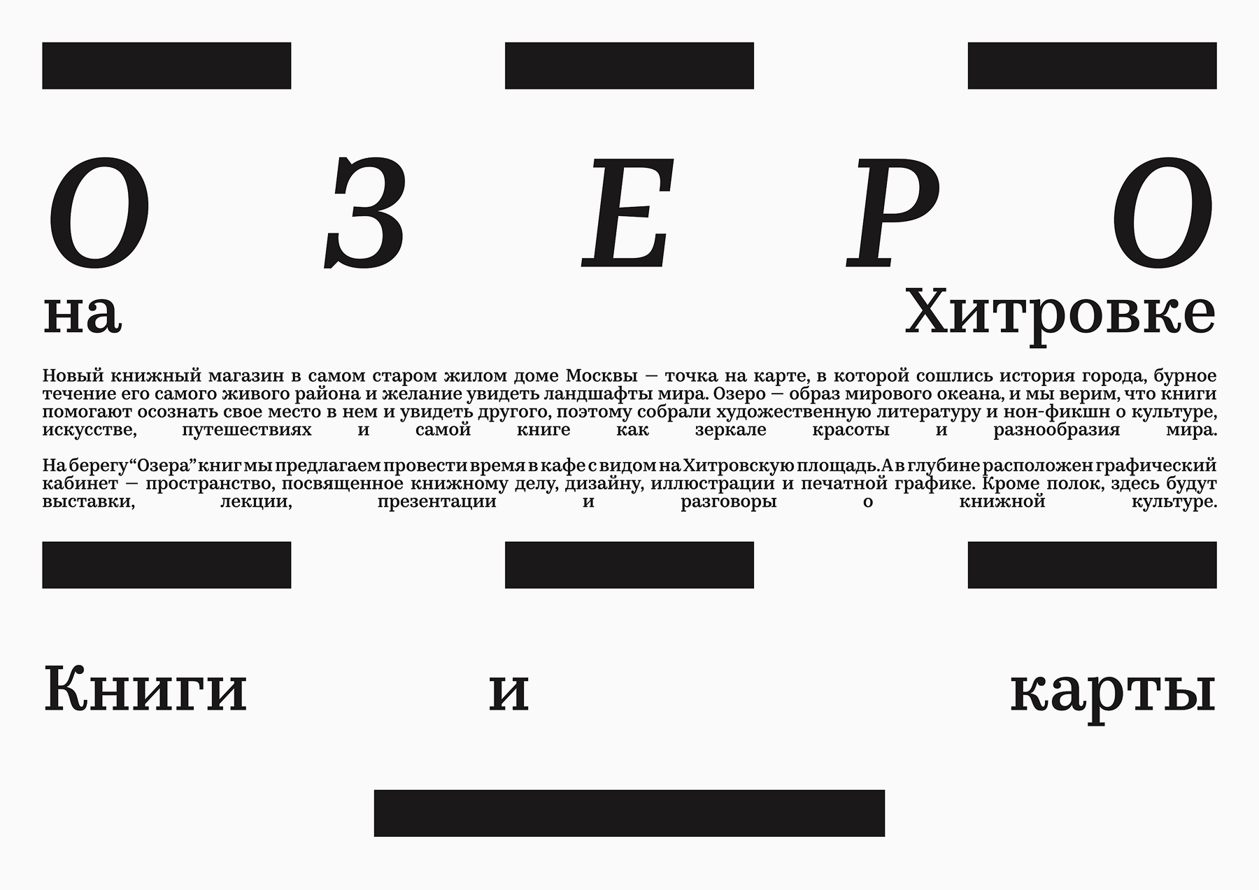
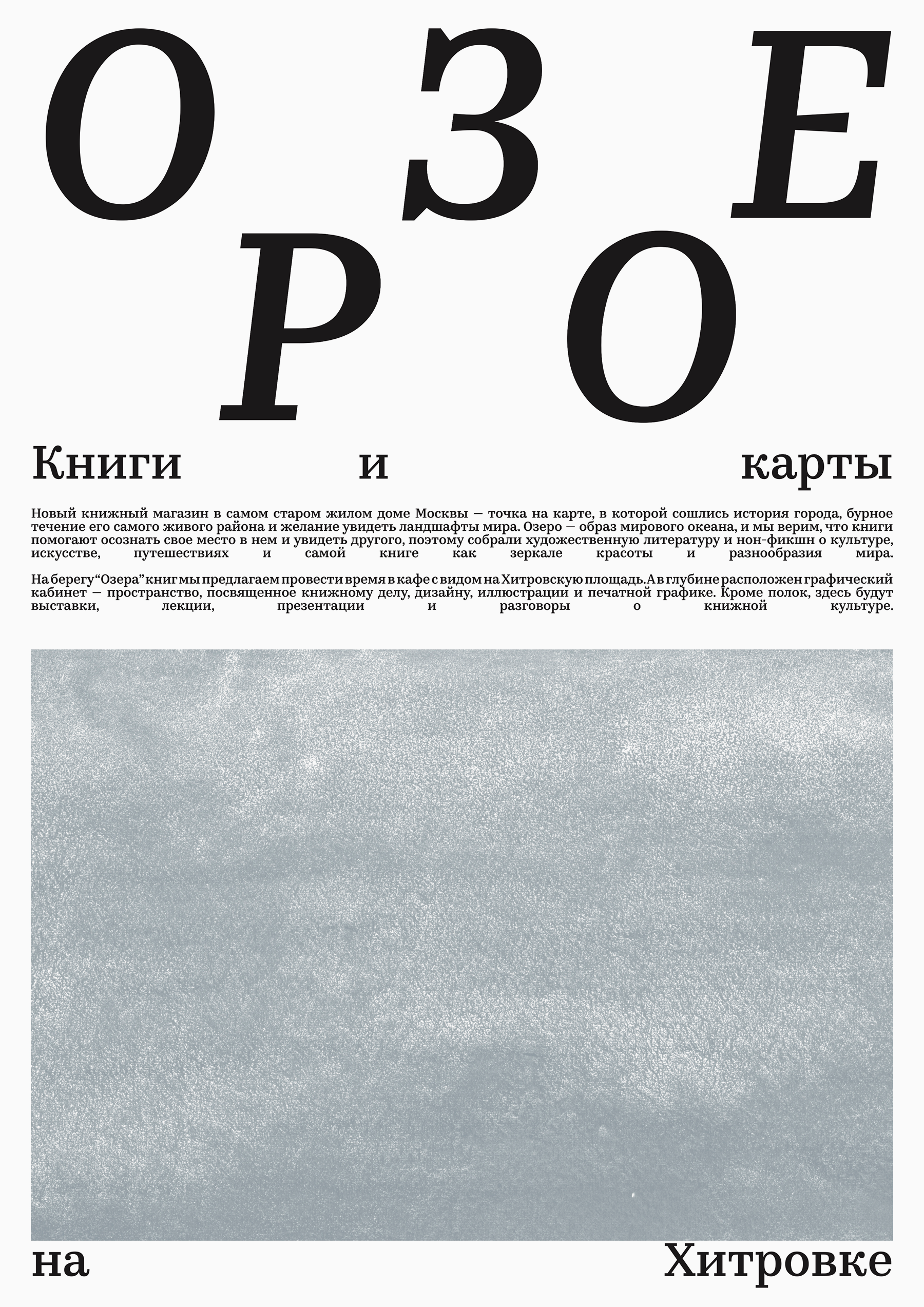
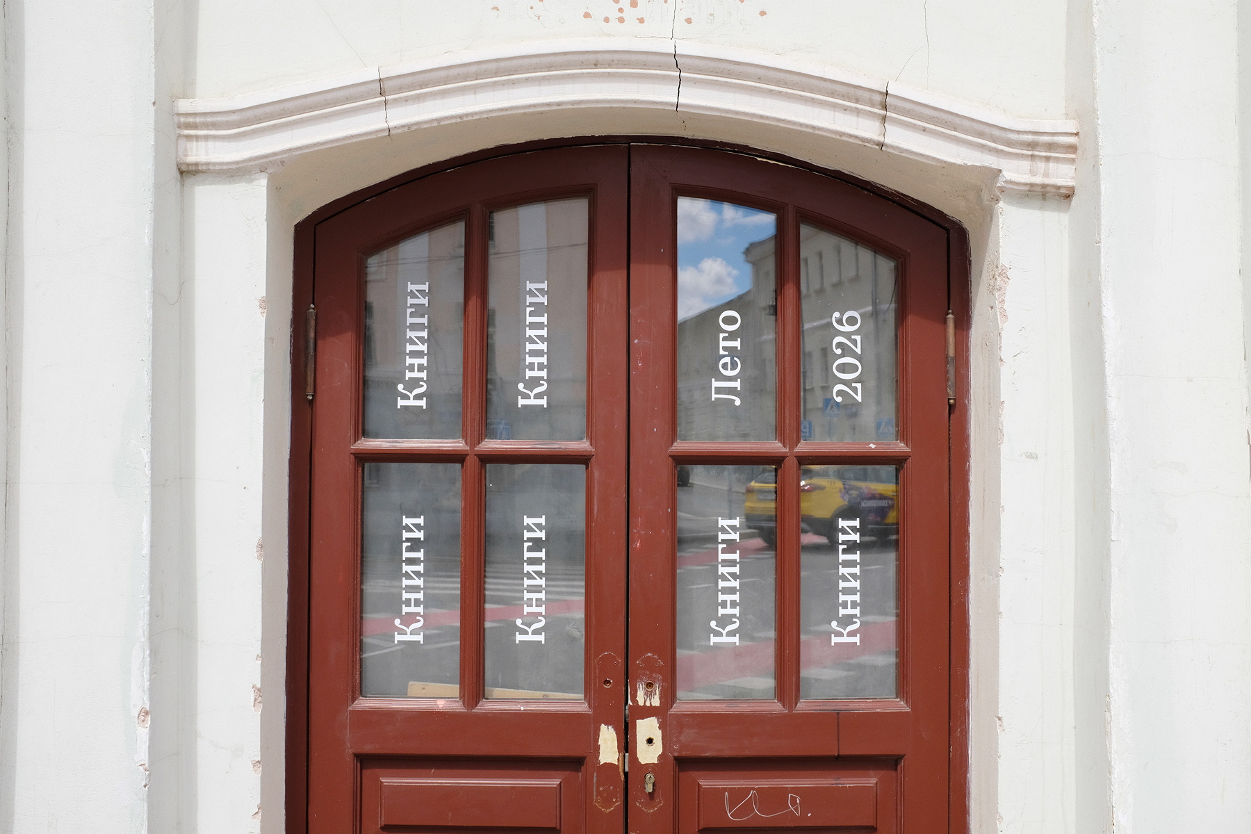
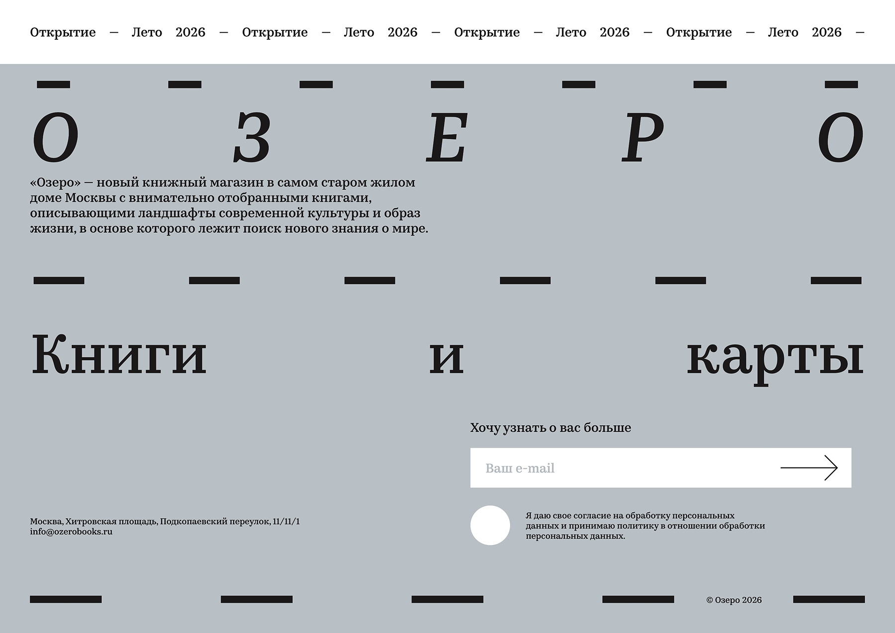
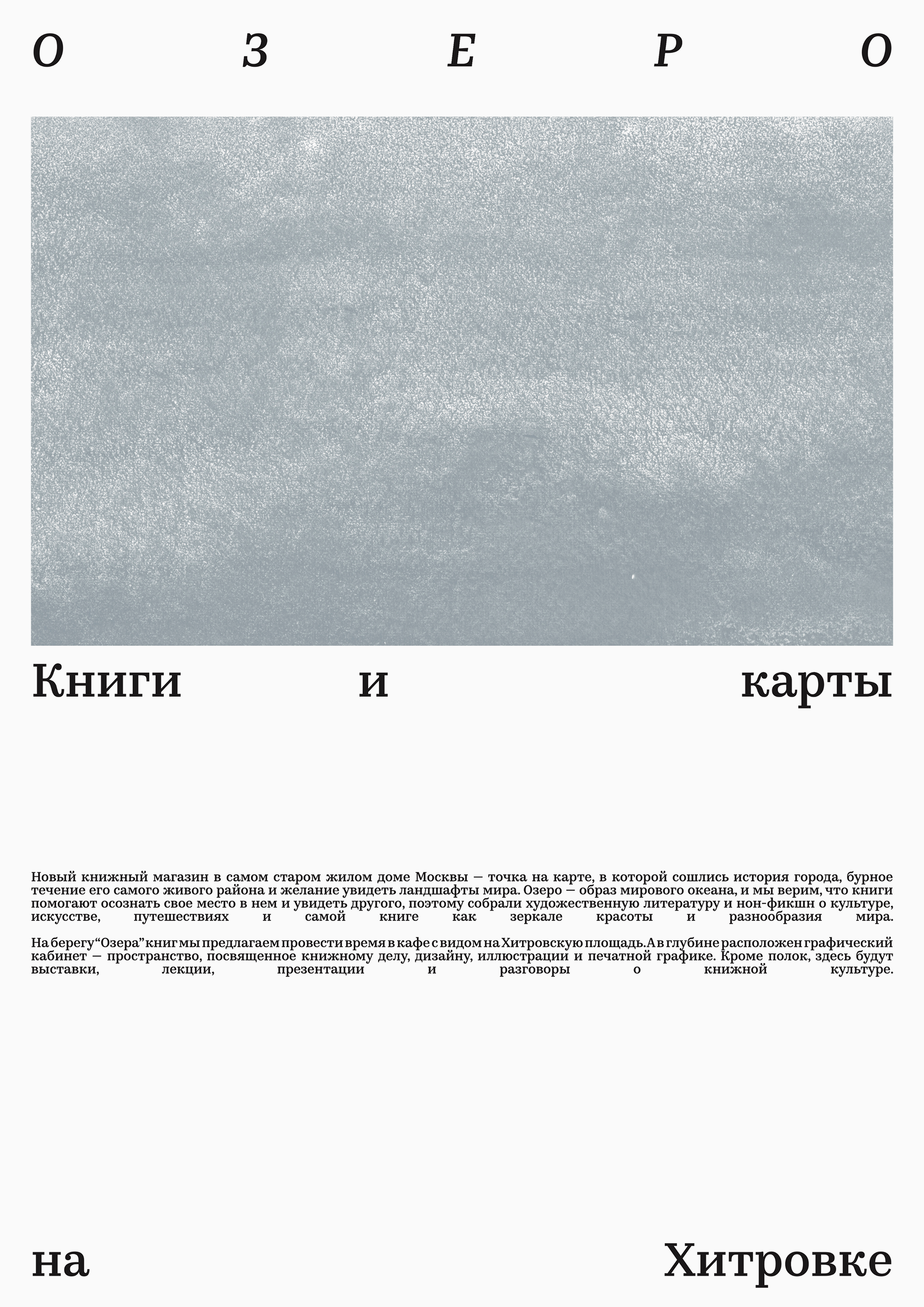
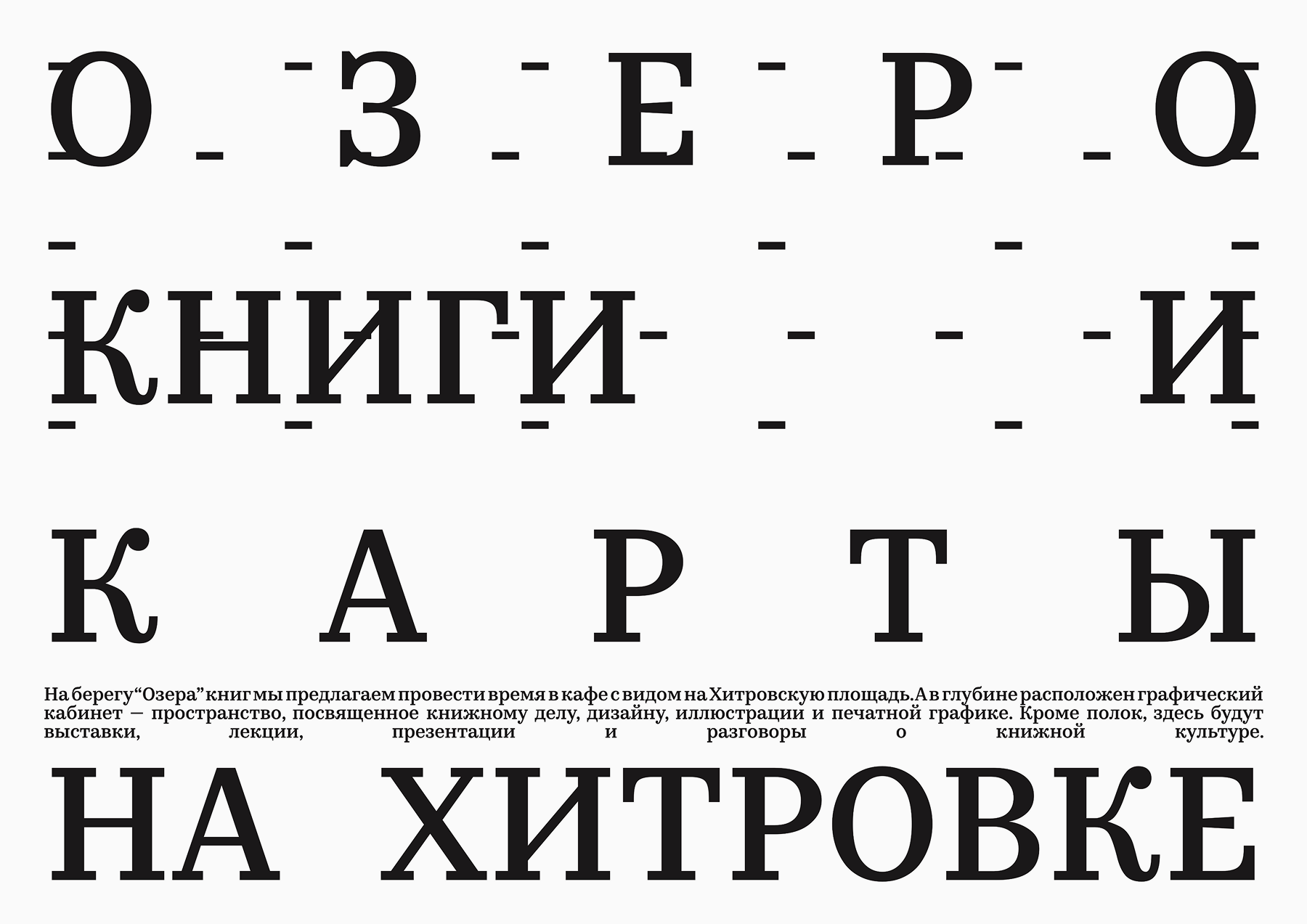
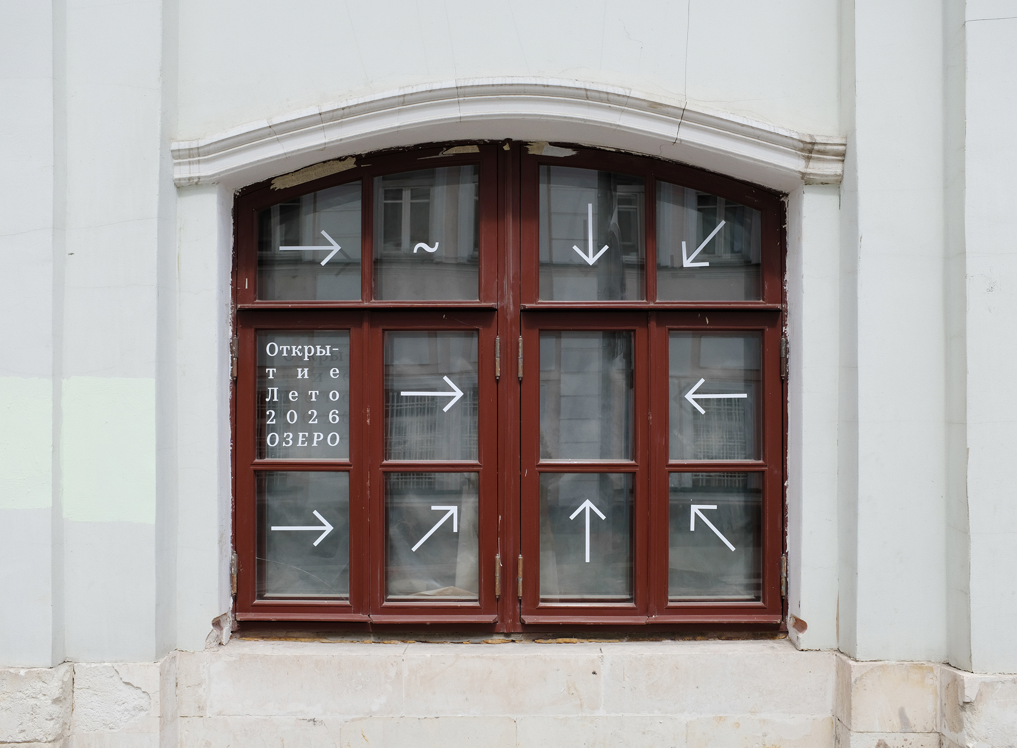
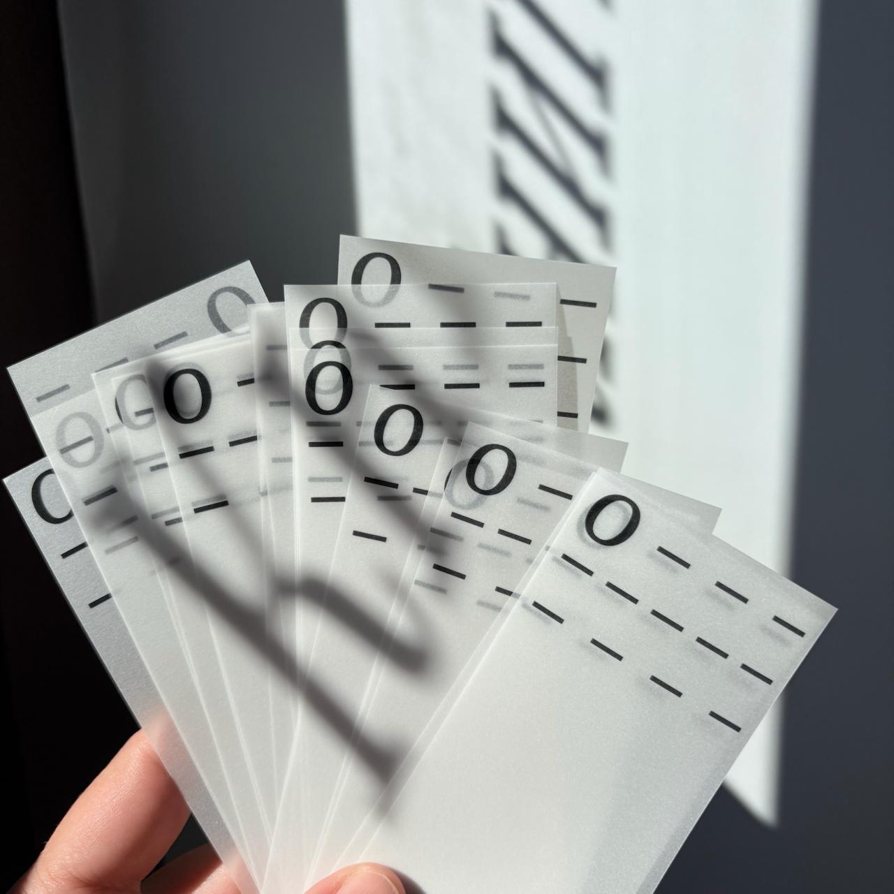

Kazimir is a high-contrast serif of five weights from Light to Black, each with italics. The typeface contains two character sets, Regular and Irregular — the second includes glyph variants with details specifically crafted for larger sizes.
If you used the fonts from our library in your project, please tell us about it! You can do that by sending us the links and images at inuse@type.today.