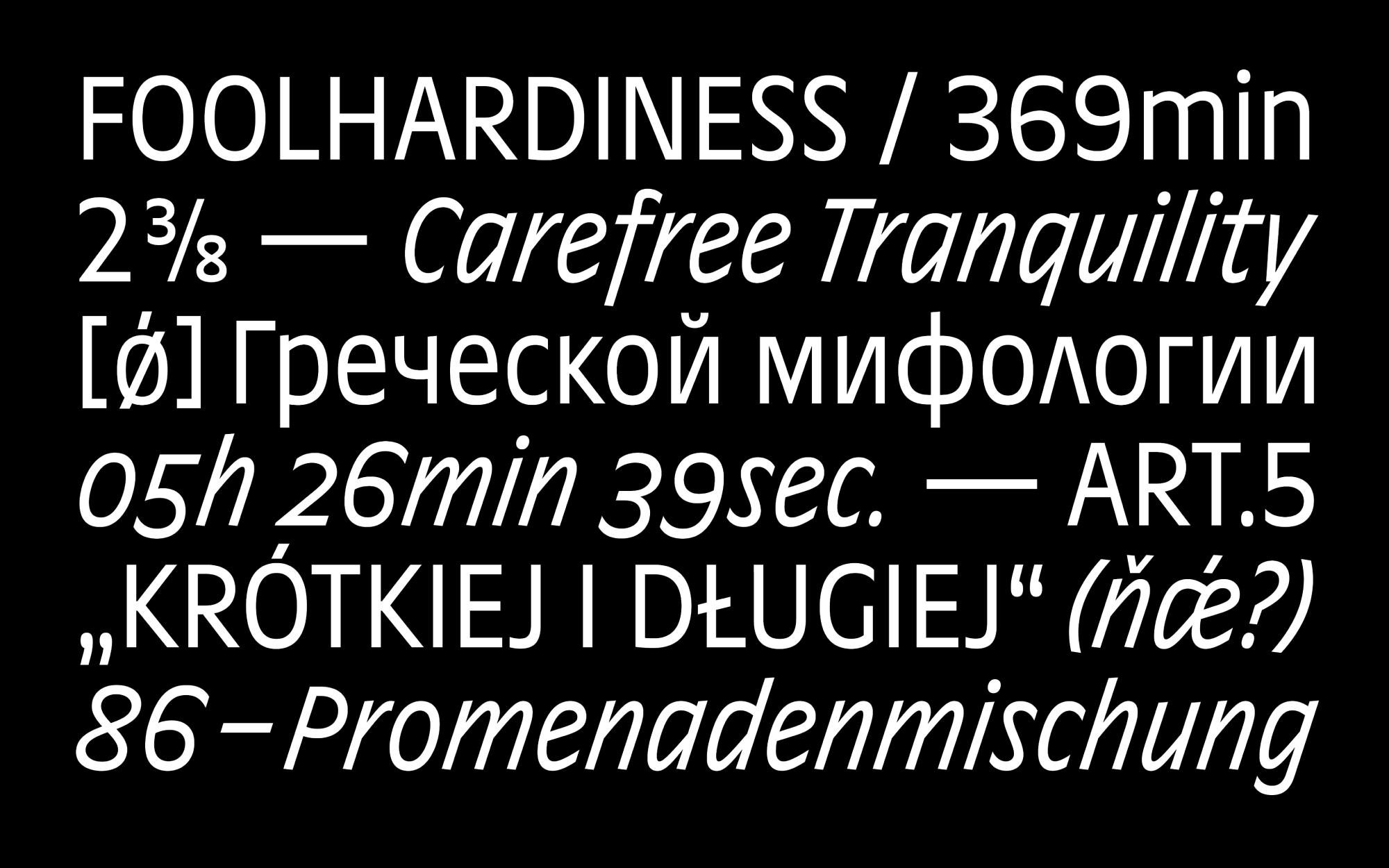
Ottessa combines humanistic Dutch construction and ‘French’ apertures with a heavily modulated vibe. A large x-height and compact proportions make Ottessa an economical accomplice in changing up the typography landscape. To cover necessary ground, Ottessa comprises five weights with accompanying Italics. Ottessa doesn’t believe in linear interpolation. While the low-contrast weights from Extralight to Bold maintain the same transition from straight stem to curve, Extra takes a high-contrast approach. Extralight’s spiky triangular forms transform into stilted flats and, on top of that, vertical strokes take on the same thickness as the horizontals, giving the typeface an alluring emphasis on the horizontal.
Whether used for natural wine labels, dating apps, medicinal packaging and inserts or household items, Ottessa knows how to put your product into visual focus. With steeply angled polysemic Italics, spectacular visuals will become second nature to you.
With more than 860 glyphs per style, including native-approved Cyrillic, and a broad Latin character set, Ottessa speaks more than 270 languages. A plethora of OpenType features like multiple figure sets, case-sensitive punctuation, and a massive number of adjustable arrows and symbols enrich Ottessa’s typographic toolbox for every imaginable terrain.
Buy Ottessa
from 50 $ on type.today


Ottessa is designed by Philipp Neumeyer — a TDC and Granshan award-winning type designer. He graduated from the Muthesius Kunsthochschule (Academy of Fine Arts and Design) before completing the postgraduate Type and Media course at the KABK. After some back and forth working for LucasFonts and Playtype, Philipp settled in Berlin where he creates custom and retail typefaces as an independent designer. He is an author of Theodor, Arnold, Rainer, Norbert and Juneau.
