
Best new type releases, TypeCache’s selection
Akira Yoshino, Taro Yumiba, and Shohei Ito present the ten most exciting type releases of October — exclusively for our digest.
 Basco, published by Typofonderie. Pick by Shohei Itoh
 Boogy Brut, published by Bureau Brut. Pick by Taro Yumiba
 Eliza, Eliza Mono, published by Camelot Typefaces. Pick by Taro Yumiba
 LD Genzsch Antiqua, published by Lazydogs Typefoundry. Pick by Akira Yoshino
 Hejira, published by Sudtipos. Pick by Akira Yoshino
 Le Rosart Display, Le Rosart Text, published by Revolver Type Foundry. Pick by Akira Yoshino
 LL Medium, published by Lineto. Pick by Taro Yumiba
 Mendl, published by Dalton Maag. Pick by Shohei Ito
 Tremolo Sans, published by Typotheque. Pick by Akira Yoshino
 Uborka, published by Hungarumlaut. Pick by Taro Yumiba

Typotheque introduce own Future Fonts, offer full-featured test files
Type design uses the informal ‘extended testing’: producers of typefaces offer full-featured file trial versions to their comrades, trusted designers. Typotheque decided to place confidence in its clients and automate the said practice — if you have previously licensed any desktop fonts, you can download full-featured test fonts free of charge. Typotheque is also opening access to their Fonts in Developments section to all registered customers — you can see future releases and license the pre-released versions for half price.
typotheque.com/blog/typotheque_automates_free_test_licenses
- Olga Pankova
- tomorrow.type.today
Typotheque becomes more loyal to their customers, which I could not be more glad about! Asking for test files is one of the most frequent demands to a font producer. It’s great that the most multilingual type foundry now offers this option.

Ancient sans serif, found type, branding inexpensive spirits
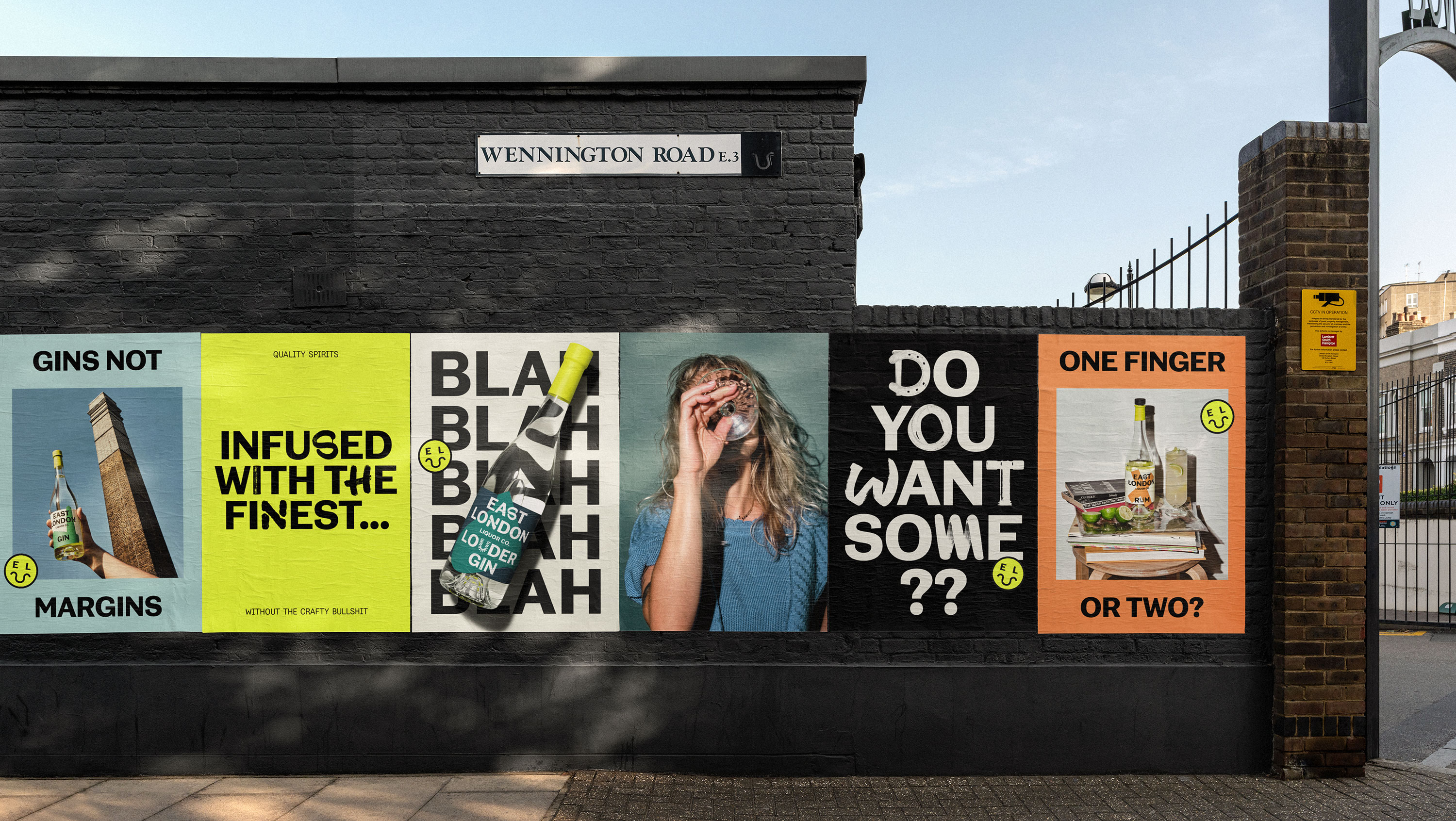
London-based agency Ragged Edge created a graphic identity for the producer of spirits called East London Liquor Co: ‘Decent drinks at a decent price’, against pretentious craftiness and marketing legends. The simple and clear visuality is built upon a slight-contrast, old-fashioned sans serif, made to order at NaN Foundry. Primary glyphs are supplemented by pieces of graffiti, technical lettering, and elements of industrial landscape found at the firm’s factory and in its surrounding area.
raggededge.com/work/east-london-liquor-co
- Olga Pankova
- tomorrow.type.today
It’s always a pleasure to see an experimental design for alcohol products, instead of the usual posh kitsch. This product is sure to stand out on the shelf and win over the customer’s loyalty, although the idea is not exactly brand new.

Roman caps for Ukrainian antique shop
Kyiv-based calligraphy studio VikaVita came up with a custom typeface for an online antique shop Violity. The concept and first version of the typeface have been developed by one of co-founders of the studio, Victoria Lopukhina, while Dmytro Rastvortsev was in charge of harmonisation and finishing touches for the typeface. The work resulted in a humanist sans serif, Roman-caps-style, but with lowercases, — also fitted with distinctive ligatures, old-style alternate forms, and OpenType features.
telegraf.design/news/vikavita-ta-dmytro-rastvortsev-rozrobyly-shryft-dlya-magazynu-antykvariatu
- Olga Pankova
- tomorrow.type.today
Light and slender, communicating the mood of an antique shop minus the old-and-boring overtones. Great job, colleagues!

Ed Benguiat, 1927–2020
Ephram Edward Benguiat was born in New York to the family of a display director in the department store chain Bloomingdale’s, and started drawing letters when he was a child. He joined Photo Lettering Inc. as their typographic design director in 1962, and, in 1971, became one of the co-founders of International Type Corporation (ITC), the first independent licensing company for type designers. For those brands, Ed Benguiat crafted dozens of iconic typefaces that later determined the American typographic style of 1970-80s: Avant Garde Gothic, Bauhaus, Souvenir, Korinna, and the eponymous Benguiat. He also designed plenty of classic logos such as Playboy, Esquire, New York Times, Reader’s Digest, Sports Illustrated, AT&T and many more.
typeroom.eu/in-memoriam-ed-benguiat-1927-2020
nytimes.com/2020/10/16/business/media/ed-benguiat-dead.html
- Olga Pankova
- tomorrow.type.today
Even if the name doesn’t ring your bell, you must have seen the Benguiat typeface which was used in Stranger Things TV series. Typeroom tells about Benguiat’s other significant works, although it’s hardly possible to mention everything: he was a part of more than 400 typeface designs.

Meet Metal, super-vast sci-fi grotesque
Metal typeface by Pizza Typefaces is now available on our Tomorrow storefront. A great choice if you need something bold and technical, yet slightly peculiar

TDC merges with The One Club For Creativity, adopts new program, introduces new directors
Type Directors Club, which reported its future reorganisation following the accusations of racism, now announces a merger agreement with The One Club for Creativity, the US organization on promoting design and advertisement. With diversity and inclusion being the key values at the core of the One Club, TDC is going to gradually change its leadership. The Typeface Design competition jury has already selected new members — with no US-born people among them, men and women equally represented, almost everyone works with something different than the Latin-based typefaces. TDC commits to provide more scholarships to unprivileged designers and plans launching new initiatives, including an outreach program aimed at introducing typography to high-school students.
typeroom.eu/brand-new-start-tdc-is-merging-with-the-one-club-for-creativity
oneclub.org/press/-tdc67-24tdc-cfe

Humanist Neo-Grotesque by Spiekermann
Another Helvetica? The answer is both ‘yes’ and ‘not even close’: Case typeface preserves modernist mechanistic character, cleverly balancing it by humanist dynamics. Case if available in three optical sizes with consistent increase in the height of lowercase letters and larger optical compensation, and a true italics — which is rare in the neo-grotesque genre. Designed by Erik Spiekermann (one of the most renown living type designers, the father of ITC Officina, FF Meta, Nokia Sans), Anja Meiners and Ralph du Carrois. The authors promise to supplement Case with wide, narrow, monowidth styles — and Cyrillic, probably.
- Olga Pankova
- tomorrow.type.today
A very German type, rigorous, close-aperture, pretty much in line with Spiekermann’s other products.

Second edition of iconic Designing Type, revised and expanded
Yale University has reissued Designing Type by Karen Cheng — ‘a comprehensive, systematic guide to the complexities of letters and how they fit together.’ As compared with the book’s first edition of 2006, the author added a chapter on calligraphy and rewrote a story on the relation between type design at the micro level and the typesetting and typography at the macro level. Plus, Cheng revised technical details and illustrations for bringing them in line with the present day: the new book uses examples of typefaces released in the last 15 years.
yalebooks.yale.edu/book/9780300249927/designing-type
blog.yalebooks.com/2020/10/20/whats-new-the-second-edition-of-designing-type/
- Nikita Kanarev
- tomorrow.type.today
The first edition is mostly illustrations comparing similiarly-formed glyphs. I believe, it would be more productive for a type designer to discover these formal relations by themselves — while using this work as a cheat sheet.


DIA Studio presents bespoke kinetic type generator
DIA Studio, pioneers of kinetic typography, developed a piece software for massive production of moving glyphs: insert text and upload image, pick one of dozens of effects, adjust sizes and frequency — and you’d get an animation, or simply a poster. The result is pretty decent, though unlikely to impress an expert — but the new process itself will definitely save time and money for the Copenhagen-based design lab SPACE10, which commissioned creation of the constructor and now has it for the exclusive use.
- Nikita Kanarev
- tomorrow.type.today
Very soon, most design studios will be offering their clients the software with built-in guidelines that would generate designs all by itself.

Text serif, display je ne sais quoi
The French Bureau Brut has designed a typeface family in collaboration with a type designer Julien Priez, aka Boogy Paper. Mostly, Boogy Brut is a dynamic, distinctive serif typeface with denser poster and quieter text cuts — but the family also has a couple of super display typefaces on the brink of legibility and pure art, and those two perfectly complement the main set.
bureaubrut.com/en/product/boogy-brut/
- Nikita Kanarev
- tomorrow.type.today
A new trend for super-wide monospace display types emerges — see Nostra in the Tomorrow collection.
- Olga Pankova
- tomorrow.type.today
Very much about today and very much about tomorrow. Sharp, bright, and very relevant. The Wild and the Poster styles are the most delightful, my passionate love. I always wanted the calligraphic experiments of High On Type to become a typeface — and here it is.
- Anna Seslavinskaya
- tomorrow.type.today
A very bright set of fonts. The display ones seem to earn a spot in the next Shoplifters, Actual Source.


Medium: new visual style, (not exactly) new typography
The US agency Collins has created a new visual identity for Medium, a leading online publishing. For its brand messages, Medium now uses a retro serif typeface GT Super (also utilised in their new logo), and a sans serif Söhne. The articles themselves will still be set in a veteran typeface called Charter (yet Medium still seems to have no idea that this one’s also fitted with Cyrillic).
itsnicethat.com/news/collins-medium-rebrand-graphic-design-191020
- Olga Pankova
- tomorrow.type.today
A very clever use of type in the illustrations, a solid and pleasurable rebranding project.
- Anna Seslavinskaya
- tomorrow.type.today
The communication strategy is built on kinetic type: everything is about the data flows and insights, the global spread of ideas and experience exchange. Notable, the typeface is neutral: firstly, this communicates the neutrality of this idea flows, a secondly, it is simply beautiful.

Grilli Type release Cyrillic for big serif family
Grilli Type, lately having been releasing variable shape-shifting typefaces, recently have renewed their website and extended GT Sectra — now the sharp magazine serif typeface is also available in Vietnamese, Greek, and Cyrillic.
grillitype.com/typeface/gt-sectra
- Olga Pankova
- tomorrow.type.today
Sectra has an unbelievably handsome Italic for every weight. I’m super-glad to see a Cyrillic release consulted by Maria Doreuli.

Type foundry, responsible about employees, environment
Production Type, authors of a half-a-dozen of typefaces in our collection, have announced their commitment to save the world using not only beauty. They published their Corporate Social Responsibility document consisting of three parts: Environment, Economy & Governance, Social. Perhaps, even those who don’t care about greenhouse emissions (and the origin of cotton for T-shirts) will love the new commitment to credit everyone taking part in the product, and the regard for work-life balance of employees.
twitter.com/ProductionType/status/1317109505155629056
- Anna Seslavinskaya
- tomorrow.type.today
The environmental policy impressed me the most: recycling, carbon footprint and how it is influenced by the website loading time. I think, this is the key thing about today’s corporate manifestos, the awareness of one’s global impact. While decades ago manifestos were all about design principles, work ethics, and client responsibility, today it is social and environmental responsibilities that matter the most.

ATypI online conference
Association Typographique Internationale has carried out a huge online program instead of their postponed Paris conference: five days, over 100 speakers. Some of the participants have already posted videos of the talks they delivered, among them Robin Mientjes — who called for reconsidering type revivals.
- Olga Pankova
- tomorrow.type.today
Let’s hope, next year ATypI conference will finally take place in Paris. And if you buy the ticket, the online program is available for watching until 15th of November.

Reviving Dutch baroque types: six years, half dozen fonts
The Rosart Project started in 2014, when a group students at Plantin Institute of Typography was assigned to study the works of Jacques-Francois Rosart, the second most-renowned Dutch punchcutter of 18th century, by professor Frank E. Blokland. After presenting the revival project and graduating from the course, the team splitted their efforts: Michel Paré concentrated on ornaments and titling capitals (joined by Walda Verbaenen in the latter), while Lucas Schneider worked on text and headline typefaces, which are now released by Revolver Type Foundry under the name Le Rosart. Apart from that, the two elegant blackletter fonts were designed, which are now available on demand. Read about the complicated, yet successful career of Rosart and the course of the eponymous project (which is not yet completed) on the beautiful presentation website, set in Le Rosart Text.
- Olga Pankova
- tomorrow.type.today
The amazingly beautiful transitional serif Le Rosart, and a comprehensive story of the complex revival project, design decisions taken, and the end result. 🔥

What makes Cyrillic typeface truly Cyrillic?
Irina Smirnova and Max Ilyinov, type designers and researchers, are reflecting on what differs an okay Cyrillic typeface from a truly expressive one, what formula is used for making Cyrillic typefaces, what makes Cyrillic alive — and what is its essence. The authors are figuring this out using rather irregular and intriguing examples, such as the pseudo-Greek Gamos, the anti-Helvetica Soyuz Grotesk, or the multilingual Greta Sans, where the Arabic script happily cohabits with European writing systems.
typejournal.ru/articles/script-and-its-graphic-language
- Olga Pankova
- tomorrow.type.today
Is it possible to reconsider and refresh the archaic, pre-Westernisation Cyrillic forms? I think yes, it really is. Studying history and calligraphy should pave way for a whole lot of fresh Cyrillic type designs.
In October our Instagram talked books and literature, thanks to Evgenia Nechaeva
For seeing all the works, use the hashtag #typetoday102020.
November’s shift has already started, please welcome Anna Alexanina.