Previously — back when a font file was limited
The absence of one of the listed sets in a typeface does not make it a bad one. Each designer chooses for themselves what figures to include based on how, in their mind, the typeface is to be used.
All sets of figures can be accessed through the font’s OpenType features. Before purchasing a font, make sure the software you are about to work with supports it.
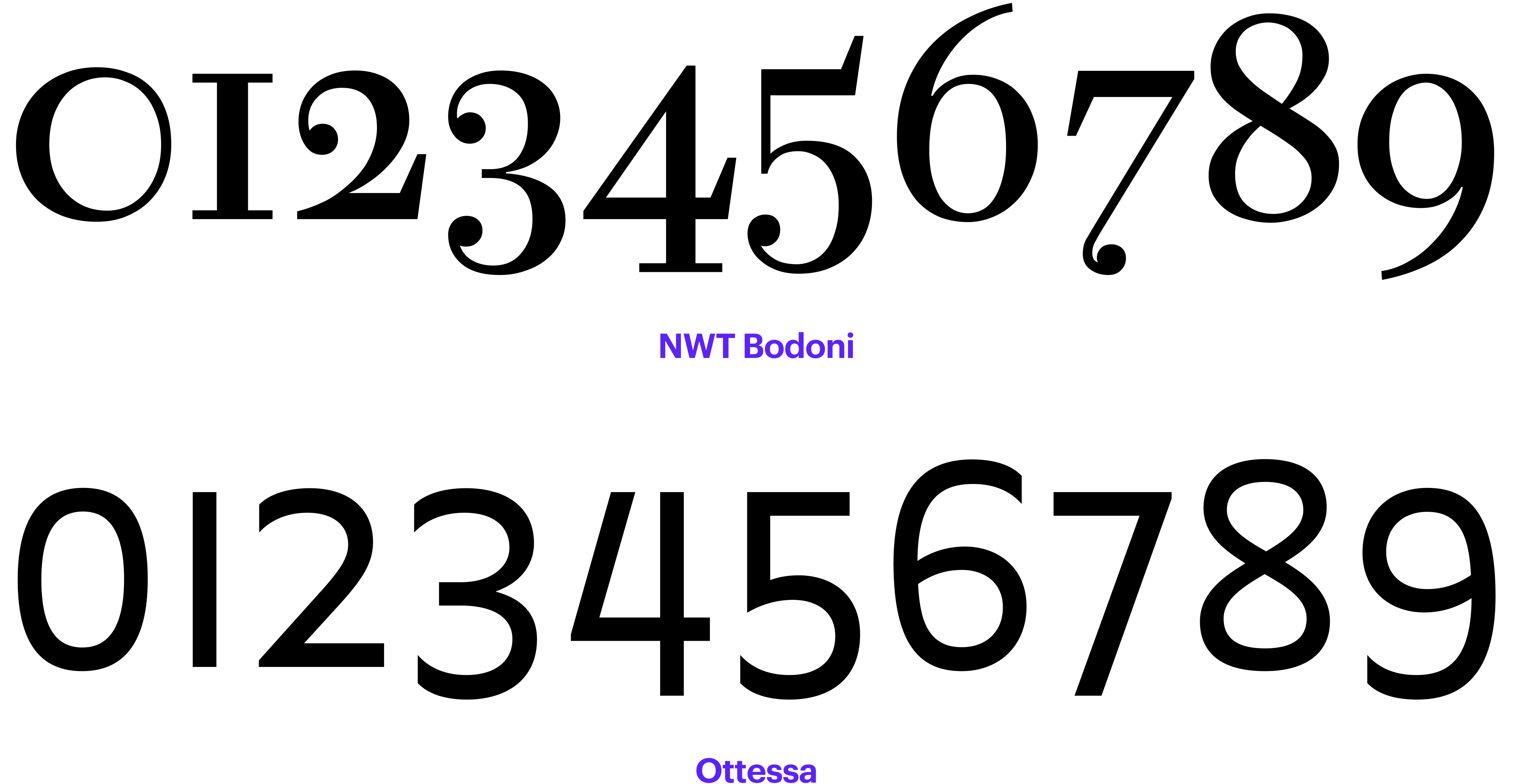
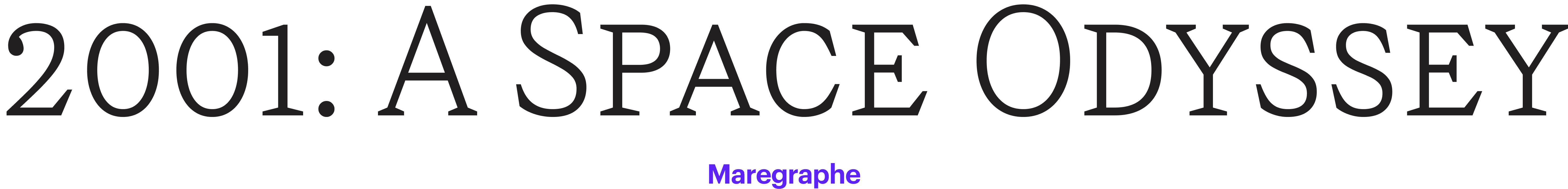
Old-style Figures (aka Text Figures)
The basic height of lining figures aligns with the x height. In most typefaces, the old-style figures 3, 4, 5, 7, 9 have descenders, while the 6 and 8 have ascenders.
However, in the serifs created in the late 17th-early
 Recueil des divers caractères de J. G. Gillé, 1808. Image: Bibliothèque nationale de France
Text figures might be of use, for example, in long texts featuring a large number of dates, where you don’t want to place any emphasis on them but rather make them an integral part of the text. But you have to keep in mind that the use of this type of numerals is typical for the 17th-18th century typography, so the old-style figures might look like a reference to that age.
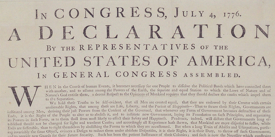 The Declaration of Independence, 1776. Image: National Park Service
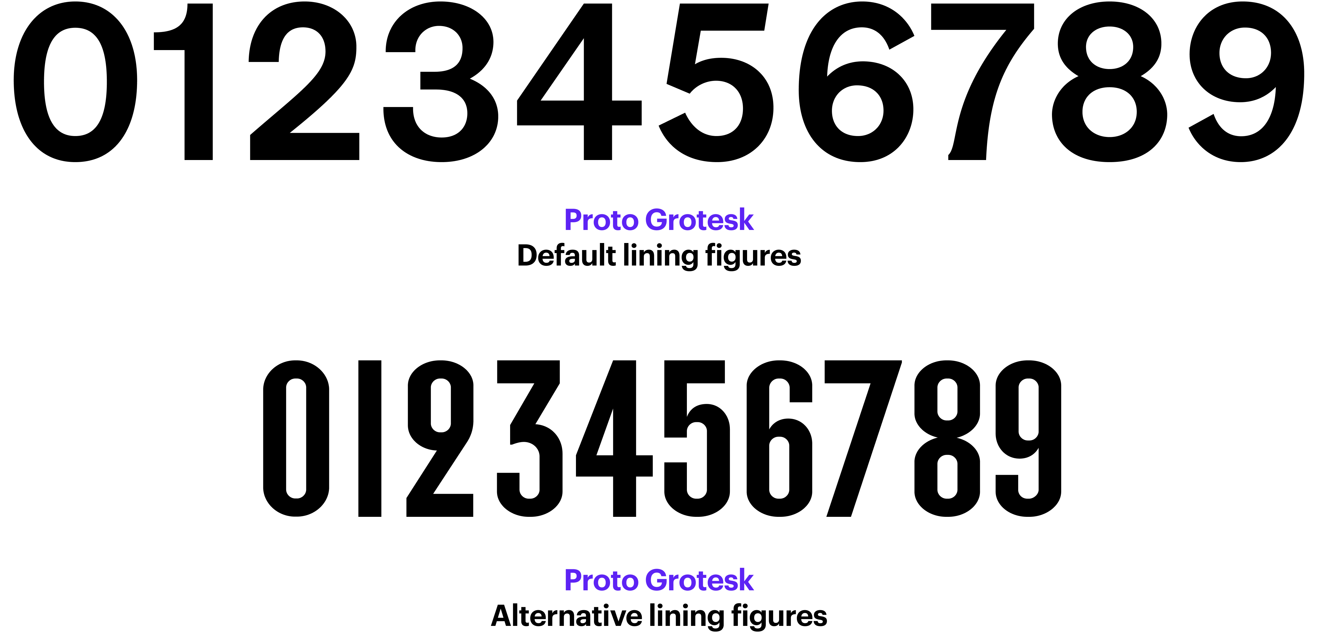
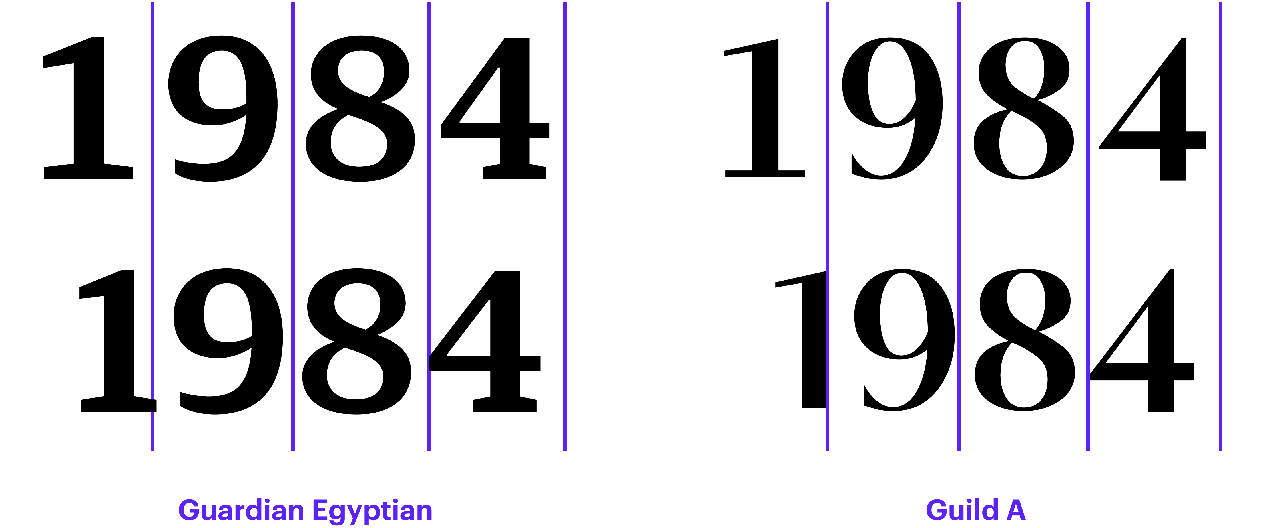
Lining Figures (aka Modern Figures)
These figures don’t feature any ascenders or descenders, and their height is close to the font’s cap height. The lining figures came about in the late 18th century and grew in popularity in the 19th century.
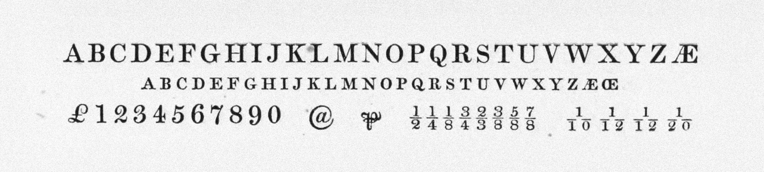
 Lining figures in Bell (1788), drawn by Richard Austin, are considered the first majuscule numerals.
Image from Robert Bringhurst’s book The Elements of Typographic Style
Lining figures in Bell (1788), drawn by Richard Austin, are considered the first majuscule numerals.
Image from Robert Bringhurst’s book The Elements of Typographic Style
If you click the All-caps button in a graphic editor, the figures will automatically switch to lining ones.
Hybrid Figures
In addition to text figures and lining figures, there are also hybrid ones, which are supposed to work equally well in both all-caps and regular text settings. These figures are roughly ¾ of the cap height. They sit on the baseline, and the 6 and 9 are fitted with a moderately long ascender/descender.
Sometimes designers make these figures the default or include them only in the version of the font intended for use in office apps.
 Small Pica Roman №1 by William Miller and Company, 1822. Image: St Bride Library
Small-caps Figures
Small-caps figures — as the name
 Old-style, lining and small-caps figure. Image from Robert Bringhurst’s book The Elements of Typographic Style
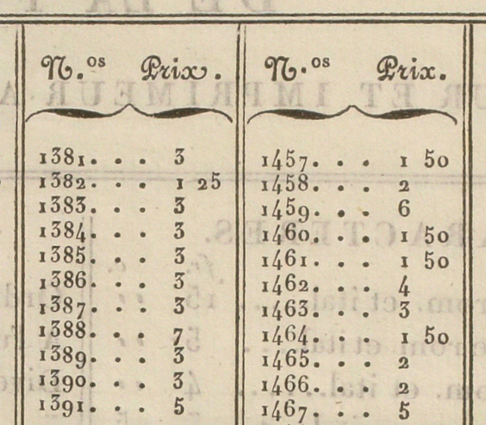
Tabular Figures, Proportional Figures
Old-style figures and lining figures can be either proportional or tabular. Proportional figures have varying advance widths (the width depends on the design of a particular glyph), whereas tabular figures share a fixed advance width. Proportional figures are good for use in running text, while tabular figures are an appropriate choice for situations where multiple numbers are set one under another (such as in price lists
Avoid using proportional oldstyle figures in uppercase setting as they look too small, or in tables as the numbers won’t align horizontally nor line up in vertical columns.
Yves Peters
Figuring out numerals
If you are working on a restaurant menu or a table in a graphics editor, make sure to select metric rather than optical kerning. Optical kerning will transform tabular figures into proportional

No version of Microsoft Excel supports OpenType features. So if you want tabular figures in your Excel
Matthew Butterick
Practical Typography
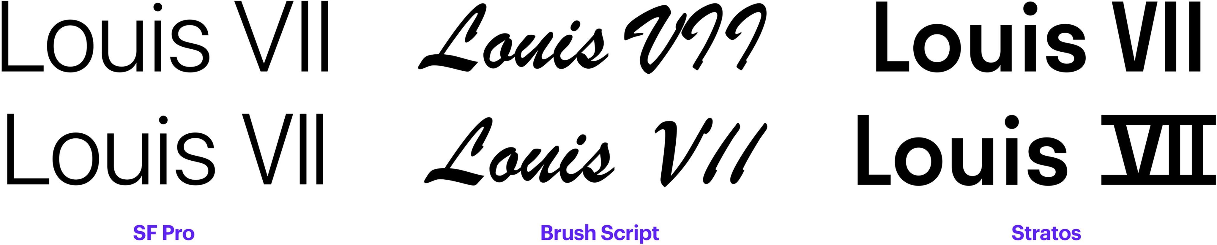
Roman Numerals
Although Roman numerals are made up of Latin letters, Unicode features a dedicated block covering them.
In some typefaces, the only thing that will distinguish the V, I, and I sitting one after another from the Roman numeral 7 would be spacing. In others, the letters would be joined with a bar, mimicking the way these numerals were often written by hand. In certain typefaces, such as blackletter, Roman numerals are built completely differently from standard Latin characters.
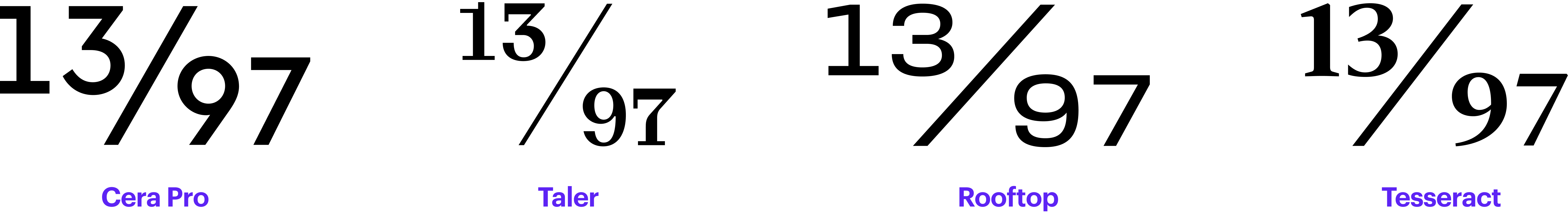
Numerators, Denominators
Many text typefaces include prebuilt fractions as well as separate sets of numerators and denominators. The upper stroke of the numerator usually aligns with the cap height, and the denominator sits on the baseline. Normally, the figures used for numerators and denominators are tabular.
You need to enable the Fractions feature to access fractions. It will convert numbers written with a slash: the first figure becomes the numerator, the second
Numerators and denominators should not be mistaken for superscripts or subscripts, as these two kinds of figures differ in their vertical position.
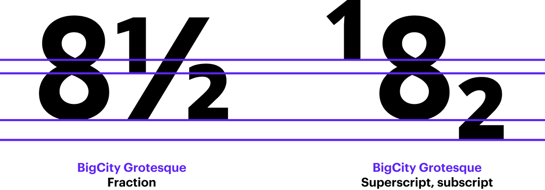
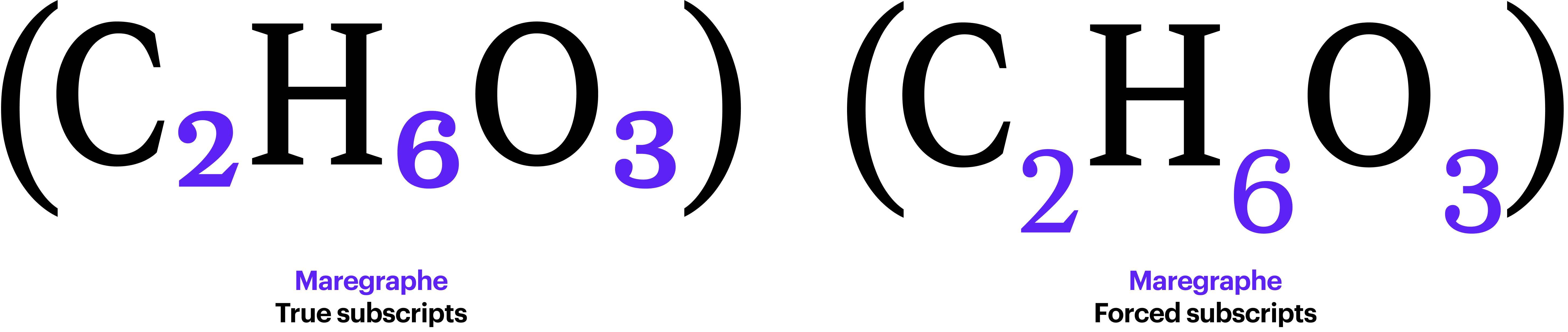
Subscripts, Superscripts
Subscripts and superscripts are most often employed in mathematical and chemical formulae.
Superscripts are also used for footnote numbering in books and academic papers. If you are about to deal with content that contains numerous formulae or footnotes, make sure that the typeface you choose includes subscript and superscript
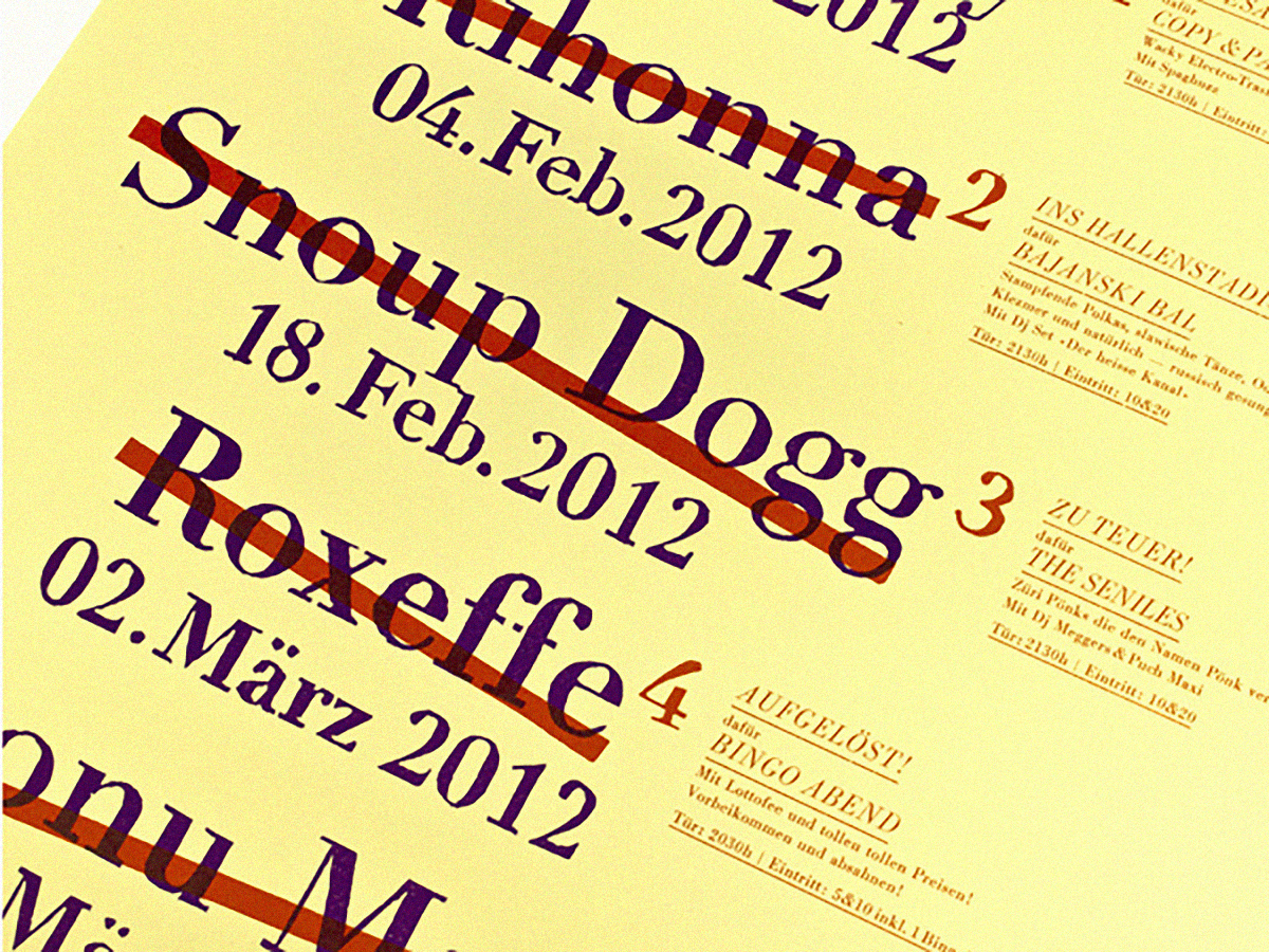 Cancelled and Rescheduled poster. Design: Dafi Kühne. Image: Indra Kupferschmid, Fonts In Use
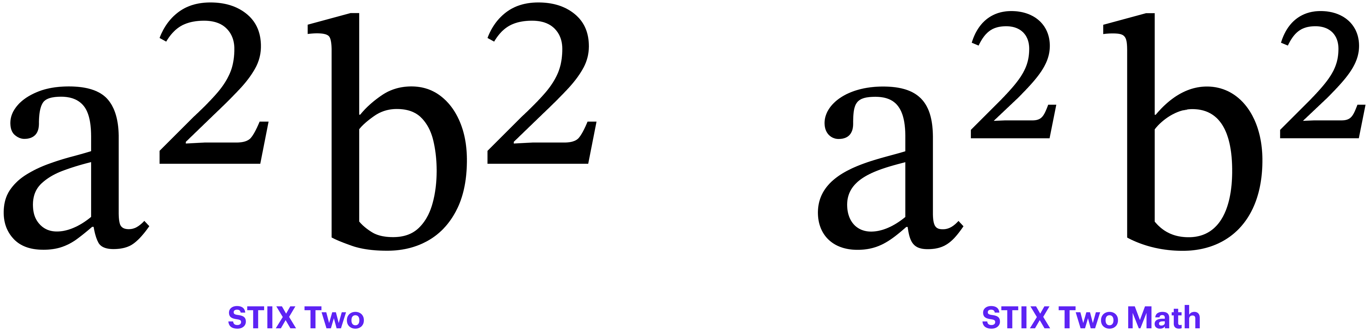
In typefaces designed exclusively to set formulae, it works differently.
Super and subscripts are drawn as a one set of full sized glyphs with the optical correction needed to look right when scaled down, and then the layout engine scales them down and calculate their vertical position.
Khaled Hosny
Type Drawers
That is why mathematical fonts normally include an additional space that is inserted if a bracketed text segment ends with an exponent, to compensate for its small side bearings.
There is no rule of thumb when it comes to positioning these figures relative to regular figures, but typically, subscripts sit below the baseline, while superscripts are placed above the line on which numerators sit. There is also no universal rule regarding the height of sub- or superscripts; for instance, Microsoft Learn recommends that they be 63% of the cap height.
Certain typefaces also contain sets of currency signs designed to work with subscripts and superscripts.
 Chevron campaign, 1962. Image: Bart Solenthaler, Flicker
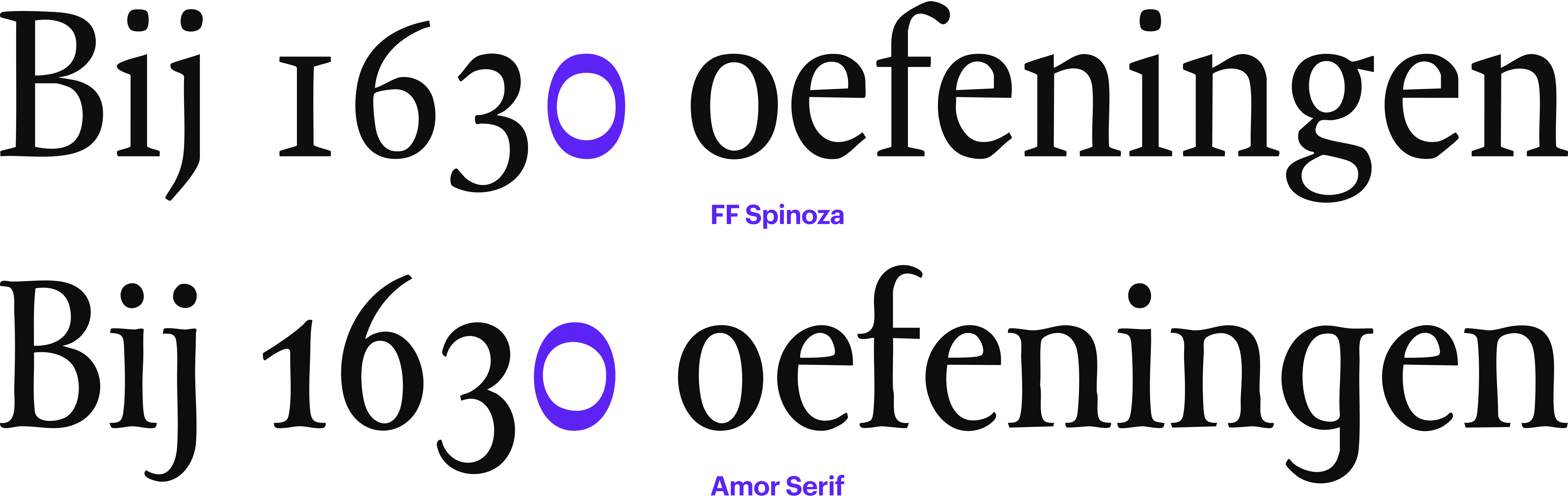
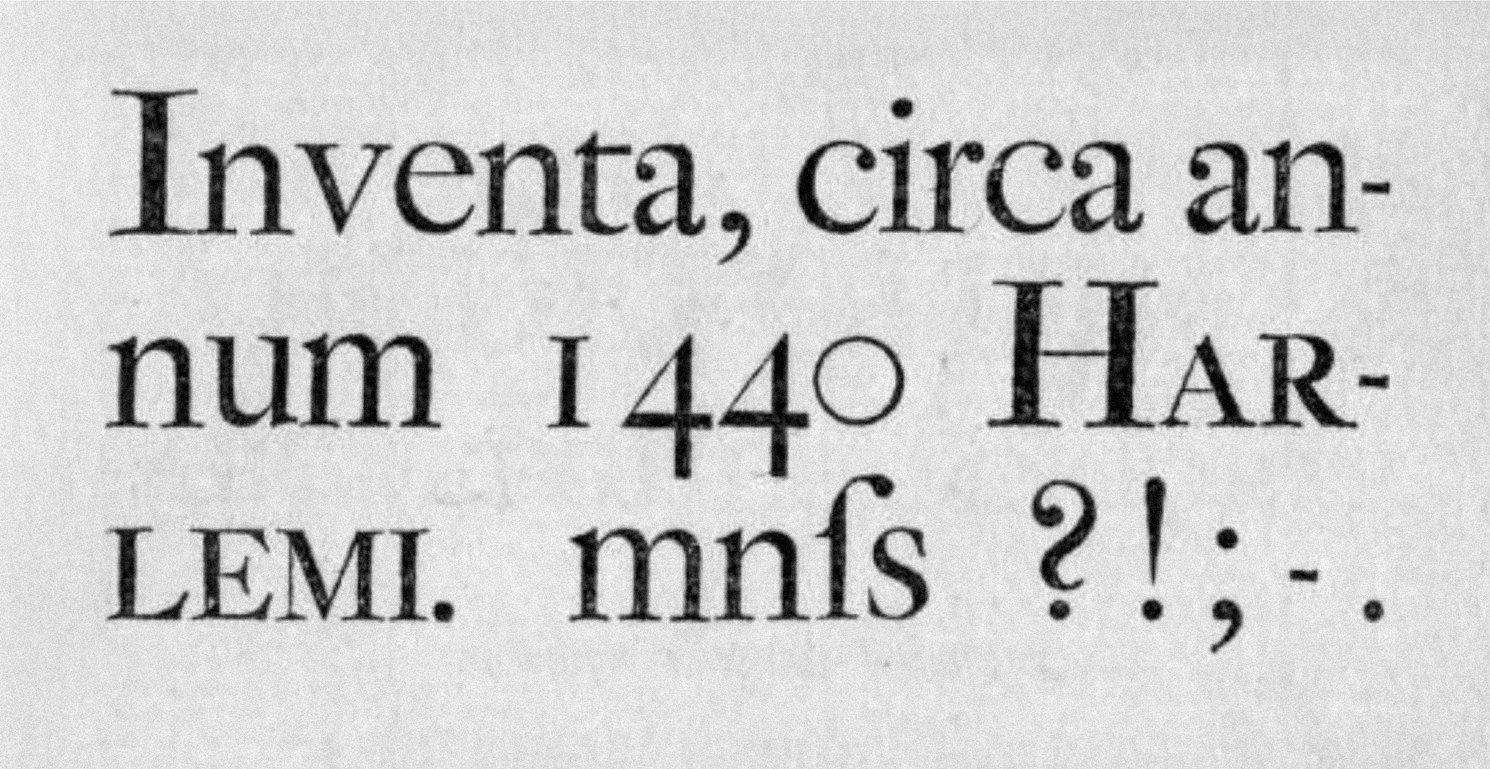
Slashed Zero
A slashed zero is used to make it easier to distinguish the digit 0 from the capital О. This might come in handy, for instance, for software engineers who deal with huge amounts of code set in a low-contrast sans serif font. If you work with text in Norwegian or Danish, make sure that the slashed zero is not too similar to the letter Ø.
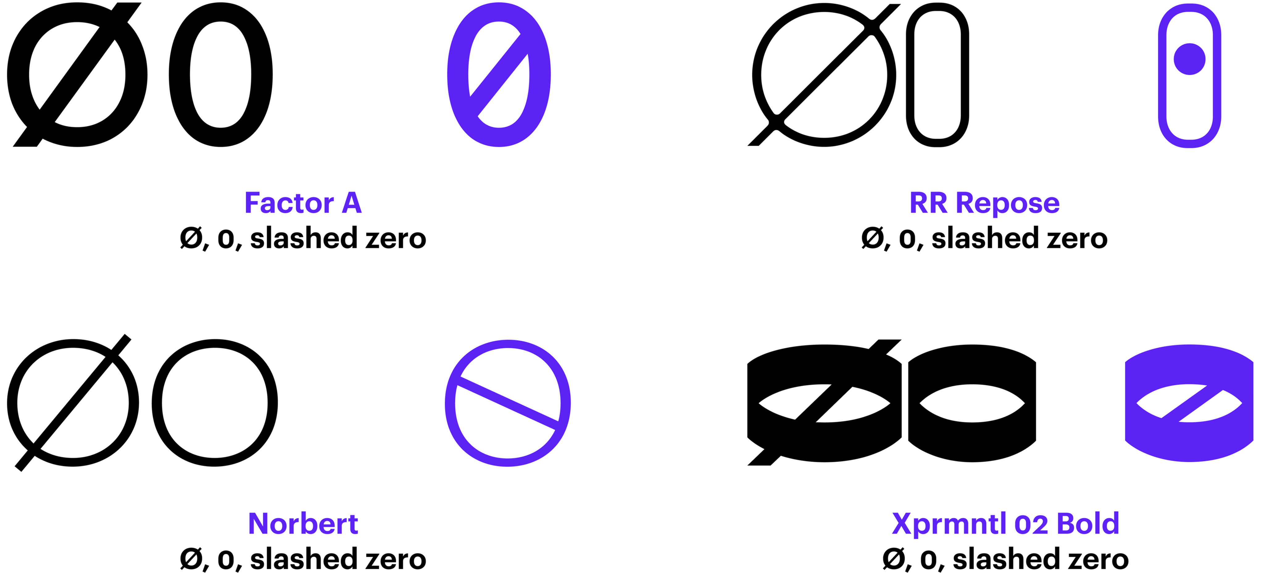
The character differentiation problem is nothing new, and it was addressed in various ways back in the era of hot-metal typesetting. For example, some foundries produced faces with a monolinear round zero, while others rotated the contrast axis so that the upper and the lower segments of the character were the heaviest.
 Joh. Enschedé & Zoonen type specimen, 1822. Image: St Bride Library
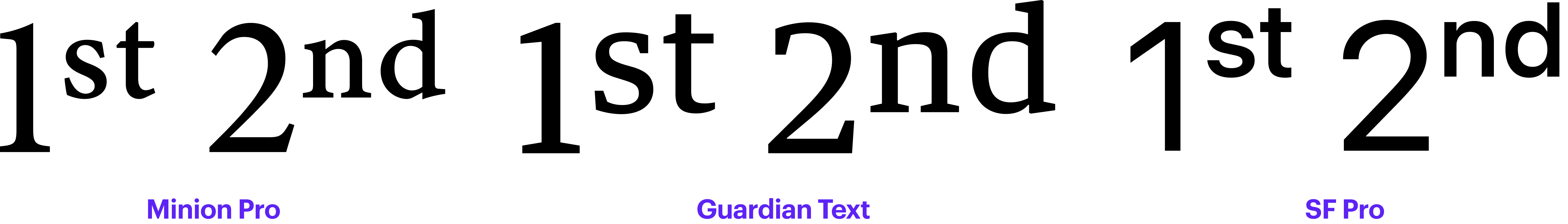
Ordinals
Ordinal numerals indicate the order of items when counting: 1st, 2nd, 3rd. The textual part of these numerals is often designed to be smaller and lifted above the baseline. Make sure you opt for a typeface that supports the Ordinals feature if you want to do this.
Graphic editor software lets you turn the characters into a superscript, but then they will look considerably lighter than the numeral itself.
Word automatically raises and scales down the textual part of an ordinal numeral, yet this feature can be disabled: Word → Preferences → AutoCorrect → AutoFormat As You Type → Ordinals (1st) with superscript.
Enclosed Alphanumerics
The most commonly used characters in this category are circled numerals, or numbers enclosed in circles or other kinds of geometric shapes.
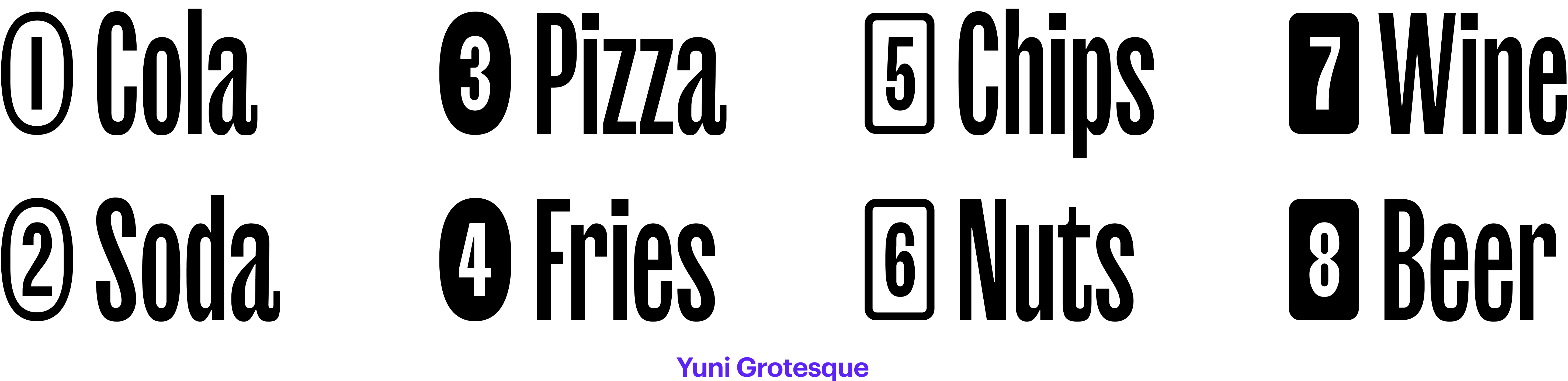
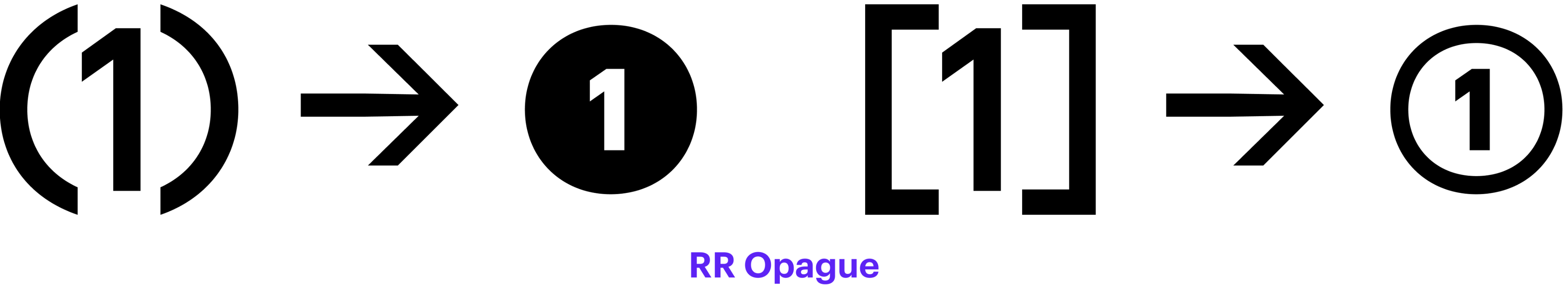
They are found in the Enclosed Alphanumerics block of Unicode, which, besides them, contains other typographical symbols intended to be applied as list markers. It includes, for instance, numerals within parentheses, digits followed by a full stop, double-circled numerals (as well as all basic Latin letters enclosed in similar shapes).
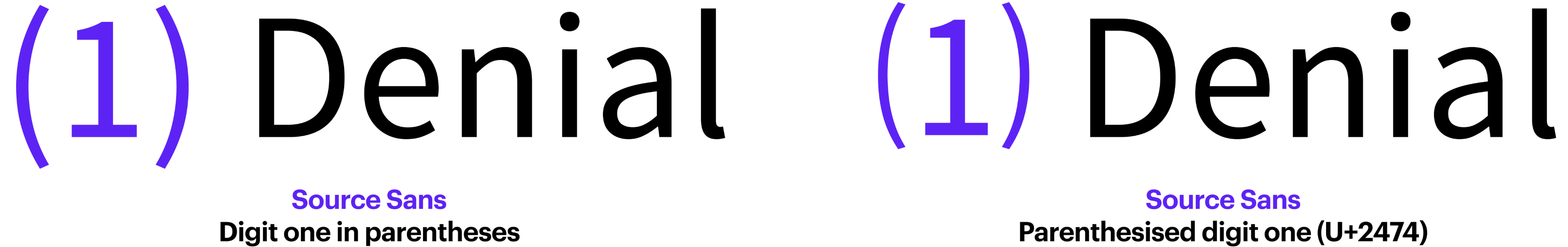
Most typefaces designed by Philipp Neumeyer boast a feature that lets you transform any number in parentheses into an enclosed number.
Bibliography
- Yves Peters. Figuring out numerals
- Yves Peters. Figuring out numerals. The sequel
- Microsoft Learn. Character design standards. Figures
- Matthew Butterick. Practical Typography. Ordinals
- Matthew Butterick. Practical Typography. Alternate Figures
- TypeDrawers. Superior, superscript, inferior, subscript, and ordinals
- TypeDrawers. Bad idea to use roman numerals
- Microsoft Learn. Typography. Slashed Zero
- Glyphs App Learn. Figure Sets