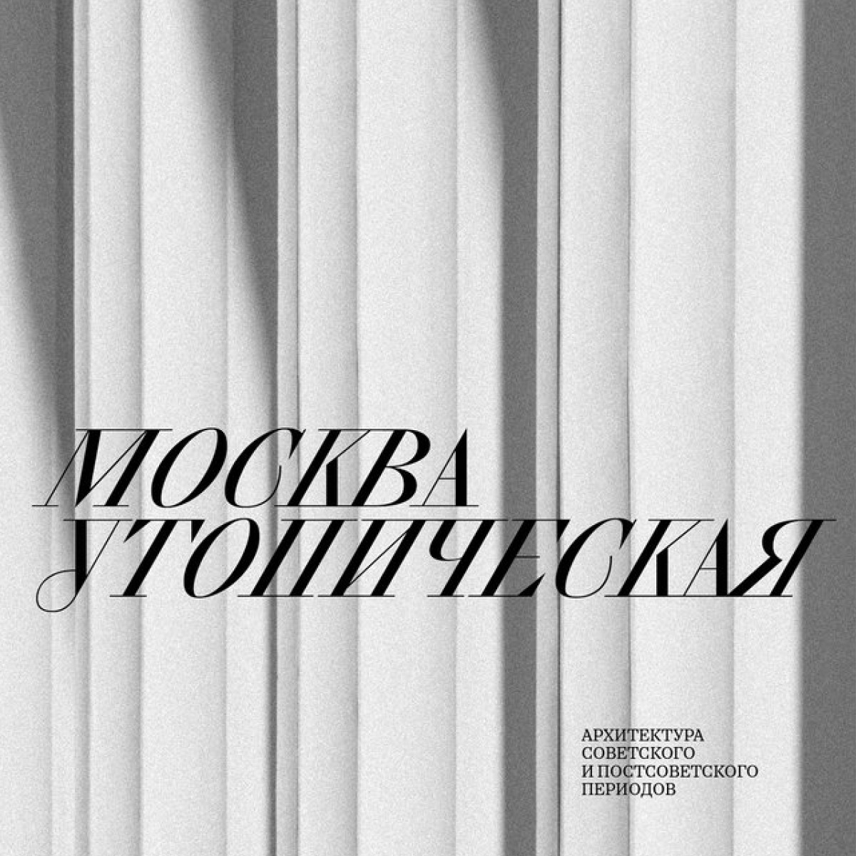
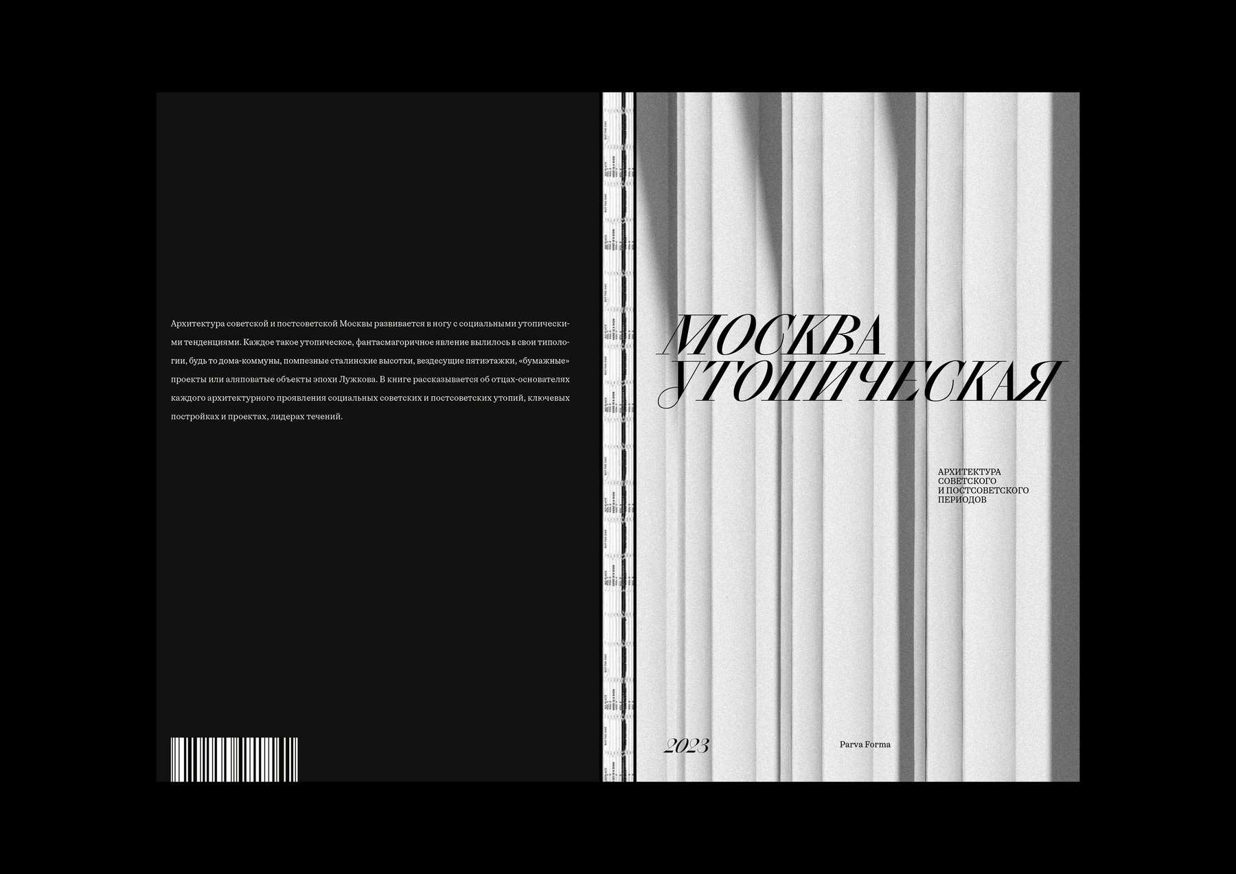
A student project by Arina Levitskaya supervised by Evgeny Korneev, Moscow Utopian is a book on how social utopias shaped Moscow’s architectural image during the Soviet and post-Soviet periods, what ‘factory kitchens’ were built for, and why the so-called paper architecture is valuable. The book’s typography is set in CSTM Xprmntl 02 Italic by CSTM Fonts and Oceanic Text by Interval Type.

Oceanic is a collection of three

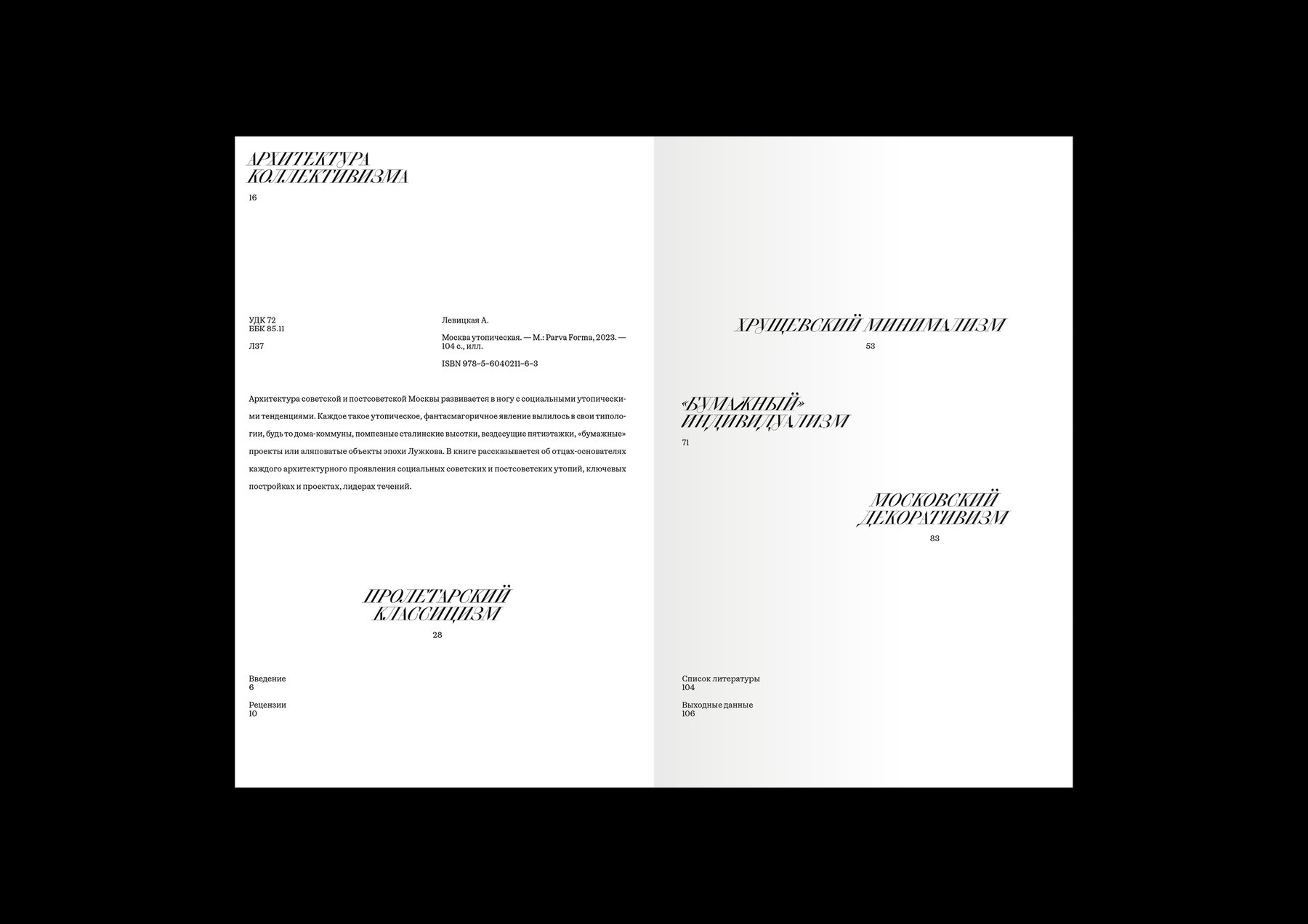
CSTM Xprmntl is a family that brings together three radically different typefaces: a regular ultra-closed sans serif with exaggerated, twisting stroke terminals, a high-contrast serif italic with deliberately straightened strokes in its diagonal characters, and a rough, heavy sans serif with reverse contrast in both its strokes and proportions. All three work great together, but do not get lost when applied on their own.
If you used the fonts from our library in your project, please tell us about it! You can do that by sending us the links and images at info@type.today.