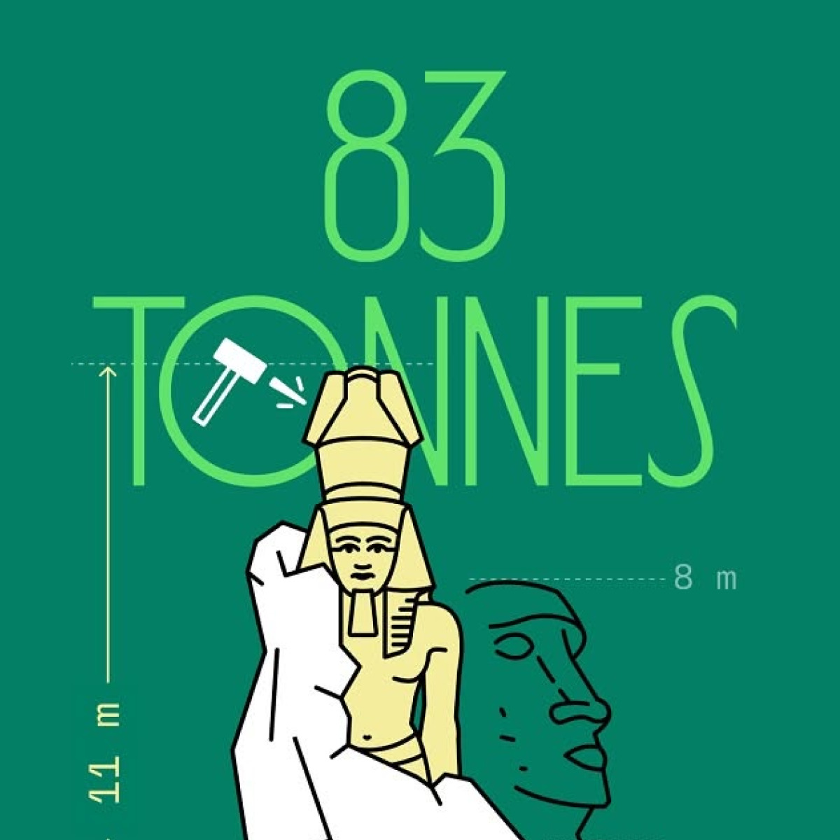
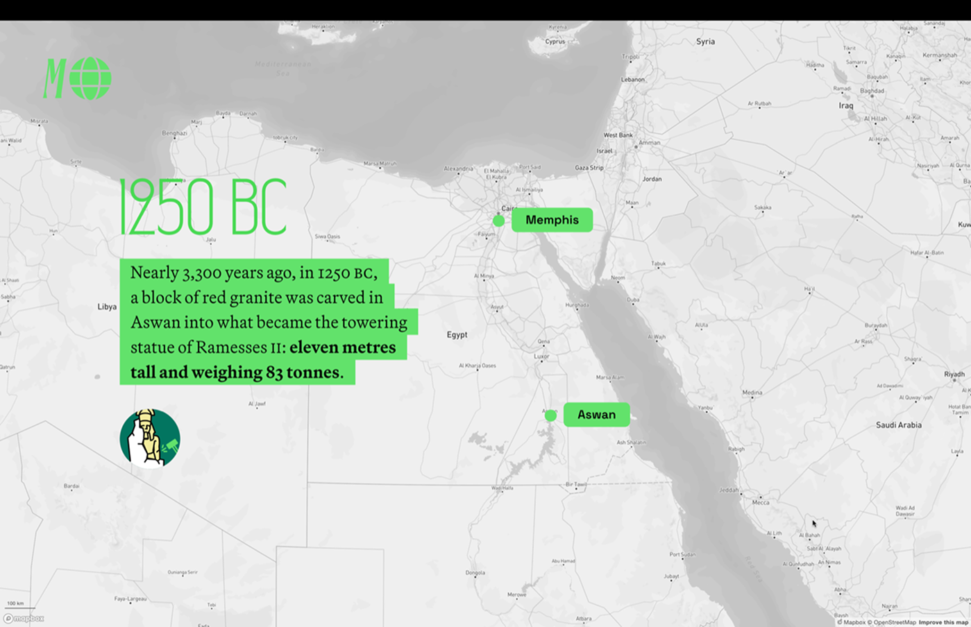
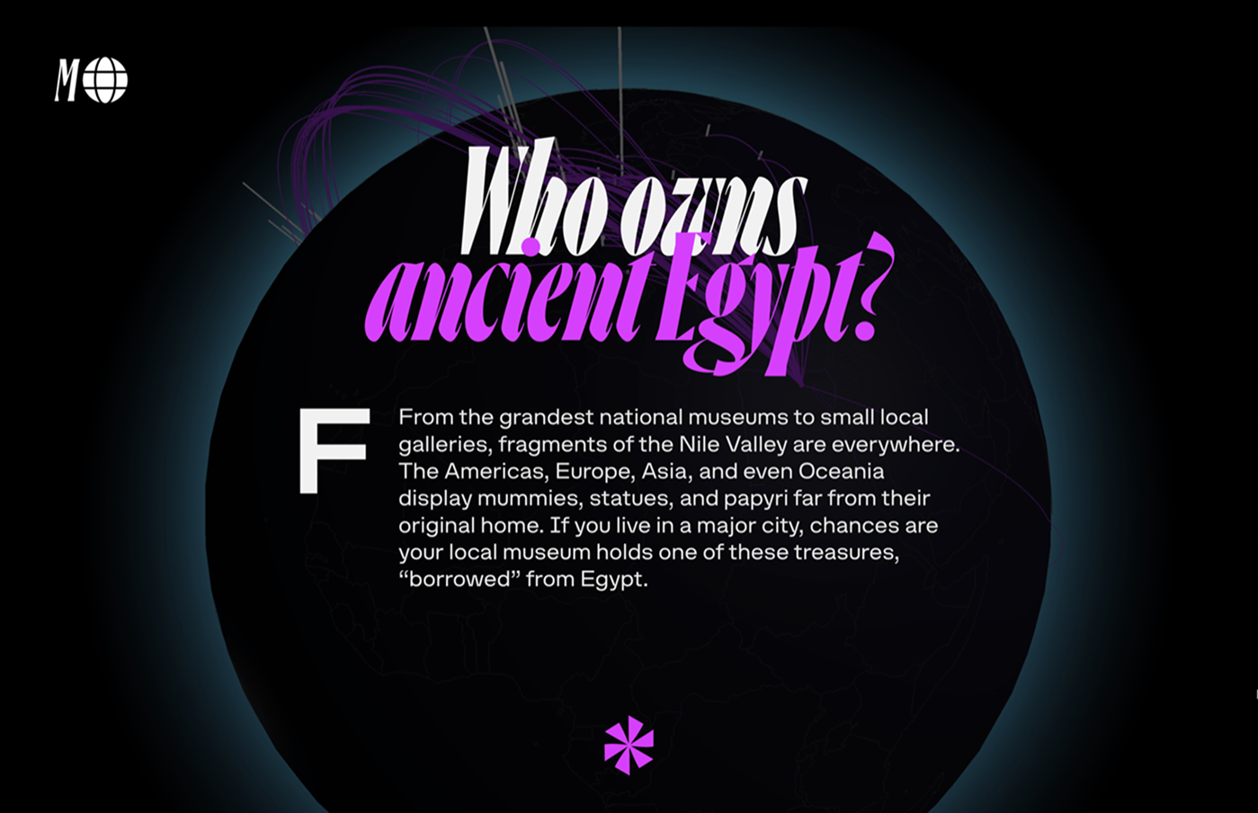
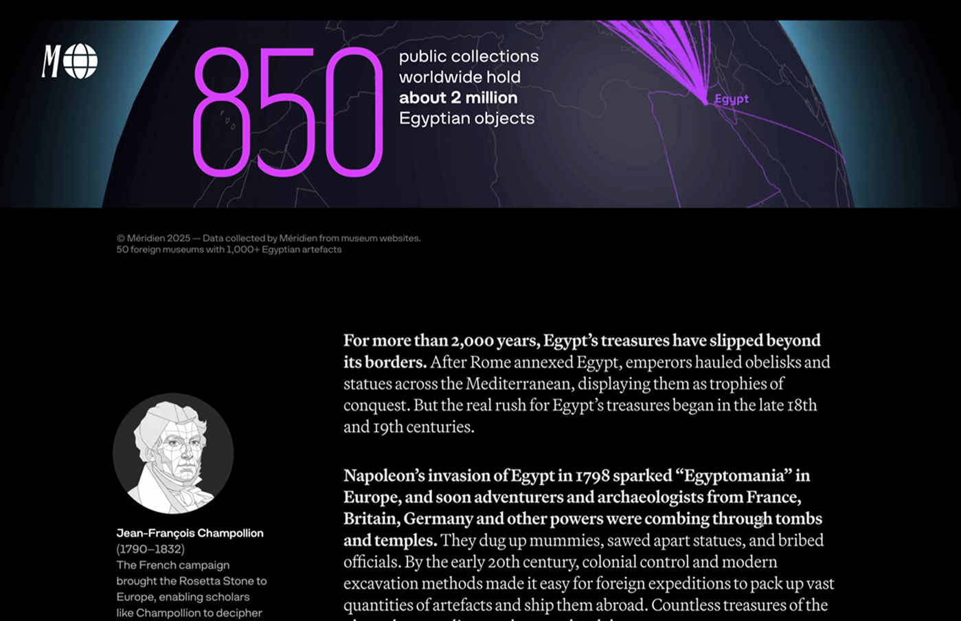
Méridien is an immersive media that explores how scientific discoveries and architectural experiments shaped different cities and our idea of them. Their first longread piece addresses Gaza, Egypt. The project’s logo and headings on its website are set in Ayer by Commercial Type, while the sidebar text features Martina Plantijn by Kris Sowersby, Struve by Schrift Foundry, and Space Grotesk by Florian Karsten. Repose by Philipp Neumeyer is used for accents.
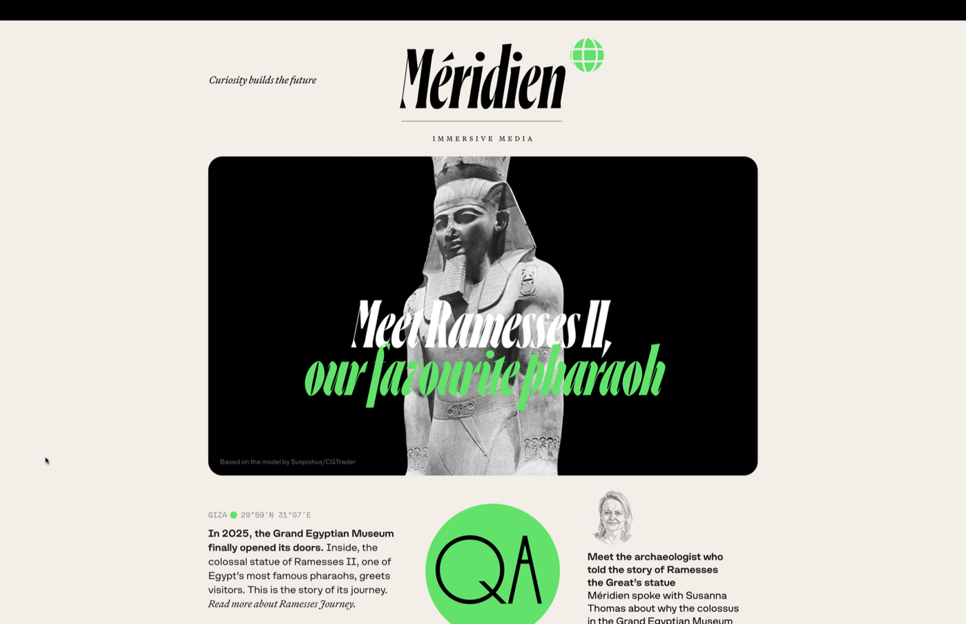
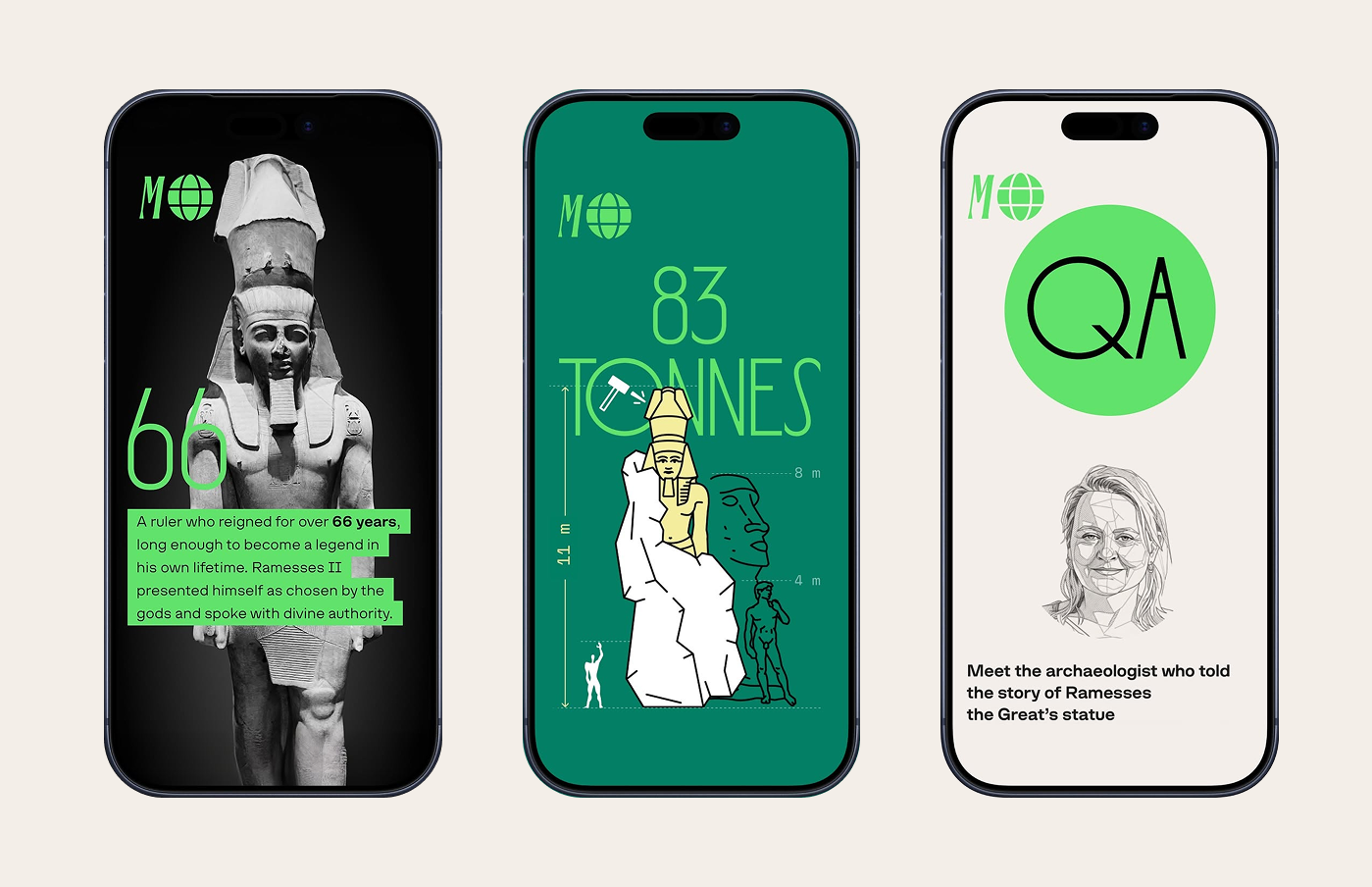
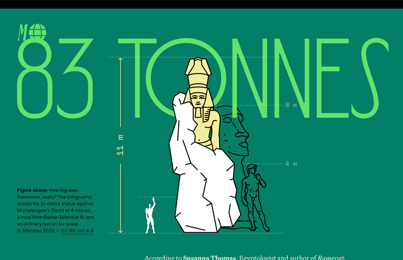

Repose is a collection of two light sans serifs. The technical Quad is a quad-width typeface. Just like monospaced fonts, it forgoes kerning, but has as many as four advance widths instead of a single fixed one. The second sans serif, Prop, opts for a more conventional spacing and kerning approach. Each typeface comes in three styles — A, B, and C. A features roundings anywhere they can be applied, B applies them sparingly, only on stroke joints and inside corners, whereas the bold C styles disregard them entirely.
If you used the fonts from our library in your project, please tell us about it! You can do that by sending us the links and images at info@type.today.
