Coronavirus, lockdown
offf.barcelona
2020.typographics.com
fontstand.com
The worldwide lockdown affected everything, including the design and type events planned for the nearest months. OFFF Barcelona is rescheduled for September, Typographics New York shifts online, Fontstand conference is cancelled in its entirety.

Moscow: Typomania and Type Workshop not cancelled
facebook.com/vasin.ru/videos/3635137533224630/
facebook.com/doreuli/posts/10206853735818444
Typomania Festival will not bring its speakers to Moscow this year, the talks will take place online instead. The annual Type Workshop, organized by Maria Doreuli, will take place as planned, and it might even be offline.

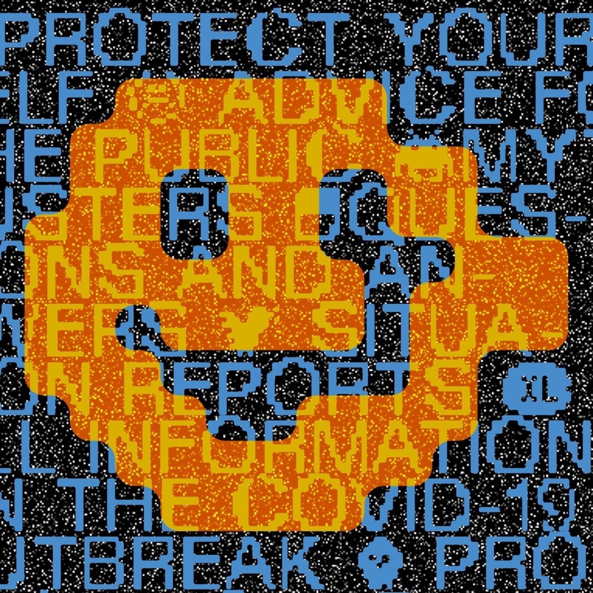
UN invites designers to combat the pandemic
talenthouse.com/i/united-nations-global-call-out-to-creatives-help-stop-the-spread-of-covid-19
UN and World Health Organization published a joint call to all creative proffessionals to help spread accurate information about the coronavirus — with all possible media, to all possible audiences. There is a list of key briefs:
- Personal Hygiene
- Physical Distancing
- Know the symptoms
- Kindness contagion
- Myth busting
- Do more, donate
A great example of graphic design joining the combat is Stay Sane Stay Safe, a vast (and growing) collection of seclusion propaganda.
Type design experts give free advice
twitter.com/HoeflerCo/status/1231790282619990017
https://twitter.com/grillitype/status/1241759105364234240
This February Jonathan Hoefler (of HoeflerCo) started a prolonged type consulting session — since that time he wrote dozens of tweets, assessing and advising on the works sent in. In March, GrilliType decided to do the same — they are still receiving material to be reviewed.
Denis Serebryakov tomorrow.type.today
Now that there are no activities but online activities, is the best time to use the given possibility. ;-)

Prototypo announces shutdown
prototypo.io/blog/news/10-years-8-months-and-12-days/
In 2009, Yannick Matthey, a design student in Strasbourg, started a student project about user-generated template-based free fonts (that was long before the introduction of variable type). Since then, Prototypo has been used by more than 100k people, yet the company has not broken even, will be ’sunset’ by June. The source code and the templates designed by Production Type will still be available at Github.
Alexander Cherepanov tomorrow.type.today
I wonder why it took so long. Sowehow, Prototypo was never mentioned in the ever popular talk about when software and neural networks will make type for us — even though it has been doing its job for 10 years, 8 months, 12 days (doing it not so great, it seems).
Ilya Bazhanov tomorrow.type.today
Already when Donald Knuth was developing his Metafont description language, there were attempts to create a language which could define fonts through coding. For example, a project called Metaflop by Alexis Reigel and Marco Müller. With Metaflop, you can adapt and adjust a font so it suits you with a couple of clicks. I believe that the Prototypo project goes further, providing even more flexible and convenient tool.
How digital fonts became what we see today
youtube.com/watch?v=5X9Dj7tBlkg
The new episode of the Typography.guru vlog: how Adobe and Apple abolished phototypesetting, why there used to be both raster and vector font files, and how rival companies agreed on the OpenType format.
Anna Seslavinskaya tomorrow.type.today
Fourteen minutes is the minimum time you can spend on learning the history of digital type, which led to OTF and variability. These are also fourteen minutes our early digital aesthetics, the younger version of Steve Jobs, pixels, and floppy drives. That is two good reasons to watch the video.

Unknown, the digital grunge
Unknown (by Lukas Haider and Alexander Raffl) is, obviously, a nod to the age of raster screen type. The idea somewhat resembles Gauge Letterpress — not recreating the model letterforms, but trying to match the resulting image and the feeling from it. The typeface is all-caps, but each case contains a different glyph variant. Three styles (square pixels, rounded pixels, and something inbetween), plenty of tastefully pixelated icons. Unknown works really well in every sort of size, and — lastly, but importantly — it is free to use.
Very contemporary. Feels like something just off the catwalk: evoking immediate emotions and spawning.
It seems like we witness further developing of nostalgic trends, and they are taking on new forms. This can be compared to the gaming industry where we have been seeing a trend to create pixel games with the use of old technologies for many years now, and we are playing those games and watching them from our high resolution monitors. I think it is interesting how different contexts get mixed for creating something new.

Bipolar Grotesque
behance.net/gallery/90621297/rihter/
ESH Group (Moscow) finally published a profile for the graphic identity of Richter (a hotel and an event venue in Moscow), which is one our favourite type projects of 2019. The backbone of it is Bipolar Grotesque, an extravagant custom face designed by Katya Daugel-Dauge. If you can read Russian, here’s a small interview about the typeface project.

As soon as you use camera on your laptop
Design studio Overtone and video game developer Set Snail made a small web game: you can tweak the variable font with your grimaces, your mouth is for width and weight, your eyebrows, optical size.
This reminds me another interaction principle of this kind https://twitter.com/Ba_Gsn/status/786544405310210049.

William Morris and Emil Ruder at Typeroom
typeroom.eu/william-morris-an-ode-to-the-revolutionary-artivist-of-arts-and-crafts
typeroom.eu/in-grid-we-trust-emil-ruder-aka-the-iconic-pioneer-of-swiss-style
Typeroom continue their Origins series, spreading the knowledge about the most significant names in design history. This March they covered William Morris, the founder of Arts & Craft movement, and Emil Ruder, the pioneer of Swiss Typographic Style.
Superb. The history of type is worth learning through personal stories. That makes things much more fun.

Stratos for Skyeng
Shuka Brand Bureau (Moscow) design a new branding for Skyeng, online school of English). The brand typeface is Stratos (Production Type, Cyrillic by CSTM Fonts), used almost everywhere, except for the logos.

A really
hungarumlaut.com/typefaces/supergravity.html
Adam Katyi, who designed Menoe Grotesque available through our main catalogue, released Supergravity, a display sans face inspired by Hungarian posters from the early 20th century. Extracondensed letters, slight contrast, non-horizontal terminals, short descenders. In case you would like something akin, but with Cyrillic glyph set — have a look at Theodor by Phillipp Neumeyer.

Variable fonts, a guide for beginners
A short, no-nonsense way to explain variable type: how it works, why you need it, how it can help you.
A handy one. Better not delay your introduction to variable type until the epidemic is over and offline meetups are on — try to learn things all by yourself. Moreover, design Python and type coding workshops (let alone, variable fonts) seem quite rare. And in case the universal lockdown is to stay, you might need some other learning resources — consider DesignDesign.Space.

Peter Biľak in interview with Type Journal (Russia)
typejournal.ru/articles/Peter-Bilak-Interview
You can compare typefaces to handshakes. Sometimes you get handshakes that go like “mmm?”… And sometimes a handshake that isn’t forceful is convincing. And you feel, yes, the person knows what he’s doing. The same with voices, and the same with types. I think credibility/authority is an important aspect. Authority means that you don’t doubt what you see; it is not just trying to surprise — “I do it differently.” Lava is completely relaxed, not in your face. It works in a subtle way. Probably, it works more subtly than any of my other fonts. And I’ve become very fond of it. I never thought that it would have such a good afterlife because it was made for the magazine project, but now you can see it in many other projects.
Founder of Typotheque, Peter Biľak tells the story of moving to Netherlands after a devastating house fire, explains why FontStand supports independent producers in the times of Monotype, elaborates on the neutrality in type and the importance of producing fonts for all existing writing systems.

Graphik Compact, Flicker, our latest releases
type.today/ru/journal/graphik_compact
type.today/ru/journal/tomorrow_flicker
This March we introduced new fonts, both in the Today and Tomorrow catalogue. Graphik Compact Cyrillic, the name says it all, doesn’t it? Flicker, a condensed grotesque with eloquent inktraps and psychedelic variability.

A custom face for Rocketbank (Russia)
facebook.com/chrpsh/posts/933557333725350
Alexander Cherepanov (Transgender Grotesk at tomorrow.type.today) finished a custom type project for Rocketbank, a pioneering Russian e-banking app. The font is a semiwide grotesque, industrial, yet humane. If the news are true, Rocketbank might not live to see next January — in that case, the font is likely to appear in retail.
Note that, we finished the font early February, I posted it on Facebook March 23rd — because of patenting and other legal issues — and the day after that, Rocket announced the service might be sunsetted before the year ends. Sad!
The face is relatively trendy, relatively wide, friendly and frank. I like Alexander’s dramatic storytelling in his gonzo Telegram channel.
The lost Russian blackletter
Vincent Lacombe, a student at ANRT, researched Russian archives and discovered Cyrillic blackletter typefaces designed in the early 19th century. He then designed a digital version of it.
I really paid attention to the visualisation of Cyrillic blackletter encounters in 1837–1850 (21:44). Not only beautiful, it is also a resume a vast research: 29 previously obscure authors included in the graph and classified. Great stuff to pin down. Unlike the blackletter one, Copperplate, the second typeface designed by Vincent (30:00), hasn’t caught my attention previously. It looks just as nice in a typesetting.
Arsen Mollakaev posted on our Instagram this March
Each day he published pages from thr fictional brandbook for Russian Caucasus — we highly recommend to take a look.
In April our IG account is led by Polina Kukushkina.