Christian Schwartz and Berton Hasebe originally designed the dense, sober Feature for T: The New York Times Style Magazine when, in 2018, new editor-in-chief Hanya Yanagihara catalysed a radical reimagining of the book. What had been an airy, image-focused publication evolved into a text-driven one.
Creative director Patrick Li and his team at The Times provided reference materials from the 1960s and 1970s, various interpretations of Times New Roman, and the notion of defaultness.
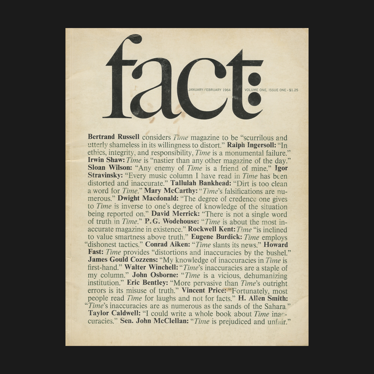 Fact magazine cover. Volume 1, January–February 1964. Image: Harvard Library
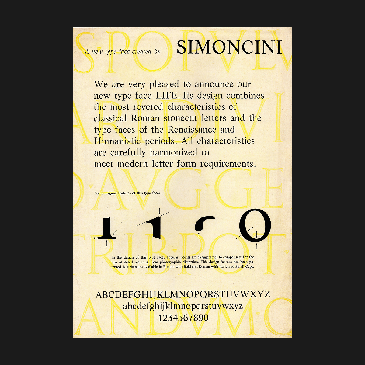 Life by Wilhelm Bilz and Francesco Simoncini, 1965. Image: Luc Devroye
Using Times New Roman as a starting point, Schwartz and Hasebe designed a newsy serif with unusual contrast (relatively low in the main strokes, higher in the serifs) that gives the face a distinctive rhythm in blocks of text.
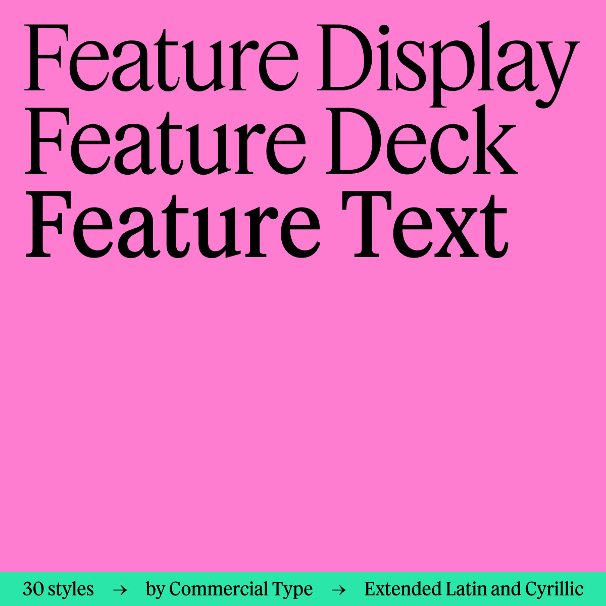
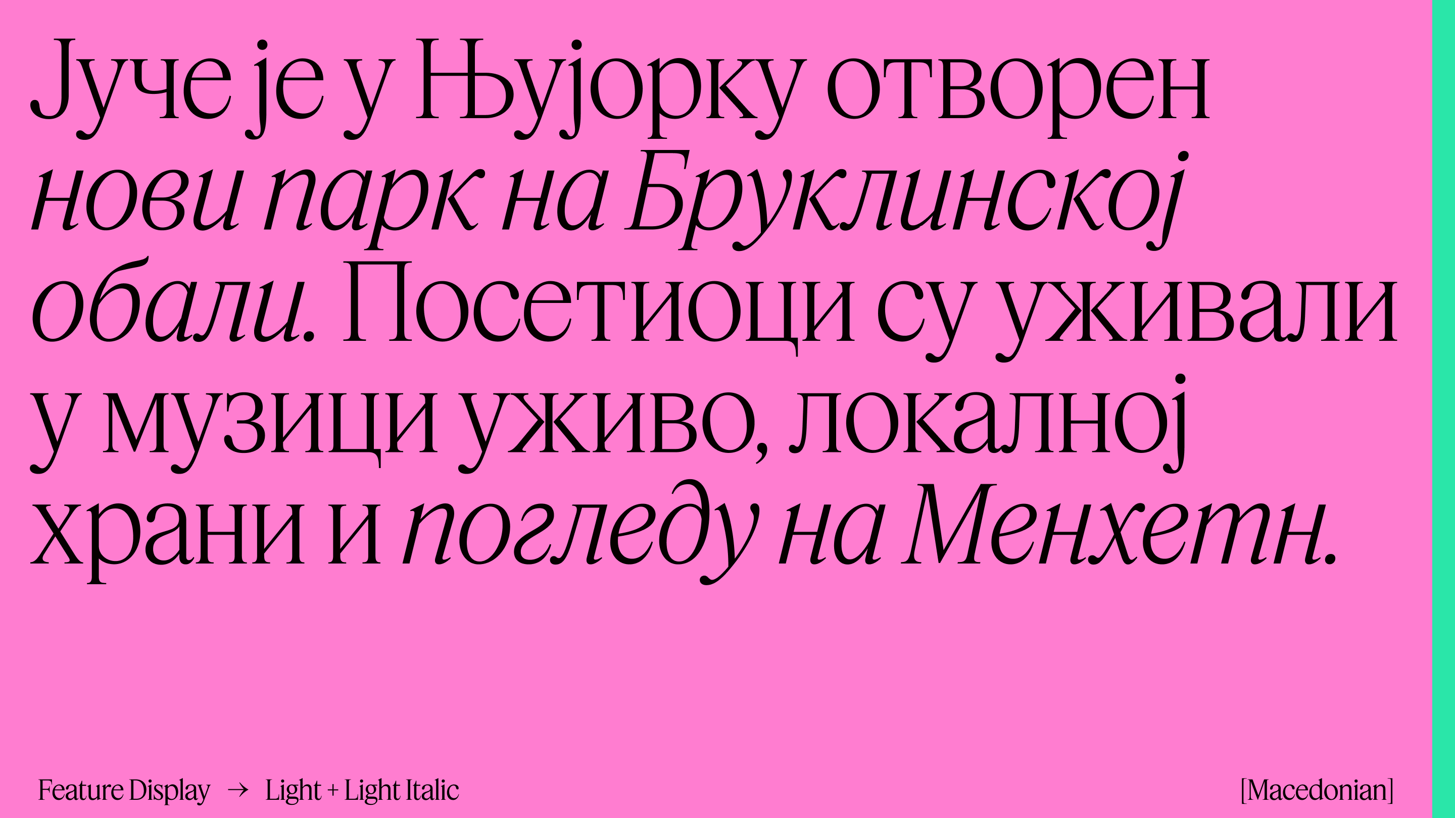
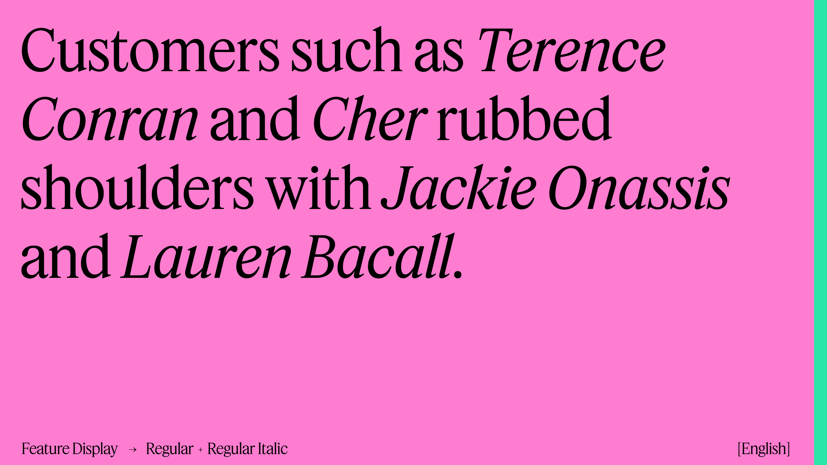
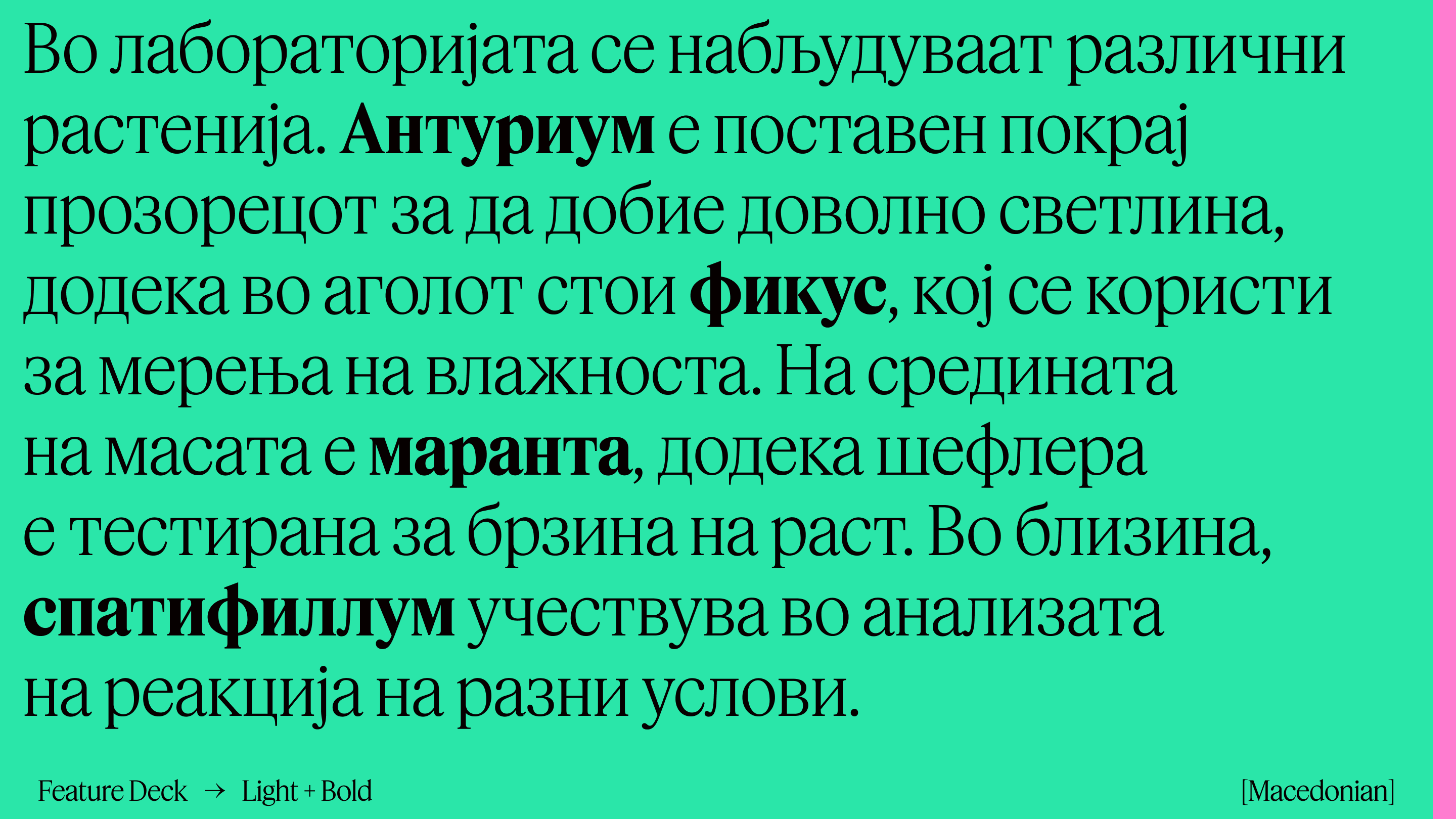
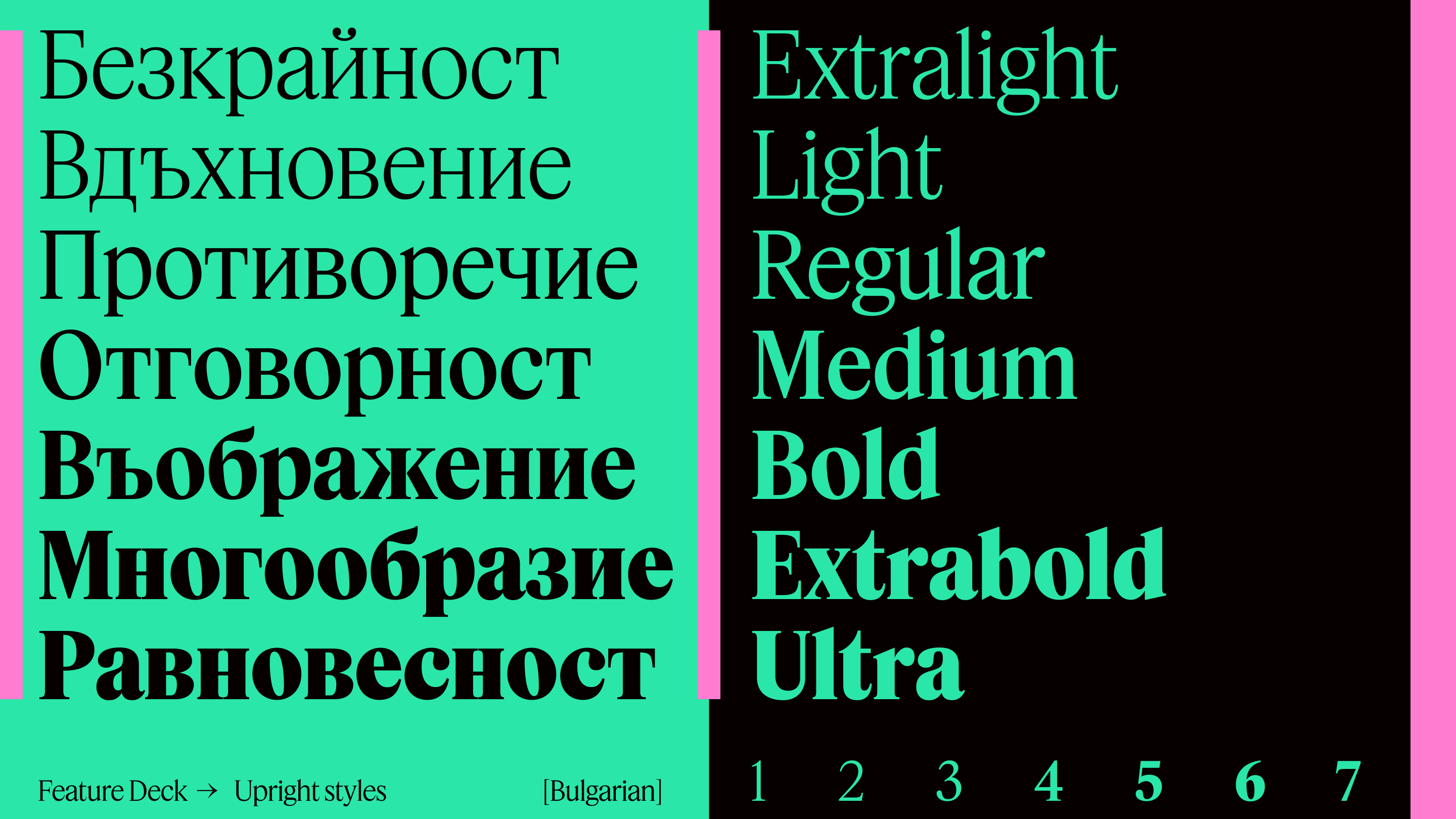
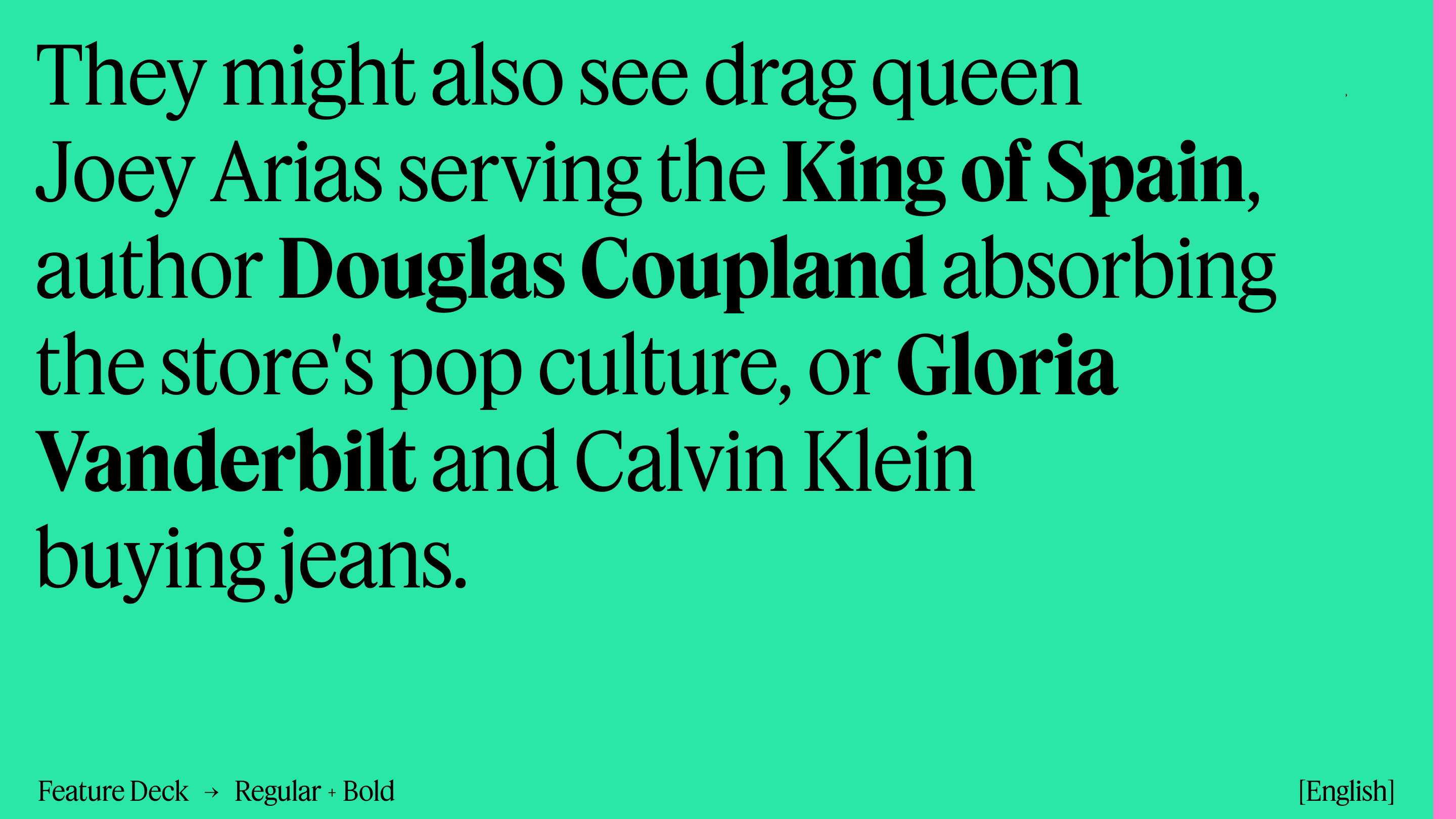
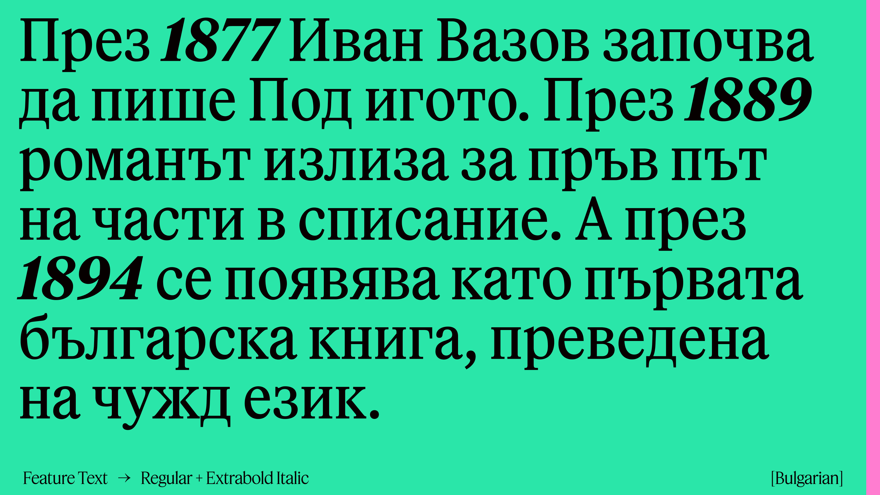
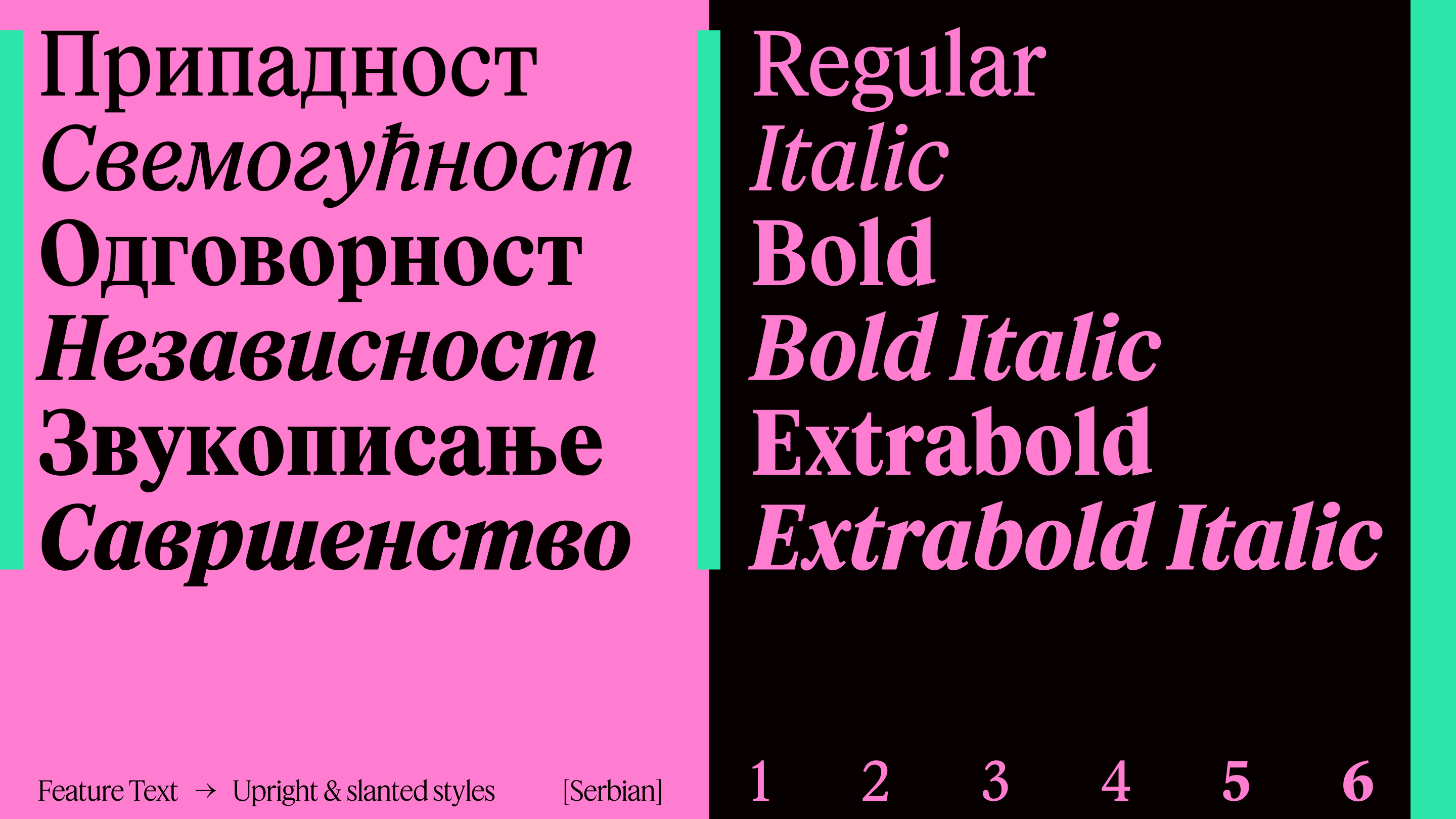
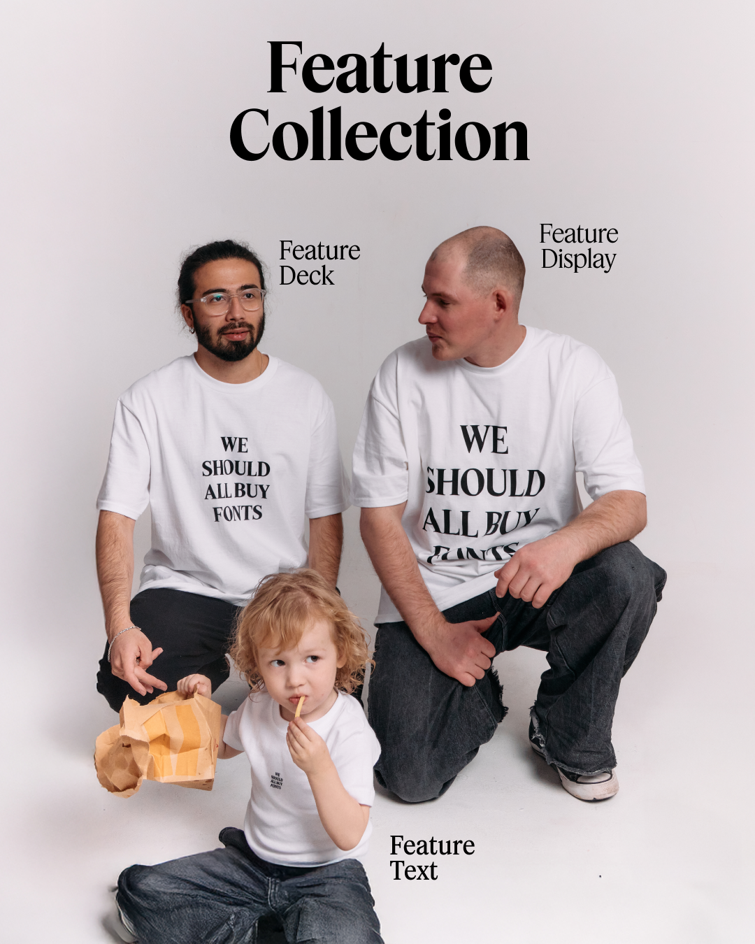
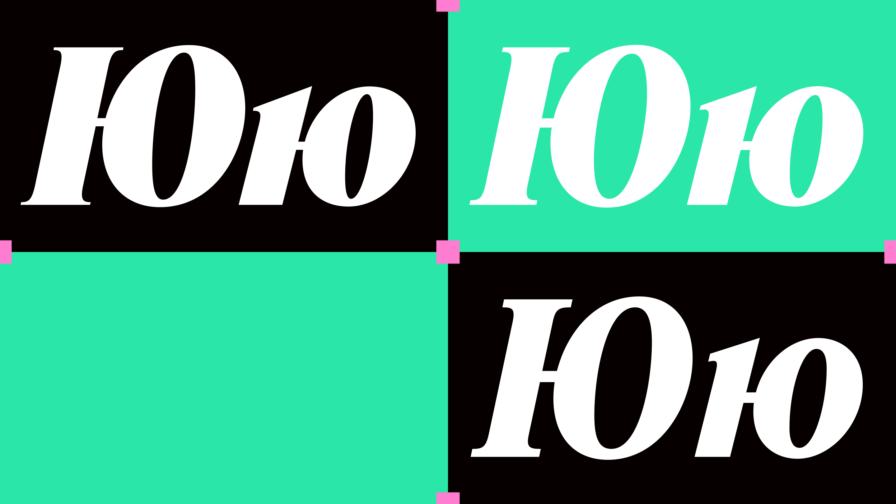
Feature consists of three optical sizes — Text, Deck, Deck, and Display — for a total of thirty styles (fifteen weights with matching italics). The Text cut includes small caps, and all three families come with lots of alternates, such as a Q with a tucked-up tail that sits on the baseline for setting tight lines of caps, a fancy quadru-serif W, a Saturday Night Fever R, a wide-stance M, and other forms.
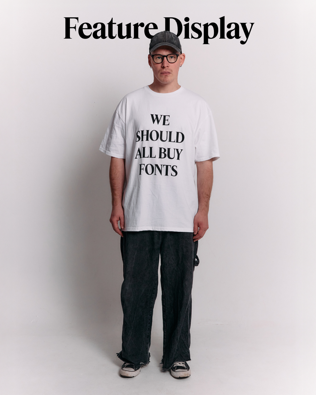
Times-ish at a glance, Feature introduces subtle, lighthearted twists and turns that make it anything but default and usable for applications well beyond editorial work. It has already appeared in the identity of a music festival, on an exhibition poster, and even on the website of a coach who helps young mothers.
Get Feature
from $60 on type.today


Get Feature
from $60 on type.today
The collection was expanded for retail release by Hrvoje Živčić, with Cyrillic added by Ilya Ruderman from CSTM Fonts.