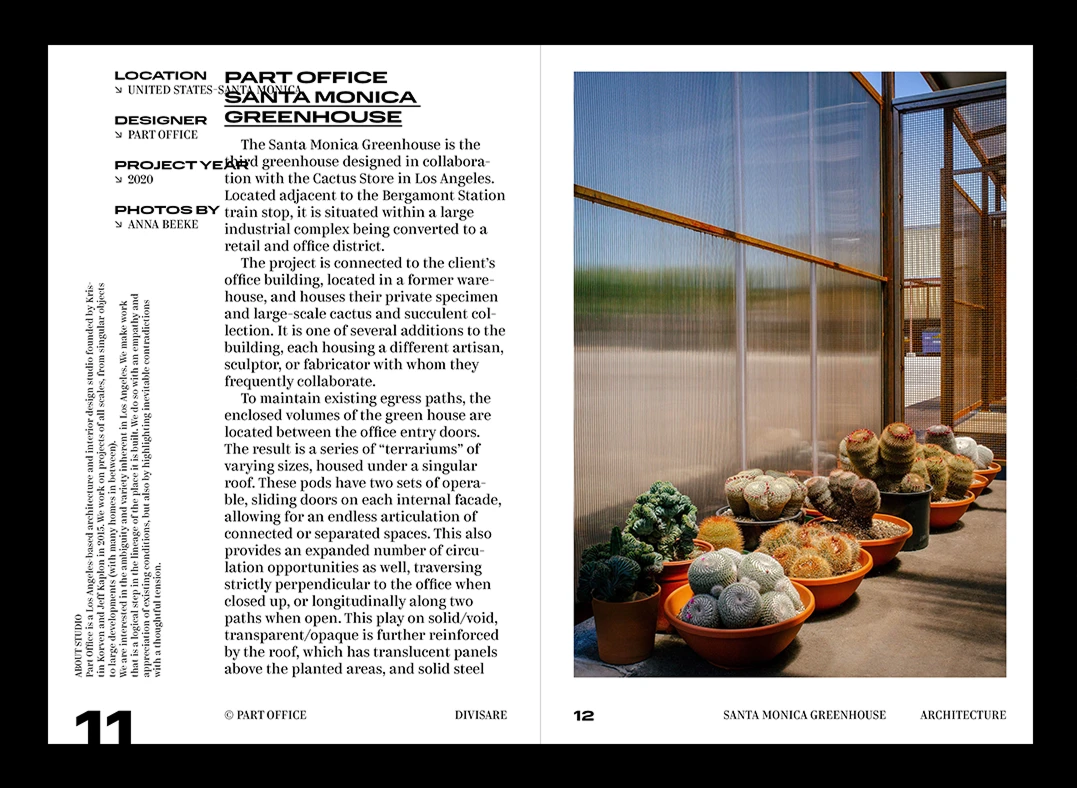
Divizare Book is a paper version of an online atlas of commercial architectural projects that Olga Kharina created as part of her book design course at Typomania School. Normalidad by CSTM Fonts is used in the book’s series titles and page numbers, while body text and headers are set in Kazimir by the same foundry.


Normalidad is a mechanistic semi-closed sans serif with an impressive number of styles. A wide palette of widths, ranging from Compact to Ultra-Extended, makes Normalidad a convenient, versatile tool.

Kazimir is a high-contrast modern serif with five weights from Light to Black, each fitted with italics. The typeface comes in two stylistic sets, Regular and Irregular. The latter contains glyph variants with bizarre details, which work great in larger sizes but are hardly imaginable in a contemporary text face.
If you used the fonts from our library in your project, please tell us about it! You can do that by sending us the links and images at info@type.today.
