
What happened?
ATypI conference posted a last-year talk delivered by Google Fonts lead operations manager Dave Crossland and FauxFoundry co-founder Laurence Penney on the future of variable fonts and how they might be affected by AVAR2 technology.
Is this only for type designers?
The AVAR2 technology itself was developed as a tool for font
For the user, this means that they can, for instance, upload to a multi-language website with a complicated text hierarchy just one font file instead of a number of files and not be afraid that the font acts weird in one of its variations.
What is actually AVAR?
Axis Variation Table is a table that allows to influence the result of automatic interpolation with the use of OpenType instructions and alternative way of interaction between axes and design space. For example, in a variable font with one axis from 100 to 900 where 100 is Thin, 400 is Regular and 900 is Black, interpolated styles Light and Bold will have values 300 and 700. If the Bold style is more optically accurate with a value of 590, one will have to add a separate master file, although this will considerably increase the file size and make any further dealing with the source file less convenient.
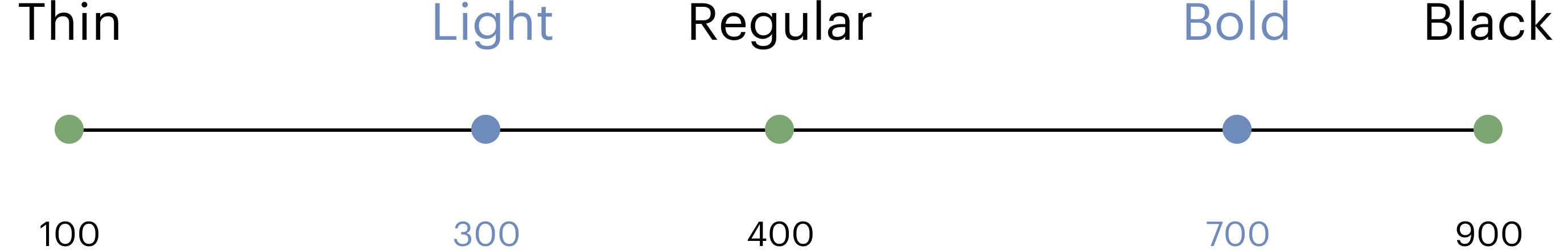

If one manually assigns a necessary value to the style, the font might improperly work in a web layout, graphics editors and
Why update AVAR?
AVAR1 technology was good only for the fonts with one variable axis. If an AVAR1 user decides to introduce to a font with a 100-900 weight axis a 75-125 width

It is impossible to use AVAR1 for changing the weight value only for the Compressed style because AVAR1 assumes that axes are orthogonal. Added master files will increase the file size and complicate any further work with it, while a manually translated style might improperly interact with CSS styles.

That is why AVAR1 authors decided to look for an alternative solution to the
Anything else?
Yes. AVAR2 tells you what portions of your design space might have any issues and sets fences in the design space. This is very much like what Adrian Frutiger was doing, defining which cells will be missing in his Univers table.

AVAR2 also reduces the size of parametric fonts. In this type of font, the axes that are visible to the user (width, weight, etc.) rely on the axes which are only visible to the author. These axes define a set
 User axes (left) and parametric axes (right) in Roboto Flex
AVAR2 helps work on the fonts with HOI (Higher order interpolation) as well. HOI assumes not just interpolation of the outline points of glyphs, but also interpolation of curves connecting the same points in different master files. Such interpolation allows to make separate styles more accurate optical-wise and even create animation within a font file.
HOI is not embedded into font tools by default, but one can still introduce it thanks to the fact that AVAR2 interacts not only with axes but with the design space as well.

When can I use it?
You can use it right now. There is a GitHub-guide for those who’d like to try out AVAR2 before font editors start supporting it. A font designed using this manual can already be applied to an app on Android or Linux.
Who is to decide that it’s time to update a technology, and who is in charge of it?
That is a decision made by an open community of developers and font designers, and it’s them who start developing it. Some members of this
Where can I learn more about all this?
-
You can go to Microsoft Learn to see how and why AVAR works.
-
You can track the AVAR development process in a GitHub discussion.
-
Here’s HOI ambassadors, Dutch studio Underware, talking about it.
-
Font Bureau, co-authors of the parametric fonts’ idea, put together a detailed guide.