New brand typeface of IKEA, two great fonts with nearly identical names, new project by type.today, and 10 more news of August.

IKEA changes brand typeface: from Matthew Carter to Google
itsnicethat.com/news/ikea-changes-typeface-to-noto-monotype-google-graphic-design-210819
World’s largest furniture retailer, IKEA will set all catalogues and ads in Noto — a typeface declared to support every written language. Noto comes into place of Verdana (by Matthew Carter), which has been used since 2009. Before that, IKEA had had Ikea Sans, an adaptation of Futura.
Yury Ostromentsky, type.today: Not much of a swap, they could just keep Verdana. Noto is neither very relevant, nor very quality typeface. Cyrillic users, again, should feel unlucky — our part of the glyph table is quite so-so, Verdana did way better. IKEA could’ve also commissioned a custom typeface.

Custom font for Top Gear
itsnicethat.com/news/dixon-baxi-top-gear-typeface-font-tg-industry-graphic-design-190819
London-based DixonBaxi designed a custom version of Industry (by Fort Foundry), for Top Gear — apart from the TV show, there is also a printed magazine and an online publication. TG Industry is a typical DIN-like sans serif, with angular edges inspired by cogs and gears .

All issues of Tipografica magazine
Tipografica (1987–1987) was an Argentine magazine writing about, well, all things typography. Browse through the full archive to get an idea of how type fashion changed over the two decades.

Dutch Graphic Roots
[Z]OO Producties keeps on updating Dutch Graphic Roots — a collection of feature stories about the classics of Dutch graphic design, this month’s edition was about Andrew Fallon. All of the stories are available in print (but only in Dutch).

Font Purchasing Habits Survey
The annual survey about wheres and hows of font shopping, commissioned by Monotype, turns four this year. If you don’t feel like filling in the questionnaire, you can read the results of the previous years.

Grtsk
Paris-based Black[Foundry] (they designed Vesterbro, available through our catalogue) released Grtsk — a huge font collection with an attitude (there is even a back-slanted style). Great option, if you lack Regular weights and widths in Druk. There is also a variable version and — most importantly — a quality Cyrillic set.

Grotesk Remix, Variable
bb-bureau.fr/post/185962827432/groteskremix
The Bureau of Benoît Bodhuin released a variable version of Grotesk Remix (not to be confused with Grtsk!) — an angular meta-modernist sans.


Adrian Frutiger, variable
myfonts.com/fonts/linotype/univers-next-variable-set
myfonts.com/fonts/linotype/neue-frutiger-variable-set
myfonts.com/fonts/linotype/avenir-next-variable-set
Linotype released variable versions of three classic fonts by Adrian Frutiger — Univers, Neue Frutiger, and Avenir.

Variable type and CSS
css-irl.info/variable-font-animation-with-css-and-splitting-js
An example-filled article on whys and hows of variable type — in relation to coding web pages.


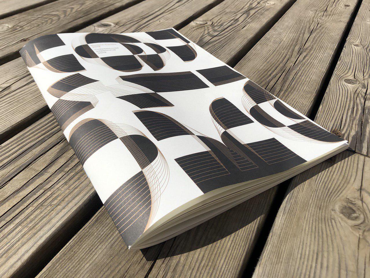
Modern Cyrillic ’19, the catalogue
The catalogue for Modern Cyrillic 2019 is out in print and soon to go on sale. Many of our fonts entered (and won) the contest, and we are thrilled to have them included in the publication.

The Birth of Inter
figma.com/blog/the-birth-of-inter
Rasmus Andersson, a designer at Figma, was interviewed about the creative process of Inter — a sans serif, designed for the application instead of Roboto, which didn’t quite work in small sizes.
tomorrow.type.today
instagram.com/tomorrow.type.today
Big announcement — we are preparing to launch a new platform called tomorrow.type.today, dedicated to experimental type. Shortly, we will reveal some details though our new Instagram account — showcasing the hottest typography of the moment, hand-picked by Timur Zima.
Ilya Ruderman, type.today: Yeah, now it’s for certain — Tomorrow is to be launched soon. Not only a separate collection and concept, but an experiment with font licenses — we want to make the distribution mechanism clear and user-friendly.


Type Design Workshop ’19
Contrast Foundry held annual Type Design Workshop (Шрифтовая мастерская) in Moscow. Among the tutors was Alexander Tarbeev, the designer of our favourite Gauge Collection.
Maria Doreuli, Contrast Foundry: TDW, first and foremost, aims at developing attention to detail, which is crucial for a designer working with typography. Each year we try to set a new level — both for the students and the tutors. We only have nine days on our hands, still, in 2019 we held an additional lecture by Konstantin Yeryomenko and extended the sketching stage — all that affected the quality of the projects dramatically.
The final projects always have a common concept, which is new, each time. This year, we looked aside from historical specimen and tried to explore the idea of emotion in type. At the start of the course every student was given an adjective, e.g. reliable, wicked, or energetic. They had to figure out what the given word meant in terms of type design, which type features correspond to it — next, they made sketches, illustrating their findings, and developed a typeface, based on them.
The projects went quite beyond our expectations, which gives us an extra motivation to go on.
In August our Instagram was in the hands of Danilo Kuchumov
Danilo designed our first ever merch item — you can pre-order the tee with Halvar Stencil at EverPress. Thanks, Danilo!
