
Experts
- Mikhail Strukov
- Type designer, graduate of Ilya Ruderman’s course at BHSAD (Moscow) and Plantin Institute of Typography (Antwerp).
Works with CSTM Fonts and Samarskaya & Partners

- Yury Ostromentsky
- Type designer, partner at CSTM Fonts and type.today

- Ilya Ruderman
- Type designer, partner at CSTM Fonts and type.today

Disclaimer
Today, a free font doesn’t necessarily mean a bad one. Sadly, things are much worse with free Cyrillic than with Latin; but there is also some good news. Our critique and our advice do not have a monopoly on the truth — that’s just an expert review by three professionals sharing the same values. Plus, you always have to remember that there is no such thing as forbidden means and tools in design. Any bug can be turned into a feature in the hands of a daring, confident typographer, — only before taking risks, you should figure out what this bug actually is.
Previously on Google Fonts series
Old-Style Serifs
Geometric Sans
Humanist Sans
Neo-Grotesques
Transitional Serifs
Didones
What is a script font?
Those are the typefaces using the logic of writing by hand with a writing tool, such as a marker, a brush, or a nib. The English-language classification uses the term Script, and the fonts mimicking handmade lettering do not fall into this category. The essential thing when it comes to scripts is exactly this simulation of the natural handwriting process and embracing the nature of a writing tool, which defines the type and amount of contrast in glyphs.
The usual criteria for assessing basic proportions and rhythm are not always applicable to such typefaces due to their innate irregularity. The graphic idea, choice and execution of letterforms, technical quality and usage potential are far more important here.
Contents
| 1 |  |
| 2 |  |
| 3 |  |
| 4 |  |
| 5 |  |
| 6 |  |
Marck Script
Denis Masharov
Marck Script mimics the appearance of handwriting done with a felt tip pen. The typeface is designed for use in logotypes, headlines and short pieces

Hands-on The lowercase characters imitate quick, sprawling, irregular handwriting, but they are not

The strokes typically gain weight in the areas where the direction of movement changes. Most likely, this is to imitate a change in writing

Certain glyphs lack contrast: the vw look weird both in terms of their shape and their weight.

The uppercase characters are more calligraphic and decorative than their lowercase counterparts. Swashes and complicated designs make them less similar to rapid writing. Letter spacing is even more irregular. And, even though a graphic designer is unlikely to set a text in all caps with a script font, the author should have considered this use scenario as well.
The font comes in one style, supporting Latin and

Cyrillic Cyrillic designs are very much in line with the cursive writing many of us remember from the school handwriting worksheets.

An unfortunate shape of the б: the letter is more like the Greek delta; the дв stick together, and there’s a hole between the в and the у. Really light н and ы lack contrast, looking like strangers on the line.

Sometimes glyphs with identical elements apply different logics: the з does not have

The apexes in the м and the л are stuck
Our advice
Marck Script is a typeface of an inarticulate graphic idea, illogical approach to letterforms and random solutions, which introduce rather a mess than personality. There’s hardly any task which Marck Script might be a decent choice for.
Bad Script
Roman Shchyukin, Gaslight
Bad Script grew out of sketches of a logo. Hand-drawn on a tablet, the typeface mimics free, yet neat writing. Bad Script is the author’s attempt to organise and arrange their own handwriting style.

Hands-on The characters are not connected to each

This approach contributes to legibility and readability.

Graphic is simple, but not primitive; the letterforms are natural, fitted with neat decorative elements, such as a swash in the f or a leg in the k.

The uppercases are more sweeping, fitted with swashes, and work great together with the lowercases. As for setting in all caps, the letters appear too tight and overly decorative.
The font’s word spacing is obviously excessive, not in line with its counters and letter spacing.
Bad Script only supports basic Latin. Although there are some accented characters, those are not enough for comprehensive support of Central and Western European
The character set features text figures, fractions, basic punctuation and a minimum amount of currency signs.

Cyrillic Cyrillic Bad Script is based on the author’s casual handwriting: the structures of most characters make you think of the good old back-to-school cursive writing, while a number of characters look like printed (block) letters.

This diversity looks pretty lively and often occurs in real handwriting examples.

Certain characters might benefit from counter space redistribution: the top of the л looks bound together, while the к features small dark triangles at the top and bottom.

There’s a technical error
Our advice
Bad Script is a simple and distinctive script font, not too sleek and natural. Its isolated imperfections can hardly be considered fatal flaws. However, when setting a text, one should bear in mind the font’s excessive word spacing and technical shortcomings in some languages’ support.
Lobster
Pablo Impallari, Impallari Type, Alexei Vanyashin, Cyreal (Cyrillic)
Lobster is a popular font released back in 2010. The only thing left from a handwritten framework is the design of glyphs and joints between

It is precisely through this combination of rhythm and clarity of contours with the vibrancy of a handwritten
Hands-on Lobster is quite versatile for a script font. Its simple structures, large x height, and uniform dark and light distribution make it easy to read.

The links between characters look natural. These are executed through alternates and ligatures.

The uppercase characters equipped with moderate swashes play a significant role in the typeface personality.

The font comes as an extensive character set both in Latin and Cyrillic with an impressive amount of ligatures. It offers regular proportional figures, fractions with sets of numerators and denominators, math symbols, essential currency signs.

Cyrillic Cyrillic support is pretty decent, corresponding to Latin in terms of personality, meaning it too has a slight retro vibe.

Cyrillic uses letterforms borrowed from the school cursive writing and it looks quite natural.

It would be logical to see a bar in the Serbian њ as a shared stroke on one

A link connecting the descender in the Ққ might have been

One won’t be able to set any text in Tadjik or Abkhaz languages as the character set is not equipped with the letters Ҳҳ and Ҭҭ.
Our advice
Lobster is a quality yet already overused typeface. Given its bright personality, this limits its applicability.
Pacifico
Vernon Adams, Jacque le Bailly, Botjo Nikoltchev, Ani Petrova
Pacifico is a script font with joined characters, inspired by the 1950s surf culture and mimicking loose writing with a rounded brush.

Hands-on The writing style is free, but not
Simple shapes, smooth x height line, overall consistency and repetitive elements make this font really usable and easy to read.

Pacifico characters are available in two options, standard and exit one without a joining

The font’s wide uppercases with swashes and shapes borrowed from the lowercase play a particular role in its personality.
Pacifico comes in one style with an extensive character set, supporting most Latin- and Cyrillic-based languages of Europe, America and Central Asia. Standard proportional figures, a bare minimum of fractions, major currency signs.

Cyrillic Cyrillic support is a quality one, with a smart choice of letterform structures, fully in line with Latin style-wise.

However, there are certain isolated issues: the к may be confused with the с, while a joint stroke between the и and the ч is too long.

The execution of connections in Cyrillic is not ideal (those are implemented with a higher quality in the font’s Latin set).

There are a number of typical issues in the way accent marks for Ukrainian were executed.

An area of the joining stroke coming out the descender in the Ққ looks a bit crumpled (the same thing with other characters having this element, Цц Щщ Ҳҳ).
Our advice
Pacifico is a quality typeface with equally distinctive Latin and Cyrillic sets, but technical realisation of its Cyrillic somehow limits its possible
Caveat
Pablo Impallari, Impallari Type, Alexey Vanyashin, Cyreal (Cyrillic)
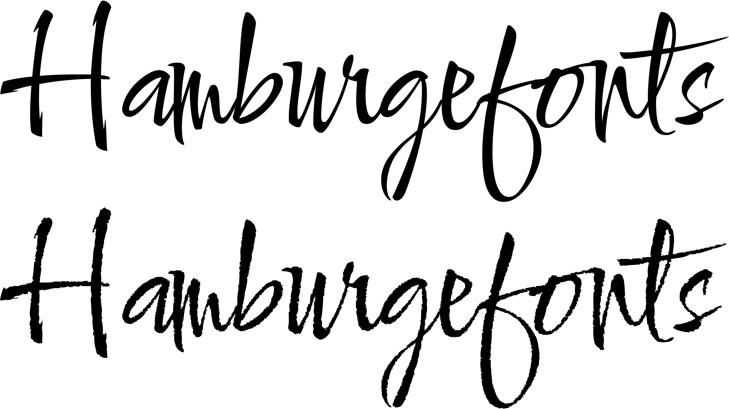
Caveat imitates fast, vivid, angular handwriting. Given the lack of contrast, a tool taken as a basis might have been a brush applied with constant pressure, or a marker pen. Hamburgefonts

It was designed for both short annotations and body text usage.

Hands-on Despite the writing speed, these characters are not connected to each other, which positively affects readability.
Each character comes in three variations which allow the typeface to look more natural and more closely mimic the real handwriting.

The uppercases aren’t trying to be decorative and they stylistically correspond to the lowercase. A text set in all caps also looks relevant, thanks to the typeface’ reserved graphics and appropriate letter spacing.
Styles Caveat comes in four weights, from Regular to Bold (also available as a variable font).

Google Fonts also features a sister family called Caveat Brush, coming in one style with no Cyrillic.

The font supports extended Latin and Cyrillic, and the latter can be used to set in most Cyrillic-based languages. The only set of figures is tabular one. There’s a set of ready-made fractions (also of fixed width), numerators and denominators, symbols for key mathematical operations. Beyond $, € and £, there are also some less common currency signs, such as the Mongolian tugrik and the Nigerian naira.

Cyrillic Cyrillic Caveat set — as in many real

There’s not enough white space in the bowls of the б и the в as compared to the other oval characters, making them look a bit too dark on the line.

The same is true for all the alternative variations of these characters.

Certain issues with Ukrainian accent marks.
An unusually shaped descender in the lowercase қ and җ.
Our advice
Caveat is a stylistically and technically smart script font with a wide usage potential. Cyrillic set is also of high quality, yet its language support has not been perfectly implemented.
Comforter
Robert Leuschke

The typeface reproduces vital, expressive, abrupt handwriting done with a brush. Comforter has a really bright personality and distinctive graphics — the author specialises in script fonts and has an extensive experience in packaging lettering.

Hands-on Comforter is highly dynamic. Despite a wide variety of sizes and arrangements of characters, it does not give a feeling of mess and

The Latin set has several sets of stylistic alternates and swash exit characters, several dozens of ligatures.

The uppercase letterforms often repeat the lowercase, which enhances the feeling of vibrancy and handwritten nature.
The font features an extensive Latin set, while the Cyrillic set is far more
Styles Comforter features just one style, but there is an additional typeface, Comforter Brush, with brutal ragged edges.

Cyrillic Cyrillic set is in line with Latin, both in its approach and graphics-wise. The designs are pretty natural, although they can’t really be objectively judged given this expressive approach.

An unfortunate я — the only way to guess a letter is to mind the context.

Not all the joints between characters are properly executed.

There is a number of usual problems with accent marks for Ukrainian.

Serbian support is realised
Our advice
Comforter is a dynamic and distinctive typeface. Its Сyrillic set lags behind Latin both in terms of possibilities and the way it was executed, so it can only be used with caution and for a limited range of projects.
Shantell Sans
Shantell Martin, Arrow Type, Anya Danilova
The typeface originates from graphic artwork done with a marker pen by British artist Shantell Martin. Back in school, any spelling tests were a challenge for Shantell because of her being dyslexic. In her struggle against insecurities from the past, the artist made dealing with words and texts her main tool to express herself.

Discussing the project with Stephen Nixon, Arrow Type foundry designer, strategist Susanna Zaraysky and Shantell Martin described the project as ‘creating a new Comic Sans’ (since it was exactly this font she has been inspired by since she was a kid).
Hands-on Later a number of requirements to Shantell Sans increased: the font had to be easy to read and suitable for wide application, both display and text.

Readability of Shantell Sans is achieved through its simple designs, open forms, large x height and generous letter spacing. The proportions of glyphs are close to the proportions of popular sans serifs (for instance, the author used Roboto as a reference), which helps the typeface look relatively familiar

The uppercase letterforms are in line with the lowercase, both in terms of their personality and general simplicity, and can be used to set individual words and short pieces of text.
Technically, Shantell Sans can be classified as a sans serif typeface. Its style system and typographic capacities are consistent with the classification (or even go beyond the range of capacities of certain modern grotesques).
A comprehensive character set in Latin and Cyrillic enables supporting most languages of Europe, America, and Central Asia. The font uses proportional figures, has inferiors and superiors, fractions with sets of numerators and denominators, plenty of mathematical symbols, punctuation symbols and currency signs.
Styles Static styles: 6 weights from Light to Extra Bold with italics. Also available as a variable font.

The variable Shantell has 5 axes: Italic, Weight, Bounce (the glyphs are shifted up and down), Informality (change of individual proportions), and Spacing.

The letterforms of the Roman face can be categorised as upright italics, italic Shantell Sans styles are their slanted versions.
Cyrillic To design Cyrillic version for the already existing typeface is not an obvious task, as the shapes for italic and cursive (handwriting) letterforms are different in this script.

Cursive shapes stay next to upright designs, typical for printed letters. This corresponds to the Latin version of the typeface and helps preserve legibility.

Cyrillic is of decent quality and stylistically in line with the Latin set. Designer Anya Danilova asked Shantell to write a couple of Russian sentences by hand, which helped her choose the most natural structures.

Cyrillic language support is properly implemented for various languages.

Our advice
Shantell Sans is a distinctive and usable typeface with exceptional technological capabilities and a style system of a modern sans serif. A high quality Cyrillic character set makes it the best option for numerous tasks.