
Fonts In Use is a public archive of typography indexed by typeface, format, industry, and period. It documents and examines graphic design with the goal of improving typographic literacy and appreciation. Designers tend to use it for project research, type selection, and discovering new ways to choose and use fonts.
The site, in its current form, launched in 2012, and since then, anyone can add a new project to the Fonts In Use collection — be it an animated poster with kinetic typography, a 19th-century type foundry catalog, or the branding of an international corporation.
- Nick Sherman
- Fonts In Use, co-founder
nicksherman.com
nicksherman@typo.social
flickr.com/nicksherman

- Stephen Coles
- Fonts In Use, co-founder
stephencoles.org
typographica@typo.social
flickr.com/stewf

- Florian Hardwig
- Fonts In Use, managing editor
florian.hardwig.com
fhardwig@typo.social
flickr.com/hardwig

AS: I’ve always wondered how you manage to combine your other projects with working on Fonts In Use?
FH: Right now I’m trying to find solutions for this problem, because it’s taking too much time and there are many other things that I like to do. There are only 24 hours in a day and that’s never enough.
NS: It’s probably easier for me because I’m not actively involved in editing all the new submissions. One of the things that makes the site so successful is that Florian and our other editors are putting in a lot of work to polish the stuff that other people submit. And that’s something I think a lot of people overlook.
SC: Fonts In Use was never a full-time job for anybody, but we all wanted it to exist. So over time we’ve had to find ways to ensure that all the individual tasks we do for the site are functional, allowing us to keep the site running. It’s difficult, but it’s also a positive thing because, unlike a regular business that is very tied to the revenue, Fonts In Use is still a passion project in a lot of ways.
FH: It’s definitely a team effort. So let me do a quick overview: Stephen and Nick had the idea together with Sam Berlow from Font Bureau. I joined about a year later. There were other people involved in the beginning and early years, but, at the moment, Nick is taking care of the design, Stephen handles finances and other managerial tasks, and Rob Meek is in charge of the technical things. And there’s a team of editors that now includes Matthijs Sluiter, a designer based in The Hague in Netherlands, Juliette Duhé, a French designer living in Canada, Caren Litherland, an editor, writer, and designer in New York, and me. We are those who respond to the people interacting with the site on a daily basis.
AS: How do you find new editors? Do you invite them or do they come to you themselves?
NS: A lot of our team members were people we knew anyway, they were our friends and we were chatting with them about design history and typography.
FH: The type scene
AS: Do you still contribute to Fonts In Use yourselves?
FH: Nick just did today.
SC: I think we all have big, long queues of drafts. One of the things for me that’s been exciting as a curator at Letterform Archive is finding things in our collection and then adding them to Fonts In Use.


P. van Dijk / Schriftguss typeface product list, 1934. From the Letterform Archive collection

A Millionth Anniversary mailing card for Meridian Books, 1958. From the Letterform Archive collection
 Bradley: His Book, Vol. 1, No. 1, 1896. From the Letterform Archive collection
FH: In the early years, it was almost everything coming from us ourselves. But around seven years ago this reversed. And since then it has become more and more contributions by others.
AS: Seven years ago you said that there were five published submissions a day. How many are there now?
FH: It’s exactly doubled. Now we’re at almost 10 per day on average.
AS: What do you check when approving a submission?
FH: We try to be open and inclusive. Sometimes we accept things that are quite small, like a poster for a flea market. We decided not to allow made-up things as we want to live up to our slogan, which has been Type at work in the real world.
As for checking the submissions, even people who are experienced forget to mention the designer, or the location where the design was made, etc. We have to go through all the data points, make sure that the image sources are credited, that there are links to mentioned people or institutions.
And also the font IDs. You would imagine that contributors who are graphic or type designers wanting to show their work would be able to identify the typefaces, but it’s not always the case. Quite often the typeface in the project is only similar to something that the contributor has tagged. It’s also common that type designers recognise their own stuff, but have no idea about the other typefaces that are featured alongside.
We also have to block a few spam submissions.
SC: Well, this brings up an important point. There’s a lot of information you can add to the use page, but we didn’t want to have too many required fields. We wanted it to be easy to add a use, that may have added a lot to the work on our moderators team though.

All the fields one could fill in while adding a projects to Fonts In Use
AS: Florian, can I ask what spam submissions are?
FH: Well, there’s outright spam. We really had submissions about Viagra, optimised for the Fonts In Use format, showing a Viagra pill with text on it set
And then there are things that look real, but actually they’re either made up projects or students’ work. When a student submits a fictive branding proposal for the MoMA made as a school assignment, it’s totally fine if it’s described as such. But if it’s presented without that crucial info, that’s a no-go because we don’t want to spread fake news and tell people that MoMA has rebranded with Comic Sans if it’s not for real.
AS: Do you have any kind of other editorial policies?
FH: Yes, we do. It’s a bit tricky to put this in words because it often depends on the context. One thing that came up in the past is propaganda material from the Nazi era. This is, of course, interesting and insightful from a design history standpoint. We can publish it as long as it’s framed in a critical way. It shouldn’t be a Nazi fanboy showing this, but a design historian putting this in context. I hope that illustrates the problem that we can’t just make a rule like «no Nazi typography».


Lieder zur Weihnachtszeit published in Germany in 1940
NS: Something else that maybe isn’t quite as recognised is the similar amount of fact checking for data about fonts. We’re pretty rigorous in trying to get the facts and the wording right.
FH: The type database is something I’m very proud of and also something that has evolved drastically over the years. In the beginning, we only had the typeface name and a sample. We subsequently added things like designer(s), foundry, release date, external links to places where one can get the fonts or learn more about them, and internal ones to related typefaces. Also, we realized that the info found on font seller websites has to be taken with a big grain of salt, so we started doing more research and fact-checking ourselves, and began indicating our sources. And the last step in this sequence was the bibliography. A page where we list all of our
Maybe you noticed links to «Reichardt» in square brackets, for example. That’s Hans Reichardt, a type historian from Germany who has compiled a large database of metal typefaces. You can click on his name and go to the bibliography entry, look up the details and check the original source yourself.


International index of hotmetal typefaces compiled by Hans Reichardt
NS: Having made that a little bit more rigorous over the years has changed the way I read about fonts. Now, if I’m entering a new font into our type database, I end up doing a lot more research than I previously would have, because I want to make sure I have the facts straight.
AS: Do you accept all the typefaces to your platform without looking at their quality?
FH: The short answer is yes, because even bad fonts can be put to use. So if they pop up in a submission, then they will get their entry.
SC: I have a set of interesting uses of mediocre fonts, because sometimes you can use them well.


Dosdecadatres portfolio showcase, 2009. From the Mediocre Type Used Well set
NS: It’s also worth pointing out that the project is not called Good Fonts In Use. The most interesting posts are not necessarily just good uses of good fonts. They might be very high profile uses, or so extremely bad that they’re interesting to talk about.
AS: Do you feel bad when you see another rather average submission?
NS: I feel like the average quality of the stuff that people submit is pretty high. People whose works appear on Fonts In Use usually have at least some level of typographic proficiency.
Things do come through that are not particularly notable or significant, but one of the things we’ve done to help is adding a filter for Staff Picks. Those are kind of like the top of the top of what we consider interesting or good.
FH: And even that is inevitably subjective to some degree.


No Guestlist Records identity, 2023. Fonts In Use Staff Pick. Set in LL Ivory and Megazoid


Decret on YouTube show titles, 2021. Fonts In Use Staff Pick. Set in Spektra
SC: The fact that there isn’t a restriction based on what somebody would define as quality is that it’s become a kind of record of typography over time. People could look at our site and understand what kinds of typefaces are used, how they are used, and what kinds of styles of typography happen.
FH: With the quantity of 10 per day, it’s clear that not everything is for everybody and not everything is for me. Some of the posts may seem boring to me but can be interesting to others.
For example, I like to explore obscure typefaces from the ’70s. And when I have finally spotted an extra rare one in use on some record cover, I’ll post it, even if the cover design is mediocre. Matthijs, who I believe is more interested in contemporary typography, then might roll his eyes: “Oh, the


Main Stream Power Band, Holiday for Swing album cover. Set in Monika, released in 1970
SC: But sometimes finding those uses is what helps us to document the typefaces and know when they were released. Sometimes we don’t know exactly when a typeface came out. And when we see something published in a certain year, it starts to build a biography for that typeface.
NS: A lot of times, even if you have a specimen for a typeface and you know when it was printed, it might not necessarily show all the glyphs that existed in that typeface. So the uses and the type data have a symbiotic relationship.

Jimmy McGriff Organ and Blues Band, Step 1 album cover, 1969. The project that played an important role for building a biography for the Oring Title typeface
AS: Who runs the @FontsInUse typo.social account? It seems to me that whenever someone has a typographic problem, the Fonts In Use account is to the rescue.
FH: It’s mostly between the three of us, I think.
NS: Probably Florian more than anyone. Also, sometimes I have no idea who posted.
SC: That’s what I was going to say.
NS: Sometimes we are replying from our personal accounts to a post from the Fonts In Use account. If there’s more of an opinion put into a reply, we tend to sign it with our initials.
AS: I learned a lot from your replies. Speaking of learning, in 2017 you said that you had founded Fonts In Use to educate yourself, among other things. So what have you learned?
NS: I actually think I talked to Florian about this. There could be a class called «World History Through Font Usage». Recently I found a book cover, the book was about a historical figure, Eugen Loebel. I just liked the typeface, but it led me down this rabbit hole of learning about this person. I ended up editing related Wikipedia pages because of stuff I was reading about him. Almost every single time I post a use, I learn about something new I wasn’t expecting to.
For another example, the post I put up today was designed by Jacqueline Casey who worked at MIT. I knew about her, but on the poster, she used a typeface by Carla Ward. I didn’t know as much about the history of the typeface or the designer behind it. So I learned a whole lot of new things just from putting together this one entry. And it was just one image.

Stalinism in Prague: The Loebl Story book jacket, 1969

Corners exhibition poster, 1979
SC: One huge thing I’ve learned is that there are typefaces that are not commonly known today because they’re not available digitally or they aren’t bundled with operating systems, but they were really common back in the day. So Mecanorma or Letraset were super common in the ’70s and ’80s, but not necessarily known today. And I think the site has really helped draw attention to those. Another example is Ludlow, who made machine composition typefaces that were really common in advertising and newspapers but don’t get a lot of attention now because they weren’t digitised as widely.


Hebrew Letraset paper bag and Catalog, ca. 1965. From the Letterform Archive collection

Mecanorma Graphic Book 6, Netherlands, ca. 1972. From the Letterform Archive collection
AS: You’ve said that when you started Fonts in Use most of the design critique was focused on graphics and photography. Do you think it is different now?
SC: From my perspective, it seems like there’s more attention paid to typefaces now, but I also wonder whether I’m skewed by my own interests.
NS: I feel like real critique of typefaces and the use of typefaces has fallen way off. There may be a lot of information about a custom typeface, but it’s often a press release and there are very few platforms these days where people are really critiquing a use thoughtfully.
SC: I added a design criticism tag, so if a use contains some kind of critique, it will be easier to find.
NS: Back in the early 2000s, there were a lot more independent design-critique blogs. I think partly that is because a lot of dialogue about design and typography moved away from semi-formal blogs to very informal posts on social media. Instagram sometimes feels like the opposite of those older blogs, perhaps because the format is so much more restricted. There is much less criticism, and when there is, it often isn’t accompanied by any thoughtful commentary. So the comments often feel like the extremes of either just all heart emojis or lazy trolling.
FH: Also the question is who will formulate this critique. Because for me as a managing editor it’s easier to write critically about something from the past than to respond to a contemporary contribution.
SC: I love when Florian chimes in the comments about the quality of a typeface. It’s always very fair and even-handed.
NS: It is tricky. Maybe this is an unfair assessment, but I feel like in the world of type, there are some fragile egos. We’ve had cases where someone posted a semi-critical review of a use of someone’s font and the person who made the font still came back defensively because they thought it looked poorly on their typeface. And we don’t want to ostracize the people that are also our readers.
When I put together comments pointing out flaws in a design, I try to be as objective as I can. I’m never going to say: «I just think this stinks». If I express a personal opinion, I try to give contextual facts about why. If people disagree with my personal opinions, that’s okay, but at least I’ve explained my thinking.
AS: What blogs about typography do you follow?
SC: I was just really happy to see Elizabeth Goodspeed joining It’s Nice That as a regular editor. I think that she does good work.
NS: Fontstand has a good blog, Dan Reynolds is editing that. That’s nice because a lot of times the blogs of companies that are selling fonts only focus on the fonts they’re selling, but they sometimes feature totally unrelated things that are still interesting.
There are a lot of blogs that I appreciate, but they aren’t as active anymore. Paul Shaw has a pretty good blog. It’s very niche, but he’s publishing pretty regularly. I think that’s an underappreciated resource.
FH: In terms of old-school blogs, I want to mention Alex Jay. His blog is called The Tenth Letter of the Alphabet. Also there are other sources that are important to me on an almost daily basis, which don’t come in the form


From the Catalogue of castings, sanitary ironwork, lamp standards, etc.: Stockport, Cheshire, 1936. John Needham & Sons Ltd. From Mike Ashworth’s blog
NS: The blogs that I follow aren’t even really design blogs. I follow a lot of blogs that are about old book covers for science fiction novels or something like that. Even if they’re just posting images of old books without any context, I can usually do a reverse image search to find more info and put together a related Fonts In Use post.
And Flickr, of course. Sometimes it feels like we’re the last three Flickr users in the world, but Flickr is owned by thoughtful people who care about their
AS: Font shops like ours get a lot of traffic (and probably purchases) from Fonts In Use. Why don’t you charge shops for submissions?
SC: Before we get to that, I think this brings up a kind of sad state of the Internet today. There’s so much of what used to be on the Internet as websites, blogs, all sorts of individual contributions, and it’s all kind of gone to social media. So one of the reasons we’re such a large referral source for a lot of websites is there just aren’t that many websites anymore that are talking about this stuff.
We have talked about a lot of different ways to monetize traffic. I don’t think any of us would be in favor of charging people to submit uses, but there are probably other ways of valuing our work. The ads that we have on the site now are the prime way to do that.
FH: Our sponsors are mostly type foundries. So there is a way to give back if you feel that that’s working out well for your company. Of course, not everybody can do this. I hear a lot from small foundries that we are their main source of incoming links.
NS: I’m not sure how much people think it costs to run the site, but we have to pay our editors, we’re not expecting them to work for free. There are also costs to running and maintaining a site with so much traffic and content. Thankfully we’ve been lucky enough that there are companies that appreciate what we’re doing and are willing to help us cover our costs with sponsorships and ads.
I also work on a design festival and conference called Typographics that advertises on Fonts In Use, and now Fonts In Use is easily one of the biggest incoming referrers to the Typographics website. It’s not because Fonts In Use has more traffic than other referrers like Instagram, but it’s the quality of the traffic. People that come to Fonts In Use are people that obviously are interested in fonts and design-related things, and that aligns perfectly with the intended audience of Typographics.


Typographics 2024 website. Designed by Nick Sherman
AS: The Typographics’ websites are great. I also love that they qualified for the 1 MB Club.
SC: It’s a great call to other organizations to build their site with interesting typefaces so that they don’t need a ton of imagery.
NS: This is tangentially related, but I’m proud that we at Fonts In Use have been able to run our site in a way we think is right. For example, when Twitter really started going down the drain, we all had a conversation and, despite having quite a large following there, we all agreed it felt kind of dirty and didn’t want to post on Twitter anymore. On one hand, it was a big sacrifice to walk away from such a big audience there, but it just felt better morally. And we take similar approaches everywhere. We don’t like invasive user tracking and cookie consent pop-ups so our site doesn’t use Google Analytics or other tools that rely on those things.
There are probably other similar examples I’m not even remembering now, but it’s nice to be able to show other people that you can have a successful website without relying on so many of the horrible companies and technologies most people accept as necessary evils on the web.
AS: Your website is a huge and representative database of typefaces and their various kinds of usages. Have you ever thought of building a font identifier based on it? I just hate the font identifiers that are out now, and also they don’t really work with Cyrillic…
NS: It’s not a small undertaking for sure.
FH: You’re right that the existing ones don’t look the way I want them to look.
SC: You did make a really great point though, about the lack of attention being paid to scripts other than Latin. We’ve tried to make some efforts recently to encourage users submitting uses and typeface samples of scripts like Arabic, CJK, and Cyrillic. But it’s still a big growth area for us.
We think about that a lot at Letterform Archive too because we want to be a source of material that’s not just from the Western world. Part of the problem there is that you need people who are native readers and writers of those scripts. So I think the next step for us is to bring in more of these folks.


Yusuf and Zulaikha Manuscript in Arabic. From the Letterform Archive collection

Holiday Inn sticker. From the Letterform Archive collection
NS: We’ve been lucky that there are some people from our audience that have helped by offering more info when they can. For example, I posted a Sriracha bottle that had a CJK typeface and I had no idea what it was, but Peiran Tan, who is much more familiar with such things, was kind enough to identify it and add more info in the comments.

Siracha bottle contributed by Nick
FH: You asked about us making foundries pay to play, but the best example of non-monetary support is that without your contributions, we would have way less Cyrillic typography on the site. So it’s an exchange. You might benefit from the links, but we do too as an archive.
AS: I’m happy to hear that.
NS: Something we’d probably do before making our own font identification tool would be to make our typeface database more visible and useful. Having more ways to group fonts and look at them outside of the context of just how they’re being used would be very helpful.
AS: You said you are planning to add more non-Latin typeface samples. How would you decide which one to put if the typeface is multi-script?
FH: Let’s take Druk, for example. Maybe 98% of the uses that we show are Latin, so it would be a bit weird to also show Cyrillic and Greek samples in each project. Theoretically we could split off the Cyrillic branch into a new entry, which creates new problems, think fragmentation.
Our rule of thumb is to show the sample in the primary script the typeface was designed for. If it’s intended for two scripts more or less equally, it’s possible to show both in the sample. We often listen to the foundries and try to follow their preference.


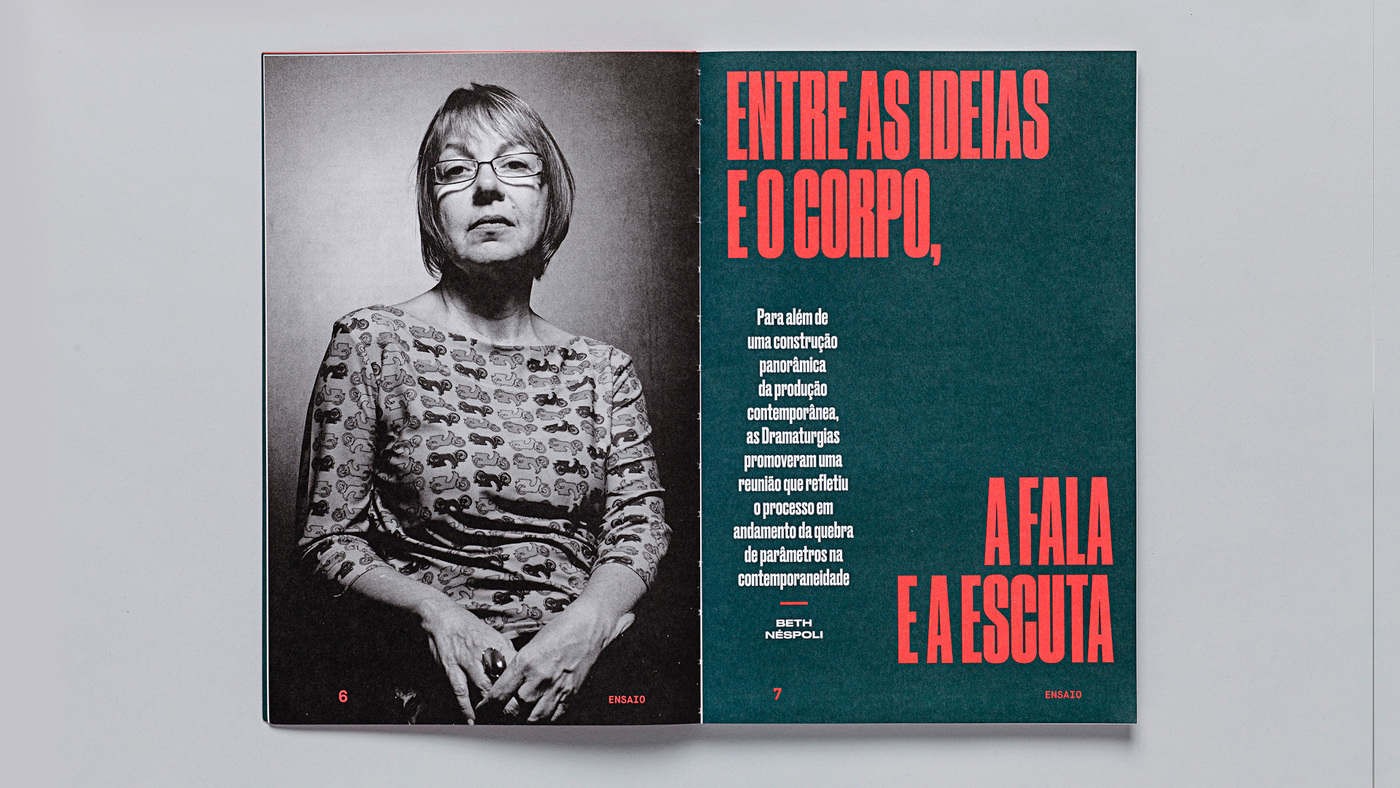
Dramaturgias Magazine. Set in Druk, Lyon, Graphik and Maison Mono


AZ Museum visual identity. Set in Druk and Akzidenz-Grotesk

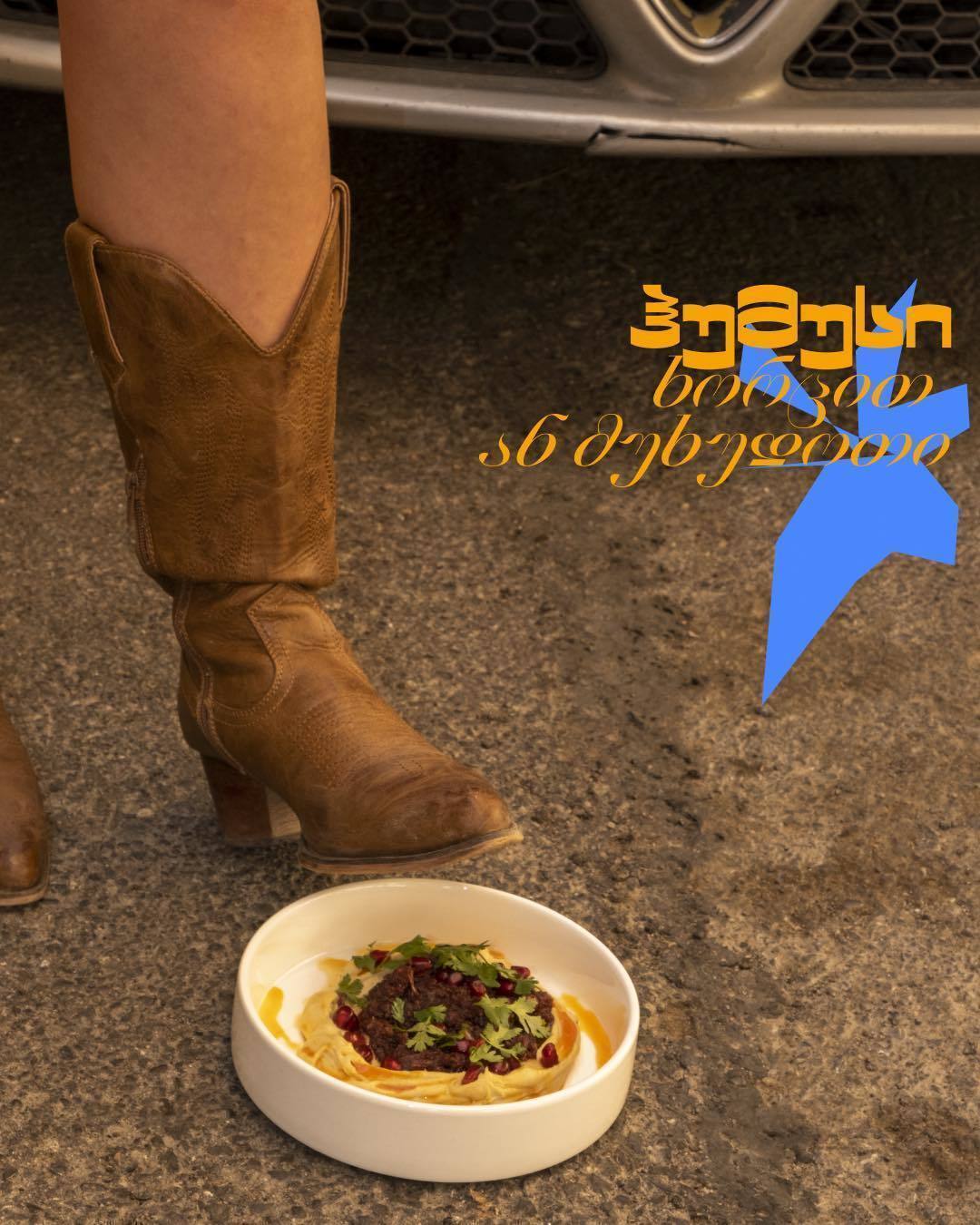

Depo restaurant, Tbilisi. Set in CSTM Xprmntl 02 in Latin and Georgian
NS: It’s also problematic if there’s a family that has a whole bunch of different weights and widths. You have to decide whether you put them all together. Or what do we do if there’s only a few weights and widths and one is extremely different from all the others?
Gill is a good example. There is Gill Sans, which is a quite moderate design. And there’s Gill Kayo, which is much bolder and feels like a separate thing.


Promenade Weekender website. Set in Gill Kayo

Solo record label. Set in Gill Sans
AS: It’s funny that before releasing the family type designers also think: do I publish it as one typeface or as a collection?
NS: I call these Existential Type Questions. Actually, I have a Tumblr dedicated to them.
AS: These are all of my Existential Type Questions. So maybe you want to add something?
NS: It’s worth acknowledging the role of our sponsors, and especially Mark Simonson who has been a generous supporter of Fonts In Use for a very long time. It’s encouraging that people are willing to support the project as something of value to themself and the design community in general. Without help from these kinds of people we wouldn’t be able to operate.
AS: We’ll highlight it!
