Ilya Ruderman: Damien, I’m a huge fan of your project, I’ve been looking forward to meeting you. How are you doing? How is it going?
Damien Gautier: We launched our foundry in March 2017, two years ago. We’d been planning this project for many years, with some of the designers we have today — like Thomas Huot-Marchand or Matthieu Cortat — because we shared the same vision of how our fonts should be distributed.
Some of us used MyFonts. We found it too large, it’s like a huge supermarket. That’s what they want to be, but a small type design practice, like us, cannot thrive in such an environment. Your product is never to be seen in the search results.
In 2016, we decided to open a new type foundry, in order to promote fellow French type designers — because we realised there are not that many people in our industry, nationwide. We wanted to manage type designers, and we wanted to be a collaborative project.
IR: Do you have exclusive contracts with them?
DG: Yes. We have exclusive contracts for the fonts, not the designers — they can distribute their other products with another type foundries. At first, we thought that we could ask them for personal exclusivity, but Alice Savoie, for instance, had already had a contract with another foundry. Today, we think that if we do a good job, type designers would prefer to distribute their fonts with us, rather than with others.
IR: As soon as you mentioned Alice — you announced that Roxane Gautaud and Alice Savoie are soon to distribute their fonts at 205TF, and it has been a while already. Are they really coming with something?
DG: Yes. We are going to release Alice’s new typeface this November. Alice works on a typeface for many months, even years — she doesn’t have much time, because of her other activities. As for Roxane, it’s a bit different story — the thing is, she works with us everyday, she is responsible for mastering other fonts we release, so she also hasn’t enough time for her own product. That’s why their fonts are still in the making, Alice and Roxane are really busy.

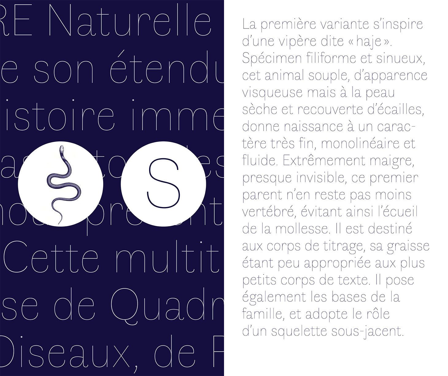


Faune by Alice Savoie, commissioned by Centre National des Arts Plastiques


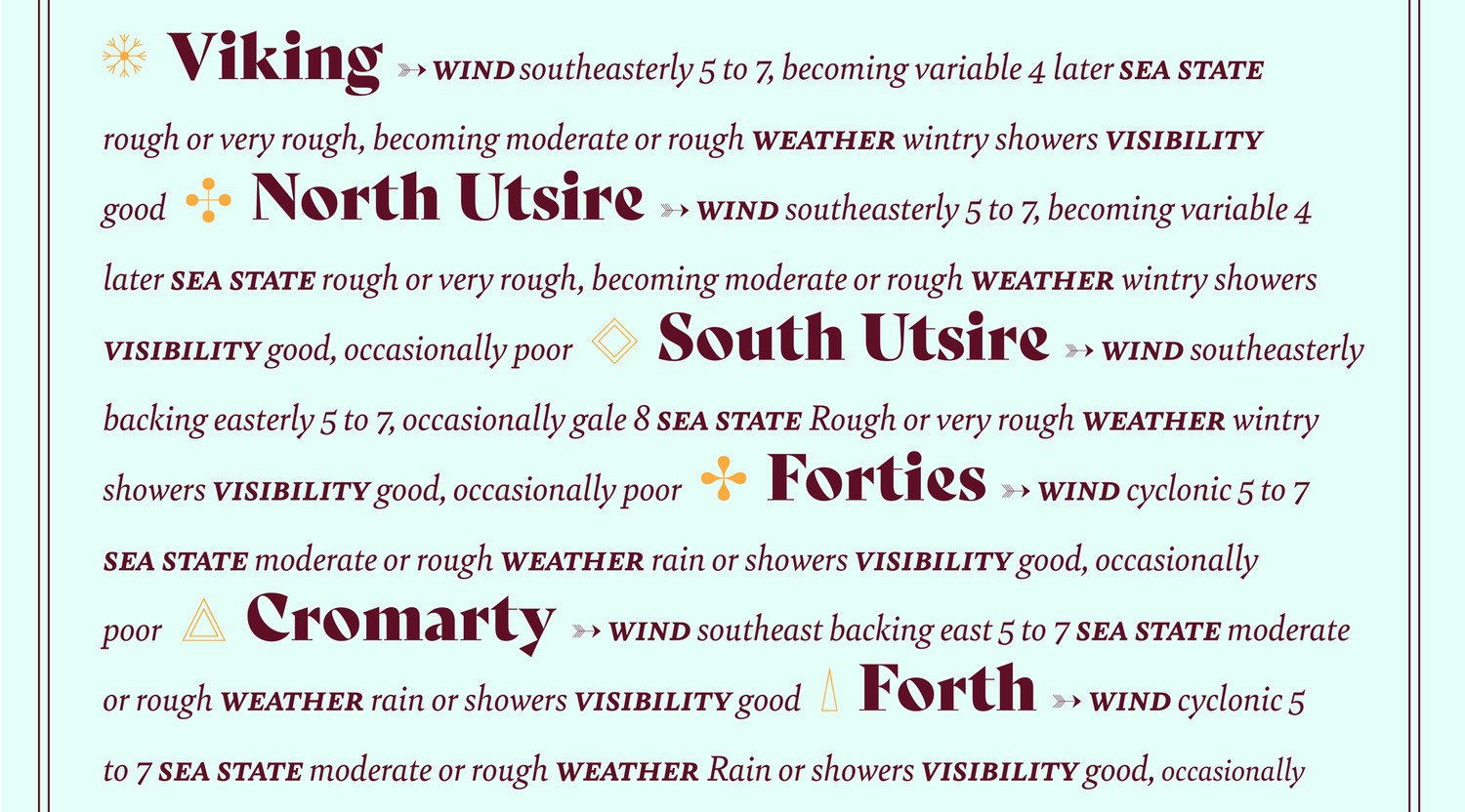
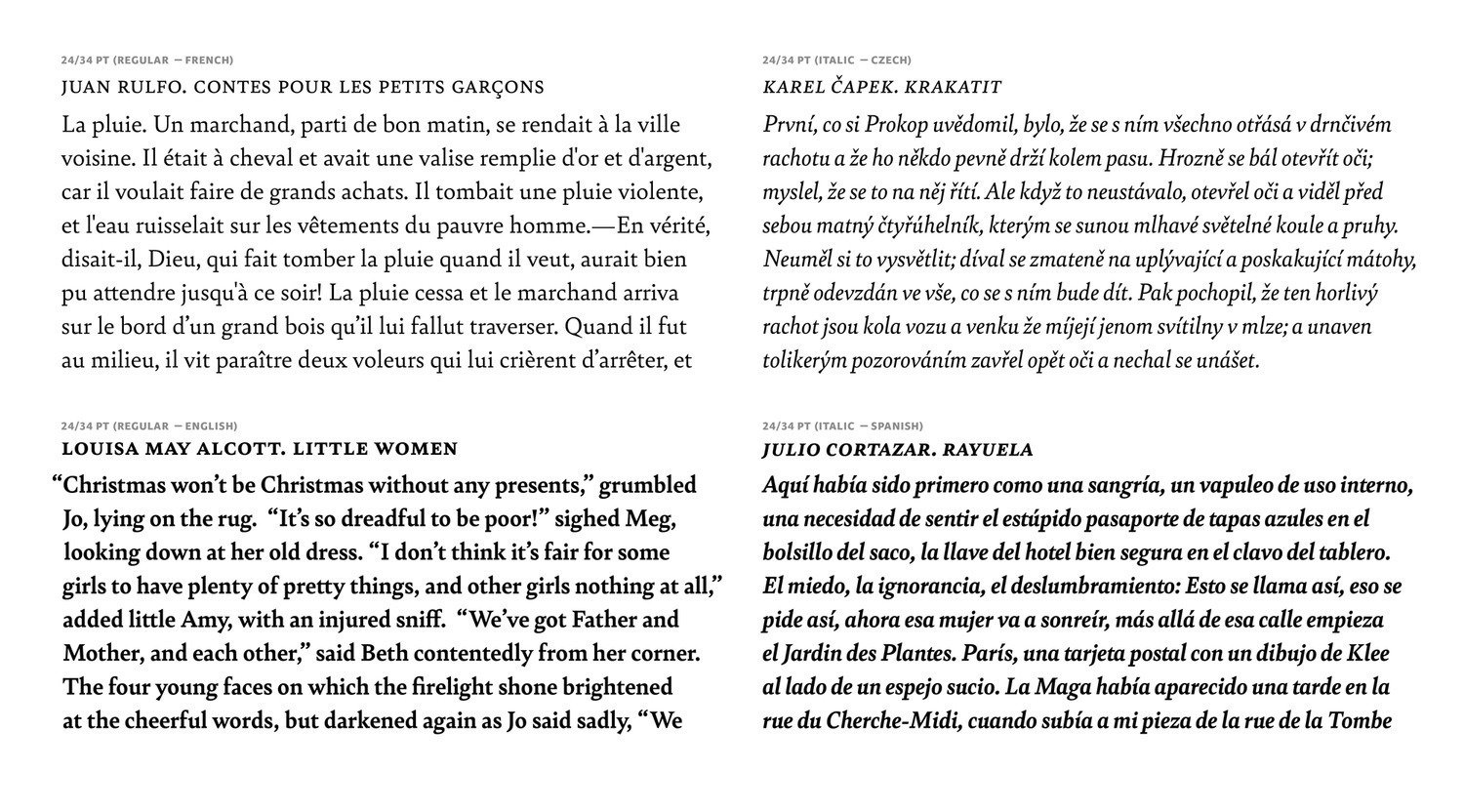
Bely by Roxane Gautaud, distributed by Type Together
IR: I understand that. Can I ask you how difficult is it to open a new font store in France? What problems did you have?
DG: It was not really complicated. The most difficult thing was to decide, it was the question of money — we needed to pay for the development. It took us about 12 months, I think.
As I said before, we had the idea of the project for many years, with Thomas Huot-Marchand. It used to be quite funny — I had invited him to manage a workshop in the art school and had known him for about ten years — and each year, he said “Tomorrow, I will launch my own website to distribute my fonts”.
It was because of MyFonts and their new conditions, that we finally decided to do it. I’d been on MyFonts for many years, and my royalty rate used to be 85%. 2/3 years later, they said it would now be 65% — even for their old partners, such as me. I felt I was not interested anymore.
IR: Did you quit? Did you remove your stuff from MyFonts?
DG: Yes, [laughs] and so did Thomas and Matthieu…
IR: We did too.
DG: The 15%, they used to take — it was okay.
IR: It was reasonable, yes.
DG: Yes, but 35% — listen, they don’t do anything other than letting you upload your fonts to their huge marketplace. They don’t do any technical or mastering support. When a customer has a problem with your font, you receive a message that you have to find and resolve the problem yourself. I think 35% is unfair.
As I said, I think it’s too big a platform. If you search for Garamond, you find thousands of fonts which don’t have anything to do with Garamond. You find things, but not the ones you need.
IR: Are you happy with the number of type designers, with the number of fonts you offer? Are you planning to expand?
DG: When we launched the platform, we did not know how big it would be. Now, we can say it’s bigger than we’d ever thought.
We’re excited to distribute the debut fonts for two or three young type designers. We are really happy to help them finalize their first project, and to promote their work. We released fonts from Juliette Collin, who’d been a student of Matthieu Cortat in ECAL, for example.
We also released the debut font of Thomas Bouville, I think it’s been about two months now. He said it was really important to get help in finalizing the font — as you make your first font, you are quite unsure about the quality of your work. You don’t know if this or that is enough or not. If you have to change everything or not. He said we’ve been a real support to him.
We are also happy to have many, many other fonts in development. We have a new project by Alice, for example. Matthieu also has two or three fonts to come. And other young type designers we have already signed, but I can’t tell you their name yet.
And, speaking of Matthieu — he is very happy about our distribution. When he decided to shut down his MyFonts account and his own website… His royalties are now about two or three — I don’t know how to say but…
IR: Two times bigger?
DG: Yeah, exactly. He did the right thing. Me, I quit MyFonts, too — when I decided to do so, they said, “No, you shouldn’t do that, your royalties will plummet”, but that was absolutely untrue. I know that many type designers are afraid to quit a large distributor, but why not try it?
IR: Independent designers are afraid to be alone. You have your own thing, you’re collaborating with several talented designers and you can launch a big project like your foundry. Teaming up, individuals can grow stronger, but not everyone can do that.
DG: Yes, absolutely. We could afford that, because we are a graphic design studio, with enough spare money.
IR: Okay, let’s talk type. What’s your favorite typeface in the collection?
DG: I don’t have one, really. No, I never think about that.
IR: Can you highlight something?
DG: Perhaps, it would be our latest. I really like Kelvin because of the project behind the typeface. I like the way Thomas Boubille tried to speak about modernity, and how he managed to balance between the contemporary type design and type history. Kelvin is great, even though I don’t usually like large font families. Especially, the ones with both serif and a sans fonts — I find that the sans serif is often not really a match. In Kelvin, Thomas found a way to make them work together — although they are quite different fonts.

Kelvin by Thomas Boubille
Within weeks, we are going to release a new font. Perhaps, it is going to be my new favourite. It’s an extension of Plaak.
IR: I know that one. Yes.
DG: Now, Plaak only has the uppercases. I’ve been designing the lowercase symbols for two or three years now. It would be a separate font release, named Plaax, with an X.
I really like this project because it’s an alternative way to manage a font family. As I said, I don’t like typefaces with many, many font styles, made using interpolation techniques. Plaak and Plaax are different, because I simply don’t work like that. I wanted to make a family with many differences between the styles. I think it is a fun project, and the result would be fun too.
IR: Probably, the first typeface that I noticed in you collection is Minuscule. Minuscule-2 works at 2 point size — I remember checking that myself. I was really impressed with its simplicity, with the idea that makes it work.
DG: Thomas Huot-Marchand is quite a genius when it comes to type design — he always finds a smart and fun idea for the project. Minuscule is based on the research made by ophthalmologist Louis Émile Javal and his theory of compact prints. The font was completed in 2007.
It was a pleasure to hear Thomas speak about the design process, I was excited to learn about how he made the smallest optical size work — for example, the lowercase O. The biggest problem were the counters — he couldn’t find a way to make them work at two point size. Then he had the brilliant idea to get rid of the bowl and make the counterform black instead.
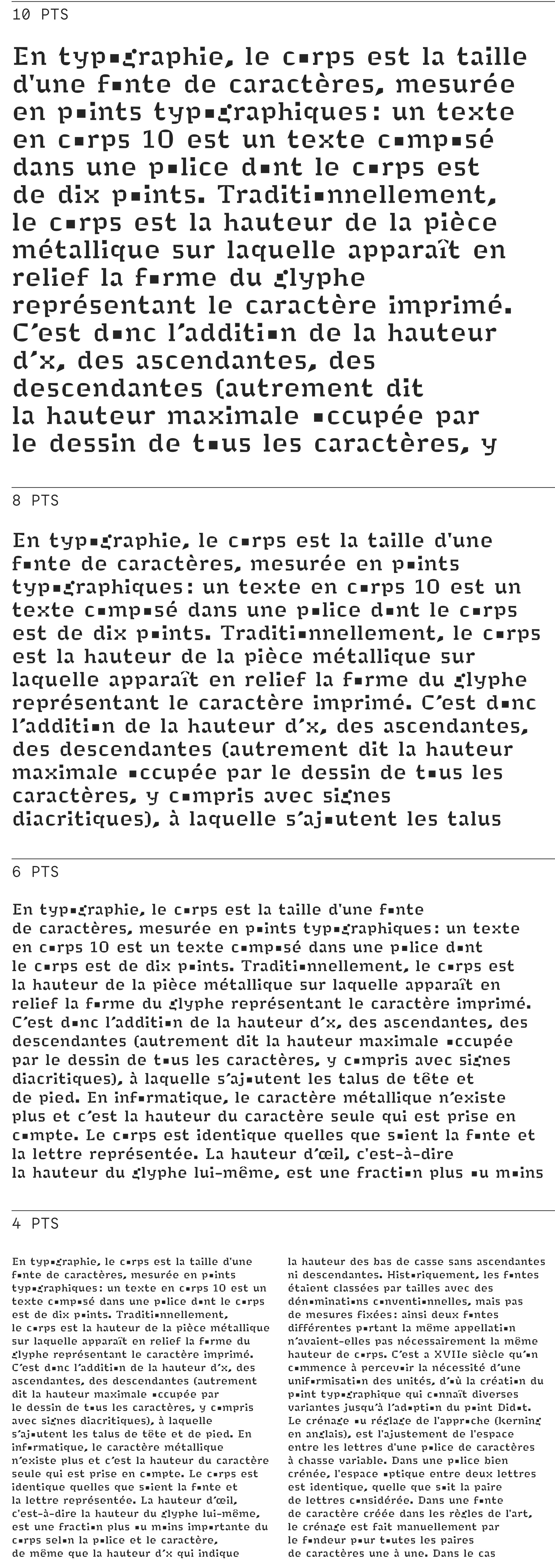
Minuscule-2 by Thomas Huot-Marchand
When you hear him explain this, you understand the way he works and how he finds a good way to solve a problem. And in Minérale — the way the axis rotates with the change of the weight is quite ingenious as well.
IR: With Minérale, the idea is quite clear. I think Thomas had much more trouble with its Black styles — he had to design those super-heavy triangles.
DG: No, I think he started with the Black!
IR: Oh, it should have been easy, then.
DG: That’s when he found the idea for the family, to make it super-contrast. Yeah, I think he started with the Black.
IR: And it works super well in the Light, I love its texture.

Minérale by Thomas Huot-Marchand, Yearbook of Type III by Slanted Publishers
I was also very impressed with Clifton, by Yoann Minet. I think there’s a lot of wit in these contours, especially in Italic. What do you think about it?
DG: In Clifton, Yoann completed the Roman, before our foundry opened. He agreed to give us the font for distribution and also decided to add the italics. It was a really good idea to make them different width — otherwise, Italic would be too wide. I think that width contrast is rather interesting.
Yoann has his own way to design type and to come up with something new. I think — and many would agree — he is the new generation of French type designers. As you know, he has his own foundry, Bureau Brut. We would like to distribute more of his fonts, but I don’t know if we could arrange that.
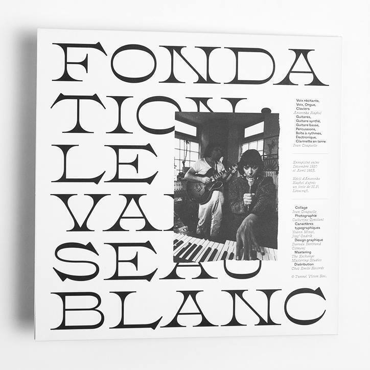 Clifton Regular, Le Vaisseau Blanc by Bureau Bertrand Clément
 Clifton Italic, Letter of the Museum of Printing and Graphic Communication by Bureau 205
IR: I’ve been partly involved with Production Type, Jean-Baptiste Levée and his team, that’s how I know Yoann. (Production Type also distribute fonts by Bureau Brut_. — type.today_)
My next question is about Cyrillic, how does Cyrillic appear in your fonts? I only found two Cyrillic fonts in your collection — Bonesana and Yorick, both by Matthieu Cortat.
DG: Yes, that’s right. As you know, we try to showcase the French taste in type design, so we don’t have many Russian customers. Matthieu teaches type design at ECAL, he has the interest and the competence to develop Cyrillic glyphs. Some time ago, he didn’t know enough about that, that’s why his previous projects have no Cyrillic.
IR: Do you think he will continue?
DG: I think so, but it’s not an obligation.

Bonesana, Yorick by Matthieu Cortat
IR: You mentioned that you, personally, are not very comfortable with interpolation techniques — when a designer produces the masters and interpolates the whole family. In that case, what do you think about the variable font technology?
DG: I’m familiar with interpolation tools, but I’m not really keen on using them, I like to draw things manually. I often see type families unnecessarily large — the weights are just too obviously interpolated. I understand that it’s a way to commercialize a large type family, but I’m not really sure that customers need that and know how to use it.
You remember the Multiple Masters technology — it was quite amazing, because we could interpolate many styles instantly. Variable fonts are quite the same thing, you can interpolate many, many styles, the very ones that you need. Today you can use it in responsive web and interface design — but at the time of Multiple Masters, there wasn’t much application for the technology. You could produce many, many styles, but you couldn’t get an opportunity to actually use them.
Another important thing is the file size, variable fonts are much more compact — but even so, I’m not sure that many web developers know how to use the technology. As a graphic designer, I work with web developers all the time, and many of them don’t know anything about typography. They don’t need extra problems with variable fonts.
Apart from their practical use, variable fonts, I think are a way to develop and test new concepts, a way to have a dramatically new experience with type — the way Thomas Huot-Marchand had it with Minérale.
Matthieu Cortat is also working on a new project with variable version, which, I think, we will release in a couple of months.
For us, variable fonts are not a goal. I don’t think they are in strong demand today.
IR: What do you think about its future?
DG: Perhaps they would be in some demand among graphic designers, but they are not going to be crucial for our business. I might be wrong, though.
IR: Wonderful, I think that would be a perfect ending for our interview. But I have one last question, just to clarify something. As far as I understood, your foundry is kind of a patriotic one, and it’s only French designers that participate? Aren’t you inviting anyone from abroad?
DG: The concept is serious and a joke at the same time. The French have a specific sense of humor, as you know. We’re not sure there is a uniquely French way to design type — but, at the same time, that’s what we try to communicate with our project. As for now, there are just French type designers, but in a few months we will have our first designer from abroad. A student in France.
That’s a way to participate in our project — you may be a foreigner, but the project can be based on a font found in a French type catalogue.
IR: So that it has some connection to France, right?
DG: Yeah, but that’s only brand strategy, it’s not all serious — as I said before, there is no specifically French way to design. Our project is not patriotic at all, no. We must be really careful about these words, because in France, when you say you’re patriotic, it doesn’t mean anything good. When we just opened, we had Thomas Huot-Marchand, Matthieu Cortat, and other French type designers — and we wanted to communicate just that.
IR: I’m sure you have heard a lot of jokes about how similar Matthieu Cortat sounds compared to Matthew Carter.
DG: [laughs] Yes!
IR: You have your own Matthew Carter in the studio, it’s a good thing.
DG: [laughs] Oh yes, it probably is.
IR: Wonderful. Thank you very much.

