
Denis, let’s get started with you telling us a little bit about yourself. You’re both a type and a graphic designer, is that right?
Yes, professionally I exist in different capacities. The Belarusian market of design services is small and is practically concentrated in the only big city, Minsk. Working as a graphic designer you won’t really make any money — unless you’re making a product for export, or doing all at once. Which is why my area of professional interest is wider, out of necessity. Sometimes you do all sorts of things.
On your website you’ve got, like, a gazillion of logotypes.
In Belarus, I am primarily known for drawing logos — you could say that in the domestic market that is my ‘anchor product’. If you drive through the streets of Minsk, you will see plenty of my logos on shop signs, billboards, or roofs. Well of course I am not a logo-producing factory — I do about seven such projects a year, but I already did enough of those for becoming an expert. I’ve been in business since 2006, and since then I’ve been able to figure out how to make a single proposal and have it approved. Most of my projects start with logos which then turn into anything a client might need. Or into something that I need. That is, I got the hand of the Belarusian market, but it took me the whole decade — this was not easy, and as a result I am somewhat fatigued with all that. I still like doing identities and packaging, but I got a little tired of dealing with someone else’s opinion. Though, logotypes provide vast space for experimentation: many of my typefaces grew out of them. All the things I have presented on type.today are my logo-based projects. My most popular typeface, Appetite, was created out of a logo, too. Outside the country I’m better known as a type designer.


Logo and bespoke typeface for Artox Media Digital Group

Copyofme, app for finding genetically compatible donors (Minsk)

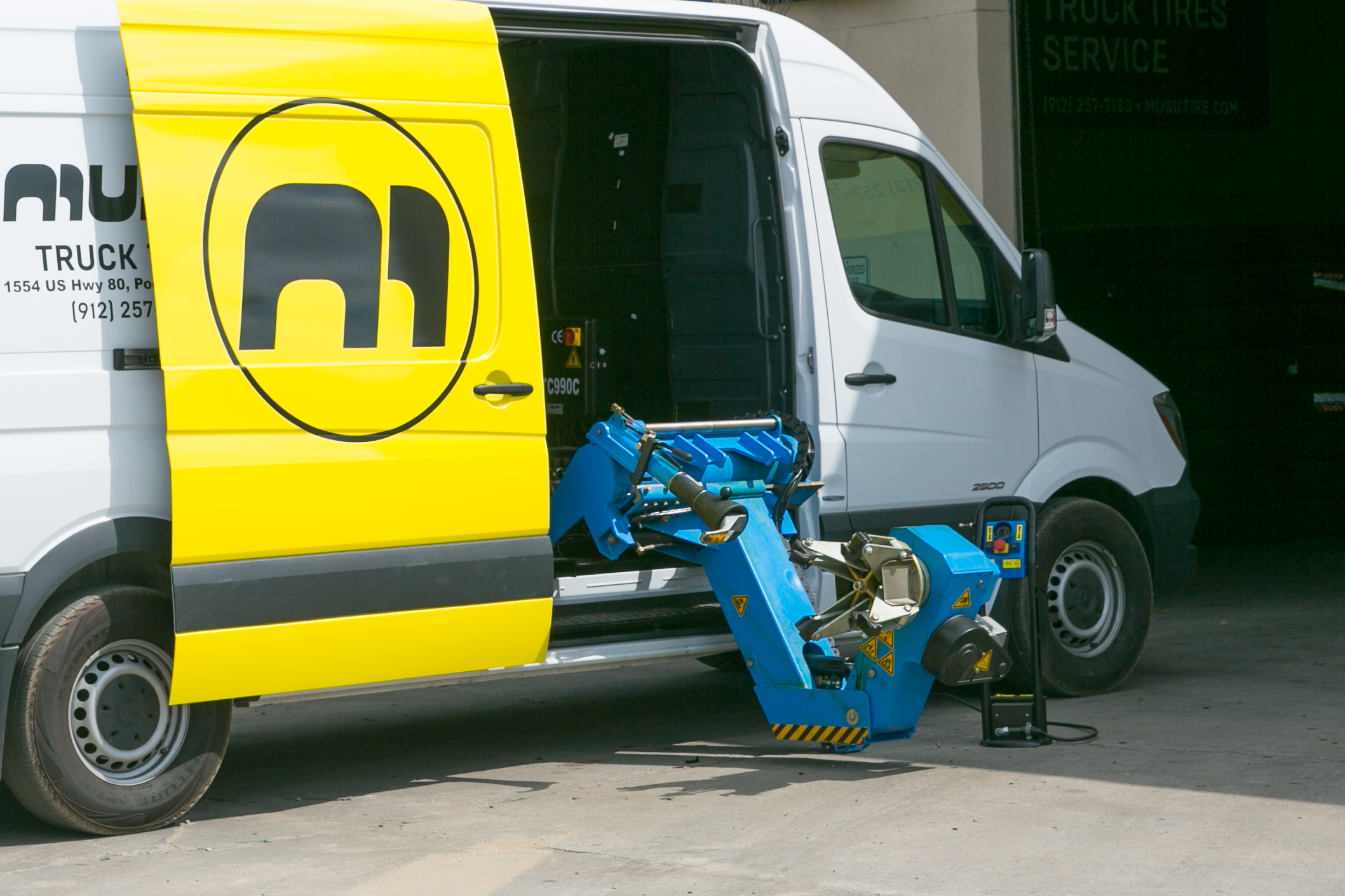
Musu Tires (GA, USA)

Dobra charity foundation (Minsk)

Minsk design week

Masura, manicure supplies brand (Russia)

Spappl, leisure sports networking app (Minsk)

Papera letterpress shop (Minsk)

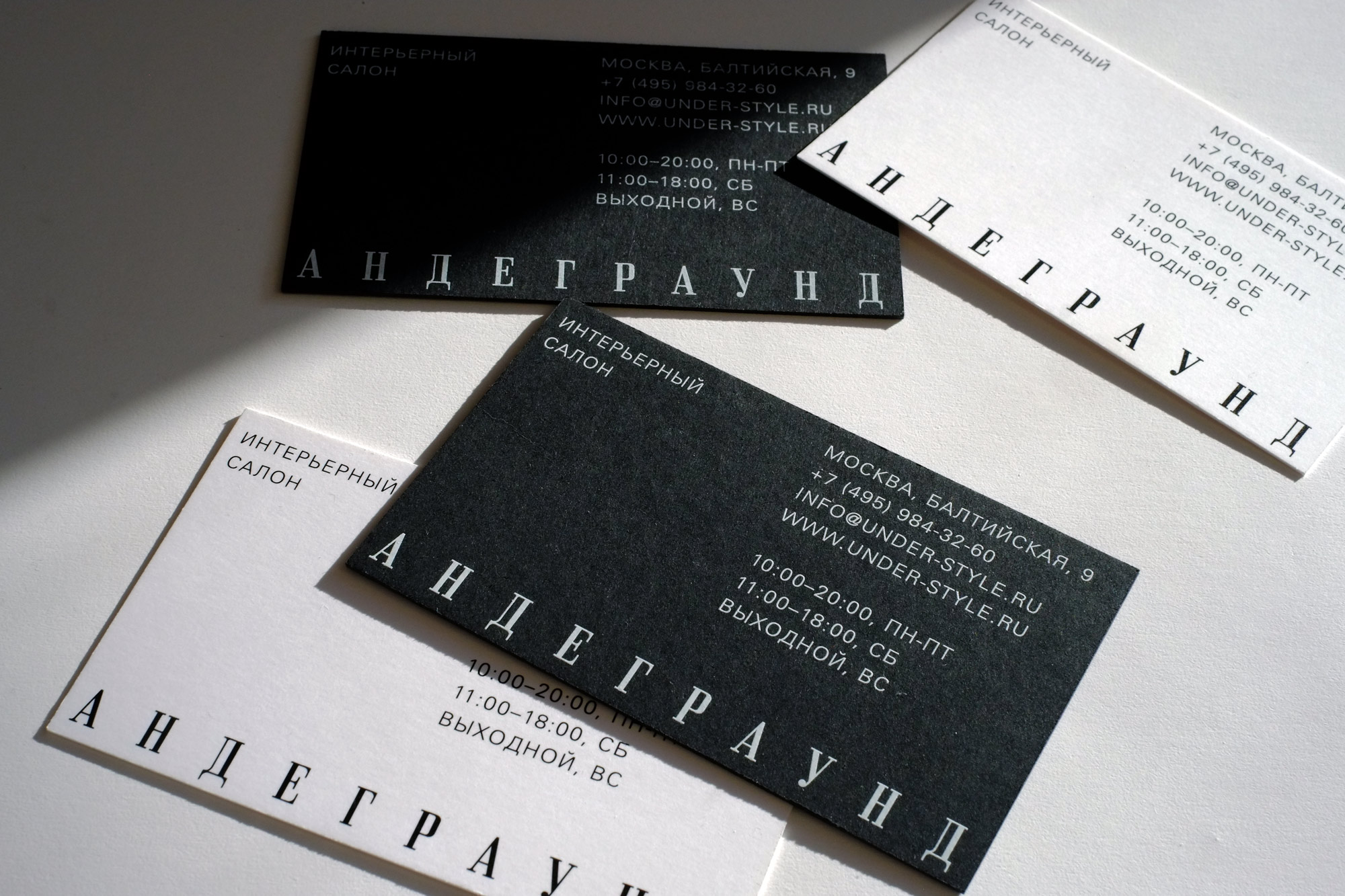
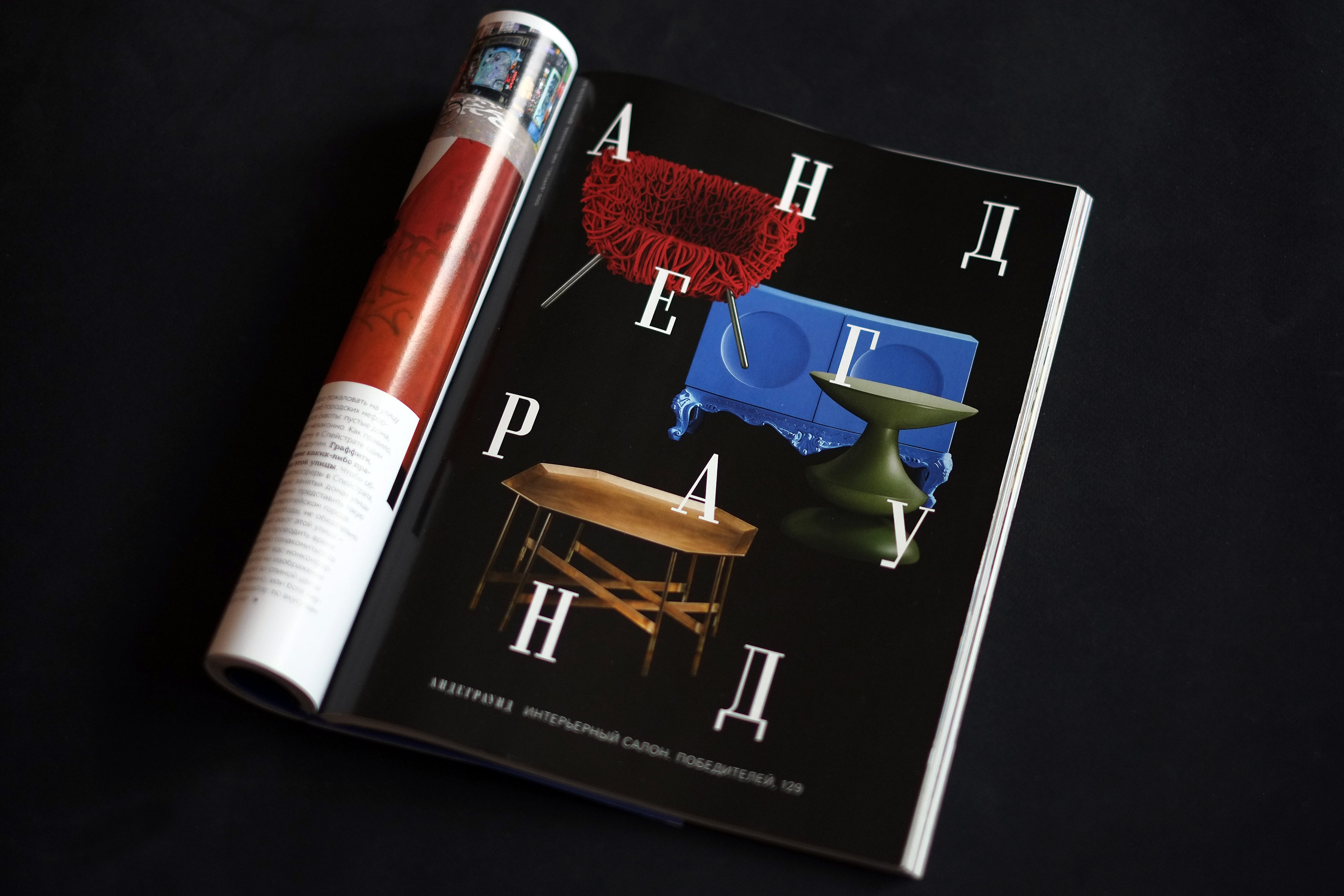
The Underground interior design shop (Minsk)
How did you end up in type design?
I began doing type nine years ago, when back in 2011 I released Appetite. But it hasn’t been until the last five years that I started actively developing typefaces — before that it was more of a side thing. Whereas now I devote much time to creating typefaces, and that is a clear awareness of my place in the world. This is a certain result of the evolution as a graphic designer: I’d been working with logos a lot and at some point I realized that anytime it just happens that I have to choose a typeface and do something with it. And I’d always really wanted the result of my work to be just like one in the
Well now I just have to ask about your education.
It is actually a weird mix: I have an economic degree in ‘commercial activity’ which was a correspondence course, but I also received design education — and this time I addressed my studies more responsibly, when already in the process of work I realized that I had gaps, and where exactly I had them. This was a two-year program of Oleg Viktorovich Chernyshov — a teacher, theoretician, methodologist of the Belarusian design school. Many of our guys studied with his textbooks. That’s to him that I owe many of my views and perspectives in design and I look on him as my teacher. Although clearly with such a diverse background I had to learn many things by myself.
And have you studied type somewhere?
No, I haven’t. I certainly always strived for a systemic knowledge of this. And, naturally, I read tons of books on type. But at a certain point I got this saturated with information that now, I think, I won’t be willing to hear a course on type and typography, and generally these days I care more about other related topics. Obviously, there was a time when I could have gone to Western Europe, but the moment’s gone — now I feel differently about myself, about type, about what I want to do and why I am doing all this. I don’t want to part with the world I created for myself, I feel comfortable in it.
What do you think of yourself as a type designer?
I am very materialistic, and it’s both my strength and my weakness. There are two types of designers. The designers of first type move the culture forward. Others make typefaces like hotcakes, so to speak: shaping them, baking them until they’re done and ready, and send them to the storefront — where they either sell, or they don’t. And I don’t classify myself as the designer of the first category. I’m all for a reasonable self-attitude. Here in Belarus nobody does world-class type, except me. That is not some bragging, simple fact. Yes, there are people who’re trying to do something, but they don’t achieve an international standard level in their results. While if you do something professionally and make a living by doing it, the result of your work can only be world-class; if it’s not, then something’s broken.
You have launched your website where one can commission a bespoke typeface. Did it yield any results?
The fact is, I wanted to try this thing, but then COVID19 happened to the world, and everyone got completely different concerns. Later, Belarus had elections and protests, and there is absolutely no time for typefaces and the website. Everyone’s agenda has changed.
And was it possible to get a commission for creating a custom type in the domestic market before the pandemic?
It happened to me just once: in 2012, I produced a typeface for an IT business. I still don’t get why they needed it. We agreed that they would use it for two years, and after that we either renew the contract or I will be able to sell it myself. They decided not to extend the contract. I sold around 40 licenses for this typeface until it was bought out by Shokoladnitsa (Russian chain of coffehouses — editor’s note). That is, the project turned out to be successful from the commercial point of view. Other than that, we don’t yet have a bespoke type market, it is still being formed, we start to get first requests on how much it could actually cost. But I had the experience of doing large custom projects. Recently I made an Appetite Pro’s customisation for the global headquarters of Lay’s — I believe it is now on their packaging in Russia as well. (Lay’s is a worlwide potato crisps brand, owned by PepsiCo — editor’s note)

Appetite Pro in Lay’s packaging, the 2020 design
What do you feel when you see your typeface on the shelves in every supermarket?
Well, I’ve already had an experience with packaging for a mass product. The first time happened in 2009 when I produced a logo and packaging design for Krinitsa beer — the most popular Belarus beer brand, sold in any village. And the people who drink beer, especially beer from 1.5-liter plastic bottles, they sometimes dump those empty bottles right where they’ve been drinking. And so you walk and see your product lying around everywhere under your feet.

Krinitsa logo in 2009–2011
You have mixed feelings: on one level, you’re glad you made something this big, mass-produced thing, while on the other this means you took part in decorating litter. But I had other large projects, too. There was Wargaming (Belarusian videogame developer and publisher, known for World of Tanks series — editor’s note). And MegaFon (Russian major cell network — editor’s note), I sometimes see their ad on YouTube — and there is this typeface made by me. Or, there was this one time while I was watching The Grand Tour, this Jeremy Clarkson’s show, an episode about Batumi — and I had created the logo for a local casino there a while ago, — and they’re driving past that casino, and there’s my logo in the close-up. This was nice and unex.


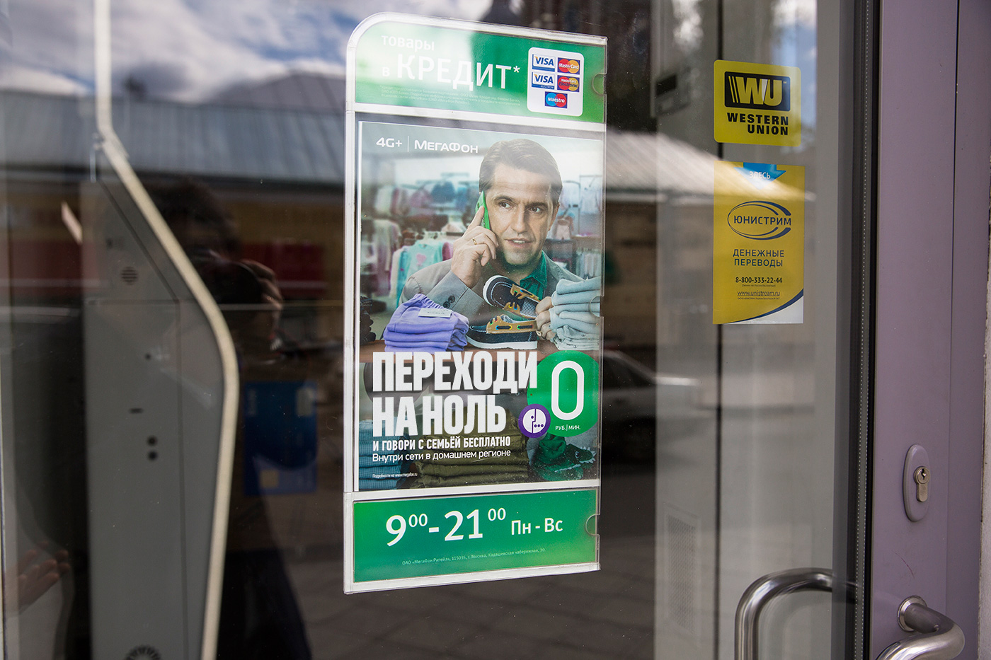
Megafont, bespoke font for Megafon


Bilingual logo for Eclipse Casino (Batumi, Georgia)
How did you like working with Georgian script?
For me, it was venturing into a new territory. And there I was helped by a Tbilisi-based palaeographer who gave me some clues in terms of how specific glyphs and graphemes might look like. That was very interesting, and I consider it as my professional success that there was nothing broken about this signage, and it preserved the image and the feeling of the Latin-written original.
Denis, let’s talk about your typefaces that ended on type.today. Starting with Nekst. Please tell us about its idea and, more generally, how it turned out like that.
Again, the idea came from a logo: I had to draw such an S that would not be
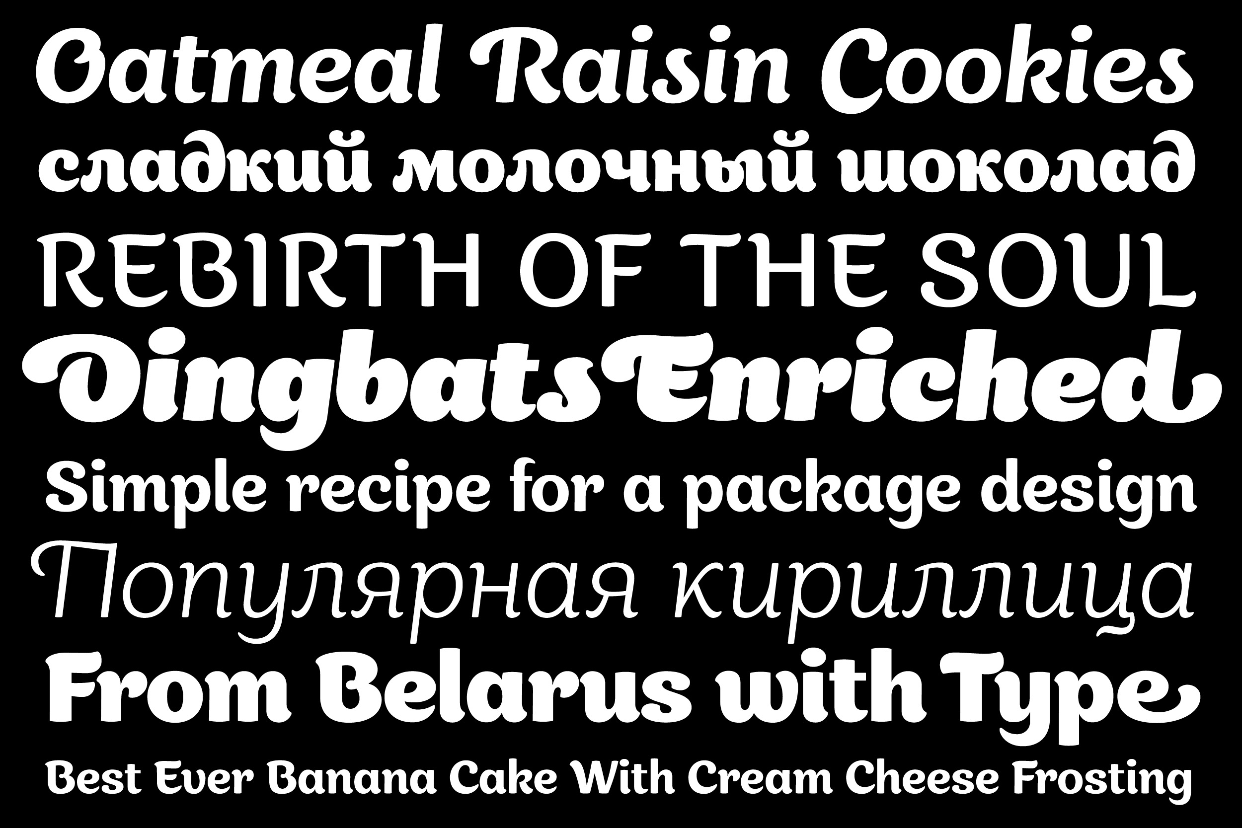
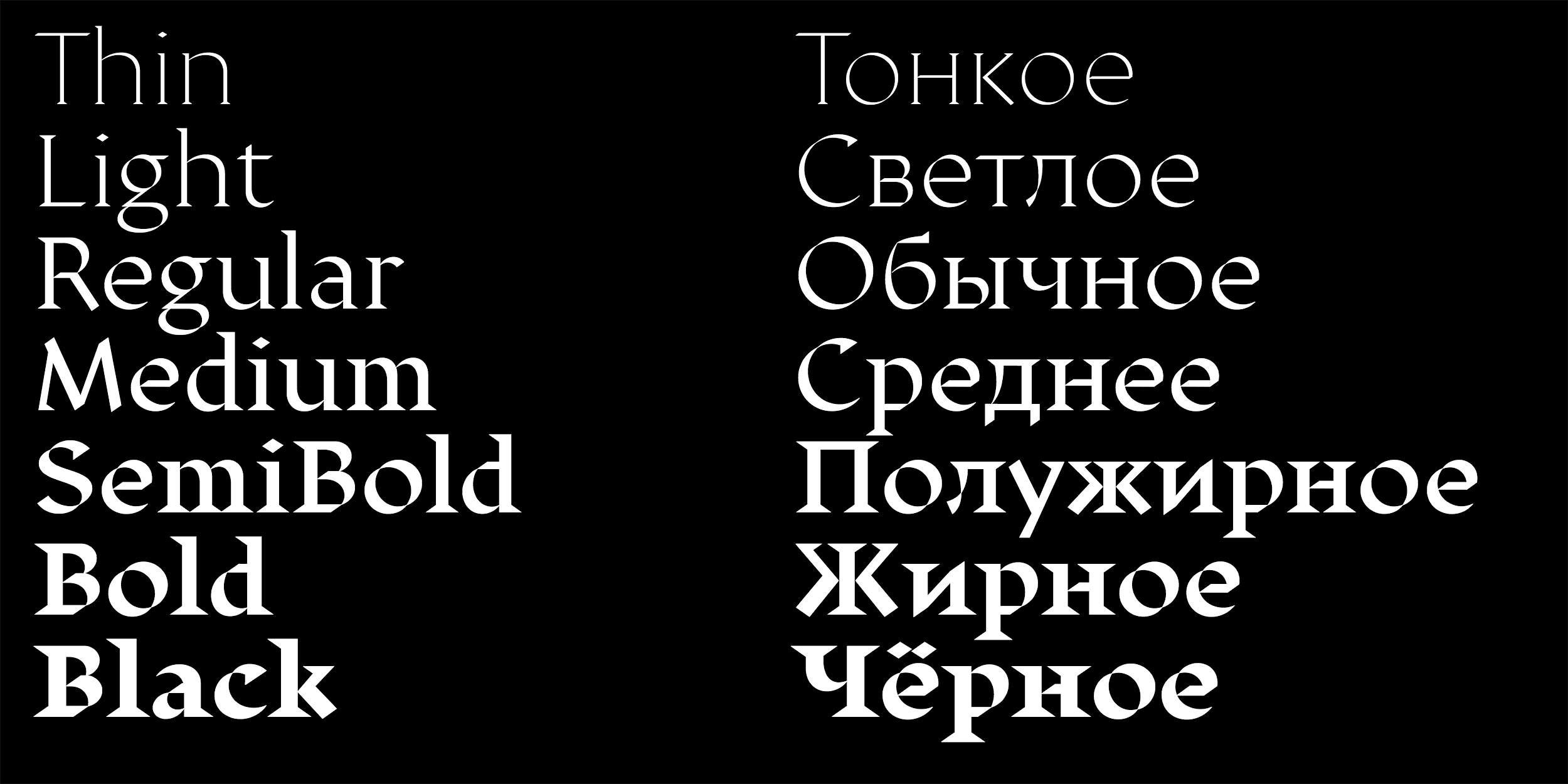
What did I end up with? A geometric sans serif with distinctive S and K, and as for Cyrillic there are very particular К, Я, Ж, З, Б, but those glyphs are not the most frequent. I cared for the repetition frequency of peculiar letters (which were actually the reason I started drawing this typeface) being the same in Cyrillic as it was in Latin alphabet.
But you can’t do such tricks with Cyrillic letters with the same repetition frequency as S has. Take Л: you create a funny Л, it will make the entire typeface look funny. I had many doubts, readjusting it a bunch of times, and consulted other designers. I was told I needed to calm it down a little bit. I decided to do the opposite — to get back to the initial idea, not to calm anything down, and make my typeface a display one. And if you want something smooth, go ahead, ‘cause it has alternates — just switch them on.


Nekst is available on type.today
By the way, Nekst was not the original name. At first I named it Quasar. I’ve been inspired by one of the things Elon Musk did. I was dreaming I created something of that kind: you have a rocket about to take off, and in what typeface the name of the rocket is typed. And I couldn’t let this cosmic name, Quasar, go for about a year, literally.
It’s a great name.
It is, and I even checked it out — it was vacant. It wasn’t until publishing the ready typeface on MyFonts that we found out that Linotype had registered their Quasaria. I’m writing to MyFonts, saying ‘Guys, so and so, partial coincidence.’ They answered ‘We know from our experience that Linotype is a highly uncooperative company to deal with, they have plenty of lawyers, you’d better pick another name for your product.’ And I already had a similar experience once when I had to withdraw my typeface, rename it, and release it again — after that we had a real problem with selling it, and I would hate to go through something like this one more time. So I immersed myself in weeks of searching for a name, even using name generators, gave up on the space theme, as whatever I came up with was already taken by someone else. For me the most important was to show an open S in the name of my typeface, but then I started to pick over its other significant letters — K, Т with a specific curve, — and that is how I came up with Nekst. I believe this typeface has the potential to fill a niche that is yet vacant.
You’re generally known by designing very financially successful typefaces. What is your way of identifying those high-demand niches?
There’s none. No secret here.
Intuitive?
Definitely not that. Intuition is when you feel in what direction you should move forward. And I simply get closure with some of my unfinished ideas. I have a heap of ideas that arose from my working on logotypes. This heap is placed on my wall — I just stick all sorts of stuff, and it’s just looming before my eyes. It can take a year or two before I get back to an idea. While I just can’t leave things unfinished, I totally have to finish them — yet another one of my neuroses.
Other than that, everything happens incidentally, by chance. Take the same Appetite. While I’ve been making it, I had absolutely no understanding of type and I was pretty much simply drawing letters separately, without a system. At some point there was already a certain amount of them — and I brought them together into a typeface. The first iteration of Appetite is awful, that’s my pain and my shame, I’m branded for life. It has such a huge amount of ligatures, about forty, that a normal person simply doesn’t need that
The revised version of the font is named Appetite Pro, it was released in 2016
What accidents shall the world thank for having the typeface called Displace?
I created a logo for Mastactva journal, this not very interesting state media about theatre plays, exhibitions, other kinds of cultural events. The logo had to refer to basic things in type — broad-pen writing, the way it’s explained in textbooks, and Roman mural writing. I believe that the magazine with my wordmark came out only one time — it was some sort of a special issue. And so I thought I might make a typeface out of it later. In Europe it is one of my most well-liked typefaces, but it didn’t become popular right away, only a couple of years ago, when I redrew it — that’s why it now has “2.0” in its name. And when I remade the typeface, I thought, ‘why not add serifs to it?’ I added serifs, and that’s how Displace Serif was born. And I did a limited merch edition with it. The Displace itself eventually did some nice

Displace 2.0 и Displace Serif are available on type.today

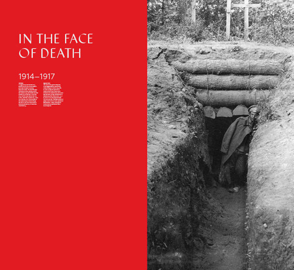
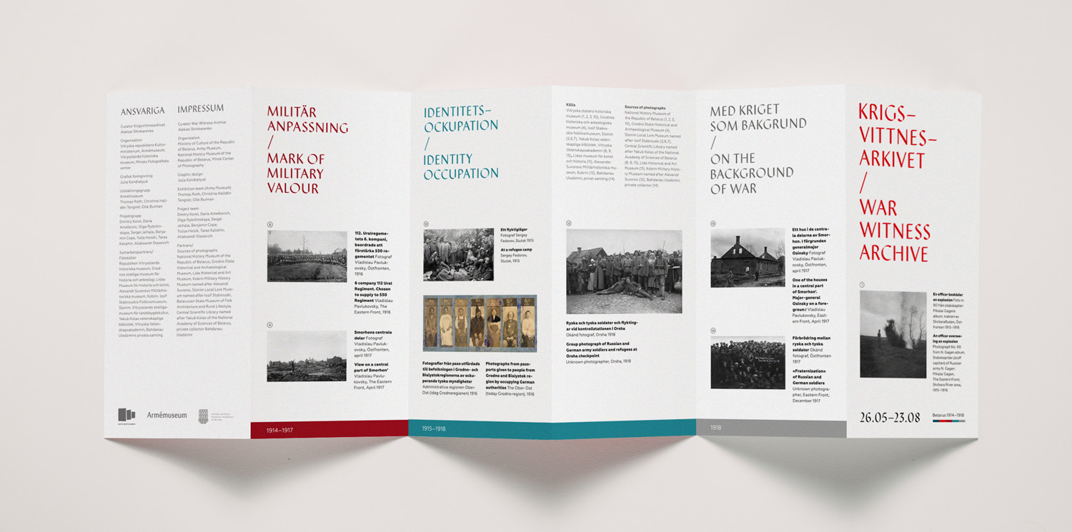

«War Witness Archive», interactive exhibition at 56th Venice Biennale and at Swedish Military Museum. Designed by Yulia Kondratiuk, 2015
I really don’t get how the market works. I have this typeface, Canapa, a humanist sans serif. That’s a good typeface — I truly enjoy its italic version. But the strange thing is, nobody paid attention to it when it came out. Probably, it needs some more time for people to notice it. It is the thing with typefaces, I think: after you release it, it detaches from you and starts living its own life. As if your typeface, just like a hotcake, is good, people will take it, and if not — maybe it’s too early. It has to take a little longer.

Canapa
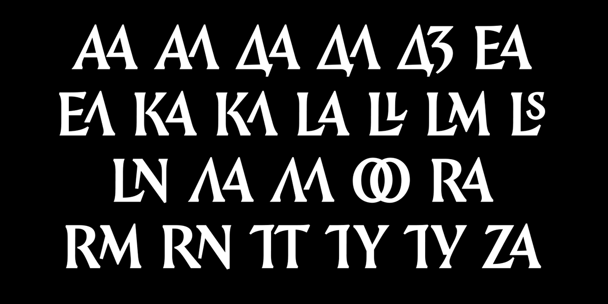
Could you tell us about Epos, which made it to our Tomorrow collection?
It is a great project and an example of how I work when I don’t do type. I was assigned with a task of making packaging for the limited edition of Krinitsa beer about Minsk’s urban legends. And I really wanted not just to decorate the packaging — insert typefaces, put plates, a little drawing here or there, — but to relate design to shape. It was important that the design layer would become a part of the container itself, like it is the case with the Rich juice packaging
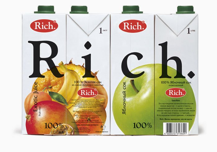 , which was produced by Open Design. I picked up the can and thought I should make it tell stories by itself. ‘Cause, when are we normally looking at the can? When we finished our beer, ‘Ouch, this was a nice beer.’ While I decided to obtain constant communication while interacting with packaging: this Trajan’s column in miniature. At first I wasn’t thinking about creating a new typeface for this project, tried other ones, but then I realized I had to make an attempt: I rarely take on making packaging, and it would be weird to design it with ready typefaces.


Legends of Mensk, the limited edition of Krinitsya beer, 2017 год
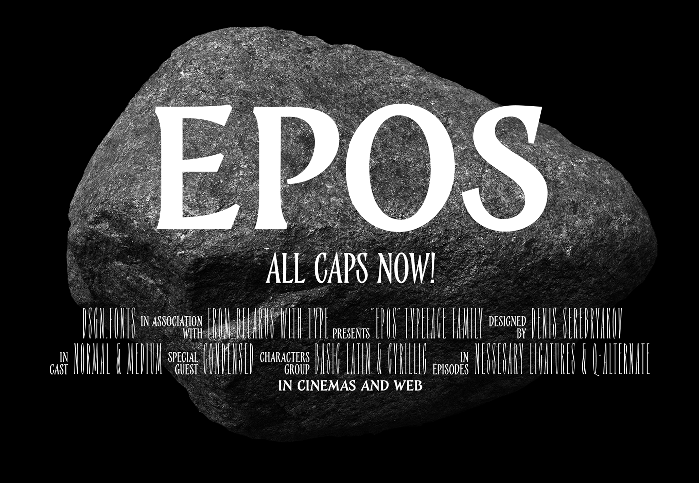


All three styles of Epos are available on tomorrow.type.today
The layout turned out to be very pragmatic. Everything on the can complies with the state-imposed packaging specifications: both point sizes and percentage ratio of spaces between obligatory elements — thanks to that, we now have a super-narrow style, Condensed, in addition to the main one. After a little while I decided to design a weight in between — that’s how Medium emerged. What is particular about Epos is that I started designing it from Cyrillic, as we needed to type text in Belarusian, and its Latin version arrived later. And me with a copywriter tried to fit texts on the can so that they would be very even, almost without hyphenation, plain uniform.
Epos sells rather well.
It is probably due to Tomorrow’s effective licensing policy. I actually think this is a very good model. Trials, this is some kind of combating piracy. I like this story, because freely available files are a driver of sales growth. Perhaps piracy is the only reason why Appetite became so popular. At a certain point, it appeared on VKontakte — and after that you’d see it on each wall and every kebab house.
It means it started to sell better after it was stolen and used in many places?
Yes, since designers are also evolving: clearly, there are some who stop at their Neanderthal evolutionary stage, but many designers understand that if they use a typeface they do have to buy it after all, and get it over with. Which is why I vote for giving away typefaces. I mean, you only start getting real money when a client pays to designers for the typeface they utilised. And you should simply provide a designer with everything so they can use it. Basically, a designer acts as an agent for a typeface, and the larger this agent network is, the better. I can send my typeface to anyone, I don’t care if it even gets stolen. I am totally cool about this: those who are going to steal, they will steal anyway, and those who are going to buy, those will buy. You can get mad at those who steal endlessly, but I vote for typeface to be used. I know tons of people — absolutely normal, responsible, professional people, — who would download a typeface on VKontakte and try it before buying it. And let them do that, if it suits them. In fact, I never even pursued complaints to anyone.
And what do you think of Tomorrow’s package licenses?
As a marketing strategy for increasing sales — that’s a great thing that works and which I like. In any case I prefer a sale to be made than not. And the bigger the amount of sales, the better. Though, a typeface can be purchased and not used on Web or elsewhere, and be used only for typesetting stickers: ‘CAUTION! Slippery stairs.’
We have the minimum license for that.
Yes, but for me as a seller it is convenient that there is a package solution: it includes all the options, and it’s up to you to then decide how to use the typeface.
Do you keep an eye on type trends?
Not routinely, no, I don’t. At one point, there was this trend for all sorts of deformation in type, then it was brutalism, for a short while, but nowadaysthose periods don’t last for decades but fly by rapidly one after another. That is why I try working without looking at trends. And I also don’t chase fashion, as I’m very slow. I haven’t been working at the office and working as a hired employee for a long time now. I feel the need to go for a walk in a park, to have a cup of coffee, to work with gusto, to lie down, to read a book, then to work again — this is how my day looks: no rush and always a room for manoeuvre. Though, there are people in the type world who manage to keep up with everything, — they amaze me and make me a bit jealous.
But do you have any ideas on where all this is going?
I believe that today the society is decentralised and that for a while now we’ve been living in a situation where we have everything, any typefaces, and sometimes we just combine the uncombinable in order to create something new. On the one hand, this new stuff fuels the existing disintegration, while on the other, we, the other way around, smooth the edges — endless circle, closed loop. How is a new typeface conceived today? “What if we mix prickly with warm? Let’s do that!” Or, we take Jensonian serif typeface and treat it with a filter that makes it, let’s say, a modular font. Is it new? Yes it is. Yet with reservations, clearly.
Will it all come to an end some day, what do you think?
No, we will constantly exist in a state like that. That is kind of sad, but what can you do. After all, you do know that type is a set of tricks, conventional forms, norms. If you don’t violate a norm, you’re creating a ‘good’ typeface. These days we have many people who have learned to do those standard things in a very high quality. And you have enough information to make a decent typeface just by following the instructions. Type.today published translations of the OH no Type School — those are great articles. Add to that Designing Type by Karen Cheng and the book by Yuri Gordon, and, using these three sources and taking any typeface from the people on the surface of type media scene, and you could easily create your own typeface. But you also need an idea, clearly, — you will always need an idea. Plus systemic knowledge, professional vision, self-awareness, certainly, too. You also have to understand how to use a tool. It seems simple, on the one hand, while on the other it is not as simple as that, as it turns out.
And if we speak of Cyrillic only, is it developing? The situation with typefaces, is it getting better?
Cyrillic is already good. What’s bad about it? How it will be developing, I have no idea. As I mentioned, I don’t classify myself as a person who shapes the culture. As for those ranges of possibilities which are discussed in lectures, conferences, and workshops, like ‘Guys, we don’t know how to make К and Я here’, — how great is that that we have a chance to do something in those places! Essentially, this is actually the most valuable thing about the very same Nekst — these Cyrillic sore spots: Ж, Я, К. Those are the letters for which there is seemingly no canon yet. It is a figurable, yielding material that can still be used at our own discretion.
Denis Serebryakov
tomorrow.type.today/en/designer/serebryakov
instagram.com/deniserebryakov
behance.net/deniserebryakov
dsgn.by