
- Pavel Kedich
- graphic and web designer

The Project
Readymag has lately been extending its template set; well, now is the time to offer you some new templates for long reads. As we discussed this, our team got an idea to present something bigger than just a plain template: a full-featured material on the evolution of on-screen reading, issues of legibility, certain details related to web layouts and web-based representation of contents. Welcome our editorial long-read essay on editorial long-reads: it is somewhat of a recursion, right.
We provide users with an opportunity to use each chapter of this article as an independent template with its own style and typographic solutions. Apart from various approaches to layouts, we are most definitely focusing on type, and all possible kinds of ways to make use of it. Since Readymag has an extensive Russian-speaking audience, we decided to address the typefaces that support Cyrillic; our choice was largely determined by this consideration. Eventually, the thing has turned out to be very rich in terms of type, in large part thanks to type.today library.

Druk
The forms of Druk enable highly articulate contrast between headers and body text. Our only objective here was showing how the Wide and Condensed styles address the challenge of type set distribution in headers. The feasible options you get in this template would demonstrate how wide this choice is. For example, on page one I intentionally opted for the narrowest of styles, to enable users to have headers significantly longer than usual. On page two of the project there is the vivid interplay of the Wide and the Condensed styles of Druk. .


Graphik
That is a very solid typeface: anything you typeset, would work just fine. 100 percent workhorse. Graphik can’t boast of some particularly pronounced specific flavour — and therefore can be applied pretty much everywhere. I like the way it works at small sizes, without declining in legibility. It is precisely why I heavily use it for captions, both here and our other articles. In this template I mention that captioning could be a bit more fun — and prove my point by introducing (in some situations) Graphik Medium, which brings in some additional density to the text body.

Yet, I see one problem about Graphik: it has become immense, it is extremely popular among designers. So, I believe, for now the challenge is to use it almost incognito, make it harder to recognize. I don’t know if we managed to do that,, but I used Graphik in some pretty dense text blocks and even used paragraph indents (which is something you rarely see on the Web). The indent alone does have an impact on your impression of a text block.
Stratos
Stratos is exceptionally capable. Due to the differing proportions of lower- and uppercase, one can handle numerous tasks within one material, using a single font style. Like, for example, the title on the page two is set in capitals, while the subtitle utilizes both cases. And each of them, in fact, rings quite different.

Spectral
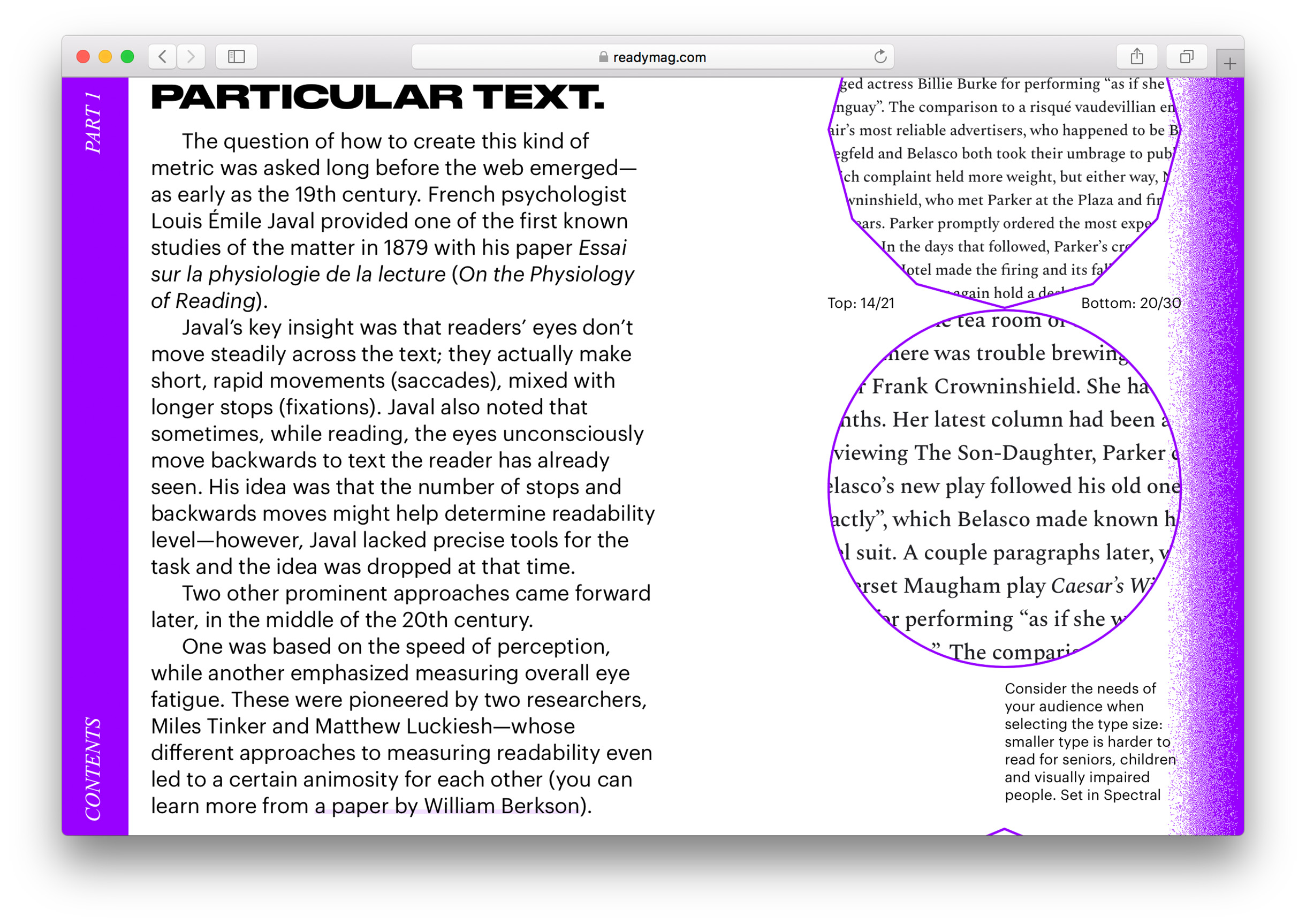
I guess, today’s web designers tend to pay little attention to the functionality of a typeface: whether it is to their software environment, a lack of knowledge — or simply for the reason of not being curious enough. Either way, they pick fonts based on something else. But when it comes to lengthy texts, you tend to find yourself in situations only a quality, fully glyph-equipped typeface can help. On Google Fonts, the small-caps variant of Spectral is a separate style, Spectral SC. This allows for applying small caps and old-style figures on the font-style level: no need for complex code, no bothering with OpenType features… This is, I believe, a great, educationally-loaded practice: a separate style for small caps is a nice pronounced way to announce they are even available. Moreover, Google Fonts doesn’t optimize the glyph sets: like, on the page one you’ll see a Spectral thin space used for spacing out a percent sign. Pity that web designers aren’t usually quite as picky and considerate of details like these.

Acute in its forms, Spectral is a rather contemporary and functional serif. Increasing body size in web layouts has been an established trend for some time now. Sometimes it entails the need to apply negative tracking. Many designers, I assume, are quite afraid to work with Spectral because of its lavish letter spacing. I would recommend being a bit bolder about it.

Karloff Negative
I’ve always cared for Karloff Negative, yet never would find the right context for introducing its reverse contrast. — It always looked forced and somewhat unnatural, way too decorative. But here, Karloff finds a place for itself in the chapter titled 10 Tips on Creating a Readable Web Text. As the Negative might seem odd and unusual to unsophisticated readers, I thought it could, probably, still benefit us — as an ironic way to support the title’s meaning. After all, you need to focus and make an effort to read-through it. My attempt to show that it is OK, having type solutions to serve the interests of the text meaning.

Kazimir Text
The roots of Kazimir date back to Russia’s pre-revolutionary typography; Kazimir has its own pronounced ways in Cyrillic — but those magically vanished in Latin. On the last page I wanted to give an example of how a caption could be typeset at small size in a serif font: Kazimir Text proves to be quite up to the task. It is absolutely legible on all kinds of screens, — retina, as well as larger grain size displays. See below for a paragraph set in Kazimir at a rather large point size; it feels very different there. How cool is that, right? That’s the beauty of the contrast interplay of the small-sized captions and the larger body text. Hopefully, this would set an example of efficiency! After all, the more fonts we bring in, the heavier our web page gets — and, oftentimes, the higher is the pressure on our budget. By the way, Kazimir is very convincing next to Graphik. The metrics are fairly similar, — which, I think, explains why these two work so great together.


I truly hope that new Readymag’s templates will graphically reveal (and clearly prove) to everyone that it is possible to harness those best centuries-old practices of graphic designers and typographers — and type, obviously, plays an essential and fundamental role in all this.
- Daria Yarzhambek
- art director, graphic designer, chief editor of the type.today Journal

I like how there is an educational side to this project: you will get the examples of ‘playing loose’ with type and all the opportunities it offers, small caps, old style figures, letter spacing, etc. Those are the tools that we should have domesticated and started actively using on the Web a long time ago; an experienced designer knows only too well that there is no such thing as a forbidden trick — nor there is ‘playing dirty’: it all depends on your context.
Before you embark on reducing Spectral’s letter spacing, I would like to tell you something on the subject. At type.today, we truly enjoy this typeface by Jean-Baptiste Levée, just the way it is. When you first see Spectral, its ampleness (let’s put it like that) can be baffling. And this is precisely what makes Spectral so special and (super)powerful. When you’re not used to such density in typesetting, it might seem somewhat ‘whitened’; while it is in fact very close to how we printed books and read big texts back in the day. This is the classical letter spacing for quality reading experience. Spectral сonverts a text into The Text: solid, lucid, self-reliant. Go get involved in this waltzing, hear its rhythm, let in more air to your design, — it will give to your work a truly great vibe, both fresh and classical. We are all used to fast, compressed on-screen information. Spectral’s kind of narrating, slow and confident, introduces you to a new sense of comfort and well-being (especially on retina displays).
As a book designer at Novoye Izdatelstvo publishers, I utilized Spectral for producing a handful of books. It makes your work appear as this classic good old volume, but without looking ancient or outdated. Plus (thanks to loose metrics) it is highly legible, even at very small sizes. For my editing tasks in Google Docs I also use Spectral, size 14. It makes me work with texts mindfully. And my eyes get less tired. In fact, you are dealing with Spectral right now, we have set this article in it. But! It was a bit tightened, — which gets us back to the conversation we’ve had earlier: it’s all contextual.