
Zhenya, your Instagram profile says that you are a librarian at a library.
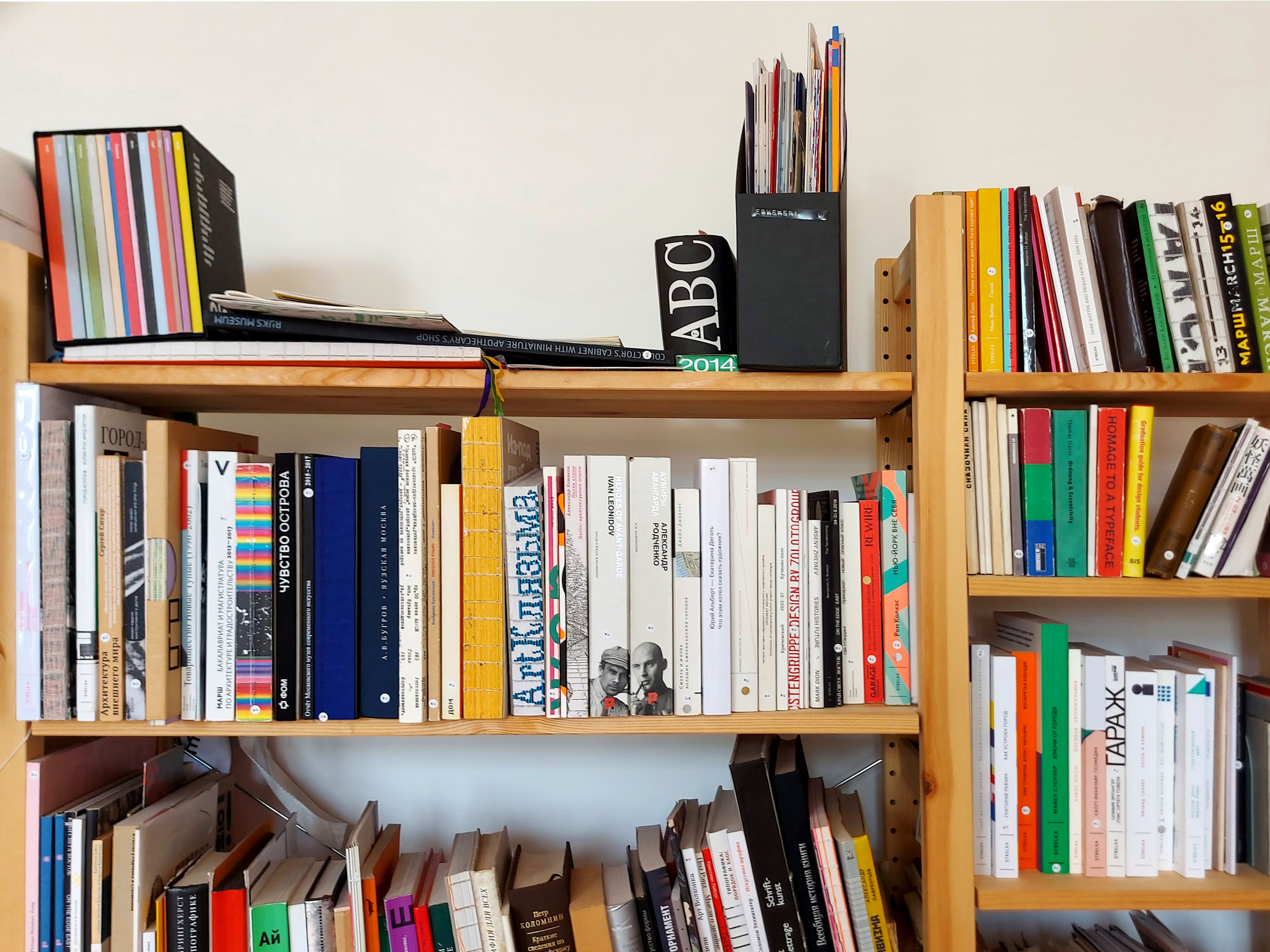
I am a self-proclaimed librarian, and our library is a small, home-maid project with my friends-colleagues Yulya Kondratieva and Sasha Bereznikova. At one point Yulya went for an internship to Studio Joost Grootens and brought from Holland two suitcases full of books. We understood that we have beautiful books stored at home, but we flip through them once a year, and you can’t see those anywhere in Moscow. We decided to offer an opportunity to come and look at the books. At first we agreed with Nekrasovka (Nekrasov Central
Do you have many people coming to you?
Now we see someone come each Friday, and normally it’s two or three people a week. But it can happen that we have an entire group of students come, 15-20 people at once. Or recently we were visited by eight girls from Yandex.Praktikum. Also, Alexander Vasin invited us to Typomania to curate its book part. There, people find out about us, we share contacts, and later they come to us.
Don’t you feel bad for the books when people pick them up, touching and flipping through?
Surely we do, but it is exactly what books are made for, to be read and looked at. We are trying to keep an eye so that nothing criminal happens. So far we had no incidents


Placeholder library
Is it pure altruism on your part?
Yes, we don’t want to monetize that, as it is unclear how it is even possible to do that. Plus, in such a case the project will lose its sense a little bit. We had a situation where we carried out workshops for money to compensate a part of the rent. However, altruism always brings some profit for yourself. To start with, we keep our books always close, and we’re looking at them. Secondly, it is a reason to buy more books. You think ‘Should I really waste money on yet another
Do people bring you books?
Yes, they do, and we accept those with great pleasure. The agreement we have is that a donator can take their book back anytime. We have a certain amount of repeats, and we have already organised a swap with the consent of owners. Some books that nobody wanted and we have in three-four copies, we donated them to Nekrasovka.
Do you possess something rare, hard to find in Moscow?
I would say most of our books are. We collect any books, not necessarily design-themed. That can be a book about anything, but with a cool layout and typography. We have lots of that: Irma Boom, books by Grootens studio, Spector Books, one or two books by Metahaven, brochures created by OK-RM.


Printed Matter / Drukwerk by Karel Martens. From the Placeholder library collection


Hong Kong Typology. From the Placeholder library collection
Recently, you’ve completed the identity courses by Velichko and Vasin?
Yes, and that was great. I like studying, and I regularly sign up for short courses. In a way that is my hobby. But I haven’t taken any large courses since I graduated from Poligraph (Moscow University of Printing


Mortuary identity project created during the course. Set in: Zangezi and Gerbera
Why have you decided to pursue education again?
There were many reasons for that. But the most important one, perhaps, is that I had been working for three years at a government structure in the field
Have you found a new job already?
I have been invited to Yandex.Praktikum. I will work as a designer and illustrator there, sort of combining my professions. I will design classes for data analytics courses.
How it was, you and Polygraph? Was it enough that they gave you?
Polygraph is great. It is a wonderful fundamental education. You understand that you’re really learning a lot of things. Though, there is this specifics that you’re slightly disconnected from real life. And you need to have a certain particular personality to want exactly this, very prolonged, stretched out in time education. Many human studies subjects are taught
I enrolled at Polygraph right after school and had no idea what design was. I wanted to become a book illustrator, because I loved reading and loved drawing. I was thinking ‘Bingo! That’s a profession’. It is only in my second year that I began to understand something, as in the first year it was only introduction and work with form. But literally in a year, during the second year of studies, everything turned around. You try, you start to feel the text and feel how it should be worked with as a matter, as it is a very particular skill, which you have to learn separately. There are lots of dimensions that should all be considered and taken into account: a text works as a grey matter, as a form, but at the same time the typeface is also an image, and at the same time all this is a text that you are reading.
So, you ended up in design thanks to Polygraph?
That’s right. Before that I hadn’t known what it was, and there I found out.
Can you name teachers that you especially liked?
From the very beginning my teachers of design, ‘composition of publications’ were Keleynikov and Ershova. And at Polygraph your lead teachers almost entirely determine the process of education: as a result, the profile of graduates depends on whom they had as a main teacher, which is why someone receives a more powerful illustration course, while others have been offered a stronger design programme. After the third year, many chose design as a major, simply because design teachers were better, plus because it was more general, more wide. You were taught to work with visuals in general, and after that you were able to do good illustration, among other things.
With which typefaces from type.today’s collection have you already worked before you volunteered to run our Instagram?
It was just Kazimir, I believe, but I used it in several projects. When it was released, it immediately caught my eye, and I even purchased a license before the relevant project arrived.
You do this a lot?
Occasionally. There are certain typefaces that I just truly enjoy, and I buy them. I used Kazimir in a project about Turgenev, and I understood right away that it would fit great there. It has a certain retro touch that refers to that period, and at the same time it works really great with modern graphics. That is a beautiful contrast. I actually like when there is a slight discrepancy in graphics that results in an interesting image. For example, when it’s a Swiss grid, but the typeface is not Helvetica and not a regular sans, but something different. Karel Martens does such things quite often, I think. You might call it Post-Modernism: you slightly undermine conventional graphic tricks and practices, and something that worked as a purely constructive solution turns into expressive moves. I really like doing so, namely through a typeface, when it is not that you would have expected to see, and it creates the desired effect.
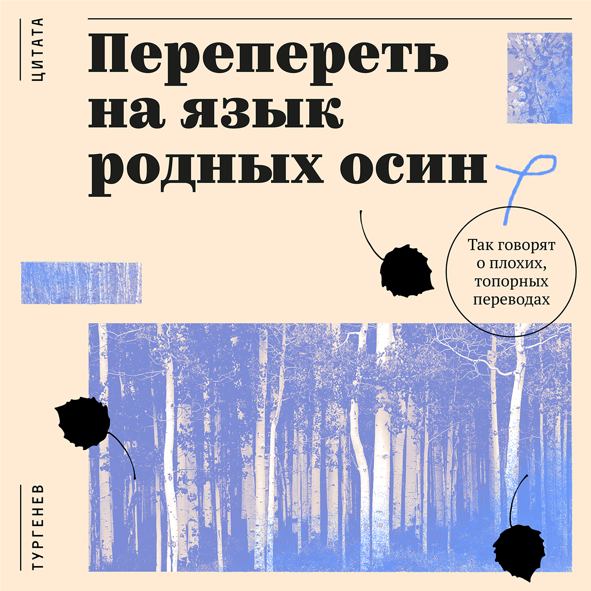

 Biographical online project about Ivan Turgenev. Set in: Kazimir, PT Serif and Activist
You found a surprising font match for the Congress
Actually, the answer is simple. For starters, I already had a license on Kazimir, while 21 Cent had to be purchased separately. Secondly, this style was also slightly based on contrasts, and I wanted to use not a very obvious pair there.

 Sixths Moscow Teachers Congress identity. Set in: Kazimir and 20 копеек
Do you generally work a lot with serif type?
Yes, I love serif typefaces very much. For me they are somehow easier than sans serifs. While I understand that perhaps it affects the result. Because I am regularly told that I do certain retro stories. I don’t have any favourite typeface. I like using completely different
Now when you have touched the whole type.today’s collection, do you have any new favourite typefaces?
I was surprised by practically everything. When you begin to touch them, you’re really looking at them differently. Even with Kazimir that was very well known to me, I found small caps
How did you make this book list? And what books are those?
I thought that it would be easier to make up things if I had a concept. And as it turned out it really was. I had figured out all the
And how did you come up with design? Did you base your work on a book, or on a typeface?
It depended. Mostly I started from the book, as I didn’t have clear associations with all the typefaces. The only instant precise hit happened with Karloff that has Negative and Positive styles. That is literally Dr. Jekyll And Mr. Hyde, an ideal illustration. It is clear, though, that typefaces don’t tell a certain story
What are your favourite images of the month?
I would probably say it’s The Virgin Suicides by Eugenides with
You decided to apply Amalta, which is also highly distinctive…
I myself was surprised. I thought I wouldn’t make it with Amalata, as it is extremely niche as well.
And the images with illustration, is this your illustration?
It is.
Do you generally do a lot of illustration?
Actually, I do. This is rather what my heart wants, because I usually come up with design ideas where illustration would be relevant, and draw it myself after that. Normally, nobody minds. I just like working with images.
How do you keep yourself in good form? Where do you look for sources of inspiration?
With me the way is rather
Zhenya’s instagram subscriptions
You have many books going through you. Do you have any observations on trends in modern book design?
I think that the Post-Modern aesthetics remains surprisingly


OASE Magazine. From the Placeholder library collection
Meaning, we continue to pursue the history that started in the 60s?
It seems to be the case, yes. Certainly, there are new technology and new trends that build up in typography, but in terms of constructive structure of the book, in terms of what looks interesting in its design, this story goes on and doesn’t change radically.
And what changes in book typography?
Perhaps, it’s the choice of type. Now, there is more freedom in terms of how you afford to yourself to use a very large or a very small size. You have a wider range. On Typomania, we organised an exhibition where we were picking out of our collection one book per year. There were 20 books. And we haven’t been able to track some sort of evolution. Design rather depends on the traditions of a certain country, on the topic, on people who create books, and on the publishing houses that print them. Actually, with such a thing as a book that already has a very long history, things like that are unlikely to happen. It is in new technologies, perhaps, where there are people-trendsetters who set certain styles, and things quickly change, and something new appears. You can literally track this happening in waves: what comes and where from. It’s different with books…
So, it is impossible to draft a certain cloud of tags that define the book of recent years, isn’t it?
You can track down some trends, or look at the winners of book competitions. There, the winners are often photo books, books without text, books working exclusively with images and telling visual stories. It is probably appealing because we’re just tired of working with text and complex structures. Also, there is a lot of working with
Is it clear why?
Because sans serif does not evoke a visual response, doesn’t provide enough
What do we have today: the death of paper, or the Golden Age of printing?
It is not the Golden Age for printing. But the book, presumably, will never die, as it is a different thing. Many predicted the death of theatre with the arrival of cinema, but now we all see that it’s just two different things. The book will probably become rather an object than the provider of information, because reading online, reading from any device has become quite comfortable and convenient. I am certain that complex-structured books will remain, because those are difficult to make on the Web. It is easier to work with complex texts when it’s printed, and it’s deconstructed. But perhaps we just don’t know yet the form that will emerge. Though, you can consider nowadays the Golden Age, too, because today, despite the fact that we print less (plenty of magazines just ceased to exist, after all), the things that still get printed are in fact more complicated and elaborate, well-conceived and well-considered. Because there has to be the point of printing it. It has to be sought-after.
Evgenia Nechaeva
@ne_stoilo_etogo_delat
ne-stoilo.com