
What is that?
There’s this Latvian online media, Satori. It is a hybrid between socio-journalistic and cultural media where you have both exhibition reviews and opinions on Latvian political and social agenda.
I’ve been involved in two of their projects for several years already. One is an eponymous literary journal, Satori, and another is an annual paper called Satori Vasaras Avīze (Satori Summer Newspaper.) Each issue is devoted to a particular topic.
This year, the editorial team decided to focus on secondary-level school education. In a way, this editorial decision was to make the shit hit the fan, as this autumn Latvian schools went through transition to the competency-based education system — the one that is in place in Nordic countries, where they have practical subjects and courses that help identify your future profession as early as on the first stages of studies. For instance, design and computer science — or political studies and economics.


This shift appears to coincide with a language reform which has been going on for 30 years already: in national minority schools, the amount of education in Russian language has significantly decreased, and their educational program has been transformed towards even greater similarity with ‘Latvian’ schools. Therefore, the situation has both political and linguistic dimensions, which is why Satori, being a liberal media, decided to issue a bilingual edition with two covers.
Design
It was obvious that I needed to start out from Russian version, as the Russian text is always at least a quarter longer than the Latvian one, — and in some cases even a third. Also, I stick to this concept that, regardless of language, the reader deserves to get similar typographic experience. Otherwise it is as if you leave someone out. I’d like to avoid that.
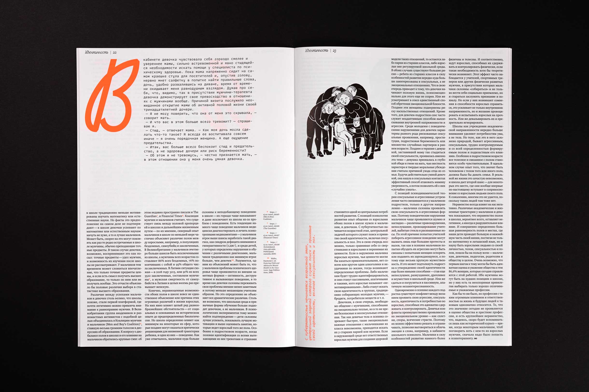
The very headline of the publication, the theme is ‘I’m sick of school’, in both languages, Latvian and Russian. Texts happened to be extremely serious, and we had to compensate for this seriousness. The bolder, the better, as the editorial team told us. Our job is to attract the reader to this content to quickly distribute the print run. We printed 3,000 copies, which is a lot for Latvia. The paper is available free of charge, as it was financed by the state and charity foundations.


Satori Vasaras Avīze Nr.7 2019
Since our last year, Berlin-themed issue, I’ve been obsessed with symmetrical covers: on that one we had the Riga TV Tower sending a signal to the Berliner Fernsehturm. I started talking with illustrator, Renāte Kloviņa, and suggested the obvious: I’m so sick of school, that shit makes me want to hang myself. I’m telling her the idea, and then it strikes me: this thing with schools has been going on for ages, they have not been able to sort it out for maybe 30 years already. Hence, the sign.

Later I realised that we came up with an unintentional allusion to the 100th anniversary of the Latvian Republic that was celebrated in 2018: there was a logo with a number 100 whose zeroes imitated the infinity sign.
The first conceptual iteration that I showed to the editorial team members already had both Curbe and Xprmntl 01 — but it also featured an illustration with hanged schoolchildren’s heads! The illustrator handed me this picture, I took the headline ‘First of all, no need to worry’!, extended the dash, and hung those heads on it.
The editors might have thought that the entire journal would be like this, and got all tensed up. I then had to explain to them that it won’t be like this, it’s just one brutal joke. So, I was sick of school at the time, and it’s just that I’m happy to get back at it now, get my sweet revenge. As for heads, it was Renāte’s bold move. We started with the loop, but Renāte decided to take it a little further.

As a result, we needed to come up with something to keep this dash effect. The text is sarcastic, there is this part that what a child needs to be happy is the latest iPhone and sneakers. I hung, using headphones, my iPhone on the bar, photographed it, and sent it to Renāte together with some sneakers I googled as a reference.
Curbe and CSTM Xprmntl 01
While I was planning the issue, I wanted two things. For one thing, I strived for a certain provocative sharpness, aggressiveness, even confusion. When I say typographic aggressiveness, I don’t necessarily mean certain bricks, heavy blocks of text — this can simply mean a highly unpleasant typeface which literally causes you an idiosyncrasy.
Secondly, I needed a reference to school writings, to strict teacher’s chalk writings on the blackboard. Plus, it had to be modern, without explicit references to Soviet movies, or the 1960s’ street signs. And when the loop arrived, I started thinking of something curly and remembered about Curbe.
It behaves in rather the same manner in Latin and Cyrillic, which is actually pretty rare. Lately I haven’t seen a typeface that would be so plastically similar in both scripts. Curbe ensures very similar lettering — clearly, with less descending and ascending elements in Cyrillics, but you don’t have this feeling that in Russian setting everything changes drastically. Besides, we all know from the history and theory of type that Latin and Cyrillic italics are much closer to each other in terms of form and texture than their upright counterparts.


At first, I was trying the Arnold designed by Philipp Neumeyer for display setting, but it turned out that it won’t work as a headline face in such a format with such pictures. Somehow it won’t fit plastically with sharp strokes, with this contrast in illustration. Eventually, I made Arnold the typeface for marginal notes and call-outs: from there, it says ‘hi’ to Curbe, since it has true calligraphic italic, which is extremely rare in monowidth typefaces.


And Curbe works great next to these pictures, as its forms are organic. And Xprmntl 01 does, too, since it has similar plasticity. It also has plenty of sharp elements, sometimes it’s very heavy, while in other places it is the opposite, very light. That way, we have a very strong connection between typography and illustration.
Curbe and Xp01 resemble each other in this shared, I don’t know how to express this if not with an obscene word, this fucked-up-ness. I have no idea how to better explain it.


However, Curbe is expanded by adding the stroke, in some cases downright fat one. If it weren’t for extra outline, those two typefaces, Curbe and Xprmntl, won’t work on one scale at all. Whereas here you don’t get this feeling that something gets lost — while other things, on the contrary, appear too visible. Curbe has no contrast, so it has a certain limit to which you can increase the thickness of its letters without making it look nasty.
Right after I applied the outline to Curbe, sharp miters came out — I knew from the start they would, and was ready to clean them manually. I suspect that if Olya (Olga Pankova — translator’s note) had known about the existence of such weird designers as myself, she would have set curve connections in the outline consisting of two points (then I would have been able to save two hours of my life.)
On applying stroke to the body text
The body text was set in Charter. It is expanded by the stroke, as well. I like it heavy; I find it annoying when letters have no density, particularly in small sizes. And on the coated paper a typeface always lacks its body. What can be done about it? Put much more ink during the printing? You can’t do that. Put more pressure? Also a no, especially if you have photos. Although, this issue has no photos in it, and we have a great black here.

My first time of adding the outlines to the set body text happened several years ago, when I was having a problem with superscripts (inferior/superior figures), as in some typefaces they are poorly designed, and look much lighter. I tried and realised that the approach was extremely useful, as I am not going to switch the typeface just because of ill-fitting superscripts.
And then I thought: why not do that on a bigger scale?
Recently I typeset a book with Kris Sowersby’s Tiempos. I preferred setting footnotes in Medium style, as it fitted well in a small size. But this very Medium in body size appeared too heavy, so I added micro-outlines to Regular, something like 0.06, or 0.07pt. And the letters kept their expanded forms well, looking very uniformly in print.
Early last year, I typeset a poetry book called Alkatība (Greed) using Wermut typeface by Brownfox studio; and it’s expanded with the stroke everywhere in the book, because otherwise it gets too weak in small sizes. Probably it would work better on white paper, but the book is printed on pink paper, while text is set in blue.
 ‘Alkatība’ by Jeļena Glazova, Valters Dakša, 2019
Why do I believe that I’m allowed to apply a stroke to the text? I already had to explain myself in a zoom session of the Type Journal (aka Schrift — translator’s note), where Ilya Ruderman participated, too. And he commented on it straight away, ‘if you’re good at doing it, if you know why you need it, why should I mind?’ Apparently, I am in the middle of solving an aesthetical, or a micro-typographic problem. Who’s gonna stop me?
***
In the last few years, I started experimenting with typography more than before, because I started to have jobs and tasks where such an approach could be suitable and helpful. To a large extent this is also an experiment on myself, finding out what I’m capable of, really, whether I am brave enough to mix in one layout something strange, or presumably non-compatible.
And here, on this set page of the Vasaras Avīze, it all fused very well all by itself; all I had to do is provide a little assistance in terms of scale and detailing. The product turned out to be pretty great; perhaps this is what I’d call ‘type today.’ And in this case this is not even a figure of speech. I genuinely see it like that: today’s is when you are constantly trying the elements of your typography on their compatibility, as all the classic schemes are already depleted. And surely trying yourself — for compatibility with the final result.
