
Artem, please tell us about your background. Because we know you started as a writing person. How did you end up in design?
This was a long and weird journey, as initially I was planning to become a journalist, but incidentally came to political PR and political technologies. I escaped to regular public relations soon after. After that I worked as a writing journalist for three or four years and around the same time joined Russian Condé Nast where I began managing special projects. Without even realizing it I started doing design, as I needed to make up sketches of future websites and advertising editorials. However, I was stoutly denying that I had anything to do with design whatsoever. The transformation probably happened when I came to New York. At first I went to study copywriting, but soon switched over to art direction in advertisement. After two months I realized that I didn’t want to do advertising, because I didn’t relate to it and in some cases even found it disgusting. And only then I finally admitted to myself that I was a designer.
Did you get some sort of design education in New York, eventually?
I didn’t, as it was rather an advertisement art direction which had nothing at all to do with design: it was more about thinking up videos, filming and overall concepts. The specific nature of the advertising industry in the US is such that art directors are absolutely incapable of doing something with their own hands: those are people who simply come up with concepts, while I strived for actually being able to influence the result. In America designers are perceived and treated as simple hands that can’t think. I fought for a year, saying ‘I’m a designer’, and they were telling me ‘hey, you’ve got nice concepts. Aren’t you able to come up with something yourself? Why don’t you try and be an art director?’ While I was simply trying to emphasize that I didn’t want to do ads, that it was rather branding, printed stuff, exposition design that I wanted. I hadn’t convinced anyone, but instead found myself.
What was that that you found? What kind of designer are you? Your portfolio consists of cultural projects, identities, exhibitions, contemporary art.
The funny thing is, eventually, after five or six years, I ended up doing art direction. And here we can talk about the definition of ‘design’. When meeting new customers, I always explain that our design is not just about drawing nice pictures — that, as pretentious as this may sound, we mostly design ideas and meanings. In many of our projects, only 10% or 20% of our time is spent on designing images, while the rest of it is about helping create a bigger general concept. How did I end up here? This happened in large part thanks to the fact that I met great people. Our first studio, Figura4, we launched it together with my friend Carlota Pastor whom I met in New York. Carlota helped us find clients — small local brands, mostly fashion and designer furniture stores. After doing it for some time, we realised that we were not much of business people and left for separate projects.


Figura4 studio website. Mabry Pro
I was lucky to work in great teams at two New York concept stores, Dover Street Market and Totokaelo, and later with museums, including MoMA and the Guggenheim; there I began to understand that a designer is not necessarily a person who comes up with an image. I spent 70% of my time on designing and arranging spaces or installations. That is, on the basic level we just created posters and small brochures, but with time we began to have a say when it comes to how it all looks, how it’s arranged and what logic it uses. If it’s museums and exhibitions, it is rather about working closely with curators and not architects. Architects usually create a space and insert graphic design in it, while we were lucky to work more with curators, meaning to work more with ideas and then set input parameters for the architects.
 Estudio Dos Gardenias designer furniture store identity. Ogg
 *Poster for Paula Cooper Gallery. Moderat, Favorit and Fugue
Many people dream of succeeding in New York, and you had every chance to do it. But you are in Moscow now. What happened?
I am currently in Moscow due to a combination of circumstances and some legal issues, not because of my willingness or intent. Though, at some point I realized that it is more interesting in Russia, since here the canvas is whiter. It’s not that I’m trying to justify my living here and my current inability to move back there, but for me it’s simpler to think about it this way. At one point I was talking to my friend who then worked at the Garage Museum and was invited to New York (he does inclusion programmes helping deaf-mute and autistic kids have better quality time in museums and in public spaces in general). And my friend said a phrase that I still remember: why go to a place where it’s good already, where there are people to do this job without me, — yes, here the audience is smaller, but there’s hardly anyone else who could help. So, I don’t make any particular plans to go back anytime soon, as there it is already good, while in Russia there are things to work on and change. Even if it’s not some global projects, they are socially important at their own level.
Does the social dimension of a designer job seem significant to you?
It seems crucial. Many people I talked to walked down this road. At first, when you start, you’d want to work on big things. You dream of working on Sberbank, for example, things like that. But then, after going through such large institutions and brands, you understand that a) it is not that exciting to be a cog in the giant machine b) there are less opportunities to come up with something interesting than there is in little local inexpensive projects. You realise that the role and significance of designers decrease in extensive projects.
Now I personally find the most satisfaction and joy in working with the Museum of the city of Makhachkala that we, Non-Objective Works studio, have been re-making almost for a year now. This project came to us by a miracle, but this is not only an interesting assignment, but also an opportunity to help people who are passionate about their work, which is one of our key motivators, I would say. There are these three great women who run the entire museum with little funds. We started working with them during lockdown and spoke only using Zoom, but when we met them personally in Moscow, we understood that they truly believed in their cause, even willing to buy something for the museum on their own salary. Probably, in the ideal picture ‘where do you see yourself in ten years?’ I see myself in a place where I can spend most of my time doing projects like this, which are possibly not at all about money and fame, but about a chance to help people who are actually not expecting this help, as they don’t think that someone would agree and come to them. Because either they don’t have money — or nobody knows about them.
For us it is also an opportunity to impact the visual landscape. By all accounts — we have not yet been there ourselves — Makhachkala is rather bad from the perspective of visual culture. In our experience, when a totally unexpected place sees the arrival of a visually good and meaningful project, things around it also start to improve. And it would be nice to influence the visual taste of people not only in Moscow, but also in Makhachkala or anywhere else.

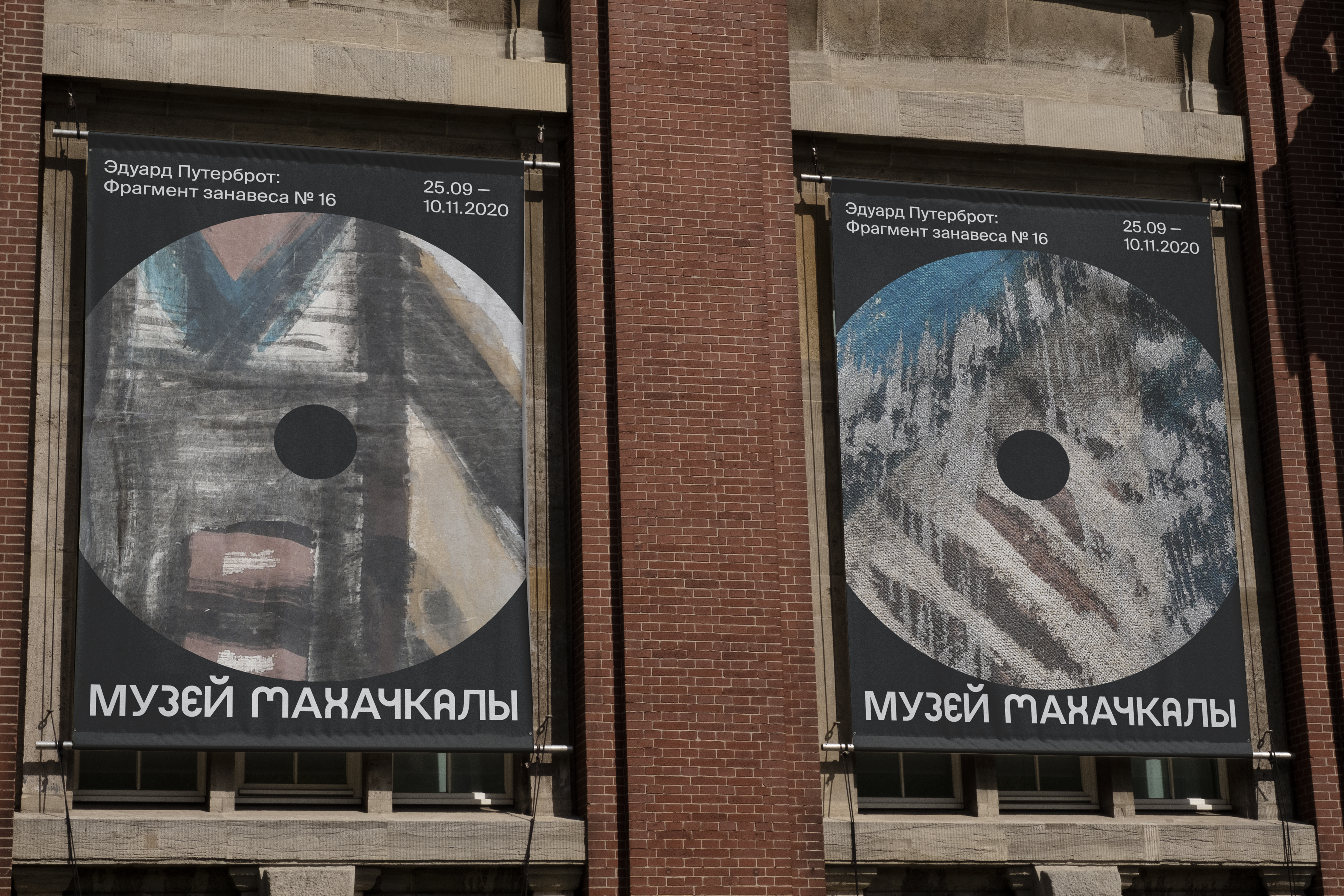
Museum of the city of Makhachkala identity. Suisse Intl
Here many people would interrupt you for arguing that design is a service. Like taxists, we are driving a person who chose us, and don’t really have much impact on how the world is going to become a better place. What would you say to those people?
For starters, design is not service. I totally disagree with viewing design as something focused only on solving customer’s tasks. This is a part of a designer’s job, clearly, but primarily this activity implies some kind of aesthetic impact. And that is the most important part of this job, because tasks of customers can be solved, one way or another, by millions designers and non-designers, while the power of good design is to do it so as to bring in certain added value, so that when a person sees, let’s say, an unusual logo, he will be brought one little (and possibly unnoticeable for this person themselves) step closer to something bigger and beautiful. Probably I am just optimist and idealistic, but I really believe in that.
Sadly, in Russia as well as in the US and Europe people often perceive design as solving tasks and creating images. However, even if we simply think of the word ‘design’ — in English, it doesn’t mean ‘drawing’, it means ‘projecting’ and ‘constructing’. I really want designers to be more about those things. You will always find a contractor to do image, motion or layout, while a person who will come up with an idea of how to do it is, I believe, the most valuable asset ever. As someone who doesn’t have a relevant education, I feel like they simply don’t teach that, and designers quickly jump to one of extremes — either beautiful images, or an interesting concept. This is frustrating. What matters most is neither, it’s both.
Let’s talk typography. Almost every project in your portfolio uses sans serifs with a very clear personality. Is it a coincidence or you are aware that there’s a certain kind of typefaces that relates to you?
As any other designer, I spent a long time finding and feeling what was mine; for a long time, I’d been wondering whether a designer should have his own recognisable style — and I now I have a clear view: there should be not a recognisable style, but a mindset, system of thinking, a certain framework which helps you work. I believe that people should see your logic rather than your visual tricks. While figuring out all this, I realized that to me it is more comfortable and interesting to think through typeface, since with the use of it I can better express emotion and character, which, let’s say, I am not always capable of transmitting in the process of filming’s art direction. In early stages of any project, I come up with an image and it results in coming up with a typeface. I believe that for every image, every personality, every brand persona you can find a typeface that would fit in a totally small detail (since details are the most interesting thing). Why do I have lots of sans lately? Simply because I had this type of projects — it’s not that I am that much into sans serifs. Now I’m going to have a slightly different period.
There are designers who fall in love with one typeface and constantly use it their entire career. But you are advocating that one should find a separate typographic solution for each project, is that right?
Absolutely, yes. That said, I sincerely admire designers and studios who work using give or take 2–4 typefaces — notional Experimental Jetset, who, the way I see it, create great stuff without taking any liberties with type. I also have typefaces which I like a lot and that I relate to, or associate with my projects. Simply by looking at my website and the one of our studio, you easily notice there’s Dinamo’s Favorit everywhere. But a typeface can be re-used, because projects can be emotionally similar to each other. Other than that I’m definitely advocating using its own typeface for each project.


Non-Objective Works studio website. Favorit
Can you define how a month of running type.today’s Instagram has changed your typographic experience?
I haven’t worked much with Cyrillic, and I rarely like Cyrillic typefaces — always suffer, not being able to choose. Here I assigned myself a task to do a project in Russian in order to fight this fear. This is a joke, clearly, but it worked. Another three projects that I’m doing right now will use Stratos, just because me and this typeface became really close during this month. It appeared more often than other typefaces, I think. Although before that I was doing a very big project for six months, which I hated, and Stratos became emotionally associated with this project, and I swore that I will never apply it anywhere else, ever, just delete it… During our month, I was actively trying to break this feeling, broke it, re-fell in love with it and discovered all of its beautiful forms. Stratos Black, which, as I believed earlier, won’t fit anywhere at all, fits perfectly well in some projects, no other typeface could do better.
Exploring a typeface is like meeting a person: you get a certain first impression (in a notional Favorit I immediately notice letters «R» and «Y»), but in the process you get to learn a million nuances that often turn out to be more important. While working with typefaces from your library, many of which I had seen earlier, I doubled my choice of typefaces simply because of taking a closer look at them — they revealed themselves in a new radiant way. I have a folder with plenty of different type foundries, and each time I look through all of them, but now type.today’s typefaces spring to my mind right away. For instance, NWT Bodoni fit great in one of my projects, and this was a one-second decision, meaning I simply had no choice as I immediately knew that it would be a perfect fit. And this month gave me those feelings about a bunch of typefaces from type.today’s collection.


Kvity Moscow. NWT Bodoni + Stratos


N + Production website. Proto Grotesk and Druk

«Slish» podcast festival website. Stratos
I get the impression that you are a sans serif person and that you’re not that comfortable with working with serifs. Is that right?
It was before, now it’s less true. I simply believe that images on type.today’s Insta were in fact all about myself, and currently I’m associating myself with a sans serif.
Have you tried working with variable fonts already?
I used variable fonts, but I find it much more comfortable to work with a large amount of styles, I’m more used to it. Basically, it is just an additional option, kind of convenient, but as I am used to working in a different way, I don’t get this convenience. Perhaps, it’s just that I’m this retro-oriented kind of person.
Could you name your favourite images of this month? Where everything works just the way it should?
The one I like the most is a circle and a quote from Baldassari. That is definitely the one. The second is with the keys, as there I was looking for some stuff from everyday life, found keys and spent the whole night, drawing ecstatically those keys, thinking of how many shapes they have, which I never noticed and didn’t even think about before. Plus all the rulers. For the same reason, I guess, — I generally like the idea of absolutely absurd, pointless, non-functional rulers.
And the image with a Perminov’s poem in square. And the funny one — a tribute to Yuri Albert, my favourite artist that I could not but feature there. The most interesting and the most underappreciated of my pictures, maybe.
Your portfolio is available on Instagram and Behance. What projects would you recommend in the first place?
You can pass on Behance, as I haven’t updated it for a hundred years, maybe. As for my Instagram, I post only things that reflect me in the moment, here and now. I would most certainly name the Museum of the History of Makhachkala — both from the perspective of idea and social importance, and just because of the positive feelings you get from this interaction. This project in general says a great deal about how I work. Even though hierarchically I should place at the top the covers for Studio 96, an American radio show that is broadcast every Friday. They are literally letting me do whatever I want. It is some sort of manifestation of my love for letters — bent, twisted, knotted — and generally the full package of clichés, stamps and other basic shapes from everyday life. Also, I would single out exhibition design guidelines for the New York museum (those are not about design but about system), a new visual identity the Genom modelling agency (a very typographic story inspired by concrete poetry — compensators in the logo symbolise their meticulous approach to work and looking after their models), and the online school Mezhdu Prochim where we combined the glyphs of Bold Proto Grotesk (unexpectedly frisky) with letters drawn by children.
 Studio 96 radio show covers. Steinbeck
 Genom modelling agency identity. Whyte Inktrap and Studio Feixen Sans
 Mezhdu Prochim online school identity. Proto Grotesk
Out of latest projects, I could mention the magazine about light, Dlina Volny, for which I developed a design system — with several levels that perfectly interact and interchange — and the brand of bags Sputnik, with which I worked for a year. This brand marked the start of our new phase — projects with punctuation. As someone who also has a linguistic education, I am inspired by language. At some point I realized that punctuation could create so many meanings that, for some reason, no one thinks about. We put Sputnik in brackets — a simple solution which can be repeated on any keyboard, — and through this emphasized that those things should not distract from their owner, that they are behind the main thing, as if in brackets.


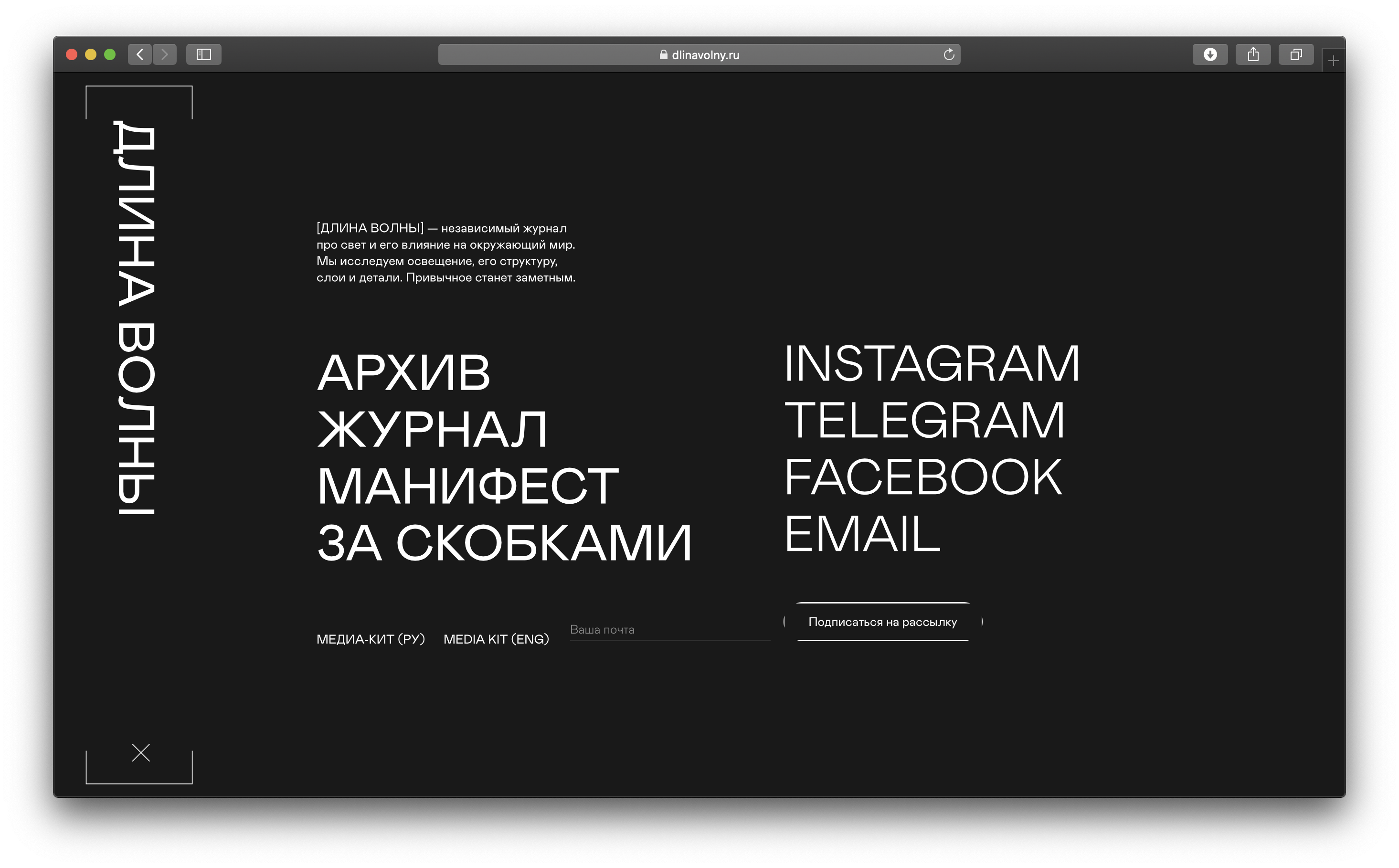
Dlina Volny magazine website. Mabry Mono и Mabry Pro
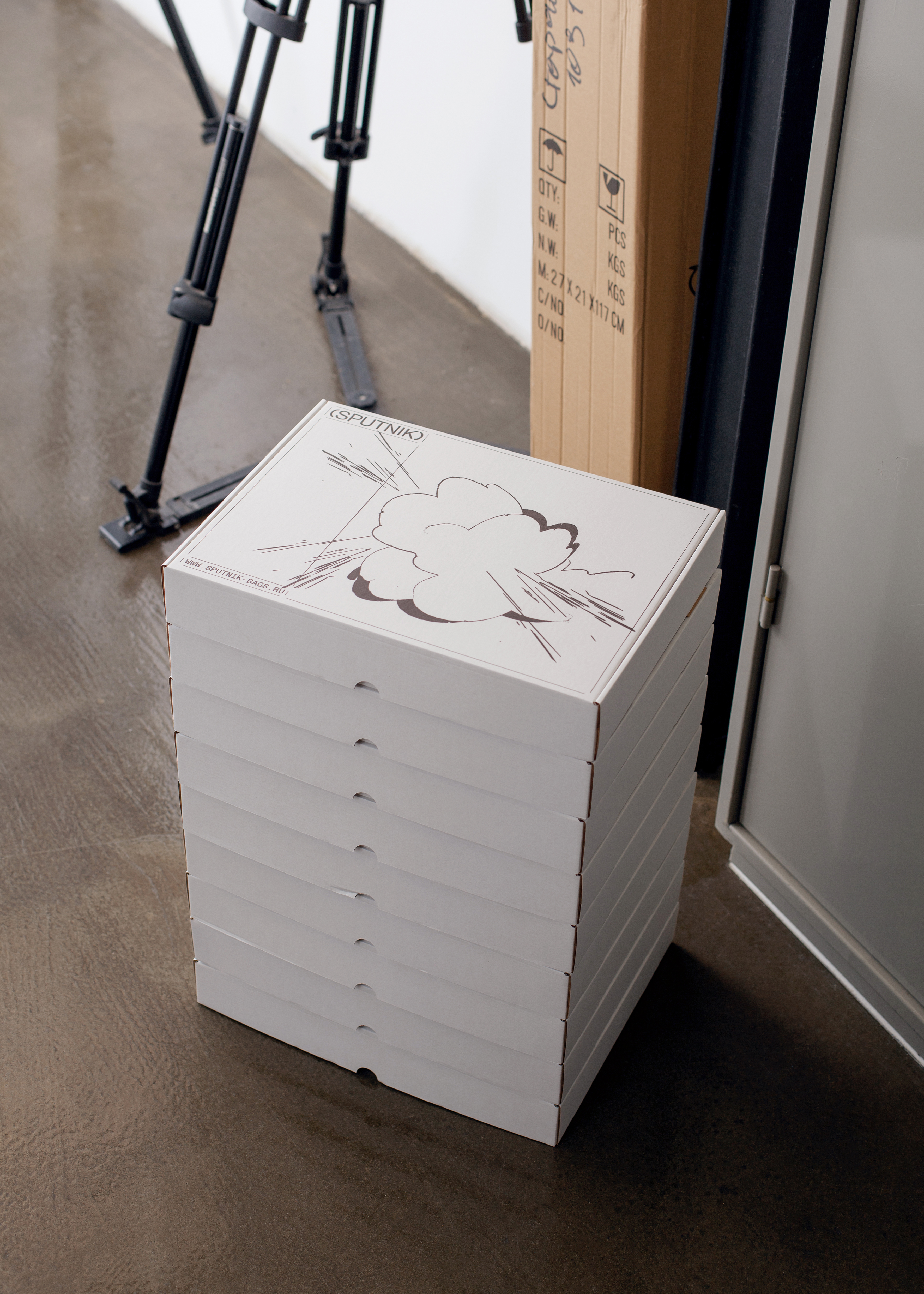

(Sputnik) brand identity. Favorit
Do you have a certain list of projects that you, as a designer, will never address?
I definitely won’t do some political or state things that I don’t believe in. I mean, clearly, there are certain state projects with a decent message, but it quickly becomes obvious when you meet customers in person. And you always can see and estimate the line between a good idea and trivializing it in use. Basically, I would not take on state and, especially, political projects, as, having studied PR and political technologies, I know all too well how it works.
Could you please share what you feel about the term ‘Russian design’?
I think about it a lot, but I won’t be able to clearly define it. We were talking about it with my friend and at one point we somehow came to the conclusion that Russian design is about the bitter taste of Russian reality and absurd humour. But those are metaphysics. In more practical terms of all this, I don’t believe in Russian design. Actually I don’t really believe in the division of design along countries’ border lines, as you can put a Russian into American system and he will do totally un-Russian design; and it works the other way around as well.
Where design and typography are going today, what do you think?
Every now and then everybody is starting to say that the future lies in motion, the future lies with 3D, or something else. But I truly hope that all those things are just temporary points, essentially cyclical. At the heart of any design there should be a good idea, that’s how it always should be, and nothing else matters — if there is motion, if there is 3D, or there is none. As long as there is an idea, a meaning. I believe that creating new meanings is in fact the main task and the key mission of a designer. Designer is an author of meanings and curator of contexts.