
AS: You named your studio after reading about Zaum The book Kris read mentioned the futuristic idea of inventing words where the sound conveys meaning. «I started reversing words in my sketchbook, and ‘milk’ became ‘Klim.’ It sounded vaguely European, and in the early 2000s, we were cringey about New Zealand, particularly in the design world, so I thought, well, that sounds good,» wrote Kris in his blog., and you’ve collaborated with a number of poets. You also quote both John Cage and Terry Pratchett in your socials. What’s your relationship with literature like?
KS: I love language. I like reading, I like writing, I think most of my learning is done through reading. When I was little, I used to read a lot, and I learned later in life that I’m an introvert. That means I need to go and recharge after spending time socializing, and reading is a natural way to recharge for me.


Sincerity/Irony written by Hera Lindsay Bird. Set in Heldane by Klim Type Foundry. Designed by Alt Group
AS: You collaborate a lot with the local designers from New Zealand, what’s the New Zealand design scene like?
KS: It’s very good, it’s probably one of the best design scenes in the world. Over the last 15 years, we’ve been learning to like ourselves again. For a really long time, due to colonialism, a lot of indigenous knowledge and art forms were either suppressed or discouraged, and New Zealanders in general were struggling with what it means to be a New Zealander. But in the last few years the New Zealand design scene has really been figuring that out and we are now becoming comfortable with who we are and what we’re doing. It has been really good seeing it, because when I went to design school 20 years ago, it was all American and European, there was no mention of New Zealand.

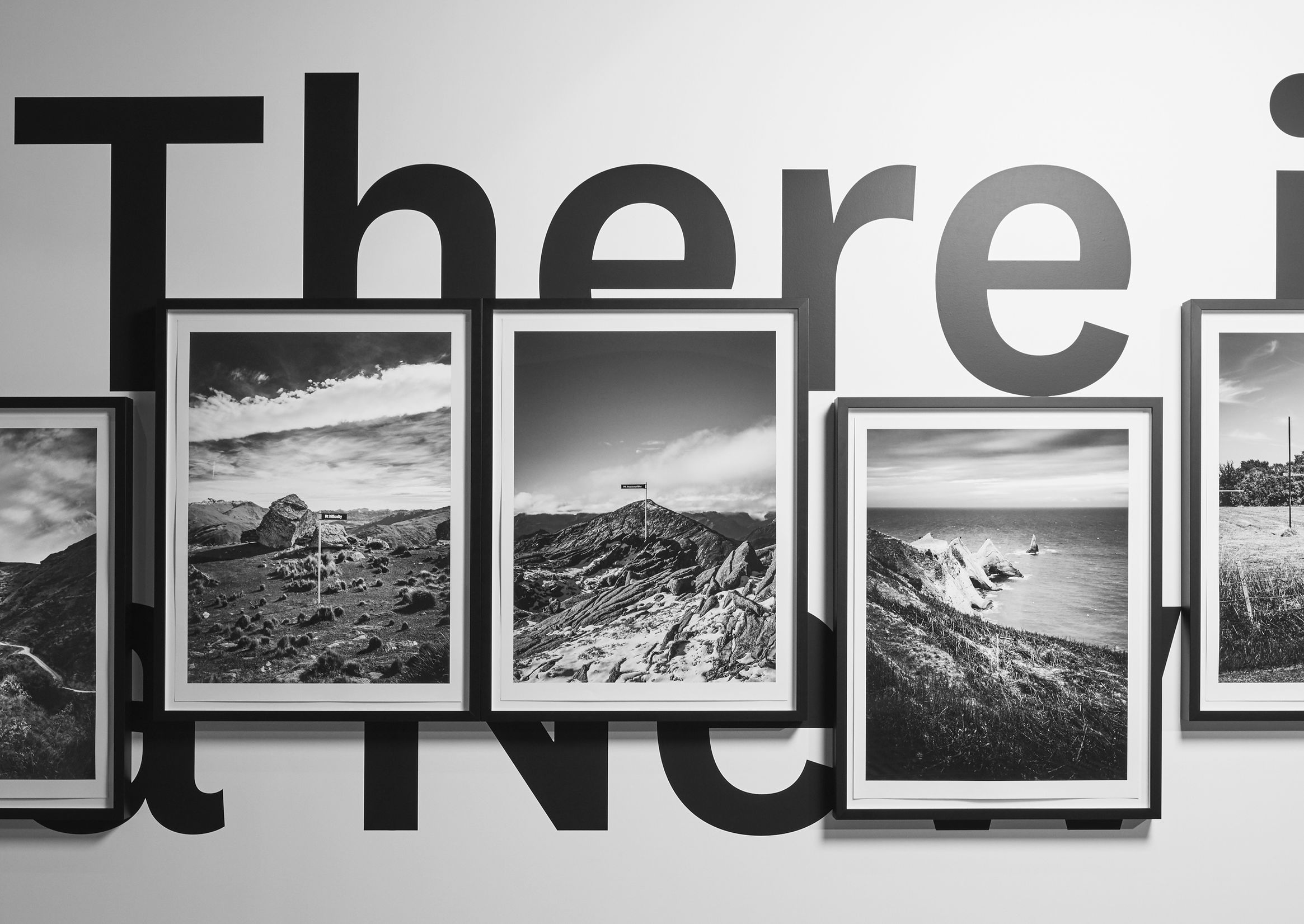


There is no such thing as a New Zealand typeface, environmental graphics. Alt Group × Klim Type Foundry
AS: And what have you figured out by now? What is it like to be a New Zealander?
KS: I don’t know, it’s really hard to tell from the inside! I think the best person to tell us might be someone who is not from here.
AS: I’ll ask the same thing in five years, you’ll have probably written a book or an essay about it by then.
KS: Maybe.
AS: In your last release you’ve used AI-generated images. How do you think AI will influence our lives in the future?
KS: I hope it doesn’t influence us at all. Do you remember the blockchain? Do you remember the metaverse? NFT’s? All of that basically came to nothing. I’m pretty sure we are at the peak of what AI can do. I don’t think AI will ever come up with any new or interesting ideas for typefaces.
Using AI for a campaign was a difficult choice, but I think, conceptually, it was the right thing, even though I wasn’t comfortable with using it. And I liked the outcome.
AS: What AI-tool did you use to create those images?
KS: I don’t know, I didn’t do it! I work with a lot of design studios in New Zealand, and I trust them to come up with concepts and campaigns. I don’t really get involved in the mechanics of it. I don’t really want to know how the sausage is made, I care about the sizzle.
What I can tell you is when DDMMYY generated all of the images, they re-photographed with film off the screen and processed the images again, which conceptually brought it to the realm of documentary photography and gave it a realistic and analogue feel. But the intention was also to fuck with the idea of copyright, because, apparently, at this point, the thing with AI images is that nobody really exactly knows who owns them. And photographing the images again adds another level of complexity.


Images from the American Grotesk release
AS: Sounds cool! I guess, six years ago you said that you wanted to show your audience that Klim Type Foundry is more than just you, do you think you succeeded in it?
KS: I don’t know. I honestly don’t know how people see Klim. I don’t know about other people’s perception of who we are and what we do. We have everybody on the website. If you want to know, you can go on the website and see everybody who is involved, but I don’t want to concern myself too much with what other people may or may not be thinking.
 Dave Foster, part-time type designer at Klim Type Foundry
 Sonja Schröder, sales manager and customer support representative at Klim Type Foundry
 Noe Blanco, type designer and font engineer at Klim Type Foundry
 Peter Dekkers, developer at Klim Type Foundry
 Lyle Chetty, contract adviser to Klim Type Foundry
IR: Are you coming to your physical studio to work alone or it’s a bunch of people in the studio?
KS: No, it’s usually just me, sometimes Sonja and Peter come in, every now and then another designer or friend will come and work here, but mainly it’s just me. We’ve been working asynchronously for so long because we are spread around the world and I don’t think we’ve ever had all of us in a room together.
AS: It’s the same for us. There are people on the team whom I’ve never seen in person.


Tiempos by Klim Type Foundry, type specimen. Designed by Kimberley Zhou
AS: A while ago you wrote that a typeface is not a tool and then later you said in an interview that you hadn’t clarified what a typeface really is, do you have the clarity now?
KS: I think it’s more than one thing. I haven’t got it totally figured out and I probably never will, which is good. I think it can be quite a few things all at once but mainly it’s a human creation, it’s a little piece of somebody’s soul, it’s functional, but it mainly acts as a material.
It’s something that you will use to make something else. And when you use it to make something else, it’s in that product. Whereas if you use a hammer to bang in a nail as a tool, you can’t see the hammer in the final building, maybe traces of it but not the hammer itself. While the typeface becomes a part of the new thing, it’s like an ingredient in a dish.
A typeface comes out of one’s creative and technical process and then it becomes part of somebody else’s creative technical process for things that will either exist in the real world (like a book) or things that will be digital and sort of ephemeral.
So I don’t know. It’s a good question, what a typeface is.
AS: If a typeface is a part of somebody’s soul, can a typeface’s outlines communicate its author’s emotions and feelings?
KS: Possibly yes, but there is a level of humanity that’s removed from it, because you can’t see your hand in it, you can’t see that a typeface is made by people, whereas you can see that in other things.
You understand a typeface is made by somebody, you understand that somebody’s put time and care and love and effort into it, but whether you can see their emotion and feeling
If I put anger into a typeface, what if it doesn’t look angry or doesn’t feel angry? Or if I put love into it, but all you see in the typeface is something very hateful, does that count? I don’t know.


Signifier by Klim Type Foundry
AS: When you study literature, you usually check the things that happened in the author’s life at the time when the book was written. Sometimes it’s the only way to understand what the author wanted to communicate. Doesn’t it work like that with type design? You compare the events in the type designer’s life and understand why the outlines turned out the way they are?
KS: Reading a novel is a very personal experience. You imagine a world and you can read feelings into it, you can relate to it, whereas if you see a shape of a letter form, it’s not exactly like that. It sits partially within the realm of human emotions, but it’s also outside of it as well.
If you’ve read a novel having no idea about the author, and it had a very strong impact on you and you understood it in a certain way, related to it, and then you found out things about the author: what she had done, what she had grown up with and why she wrote the novel, would that then change your perception of what you read? Should the author’s biography and your perception be connected at all?
AS: For me it depends on the genre. If it’s autofiction, of course.


Untitled Serif by Klim Type Foundry in use in the poetry book by Peter Frielingsdorf with illustrations by Werner Schlegel. Designed by Lasse Schlegel. Photography by Jan Schölzel
KS: I suppose to a lesser extent, over the last few years, there’s been a great reckoning towards people and power. We found out that some artists and musicians and actors have done really shitty things and they’ve ended up being canceled. But before all of that, people had a relationship with the things that they’d made or the shows that they’d done or whatever. And as soon as their behavior towards other people has been exposed, for better or for worse, then our relationship with their work has changed and we can’t stand looking at some of the things we used to enjoy.
It’s what the whole can you separate the art from the artist debate is about. Some people say that you can’t and some people say that of course you can.
I fall possibly more towards the point that one’s deeds are not the same thing as one’s art, but they’re close enough to affect your relationship with the art. I don’t know how we got here from the shape of letterforms, but here we are.
AS: Ilya, how do you feel about cancel culture?
IR: I don’t know, to be honest. We know the story about Eric Gill and his legacy, and we’re still struggling to comprehend the coexistence of the beauty of his art and the history of his family. And everyone has different opinions about that. It’s super hard and personal.
I’m not a huge fan of cancel culture in general, I find it can be aggressive. I do understand the purpose though. Kris, what do you think?
 One of the sketches for Joanna by Eric Gill, 1930
 One of the sketches for Gill Kayo, 1932
KS: I think we’re all terrified of cancel culture, especially men, in certain ways. I don’t want anything I do to be misconstrued. At the same time, I don’t want to say that victims of traditional male power and the patriarchy suffer less, but both things can be true.
Cancel culture came in hard and fast, and it took people down pretty quickly. It has a lingering effect on all of us, and I’m not entirely sure what it’s going to be like. It’s like the pandemic. It has affected all of us, but we still don’t know what the long term trauma of that will be. We don’t even know how we are going to understand it.
IR: Speaking of canceling and all the new ways of how we communicate around, there is a strong anti-monotype movement in industry. What do you think about that?
KS: Monotype is a company operating within the bounds of capitalism, they’re just doing what a big company does. On one hand, they’re just buying type foundries and trying to establish some sort of market dominance. But on the other hand, that has an effect on other people, that sort of consolidation of foundries and market power.
I don’t know why foundries would sell to Monotype. Maybe the market that we operate in didn’t work for them and they need money. Maybe they just got sick of it. I think there’s a lot of reasons but I don’t think Monotype is inherently evil, it’s just a boring company operating under investor money. They’re not interesting, they have a lot of fonts but I don’t think they have the fonts that people really want. I reckon they’ve got about 20% of the world’s best fonts at best and the rest are everywhere else. I don’t feel threatened by Monotype.
IR: It sounds like they never contacted you to buy out.
KS: They haven’t. They contacted us to sell our stuff through sort of one-off deals, but we’ve always just said no because we can sell the fonts just as well as they can. I’ve been quite vocal about not being interested in them.
This comes back to your earlier question, I have no idea how people see Klim, so I don’t know what Monotype thinks about us or how they feel about us. Maybe we go under the radar as some little New Zealand type foundry.
AS: I’m the only person here who is not a founder, so I feel for employees. As a corporation Monotype has a lot of hiring campaigns and then they have huge layoffs. It would be insecure for me to work there.
Also when Monotype buys a studio, they take down their journal and copy just a few like articles to their own website. A lot of good stuff about type design gets lost. So what I want to say is, Monotype is just a business, but not an ethical one.
KS: You’re right.


Söhne by Klim Type Foundry. Typeface presentation designed by DIA
AS: Let’s move on from discussing business. I wanted to ask about the process behind your design info essays. Do you write them when you finish the glyph set or the processes are somehow concurrent?
KS: I always write them at the end, once it’s all finished. Usually once Noe is about to master the typefaces, because otherwise it’s not done. I don’t want to start writing halfway through and then change my mind about a typeface. I also don’t want to start writing halfway through a typeface I’m not going to finish because that seems a bit counterproductive.
I write those things specifically for me 20 years ago. I’m writing about the things that I wanted to know about when I was just starting. Because you can understand a typeface at a typographic level by just looking at the outlines, but you won’t understand it at a conceptual or intellectual level. Like what we were saying before, without the text about the typeface you couldn’t understand what its author was thinking, what she was going through, what she was aiming for with this typeface.
Writing about the process and summarizing what I was thinking helps me achieve closure on the project. But it also works for the storytelling
I usually don’t know what I’m going to write until I start writing. Sometimes it starts one way and ends up in a totally other way, which is part of the process, and it’s quite interesting for me.
 The Future Collection by Klim Type Foundry
 The Future Collection by Klim Type Foundry
 Trajan inscription, AD 113. Photograph © Carl Rohrs (2017). From the essay about The Future Collection
 Brass plate from Futura development. Photographed from the collection in the Museum für Druckkunst Leipzig. From the essay about The Future Collection
 The Future on the cover of a novel by John Kinsella. Designed by Monograph
AS: Do you use any editor’s or copy editor’s assistance?
KS: Yeah, I do. But it’s not for structure, more for grammatical consistency. Do I need an editor? Maybe. But I edit a lot myself. I do cut a lot of words out. My texts could be twice as long, but they don’t need to be. I quite enjoy chopping the bits out.
AS: I love that in the beginning of the page you always write how many words there are.
KS: When we were developing the site, I wanted an opening for the blog page to be ‘how many words’, because I thought, ‘100,000 words on letters’ is quite funny. But that’s a pure vanity design thing, that’s not really for any functional purpose.
I don’t aim to write a certain amount of words. Every time I say: this one’s going to be quick. But then I realize I’ve got to put this in and I’ve got to explain that, and it just keeps going on. I was going to stop doing the design infos when we launched the new site. They’re really hard to write and they take a long time and I didn’t want to do it anymore, but then everybody around me said: no, you’ve got to do it.
The design infos get a lot of traffic, people read them. Once I was at a conference and some Argentinian students came up and said, ‘thank you for your blog, we were using it in our type class’. It was really nice to hear, because there’s a huge amount of people who don’t say or write anything and just silently look at your work, but they have their own private inner worlds and discuss it in real life with their friends and colleagues. And whenever you hear a part of this discussion, you can compare it to how people talk about Klim on social media.

AS: You know, once I saw a Telegram post saying: “Kris Sowersby designed another typeface so that he could write an essay about it”. People in Telegram love your design info essays and analyze them a lot.
KS: Oh shit!
AS: What, in your opinion, is bad taste concerning typeface descriptions?
KS: Everybody’s taste is different, there are things that I don’t like and things I wouldn’t do, but I wouldn’t say they are bad taste. I’m very clear about how we separate our typefaces in terms of having a campaign, the specimens on the website, and the design info on the blog. And I’m quite happy to be difficult and obscure and non-obvious in our marketing. One of my goals is to market a typeface without actually showing the typeface. I don’t know how to do it, but I want to get there. Because you can sell a T-shirt without showing it, or a car. You can have a moody, evocative campaign and say «t-shirt coming soon» without showing it. But you can’t sell a typeface without showing the typeface. It would probably be really chin-stroking conceptual art.


Epicene by Klim Type Foundry
KS: What do you think is bad taste?
AS: Well, we try to avoid a number of things when writing about typefaces. These things are what our editorial team considers to be bad taste. For example, as an editor, I always omit complicated and useless metaphors. When a type designer writes, “One morning I saw a sunbeam in my room, I felt like I could touch it, and this touch would be as tender as the contact between my Apple Pencil’s tip and the screen of my iPad that I use to draw my typeface sketches”, that’s a no-go.
KS: But it’s really hard trying to find new words to describe old fonts, right? Let’s take American Grotesk, it’s just my version of Franklin Gothic, but there is more that we can say around that. What is Franklin Gothic? Where did it come from? Why is it important? Where was it used? How is that now relevant to where we are in society and culture?
And there’s a certain way that type designers will see it. When they see a font that’s released, they can see all the references, they know where it came from. They say, ‘I wouldn’t have done that’ or ‘I wish’ I’d done that or ‘why did the designer do this’. Whereas graphic designers will look at a typeface with different eyes. They’re looking for fonts to use, to love and to incorporate into their own work. But type designers are not going to buy a typeface and they’re not going to use it. It’s not going to be part of their working life. So I’m not selling fonts to typeface designers and I’m not particularly interested in what other type designers think about it. That kind of removes all ideas of bad taste. Actually, bad taste would be just a boring campaign that had “quick brown fox jumps over whatever dog”.
 Franklin Gothic, ATF (1902); Franklin Gothic Condensed, ATF (1906); Franklin Gothic Extra Condensed, ATF (1906). From the essay about American Grotesk


American Grotesk by Klim Type Foundry
AS: Do you also write the slogans for the typefaces yourself? I have a question about one in particular: Martina Plantijn is the better Plantin.


Martina Plantijn by Klim Type Foundry
KS: That came out between James Goggin and I. We were fucking around with a whole lot of things trying to say exactly that, but without saying it. And then I was like: why don’t we just say it? Why don’t we say it’s the better Plantin? And then we realized that we can do it and it’s perfectly legal as Monotype doesn’t own the name Plantin.
AS: It was the most feminist statement I’ve ever read. It brought me down the rabbit hole of googling why Martina was better than her dad.
KS: The whole thing was trying to foreground the “hidden” women who have been fundamental to typeface design, who have upheld the legacy. The only reason we know Plantin is because all the strong women kept the archives and the business running, not just two dudes who wanted to make some stuff. But they got all the glory later on.
 Martina Plantijn painted by Peter Paul Rubens
AS: You work with professional marketing strategists at Klim Type Foundry. How did you realize that you needed them?
KS: It was when Jess, my wife, joined Klim. It was only meant to be part time and she was just going to help with a few things in between jobs. She started asking me questions, ‘Do you have a strategy when you release stuff? How often do you email your customers? What’s your marketing budget?’ I couldn’t answer any of that.
Then it was a slow process of Jess getting me to understand that, firstly, I don’t have to do everything myself, we can hire other people to do it. And part of it was starting to take the business more seriously and then going with Alt Group. They are one of the best design firms in New Zealand, who did some challenging things with our campaigns. It wasn’t cheap, but it worked. I really enjoy how it turned out.
I love the process after you’ve designed a typeface, when you invite someone in with fresh eyes and they’re basically figuring out how to sell the font to themselves, because they are the ones who are going to end up buying it. That’s an interesting little loop.
AS: Do you consult marketers when planning the release of a typeface? Do you research what designers need now?
KS: I don’t. I have no idea what designers want. If I did a whole lot of research into what type designers want to use and what they’re buying, by the time I’ve finished the typeface, the research will be out of fashion.
You have the lab — CSTM Xprmntl — where you do things that are single weights and they’re very experimental. And that’s good, because you don’t have to develop it into a whole massive family, it’s fun and quick. There’s a lot of other foundries that have got their lab areas or places where they put stuff that’s not finished.
But in terms of figuring out what people want, I don’t know. I’m afraid if I start doing that, then it’ll change how I start working. I don’t want to end up making fonts to satisfy market research. So for now I’ll continue making typefaces I’m interested in making.
AS: Klim Type Foundry supports a lot of charities. Do you think a type design business has to be socially responsible?
KS: If it can, yes. If it can’t, then no. I wouldn’t say that a type foundry should have a social programme. There’s no way you can have an imperative to give away the money that you can’t afford to. But if you’ve got some spare money around, if you’ve got enough to give them back, why not? The whole point of the economy is that money circulates around and you can choose where you put it. But if you can’t, you shouldn’t feel guilt over it. We should remove that element of guilt and shame around large problems that we shouldn’t feel personally responsible for.


Klim Type Foundry donates 20% of Mānuka sales to Trees That Count initiative
AS: Answering our questionnaire, you’ve mentioned that you would like to create a custom typeface for FromSoft, a japanese game developer. Does that mean that you like video games?
KS: Yes, I do. But I’ve only recently understood why I do, and it’s not for good reasons. Video games were probably my first addiction as a child. And the reason I played video games is the same reason why anybody else has an addiction and it’s to not deal with their own problems and emotions and feelings. Since I’ve realized this, I’ve just stopped playing.
But if FromSoft called, I probably would design a typeface for them.
AS: Was there a video game that you especially liked?
KS: Quake and Doom, because there was music by Nine Inch Nails and it was all very techno and horror, which I, as a teenager, thought was cool. But in terms of a whole graphic identity, when Wip3out came out on PlayStation, it blew my mind. The identity was created by The Designers Republic, they were very popular at the time. But by and large, most video games don’t do type very well.


Graphics created for Wip3out by The Designers Republic
AS: Answering our questionnaire you also wrote that there is still no decent Times. Are you planning to design one?
KS: Yep. I’m doing one, but that’s not to say that it’s going to be good. It’s just going to be my version of it. But I’m sort of coming out of a revival phase, I think. The Times is basically finished, which means it just needs a bit of love and attention to finish. And then we’ll probably spend six months doing the marketing and thinking, how can we say that it’s a better Times without saying that it’s a better Times.
Also all the obvious puns like Good Times, Bad Times, Different Times have been already taken, so I need to think of a decent name, too.
AS: So why do your typefaces only support Latin? Why don’t you do Cyrillic, for example?
KS: Some actually do, we just don’t really sell them. Mainly because I’m not confident enough in working with Cyrillic typeface design and I don’t understand the market. And there is also fear. I don’t know if the time spent will be reimbursed. I don’t know if it’s going to create a whole lot more admin problems. From what I understand, selling to the Russian or the Eastern European market is quite different from selling to everywhere else, and it takes a lot of specialised business stuff.
AS: You’ve said that your professional goal has changed over the years. First it was to learn how to make a typeface and earn a living. Then it was to find a place in the design world. In 2019 it was about focus and expansion. What is the goal now?
KS: 2019 was five years ago, and a lot has changed. My goal with type design now is to pull my ego out of it, try not to base my self worth on the typefaces that I make. I want to see if I can have a functional and healthy relationship with my work rather than having it so bound up with me and my ego and my personality and my internal life.
AS: Let’s imagine for whatever reason all kinds of type design businesses shut down all over the world. What would you do then?
KS: I have thought about this a lot, but I don’t know. Maybe I would panic and then celebrate, experiencing a massive relief. Actually, I don’t have an answer for you. The other day at the gym we started a session with the question: if you could do a job for a week, what would it be? It could be anything you like and you’d be good at it. And to my surprise, I said that I’d be a therapist. I knew why that was the choice, but I don’t know whether I want to actually do that for a living.
It’s a complicated question. I’d love just to say I’d be a firefighter, but the problem of being a typeface designer is you have a real lack of skills transferable to other industries. The interview won’t be like:
- What’s your CV?
- 20 years of drawing letters!
- You’re hired, mate. You’re perfect for the job.
I was also thinking maybe I’d just be a dad. Just always being in the moment, having no ambitions and no fear and no worry about work and just live. It would be amazing to be able to do that.